Opportunity Mapping: The Complete Guide (2026)
64% of software features are rarely or never used. That Standish Group number should haunt every product leader. Your CEO asks, "Why are we building this instead of that?" and nobody has a clear answer because the roadmap was built on opinions, not evidence.
Opportunity mapping fixes the gap between what you're building and what actually matters.
The Short Version
- The practice turns scattered customer insights into a structured, prioritized tree of problems worth solving - not features to build.
- The framework to use: the Opportunity Solution Tree, popularized by Teresa Torres. It's the most widely adopted structure and the one we recommend.
- Time commitment: 4-6 weeks to establish the habit. Once running, roughly 2-3 hours per week from your product trio - PM, designer, tech lead.
- Starter tool stack: Miro or FigJam for the visual map, Notion for the opportunity backlog, your existing PM tool for delivery tracking.
Most teams don't have a discovery problem. They have a synthesis problem. This process is the synthesis layer.
What Is Opportunity Mapping?
It's a structured approach to identifying, organizing, and prioritizing the customer problems your product team should solve. Instead of starting with feature ideas ("let's build a dashboard redesign"), you start with outcomes ("reduce time-to-value for new users") and work backward through the opportunities - unmet needs, pain points, desires - that connect to that outcome.
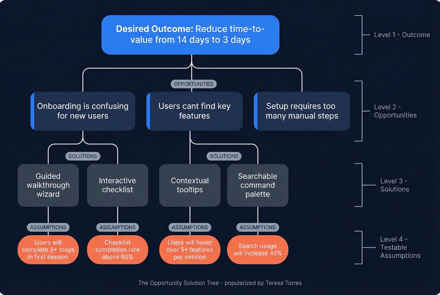
The most common framework is the Opportunity Solution Tree, popularized by Teresa Torres as part of her continuous discovery methodology. The structure flows top-down: a desired outcome branches into opportunities, which branch into potential solutions, which branch into testable assumptions. It's a living artifact that should evolve as you learn.
A note on the other meaning. In urban planning and social equity contexts, opportunity mapping is a geospatial methodology developed in 2005 at the Kirwan Institute under john powell (who uses lowercase styling for his name), now refined at UC Berkeley's Othering & Belonging Institute. It maps how neighborhood structures restrict or enable access to education, health, and economic mobility. This article covers the product management meaning.
Why Flat Backlogs Fail
Your team has 12 customer interviews scattered across Google Docs, Slack threads, Loom recordings, and someone's physical notebook. Forty items sit in the backlog. The VP of Sales added three "urgent" requests last week. The CEO saw a competitor launch something shiny.
Without a structure to synthesize all of this, you end up with what Usersnap's research calls a "democracy of opinions" - whoever argues loudest wins the sprint. That's not product strategy. That's politics.
Here's a concrete example. Imagine you're building a streaming entertainment app. A flat backlog might have "improve recommendations" as a single item. But structured discovery forces you to ask: recommendations for whom, in what context? A user on a plane with no internet has completely different constraints than someone on a train with spotty Wi-Fi. Those are different opportunities with different solutions. A flat backlog treats them equally and hides the fact that 70% of your users are on mobile data while 5% are on planes. An opportunity map reveals they're siblings under the same parent, and one is ten times more impactful than the other.
The Step-by-Step Process
Define the Desired Outcome
Start with the outcome, not the output. "Launch a new onboarding flow" is an output. "Reduce time-to-first-value from 14 days to 3 days" is an outcome. Outcomes give you a measuring stick - you can evaluate every opportunity against whether it moves that metric.
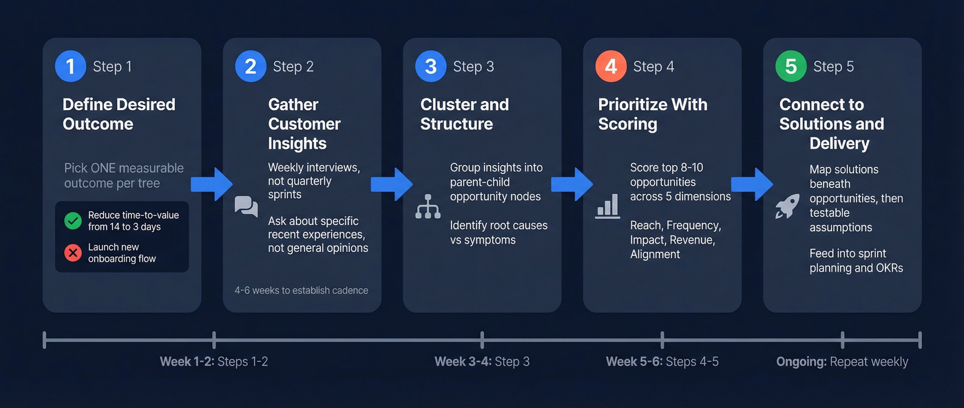
Your product trio should align on one desired outcome before touching the map. One outcome per tree. Multiple outcomes mean multiple trees.
Gather Customer Insights
The fuel for your map is customer insight, and the best source is weekly interviews. Not quarterly research sprints. Not annual surveys. Weekly conversations with real users, following Teresa Torres' story-based approach: ask people about specific recent experiences, not general opinions. "Tell me about the last time you tried to find a recommendation on the app" beats "What do you think about our recommendations?" every time.
Expect 4-6 weeks to establish this cadence. The first two weeks feel awkward. By week six, it generates more signal than any analytics dashboard.
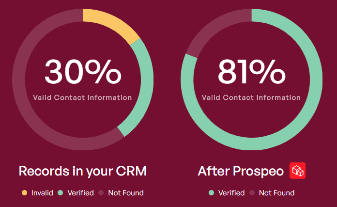
But even the best interview technique is useless if you can't get people on the call. The practical blocker most teams hit isn't willingness - it's access. You need to reach the right customer segments, and stale contact data kills discovery pipelines before they start. If half your outreach emails bounce, you're mapping opportunities based on whoever happened to reply, not the customers who matter most. Tools like Prospeo, which verifies emails in real-time with 98% accuracy and refreshes data every 7 days, keep your outreach actually reaching the segments your discovery process needs.
Cluster and Structure
Once you've got a few weeks of interview notes, patterns emerge. Three users mentioned friction during checkout. Two described confusion about pricing tiers. One told a story about abandoning the product because they couldn't find a feature they'd used before.
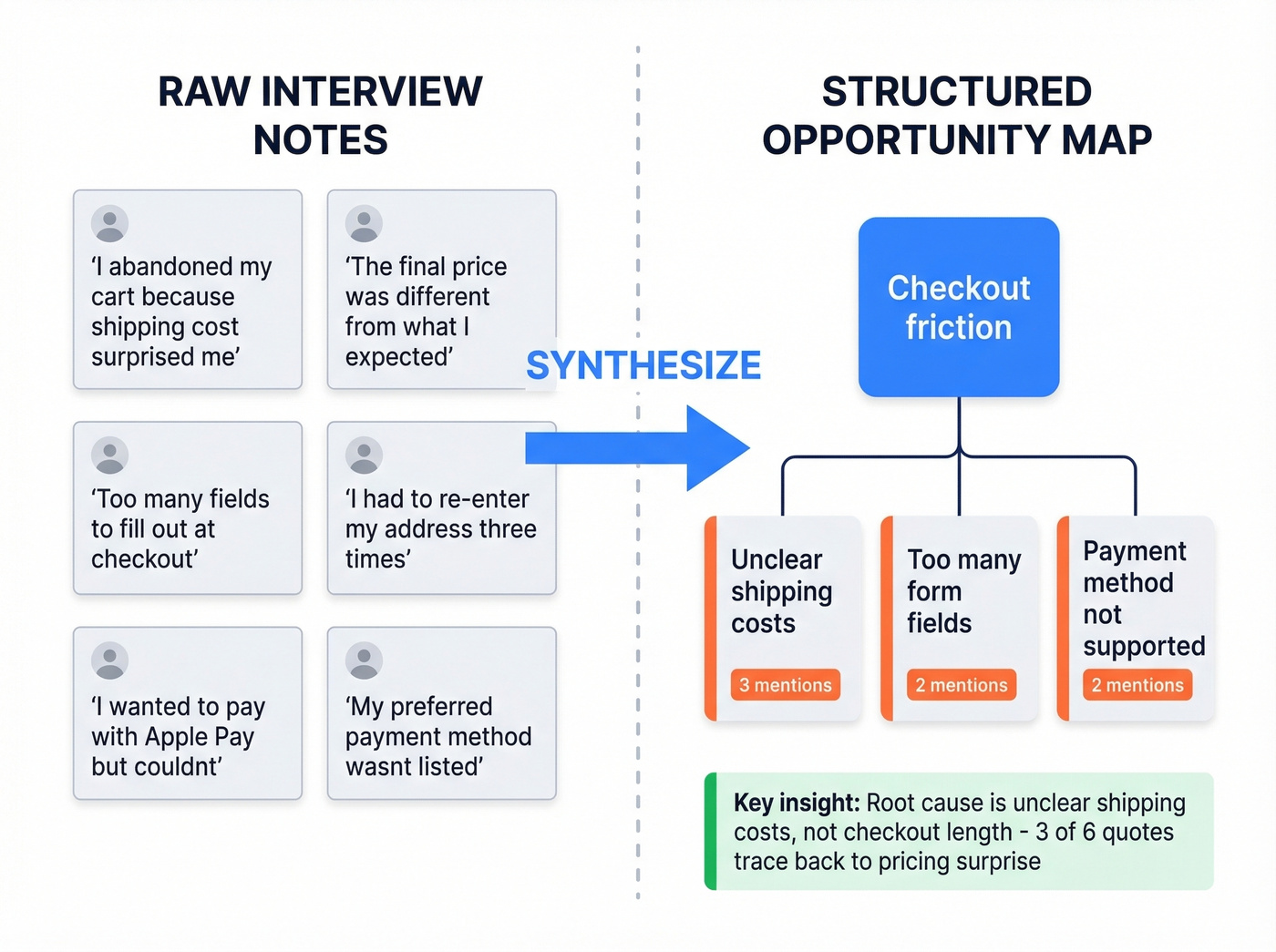
These become nodes on your tree, organized by parent-child and sibling relationships. "Checkout friction" might be a parent opportunity with children like "unclear shipping costs," "too many form fields," and "payment method not supported." The relationships matter because they reveal which problems are symptoms and which are root causes.
Look - the best opportunity map is ugly. If it looks like a polished slide deck, you're not updating it enough. Treat it like a whiteboard, not a presentation.
Prioritize With a Scoring Model
Most guides tell you to "prioritize by impact" and stop there. That's like telling someone to "cook something delicious" without a recipe. You need a scoring model with explicit dimensions: Reach, Frequency, Impact, Revenue Potential, and Strategic Alignment. We walk through a concrete scoring table in the next section.
Don't score every opportunity. After a few weeks of discovery, you'll have 30-50 on your map. Score the top 8-10 that your trio believes are most promising. Scoring everything is a recipe for prioritization paralysis - the exact problem you're trying to solve.
Connect to Solutions and Delivery
Once you've prioritized opportunities, each one gets potential solutions mapped beneath it. Solutions get testable assumptions beneath them. Those assumptions feed into sprint planning, OKRs, and roadmap conversations.
Yes, this means duplication between your OST in FigJam and your tickets in Jira. We address workarounds in the troubleshooting section below.
A Scoring Model That Works
Here's a weighted scoring model applied to four example opportunities, each rated 1-5 on five dimensions with weights of Reach 25%, Frequency 20%, Impact 20%, Revenue 20%, Alignment 15%.
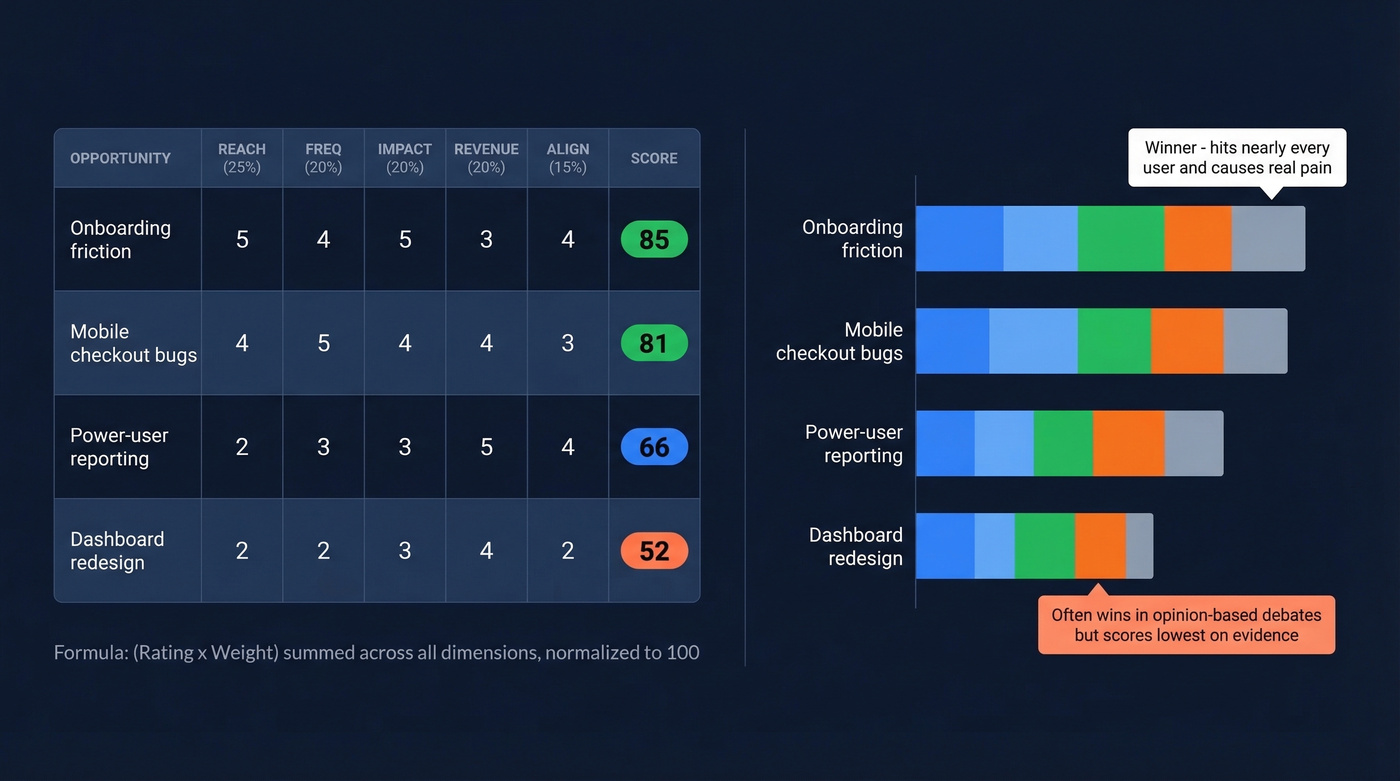
Ranked results:
- Onboarding friction - 85 (Reach 5, Freq 4, Impact 5, Rev 3, Align 4)
- Mobile checkout bugs - 81 (Reach 4, Freq 5, Impact 4, Rev 4, Align 3)
- Power-user reporting - 66 (Reach 2, Freq 3, Impact 3, Rev 5, Align 4)
- Dashboard redesign - 52 (Reach 2, Freq 2, Impact 3, Rev 4, Align 2)
The formula: (Rating x Weight) summed across all five dimensions, then normalized to 100. Onboarding friction scores highest because it hits nearly every user, happens frequently, and causes real pain - even though its direct revenue potential is moderate. Dashboard redesign, the kind of project that often wins in a "democracy of opinions" environment, scores lowest.
I've watched product trios argue for an hour about whether something is a 3 or a 4 on impact - and that's actually a sign the model is working. It forces explicit tradeoff conversations instead of gut-feel debates. When your VP of Engineering says "we should redesign the dashboard," you can point to the numbers and have a productive disagreement instead of a political one.
Opportunity mapping depends on talking to the right customers every week. But half your discovery outreach bounces when contact data is stale. Prospeo's 98% email accuracy and 7-day refresh cycle ensure your interview invites actually land - so your map reflects real customer pain, not just whoever happened to reply.
Stop mapping opportunities based on whoever's email worked.
Templates and Frameworks Compared
| Framework | Best For | Format | Effort |
|---|---|---|---|
| Opportunity Solution Tree | Ongoing discovery | Visual tree | Medium (weekly) |
| Opportunity Canvas | Deep-diving one opportunity | One-page doc | Low (per session) |
| Impact/Effort Matrix | Workshop prioritization | 2x2 grid | Low (one-off) |
| Notion Opportunity Backlog | Teams not ready for OST | Database/table | Low-Medium |
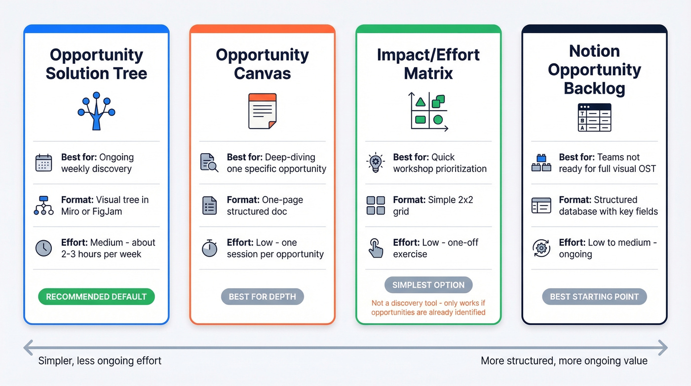
The Opportunity Solution Tree is the default recommendation for most product teams running continuous discovery. It's visual, evolves weekly, and forces you to connect solutions back to outcomes.
The Opportunity Canvas - available as a Miro template - works best when you've already identified a specific opportunity and need to go deep: users, goals, current alternatives, business impact, metrics, adoption strategy, success definition, and budget on one page.
The Impact/Effort Matrix is the simplest option, great for stakeholders who don't have time to learn a new framework. Just don't mistake it for a discovery tool - it only works if you've already identified the right opportunities.
A Structured Opportunity Backlog in Notion is the best starting point for teams not ready for a full visual OST. Key fields include who has the problem, strategic alignment, intended outcome, how many people are affected, and why you can win.
When the Process Breaks Down
Evidence Stays Scattered
A common complaint on r/ProductManagement about OSTs is that supporting evidence - research decks, Slack feedback, analytics screenshots, interview transcripts - stays disconnected from the tree nodes.
To fix this, link evidence directly to nodes. If you're using Notion alongside your visual map, create a database where each opportunity record has a "Supporting Evidence" relation field. Tag Slack messages, link to recordings, paste key quotes. It's manual, but it turns your map from an opinion tree into an evidence tree.
Prioritization Paralysis
After a few weeks of discovery, you'll have 30-50 opportunities. The temptation is to score and ideate solutions for all of them. Don't. Score the top 8-10. Let the rest sit. If a lower-ranked opportunity keeps showing up in interviews, it'll naturally climb the list. Trust the process.
Tool Duplication
Real talk: it's absurd that in 2026, most teams still don't use a single tool that combines visual mapping with execution tracking and evidence attachment. Your OST lives in FigJam, your tickets live in Jira, and keeping them in sync is a weekly chore.
Accept the duplication. Designate one person as the sync owner. Review alignment in a weekly 15-minute standup. And resist the urge to build an elaborate Notion-to-Jira automation - we've seen teams spend more time maintaining the sync system than doing actual discovery.
Adapting for Platform Teams
Opportunity mapping was designed for user-facing product teams. If you're on a platform or infrastructure team, the framework needs adaptation because your "users" are other engineering teams and your "opportunities" are often capabilities rather than features.
Hot take: if your deal sizes are small and your product is straightforward, you probably don't need a full OST. A structured Notion backlog with the scoring model above will get you 80% of the value at 20% of the overhead. Save the visual tree for when your team and product complexity demand it.
Three adaptations that work for platform teams:
First, build one shared OST for the entire infrastructure pillar, not one per team. An outcome like "cut MTTR below 5 minutes" spans observability, platform, and SRE - team-by-team trees risk narrow fixes that never move the shared metric. Second, run two parallel discovery tracks: product discovery for user-visible opportunities and engineering capability discovery for technical bets like reducing blast radius or improving deploy safety. Third, slice initiatives into verticals that show a metric shift within 90 days. Infrastructure work tends to become multi-quarter "platform investments" with no measurable outcome until the end, and that's a recipe for losing stakeholder trust.
Connecting to Revenue Outcomes
An opportunity map doesn't exist in a vacuum - it should connect to how your organization tracks commercial results. For sales-led organizations, pipeline management is the downstream system that benefits most from better discovery. When product teams map and prioritize the right customer problems, the solutions they ship directly improve conversion rates across the pipeline.
Consider how closed-won deal tracking reinforces the feedback loop. Every deal your sales team closes contains signal about which product capabilities mattered most during the buying process. Feeding that data back into your map - tagging which opportunities contributed to wins - turns your tree into a revenue-aware artifact, not just a discovery tool.
Reviewing accounts with open deals in your CRM can surface patterns your discovery interviews miss, too. If a cluster of prospects stalls at the same stage because of a missing capability, that's a node waiting to be added to your map. Sales data and customer interviews are complementary inputs, not competing ones.
Real-World Results
In one published set of case notes, Grailed switched from an 8-month feature project to weekly customer interviews paired with an OST. By focusing on the biggest browsing pain point their interviews revealed, they drove a 20% increase in customer lifetime value within 6 months.
Those same case notes describe Chime using the process to identify onboarding identity-check friction as their highest-priority opportunity. The redesign cut abandonment by 28%, validated in a single week of testing.
They also describe a global travel app mapping opportunities around content engagement and discovering that recommendation relevance was the top pain point. A targeted recommendation ribbon boosted average watch-time by 12 minutes per user.
The common thread: none of these teams would have prioritized these solutions from a flat backlog. The structure surfaced what mattered. As one product manager put it on Reddit, the OST created an experimental mindset where the team stopped debating opinions and started testing assumptions.
Tools for Getting Started
Opportunity mapping can run on free-tier tools. The real cost is the 2-3 hours per week your product trio invests.
Miro (free tier; ~$8-12/user/mo paid) and FigJam (free tier; ~$5-12/user/mo) are the two most common choices for the visual map. Pick whichever your team already uses. Notion (free tier; ~$8-12/user/mo) handles the opportunity backlog and evidence database. Creately (free tier; ~$5-10/user/mo) is a lighter alternative if Miro feels heavy. Usersnap (~$50-100/mo depending on plan) adds structured feedback collection that feeds directly into your mapping workflow. Your existing PM tool handles delivery.
Skip Usersnap if you already have a feedback pipeline through Intercom or Zendesk - adding another collection point creates more noise than signal.
The best opportunity maps are built on continuous discovery across every customer segment - not just the ones you can reach. Prospeo gives you 300M+ verified profiles with 30+ filters so you can target exact roles, company sizes, and industries your discovery process needs to cover.
Reach every segment your opportunity map demands - starting at $0.01 per email.
FAQ
What's the difference between opportunity mapping and an opportunity solution tree?
Opportunity mapping is the broader practice of identifying and prioritizing customer problems. The OST is the most popular visual framework for doing it - outcome to opportunities to solutions to assumptions - popularized by Teresa Torres. You can practice the discipline without using a tree, but most teams find the visual structure essential.
How long does it take to build an opportunity map?
The initial map takes one 2-3 hour workshop with your product trio. Maintaining it requires roughly 2-3 hours per week after that. Expect 4-6 weeks before the cadence feels natural and starts generating compounding insight.
Can I do opportunity mapping without customer interviews?
You can start with support tickets, analytics, and NPS comments, but the map will plateau fast. Weekly interviews are the primary input that keeps it evolving - quantitative data tells you what's happening, interviews tell you why.
What tools do I need to get started?
A whiteboard tool like Miro or FigJam for the visual map, Notion for the opportunity backlog, and your existing PM tool for delivery tracking. That's it. Don't over-engineer the tool stack before you've proven the habit.
Is opportunity mapping only for product managers?
No. It works for any team making strategic bets under uncertainty - UX research, growth, marketing strategy, even infrastructure planning. The key requirements are a clear desired outcome and a regular cadence of learning.