Pipeline Dashboards: How to Build One Your Team Will Actually Use
It's Monday morning. The VP of Sales opens the pipeline dashboard her team spent two weeks building, squints at 14 charts, can't find the number she needs, and switches back to a spreadsheet she built herself. Two weeks of work, ignored in ten seconds.
This isn't a tool problem. A BARC survey found dashboard adoption sits at just 20%. The ones that get ignored almost always share the same root cause: bad data and too many metrics, not bad software. Fix those two things and the tool barely matters.
Most guides on sales pipeline reporting skip the hard parts - weighted vs. unweighted coverage, data modeling edge cases, segment-specific benchmarks. This one doesn't.
What You Need (Quick Version)
- Pick your dashboard by role. Reps need a daily activity view. Managers need a weekly pipeline health view. Execs need a monthly forecast view. Don't build one dashboard for all three audiences.
- Track five KPIs, not fifteen. Stage conversion rate, pipeline coverage ratio, pipeline velocity, win rate, and average cycle length. Everything else is noise until these five are dialed in.
- Fix your data before you build anything. If your CRM has stale opportunities, moving close dates, and missing next steps, a beautiful dashboard just visualizes garbage faster.
What Is a Pipeline Dashboard?
A pipeline dashboard is a near-real-time visual layer on top of your CRM that shows how deals move through sales stages - from first qualified opportunity to closed-won. It answers one question: do we have enough pipeline, moving fast enough, to hit our number?
Two quick disambiguations. A sales pipeline dashboard isn't the same as a data pipeline dashboard. If you're an engineer monitoring ETL jobs, throughput, and latency, skip to the section near the end.
Pipeline and funnel aren't interchangeable either. A pipeline tracks sales actions and stages - qualification, demo, proposal, negotiation, close. A funnel tracks volume drop-off: how many leads enter the top and how many convert at each step. Your dashboard should show stage movement and deal health, not just lead counts.
Which Dashboard Should You Build?
The biggest mistake teams make is building one dashboard and expecting reps, managers, and the CRO to all find it useful. They won't.
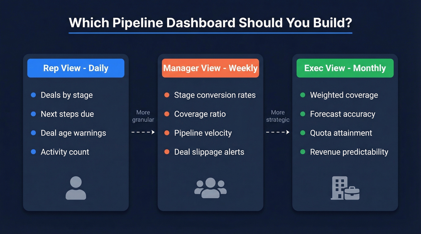
| Dashboard Type | Audience | Cadence | Key KPIs |
|---|---|---|---|
| Activity & Deal View | Reps | Daily | Deals by stage, next steps, deal age, activity count |
| Pipeline Health | Managers | Weekly | Stage conversion, coverage ratio, velocity, slippage |
| Forecast & Revenue | Execs | Monthly/Quarterly | Weighted coverage, forecast accuracy, quota attainment |
Reps care about what to do today - which deals need attention, which are stalling. A sales opportunity view at the rep level should surface deal age, next steps, and sales activities gaps so nothing slips through the cracks. Managers care about whether the team's pipeline is healthy enough to hit target this quarter. Execs care about forecast accuracy and revenue predictability.
If you're running a qualification framework like MEDDPICC or BANT, surface that data in the manager view. A deal sitting in "negotiation" with no champion identified and no decision criteria documented shouldn't be in your weighted pipeline.
The KPIs That Actually Matter
Stage Conversion Rates
This is the most granular metric on your dashboard: what percentage of deals advance from one stage to the next? The formula is (# deals that advanced / # deals in stage) x 100.
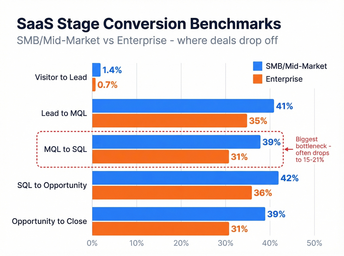
Benchmarks vary dramatically by segment. Here's what current SaaS funnel data shows:
| Stage Transition | SMB/Mid-Market | Enterprise |
|---|---|---|
| Visitor to Lead | 1.4% | 0.7% |
| Lead to MQL | 41% | 35% |
| MQL to SQL | 39% | 31% |
| SQL to Opportunity | 42% | 36% |
| Opportunity to Close | 39% | 31% |
The MQL-to-SQL handoff is consistently the biggest bottleneck, running 15-21% in many orgs. If your dashboard shows a cliff at that transition, you've found the place to fix first.
Pipeline Coverage Ratio
Coverage ratio tells you whether you have enough pipeline to hit your target: Total pipeline value / Sales target = Coverage ratio.
A worked example: $250K in pipeline against a $100K quota gives you 2.5x coverage. Sounds healthy - but it depends on your win rate. If you close 25% of pipeline, you need 4x coverage just to break even.
| Segment | Target Coverage |
|---|---|
| Enterprise | 3-5x |
| Mid-market B2B | 2.5-4x |
| High-velocity SMB | 2-3x |
Most dashboards miss the critical distinction between weighted and unweighted coverage. Unweighted treats every deal as equally likely to close. Weighted multiplies each deal by its stage probability - a $100K deal at 25% probability contributes $25K, not $100K. Unweighted coverage is directional. Weighted coverage is what you should actually forecast from.
Pipeline Velocity
Velocity measures how fast revenue moves through your pipeline: (Number of Opportunities x Average Deal Value x Win Rate) / Sales Cycle Length.
For a hypothetical team with 50 opportunities, a $26,265 average deal size, a 25% win rate, and an 84-day cycle, that's (50 x $26,265 x 0.25) / 84 = $3,906/day. Industry ranges swing from roughly $743/day in marketing and advertising to $2,456/day in real estate and construction. The absolute number matters less than the trend - if velocity is declining quarter over quarter, something's broken and you need to find out where.
Win Rate, Cycle Length, Deal Size
Typical B2B SaaS win rates land between 20-30%. Median sales cycle is 84 days, though the optimal range is 46-75 days. Anything longer usually signals qualification problems or decision-maker access issues. Median deal size for private SaaS sits around $26,265.
The overall lead-to-customer conversion rate? Just 2-5%. That number should humble any team that thinks they can skip pipeline math and just "generate more leads."
Why Your Coverage Ratio Is Lying
Here's the thing: coverage ratio is the most cited pipeline metric and the most frequently misleading one.
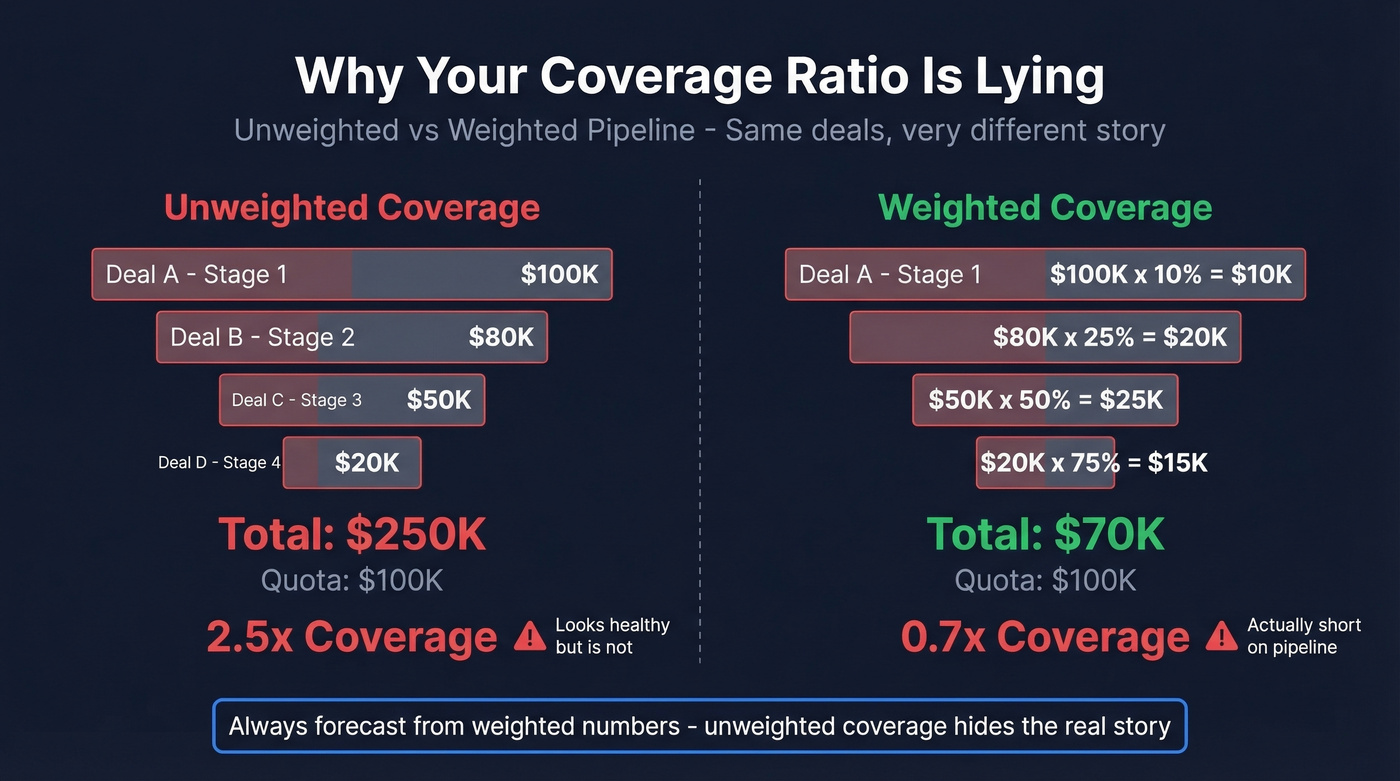
Early-stage inflation. A pipeline stuffed with Stage 1 opportunities looks great on paper. But those deals haven't been qualified, and most won't advance. Your 4x coverage is really 1.5x when you weight by stage probability.
Hope-based stuffing. Reps keep deals alive that should've been closed-lost months ago. Close dates keep sliding right. The pipeline looks full, but it's full of stale opportunities with moving close dates and missing next steps - a problem that shows up constantly in r/sales discussions about CRM hygiene.
Blended deal types. A 3x ratio means something very different for new business versus expansion versus renewal. Blending them into one number hides the real story.
Mid-period irrelevance. Halfway through the quarter, raw coverage against the full-quarter target is misleading. You need to compare remaining quota against advanced-stage pipeline.
The fix is weighted pipeline coverage. Expected revenue = won deals + each open deal x its stage probability. A $50,000 deal at 25% probability contributes $12,500, not $50,000. Build your dashboard around weighted numbers and you'll stop lying to your board.
You just read that bad data is the #1 reason pipeline dashboards get ignored. Prospeo's 5-step verification delivers 98% email accuracy and refreshes every 7 days - not the 6-week industry average. Stop visualizing garbage faster.
Clean data in, accurate pipeline out. It starts at $0.01 per email.
How to Build a Sales Pipeline Dashboard
Before you touch a tool, audit your data. Start with contact data quality. If your email bounce rate is above ~5%, your pipeline is inflated with contacts you can't actually reach. We run lists through Prospeo's verification before they hit the CRM - 98% email accuracy on a 7-day refresh cycle means the data feeding our dashboards is current, not six weeks stale.
Once your data is clean:
- Define your stages. Map your actual sales process to 5-7 discrete stages with clear exit criteria. If reps can't agree on what "qualified" means, your dashboard will be meaningless.
- Select your KPIs. Limit to five metrics per dashboard view.
- Choose your tool. Match the tool to your stack and budget. Don't buy Tableau when Google Sheets will do.
- Connect your data source. Pull directly from your CRM - Salesforce, HubSpot, Pipedrive, whatever you're running. Never manually update a dashboard.
- Build role-specific views. One for reps, one for managers, one for execs. The manager view should function as a sales opportunities dashboard that surfaces deal health, slippage, and stage conversion in a single screen.
- Set a refresh cadence. Daily sync minimum. Weekly is too slow for rep-level views. Make sure dashboards render on mobile and tablet too - field reps won't open a laptop between meetings.
Data Pitfalls Nobody Warns About
These edge cases will break your reporting if you don't handle them upfront.
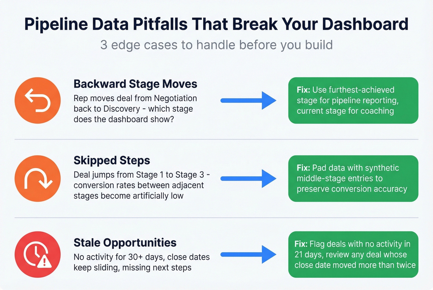
Backward stage moves. A rep moves a deal from "Negotiation" back to "Discovery." Does your dashboard show the deal in Discovery or Negotiation? There's no universal answer, but you need to pick one and document it. A common approach: use furthest-achieved for pipeline reporting and current stage for rep coaching.
Skipped steps. A deal jumps from Stage 1 to Stage 3 - the rep never logged the middle step. If your stage conversion metrics matter (and they should), you'll need to pad the data with a synthetic Stage 2 entry. Otherwise your conversion rates between adjacent stages will be artificially low.
Stale opportunities. Deals with no activity for 30+ days, close dates that keep sliding, missing next steps. Build a hygiene rule: flag any opportunity with no logged activity in 21 days, and review any deal whose close date has moved more than twice. Decide these rules with your sales leaders before you build, not after the dashboard is live and everyone's arguing about what counts.
Why 80% of Dashboards Get Ignored
Remember the VP who abandoned two weeks of dashboard work? Let's break down why that keeps happening.
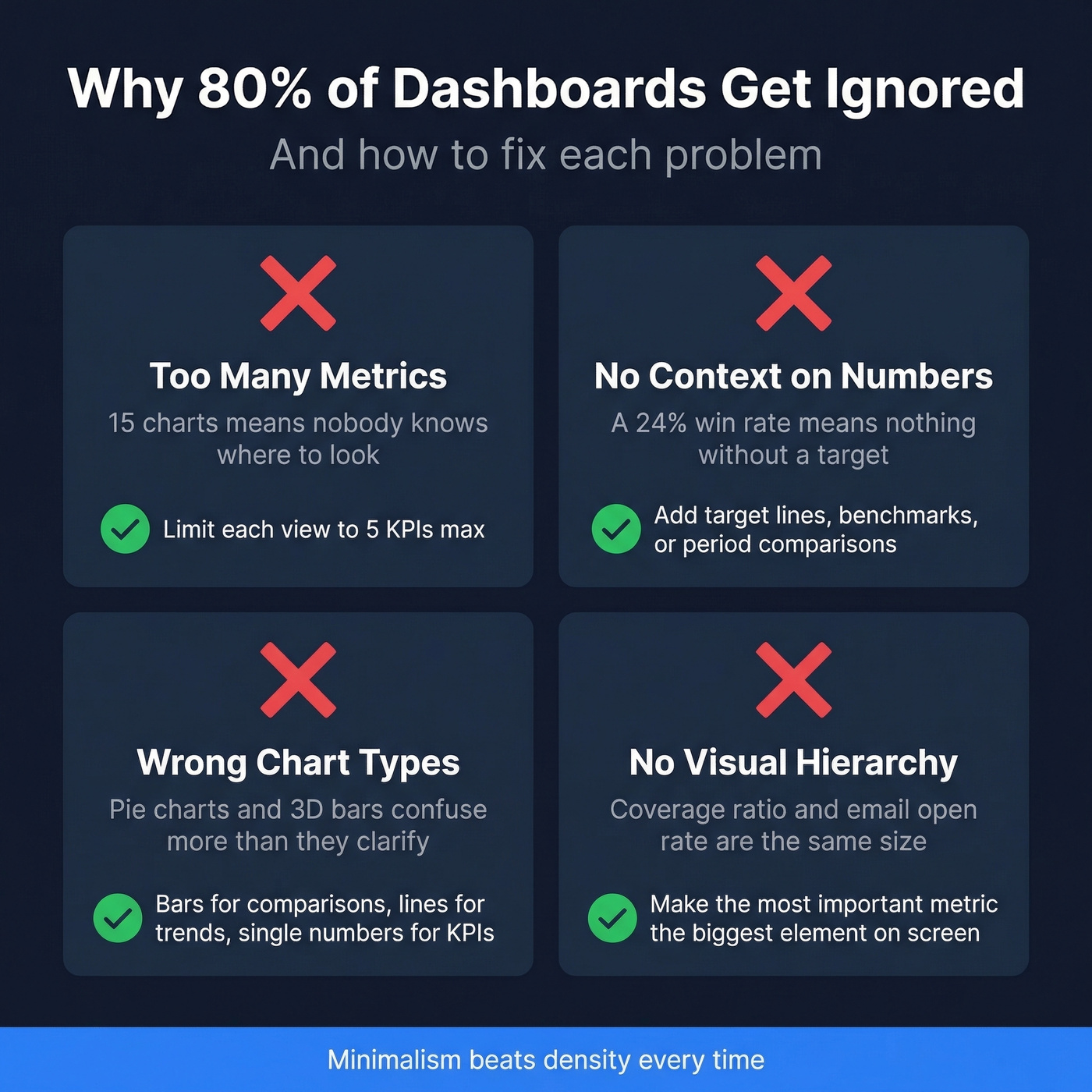
Too many metrics. If your dashboard has 15 charts, nobody knows where to look. Limit each view to five KPIs. If a metric doesn't drive a specific action, cut it.
No context on the numbers. A win rate of 24% means nothing without a target or benchmark next to it. Every metric should have a target line, a benchmark, or a period-over-period comparison. Numbers without context are decoration.
Wrong chart types. Pie charts for stage distribution. 3D bar charts for trends. Dual-axis charts nobody can read. Match the chart to the data: bar charts for comparisons, line charts for trends, single-number cards for KPIs. Keep color palettes to three hues maximum with shade variations for emphasis, and maintain consistent fonts and styles across every view. Minimalism beats density every time.
No visual hierarchy. The most important metric should be the biggest element on the screen. If your coverage ratio and your email open rate are the same size, you've failed at hierarchy. Put forecast-critical numbers in the most prominent position, and push supporting metrics into secondary rows.
Best Pipeline Dashboard Tools in 2026
The tool matters less than the data feeding it. But you still need to pick one.
| Tool | Best For | Starting Price | Key Strength |
|---|---|---|---|
| Salesforce | SF-native teams | $25/user/mo | Deep CRM integration |
| HubSpot | SMBs | $9/seat/mo | Built-in, easy setup |
| Tableau | Custom builds | ~$15/user/mo | Unlimited flexibility |
| Looker Studio | Budget teams | Free | Google ecosystem |
| Power BI | Microsoft shops | ~$10/user/mo | Excel-like familiarity |
| Pipedrive | Small teams | $14/user/mo | Pipeline-first CRM |
| Databox | Template-first | ~$47/mo | Pre-built dashboards |
| Geckoboard | TV dashboards | ~$39/mo | Office display focus |
| Klipfolio | Advanced KPIs | ~$90/mo | Custom metric builder |
| Coupler.io | Sheets users | ~$49/mo | Spreadsheet sync |
Salesforce is the default if you're already on the platform. Native reporting handles 70% of use cases. When it doesn't, graduate to Tableau or Looker Studio - don't fight Salesforce's reporting limitations when purpose-built BI tools exist.
HubSpot is the right call for SMBs. Built-in sales reporting covers most of what small teams need, and you won't need a dedicated analyst to maintain it. Professional tier at $90/user/mo unlocks custom reporting that closes most of the remaining gap.
Need full control over data blending and calculated fields? That's Tableau territory. It's overkill for a 5-person sales team but essential for a 50-person org with multiple pipelines and segments.
Looker Studio is free and surprisingly capable for teams pulling from Google Sheets or BigQuery. Power BI fills the same role for Microsoft-heavy shops. Pipedrive has the cleanest native pipeline view of any CRM - if you're a small team that lives in Pipedrive, don't bother with external BI.
Our hot take: if your deals average under $15K, you almost certainly don't need Tableau or a dedicated BI analyst. HubSpot's built-in reporting or a Looker Studio dashboard connected to your CRM will get you 90% of the way there at a fraction of the cost. Save the BI budget for hiring another rep.
Free Pipeline Dashboard Templates
Not ready for a BI tool? Start with a template.
- Indzara - Excel template with dashboard graphs covering pipeline value, conversion rate, average time to close, and stage loss analysis. No email required.
- Close SalesTable - Google Sheets template with a simple visual dashboard showing open, closed, and won deals plus total value. Email required.
- Smartsheet - Quarterly forecast template with next actions, projected close dates, and pipeline stage tracking.
- Microsoft Office - Multi-sheet Excel template with built-in forecasting calculations and a visual forecast graph.
- Tipsographic - Deals by quarter with customizable win probability, close dates, and rep assignments.
For teams that want to build their own in Google Sheets, here's the fastest path: install a CRM sync add-on like Coefficient, import your Opportunity data with Forecast Category, Amount, and Close Date, pivot by Forecast Category and Close Date grouped by month with Amount summed, then build a combo chart - area for pipeline evolution, line for target. Takes about 30 minutes and stays synced automatically.
Skip templates entirely if you already have more than 20 reps or multiple pipeline types. You'll outgrow them within a quarter and end up rebuilding from scratch.
Data Pipeline Dashboards (For Engineers)
If you searched "pipeline dashboards" for data pipeline monitoring, everything above is about sales pipelines. Here's the engineering version.
Data pipeline dashboards track the health and performance of your ETL/ELT workflows - data flowing from source systems through transformations to destination warehouses. The core metrics are different: throughput (records processed per second), latency (end-to-end processing time), error rate (failed jobs or records), freshness (how current the destination data is), schema validation (detecting drift before it breaks downstream), and cost per pipeline run, which is increasingly important as cloud compute bills balloon.
A common tool stack is Prometheus + Grafana for real-time alerting, paired with Great Expectations or dbt tests for data quality validation. One key distinction: monitoring tracks predefined metrics like whether latency exceeds a threshold, while observability adds logs, metrics, and traces to help you diagnose why something broke. Build for monitoring first, add observability when your pipelines are complex enough to warrant it.
That VP who abandoned the dashboard? The fix wasn't a better tool. It was five metrics, role-specific views, and clean data. Pipeline dashboards work when they're built around those three principles - everything else is optimization.
Stale opportunities and missing contacts tank your coverage ratio. Prospeo enriches your CRM with 50+ data points per contact at a 92% match rate - so every deal in your dashboard has verified emails, direct dials, and real buyer signals behind it.
Enrich your CRM and watch your pipeline dashboard finally tell the truth.
FAQ
What's the most important metric for pipeline dashboards?
Weighted pipeline coverage ratio - it tells you whether you have enough qualified pipeline to hit your number. Multiply each deal by its stage probability instead of counting raw totals. Enterprise teams should target 3-5x weighted coverage, mid-market 2.5-4x, and high-velocity SMB teams 2-3x.
How often should a pipeline dashboard refresh?
Daily minimum for rep-level views, weekly for manager reviews, and monthly or quarterly for executive forecasts. The data source matters more than refresh frequency - if your CRM contacts are outdated and close dates keep slipping, real-time sync just visualizes stale numbers faster.
How do you keep pipeline data clean for accurate reporting?
Enforce CRM hygiene rules: mandatory next steps on every deal, close date validation, and clear stage exit criteria. Verify contact data before it enters the system - tools like Prospeo prevent stale contacts from inflating pipeline numbers by catching bad emails before they hit your CRM. Flag any deal with no activity in 21 days for review.
What free tools work for building a sales pipeline dashboard?
Looker Studio is the strongest free option - it connects directly to Google Sheets or BigQuery and handles most mid-market reporting needs. For simpler setups, Indzara offers a no-signup Excel template with built-in pipeline graphs. Either option gets small teams to 80% of what paid BI tools deliver.