Sales Pipeline Power BI: Build a Dashboard That Actually Works
In 2026, up to 70% of B2B reps are missing quota. Not because they aren't working - because they're making decisions off dashboards that show them fiction. Unweighted pipeline totals, stale deal stages, no historical snapshots. The dashboard says $2M in pipeline. Reality says $600K.
Meanwhile, [65% of B2B sales orgs](https://isbm.org/business-readings/gartner-predicts-65-of-b2b-sales-organizations-will-transition-from-intuition-based-to-data-driven-decision-making-by-2026/) are outpacing competitors with data-driven strategies. The other 35% are still staring at vanity metrics every Monday morning.
Here's our take: most teams don't have a dashboard problem. They have a data-capture problem dressed up in bar charts.
What You Need (Quick Version)
Four things put you ahead of 90% of pipeline dashboards:
- Star-schema data model - dimensions above facts, one-to-many, single-direction relationships
- 7 core metrics - coverage, win rate, velocity, cycle length, stage conversion, deal aging, creation rate
- Snapshot architecture - you can't reconstruct last month's pipeline without it
- One central date table - with IsActual/IsForecast flags, not multiple competing calendars
Sales Pipeline Power BI Data Model
Your dashboard lives or dies in the data model, not the visuals. Use a star schema: dimension tables (Account, Rep, Product, Stage) connect one-to-many to a central Opportunities fact table with single-direction filters. Bidirectional filters create ambiguity and circular behavior - avoid them unless you have a specific, well-documented reason.
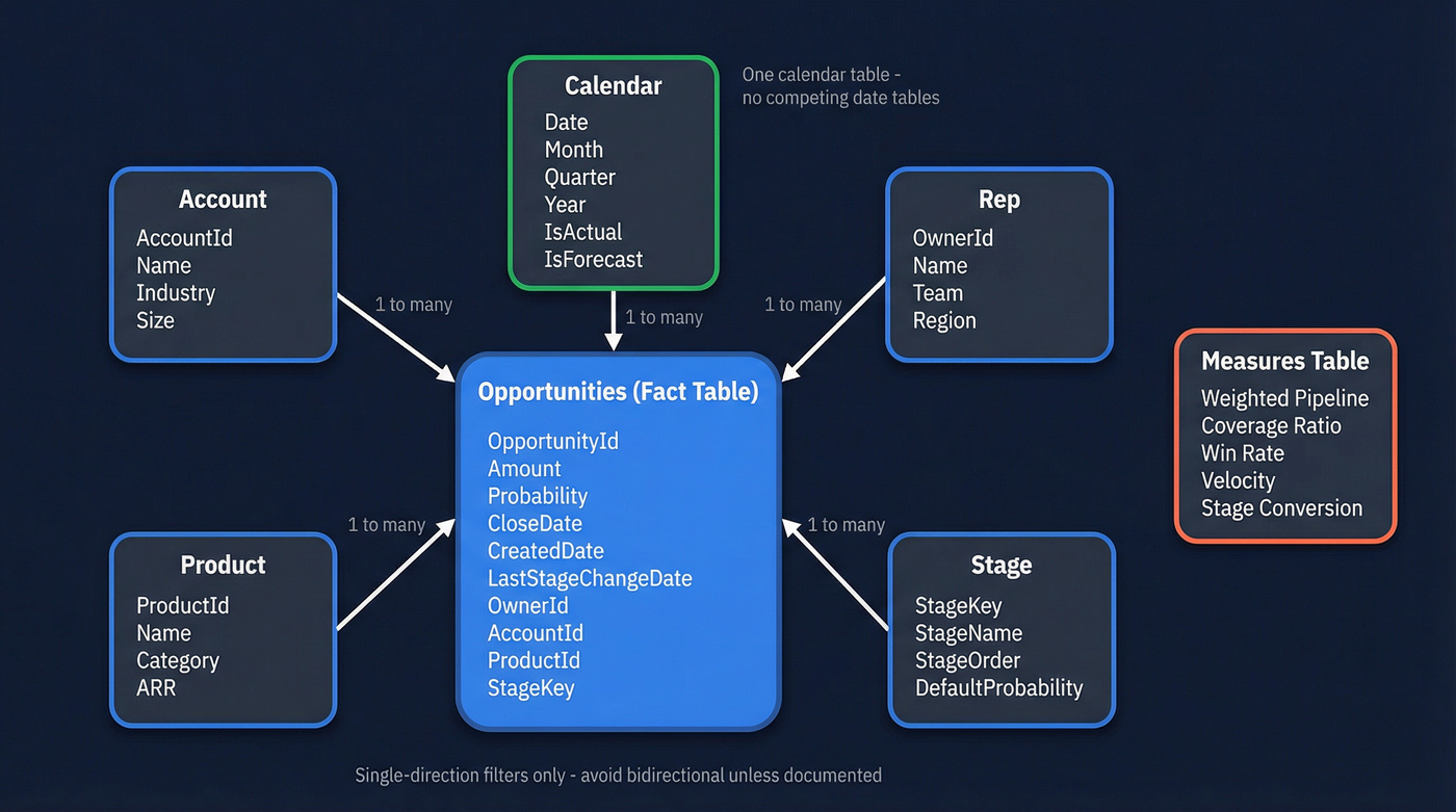
Create a dedicated Measures table to keep DAX organized. Build one Calendar table that derives _MinDate and _MaxActualDate from your fact table, extends five years out, and includes IsActual and IsForecast flags.
Here's the thing most teams miss: if your CRM only gives you the current state of each opportunity, you can't reconstruct what your pipeline looked like last month. You need either weekly snapshots via an OpportunitySnapshot fact table or a stage-change event log. We've watched teams spend months trying to reverse-engineer pipeline history from a single current-state pull. Solve it at the source.
Snapshot Table: The Minimum Viable Design
If you want "pipeline as of date," you need a table that stores:
SnapshotDate(daily or weekly)OpportunityId(stable unique key)Stage,Amount,CloseDate,OwnerIdProbability(or stage probability lookup)- Optional:
ForecastCategory,IsCommitted,IsClosed
Daily snapshots are ideal if your deal volume is manageable. Weekly snapshots are usually enough for most B2B teams and dramatically cheaper to store.
7 Sales Pipeline Metrics for Power BI
Not every metric deserves dashboard real estate. These seven actually predict revenue.
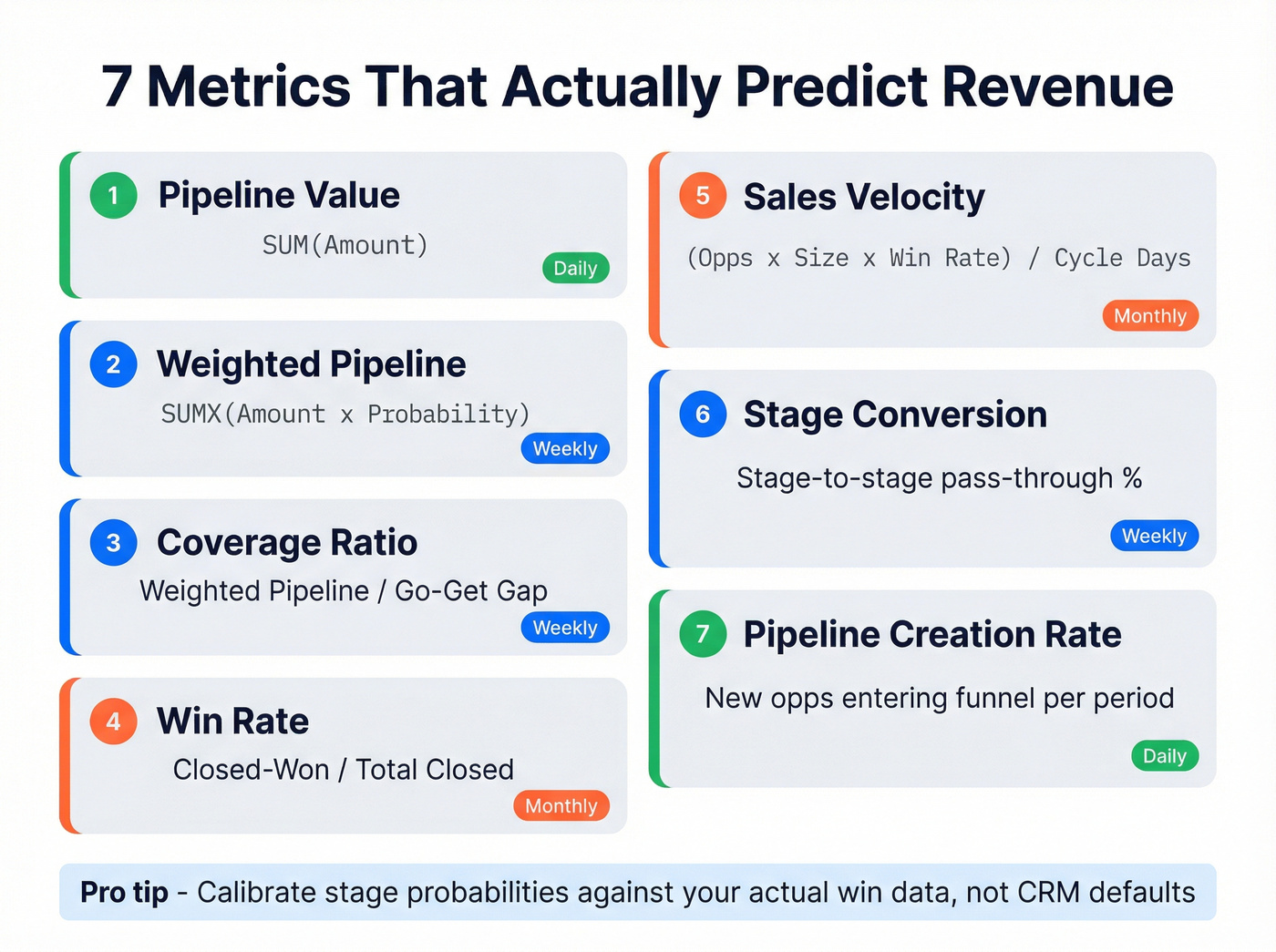
| Metric | Formula / DAX | Cadence |
|---|---|---|
| Pipeline Value | SUM(Opportunities[Amount]) |
Daily |
| Weighted Pipeline | SUMX(Opportunities, [Amount] * [Probability]) |
Weekly |
| Coverage Ratio | Weighted Pipeline / Go-Get gap (quota minus committed deals) | Weekly |
| Win Rate | Closed-Won / Total Closed | Monthly |
| Sales Velocity | (Opps x Deal Size x Win Rate) / Cycle Days | Monthly |
| Stage Conversion | Stage-to-stage pass-through % | Weekly |
| Pipeline Creation Rate | New opps entering funnel per period | Daily |
For deal aging, add a Power Query column: Duration.Days(DateTime.LocalNow() - [LastStageChangeDate]). Any deal sitting beyond 1.5x your average cycle length is a zombie. Kill it or move it.
When building your weighted pipeline measure, calibrate stage probabilities against your actual historical conversions - not the CRM defaults. Typical ranges: Discovery 10-15%, Demo ~30%, Proposal ~50%, Negotiation ~80%, Verbal commit 90-95%. We've seen dashboards where the VP's number was 3x reality because nobody updated these from the out-of-box settings. That's not a rounding error. That's a forecasting disaster.
Stage Slippage: The Long-Tail Metric Worth Adding
If you have snapshots or stage-change events, track slippage rate:
- % of deals that moved backward a stage in the last 14-30 days
- % of deals that pushed Close Date by 30+ days
This is the early-warning system that "pipeline value" alone will never give you.
Weighted pipeline means nothing when 20% of your contacts bounce. Prospeo's 98% email accuracy and 7-day data refresh cycle mean every deal in your Power BI dashboard maps to a real, reachable buyer - not a stale record inflating your coverage ratio.
Stop forecasting on fiction. Start with data that's verified weekly.
Pipeline Benchmarks
Use these as calibration points, not gospel.
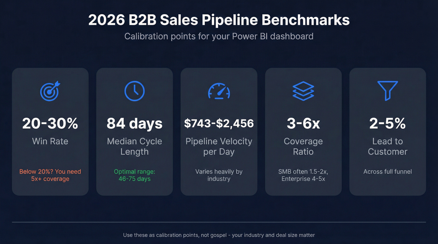
| Metric | Benchmark | Note |
|---|---|---|
| Win Rate | 20-30% | Below 20%? Coverage needs 5x+ |
| Median Cycle | 84 days (optimal 46-75) | Enterprise skews longer |
| Pipeline Velocity | $743-$2,456/day | Industry-dependent |
| Coverage Ratio | 3-6x quota | Smaller deals often run ~1.5-2x, enterprise often ~4-5x |
| Lead to Customer | 2-5% | Across full funnel |
If your win rate is below 20%, your coverage ratio needs to be 5x or higher just to hit target. Most teams don't do this math.
Choosing the Right Visuals
Need to show conversion drop-off between stages? Funnel chart - but only for that. Annotate both absolute counts and stage-to-stage proportions, and keep stage spacing consistent to avoid visual distortion. Don't use it for pipeline stock or forecasting.
Your workhorse is the bar/column chart. Pipeline by stage, by rep, by time period. Hard to misread, easy to filter. We use it for about 80% of every pipeline dashboard we build.
For deal landscape views, scatter/bubble charts encode value as size and segment as color. But native Power BI scatter can't map probability to opacity - the one thing pipeline managers actually want. That's where Deneb (Vega-Lite) comes in, giving you hover highlighting, opacity-by-probability, and Gantt-style aging timelines. The PBI-David/Deneb-Showcase repo has ready-to-adapt specs. On Reddit, Power BI users consistently flag Deneb's learning curve and tenant admin restrictions as real blockers - check your org's custom visual policy before investing time there. For locked-down environments, grab the zero-custom-visuals PBIX template from the Fabric Community.
Apply the 3-30-300 rule: key message in 3 seconds, drivers in 30, drill-down detail in 300.
Visual Layout That Prevents "Monday Chaos"
A clean layout that tends to stop exec drive-bys:
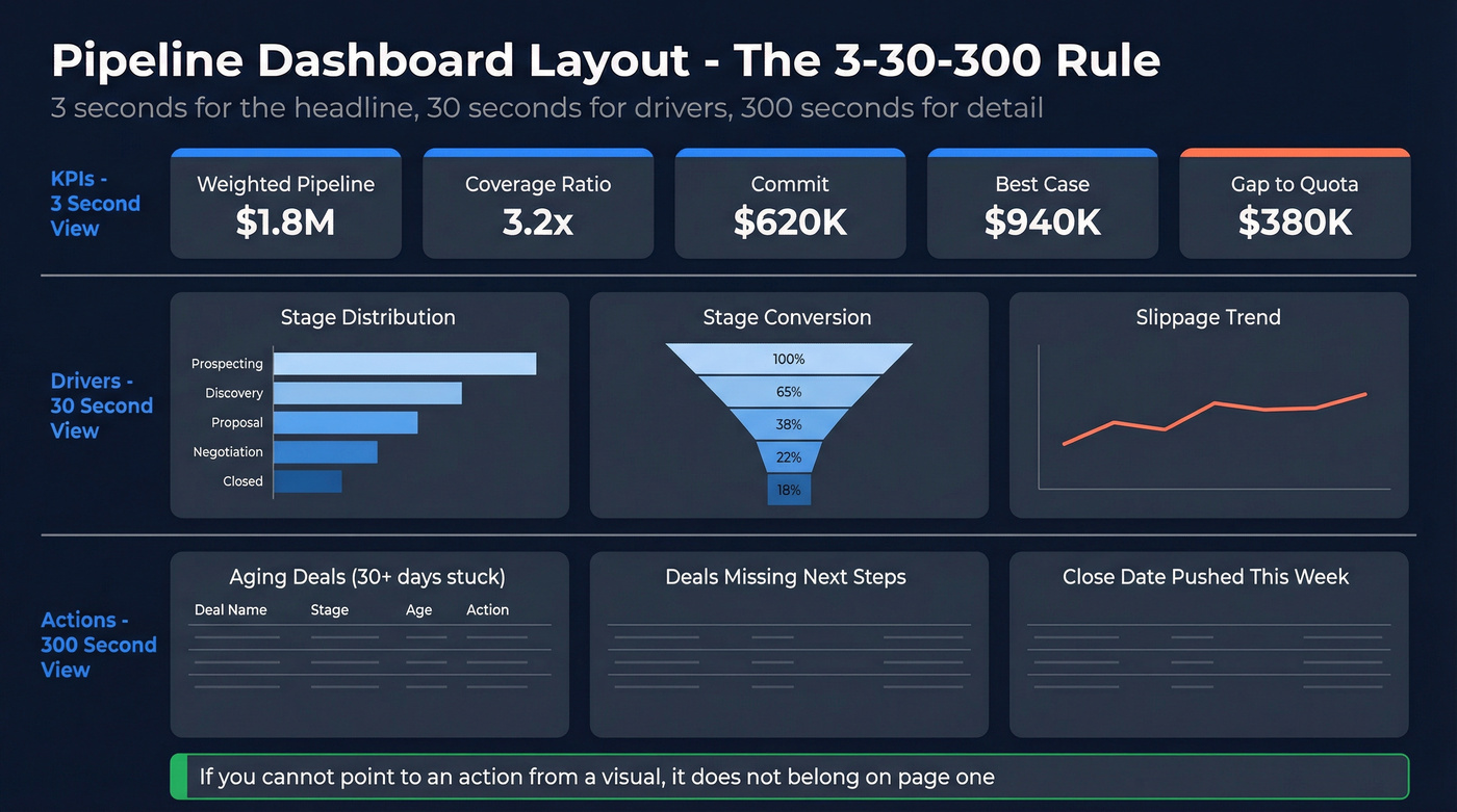
- Top row (KPIs): weighted pipeline, coverage, commit, best-case, gap
- Middle row (drivers): stage distribution + stage conversion + slippage
- Bottom row (actions): aging list, stuck deals, next-step compliance
If you can't point to an action from a visual, it probably doesn't belong on the first page.
5 Mistakes That Break Pipeline Dashboards
Look, your VP asks why the Power BI number doesn't match Salesforce. Check these five things first.
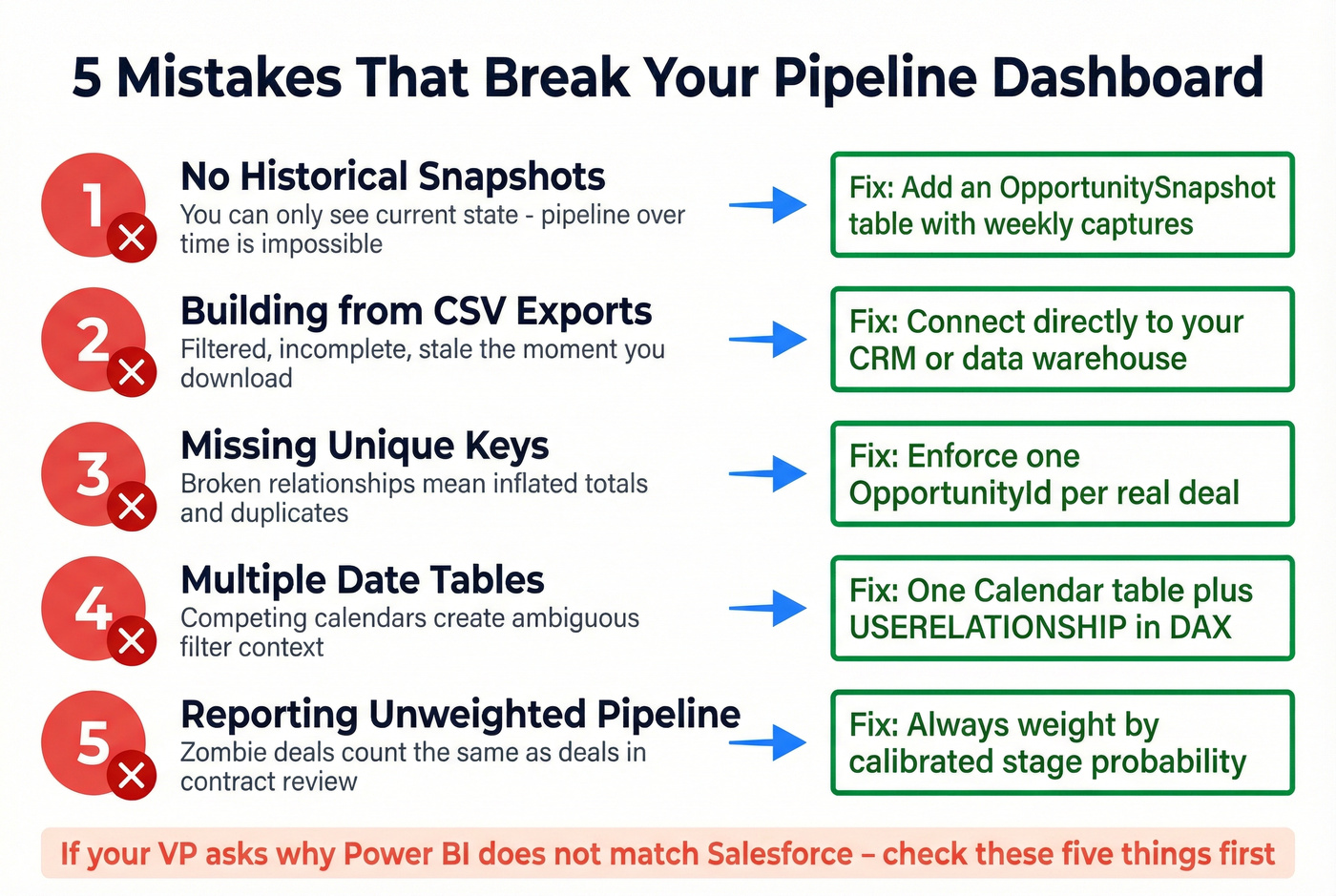
No historical snapshots. Without them, you're reporting current state only - pipeline-over-time views are impossible.
Building from CSV exports. Exports are filtered, incomplete, and stale the moment they're downloaded. Connect directly to your CRM or data warehouse.
Missing unique keys. Broken relationships mean inflated totals and duplicate records. This one's embarrassingly common.
Multiple date tables. Use one Calendar table. For different date fields, use inactive relationships and USERELATIONSHIP in your DAX.
Reporting unweighted pipeline. Total pipeline is a vanity metric. It counts zombie deals the same as deals in contract review.
Fix Your Data Before Your Dashboard
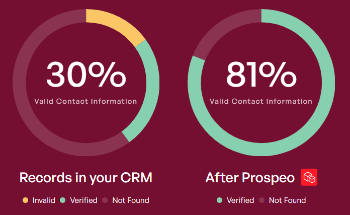
Let's be honest: stop building pipeline dashboards before you fix your pipeline data. If 35% of your emails bounce and contact records haven't been updated in months, every metric on your dashboard is fiction. Win rates are wrong because closed-lost deals have bad contact data. Coverage ratios are inflated because half those "opportunities" are attached to people who left the company six months ago.
This is where data enrichment tools earn their keep. Prospeo's CRM enrichment returns 50+ data points per contact with 98% email accuracy and a 92% API match rate, refreshing every 7 days. Native Salesforce and HubSpot integrations mean clean data flows in automatically. One customer, Meritt, saw their bounce rate drop from 35% to under 4% after switching, and pipeline tripled from $100K to $300K per week. That's not a dashboard improvement - that's a data quality improvement that made the dashboard trustworthy.
Data Hygiene Checklist (Before You Touch DAX)
If you want your Power BI numbers to stop being questioned every Monday, enforce these:
- Required fields: Amount, Close Date, Stage, Next Step, Last Stage Change Date
- Stage definitions: written rules for entry/exit, not vibes
- Duplicate control: one OpportunityId per real deal - no clones per product unless you model it intentionally
- Contact validity: verified email + working mobile for active opps, or you'll misread "no response" as "no intent"
- Refresh discipline: enrichment on a weekly cadence so rep-owned records don't rot
Skip this checklist and you'll spend more time defending your numbers than acting on them.
You just built a pipeline dashboard that tracks velocity, aging, and stage conversion. Now make sure the contacts behind those deals are actually reachable. Prospeo enriches your CRM with 50+ data points per contact at a 92% match rate - so your pipeline reflects reality, not ghost opportunities.
Enrich your CRM before your next Monday pipeline review.
FAQ
Can Power BI connect directly to Salesforce?
Yes. Microsoft offers a Salesforce Analytics template app requiring Power BI Pro or Premium Per User. The Reports API caps at 2,000 rows and five auth tokens per app, so for larger datasets, route through a warehouse or curated tables to avoid refresh failures.
How often should a pipeline dashboard refresh?
Daily at minimum, and 2-8x per day if your team works fast-moving inbound or high-volume outbound. One global company automated Salesforce extraction to refresh 8x per day, cutting manual reporting from six hours to zero. Match refresh cadence to how often stages and close dates actually change.
What's the fastest way to start?
Start with a proven PBIX template, then adapt measures to your stage definitions and probability model - you can usually get there in 2-4 hours. The Fabric Community template is a solid baseline, but you still need snapshots (weekly is fine) and clean opportunity keys. If contact data is stale, fix enrichment first or your "conversion" math will lie to you.
How do I make pipeline history accurate in Power BI?
Use a snapshot fact table captured at least weekly, keyed by OpportunityId + SnapshotDate, so you can calculate "as of" pipeline and stage movement over time. Without snapshots or a stage-change event log, you can't answer basic questions like "what changed since last Friday?" with any credibility.
Summary
A sales pipeline Power BI dashboard only works when the model is solid (star schema + one date table), the metrics are predictive (weighted pipeline, coverage, velocity, conversion, aging), and you can report history through snapshots. Fix the upstream data first - with consistent fields, unique keys, and regular enrichment - and the dashboard finally becomes a decision tool instead of a weekly argument.