How to Write an Email Call to Action That Actually Gets Clicked
You sent a 5,000-person campaign. Open rate looks fine at 38%. Click-through rate: 0.9%. That's not a subject line problem or a deliverability issue - it's a CTA problem.
Most advice on the email call to action boils down to "test button colors." We've spent enough time in cold outreach to know that's barely scratching the surface. This piece gives you 2026 benchmarks from 183,000+ brands, a funnel-stage framework for matching CTAs to buyer intent, and a dedicated section on cold email CTAs - because marketing emails and cold outreach follow completely different rules.
What Is a Call to Action in Email?
A call to action in email is the element that converts a reader into a clicker. It's the single point where passive attention becomes active engagement, and it comes in three forms: buttons (the highest-performing), text hyperlinks, and image-based links.
Every email has one job. The CTA is where that job either succeeds or fails. Subject line, body copy, design - all of it exists to support that one click.
The Three Changes That Matter Most
If your campaign CTR is below 1.69%, your CTA is the first thing to fix. Three changes move the needle more than anything else:
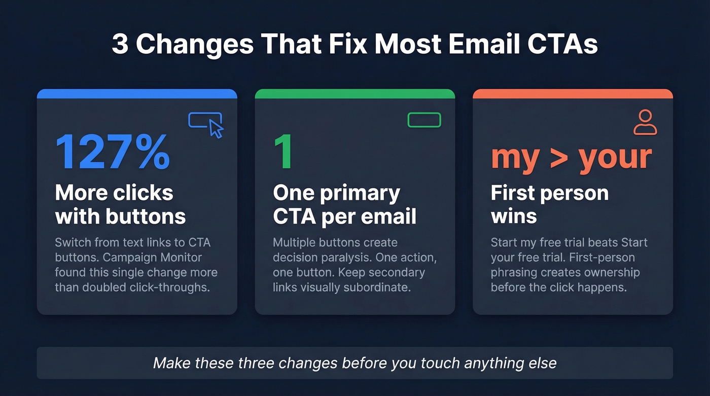
- Switch from text link to a CTA button. Campaign Monitor testing showed a 127% increase in click-throughs when emails swapped text links for clickable buttons.
- Cut to one primary CTA per email. Multiple competing CTAs create decision paralysis and split clicks.
- Rewrite in first-person language. "Start my trial" outperforms "Start your trial" - first-person phrasing consistently wins in CRO tests because it creates a sense of ownership before the click even happens.
Make those three changes before you touch anything else.
2026 Email CTA Benchmarks
Klaviyo analyzed data from 183,000+ brands for their 2026 benchmarks. The campaign vs. automated flow split is striking:
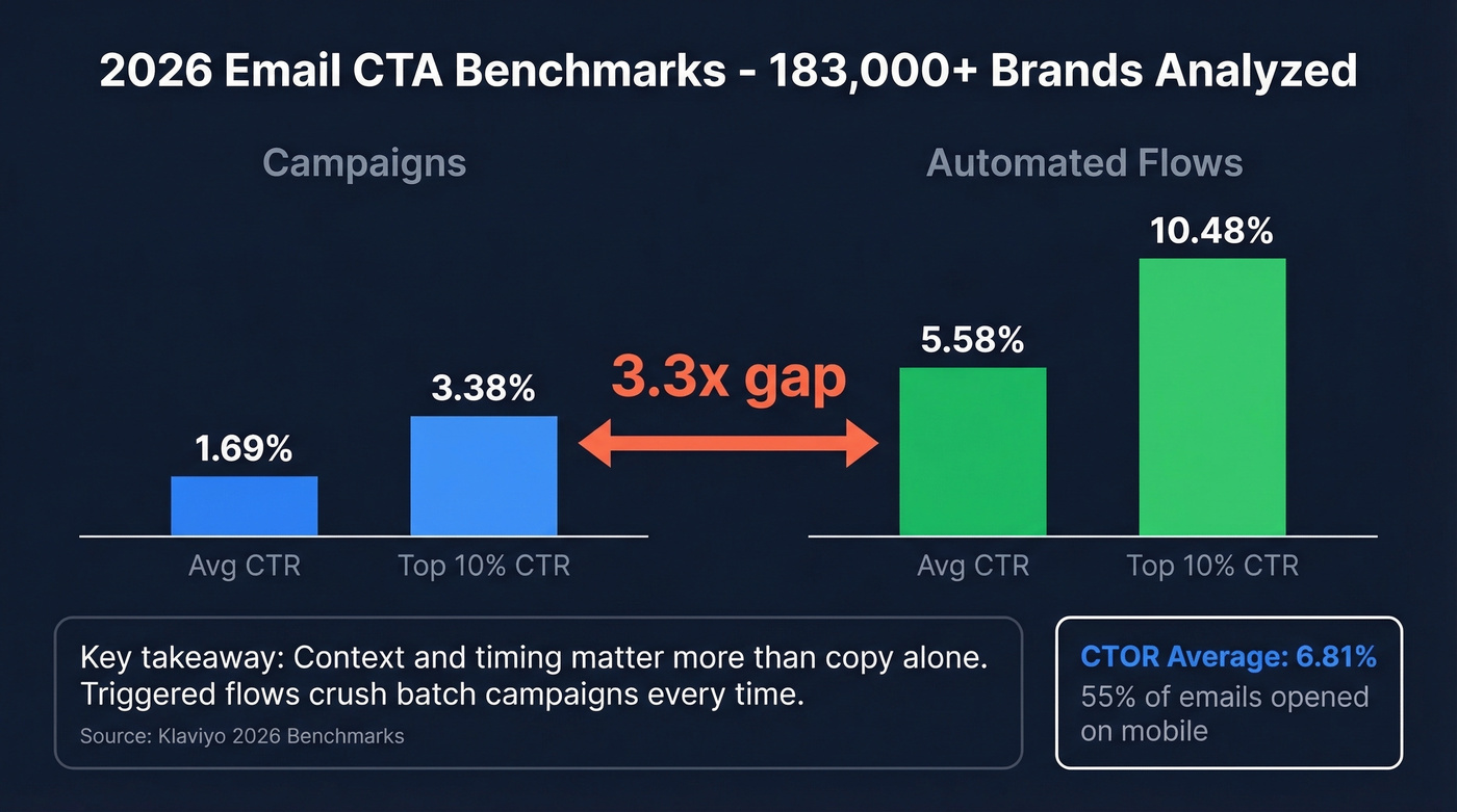
| Metric | Campaigns | Automated Flows |
|---|---|---|
| Avg CTR | 1.69% | 5.58% |
| Top 10% CTR | 3.38% | 10.48% |
That 3.3x gap tells you something important: context and timing matter more than copy alone. A welcome sequence triggered by a signup will always outperform a Tuesday blast, no matter how clever your button text is.
ActiveCampaign's 2026 report shows a 6.21% average click rate, but that blends transactional, marketing, and other campaign types - don't compare it directly to Klaviyo's campaign-only number. Different definitions, different baselines.
For a cleaner single metric, look at click-to-open rate (CTOR). Growth-onomics pegs the 2026 average CTOR at 6.81%, which strips out the noise from Apple Mail Privacy Protection inflating open rates. With 55% of emails now opened on mobile, CTOR is the metric that actually tells you whether your CTA is working once someone reads the email.
Rules for CTAs That Get Clicked
One Primary CTA Per Email
Choice overload kills conversions. When you give someone three buttons - "Read the blog," "Book a demo," "Follow us on Twitter" - they pick none. One action, one button. If you need secondary links like footer navigation or social icons, keep them visually subordinate so the primary CTA is unmistakable.
Use Action Verbs, Not Labels
"Get your report" beats "Submit." "Start building" beats "Continue." The verb does the heavy lifting - it tells the reader exactly what happens next. That 127% button lift from Campaign Monitor evaporates if the button says something generic like "Click here."
Write in First Person
"Start my free trial" outperforms "Start your free trial." The principle holds across modern CRO testing: first-person language creates a sense of ownership before the click. It's a small change that signals "this is already mine."
Keep It to 2-5 Words
Scannable. Decisive. No ambiguity. "Get the playbook" works. "Click here to download our guide to email marketing best practices" doesn't. If your CTA needs a sentence to explain itself, the email body isn't doing its job.
Match CTA to Funnel Stage
Here's the thing - this is where most guides fall short, and it's the single biggest lever most marketers ignore. Your CTA should match where the reader sits in the buying journey:
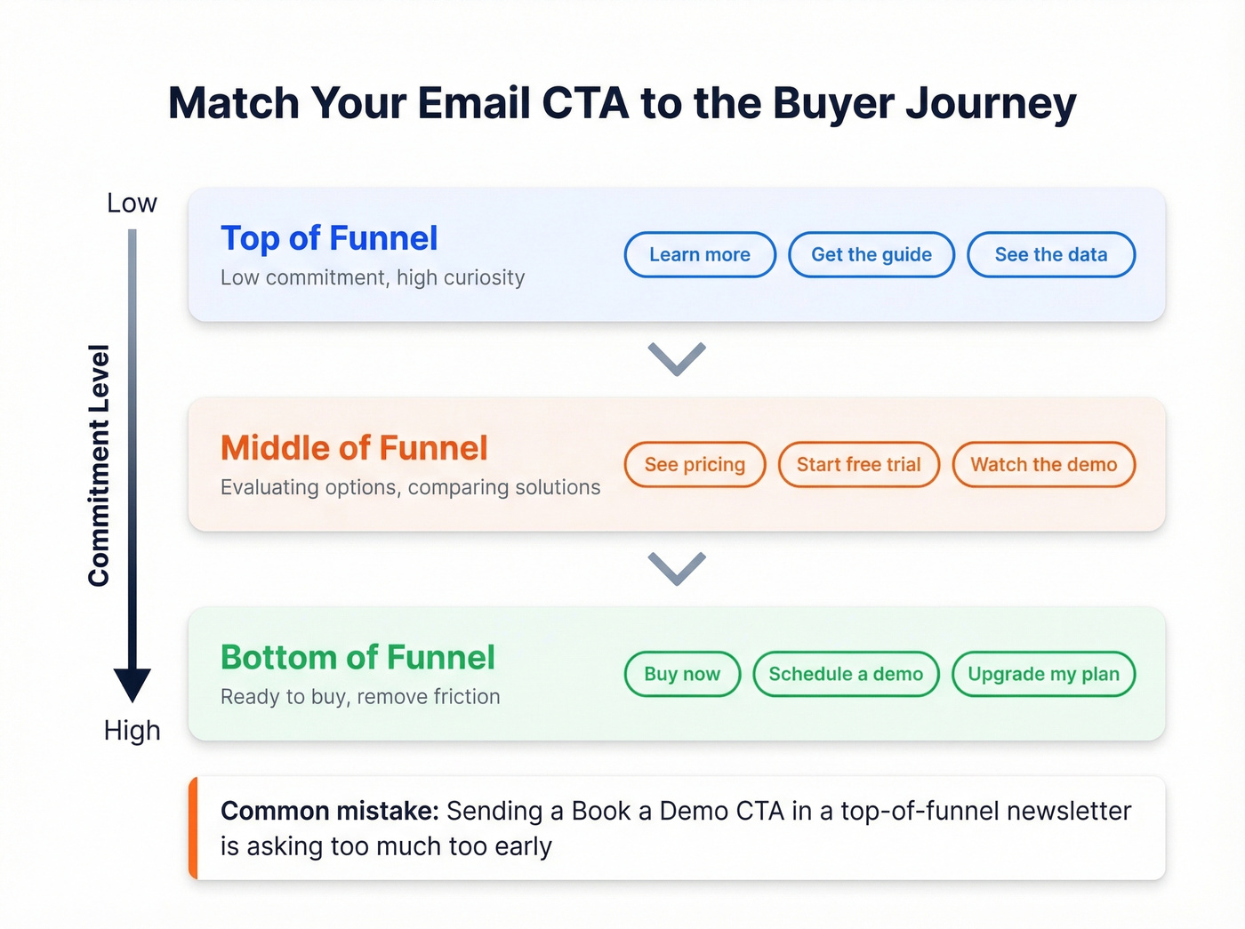
- Top of funnel: "Learn more," "Get the guide," "See the data." Low commitment, high curiosity.
- Middle of funnel: "See pricing," "Start free trial," "Watch the demo." They're evaluating - give them the next logical step.
- Bottom of funnel: "Buy now," "Schedule a demo," "Upgrade my plan." They're ready - don't make them work for it.
A "Book a demo" CTA in a top-of-funnel newsletter is asking for too much too early. Match the ask to the intent, and your click rates will reflect it.
Urgency: Real or Nothing
Manufactured urgency is the fastest way to train your list to ignore you. "Sale ends Friday" works when the sale actually ends Friday. "Only 3 spots left" works when there are actually 3 spots left. Time-bound offers and limited availability are powerful, but only when they're real. Fake scarcity gets one extra click and costs you ten future ones.
CTA Must Match the Landing Page
If the button says "Get my free audit" and the landing page says "Schedule a consultation," you've created a trust gap. That mismatch equals a bounce. Every click is a micro-promise, and the landing page has to deliver on it.
A perfect CTA is worthless if it lands in a bounce folder. Prospeo's 98% email accuracy and 7-day data refresh mean your CTAs reach real inboxes - not dead addresses that tank your domain reputation.
Stop perfecting CTAs for emails that never arrive.
Email CTA Examples by Category
Ecommerce CTAs
Every strong ecommerce CTA assumes the reader already wants the product. You're removing friction, not creating desire.
"Shop the sale," "Claim my 20% off," "Add to bag," "See what's new," "Get it before it's gone," "Complete my order," "Unlock my discount," "Browse the collection," "Grab mine now," "See today's picks"
SaaS and Free Trial CTAs
The best SaaS CTAs reduce perceived risk. Notice how "no card needed" and "free" do the heavy lifting - they answer the objection before it forms.
"Start my free trial," "See it in action," "Try it free for 14 days," "Get started - no card needed," "Build my first workflow," "Explore the platform," "Create my account," "Start building free," "Launch my dashboard," "Test it yourself"
Newsletter and Content CTAs
"Read the full story," "Get the playbook," "See the data," "Watch the breakdown," "Read the research," "Get the template," "Download the report," "See the results"
Event and Webinar CTAs
"Save my seat," "Register now - spots limited," "Join us live," "Add to calendar," "Watch the replay," "Claim my spot," "Reserve my place"
Feedback and Survey CTAs
"Share my opinion," "Take the 2-min survey," "Tell us what you think," "Rate my experience," "Leave a quick review"
Cold Outreach CTAs
Cold email CTAs follow different rules entirely (more below), but these phrases consistently generate replies:
"Worth a quick look?", "Open to exploring this?", "Would this be useful for [company]?", "Happy to share how - interested?", "Does this resonate?", "Worth 15 minutes to discuss?", "Curious if you've seen this approach?", "Is this on your radar for Q3?"
Cold Email CTAs: Different Rules
Everything above applies to marketing emails where someone opted in. Cold email is a different game entirely - you're interrupting a stranger's inbox, and the rules change.
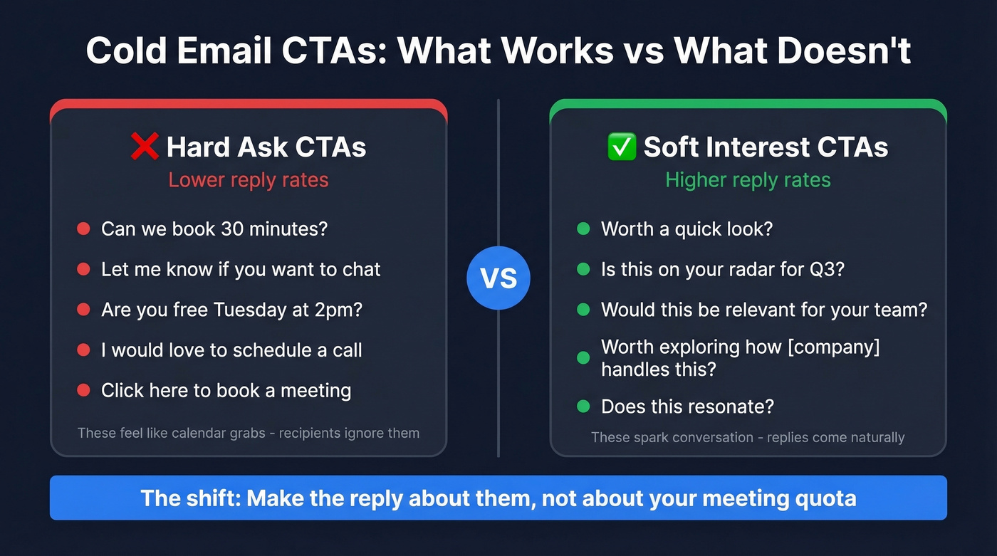
Interest-based CTAs outperform meeting requests. Mixmax (citing Gong research) backs this up: asking "Is this worth exploring?" generates more replies than "Can we book 30 minutes?" The right cold email CTA focuses on starting a conversation, not closing a deal.
Close-ended questions beat open-ended ones because they're easier to answer. "Would this be relevant for your team?" takes two seconds to reply to. "What are your thoughts on improving your outbound process?" feels like homework. Put your calendar link in your signature and keep the body CTA focused on sparking genuine interest.
We've seen SDRs switch from "Let me know if you'd like to chat" to "Worth exploring how [company] handles [specific problem]?" and watch reply rates jump noticeably. The shift is subtle but meaningful - you're making the reply about them, not about your meeting quota. The consensus on r/sales echoes this: soft CTAs that ask a genuine question outperform anything that sounds like a calendar grab.
None of this matters if the email bounces. A 35% bounce rate doesn't just kill CTA performance - it damages your sender reputation, which tanks deliverability for every future email you send. Before you A/B test your cold email CTA, verify your list. Prospeo verifies emails in real time with 98% accuracy on a 7-day refresh cycle, so you're not wasting sends on addresses that went stale months ago.
You just learned how to match CTAs to funnel stage. Now match them to verified buyers. Prospeo's 300M+ profiles with intent data across 15,000 topics let you send the right CTA to the right person at the right time - starting at $0.01 per email.
Pair better CTAs with better data and book 35% more meetings.
CTA Design for Every Device
With 55% of emails opened on mobile, your CTA button needs to be thumb-friendly. The minimum tap target is 44x44 pixels - anything smaller and you're asking people to play a precision game on a 6-inch screen. Leave 20-30px of spacing between clickable elements so taps don't hit the wrong link.
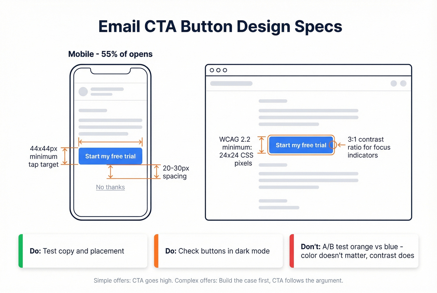
WCAG 2.2 sets the compliance floor at 24x24 CSS pixels (SC 2.5.8) - inline text links are exempt, but buttons should always meet this minimum. SC 2.4.11 requires a 3:1 contrast ratio for focus indicators, which matters for anyone navigating with a keyboard or assistive technology.
Bigger targets closer to the user's thumb get clicked faster. Color contrast matters; specific color doesn't. Stop A/B testing orange vs. blue and start testing copy and placement instead. And check your buttons in dark mode - many email clients invert colors, and a beautiful teal button can turn invisible on a dark background.
One nuance on placement: "above the fold" isn't always best. For a simple offer like a flash sale or free download, put the CTA high. For a complex offer that needs context - enterprise software, high-ticket services - build the case first and let the CTA follow the argument. Premature CTAs on complex offers actually reduce clicks because the reader hasn't been convinced yet.
Common Mistakes That Kill Clicks
Let's be honest: 70% of small business websites have no homepage CTA at all, and business email CTA copy isn't much better. The fastest way to improve is to stop doing what doesn't work.
| Before | After | Why It's Better |
|---|---|---|
| "Submit" | "Get my report" | Value, not obligation |
| "Register" | "Create my free account" | Benefit-first framing |
| "Learn More" | "See the pricing breakdown" | Specific next step |
| Three competing buttons | One primary CTA, secondary links as text | Eliminates decision paralysis |
These "homework CTAs" - Submit, Register, Complete Form - communicate obligation instead of value. They tell the reader what they have to do, not what they'll get. Every CTA rewrite should answer one question: "What's in it for me?"
Other silent killers: low-contrast buttons that blend into the background, tiny text that's unreadable on mobile, and tone mismatches where a playful brand suddenly sounds corporate in the CTA. If your brand voice is casual and your button says "Proceed to checkout," something's off.
How to Measure Your Email CTAs
Three metrics matter, and they answer different questions.
CTR (clicks / delivered) tells you overall email performance. CTOR (clicks / opens) isolates CTA effectiveness from subject line performance. Conversion rate (actions / clicks) tells you whether the landing page delivered on the CTA's promise.
With Apple Mail Privacy Protection making open rates unreliable, CTOR is the better diagnostic metric for CTA performance specifically. If your CTOR is strong but your CTR is weak, the problem is your subject line, not your CTA. That distinction saves you from rewriting the wrong thing.
Use UTM parameters on every CTA link so you can track downstream behavior in GA4. Most ESPs offer click maps - use them, but segment by device. A CTA that performs well on desktop can be buried below the fold on mobile, and email click maps track clicks only, not scroll depth or mouse movement. Rendering differences across clients reduce accuracy further, so always cross-reference with your analytics platform.
When A/B testing, change one variable at a time and aim for 1,000+ views per variation before drawing conclusions. HubSpot's CTA analytics can help you track performance across campaigns if you're in their ecosystem. Iterate based on data, not instinct.
FAQ
How many CTAs should an email have?
One primary CTA. You can include secondary text links like footer navigation or social icons, but the main action should be unmistakable. Multiple competing CTAs create decision paralysis - if you need to drive two different actions, send two different emails.
Does CTA button color matter?
Contrast matters more than any specific color. A high-contrast button that stands out from the email background will outperform any particular hue. Stop A/B testing orange vs. blue - test copy and placement instead. The button just needs to be visually obvious.
What's a good click-through rate for email CTAs in 2026?
For marketing campaigns, the 2026 average is 1.69% across 183,000+ brands. Top performers hit 3.38%. Automated flows average 5.58%, with the top 10% reaching 10.48%. If you're below the campaign average, your CTA is the first thing to optimize.
Should I use the same CTA for cold emails and marketing emails?
No. Marketing emails target opted-in subscribers, so direct CTAs like "Start my free trial" work well. Cold emails interrupt strangers, so interest-based CTAs like "Worth a quick look?" generate far more replies than meeting requests.
How do I improve cold email CTA performance if my bounce rate is high?
Verify your list before sending. A bounce rate above 5% damages sender reputation and tanks deliverability for every future campaign. Prospeo's real-time verification catches stale addresses before they hurt you - the free tier includes 75 verifications per month to test the workflow.