How to Make a Sales Report That Leadership Actually Reads
You spent three hours building a monthly report with 12 charts, conditional formatting, and a pivot table you're genuinely proud of. Leadership spent 45 seconds on it and asked one question: "Are we going to hit the number?"
That's the gap. Most sales reports are built to impress, not to inform. This guide shows you how to make a sales report that answers the only question that matters - in the first paragraph.
What to Include in a Sales Report
Before you touch a spreadsheet, internalize these five rules:
- Pick 5-7 KPIs max. Not 15. Not "everything the CRM tracks." Five to seven metrics that connect to revenue.
- Include benchmarks so your numbers have context. "22% win rate" is hard to interpret in isolation.
- Write the executive summary first, not last. It forces you to know your story before you build the slides.
- Clean your CRM data before pulling a single number. Bad data doesn't become good data because you put it in a chart.
- Same format, same metrics, every single week. Consistency beats comprehensiveness - leadership wants to compare periods, not learn a new layout.
What a Finished Report Looks Like
Most guides tell you what a sales report should include. Here's what one actually looks like - a filled-in pipeline report for a mid-market SaaS team:
| Company | Contact | Stage | Value | Next Action | |
|---|---|---|---|---|---|
| Acme Corp | Sarah Chen | sarah.chen@acme.com | Proposal Sent | $42,000 | Follow up Wed |
| Bolt Logistics | James Park | j.park@boltlog.com | Discovery | $28,000 | Send case study |
| ClearPath HR | Dana Reeves | dreeves@clearpath.io | Negotiation | $67,000 | Legal review Fri |
| Drift Media | Tom Alvarez | tom@driftmedia.co | Qualified | $19,500 | Schedule demo |
| Envoy Health | Lisa Tran | l.tran@envoyhealth.com | Closed-Won | $55,000 | Handoff to CS |
Every column earns its place. "Stage" tells you where deals sit. "Value" tells you what's at stake. "Next Action" tells leadership what's actually happening - not just what happened.
Two formulas you'll use constantly:
[Stage conversion rate](https://docs.oracle.com/en/cloud/saas/analytics/25r4/fawcx/sf - opportunity-stage-progression-metrics.html): (Opportunities moved to next stage / Opportunities in current stage) x 100. If 40 deals entered Discovery and 12 moved to Proposal, that's a 30% conversion rate.
Forecast expected revenue: Probability of closing x Potential revenue. A $67,000 deal at 60% probability contributes $40,200 to your weighted forecast.
How to Create a Sales Report in 7 Steps
1. Define Your Goal and Audience
A report for your VP of Sales looks nothing like a report for your reps. The VP wants revenue vs. target, pipeline coverage, and forecast confidence. A frontline manager wants deal progression and coaching signals. Reps want their own pipeline health and next steps.
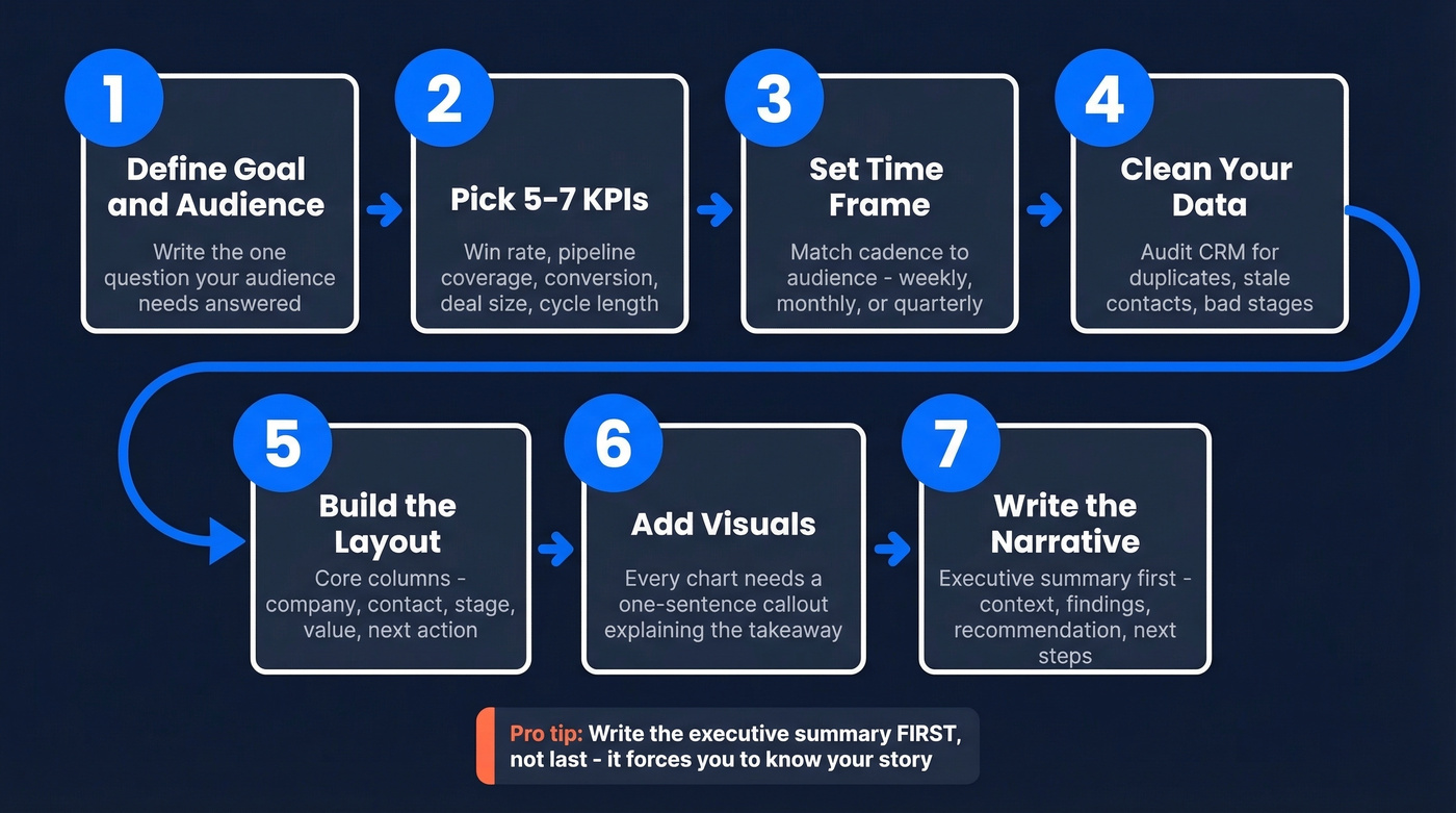
Before you open a single tab, write down the one question your audience needs answered. Everything else is supporting evidence.
2. Pick 5-7 KPIs (No More)
Track these:
- Win rate - the single best health metric for any sales org.
- Pipeline coverage - qualified pipeline divided by quota. Minimum 3x; if your win rate is below 25%, you need 4-5x.
- Stage conversion rate - where deals stall and die.
- Average deal size - the trend matters more than the absolute number.
- Sales cycle length - how long from qualified to closed.
Skip total calls made, emails sent, and messages fired off. A rep who makes 200 calls and books zero meetings isn't productive - they're busy. There's a difference.
3. Set Your Time Frame
Match cadence to audience. Weekly reports track pipeline health. Monthly reports show performance trends and quota attainment. Quarterly reports support strategic review and forecasting.
Every report needs a comparison period. This month vs. last month. This quarter vs. same quarter last year. Numbers without a baseline are just numbers - a benchmark report without comparison data is a spreadsheet, not a story.
4. Gather and Clean Your Data
You've been in this meeting: leadership asks "how's the pipeline?" and three people give three different numbers. That's a data hygiene problem, not a reporting problem.
Before you pull a single metric, audit your CRM for inconsistent stage definitions, duplicate records, and stale contact data. If your bounce rate is above 5%, your conversion metrics are unreliable. Tools like Prospeo verify and refresh contact data on a 7-day cycle with 98% email accuracy, so the metrics feeding your reports stay current rather than reflecting contacts who left the company six months ago.
5. Build the Layout
For teams under 10 reps, Google Sheets works fine. Spreadsheets are underrated - don't let CRM vendors convince you otherwise when you have 3 reps and a pipeline you can count on two hands.
Your pipeline report needs these core columns: Company Name, Contact Name, Contact Email, Stage (use a dropdown for consistency), and Deal Value. Add a "Next Action" column if you want leadership to see momentum, not just snapshots. For forecast reports, add a probability column and calculate expected revenue with a scheduled dashboard export so you're not rebuilding from scratch every Monday.
If your CRM provides AI-generated forecasts or a confidence indicator, include it alongside your manual probability estimates. 89% of revenue orgs use AI in some capacity - your leadership likely expects it.
6. Add Visuals That Clarify
A chart without annotation is decoration, not communication.
Every visual needs a one-sentence callout explaining what the reader should take away. Use line charts for trends over time. Use bar charts for rep-to-rep or period-to-period comparisons. Use pie charts only for composition - and even then, sparingly. If you're reaching for a pie chart, a simple bar chart is almost always clearer.
7. Write the Narrative
Here's the thing: the executive summary is the only part leadership reads. Learning how to write a compelling narrative is arguably more important than choosing the right metrics, because the narrative is what turns data into action.
Write it first, not last - it forces you to know your story before you build the supporting slides. Automated dashboards handle the "what." Your narrative handles the "so what" and "now what," and that's the part no automation replaces.
Keep it to one page, 300-500 words max. Structure it like this:
- Context: Where are we in the quarter? What were the targets?
- Three key findings: Pipeline coverage is at 3.2x (healthy). Win rate dropped 4 points to 21% (flag). Enterprise deals are extending past 90 days (risk).
- Recommendation: What should we do about it?
- Next steps: Specific actions with owners and dates.
Bullets, not paragraphs. Quantified callouts, not vague summaries. Annotate every chart so the reader doesn't have to interpret - tell them what to see.
Step 4 says clean your data before pulling metrics. If your CRM has stale emails and outdated contacts, every conversion rate in your report is a lie. Prospeo enriches your CRM with 50+ data points per contact at a 92% match rate - on a 7-day refresh cycle, not the 6-week industry average.
Fix your data before you build another report.
That pipeline table in your report needs accurate contacts to mean anything. When Sarah Chen left Acme Corp three months ago and your CRM still shows her, your forecast is fiction. Prospeo verifies 143M+ emails at 98% accuracy so the names in your report map to real, reachable buyers.
Start with 75 free verified emails and see how much of your pipeline is real.
Benchmark Cheat Sheet
A 22% win rate is hard to interpret until you know the average is 20-30%. In our experience, the teams that report on 5 metrics consistently outperform the ones tracking 15 metrics inconsistently. These benchmarks give your report the context it needs.
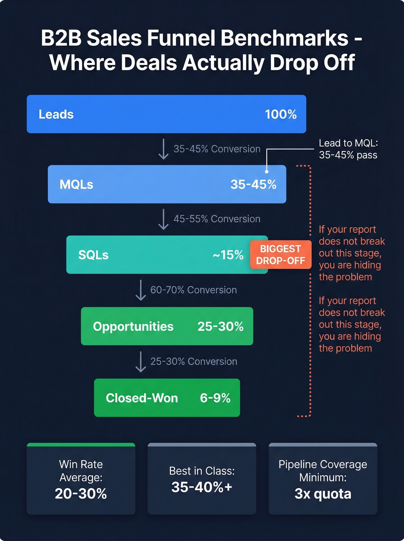
| Metric | Benchmark | Range |
|---|---|---|
| B2B conversion rate | 2.9% median | 2.0-5.0% |
| Lead to MQL | 35-45% | Varies by industry |
| MQL to SQL | ~15% | Largest drop-off |
| SQL to Opportunity | 25-30% | - |
| Opp to Closed-Won | 6-9% | - |
| Pipeline coverage | 3x minimum | 4-5x if win rate <25% |
| Win rate | 20-30% average | 35-40%+ best-in-class |
| Sales cycle (SMB) | ~30 days | - |
| Sales cycle (Enterprise) | ~90 days | - |
That MQL-to-SQL drop-off at ~15% is often the biggest leak in the funnel. If your report doesn't break out funnel stages, you're hiding the problem.
Pipeline velocity is the metric most teams skip and shouldn't. The formula: (Qualified opportunities x Average deal size x Win rate) / Sales cycle length in days.
Worked example: (200 qualified opps x $15,000 avg deal x 25% win rate) / 45-day cycle = $16,667/day in pipeline velocity. Include this in your quarterly report and you'll immediately stand out from every other team that just shows a pipeline bar chart.
The average B2B purchase involves about 8-13 stakeholders. If your forecast report tracks single-contact pipeline instead of multi-threaded engagement, your weighted revenue numbers are optimistic at best and fiction at worst. We've seen teams overestimate forecast accuracy by 30-40% because they're tracking one champion per deal instead of the full buying committee. Most teams haven't caught up to this reality yet.
Sales Report Types
Not every report serves the same purpose. Knowing which type to build saves you from creating one bloated document that tries to do everything.
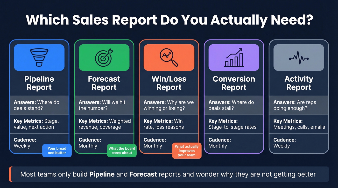
| Type | What It Answers | Key Metrics | Cadence |
|---|---|---|---|
| Pipeline | Where do deals stand? | Stage, value, next action | Weekly |
| Forecast | Will we hit the number? | Weighted revenue, coverage | Monthly |
| Win/Loss | Why are we winning or losing? | Win rate, loss reasons | Monthly |
| Conversion | Where do deals stall? | Stage-to-stage rates | Monthly |
| Activity | Are reps doing enough? | Meetings, calls, emails | Weekly |
The pipeline report is your bread and butter. The forecast report is what the board cares about. The win/loss analysis is what actually improves your team.
Most teams only build the first two and wonder why they're not getting better.
Mistakes That Get Your Report Ignored
1. Leading with vanity metrics. Total calls made and emails sent don't tell leadership anything about revenue. Replace them with pipeline influence, win rate, and stage conversion. If a metric doesn't connect to money, cut it.
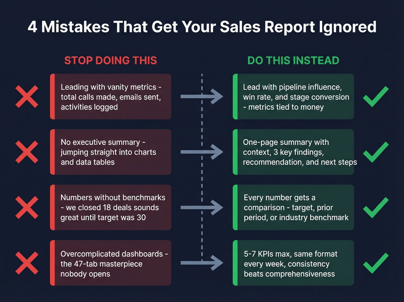
2. No executive summary. If yours doesn't have a one-page summary with the three things that matter, it gets skimmed and forgotten. The summary is the report. Everything else is the appendix.
3. Numbers without benchmarks. "We closed 18 deals this month" sounds great until you realize your target was 30. Every number needs a comparison: target, prior period, or industry benchmark.
4. Overcomplicated dashboards. Look, we've all built the 47-tab dashboard. It felt productive. Nobody used it. Put 3-5 KPIs on page one. Drill-down layers go behind. If leadership has to click more than once to find the answer, you've already lost them.
5. Dirty data and inconsistent definitions. The most common complaint from sales leaders isn't missing data - it's inconsistent data across reps. If "Qualified" means one thing to your SDR team and another to your AEs, your conversion rates are meaningless. Standardize stage definitions. Audit CRM hygiene quarterly at minimum.
Reporting Tools and What They Cost
| Tool | Starting Price | Best For |
|---|---|---|
| Google Sheets | Free | Teams under 10 reps |
| Looker Studio | Free | Dashboards, visualization |
| Bigin by Zoho CRM | $7/user/mo | Small teams, light CRM |
| Pipedrive | $14/user/mo | Mid-size, clean reporting |
| Tableau | $15/user/mo | Advanced BI |
| Zendesk Sell | $19/agent/mo | Support-heavy sales |
| Zoho Analytics | $24/mo | Standalone analytics |
| Salesforce | From $25/user/mo | Enterprise, deep custom |
| HubSpot CRM | Free; paid from ~$20-50/user/mo | All-in-one marketing + sales |
By team size: Under 10 reps - Google Sheets with a consistent template, total cost $0. For 10-50 reps, Pipedrive or HubSpot for CRM reporting plus Looker Studio for dashboards runs about $15-25/user/month. At 50+ reps, you're looking at Salesforce or HubSpot Enterprise plus Tableau or Power BI, which lands in the $50-100+/user/month range. Dynamics 365 also handles complex org structures well if you're already in the Microsoft ecosystem.
Skip the activity report if your team is under 5 reps - you can see what they're doing by walking over and asking.
FAQ
How often should I send a sales report?
Weekly for pipeline health and rep activity, monthly for quota tracking and win/loss analysis, quarterly for board-level forecasting. Match cadence to audience - reps need weekly visibility, VPs need monthly summaries, and the board needs quarterly narratives with benchmarks and trend comparisons.
What's the difference between a sales report and a dashboard?
A dashboard is a live, always-on view of current metrics showing what's happening right now. A report is a point-in-time document with interpretation, benchmarks, and recommendations. Dashboards answer "what." Reports answer "why it matters and what to do next." You need both, but the report drives decisions.
How do I keep CRM data accurate before reporting?
Audit quarterly for duplicates, stale contacts, inconsistent stage definitions, and bounced emails. If your bounce rate exceeds 5%, conversion metrics become unreliable. Enrichment tools that refresh contact records on a weekly cycle - rather than the typical 4-6 week lag - keep your pipeline numbers reflecting reality instead of history.
What belongs in a board-level sales report?
Three things: a one-page executive summary with revenue vs. target, a weighted forecast showing pipeline coverage ratio (minimum 3x), and a brief narrative explaining the biggest risk plus the mitigation plan. Skip rep-level activity metrics entirely - the board cares about trajectory and forecast confidence, not daily dial counts.