How to Build a Quarterly Sales Report That Actually Gets Read
Every quarter, the same thing happens. Someone exports the CRM numbers, finance says they don't match, and what should be a 30-minute review turns into weeks of finger-pointing because the data is off. Meanwhile, 69% of B2B reps missed quota in recent years - so the pressure on your quarterly sales report to explain what happened and drive what happens next has never been higher.
The problem isn't the data. It's that most reports are 30 slides of what happened with zero recommendations for what to do next.
What You Need (Quick Version)
A quarterly report that leadership actually reads needs five things:
- A clear structure - exec summary, metrics, pipeline, outlook. Nobody reads a 30-page data dump.
- Five core KPIs with formulas - revenue vs. target, win rate, pipeline coverage, sales velocity, and churn.
- Period-over-period context - QoQ and YoY comparisons, because you should never judge a quarter in isolation.
- One cumulative chart - actual revenue vs. target, plotted daily through the quarter, which answers the CEO's first question before they ask it.
- Three recommendations - not observations, not "areas to watch," but actual decisions for leadership to make.
If your report takes more than 90 minutes to refresh each quarter, your process is broken. Fix the plumbing before you polish the slides.
What Is a Quarterly Sales Report?
A quarterly sales report is a document - not a meeting. It summarizes three months of sales performance, pipeline health, and revenue trajectory against targets. These reports sit between monthly tactical reports and annual strategic reviews, which makes them the sweet spot for identifying trends without drowning in daily noise.
Don't confuse it with a QBR. An internal QBR is a cross-functional meeting where sales, CS, marketing, and leadership diagnose what happened and align on priorities. A customer QBR is an entirely different format - outward-facing, focused on value delivered and renewal. Your quarterly report is the analytical backbone that makes all those meetings productive.
What to Include
Your VP asks for the quarterly deck by Monday. Here's what goes in it, in order:
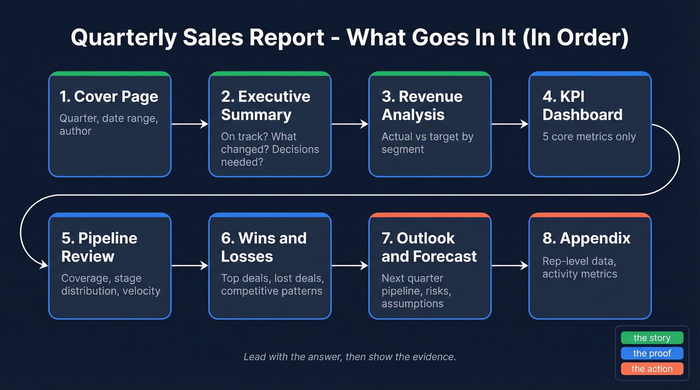
- Cover page - quarter, date range, who prepared it.
- Executive summary - one page. Are we on track? What changed? What needs a decision?
- Revenue analysis - actual vs. target, broken down by segment, product line, or region.
- KPI dashboard - the five metrics that matter (next section covers these).
- Pipeline review - coverage ratio, stage distribution, velocity trends.
- Wins and losses - top deals closed, deals lost and why, competitive patterns.
- Outlook and forecast - next quarter's pipeline, risks, and assumptions.
- Appendix - rep-level data, activity metrics, anything that supports the story but doesn't belong up front.
Lead with the answer, then show the evidence.
Tailor the depth to your audience:
| Stakeholder | Cares About | Detail Level |
|---|---|---|
| CEO / Board | Revenue growth, forecast | High-level, trends |
| Sales Director | Quota attainment, rep data | Granular, actionable |
| Marketing | Campaign-sourced pipeline | Attribution, ROI |
Five Metrics Every Report Needs
Five KPIs are enough. Ten is too many. Twenty means nobody reads your report.
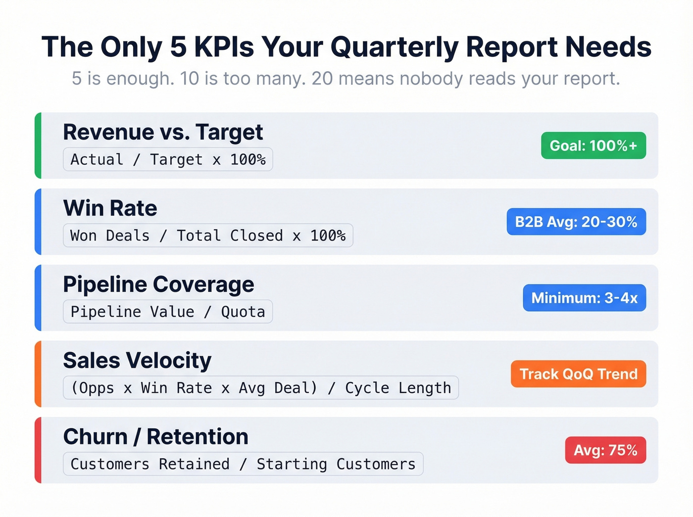
| Metric | Formula | Benchmark |
|---|---|---|
| Revenue vs. Target | Actual / Target x 100% | 100%+ |
| Win Rate | Won Deals / Total Closed x 100% | 20-30% B2B avg; best-in-class 35-40%+ |
| Pipeline Coverage | Pipeline Value / Quota | 3-4x minimum |
| Sales Velocity | (Opps x Win Rate x Avg Deal) / Cycle Length | Track QoQ trend |
| Churn / Retention | Customers retained / Starting customers | 55-84% depending on industry, 75% avg |
Sales velocity deserves a worked example because it's the metric most teams skip - and the one that catches problems earliest. Say you've got 80 opportunities, a 25% win rate, a $30,000 average deal size, and a 90-day sales cycle. That's (80 x 0.25 x $30,000) / 90 = $6,667 per day in pipeline velocity. If that number drops QoQ, you've got a problem even if revenue looks fine on the surface, because it means your future quarters are decelerating while your current quarter masks the slowdown.
The goal isn't to hit generic benchmarks. It's to establish your own baseline and improve it 10-20% per quarter. External benchmarks give you a sanity check; internal trends tell you whether you're actually getting better. And here's a stat worth pinning: 65% of companies using mobile CRM hit their sales quotas vs. 22% without it. The tool matters less than whether your team actually uses it and whether the data inside it is clean.
Your win rate and pipeline coverage numbers only mean something if the contacts in your CRM are real. Prospeo's 98% email accuracy and 7-day data refresh keep your pipeline clean - so your quarterly report reflects reality, not stale records.
Stop reporting on ghost pipeline. Start with verified data.
How to Build It in Excel
Let's be honest - a blank Google Sheet with five formulas and one chart beats a beautiful 20-page Canva template that nobody updates after Q1. A good quarterly sales report template is less about aesthetics and more about structure that survives repeated use.
Step 1: Set up tidy data. Each row is one opportunity. Columns: Date, Sales Rep, Account, Deal Size, Stage, Status (Won/Lost/Open), Close Date. No merged cells. No blank rows. This is non-negotiable.
Step 2: Convert to a table. Select your data and hit Ctrl+T. This gives you structured references that auto-expand as you add rows - no more broken formulas in Q3.
Step 3: Build your KPIs. Here are the formulas you need:
Total Revenue:        =SUM(Table1[Revenue])

Revenue per Rep:      =SUMIFS(Table1[Revenue], Table1[Sales Rep], A2)

Win Count:            =COUNTIF(Table1[Status], "Won")

Total Opportunities:  =COUNTA(Table1[Status])

Win Rate:             =COUNTIF(Table1[Status],"Won") / COUNTA(Table1[Status])

Avg Won Deal Size:    =AVERAGEIF(Table1[Status], "Won", Table1[Revenue])
Step 4: Build two charts. A bar chart comparing revenue by rep - who's carrying the team? - and a cumulative line chart showing actual revenue vs. target through the quarter. In our experience, the line chart is what execs look at first and the bar chart is what reps argue about. For anything more complex, pivot tables handle the slicing so you don't need nested SUMIFS for every view.
How to Present to Leadership
The CFO asks about Q3 pipeline coverage and you have no answer. That's the nightmare scenario.
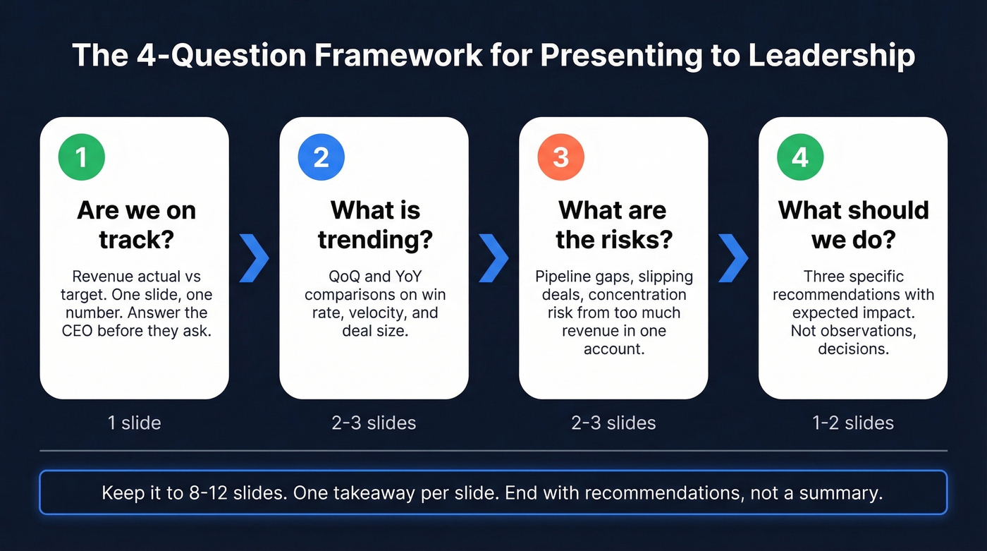
Structure your deck around four questions, in this order. Start with "Are we on track?" - revenue actual vs. target, one slide, one number. Then move to "What's trending?" with QoQ and YoY comparisons on win rate, velocity, and deal size. Third, address "What are the risks?" - pipeline gaps, slipping deals, concentration risk from too much revenue sitting in one account. Close with "What should we do?" - three specific recommendations with expected impact.
Keep it to 8-12 slides, one takeaway per slide. The cumulative daily sales chart - actual line vs. target line, with prior quarter and prior year as faded reference lines - is the single most useful visual you can show an executive. It communicates pace, trajectory, and gap in one image.
End with recommendations, not a summary. "We recommend increasing SDR headcount by two to close the Q3 pipeline gap" is infinitely more useful than "Q2 pipeline was below target." And why do teams still export CRM data to Sheets for the final deck instead of using Salesforce's built-in reports? Customization, cross-source data, and the reality that every CEO asks for something slightly different than what any dashboard provides out of the box.
Mistakes That Kill Your Report
We've seen the same patterns wreck quarterly reports across dozens of teams.
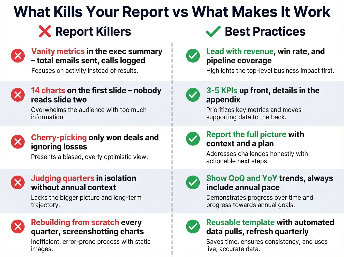
Vanity metrics in the exec summary. Total emails sent and calls logged aren't business KPIs. Lead with revenue, win rate, and pipeline coverage. Activity metrics go in the appendix.
Overcomplicated dashboards. If your first slide has 14 charts, nobody's reading slide two. Three to five KPIs up front, everything else is detail.
Cherry-picking good data. Showing only won deals and ignoring losses destroys trust fast. Report the full picture with context and a plan.
Judging quarters in isolation. A rep who closed $350K in Q1 and $150K in Q2 is still on pace for a $1M annual target. Quarterly numbers need annual context - this is a common debate on r/sales and the nuance matters more than most leaders realize.
No template and no automation. Rebuilding from scratch every quarter is a time sink that Reddit threads consistently flag. Build a reusable template once, automate the data pull, refresh quarterly. If you're screenshotting charts and pasting them into slides, you're spending Friday afternoons on formatting instead of analysis.
Dirty CRM data inflating your numbers. Here's the thing - your quarterly report is only as accurate as what's in your CRM. If a meaningful chunk of your contact emails bounce, your pipeline and outreach metrics are inflated and you're reporting on phantom opportunities. Prospeo verifies emails at 98% accuracy and refreshes records every 7 days, so the data feeding your report reflects reality rather than stale records from six months ago.
Tools for Quarterly Reporting
Google Sheets is fine. Stop overthinking the tool.
- Google Sheets - Free. Good enough for 90% of teams.
- Excel (Microsoft 365) - $6-22/user/mo. Better for complex formulas and large datasets.
- HubSpot - Free CRM tier; Sales Hub starts around $20/user/mo.
- Salesforce - Starts around $25/user/mo, though many teams land in the $75-150/user/mo range once you add editions and seats. (If you're comparing options, see examples of a CRM and Salesforce pricing.)
- Databox - Free tier; paid starts around $47/mo. Skip it unless you're pulling from 5+ data sources - for most teams, a single CRM export into Sheets is faster.
- Looker Studio - Free. Solid if your data lives in Google's ecosystem.
- Prospeo - From ~$0.01/email, free tier available. The upstream data quality fix: enriches CRM records with 50+ data points and flags outdated contacts so your pipeline numbers reflect reality.
For teams running deals under $10K average, you don't need Salesforce-level reporting infrastructure. A clean spreadsheet with five formulas and accurate CRM data will outperform a $150/user/mo platform filled with stale records every single time.
Pipeline coverage dropping quarter over quarter? The fix isn't better slides - it's better data. Prospeo gives your reps 300M+ verified profiles with 30+ filters so they build real pipeline, not inflated forecasts that collapse at QBR time.
Build pipeline coverage your CFO can actually trust.
FAQ
How long should a quarterly sales report be?
Eight to twelve slides for the executive deck, plus an appendix for detailed breakdowns. The exec summary should fit on one page. If your QBR presentation runs longer than 20 minutes, move the extras to an appendix that stakeholders can review async.
How often should I refresh the data?
Build the report structure once and refresh it quarterly. Automate the data pull from your CRM - most teams spend 30-90 minutes per refresh once the template and connections are in place. Between quarters, keep your CRM clean so the quarterly pull is painless rather than a scramble.
What's the difference between quarterly and monthly reports?
Monthly reports track tactical execution - activity volume, pipeline movement, deal progression. Quarterly reports zoom out to strategic patterns: win rate trends, pipeline coverage health, and revenue trajectory against annual targets. Monthly feeds quarterly; quarterly feeds annual planning.
Do I need a dedicated template?
You don't need a fancy one, but you need a reusable structure. The best template is a clean spreadsheet with five core KPIs, two charts, and a consistent slide layout you refresh each quarter rather than rebuild. Invest the time upfront so every future quarter is a 90-minute data refresh, not a multi-day project.