Sales Analysis Reports: A Practitioner's Guide to Reports That Actually Get Read
A RevOps lead we know rebuilt her entire reporting stack last quarter. She cut 14 dashboards down to 3. Pipeline coverage went from a mystery to a weekly conversation, and her VP finally stopped asking "but what does this mean?" during QBRs. The difference wasn't better tools - it was better thinking about what sales analysis reports should contain and why.
70% of B2B executives say the reports they receive don't match their strategic needs. Meanwhile, 93% of sales teams have access to basic CRM dashboards, but only 21% focus on the right activities. That gap between data availability and data usefulness is where most reporting efforts quietly die.
Here's the short version:
- Pick 3 reports that match your 3 biggest questions - not 10 reports nobody reads. If you can't name the decision each report drives, kill it.
- Benchmark every metric. If you don't know what "good" looks like, the report is decoration.
- Verify your data first. A pipeline report built on 6-month-old contacts isn't analysis - it's creative writing.
What Is a Sales Analysis Report?
A sales analysis report translates raw sales data into patterns, risks, and recommendations someone can act on. That last part separates it from sales reporting, which just shows numbers. Reporting says "we closed $420K this month." Analysis says "we closed $420K, 15% below target, driven by a 22% drop in enterprise conversion - here's what we're changing."
Sales analysis generally spans three domains: sales management (rep and team performance), forecasting (predicting future revenue), and reporting (tracking historical results). The audience determines the depth. Your CEO needs growth trajectory. Your VP of Sales needs pipeline health and forecast accuracy. The average B2B purchase involves 8.4 stakeholders per Gartner, each with different reporting needs, which is exactly why one report can't serve all of them well - and why most reports serve none. Understanding the difference between qualitative and quantitative sales data, like win/loss interview themes versus conversion percentages, helps you decide which report type fits each audience.
Types of Sales Analysis Reports
Pipeline Report
This is the foundation of every sales org's reporting. It shows total pipeline value, stage distribution, and movement over time. The benchmark that matters most: pipeline coverage ratio. You want 3x-5x your quota in active pipeline. Below 3x, no amount of coaching saves the quarter. Above 5x, you probably have qualification problems inflating the number.

Conversion Rate Report
Tracks how efficiently deals move through each stage. Healthy B2B SaaS conversion rates run 20-30% from opportunity to close. Below 15%, look at qualification criteria. Above 35%, your reps might be sandbagging and only logging sure things. This is one of the clearest sales analysis examples to share with new managers learning how to read pipeline health.
Sales Cycle Length Report
Most teams get this wrong by fixating on the average. A 90-day average with a 120-day standard deviation tells you your process is inconsistent, not that deals take 90 days. Enterprise deals typically run 6-18 months; SME deals run 1-6 months. Track the variance, not just the mean.
Won/Lost Deal Analysis
This is the report most teams skip and shouldn't. Track loss reasons by category - pricing, timing, competitor, no decision - and by deal value. A pattern of losing $50K+ deals to "no decision" is a fundamentally different problem than losing them to a competitor. Include win reasons too. Knowing why you win is just as actionable.
Revenue Report
Monthly and quarterly revenue trends, broken down by segment, channel, and product line. Actual vs. target with a trailing trend line. The moment you add 15 dimensions, nobody reads it. Keep it simple.
Sales Forecast Report
The core formula worth knowing is pipeline velocity:
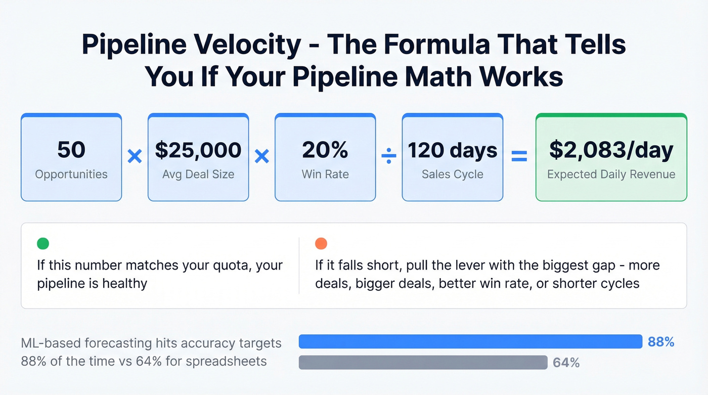
(# opportunities x avg deal size x win rate) / sales cycle length
Worked example: 50 opportunities x $25,000 x 20% win rate / 120-day cycle = $2,083/day in expected revenue. If that doesn't match your quota, you know exactly which lever to pull. This kind of sales data analysis shows how even a simple calculation can reveal whether your pipeline math adds up.
Teams using ML-based forecasting hit accuracy targets 88% of the time vs. 64% for spreadsheet-based methods. The gap is real, but typical implementation cost runs $75K-$500K+, which makes it an enterprise play for most.
Sales Activity Report
Look, activity metrics are the most dangerous numbers in sales reporting. They feel productive to track but tell you almost nothing about outcomes. A rep making 80 calls a day with a 1% connect rate isn't outperforming a rep making 30 calls with a 12% connect rate. Always pair activity with outcomes, or you're rewarding motion over progress.
Rep Performance Report
Individual contribution metrics: revenue closed, pipeline generated, win rate, average deal size, ramp progress. Win rates typically fall between 15-30% depending on segment. Compare reps against each other and against their own trajectory - a rep trending from 12% to 22% over two quarters is a different story than one stuck at 18%.
How to Build a Sales Analysis Report
1. Define purpose and audience. Every report needs a named stakeholder and a specific question it answers:
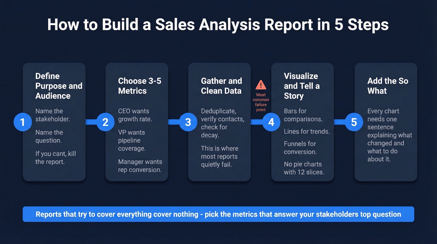
- CEO - growth rate, profitability, market expansion signals
- VP Sales - quota attainment, pipeline coverage, win rate, cycle length
- Sales Manager - rep activity, funnel conversion, coaching opportunities
- Marketing - campaign attribution, lead quality, cost per qualified opportunity
2. Choose 3-5 metrics per audience. Reports that try to cover everything cover nothing. Pick the metrics that answer your stakeholder's top question, and leave the rest as drill-down layers.
3. Gather and clean your data. Export from your CRM, deduplicate records, verify that contact and deal data is current. This step is where reporting problems originate and where most teams spend the least time. If you're wondering how to analyze sales data effectively, the answer starts here - no framework survives dirty inputs.
4. Visualize and tell a story. Bar charts for comparisons. Line charts for trends. Funnel charts for conversion. Every chart type has a job - don't use a pie chart for anything with more than 4 categories.
5. Contextualize with recommendations. Every chart needs a "so what" sentence. "Conversion dropped 8% this month" is data. "Conversion dropped 8% because we changed qualification criteria in week 2 - here's the expected recovery timeline" is analysis. That sentence is the entire reason the report exists. In 2026, tools like ChatGPT and Claude can draft these narrative summaries from raw data in seconds - use them as a first pass, then add the context only your team knows.
You just read that dirty data kills reports at step 3. Prospeo refreshes 300M+ profiles every 7 days - not every 6 weeks like competitors. Your pipeline reports reflect reality, not stale records from last quarter.
Stop building sales analysis reports on data you can't trust.
Mistakes That Ruin Your Reports
Leading with vanity metrics. Calls made and emails sent feel satisfying to report but are meaningless without conversion context. Lead with pipeline, conversion, and revenue. Activity metrics are supporting detail, never headlines.
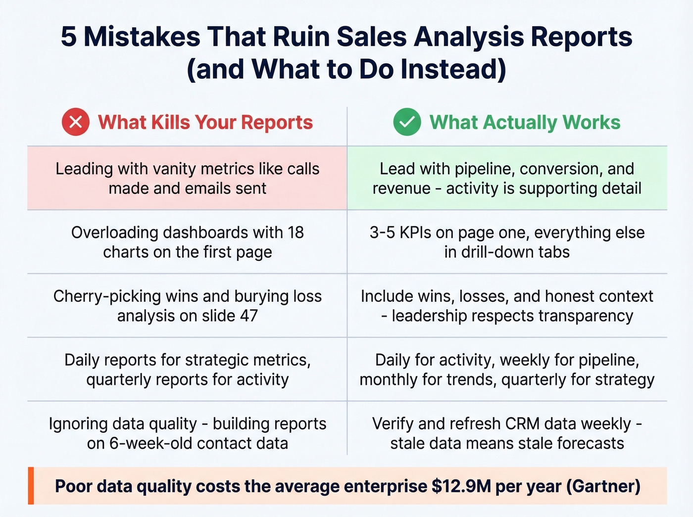
Overloading dashboards. If your exec summary has 18 charts, it's not a summary. Three to five KPIs on the first page. Everything else lives in drill-down tabs.
Cherry-picking data. We've all seen the QBR deck that highlights the three biggest wins and buries the loss analysis on slide 47. Include wins, losses, and context. Leadership respects honesty more than spin.
Wrong reporting cadence. Daily reports for strategic metrics waste everyone's time. Quarterly reports for activity metrics are useless. Match the cadence to the audience: daily for activity pulses, weekly for pipeline movement, monthly for trend analysis, quarterly for strategic reviews. Your CEO doesn't need daily call counts.
Ignoring data quality. This is the silent killer. Over 70% of small businesses still rely on spreadsheets or outdated methods to track sales. Poor data quality costs the average enterprise $12.9M annually per Gartner. Even teams with proper CRMs let contact data decay for months. If your contact records are only refreshed on a 6-week cycle - the industry average - your pipeline report overstates reality. You're forecasting against people who've changed jobs, emails that bounce, and phone numbers that ring nobody.
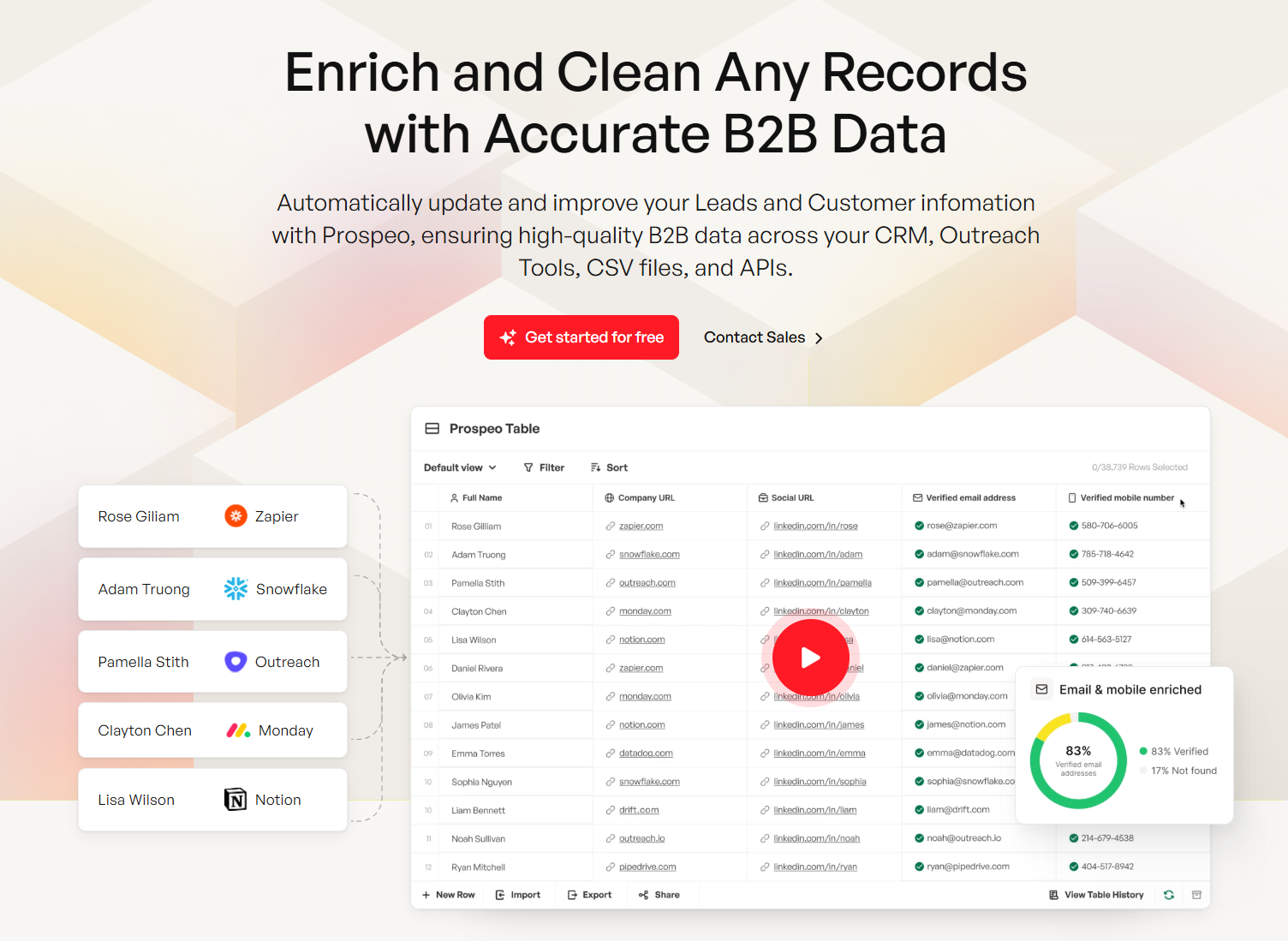
Before you build another pipeline report, verify your underlying data. Prospeo enriches and verifies CRM records on a 7-day refresh cycle with 98% email accuracy and an 83% enrichment match rate, integrating natively with Salesforce and HubSpot so your reports start with clean data instead of inherited assumptions.
Pipeline velocity only works when your contact data connects reps to real buyers. Prospeo delivers 98% email accuracy and 125M+ verified mobiles - so the pipeline numbers in your reports translate to actual conversations.
Turn your sales reports from creative writing into revenue forecasts.
Templates You Can Copy
Three templates that cover 90% of what sales teams actually need.
Weekly Activity Report
| Metric | Structure |
|---|---|
| Calls (with outcomes) | Daily rows, weekly totals |
| Leads generated | Variance to target |
| Deals created | Count + pipeline value |
| Pipeline generated ($) | Running weekly total |
| Closed-won ($) | Count + revenue |
Track daily, summarize weekly, always include variance to target. The consensus on r/sales is that weekly reports fail when they dump every metric instead of focusing on these critical data points.
Monthly Pipeline Report
Metrics: pipeline value, coverage ratio, conversion rate by stage, average deal size, cycle length. Structure it as a funnel visualization with month-over-month trend lines. This is the report your VP of Sales should live in.
Quarterly Revenue Report
Open with a 3-KPI exec summary - total revenue, forecast accuracy %, net revenue retention - then drill into segment and channel breakdowns. Include churn rate and expansion revenue. This is the one that goes to the board.
How to Analyze Sales Trends Over Time
Sales analytics reports are most valuable when they reveal direction, not just snapshots. Compare the same metric across at least three consecutive periods - a single month-over-month change could be noise, but a three-month trajectory is a signal. Layer in seasonality adjustments and segment-level breakdowns so you're analyzing data in context rather than reacting to surface-level fluctuations.
Let's be honest: most teams react to one bad month like it's a crisis and one good month like they've cracked the code. Neither is true. The analysis should always answer one question - is this trend accelerating, decelerating, or stabilizing, and what's driving it?
Best Tools for Sales Analysis in 2026
The right tool depends on where you sit in the stack. Evaluation criteria that matter: interactive dashboards, customizable templates, scheduling and automation, security and permissions, and native CRM integrations.
| Tool | Category | Starting Price | Best For |
|---|---|---|---|
| Prospeo | Data Quality | Free (75 emails/mo); ~$0.01/email | CRM data verification |
| HubSpot | CRM-native | Free; paid from ~$20/user/mo | Best free reporting |
| Salesforce | CRM-native | From ~$25/user/mo | Enterprise customization |
| Pipedrive | CRM-native | From ~$14/user/mo | SMB simplicity |
| Tableau | BI | From ~$15/user/mo | Advanced visualization |
| Power BI | BI | Free desktop; Pro ~$10/user/mo | Microsoft ecosystem |
| Looker Studio | BI | Free | Budget/startup teams |
| Zoho Analytics | BI | From ~$24/mo | Mid-market value |
| Gong | Revenue Intel | ~$100-150/user/mo | Conversation analytics |
| Clari | Revenue Intel | ~$30K-80K+/year | Forecast accuracy |
Most sales teams don't need a BI tool. If your average deal size is under $30K and you have fewer than 20 reps, HubSpot or Salesforce reporting covers 90% of your needs. The teams that benefit from Tableau or Power BI are the ones blending CRM data with marketing, finance, or product usage data across multiple sources.
CRM-native tools handle standard reporting out of the box. HubSpot's free tier is genuinely useful for early-stage teams. Salesforce is the enterprise default with the deepest customization - and the steepest learning curve. Pipedrive keeps it simple for SMBs who don't need 200 custom report types.
BI tools step in for cross-source analysis. In our experience, teams that start with Power BI and graduate to Tableau rarely go back. Looker Studio is free and surprisingly capable for startups who want to analyze data from multiple channels without paying for a full BI suite. Zoho Analytics hits a sweet spot for mid-market teams already in the Zoho ecosystem.
Revenue intelligence adds conversation and forecast analytics on top of CRM data. Gong is the standard for call analysis; Clari is the go-to for enterprise forecast accuracy. Both are expensive and best suited for teams with 20+ reps. Reddit threads on r/salesops consistently flag implementation time as the hidden cost - budget 2-3 months before you see value. Skip these if you're under 15 reps or don't have a dedicated ops person to own the rollout.
FAQ
How often should I update sales analysis reports?
Daily for activity pulses like calls and meetings booked. Weekly for pipeline movement and deal progression. Monthly for trend analysis and conversion rates. Quarterly for strategic reviews. Match the cadence to the audience - your sales manager can't wait until quarter-end to spot a coaching opportunity.
What's the most important metric in a sales analysis report?
Pipeline coverage ratio, targeting 3x-5x quota. It's the single best predictor of whether you'll hit your number. If coverage drops below 3x, no amount of coaching or activity optimization saves the quarter. Track it weekly as the leading indicator everything else flows from.
How do I make sure my sales data is accurate?
Deduplicate CRM records quarterly at minimum and verify contact emails before running pipeline reports - stale data inflates numbers and makes forecasts unreliable. A 7-day refresh cycle on contact data eliminates the "garbage in, garbage out" problem most teams ignore until a forecast misses badly.
Can I build useful reports without a BI tool?
Absolutely. Start with your CRM's built-in reports and a spreadsheet. Export deal-level data, segment by stage and source, and calculate conversion rates between stages. A well-structured spreadsheet your team actually reviews beats a $50K BI platform nobody logs into. The goal isn't sophistication - it's finding the one or two insights that change behavior this week.