How to Build a Sales Power BI Dashboard Your Team Will Actually Use
Your VP asks for a sales Power BI dashboard by Friday. You spend two days building it. It looks great in the demo. Three weeks later, nobody opens it.
This isn't a Power BI problem - it's a design and data problem. BI adoption rates sit around 25% on average, and 58% of organizations never crack that threshold. The dashboards that survive are the ones built around decisions, not decoration.
Here's the thing: Power BI can cover most sales reporting needs that teams also use Tableau for - and it's typically cheaper. But the tool isn't the bottleneck. Bad KPI selection and dirty CRM data kill more dashboards than any software limitation ever will.
What You Need Before Building
Before you touch Power BI Desktop, nail these five things:
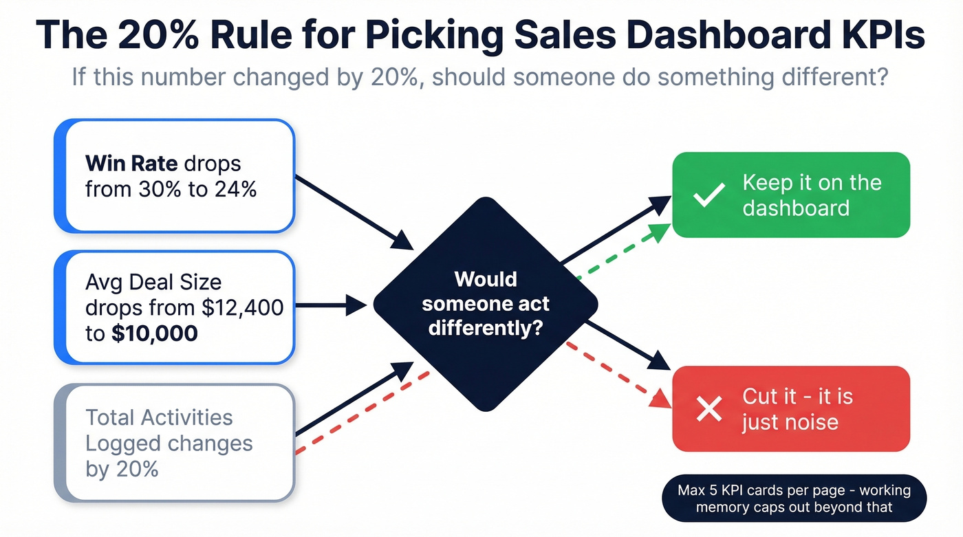
- Start with 5 or fewer KPIs. Not 25. Apply the 20% Rule - if this number changed by 20%, should someone do something different? If not, cut it.
- Build a star schema first. One fact table connected to dimension tables like date, product, rep, and region. This isn't optional.
- Copy the DAX measures below for YoY comparisons, pipeline velocity, and win rate. They're ready to paste.
- Budget $14/user/month for Power BI Pro. The free tier can't share dashboards with your team.
- Clean your CRM data before connecting. A dashboard built on stale contacts and dead emails is fiction dressed up in bar charts.
Two Types of Sales Dashboards
Not every sales dashboard tracks the same thing. The split comes down to where you sit in the revenue cycle, and getting this wrong means you're pulling from the wrong data sources entirely.
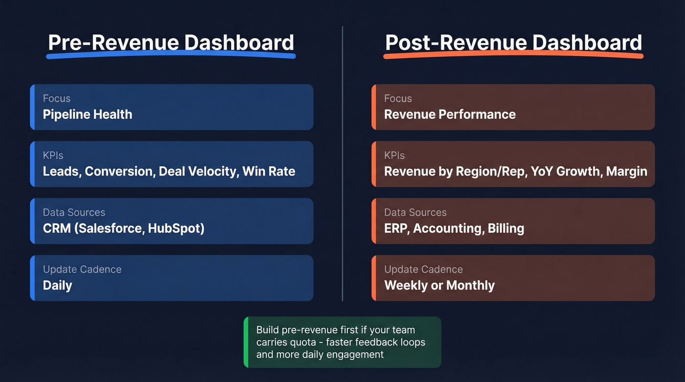
| Pre-Revenue | Post-Revenue | |
|---|---|---|
| Focus | Pipeline health | Revenue performance |
| KPIs | Leads, conversion, deal velocity, win rate | Revenue by product/region/rep, YoY growth, margin |
| Data sources | CRM (Salesforce, HubSpot) | ERP, accounting, billing |
| Update cadence | Daily | Weekly or monthly |
Pre-revenue dashboards answer "will we hit the number?" Post-revenue dashboards answer "why did we hit (or miss) the number?" Most teams need both, but they shouldn't live on the same page. The data sources are different, the refresh cadence is different, and the audience is different. Your SDR manager doesn't need margin analysis, and your CFO doesn't need lead-to-MQL conversion rates.
Which one to build first? If your team is quota-carrying and pipeline-driven, start with pre-revenue. You'll get faster feedback loops and more daily engagement. Post-revenue dashboards matter more for leadership reviews, but they don't drive the same behavioral change on the floor.
Pick Your KPIs First
Most dashboard projects fail before anyone writes a single DAX formula. They fail in the KPI selection phase, usually because someone browses a gallery of beautiful dashboards and tries to recreate all of them at once.
Stop browsing galleries. Start with your KPIs.
The Chandoo contest gallery has 110+ entries and they're gorgeous - but copying someone else's layout without understanding your own decision points is how you end up with a dashboard nobody trusts. We've seen teams spend weeks recreating a contest-winning layout only to realize it tracked metrics their org doesn't even collect.
The heuristic that works is what we call the 20% Rule: "If this number changed by 20%, should someone do something different?" If your win rate drops from 30% to 24%, that's a five-alarm fire. If your average deal size shifts from $12,400 to $10,000, someone needs to investigate. But if your total number of activities logged changes by 20%? Probably noise.
Limit each dashboard page to five KPI cards or fewer. Working memory caps out around five items before comprehension drops. Every card beyond five dilutes the ones that matter.
Set Up Your Data Model
A star schema isn't fancy database theory - it's the foundation that makes your DAX fast and your filters intuitive. Skip this step and you'll spend hours debugging relationships later.
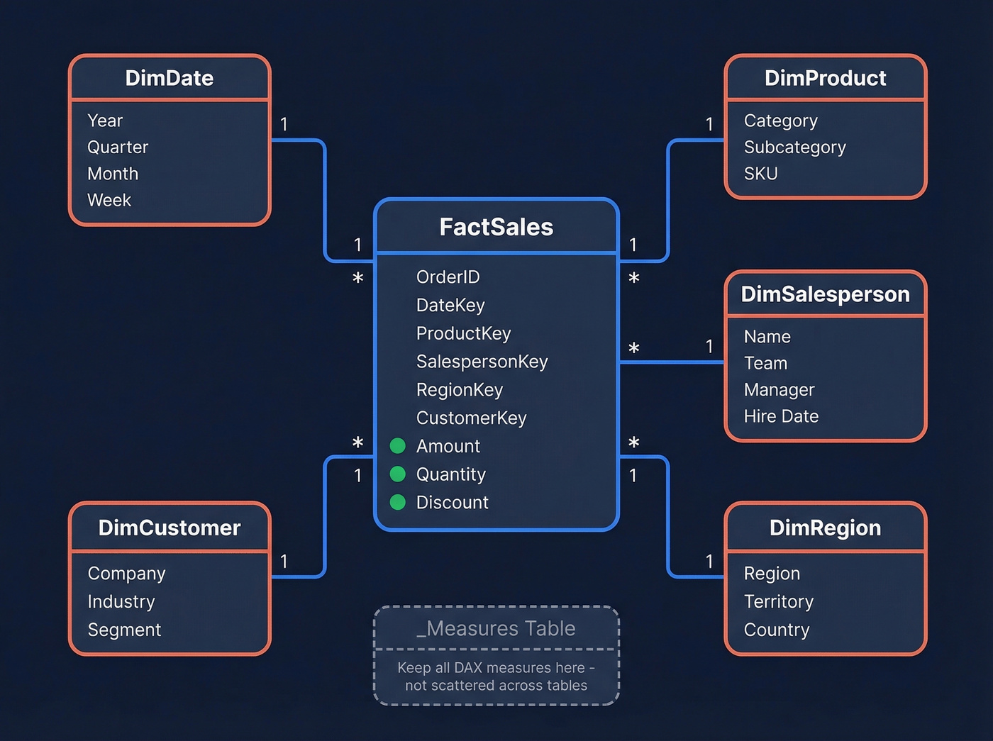
One fact table sits at the center, storing transactional events. Dimension tables surround it, providing the attributes you'll filter and group by. Every relationship flows one-to-many from dimension to fact.
Here's what your schema looks like for a sales reporting model:
[DimDate] ──┐
[DimProduct] ──┤
[DimSalesperson] ──┼── [FactSales]
[DimRegion] ──┤    (OrderID, DateKey, ProductKey,
[DimCustomer] ──┘     SalespersonKey, Amount, Quantity)
Each dimension table has a primary key and descriptive columns. DimDate includes year, quarter, month, and week. DimSalesperson includes name, team, manager, and hire date. DimProduct includes category, subcategory, and SKU. The fact table references these via foreign keys and stores only numeric measures - amount, quantity, discount.
Two modeling rules that'll save you grief.
First, create a dedicated _Measures table to house all your DAX measures. This keeps the Fields pane clean and stops measures from scattering across random tables. Second, prefer measures over calculated columns. Measures compute at query time and don't bloat your model. Calculated columns compute at load time and get stored permanently - use them only when you need a value available for filtering or sorting.
If your CRM export comes as one giant denormalized table (and it will), use Power Query to split it into proper fact and dimension tables before loading. Microsoft's star schema guidance walks through this in detail.
Essential DAX Measures
This is the section that separates a dashboard from a spreadsheet. Copy these measures into your _Measures table and adjust the table/column names to match your model.
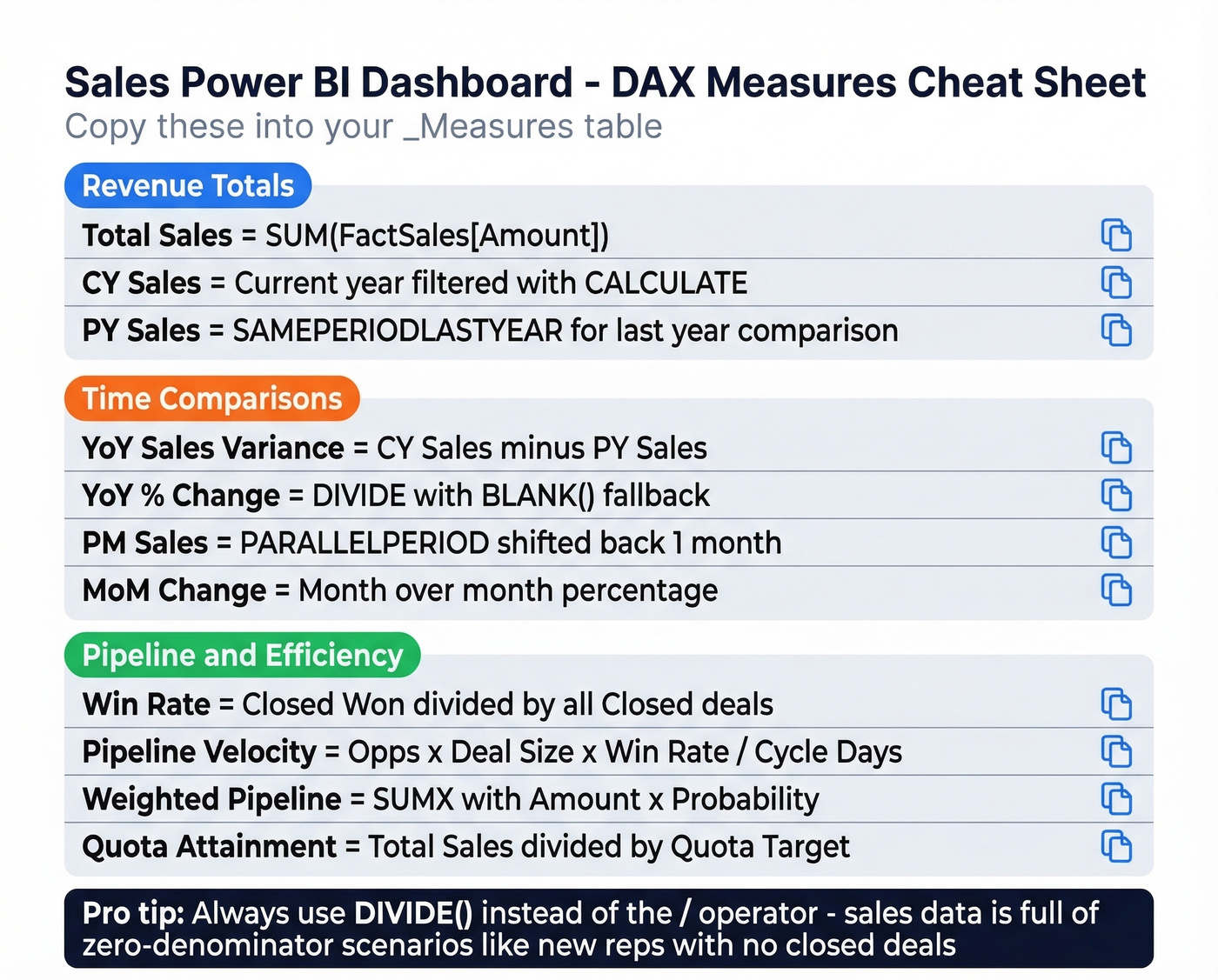
Revenue Totals
Total Sales = SUM(FactSales[Amount])

CY Sales =
VAR CurrentYear = MAX(DimDate[Year])
RETURN
    CALCULATE([Total Sales], DimDate[Year] = CurrentYear)

PY Sales =
    CALCULATE([Total Sales], SAMEPERIODLASTYEAR(DimDate[Date]))
SAMEPERIODLASTYEAR requires a proper date table marked as a date table in your model. Don't skip that step - time intelligence functions won't work without it.
Time Comparisons
YoY Sales Variance = [CY Sales] - [PY Sales]

YoY % Change =
    DIVIDE([CY Sales] - [PY Sales], [PY Sales], BLANK())

PM Sales =
    CALCULATE([Total Sales], PARALLELPERIOD(DimDate[Date], -1, MONTH))

MoM Change =
    DIVIDE([Total Sales] - [PM Sales], [PM Sales], BLANK())
CALCULATE does the heavy lifting - it modifies the filter context so your measure evaluates against a different time period. PARALLELPERIOD shifts the entire date range back by one month. DIVIDE with a BLANK() fallback prevents division-by-zero errors from crashing your visuals.
Pipeline and Efficiency
Win Rate =
    DIVIDE(
        COUNTROWS(FILTER(FactDeals, FactDeals[Stage] = "Closed Won")),
        COUNTROWS(FILTER(FactDeals, FactDeals[Stage] IN {"Closed Won", "Closed Lost"})),
        BLANK()
    )

Pipeline Velocity =
    DIVIDE(
        [Qualified Opportunities] * [Average Deal Size] * [Win Rate],
        [Average Sales Cycle Days],
        BLANK()
    )

Weighted Pipeline =
    SUMX(FactDeals, FactDeals[Amount] * FactDeals[Probability])

Quota Attainment =
    DIVIDE([Total Sales], [Quota Target], BLANK())
DIVIDE shows up everywhere in sales DAX because sales data is full of zero-denominator scenarios - new reps with no closed deals, new products with no pipeline, new regions with no quota. Always use DIVIDE instead of the / operator.
Two more functions worth knowing: SUMX iterates row-by-row, which is what powers the Weighted Pipeline measure above. ALL removes filters when you need grand totals or percentage-of-total calculations - essential for rep performance as a share of team revenue.
Last Refreshed Date
Sales Max Date = MAX(FactSales[OrderDate])
Display this in a card visual so users know how fresh the data is. If your CRM has future-dated rows like scheduled renewals or projected close dates, this measure will show a misleading date. Filter to OrderDate <= TODAY() to fix that.
You just read it: a dashboard built on stale contacts and dead emails is fiction dressed up in bar charts. Prospeo's 98% email accuracy and 7-day data refresh cycle mean your CRM stays clean - so every KPI card in Power BI reflects reality, not decay.
Fix the data before you fix the dashboard.
Dashboard Design That Drives Adoption
A dashboard that looks good in a screenshot but confuses users in practice is worse than no dashboard at all. In our experience, the single biggest predictor of adoption is whether the data is trusted - not whether the charts are pretty.
Every KPI card needs context
A number without context is just a number. Each card should show the metric, a target or baseline, the gap between actual and target, and a trend indicator. "Revenue: $1.2M" tells you nothing. "Revenue: $1.2M vs $1.4M target, down 3% MoM" tells you everything.
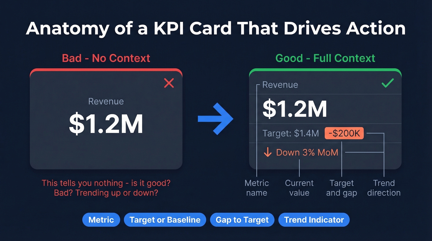
Stick with the built-in KPI visual or certified custom visuals like Deneb. Flashy SVG workarounds look great in demos but break during updates.
Use a 16:9 canvas size
If your dashboard will be shown in meetings, design for widescreen. 1280x720 (Power BI's default) or 1920x1080 works for most screens and projectors.
Bookmarks for navigation
Instead of cramming everything onto one page, use bookmarks to create tab-like navigation between views: pipeline, performance, and rep leaderboard. The Chandoo contest entries that judges highlighted often used bookmarks for clean multi-view navigation.
Field parameters for metric switching
Let users toggle between revenue, units, and margin without building three separate pages. Field parameters were built for this exact use case.
Conditional formatting for exceptions
Don't make users scan a table of 50 reps to find who's behind quota. Highlight the exceptions. Red for below 80% attainment, yellow for 80-100%, green for above.
Sort before converting to KPI visual
This is a documented gotcha - once you convert a visual to a KPI type, the sort option disappears. Set your axis sort order first, then convert.
Connect Your CRM Data
Salesforce
Salesforce has a strong Power BI connector, but it comes with sharp edges. You'll need API access enabled on your Salesforce account, and the connecting user needs admin, developer, or marketing permissions. The real constraints: Salesforce limits you to five authentication tokens per application, so keep your imported datasets to five or fewer. And the Reports API caps at 2,000 rows - if your pipeline has more than 2,000 deals (and it probably does), use the Objects API instead.
You'll also need Power BI Pro or PPU to use the Salesforce template app. Free tier won't cut it.
HubSpot
A common approach is to export to CSV or use a third-party connector like Hevo or Fivetran, then build a dataflow in the Power BI service. It's more setup than Salesforce but works fine once configured.
Dynamics 365
If you're already in the Microsoft ecosystem, this is the easiest path. The Dataverse connector pulls Dynamics data directly into Power BI with minimal configuration.
Before connecting any CRM, verify your data is current. Stale pipeline numbers make your dashboard untrustworthy from day one. Tools like Prospeo can enrich and verify contacts before they hit Power BI - its native Salesforce and HubSpot integrations make this a one-time setup rather than an ongoing chore.
Licensing for Sales Teams
Licensing is where most teams get confused, so let's break it down.
| Feature | Free ($0) | Pro ($14/mo) | PPU ($24/mo) |
|---|---|---|---|
| Model size | 1 GB | 1 GB | 100 GB |
| Refreshes/day | 8 | 8 | 48 |
| Share dashboards | No | Pro users only | PPU users only |
| Premium features | No | No | Yes |
The sharing rules matter most. Pro users can share with other Pro users. PPU users can share with other PPU users. Free users can only view dashboards if the content sits in Premium capacity - a separate, more expensive SKU.
For a 15-person sales team, you're looking at $210/month for Pro licenses. If you've got a larger org with many viewers, Premium capacity (Fabric F64+ or Premium P SKUs) lets free users view content - but the capacity license itself runs thousands per month. For most mid-market sales teams, Pro at $14/user/month is the right call.
Clean Your Data First
This is the step everyone skips and the reason most dashboards get abandoned.
If 30% of your CRM contacts have outdated emails, wrong titles, or dead phone numbers, your pipeline metrics are fiction. Win rates look inflated because stale deals never got closed-lost. Revenue forecasts drift because rep territories are mapped to contacts who changed companies six months ago. I've watched a team present a $4M pipeline to their board only to discover half those contacts had bounced emails - the deals were ghosts.
Run your contact list through an enrichment tool before connecting to Power BI. Prospeo returns 50+ data points per contact with 98% email accuracy and an 83% enrichment match rate, and its 7-day data refresh cycle keeps records current compared to the 6-week industry average. Native Salesforce and HubSpot integrations make this a one-time setup, not an ongoing chore. If you're comparing vendors, start with a shortlist of data enrichment services.
Your pipeline velocity and win rate measures are worthless if half your contacts have bounced emails and disconnected numbers. Prospeo enriches CRM records with 50+ verified data points at 92% match rate - for roughly $0.01 per email. No contracts, no sales calls.
Power BI shows the numbers. Prospeo makes them real.
Free Templates to Start With
You don't need to build from scratch. If you're building your first sales Power BI dashboard, start with the ZebraBI template - it has the most complete out-of-box setup.
ZebraBI Free PBIX - This free template includes pre-built KPI cards, variance waterfall charts, Top N product rankings, and interactive time/region filters. No complex DAX required for the basics, and it's the fastest way to get a professional-looking dashboard running.
Chandoo Contest Gallery - 110+ downloadable PBIX files from a community contest using a standardized sales dataset. Great for studying design patterns like bookmarks, field parameters, and conditional formatting in the wild.
Microsoft Sample Sales Dashboard - Microsoft's own sales and marketing sample walks through a complete dashboard with data, reports, and drilldowns. Useful for understanding the intended Power BI workflow.
ZoomCharts Templates - Custom visuals with drill-down capabilities that go beyond native Power BI charts. Their DAX formula guide is worth reading alongside the templates.
Skip the paid template marketplaces unless you've already tried these free options and found them lacking. Most paid templates are just prettier versions of the same star schema and DAX patterns covered above.
FAQ
Can I build a sales Power BI dashboard with the free tier?
Yes, for personal use. Power BI Desktop is free and fully functional for building dashboards locally. Sharing with your sales team requires Pro ($14/user/month) or Premium capacity. Prototype everything for free, then upgrade when it's time to distribute.
How often should my dashboard refresh?
Daily is the standard for pipeline-driven sales teams. Pro allows 8 refreshes per day, PPU allows 48. For real-time visibility, consider DirectQuery mode - but expect slower rendering on large datasets. Most teams find scheduled daily refresh is the right balance.
What's the best visual for pipeline data?
A funnel chart for stage-by-stage conversion, paired with a stacked bar for pipeline by rep or region. Avoid pie charts - they're nearly useless for comparing similar-sized segments. Waterfall charts work well for showing where pipeline is gained and lost across stages.
Do I need to learn DAX?
For a basic dashboard with totals and filters, no. For YoY comparisons, win rates, and pipeline velocity - yes. The DAX measures in this guide are copy-paste ready. Start with those, then learn CALCULATE and DIVIDE to customize further.
How do I make sure CRM data is accurate before connecting?
Run your contact list through an enrichment tool before connecting to Power BI. Stale emails and wrong titles inflate pipeline numbers and erode trust. Even a quick audit of your top 100 accounts will tell you whether your data is dashboard-ready or needs cleanup first.