Churn Analysis: From Formula to Action
Your CEO just forwarded the board deck with a red circle around one number: monthly churn. Now everyone wants answers - not just the rate, but why it's happening and what to do about it. You already calculated churn. You sliced it by country, plan type, maybe company size. And now you're staring at a spreadsheet wondering what the next move actually is.
That's the gap this guide fills. Not the formula - you've got that. The diagnostic framework for churn analysis, the benchmarks that matter, and the step-by-step process for turning a churn number into a retention strategy you can actually execute.
The Short Version
If you've calculated your churn rate and don't know what to do next, here's the sequence:
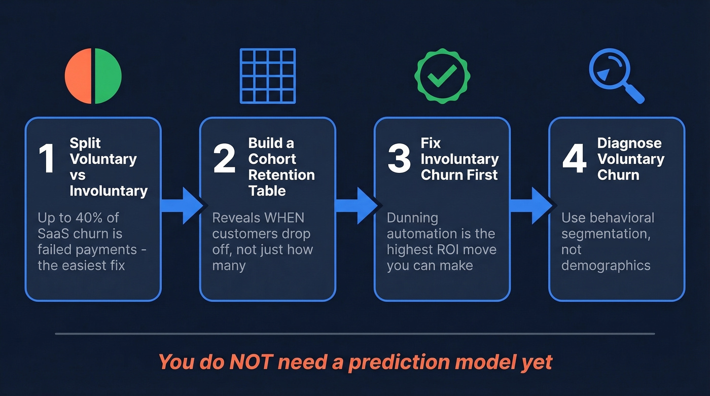
- Split voluntary vs. involuntary churn. Up to 40% of SaaS churn is involuntary - failed payments - and it's the easiest to fix.
- Build one cohort retention table. This reveals when customers drop off, which is more useful than knowing how many dropped off.
- Fix involuntary churn with dunning automation first. It's one of the highest-ROI moves you can make before touching anything else.
- Diagnose voluntary churn with behavioral segmentation. Demographics won't tell you much. Product usage patterns will.
You don't need a prediction model yet. Let's walk through each piece.
What Is Churn Analysis?
Churn analysis is the discipline of diagnosing why customers leave and predicting who's likely to leave next. It isn't the same as calculating a churn rate - that's just the starting metric. The analysis is everything that happens after: segmenting, identifying behavioral drivers, building retention interventions, and measuring whether those interventions work.
Think of it as two layers. The descriptive layer tells you what happened - cohort retention curves, revenue vs. logo churn splits, voluntary vs. involuntary breakdowns. The predictive layer tells you what's about to happen and where to intervene before it does. Most teams get stuck between these two layers, which is the exact gap practitioners describe in communities like r/dataanalysis.
Why Retention Economics Matter
The economics of churn are brutal. McKinsey's research puts it starkly: compensating for the value of one lost customer can require acquiring three new ones. That 3-to-1 replacement ratio makes every churned account exponentially more expensive than it looks on a dashboard.
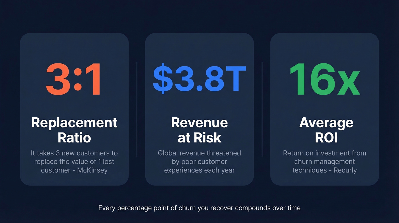
The macro picture is equally sobering. One widely cited industry estimate puts $3.8 trillion in global revenue at risk from poor customer experiences. McKinsey also found that 80% of value creation by the most successful growth companies comes from their core business - unlocking new revenue from existing customers, not acquiring new ones.
These aren't abstract numbers. One telecom operator cut customer churn by 75% and nearly doubled revenue over three years. Recurly reports that churn management techniques deliver an average 16x ROI across their customer base. Every percentage point of churn you recover compounds over time, and the companies that figure this out early build a structural advantage that's hard to replicate. The takeaway: you can reduce customer churn with data far more efficiently than you can outgrow it with new acquisition.
Metrics Worth Tracking
The churn rate formula itself is straightforward:
Churn Rate = (Customers Lost During Period / Customers at Start of Period) x 100
If you started January with 1,000 customers and lost 50, your monthly churn rate is 5%. Simple. But this single number hides more than it reveals, which is why you need a family of metrics working together.
Logo churn vs. revenue churn is the most important distinction. You can lose 5% of your customers but 15% of your revenue if the churned accounts are disproportionately large. We've seen teams celebrate a "low" logo churn rate while hemorrhaging their best accounts. Revenue churn is almost always the more honest metric.
Gross churn vs. net churn matters for growth-stage companies. Gross churn counts all lost revenue. Net churn subtracts expansion revenue - upsells, cross-sells - from the losses. If you're losing $50k/month in churn but gaining $60k in expansion, your net revenue churn is actually negative, which is the holy grail of SaaS economics. Negative churn means your existing customer base grows even without new logos.
| Metric | What It Measures | Why It Matters |
|---|---|---|
| Logo churn rate | % of customers lost | Headcount health |
| Revenue/MRR churn | % of revenue lost | Financial health |
| Net revenue churn | Revenue lost minus expansion | Growth trajectory |
| Involuntary churn | Failed payment losses | Recoverable revenue |
| NPS / CSAT / CES | Satisfaction signals | Leading indicators |
The leading indicators - NPS, CSAT, customer effort score, and product usage frequency - are where the analysis gets predictive. A drop in login frequency three weeks before a renewal is worth more than a survey response after cancellation.
Every churned account costs 3x to replace. Cut that replacement cost by filling your pipeline with 98% accurate emails and 125M+ verified mobile numbers - so your team books meetings faster than churn can drain revenue.
Stop outrunning churn. Start outpacing it with better data.
Churn Benchmarks in 2026
Benchmarks vary wildly by industry, segment, and pricing model. But having directional numbers prevents you from panicking over a rate that's actually normal - or celebrating one that's mediocre.
By Industry
| Industry | Avg. Annual Churn |
|---|---|
| Healthcare | ~8.7% |
| SaaS | ~13.2% |
| Banking | ~15.3% |
| Telecom | ~21.5% |
| Retail | ~25.4% |
These come from Growth-onomics' analysis. Retail's high number reflects intense price competition and low switching costs. Healthcare's low number reflects regulatory stickiness and long implementation cycles.
In our experience, teams that obsess over industry-wide averages miss the real story. Segment-level benchmarks are where the useful comparisons live.
By SaaS Segment
This is where benchmarks get genuinely useful. RevMine's analysis of 500+ SaaS companies breaks monthly churn by customer segment:
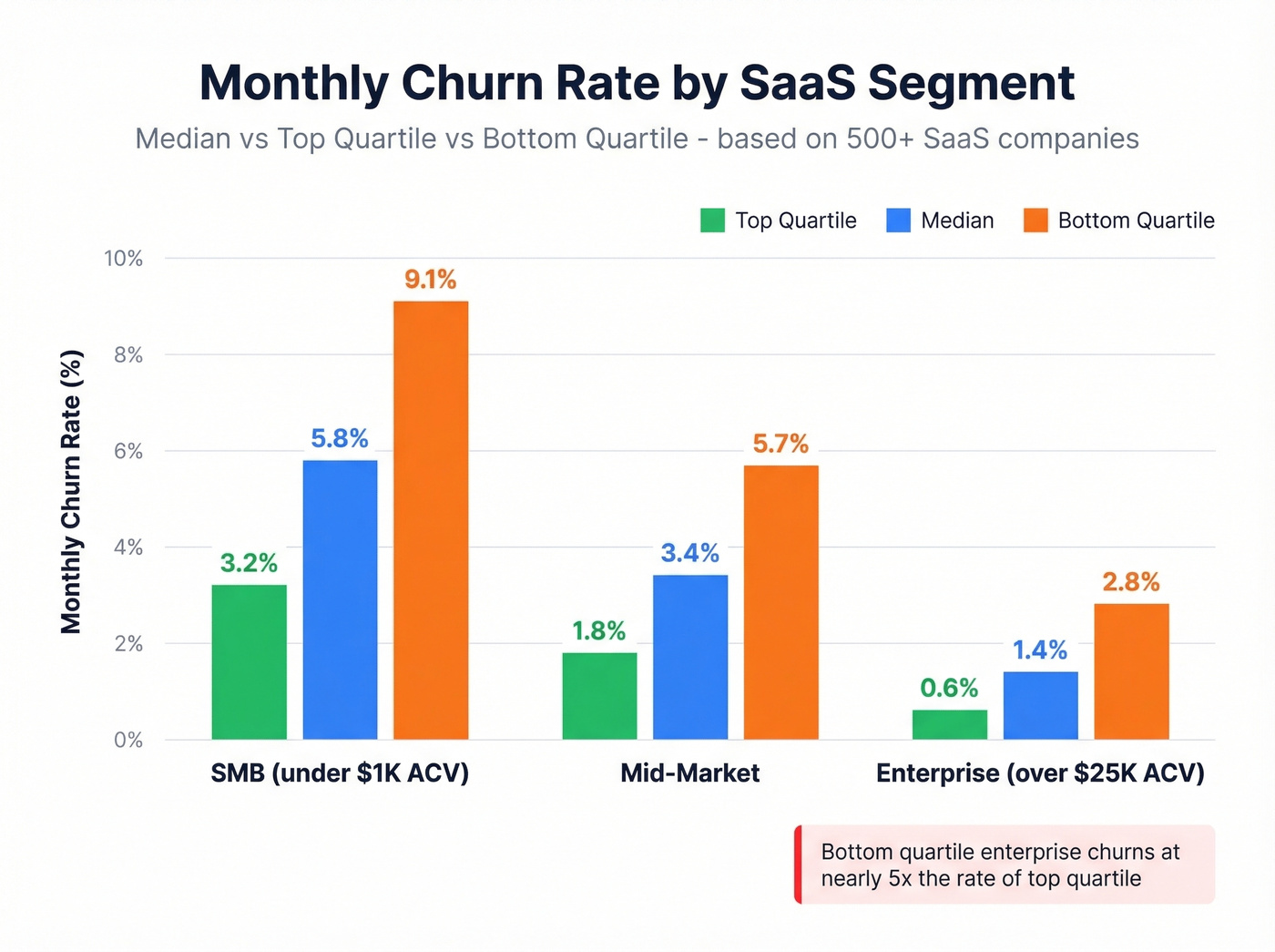
| Segment | Median Monthly | Top Quartile | Bottom Quartile |
|---|---|---|---|
| SMB (<$1K ACV) | 5.8% | 3.2% | 9.1% |
| Mid-market | 3.4% | 1.8% | 5.7% |
| Enterprise (>$25K) | 1.4% | 0.6% | 2.8% |
The gap between top and bottom quartile is massive. A top-quartile enterprise company churns at 0.6% monthly; a bottom-quartile one churns at 2.8% - nearly 5x worse. That's the difference between a compounding machine and a leaky bucket.
By Pricing Model
| Pricing Model | Median Monthly Churn |
|---|---|
| Annual billing | 2.1% |
| Usage-based | 4.5% |
| Freemium to paid | 5.4% |
| Monthly billing | 6.2% |
Annual billing cuts churn by about 3x compared to monthly. If you're running monthly-only pricing and wondering why churn is high, the pricing model itself might be the biggest lever you have.
General guidance: under 10% annual total churn is solid. Top performers run under 5%. Above 10%, there's almost certainly a structural problem worth diagnosing.
Voluntary vs. Involuntary Churn
Here's the thing: the single most underappreciated distinction in any attrition diagnosis is voluntary vs. involuntary. Voluntary churn is a customer actively deciding to leave - they cancel, they switch to a competitor, they outgrow your product. Involuntary churn is a failed credit card, an expired payment method, a billing error. The customer didn't choose to leave.
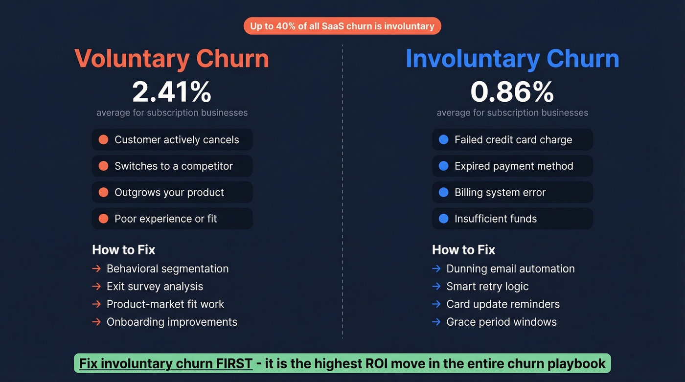
Up to 40% of SaaS churn is involuntary. Recurly's benchmarks split it at 2.41% voluntary vs. 0.86% involuntary for subscription businesses. DTC subscription categories average 6.5% total churn vs. 3.8% for B2B.
Fix involuntary churn before you do anything else. Before cohort analysis, before prediction models, before exit surveys. Dunning automation - retry logic, card update reminders, grace periods - recovers revenue that was never actually "lost" in the first place. It's one of the highest-ROI moves in the entire churn playbook, and most teams skip it because it feels like plumbing, not strategy.
How to Do Churn Analysis Step by Step
Define Churn for Your Business
This sounds obvious, but it trips up more teams than you'd expect.
| Business Type | Churn Definition | Typical Threshold |
|---|---|---|
| Subscription SaaS | Subscription ends or isn't renewed | Contract expiration date |
| Usage-based platform | Activity drops below meaningful threshold | 30-60 days without usage |
| E-commerce / marketplace | No purchases within a defined window | 60-90 days without a transaction |
| Freemium product | Paid user downgrades to free or goes inactive | Downgrade event or 30+ days inactive |
If your team can't agree on what "churned" means, your churn rate is meaningless. Define it once, document it, and stick with it. I've watched teams argue about this for weeks - just pick a threshold that matches your product's natural usage cadence and move on.
Collect and Unify Your Data
Your analysis is only as good as the data feeding it. This is where most teams unknowingly sabotage themselves. If a quarter of your CRM records have bounced emails, outdated job titles, or contacts who changed companies six months ago, you're analyzing ghosts. Stale records create phantom churn - accounts that look inactive because the person you're tracking no longer works there, not because they stopped using your product.
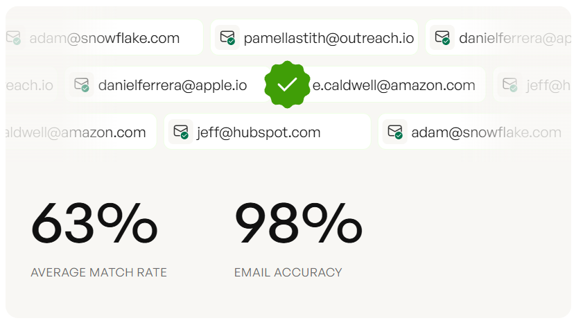
The practical step: before running any analysis, audit your CRM for data decay. How many contacts have bounced emails? How many have job titles older than six months? Tools like Prospeo help prevent this with a 7-day data refresh cycle and 98% email accuracy, so your behavioral signals reflect real customer activity instead of stale records. Everything else depends on getting this foundation right.
Calculate Baseline Metrics
With clean data in hand, calculate the core metrics from the earlier section. Here's a worked example showing how the same underlying data tells different stories depending on which metric you use:
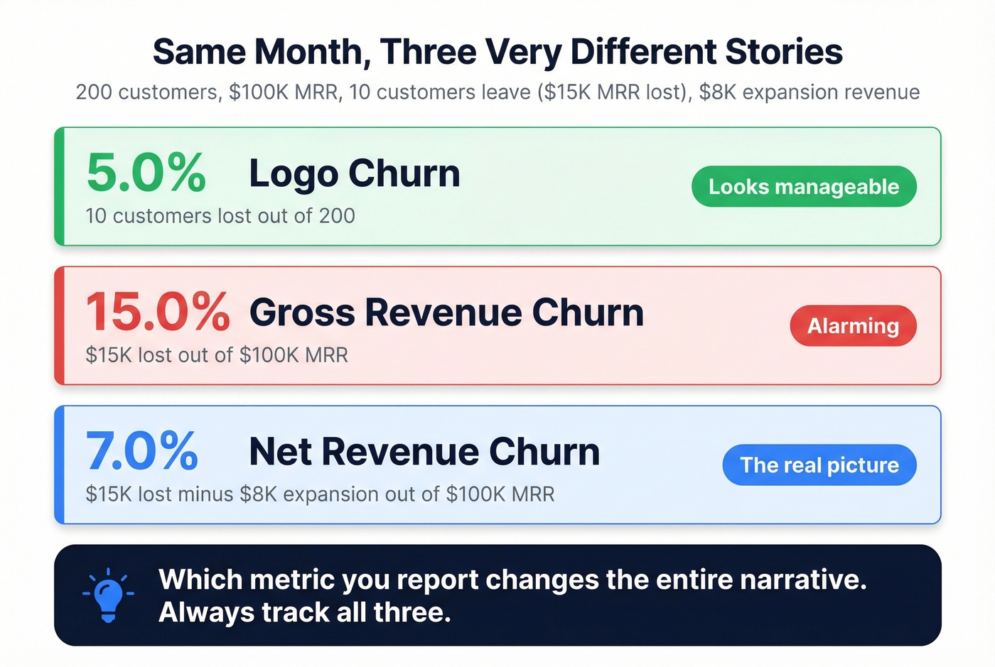
Scenario: You start the month with 200 customers paying a combined $100K MRR. During the month, 10 customers leave (losing $15K MRR), but existing customers expand by $8K MRR.
- Logo churn: 10 / 200 = 5.0% - looks manageable
- Gross revenue churn: $15K / $100K = 15.0% - alarming
- Net revenue churn: ($15K - $8K) / $100K = 7.0% - the real picture
Same month, three very different narratives. If you'd only tracked logo churn, you'd have missed that your largest accounts were walking out the door. Always calculate all three, and weight decisions toward revenue churn.
Segment and Build Cohorts
Cohort analysis is where the investigation stops being a number and starts being a story. Instead of looking at aggregate churn, you group customers by when they signed up - or by behavior, plan type, acquisition channel - and track their retention over time.
The retention curve tells you when customers drop off. One analysis found that 34% of users who don't return by day 3 never come back, compared to just 8% churn for those who do return by day 3. That's a massive signal pointing straight at your onboarding experience.
The same study showed that users who didn't complete the setup wizard churned at 67%, vs. 12% for those who completed it - a 4.8x difference in retention. When you segment cohorts by behavior like completing onboarding, connecting an integration, or inviting a teammate, the drivers become obvious. This is the "next level" that analysts on Reddit keep asking about: move from demographic slicing to behavioral segmentation, and the story writes itself.
Identify Behavioral Drivers
Once you've built cohorts, connect product usage patterns to churn outcomes. The behavioral signals that matter most aren't demographics - they're things like transaction intervals stretching out, average order values declining, and session frequency decaying over time.
We've seen teams spend weeks analyzing churn by company size and industry when the real driver was that churned customers hadn't logged in more than twice in their first 14 days. The SaaS operators on r/SaaS describe this exact gap: "I can see journeys but can't connect them to churn." Behavioral feature engineering bridges that gap.
Pair Quantitative with Qualitative
Numbers tell you what is happening. Qualitative research tells you why. The strongest programs combine both: exit surveys and cancellation feedback forms capture the customer's stated reason for leaving, while support ticket themes reveal friction patterns that usage data alone can miss. A customer might be logging in daily but filing tickets every other day, which is a churn signal hiding behind an "engaged" metric.
We've found that even five user interviews with recently churned customers surface patterns that no dashboard will show you. Ask open-ended questions: "Walk me through the moment you decided to cancel." The answers are almost never what you'd predict from the data alone.
Build Predictive Models (If Needed)
Let's be honest: you don't need a churn prediction model. Not yet. Cohort analysis and behavioral segmentation will surface 80% of the actionable insights.
When you're ready, XGBoost is a popular choice - it handles mixed feature types well and produces interpretable feature importance rankings. Handle class imbalance with SMOTE or class weights, since churned customers are always the minority class. Evaluate with precision-recall AUC, not just accuracy; a model that predicts "not churned" for everyone can look highly accurate and still be completely useless. Feature engineering patterns that work well include tenure x monthly charges interaction terms and group-difference features comparing a customer's spend against their segment average.
Beyond classification models, survival analysis predicts when customers will churn, not just if - which is more useful for subscription businesses with time-based renewal cycles. Conditional survival forests can achieve concordance index scores around 0.83, and the output gives you a time-to-event curve for each customer rather than a binary probability. If your churn clusters around specific renewal windows, survival analysis will show you that pattern far more clearly than a classification model.
Operationalize Predictions
This is where most data science teams get stuck. You've built a model. It spits out probabilities. Now what?
The targeting matrix matters more than the model itself:
| Churn Probability | Intervention | Why |
|---|---|---|
| 80%+ | Minimal - likely already gone | Too late for most interventions to change the outcome |
| 40-60% | Maximum effort - this is your ROI zone | A well-timed intervention can actually shift behavior |
| Under 20% | Light touch only | These customers don't need saving right now |
The highest-ROI segment is that borderline 40-60% group. High-value borderline customers get a personal call from their CSM. Mid-value borderline customers get an automated re-engagement sequence. Low-value borderline customers get a discount offer or plan adjustment. Without these playbooks, your prediction model is an expensive screensaver.
Seven Mistakes That Waste Your Time
1. Only tracking logo churn, ignoring revenue churn. You can lose 5% of logos and 15% of revenue. If your biggest accounts are leaving, logo churn is hiding the real problem.
2. Ignoring involuntary churn. Up to 40% of SaaS churn is failed payments. That's revenue you can recover with dunning automation before you build a single model.
3. Not defining "churned" precisely. If your team can't agree on what constitutes a churned customer, your churn rate is meaningless.
4. Analyzing demographics instead of behavior. Slicing churn by country, company size, or industry feels productive but rarely surfaces actionable drivers. Login frequency, feature adoption, and support ticket volume predict churn far better than firmographics.
5. Ignoring seasonality. A spike in churn after the holidays isn't necessarily a crisis - it might be annual budget resets. Compare cohorts year-over-year before sounding alarms.
6. Building ML models before doing basic cohort analysis. We've watched teams spend three months building an XGBoost model when a simple cohort retention table would've shown them that 67% of churn happens in the first 90 days. Start simple.
7. Using stale data as your foundation. If your CRM hasn't been enriched in months, you're building analysis on outdated records. Contacts who changed jobs, emails that bounce, phone numbers that don't connect - all of this corrupts your behavioral signals and creates phantom churn that doesn't actually exist.
Churn Analysis Tools
The tooling breaks into four categories: metrics dashboards, dunning/recovery, retention platforms, and customer success platforms. You don't need all four - your stack depends on your stage and where churn is actually coming from.
| Tool | Category | Starting Price | Best For |
|---|---|---|---|
| Prospeo | Data Quality / Enrichment | Free tier; ~$0.01/email | CRM data accuracy |
| Baremetrics | Analytics | $49/mo | SaaS metrics dashboard |
| Churn Buster | Dunning | $249/mo | Failed payment recovery |
| ChurnKey | Retention | $250/mo | Cancel flow optimization |
| ProsperStack | Retention | $200-$750/mo | Cancel session mgmt |
| Mixpanel | Product Analytics | Free; ~$25/mo paid | Behavioral event tracking |
| Amplitude | Product Analytics | Free; ~$50/mo paid | Product analytics at scale |
| Vitally | CS Platform | Not public | Small team CS ops |
| Totango | CS Platform | Free tier available | Freemium CS entry |
| ChurnZero | CS Platform | Not public | Mid-market CS automation |
| Gainsight | CS Platform | Not public | Enterprise health scoring |
Skip the enterprise CS platforms if your deal sizes are under $10K. The money is better spent on dunning recovery and product analytics. Our team has tested most of these, and the stack that delivers the most value per dollar for sub-$10M ARR companies is Baremetrics for metrics visibility, Churn Buster for dunning recovery, and whatever product analytics tool you already have - Mixpanel, Amplitude, or even PostHog. Save the enterprise CS platform budget for when you have a dedicated CS team that can actually operationalize it.
Net revenue churn turns negative when you expand existing accounts and replace lost ones fast. Prospeo gives sales teams 300M+ profiles with 30+ filters - including buyer intent and headcount growth - so you backfill churned revenue before the board deck goes red.
Replace churned revenue in days, not quarters.
FAQ
What's a good churn rate?
SMB SaaS should target under 5% monthly, with top quartile around 3.2%. Mid-market: under 3%. Enterprise: under 1%. As an annual benchmark, under 10% total churn is healthy and top performers run under 5%.
What causes customer churn?
The top drivers are poor onboarding (67% churn rate for users who skip setup), failed payments (up to 40% of SaaS churn), lack of perceived value, competitive alternatives, and poor support experiences. Behavioral cohort analysis reveals the specific cause for your product.
What's the difference between voluntary and involuntary churn?
Voluntary churn means the customer actively cancels. Involuntary churn means a payment failed due to an expired card, insufficient funds, or a billing error. Involuntary churn accounts for up to 40% of SaaS churn and is largely recoverable through dunning automation - fix it first.
Do I need machine learning for churn prediction?
Not initially. Cohort analysis and behavioral segmentation reveal the majority of actionable insights without any modeling. ML adds value when you have clean behavioral data, at least 12 months of history, and you've exhausted simpler methods. Start with a retention table.
How do I make sure my churn data is accurate?
Audit your CRM for bounced emails, outdated titles, and duplicates, then set up a regular enrichment cadence - monthly at minimum. Prospeo's 7-day refresh cycle handles this automatically with 98% email accuracy, preventing stale records from corrupting your analysis.