Sales Dashboard Reporting: How to Build Dashboards Your Team Will Actually Use
A RevOps lead we know built seven dashboards last quarter. Custom filters, color-coded stages, drill-downs for every metric imaginable. Two months later, exactly one got opened regularly - the simplest one. The other six collected dust, just like the ones on that r/BusinessIntelligence thread where an AE requested a deal-cycle dashboard and never looked at it again. Meanwhile, 69% of B2B reps missed quota in 2025. The dashboards were supposed to fix that. They didn't - because the problem was never the dashboard. It was the approach to sales dashboard reporting: the design, the data, and the cadence.
What you need (quick version): Two to three dashboards, each with three to five core metrics, reviewed at a set cadence. If a rep can't grasp the key insight in five seconds, the dashboard will collect dust. And none of it matters if your CRM data is stale. Fix the inputs before you build the views.
What Is a Sales Dashboard?
Sales dashboard reporting is the practice of visualizing pipeline, activity, and revenue data in a live, interactive format that updates automatically - replacing the static spreadsheet exports someone emails around every Monday morning. A dashboard pulls from your CRM and other systems, shows what's happening now, and lets you drill into details without opening a separate report.
Three core types exist. Operational dashboards track real-time activity: calls, emails, meetings. Strategic dashboards measure progress against quarterly or annual goals. Analytical dashboards let you explore patterns, like which lead sources convert fastest or why deals stall at a specific stage. Most teams need at least one of each, but cramming all three into a single view is how you get a dashboard nobody reads.
Why Reporting Dashboards Matter in 2026
Sales reps spend 60% of their time on non-selling tasks - admin, data entry, internal meetings, manually pulling numbers for pipeline reviews. A well-built dashboard eliminates the "pull the numbers" step entirely. When you combine dashboard automation with AI-assisted workflows, you can free up roughly 20% of sales team capacity. That's the core promise of reporting automation: removing the human bottleneck between raw data and actionable insight.
The numbers get worse the deeper you look. 43% of reps say administrative work eats 10-20 hours per week. And the output of all that manual reporting? Only 9% of companies hit accurate sales forecasts. The rest miss by over 10%.
A dashboard doesn't magically fix forecasting. But it removes the lag between reality and visibility. When your pipeline view updates in real time instead of once a week, you catch slipping deals before they're lost - not during the post-mortem. One logistics company proved this by tracking 37 recurring signals per week on their dashboards, documenting 212 actionable insights in a single quarter, and saving $480,000 in the process.
The Dashboards Every Sales Team Needs
Pipeline Dashboard
Do you have enough pipeline to hit the number? That's the only question this dashboard answers. Track pipeline value by stage, average deal size, stage-to-stage conversion rates, and pipeline velocity. Your VP of Sales owns this one, reviewed weekly.
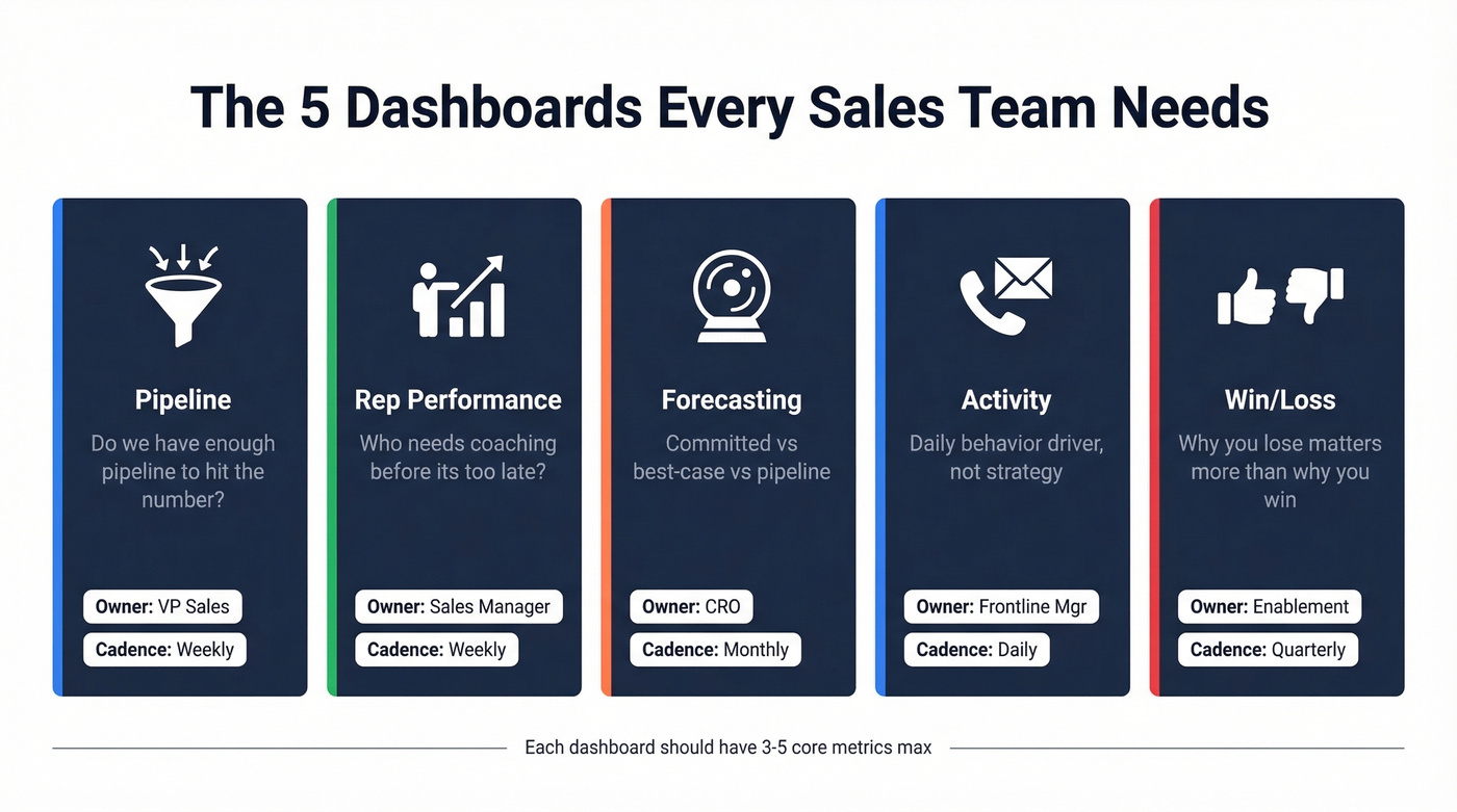
Rep Performance Dashboard
Individual and team performance, side by side. Quota attainment, win rate, average deal size, and activity-to-outcome ratios. Sales managers live here - it's how they know who needs coaching before it's too late. Consistent sales team performance reporting at this level is what separates managers who react from managers who anticipate. Review weekly or biweekly.
Forecasting Dashboard
The hardest one to get right. Track committed vs. best-case vs. pipeline, weighted pipeline value, and forecast accuracy over time. AI-assisted forecasting tools are improving accuracy by 10-20%, but only 9% of companies hit accurate forecasts today. If yours is consistently off by 15%+, the dashboard isn't broken - your stage definitions are. CRO or VP Sales owns it, reviewed monthly.
Activity Dashboard
This is the dashboard you put on a TV screen in the sales pit. Calls made, emails sent, meetings booked, response times. It drives daily behavior, not strategic decisions. Frontline managers own it.
Win/Loss Dashboard
The one most teams skip and shouldn't. Win rate by segment, loss reasons, competitive win/loss, average sales cycle length. With B2B deals now averaging 8.4 stakeholders per buying decision, understanding why you lose matters more than ever. If 40% of your losses are "no decision," your qualification is broken - not your close rate. Sales leadership and enablement share ownership, reviewed monthly or quarterly.
KPI Benchmarks for Your Dashboards
Before you pick metrics, know what good looks like. Here's a consolidated benchmark table based on current B2B sales data and 2026 KPI benchmarks:
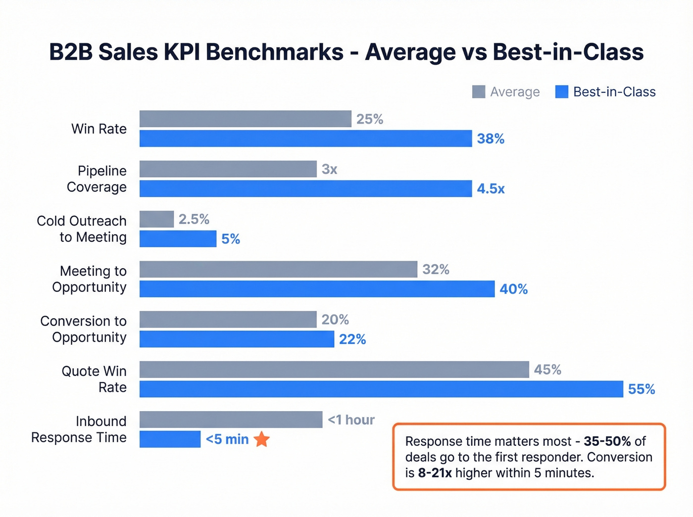
| Metric | Average | Best-in-Class |
|---|---|---|
| Win rate | 20-30% | 35-40%+ |
| Pipeline coverage | 3x | 4-5x |
| Cold outreach to meeting | 2-3% | 5%+ |
| Meeting to opportunity | 25-40% | 40%+ |
| Conversion to opportunity | 20% | 22%+ |
| Quote win rate | 35-55% | 55%+ |
| Inbound response time | <1 hour | <5 minutes |
The response time stat deserves its own callout: 35-50% of deals go to the first responder, and conversion is 8-21x higher when you respond within five minutes. If your activity dashboard doesn't surface response time, you're leaving money on the table.
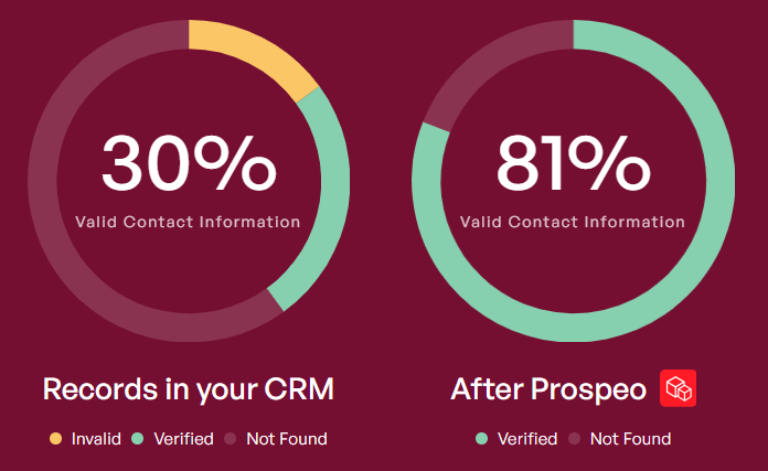
Dashboards don't fix bad data - they expose it. If your pipeline metrics look off, stale contacts and bounced emails are the likely culprit. Prospeo enriches your CRM with 98% accurate emails, 125M+ verified mobiles, and 50+ data points per contact - refreshed every 7 days, not every 6 weeks.
Clean inputs make every dashboard metric trustworthy.
Designing Dashboards That Get Used
The 5-second test is the only design rule that matters: if someone can't grasp the key insight within five seconds, the dashboard gets ignored. Everything else flows from that principle.
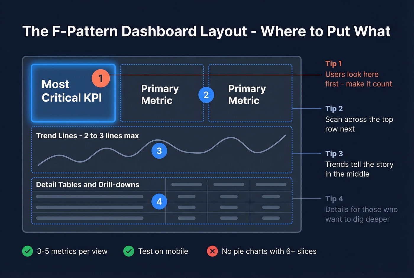
Layout follows the F-pattern. Users scan top-left first, then across the top row, then down the left side. Put your most critical KPI in the top-left position. Primary metrics go across the top. Trend lines sit in the middle. Detail tables live at the bottom.
Chart selection matters more than aesthetics. Metric cards for single-number KPIs. Line charts for time series - but limit to two or three lines. Bar charts for category comparisons, always sorted descending. Avoid pie charts with more than six slices; a treemap communicates the same thing without the visual noise.
Use a three-tier color system. Reserve semantic colors (green, yellow, red) for status indicators only. Use a separate palette for data series. Keep UI elements neutral. When everything is color-coded, nothing stands out. Stick to three to five metrics per view - more than that and you're building a report, not a dashboard.
And test every dashboard on mobile. If your field reps can't read it on a phone, it won't get used.
Reporting Mistakes That Kill Adoption
One dashboard for all audiences. Mixing daily operational metrics with quarterly board-level KPIs guarantees nobody finds what they need. Split by cadence and role. One company that did this cut weekly ops meeting time by 60% because the dashboard answered questions before the meeting started.
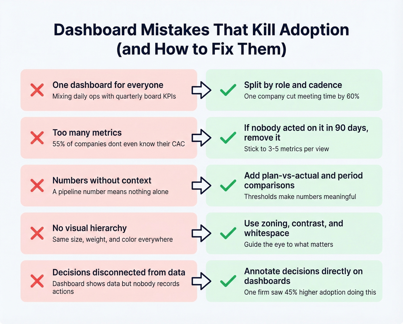
Too many metrics. Legacy KPIs accumulate like barnacles. 55% of companies don't know their customer acquisition cost - yet they're tracking 15 dashboard metrics. If nobody's acted on a metric in 90 days, remove it.
Numbers without context. A pipeline number means nothing without a target. Add plan-vs-actual deltas, period-over-period comparisons, and threshold indicators.
No visual hierarchy. When every element has the same size, weight, and color, the dashboard becomes a wall of noise. Use zoning, contrast, and whitespace to guide the eye. The r/PowerBI thread on sales analytics dashboards reinforces the same idea - builders who prioritize "simple and clean" designs get better adoption.
Decisions disconnected from dashboards. The dashboard shows the data, but nobody records what they did about it. Annotating decisions directly on dashboards - "moved $200K deal to next quarter, reason: budget freeze" - increased adoption 45% and shortened decision cycles 22% at one construction firm that tested it. We've seen this pattern repeatedly: the teams that treat dashboards as decision logs, not just data displays, are the ones that actually keep using them.
How to Automate Sales Reporting
Here's the thing: most dashboard projects fail before a single chart is built. Teams spend weeks debating chart types and color palettes while their CRM rots underneath. 84% of data and analytics leaders say their analytics outputs are only as good as the inputs. And 19% of company data is flat-out inaccessible. Meanwhile, 68% of reps say data input is their most time-consuming task - which means they're cutting corners, and your CRM is decaying in real time.
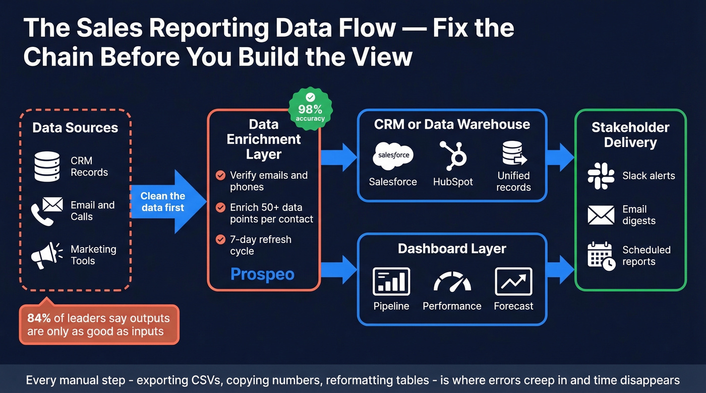
The fix starts with a commitment to automate wherever possible. Every manual step - exporting CSVs, copying numbers into slides, reformatting tables - is a place where errors creep in and time disappears. Automated reports that pull directly from your CRM and deliver to Slack or email on a schedule eliminate an entire class of mistakes. Teams that invest in this kind of reporting automation consistently report faster review cycles and fewer "wait, that number looks wrong" derailments in pipeline meetings.
Now picture this: your forecasting dashboard says you're at 95% of quota. But half the contacts in your pipeline have changed jobs, a quarter of the email addresses bounce, and the phone numbers haven't been verified in months. That forecast is fiction.
Before worrying about chart types, map your data flow: data sources, warehouse or CRM, dashboard, scheduled delivery to stakeholders. If any link in that chain is broken - especially the first one - no amount of visualization will save you.
This is where Prospeo fits into the stack. It's not a dashboard tool - it's the data quality layer underneath. Prospeo enriches CRM contacts with 98% verified email accuracy on a 7-day refresh cycle, returning 50+ data points per contact and integrating natively with Salesforce and HubSpot. Snyk's sales team saw their bounce rate drop from 35-40% to under 5% after plugging it into their workflow, which meant their pipeline dashboards finally reflected reality instead of wishful thinking.
Before you spend a week designing the perfect dashboard, spend an hour fixing the data feeding it.
That win/loss dashboard showing 40% "no decision" losses? It often means reps are reaching the wrong contacts with stale data. Prospeo's 30+ filters - buyer intent, job changes, headcount growth - ensure your pipeline is filled with real, reachable decision-makers at $0.01 per verified email.
Stop reporting on dead leads. Start with verified ones.
Best Dashboard Tools Compared
| Tool | Category | Starting Price | Best For |
|---|---|---|---|
| Power BI | BI / analytics | $10/user/mo (Pro) | Data-heavy orgs, custom viz |
| Tableau | BI / analytics | ~$15/user/mo (Viewer) | Advanced analytics, large datasets |
| HubSpot Sales Hub | CRM-native | $9/seat (Starter, annual) | Mid-market HubSpot shops |
| Salesforce Sales Cloud | CRM-native | From $25/user/mo | Enterprise Salesforce orgs |
| Google Sheets + connector | Spreadsheet | Free + ~$0-50/mo add-on | Teams under 20 reps |
| Geckoboard | Real-time display | ~$39-49/mo | TV dashboards, live metrics |
| Salesflare | Lightweight CRM | ~$29-35/user/mo | Small teams, auto-tracking |
| Pipedrive | Lightweight CRM | ~$14/user/mo | SMB, visual pipeline |
Power BI is the right choice if your org lives in the Microsoft ecosystem and you need custom visualizations beyond what your CRM offers. At $10/user/month for Pro, it's absurdly cheap for the analytical depth. The tradeoff is setup time - expect a week or two of data modeling before your first useful dashboard goes live.
Tableau is the gold standard for complex data exploration, with Viewer licenses around $15/user/month and Creator licenses running higher. If your team has a dedicated analyst, Tableau will outperform Power BI on advanced visualizations. If you don't have that analyst, skip it.
HubSpot Sales Hub is the path of least resistance for HubSpot teams. Starter at $9/seat gets basic reporting, but the dashboards worth building require Professional at roughly $90-100/user/month plus $1,500 onboarding. Since everything lives in HubSpot already, there's no data sync to configure.
Salesforce Sales Cloud starts from $25/user/month at the entry tier. If you're already a Salesforce shop, building dashboards outside of it creates a data sync headache that isn't worth the trouble. The native reports are better than most teams realize.
Let's be honest about something: Google Sheets dashboards are underrated for teams under 20 reps. Pair Sheets with a connector like Coefficient or Coupler.io to auto-pull CRM data, and you've got a self-updating dashboard for essentially free. It won't scale to 100 reps, but it'll outperform a fancy BI tool that nobody configures properly. In our experience, the teams that start with Sheets and graduate to Power BI or Tableau when they outgrow it end up with better dashboards than teams that buy enterprise tools on day one.
Geckoboard does one thing well: real-time TV dashboards for the sales floor. Salesflare and Pipedrive both include decent built-in dashboards for small teams that don't need a separate BI layer.
FAQ
What metrics should a sales dashboard include?
Start with three to five per view: pipeline value, win rate, activity volume, conversion rate, and forecast accuracy. These cover 80% of decision-making for most B2B teams. Add response time if inbound is a significant channel - sub-5-minute response lifts conversion 8-21x.
How often should reporting dashboards update?
Operational dashboards should refresh in real time or daily. Strategic views update weekly. Executive summaries monthly. Match the refresh frequency to the decision cadence - if nobody acts on daily data, weekly is fine.
Can I build a useful dashboard in Google Sheets?
Yes - for teams under 20 reps, pair Sheets with a CRM connector like Coefficient or Coupler.io to auto-populate Salesforce or HubSpot data. It's free, flexible, and outperforms misconfigured enterprise BI tools.
How do I fix stale data in my sales dashboard?
Automate CRM enrichment so contact records stay current. A 7-day refresh cycle with verified data points per contact - compared to the 6-week industry average - makes a dramatic difference. Clean inputs are the prerequisite for trustworthy dashboards.
What's the difference between a dashboard and a report?
A dashboard is a live visual snapshot designed for quick, at-a-glance decisions. A report is a detailed, point-in-time document built for deeper analysis. Dashboards answer "what's happening now"; reports answer "what happened and why."