How to Work With Sales Data in Excel - From Messy Export to Finished Dashboard
Last day of the month. You've got 3,000 rows of sales data in Excel, half the cells are merged, there are blank rows where someone inserted subtotals, and your director needs a dashboard by 4 PM. You've been manually filtering and summing columns for six months - every month it takes two hours, and every month you swear you'll build something better.
Let's actually do that.
What You Need (Quick Version)
Five moves cover 90% of the work when handling sales data in Excel:
- Ctrl+T to convert your range into a proper Excel Table. This single step fixes half your downstream problems.
- Pivot tables for summarizing revenue by rep, region, product, or time period. If you learn one Excel feature, make it this one.
- Power Query (Data tab -> Get & Transform) for cleaning messy exports - fill blanks, remove subtotal rows, unpivot columns. Repeatable, refreshable.
- Conditional formatting color scales to spot highs and lows across large tables without squinting.
- SUMIFS for targeted aggregation when you need a specific slice that a pivot table makes awkward.
Everything below expands on these five. Whether you're building a small business sales tracking spreadsheet or managing enterprise-level reporting, these fundamentals apply.
How to Structure Your Spreadsheet
The number one reason sales analysis breaks in Excel isn't bad formulas - it's bad structure. Your data needs to be a flat table before anything else works.
"Flat" means each row is one transaction, each column is one attribute (date, product, region, amount), and there's exactly one header row with unique column names. No blank rows. No merged cells. No subtotals embedded in the data range. This structure is what separates a reliable Excel sales tracker from a fragile mess that breaks every reporting cycle.
A few rules that sound obvious but get violated constantly: numeric columns must contain numbers, not text. Date columns must be real dates, not strings like "March 2026." Zeros and blanks aren't interchangeable - a blank cell gets excluded from averages, while a zero gets included. If a rep made zero sales in a region, enter zero.
The fastest structural fix you can make right now: select your data, press Ctrl+T, confirm the header row, and name the table Sales_Data. Structured references, automatic expansion, pivot table compatibility - all from one shortcut.
Mistakes That Break Your Analysis
These seven errors show up in almost every sales spreadsheet we've audited. Each one silently corrupts your results.
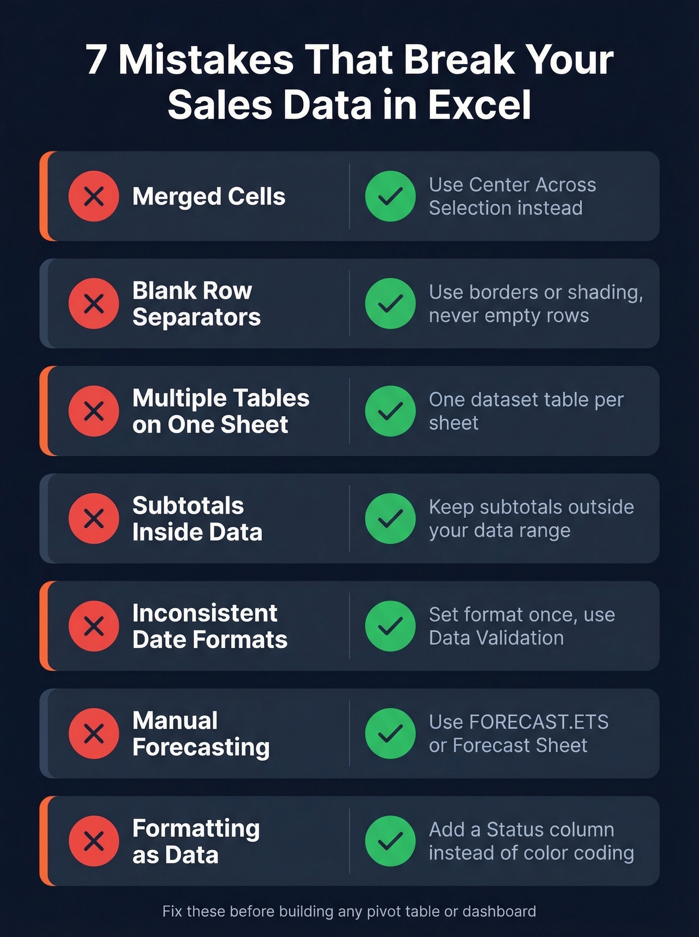
Merged cells. They break sorting, filtering, and pivot tables. Use Center Across Selection instead - same visual effect, zero structural damage.
Blank rows as separators. They distort filters and pivot table ranges. Use borders or shading, never empty rows.
Multiple tables on one sheet. Anything in the same row gets interpreted as one observation. Keep one primary dataset table per sheet.
Subtotals inside data ranges. Your SUM will double-count. Your pivot table will treat subtotal rows as data.
Inconsistent date formats. "3/15/2026" and "March 15, 2026" in the same column will produce sorting nightmares. Set the format once and use Data Validation.
Manual forecasting. Copy-pasting last month's numbers and adjusting by gut feel is untraceable. Use FORECAST.ETS or Insert -> Forecast Sheet - even a basic 12-month sales forecast template built with these functions is more defensible than gut-adjusted numbers.
Formatting as data. Highlighting cells yellow to mean "pending" instead of adding a Status column. Pivot tables can't group by "yellow." This one is a perennial complaint on r/excel - people using color as a data field and then wondering why nothing filters correctly.
Free Sample Datasets to Practice
You need practice data before you build anything real. A good sales spreadsheet example helps you learn techniques without risking your live data.
| Dataset | Rows | Columns | Best For | Access |
|---|---|---|---|---|
| Contextures Food Sales | 244 | 9 | Learning pivots + SUMIFS | Direct download |
| ExcelX Sales & Retail Workbooks | 5 workbooks (500-2,000 rows each) | Varies | Realistic multi-file practice | Direct download, no sign-up |
| Kaggle Sample Sales | ~2-3k | Varies | Segmentation + clustering | Requires free Kaggle account |
| Microsoft Financial Sample (Excel workbook) | - | - | Dashboard building | Direct download |
You need 500+ rows to see real patterns. The Contextures dataset at 244 rows is perfect for learning formula mechanics, but grab a larger one when you want to simulate actual monthly reporting. Small datasets teach technique; larger ones teach you what breaks at scale.
Try this now: Download the Contextures dataset and build a pivot table showing revenue by region. Add a slicer for Category. Time yourself - it should take under 3 minutes. If it takes longer, the pivot table section below is where you'll get the most value.
Analysis Techniques That Matter
Pivot Tables
Drag Category into Rows, Region into Columns, and TotalPrice into Values. You've just summarized thousands of transactions into a readable matrix in about four seconds. Using the Contextures dataset, this gives you revenue by food category across regions - swap in Qty, add date grouping, or filter by city without touching a formula.
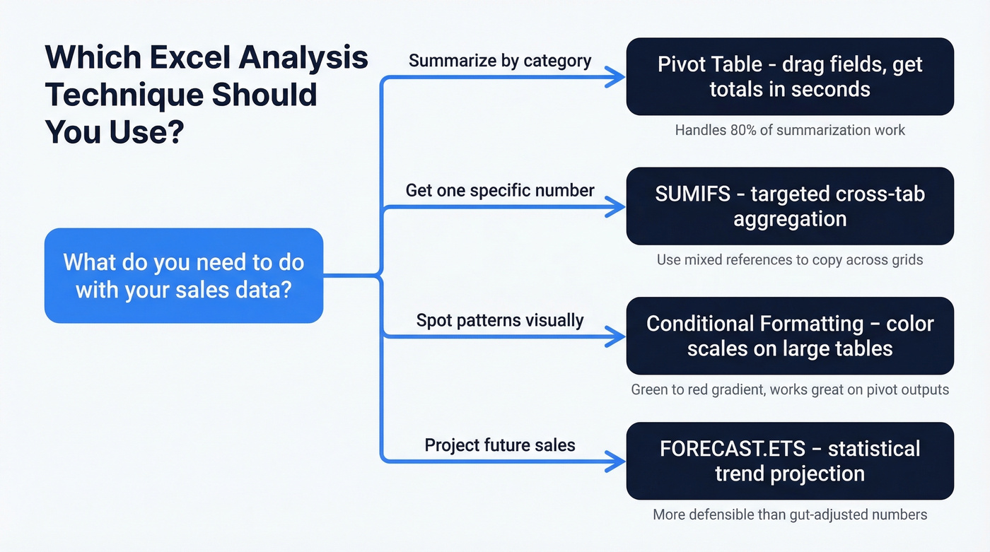
Here's the thing: if you learn one skill from this entire article, make it pivot tables. They handle 80% of the summarization work that people do with SUMIFS, VLOOKUP chains, and manual filtering.
SUMIFS, SUMPRODUCT, and XLOOKUP
When you need a specific cross-tabulated value in a fixed report layout, SUMIFS is your formula:
=SUMIFS(Sales_Data[Qty], Sales_Data[Category],$B5, Sales_Data[Region],C$4)
The mixed references let you copy the formula across a grid. For weighted averages - average unit price weighted by quantity - use SUMPRODUCT: =SUMPRODUCT(A1:A10,B1:B10)/SUM(B1:B10). This kind of formula is the backbone of any sales math template. Once you build the grid, you reuse it month after month.
When you need to pull product details or rep info from a lookup table, XLOOKUP replaces the old VLOOKUP entirely: =XLOOKUP(A2, Products[SKU], Products[Name]). It searches any direction, handles errors gracefully, and doesn't break when you insert columns.
Practice prompt: Using the Kaggle dataset, write a SUMIFS formula that returns total revenue for the "Ships" product line in Q4. Then verify it against a pivot table. The numbers should match exactly - if they don't, you've got a data type issue.
Conditional Formatting Heat Maps
Select your data range, go to Home -> Conditional Formatting -> Color Scales, and pick a green-to-red gradient. Large tables become instantly scannable - your eye goes straight to the darkest greens and deepest reds. This works especially well on pivot table outputs where you're comparing dozens of reps or products.
Trend Charts and Dynamic Arrays
Select your monthly revenue column, insert a line chart, and you've got a visual trend. This assumes you've already aggregated monthly totals via a pivot table or SUMIFS grid.
In Microsoft 365, dynamic array functions like SORT, FILTER, and UNIQUE let you reshape data without helper sheets. =UNIQUE(Sales_Data[Region]) gives you a clean region list; =FILTER(Sales_Data, Sales_Data[Region]="West") pulls a subset automatically. For competitive analysis, overlay your own product data against competitor benchmarks on the same time-series chart - even rough estimates plotted alongside your actuals reveal whether you're gaining or losing ground, and that's the kind of chart that gets budget approved.
Scenario Analysis and Forecasting
Go to Data -> What-If Analysis -> Scenario Manager to model "what if we raise prices 10%?" or "what if volume drops 15%?" For target-based analysis - "what price do we need to hit $500K revenue?" - use Goal Seek. It reverse-engineers the input from your desired output.
For longer-horizon planning, build a quarterly sales forecast template using FORECAST.ETS on your historical data. Group your actuals by quarter, apply the function, and you get a statistically grounded projection that's far more defensible than manual estimates.
You're spending hours cleaning messy sales data in Excel. What if the data was clean before it hit your spreadsheet? Prospeo exports 300M+ verified contacts with 50+ data points per record - no blank fields, no duplicates, no formatting nightmares.
Start with clean data and skip the Power Query cleanup entirely.
Clean Messy Exports With Power Query
Fix a Single Export
Most CRM and ERP exports arrive in "report layout" - merged cells, embedded subtotals, dates spread across columns. Power Query fixes this without manual editing.
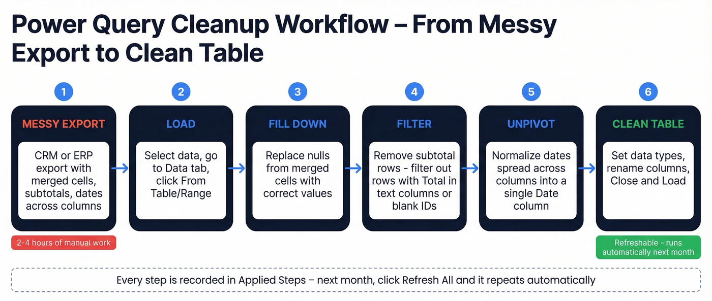
Select your data, go to Data -> From Table/Range, and you're in the Power Query editor. Use Fill Down to replace the nulls that merged cells created. Filter out subtotal rows - they typically have "Total" in a text column or a blank ID. If dates are spread across columns, use Unpivot Other Columns to normalize them into a single Date column. Set data types, rename columns, and click Close & Load.
In our experience, this saves 2-4 hours per monthly reporting cycle. Every step is recorded in the Applied Steps pane - next month, the same transformations run automatically on your new export.
Automate With Folder Combine
Here's the real automation endgame. Go to Data -> Get Data -> From Folder, point it at a folder where you drop monthly exports. Power Query combines every file, applies your transformations, and loads the result.
Next month? Drop the new CSV into the folder, click Refresh All, and every table and chart downstream updates. No copy-pasting between workbooks. The only requirement is consistent column structure across exports. If your exports change format frequently, skip this approach and stick with single-file Power Query until your data source stabilizes.
Build a Sales Dashboard
A solid sales dashboard has four components: KPI cards at the top showing total revenue, average order value, and customer count; a line chart showing MoM revenue trend; a bar chart breaking down performance by product or region; and slicers for filtering by date range or category.
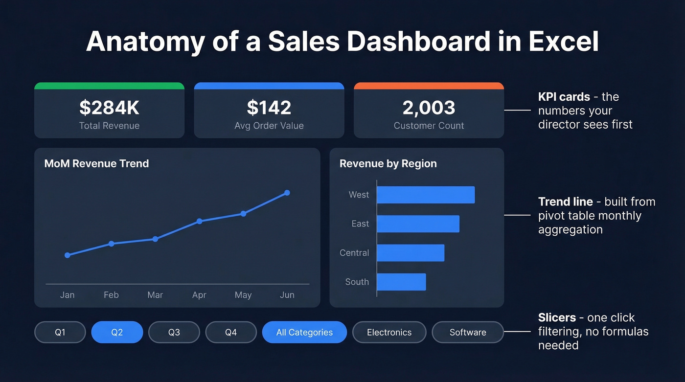
The part every YouTube tutorial skips is data prep. If your underlying table isn't structured correctly, your pivot charts break the moment you add new data. We covered that first for a reason.
Before/After Event Analysis
Comparing sales performance around a specific event - a price change, product launch, new territory - is a common pain point on r/excel. The trick: add a calculated "relative month" column. If an event happened in March, month -2 is January, month +1 is April. This normalizes time windows across events with different dates, so you can compare impact consistently instead of manually adjusting sum ranges every update.
Connect your dashboard charts to pivot tables, add slicers via Insert -> Slicer, and link multiple pivots to the same slicer for synchronized filtering. The result is an interactive report that updates with a single Refresh All click.
That dashboard your director needed by 4 PM? With this workflow, it takes 20 minutes next month.
Report Templates - What to Track
Not every stakeholder needs the same report. Your CEO wants three charts on one page. Your sales director wants quota attainment by rep. Build separate views.
| Report Type | Cadence | Key Metrics | Audience |
|---|---|---|---|
| Daily KPIs | Daily | Revenue, AOV, customer count | Reps |
| Activity Report | Weekly | Calls, leads, deals, revenue vs goal | Sales director |
| Monthly Sales Tracker | Monthly | Conversion rate, pipeline by stage, revenue by rep | VP / director |
| Annual Review | Yearly | Quarterly growth by product/region, estimated vs actual | CEO |
A monthly sales tracker Excel template is one of the most requested downloads on sites like Smartsheet and Vertex42 - and for good reason. It gives you a repeatable cadence for reviewing pipeline health without rebuilding from scratch. But the metrics matter more than the template. Tailor what you track to who's reading it. Dumping raw data on executives is how you lose budget for the tools you actually need.
Consider pairing your reporting templates with a sales process flow chart so reps can see where each deal sits in the pipeline alongside the numbers. Visual context makes the data actionable rather than just informational.
Excel vs Google Sheets
If your average deal size is under $10K and your team is fewer than five reps, Google Sheets is probably fine. For everyone else, Excel is the only serious option for analyzing sales figures at scale.
| Feature | Excel | Google Sheets | Edge |
|---|---|---|---|
| Row capacity | 1M+ rows per sheet | 10M cells/workbook | Excel |
| Power Query / Power Pivot | Yes | No | Excel |
| Real-time collaboration | Limited (web version) | Native strength | Sheets |
| Offline performance | Excellent | Weak | Excel |
| Advanced modeling (DAX) | Yes | No | Excel |
| Scripting/automation | VBA + Power Automate | Apps Script + BigQuery | Sheets (Google ecosystem) |
Google Sheets has legitimate strengths beyond collaboration - Apps Script is genuinely powerful for automating workflows within the Google ecosystem, and BigQuery Connected Sheets handles massive datasets. But once you're past a few thousand rows with pivot tables, SUMIFS, and conditional formatting, Sheets starts lagging noticeably. Power Query and Power Pivot don't exist in Sheets at all - and those are the features that turn Excel from a spreadsheet into an actual analysis platform.
For monthly reporting, dashboards, scenario modeling, and cleaning messy exports - Excel wins and it isn't close.
From Sales Insights to Pipeline
You've built the dashboard. You know which segments convert best, which regions are growing, which products carry the highest margins. Now what?
If you're turning those insights into outbound segments, it helps to standardize your lead scoring and keep your lead status definitions consistent across reps.
Your pivot tables and SUMIFS are only as good as the data feeding them. Prospeo refreshes every 7 days - not 6 weeks - so your Excel dashboards reflect reality, not last quarter's stale contacts. At $0.01 per verified email, it costs less than the hours you burn fixing bad exports.
Feed your spreadsheets data that doesn't need fixing.
FAQ
How do I analyze sales data in Excel?
Structure your data as a flat table with Ctrl+T, build pivot tables for summarization, use SUMIFS for targeted slices, and add conditional formatting to spot patterns visually. Power Query handles the cleaning step if your exports arrive messy.
How many rows can Excel handle?
Excel supports 1,048,576 rows per worksheet. For larger datasets, Power Query can process millions of rows by loading to the Data Model - you query it through pivot tables without hitting the sheet limit.
What's the best chart type for sales trends?
Line charts for time-series trends like MoM or QoQ revenue. Clustered bar charts for comparing categories. Combo charts when you need both - revenue bars with a margin-percentage line overlaid.
How do I automate monthly reports?
Use Power Query with folder combine. Point it at a folder, build your transformations once. Each month, drop the new export into the folder, click Refresh All, and every table and chart updates automatically. Pair this with a monthly sales tracker template so your output format stays consistent.
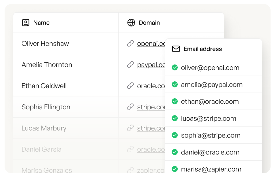
What's the fastest way to get contact data for segments I've identified?
Upload a CSV of target companies to a B2B data platform like Prospeo and get verified emails and direct dials back. The free tier includes 75 emails per month - enough to test outreach into your top-performing segments before committing budget.