Sales Data Visualization: Build Dashboards That Actually Get Used
It's Monday morning. Your VP of Sales opens Salesforce, stares at a dashboard with 23 widgets, exports the pipeline to a spreadsheet, and builds their own version in Google Sheets.
Sound familiar? That dashboard took your RevOps team two weeks to build, and nobody trusts it. Meanwhile, 70% of B2B reps missed quota in recent years. The sales data visualization isn't the problem - it's what you're visualizing, who you're building it for, and whether the underlying data is any good.
Here's the thing: most teams don't need better charts. They need fewer charts, cleaner data, and dashboards built for a specific person - not the entire org.
The Short Version
- Track 5-7 KPIs max. Teams that do hit 91% quota attainment vs. 73% for teams tracking 0-3 metrics.
- Build role-specific dashboards, not one mega-dashboard. A rep and a CRO need completely different views.
- Fix your CRM data first. Dashboards built on stale contacts aren't analytics - they're decoration.
What Sales Data Visualization Actually Is
Sales data visualization turns raw CRM, pipeline, and activity data into charts and dashboards that help sellers and leaders make faster decisions. But the only thing that actually matters is whether it changes behavior. Data-driven B2B sales engines produce 15-25% EBITDA increases, and 64% of B2B companies are increasing their predictive analytics investment right now. The gap between "having dashboards" and "using data to sell better" is where most teams get stuck.
Dashboard Types by Role
One dashboard for the entire sales org is what Tableau's own documentation calls a "recipe for confusion and low adoption." Let's break down what each role actually needs.
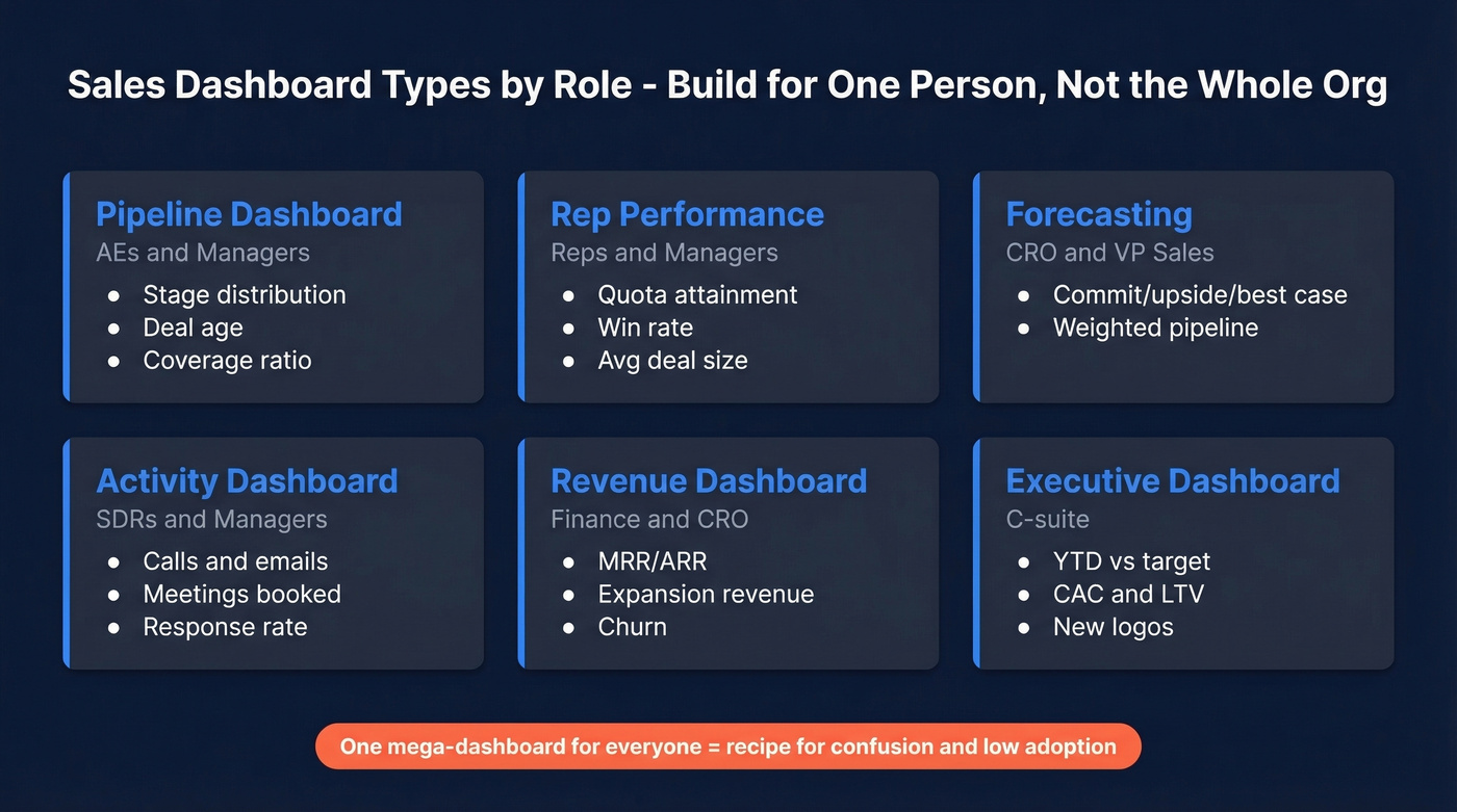
| Dashboard | Audience | Key KPIs |
|---|---|---|
| Pipeline | AEs, Managers | Stage distribution, deal age, coverage ratio |
| Rep Performance | Reps, Managers | Quota attainment, win rate, avg deal size |
| Forecasting | CRO, VP Sales | Commit/upside/best case, weighted pipeline |
| Activity | SDRs, Managers | Calls, emails, meetings booked, response rate |
| Revenue | Finance, CRO | MRR/ARR, expansion revenue, churn |
| Executive | C-suite | YTD vs target, CAC, LTV, new logos |
Before you build any of these, run every widget through the 4-Question Insight Test:
4-Question Insight Test: (1) Is this good or bad? (2) How good or bad? (3) Why? (4) What do we do about it? If a chart can't answer at least the first two, cut it.
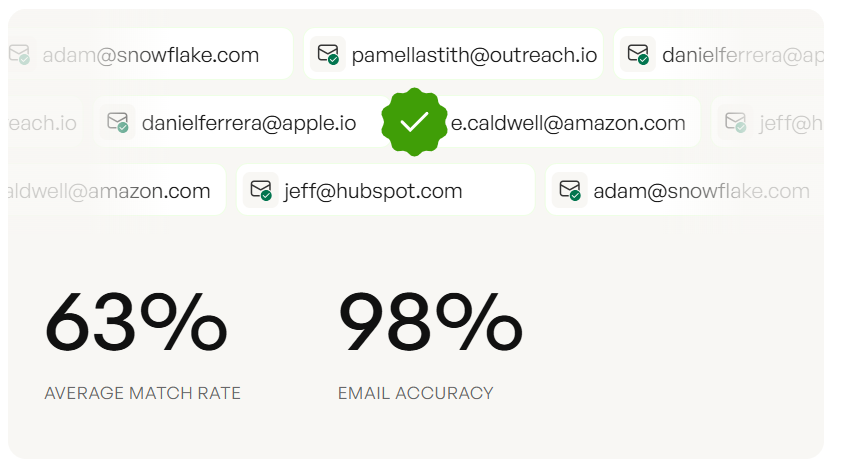
Every dashboard mistake on this list traces back to one root cause: stale CRM data. Prospeo enriches your pipeline with 50+ data points per contact, refreshed every 7 days - not the 6-week industry average. 83% of leads come back with verified contact data at 98% email accuracy.
Stop decorating dashboards with dead data. Enrich your CRM first.
KPIs That Move Revenue
Not all metrics deserve dashboard real estate. These five correlate directly with revenue growth, and we've found they're the only ones most teams need to start with.
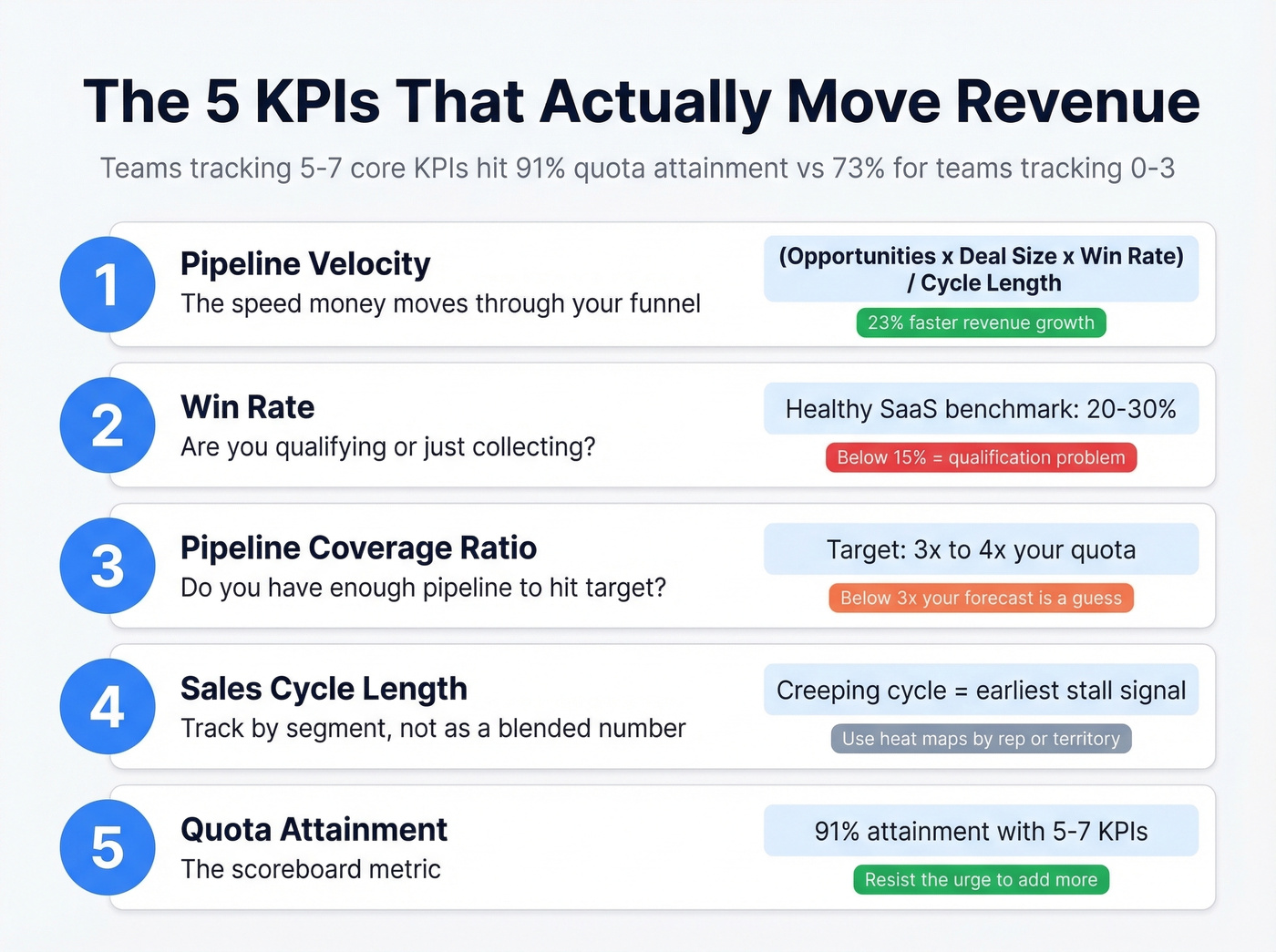
Pipeline Velocity = (# Opportunities x Avg Deal Size x Win Rate) / Sales Cycle Length. 68% of teams don't track it. That's wild, because teams that focus on pipeline velocity see 23% faster revenue growth than teams tracking only pipeline value.
Win Rate - healthy SaaS benchmark is 20-30%. Below 15%, you've got a qualification problem, not a closing problem. Stop blaming your closers and look upstream at discovery.
Pipeline Coverage Ratio - 3x to 4x your target. Below 3x, your forecast is a guess. And 55% of sales leaders say inaccurate forecasting costs them revenue targets every quarter. AI-assisted forecasting tools like Salesforce Einstein can improve accuracy by 20-50%, but they still need clean pipeline data to work with.
Sales Cycle Length - track by segment and deal size, not as a single blended number. A creeping cycle is the earliest signal of a stalling pipeline. Sales heat maps that color-code cycle length by rep or territory make slowdowns visible at a glance.
Quota Attainment - the scoreboard metric. Teams tracking 5-7 core KPIs achieve 91% quota attainment vs. 73% for those tracking 0-3. Start with these five and resist the urge to add more.
Mistakes That Kill Adoption
Ask any RevOps team what kills dashboard adoption and you'll hear the same answer: nobody trusts the data. Here are the specific ways that happens.
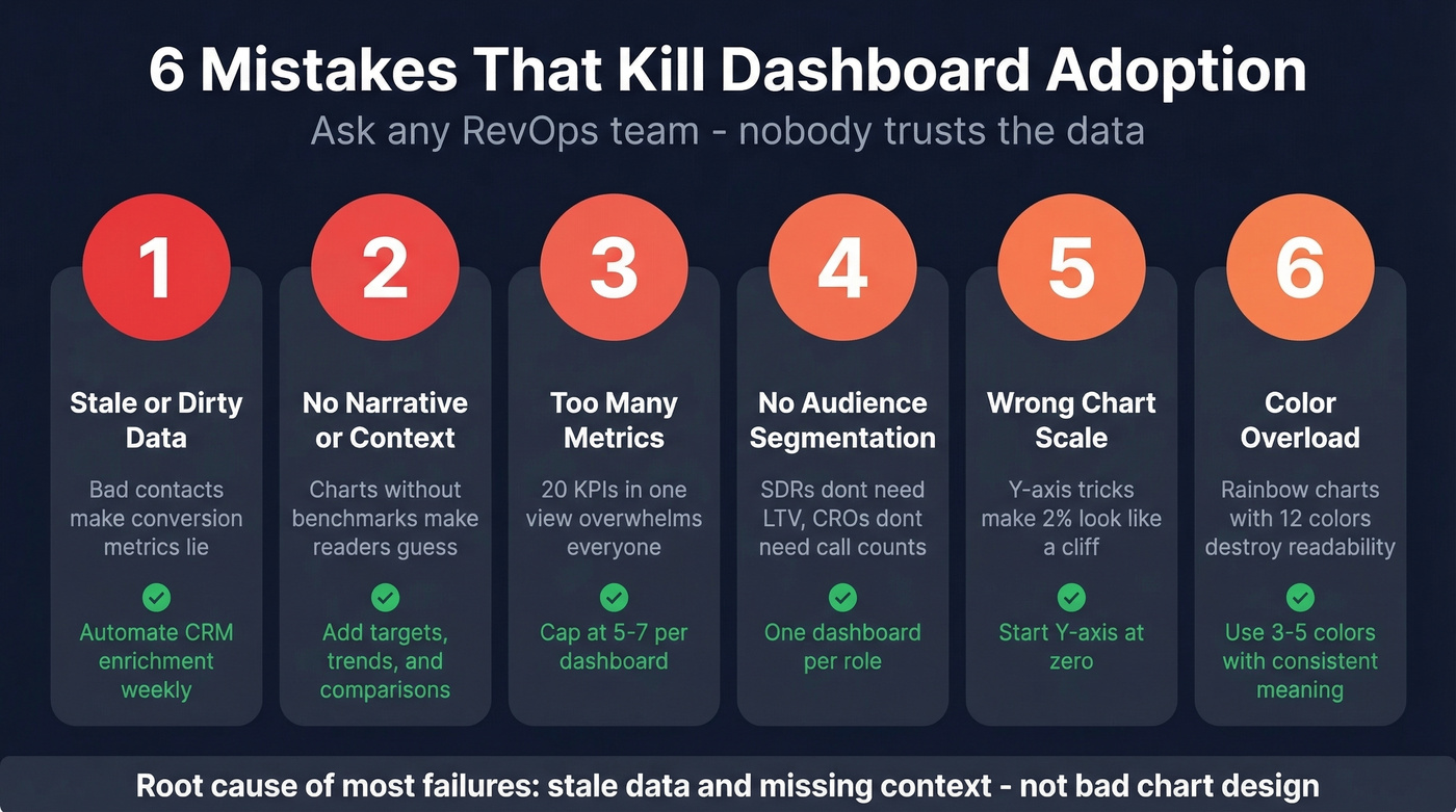
| Mistake | What Goes Wrong | One-Line Fix |
|---|---|---|
| Wrong chart scale | Y-axis starting at 900 makes a 2% change look like a cliff | Start at zero unless you have a very good reason not to |
| Too many metrics | 20 KPIs in one view overwhelms everyone | 5-7 per dashboard, max |
| No audience segmentation | SDRs don't need LTV charts; CROs don't need daily call counts | One dashboard per role |
| Color overload | Rainbow charts with 12 colors destroy readability | Stick to 3-5 colors with consistent meaning |
| Stale or dirty data | Bad contact data makes conversion metrics lie | Automate data enrichment on a weekly refresh cycle |
| No narrative | A chart without context makes the reader work for the insight | Add benchmarks, targets, and trend arrows |
In our experience, the last two - stale data and missing context - cause more abandoned dashboards than bad chart design ever will. We've watched teams spend weeks perfecting Tableau layouts only to have reps ignore them because the underlying contact data was six months old and everyone knew it.
Best Tools for Visualizing Sales Data
Our pick for most teams: Looker Studio. It's free, handles 80% of sales reporting needs, and lives in the Google ecosystem most teams already use.
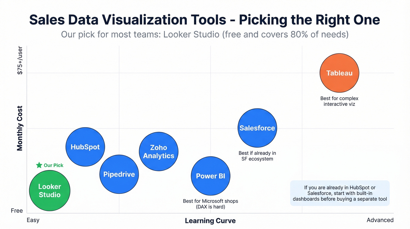
| Tool | Best For | Starting Price | Learning Curve |
|---|---|---|---|
| Power BI | Microsoft shops | $10/user/mo (Pro) | Easy (DAX is hard) |
| Looker Studio | Budget teams | Free | Easy |
| Tableau | Advanced viz | $15-$75/user/mo | Moderate |
| HubSpot | CRM-native | Free; paid from $20/user/mo | Easy |
| Salesforce | SF ecosystem | From $25/user/mo | Moderate |
| Zoho Analytics | SMBs | From $24/mo | Easy |
| Pipedrive | Small teams | From $14/user/mo | Easy |
Power BI is the right call if your company runs on Microsoft 365 - the Excel-to-dashboard workflow works natively and it doubles as a business intelligence platform when connected to your CRM and marketing data. Tableau wins when you need complex, interactive visualizations beyond standard bar-and-line charts. Skip Tableau if your team is small and non-technical; the learning curve isn't worth it for basic pipeline reporting.
For teams already in HubSpot or Salesforce, start with the built-in dashboards before buying a separate tool. They're good enough for 80% of use cases, and you avoid the data sync headaches that come with piping CRM data into a third-party platform.
Why Dashboards Fail Without Clean Data
Most visualization guides skip this entirely, and it drives us crazy: you don't have a visualization problem - you have a data quality problem.
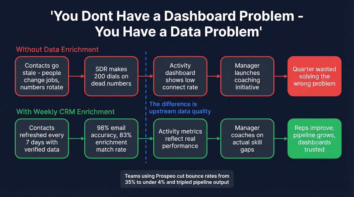
People change jobs, phone numbers rotate, companies rebrand. An SDR making 200 dials on a list full of dead numbers looks like an underperformer on the activity dashboard. The real problem is upstream data rot, and no amount of chart formatting fixes that. Prospeo addresses this with 98% email accuracy, an 83% enrichment match rate, and a 7-day data refresh cycle compared to the six-week industry average. Every chart, forecast, and pipeline metric downstream is only as reliable as the contact data underneath it.
Here's a scenario we see constantly: a sales manager notices win rates dropping on the dashboard, launches a coaching initiative, and spends a quarter retraining reps on discovery calls. The actual cause? Half the "opportunities" in the pipeline were contacts who'd left their companies months ago. The dashboard was telling a true story about false data.
Pipeline velocity, win rate, coverage ratio - none of these KPIs tell the truth when 35% of your contacts bounce. Teams using Prospeo cut bounce rates from 35% to under 4% and tripled pipeline output. Clean data isn't a nice-to-have; it's what makes your dashboards trustworthy.
Accurate dashboards start at $0.01 per verified email.
FAQ
How many KPIs should a sales dashboard track?
Five to seven per dashboard. Teams in that range hit 91% quota attainment versus 73% for teams tracking 0-3 metrics. Start with pipeline velocity, win rate, coverage ratio, cycle length, and quota attainment - then add only what your specific role demands.
How do I keep dashboard data accurate?
Automate CRM enrichment on a weekly refresh cycle and enforce consistent pipeline stage definitions across your team. Stale contact records are the top reason conversion and activity metrics silently drift from reality. The consensus on r/salesops is that data hygiene matters more than dashboard design - and we'd agree.