Sales Engagement Analytics: The Metrics That Actually Matter in 2026
60% of sales leaders say extracting actionable insights from engagement data is a major challenge. That's not a tooling problem - it's a framework problem. Most teams drown in dozens of metrics when they need eight, and they're still treating open rates as gospel years after Apple broke them.
A recurring question on r/sales is how to get real analytics for written channels - email sequences, DMs, async touches - when most platforms focus on call intelligence. The tooling hasn't caught up. This article fixes the framework side of that equation.
What Engagement Analytics Actually Measures
Sales engagement analytics measures how prospects interact with your outreach across every channel: email, calls, meetings, social touches, and content. It's not sales analytics broadly - that's forecasting, pipeline, revenue. This zooms in on the interaction layer. Which sequences work? Which channels connect? Where do deals stall because reps lose momentum?
At its core, you're turning raw rep actions into a clear picture of what's producing pipeline and what's just noise.
What You Need (Quick Version)
- Use a 3-tier metrics model to cut dashboard clutter. Track 6-8 metrics across outcome, lagging, and leading tiers - not 25 vanity numbers.
- Stop trusting open rates. Apple Mail Privacy Protection broke them in 2021. If you're still optimizing cadences based on opens, you're making decisions on fabricated data.
- Fix your contact data first. Engagement analytics are only as reliable as the emails and phone numbers underneath them. Bounced emails and disconnected numbers corrupt every metric downstream.
Gartner's 3 Tiers Applied to Engagement
Gartner's tiered metrics framework gives you a clean way to organize what matters:
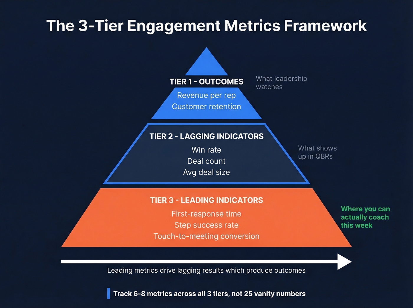
| Tier | What It Measures | Engagement Metrics |
|---|---|---|
| Tier 1 (Outcomes) | Business results | Revenue per rep, retention |
| Tier 2 (Lagging) | Deal-level results | Win rate, deal count, avg deal size |
| Tier 3 (Leading) | Rep-level activity | Response time, step success, touch-to-meeting rate |
Most teams obsess over Tier 2 - win rates and deal sizes - because those numbers feel important in QBRs. But Tier 3 is where you can actually make changes. Leading indicators like first-response time and touch-to-meeting conversion are the metrics you can coach on this week, not next quarter.
Gartner recommends testing hypotheses on these leading indicators using regression analysis or AI capabilities in your RevTech stack, then tracing them back to Tier 2 outcomes. You need fewer metrics, not more. Six to eight across all three tiers gives you signal. Twenty-five gives you a dashboard nobody opens.
You just read why bad data pollutes every engagement metric downstream. Prospeo's 7-day data refresh and 98% email accuracy mean your touch-to-meeting rates, reply rates, and pipeline coverage reflect reality - not bounces and phantom opens.
Clean data in, clean analytics out. Start free with 75 verified emails.
8 Dashboard Metrics That Drive Revenue
Here's a practical starter set, adapted from Valintry360's dashboard framework:
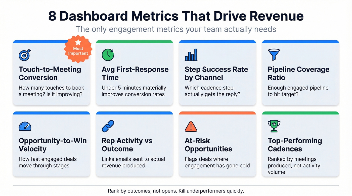
Touch-to-meeting conversion is the single most important engagement metric. It measures how many touches it takes to book a meeting and whether that number is improving over time. If you only track one thing, track this.
Average first-response time - responding within 5 minutes materially improves conversion rates. We've seen teams that measure this weekly and coach against it shave days off their cycle within a single quarter.
Step success rate by channel identifies which cadence step actually gets the reply. If email step 3 outperforms step 1, rewrite step 1 or move the phone call earlier. This is where sequence reports gets genuinely useful instead of decorative.
Pipeline coverage ratio confirms you're generating enough engaged pipeline to hit target. Opportunity-to-win velocity tracks how fast engaged opportunities move through stages. Rep activity vs. outcome correlation forces the link between "emails sent" and actual revenue - without it, you're just doing vanity reporting.
At-risk opportunities flag deals where engagement has gone cold before the rep notices. And top-performing cadences rank sequences by meetings produced, not just activity volume. Use your sequence reports to compare cadences side by side and kill underperformers quickly.
One emerging metric worth watching: video engagement tracking in sales workflows, specifically which video assets prospects actually view and how that correlates with deal progression.
The Open Rate Trap
Here's the thing: open rates are dead, and it's inexcusable that platforms still default to them as a primary metric in 2026.
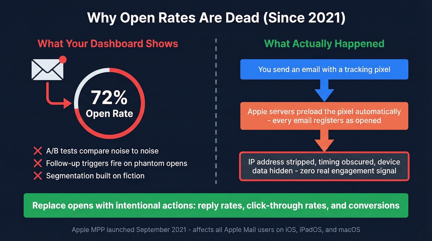
Apple Mail Privacy Protection, rolled out in 2021, preloads tracking pixels using Apple's own servers. Every email gets "opened" whether the recipient reads it or not. MPP also strips IP addresses and obscures engagement timing, device data, and geolocation - so you can't even infer engagement from metadata. Your A/B testing compares noise to noise. Your follow-up triggers fire on phantom opens. Your segmentation is built on fiction.
Replace opens with intentional actions: reply rates, click-through rates, and conversions. We've seen teams cut their "high-performing" cadence list in half once they switched from open-rate rankings to reply-rate rankings. The sequences that looked great were just getting Apple MPP inflation.
Benchmarks Worth Knowing
Let's ground this in real numbers. Outreach's Sales Data Report provides some of the best engagement benchmarks available right now. Opportunities closed within 50 days carry a 47% win rate. After 50 days, that drops to 20% or lower. That's not a gradual decline - it's a cliff.
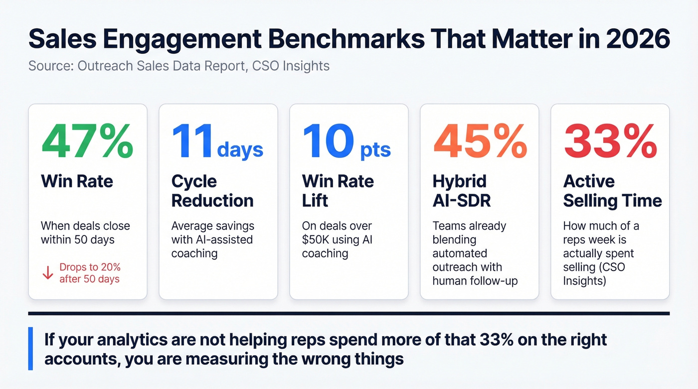
On cycle length, 34% of revenue teams report an average sales cycle of 1-2 full quarters. Teams using AI-assisted coaching shave 11 days off their cycle on average, with a 10-point win-rate lift on deals over $50K. And 45% of teams are already running a hybrid AI-SDR model, blending automated outreach with human follow-up.
CSO Insights still pegs active selling time at just 33% of a rep's week. If your outbound engagement reporting isn't helping reps spend more of that 33% on the right accounts, you're measuring the wrong things.
Skip the enterprise analytics suite if your average deal size is under $15K and your team has fewer than 10 reps. You don't need a $100K platform. You need clean data, a solid cadence tool, and these eight metrics in a spreadsheet. The analytics stack arms race is mostly a distraction from fundamentals - fix your data quality and your sequences before you buy another dashboard.
The Data Quality Prerequisite
Picture this: a team sends 500 emails. 80 bounce because the data's stale. Another 200 register as "opened" thanks to Apple MPP. Three people actually reply. Your dashboard ends up reflecting a mix of delivery failures and phantom opens, and your reply rate looks worse than it really is because the denominator is polluted with bad addresses. No amount of CRM reporting saves you if the underlying contact records are garbage.
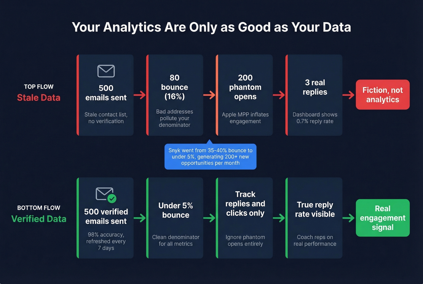
Your engagement analytics are a mirror of your data quality. Fix the input before optimizing the output.
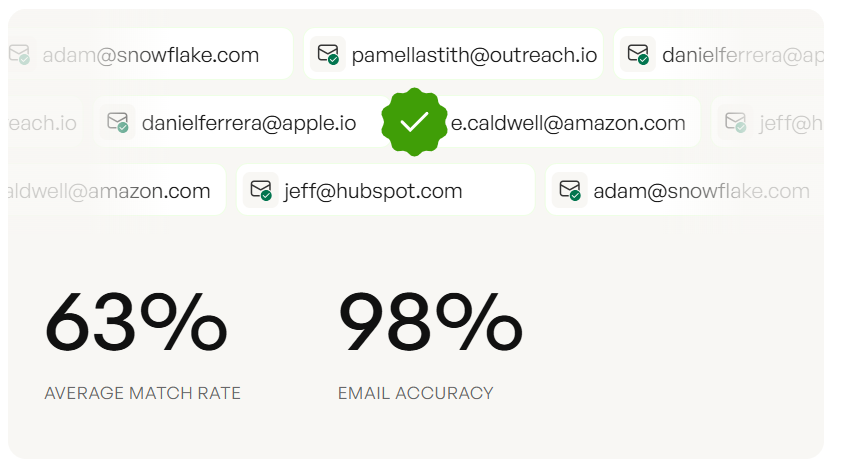
Prospeo handles this at the foundation layer with 98% email accuracy and a 7-day refresh cycle versus the 6-week industry average. Meritt dropped their bounce rate from 35% to under 4%, and Snyk went from 35-40% bounces to under 5% across 50 AEs - generating 200+ new AE-sourced opportunities per month. When your data's clean, your analytics finally reflect real human behavior instead of delivery failures.
If you're seeing bounces, start with email bounce rate benchmarks and fixes, then work backward into email deliverability and list hygiene.
If 80 of your 500 emails bounce because your data is stale, your entire engagement dashboard is fiction. Prospeo refreshes 300M+ profiles every 7 days - not every 6 weeks - so your cadence metrics actually mean something.
Stop optimizing sequences built on bad numbers. Fix the foundation.
FAQ
What's the difference between sales analytics and sales engagement analytics?
Sales analytics covers the full funnel - forecasting, revenue, pipeline health. Sales engagement analytics focuses specifically on how prospects interact with your outreach: reply rates, call connects, cadence performance, and channel effectiveness. The goal is tying interaction data directly to pipeline movement, not just reporting activity volume.
Which engagement metrics should I track first?
Start with three Tier 3 leading indicators: touch-to-meeting conversion, first-response time, and step success rate by channel. These are actionable this week and trace directly to pipeline outcomes. Most teams see measurable coaching improvements within one quarter.
How does bad contact data affect engagement metrics?
Stale emails bounce, disconnected numbers skew connect rates, and your dashboard shows fiction instead of signal. A 5-step verification process and weekly data refresh cycle keep the data underneath your metrics reliable - Snyk cut bounce rates from 40% to under 5% after cleaning up their contact data pipeline.