How to Build a Sales Funnel Diagram With Actual Numbers on It
Someone on your team asked, "What's a good Lead-to-MQL rate?" and the room went quiet. You pulled up a sales funnel diagram - the same empty triangle from every marketing blog - and it had labels but zero numbers.
A common takeaway on r/SaaS is that teams confuse complexity with strategy: more emails, more pages, more steps, and nothing actually moves the needle. Here's what does: benchmarks, design rules, and tools with real data behind them.
What a Funnel Diagram Actually Shows
A sales funnel diagram visualizes the buyer's journey from first touch to closed deal, with conversion rates annotated at each stage. It answers one question: where are prospects dropping off, and how badly?
Don't confuse it with a sales pipeline. A funnel maps the buyer's journey and conversion rates. A pipeline maps the seller's activities and deal progress. You need both - teams that align them see 38% higher win rates.
The 5 Stages (With Real Benchmarks)
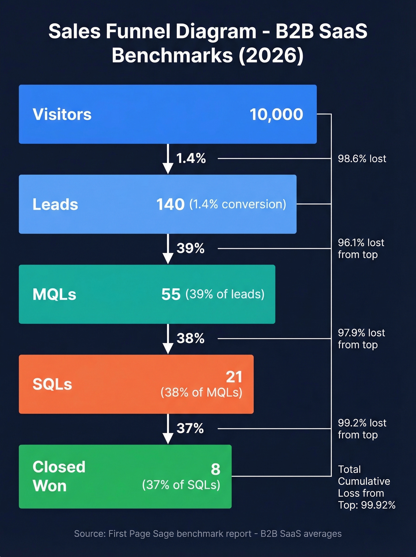
Here are stage-to-stage conversion rates across industries, drawn from First Page Sage's benchmark report and cross-industry ranges from Zeliq's analysis:
| Stage | B2B SaaS | eCommerce | Cybersecurity | Cross-Industry Band |
|---|---|---|---|---|
| Lead → MQL | 39% | 23% | 24% | 20-40% |
| MQL → SQL | 38% | 58% | 40% | 20-35% |
| SQL → Opportunity | 42% | 66% | 43% | 30-50% |
| SQL → Closed | 37% | 60% | 46% | 20-35% |
First Page Sage labels the final step "SQL → Closed." Many teams visualize this as "Opportunity → Closed Won" in a 5-stage model; if you do, keep the definition consistent with your CRM so you're not comparing mismatched stages.
The visitor-to-lead step sits earlier and runs much lower - 1.4% for SMB/mid-market SaaS, with cross-industry bands of 0.8-2.5% and top performers hitting 3-5%.
Lead → MQL. A known contact shows buying interest. If this rate is below 25%, your lead nurturing is broken - fix your email sequences, retargeting, and educational content before adding more top-of-funnel volume.
MQL → SQL. Marketing hands off to sales. This is the alignment metric. It settles the argument when marketing says "we sent great leads" and sales says "those leads were garbage." Fix it with shared definitions and better lead scoring.
SQL → Opportunity. The prospect has seen pricing or a proposal and wants to continue. Case studies and competitive comparisons do the heavy lifting here.
Opportunity → Closed Won. Contract in hand, actively deciding. If this drops below 30%, your proposals or negotiation process needs work - not your lead gen.
Practitioners on r/SaaS advocate for a Trust stage between Interest and Decision. It's the quiet phase where buyers read reviews, check references, and decide if they believe your claims. Most textbook funnels skip it. Real buying journeys don't.
B2B vs B2C - How the Shape Changes
| Dimension | B2B | B2C |
|---|---|---|
| Typical stages | Lead → MQL → SQL → Opp → Won | Awareness → Interest → Cart → Purchase |
| Key metrics | MQL rate, SQL rate, velocity, CLV | CTR, AOV, cart abandon, repeat rate |
| Cycle length | 3-12 months | Minutes to days |
| Decision-makers | 8-13 stakeholders | 1 (usually) |
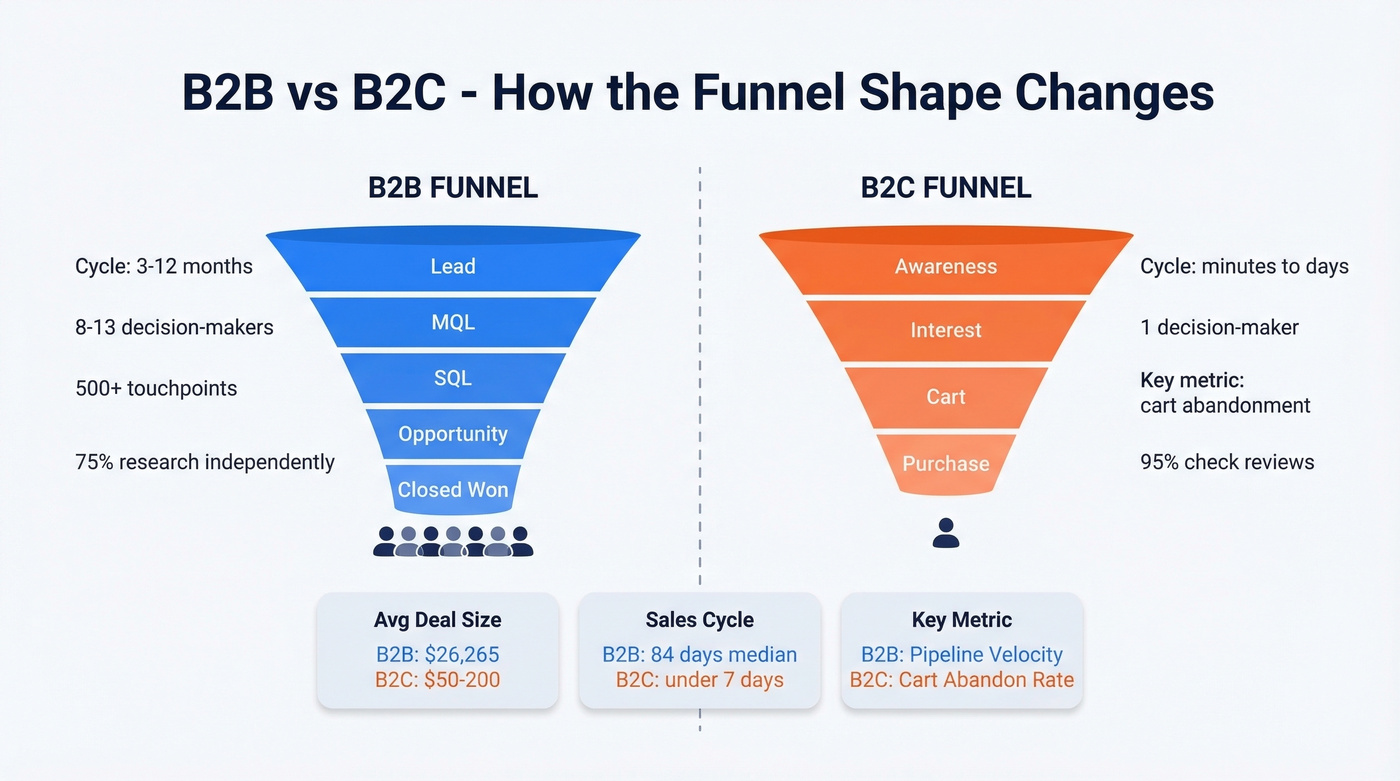
B2B funnels are longer, messier, and involve more people - 75% of B2B buyers research independently before talking to sales, and complex journeys can involve 500+ touchpoints. B2C funnels are shorter but wider, with 95% of consumers consulting online reviews before purchase.
Beyond the textbook triangle, a real funnel varies dramatically by business model. A PLG SaaS company has a wide top (free trial signups) that narrows sharply at activation, while an enterprise sales team sees a narrower top with higher conversion at each stage. The shape tells you where your revenue model lives - and where it leaks.
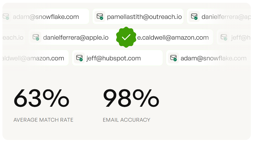
Your Lead-to-MQL rate means nothing if 15% of emails bounce. Prospeo's 98% email accuracy and 7-day data refresh cycle ensures every stage of your funnel measures real buyer behavior - not deliverability failures. Teams using Prospeo cut bounce rates from 35%+ to under 4%.
Stop diagnosing a data problem as a funnel problem.
Design Rules for Honest Diagrams
Here's the thing: most funnel diagrams lie. Not intentionally - they use equal-width segments that make a 39% conversion look the same as a 5% one. Five rules to fix that:
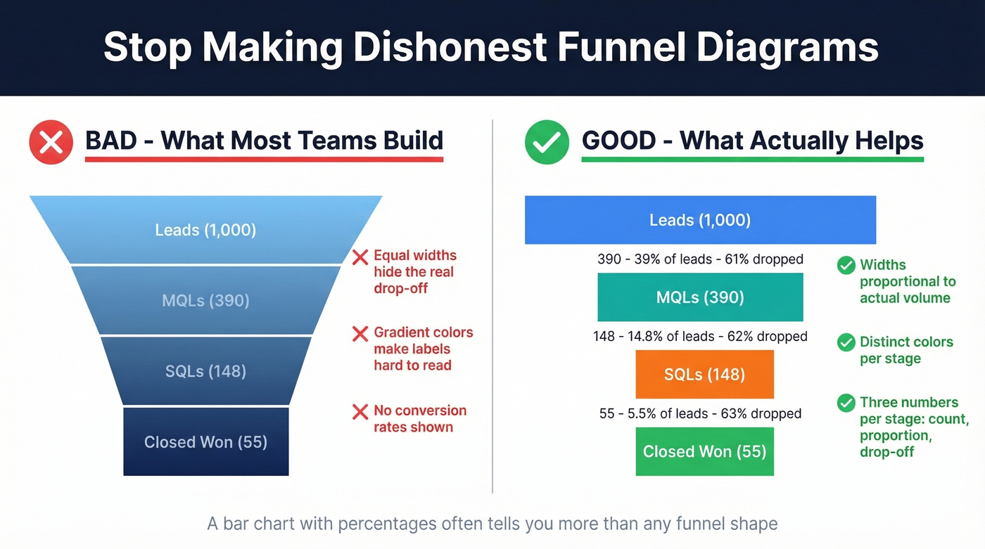
- Make widths proportional to volume. If 1,000 leads become 390 MQLs, the MQL band should be roughly 39% as wide. Equal segments are the #1 design mistake.
- Annotate three numbers per stage: raw count, proportion remaining vs. top of funnel, and stage-to-stage drop-off.
- Skip the funnel chart if you have fewer than 3 stages. Use a bar chart instead.
- Use distinct colors per stage. Smooth gradients look pretty but make labels unreadable.
- One label + one number per section. Cluttered annotations defeat the purpose.
Let's be honest: a plain bar chart with conversion percentages tells you more than any gradient-shaded funnel. Funnels win in boardroom presentations. Bar charts win everywhere else.
Metrics That Belong on Every Diagram
Beyond stage conversion rates, every diagram should show lead volume by source, drop-off rate between stages, average deal size (median for private SaaS: $26,265), sales cycle length (median SaaS: 84 days), and CAC vs. CLV.
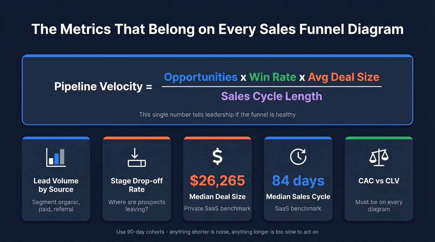
The formula that ties it together is pipeline velocity: (Opportunities x Win Rate x Avg Deal Size) / Sales Cycle Length. Put this number on your diagram. It's the single metric that tells leadership whether the funnel is healthy.
Use a 90-day cohort for measurement. Anything shorter and you're measuring noise; anything longer and you're too slow to act. And verify your contact data first - if 15% of emails bounce, your Lead-to-MQL rate is measuring deliverability failures, not buyer disinterest. We've seen teams "fix" their MQL conversion by simply cleaning their contact list, and Prospeo's 98% email accuracy on a 7-day refresh cycle handles this at the source.
Free Tools to Build Your Funnel
We've built dozens of these internally. The tool matters far less than the numbers you put on it - a Google Drawing with accurate benchmarks beats a beautifully designed Canva funnel with made-up percentages every time. A dedicated sales funnel flowchart tool can help you map decision points and branching paths that a static diagram misses, but start simple.
| Tool | Best For | Free Tier |
|---|---|---|
| Google Drawings | Simplest, zero learning curve | Completely free |
| Canva | Polished visuals | Yes; Pro ~$15/mo |
| FigJam (Figma) | Team collaboration | Yes; paid ~$5-8/user/mo |
| Funnelytics | Dedicated funnel mapping | Yes; paid ~$99+/mo |
| Lucidchart | Integrations + exports | Yes; paid ~$8-10/user/mo |
For actually diagnosing your sales process, skip the design tools entirely and start with a spreadsheet. Excel's built-in funnel chart or Google Sheets with conditional formatting will get you 80% of the way there. If your funnel has fewer than 5 stages, a spreadsheet is genuinely all you need.
If you're building a B2B version, start from a B2B sales funnel template and then customize the stages to match your CRM.
B2B funnels involve 8-13 stakeholders and 500+ touchpoints. You need verified direct dials and emails for every one of them. Prospeo gives you 300M+ profiles with 30+ filters - buyer intent, job changes, headcount growth - so you fill each funnel stage with real decision-makers, not dead contacts.
Build your funnel on 300M+ verified contacts for $0.01 each.
FAQ
What's the difference between a sales funnel and a sales pipeline?
A funnel visualizes the buyer's journey and conversion rates at each stage; a pipeline maps the seller's activities and deal progress. The funnel shows where prospects drop off, while the pipeline shows what reps need to do next. They're complementary views of the same revenue process.
How many stages should a sales funnel diagram have?
Most effective funnels use 4-6 stages. Fewer than 3 and a funnel chart is the wrong format - use a bar chart. More than 7 adds complexity without clarity. Start with Lead → MQL → SQL → Opportunity → Closed Won and adjust based on your actual sales motion.
What's a good conversion rate for a sales funnel?
B2B SaaS companies typically convert 39% of leads to MQLs and close 37% from SQL to Closed Won. Cross-industry, expect visitor-to-lead rates of 0.8-2.5%, with top performers hitting 3-5%. Make sure your top-of-funnel data is clean - bounced emails inflate drop-off rates and make every downstream metric look worse than it is.
Can I build a useful funnel diagram for free?
Yes. Google Drawings or Excel's built-in funnel chart costs nothing and handles 4-6 stages cleanly. The tool matters less than annotating real conversion benchmarks at each stage. A free spreadsheet with accurate numbers beats a $99/month visualization tool with guesses every time.