How to Build a Sales Report Template That Actually Works
You just downloaded your fifth free sales report template and it's another blank grid with pretty colors and zero substance. No formulas, no benchmarks, no structure - just a spreadsheet cosplaying as a tool. The top complaint on r/smallbusiness sums it up: "can't find a very organized one that works for me."
Stop downloading templates. Start understanding your metrics. This guide gives you both.
Quick version:
- Pick ONE cadence - monthly covers 80% of teams.
- Track 5 KPIs max - win rate, pipeline coverage, revenue vs. quota, sales velocity, conversion rate.
- Structure: 3 tabs - Setup, Data Entry, Dashboard.
Why Sales Reporting Matters
Companies that embrace data-driven sales see 2-5% higher revenue and up to 20% productivity gains, per McKinsey research. For a $10M ARR company, that's $200K-$500K in incremental revenue from simply knowing your numbers.
85% of sales and marketing leaders say alignment between their teams is the single biggest opportunity to improve performance. Alignment requires shared data, and shared data requires structured reporting - which starts with a reliable template. Meanwhile, an SBI Growth Advisory stat found only 52% of CEOs believe in their growth plans. A report that shows real pipeline health - not vibes - is how you close that confidence gap.
Pick Your Reporting Cadence
Most teams overcomplicate this. Start with monthly.
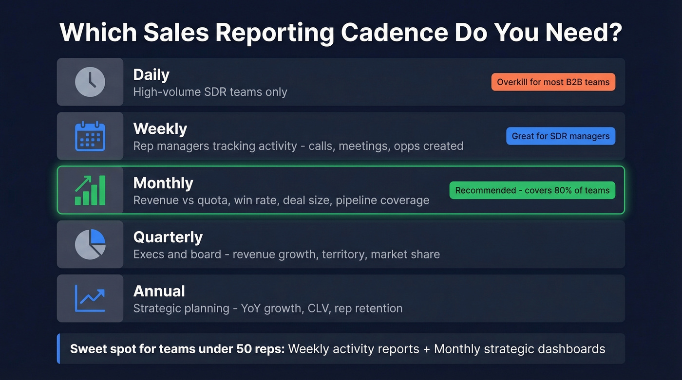
It covers 80% of what leadership asks for, and you can always layer in weekly activity tracking for SDR teams later.
| Cadence | Best For | Key Metrics |
|---|---|---|
| Daily | High-volume SDRs | Calls, meetings, deals closed |
| Weekly | Rep managers | Opps created, conversion, revenue |
| Monthly | Leadership | Revenue vs. quota, win rate, deal size |
| Quarterly | Execs, board | Revenue growth, territory, market share |
| Annual | Strategic planning | YoY growth, CLV, rep retention |
Daily reporting is only worth the overhead if your team closes multiple deals per day. For many B2B SaaS teams running ~84-day sales cycles, it's noise. In our experience, weekly activity reports plus monthly strategic dashboards is the sweet spot for teams under 50 reps, and we've seen that pattern hold across dozens of sales orgs we've worked with.
KPIs Worth Tracking in Your Report
Here's the thing: metrics and KPIs aren't the same. Metrics are raw activity data - calls made, emails sent. KPIs are the strategic numbers tied to business outcomes. Your dashboard tab should spotlight KPIs only. Five is the right number; more than that and nobody reads the report.
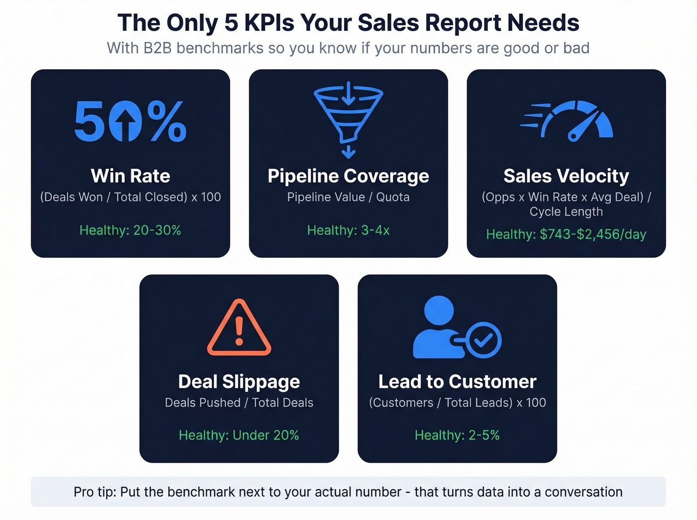
| KPI | Formula | B2B Benchmark | Report Type |
|---|---|---|---|
| Win Rate | (Deals Won / Total Closed) x 100 | 20-30% | Monthly |
| Pipeline Coverage | Pipeline Value / Quota | 3-4x | Monthly |
| Sales Velocity | (Opps x Win Rate x Avg Deal) / Cycle Length | $743-$2,456/day | Monthly |
| Deal Slippage | Deals Pushed / Total Deals | <20% | Weekly |
| Lead-to-Customer | (Customers / Total Leads) x 100 | 2-5% | Monthly |
A few benchmarks worth pinning to your wall: the median B2B SaaS sales cycle runs 84 days, the median deal size for private SaaS is $26,265, and the biggest funnel bottleneck is MQL-to-SQL at 15-21% conversion. The average B2B website converts visitors to leads at just 2.9%. If your numbers are wildly off from these, your template just told you where to dig.
A report without benchmarks is just a number dump. Put the benchmark in the column next to your actual - that's what turns data into a conversation.
How to Structure a 3-Tab Template
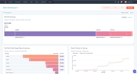
The Salesflare template architecture nails the right approach: three tabs, each with a clear job.
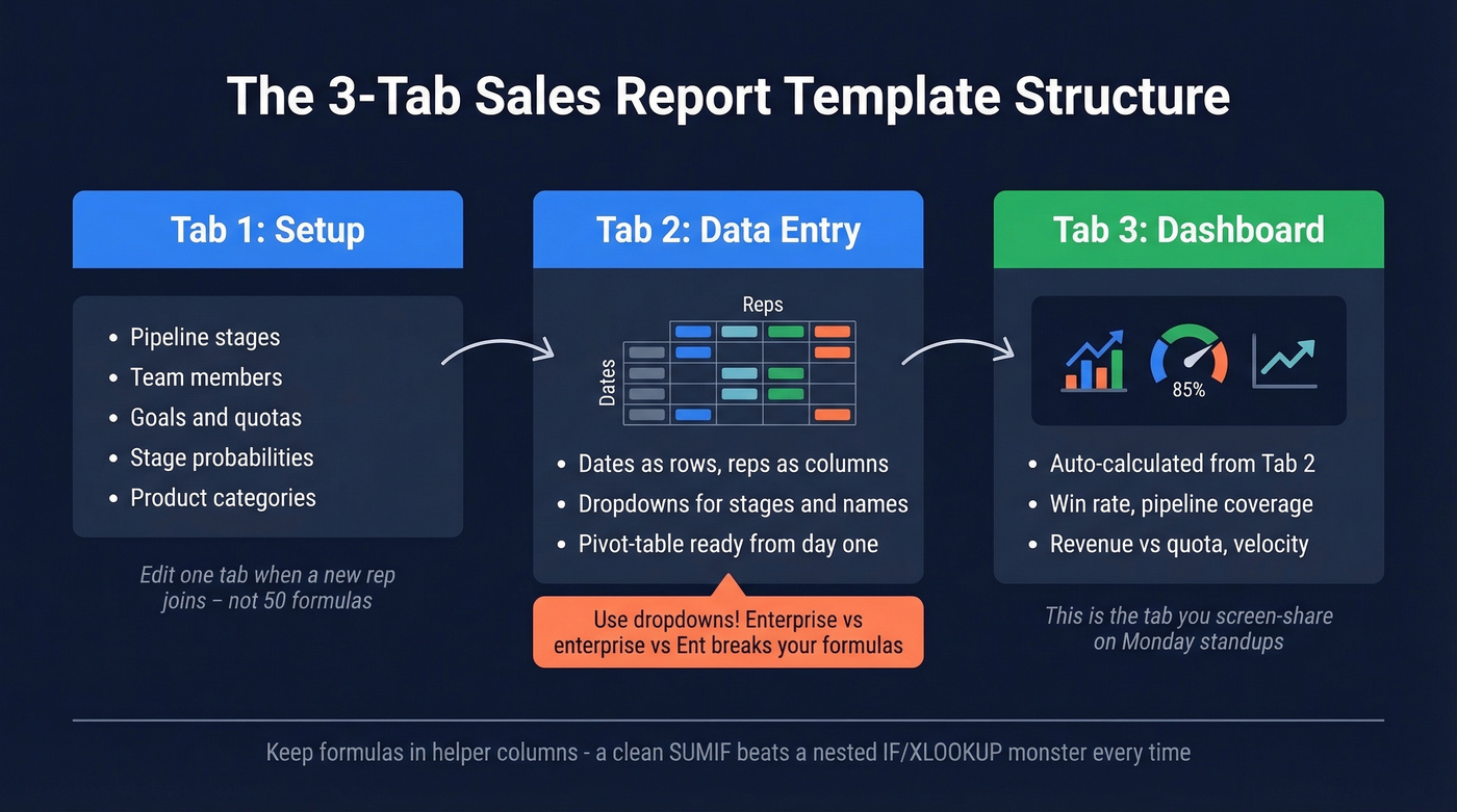
Tab 1 - Setup. Pipeline stages, team members, goals, probabilities. Your config layer. When a new rep joins, you edit one tab instead of hunting through formulas.
Tab 2 - Data Entry. Dates as rows, reps as columns. Pivot-table ready from day one. Use dropdowns for stage names, product categories, and rep names - this single step eliminates one of the biggest data quality problems in sales spreadsheets, because "Enterprise," "enterprise," and "Ent." all breaking your SUMIF formulas is a pain we've lived through more than once.
Tab 3 - Dashboard. Auto-calculated from Tab 2. Win rate, pipeline coverage, revenue vs. quota, velocity. This is the tab you screen-share in Monday standups.
Keep your formulas in helper columns rather than nesting five functions deep. A SUMIF pulling from a clean structured table beats a nested IF/XLOOKUP monster every time - and it stays stable as your file grows into the hundreds of rows.
Your pipeline coverage ratio means nothing if 35% of your leads bounce. Prospeo delivers 98% email accuracy with a 7-day data refresh - so every deal in your report maps to a real, reachable buyer.
Stop reporting on dead leads. Start with data that's actually verified.
Report Types Worth Building
You don't need 15 templates. You need one good one and the knowledge to customize it. Here are the four types that cover virtually every B2B reporting need.
Pipeline Report
The most universal type - every team needs one. Core fields: deal name, stage, owner, value, probability, expected close date, days in stage. The Smartsheet version adds lead-to-opportunity and opportunity-to-win ratios, which are worth including.
Skip this only if you're an SDR team focused purely on top-of-funnel activity.
Weekly Activity Report
Built for SDR and BDR managers tracking calls, meetings, emails, and deals created per rep per day. The Smartsheet weekly template includes daily revenue goals vs. actual with variance calculations - steal that structure. For teams under 3 reps, a Slack check-in honestly works better.
Monthly Dashboard
Your "executive summary" for VP and C-suite reporting: revenue vs. quota, win rate, pipeline coverage, sales cycle length, and rep-level breakdowns. Charts matter here - leadership wants trends, not tables.
Deal Loss Analysis
Let's be honest: this is the most underbuilt report in B2B sales. Most teams track wins obsessively and ignore losses entirely. Track loss reasons by both count and value. "Lost on price" hitting 40% of deal value tells a completely different story than "lost on price" hitting 40% of deal count. That distinction changes your pricing strategy.
What a Completed Report Looks Like
Most template articles stop at the blank grid. Here's what a finished monthly report actually communicates.
Imagine your dashboard tab reads: win rate at 27%, comfortably within the 20-30% benchmark. Pipeline coverage at 3.2x, healthy and above the 3x floor. Revenue vs. quota at 94%, close but with a gap to close. Deal slippage at 18%, safely under the 20% threshold. Sales cycle at 78 days, beating the 84-day median.
That report tells a story: you're converting well, your pipeline is healthy, but you're leaving 6% of quota on the table. The next question writes itself - where are the stalled deals, and what unblocks them? Good sales report formatting makes those answers jump off the page instead of hiding in raw data.
Choosing the Right Format
Before you build, decide on a sales report format that matches your audience. A board deck needs charts and narrative; a weekly SDR review needs sortable tables. The format shapes how quickly people act on the data.
Table-heavy format works best for rep managers who need to drill into individual deal details and sort by stage or owner. Chart-forward format is better for executives who want trend lines, quota attainment bars, and pipeline waterfall visuals. Hybrid format - a dashboard tab with charts plus a data tab with full tables - is the default for most reporting setups and the structure we recommend above.
Sales report formatting isn't cosmetic. It determines whether your audience actually reads the thing or skips to the summary line.
Mistakes That Break Sales Reports
1. Inconsistent data entry. Same deal entered as "Enterprise," "enterprise," and "Ent." breaks every pivot table and SUMIF you've built. Fix: dropdowns for every categorical field. No exceptions.
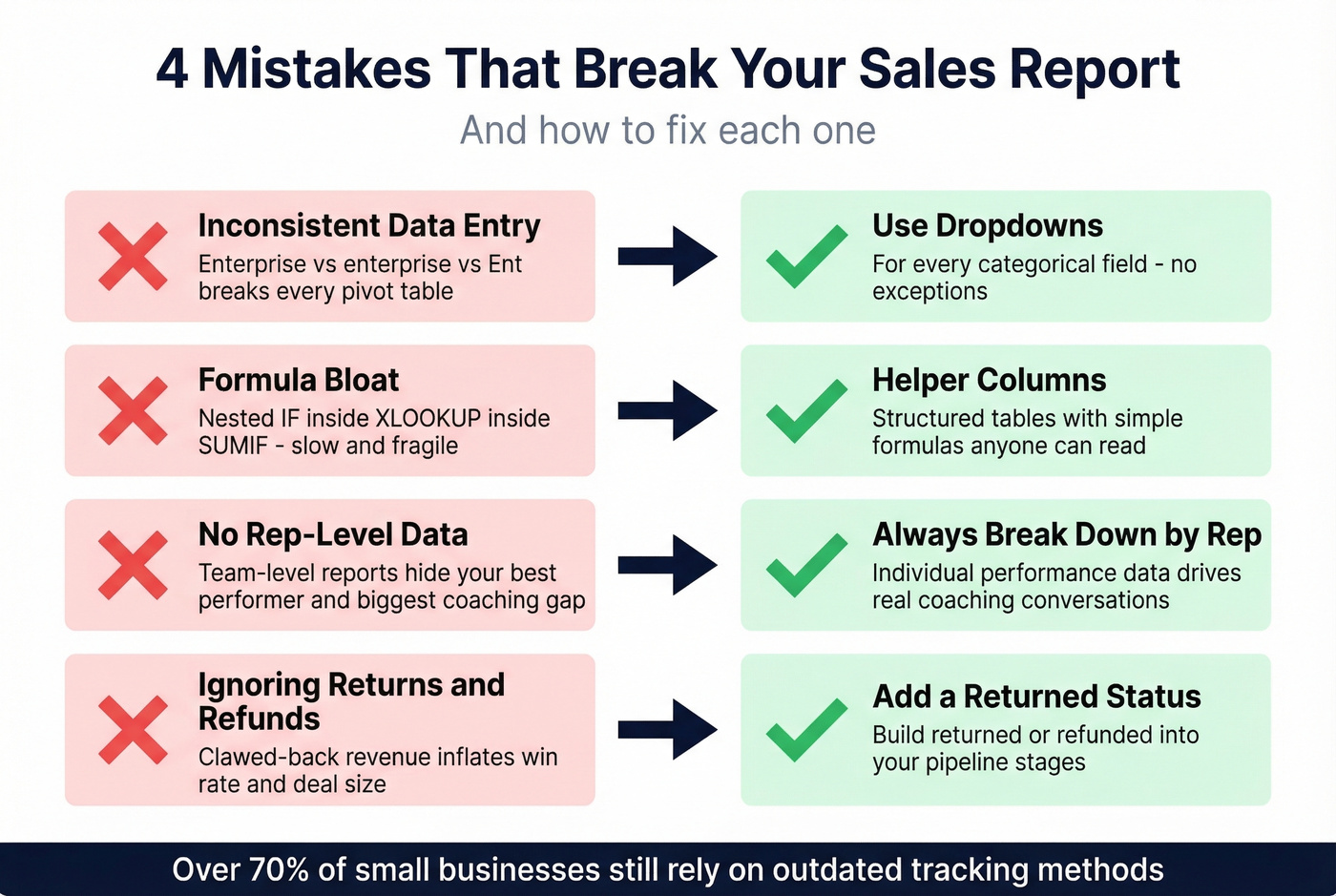
2. Formula bloat. Nesting IF inside XLOOKUP inside SUMIF creates a file that's slow, fragile, and impossible for anyone else to maintain. Fix: helper columns and structured tables.
3. Not tracking by rep. A team-level report hides your best performer and your biggest coaching opportunity. Always include rep-level breakdowns.
4. Ignoring returns and refunds. Revenue that gets clawed back still shows as closed-won in most templates, inflating your win rate and deal size metrics. Build a "returned/refunded" status into your pipeline stages.
Over 70% of small businesses still rely on outdated tracking methods. But even teams with solid reporting infrastructure get burned by bad input data upstream. Your pipeline report is only as accurate as the contact data feeding it - if half your emails bounce, your conversion metrics are fiction. Tools like Prospeo verify emails before they enter your CRM at 98% accuracy, refreshed every 7 days, so your reports reflect reality instead of garbage-in-garbage-out.
When to Ditch the Spreadsheet
A well-built spreadsheet handles more than people think. But there are clear thresholds where it breaks down:
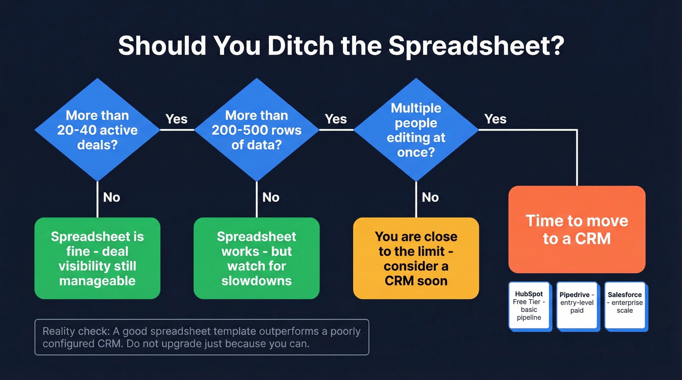
- 20-40 active deals - deal visibility gets messy in flat rows
- 200-500 rows - performance degrades with formulas
- Multiple editors - version conflicts and overwritten data
Below those thresholds, a good sales report template genuinely outperforms a poorly configured CRM. The r/sales consensus is that plenty of teams adopt a CRM and use it as a "glorified spreadsheet" anyway.
When you do make the jump, HubSpot's free tier handles basic pipeline management. Pipedrive and Salesforce both have entry-level paid plans, and CRMs like monday.com now offer AI-assisted dashboards and reporting - worth considering if your reporting needs outgrow manual formulas. If you're evaluating options, it helps to review a few examples of a CRM before you migrate.
Tracking sales velocity in your report? The formula only works when your pipeline is full of real opportunities. Prospeo's 300M+ profiles and 30+ filters - including buyer intent and headcount growth - feed your funnel with qualified contacts at $0.01 per email.
Better data in, better reports out. It starts at the top of your funnel.
FAQ
What should a sales report include?
Revenue vs. quota, win rate, pipeline coverage, conversion rate, and sales cycle length. These five KPIs cover 80% of what leadership needs. Add rep-level breakdowns if you manage a team of three or more.
How often should I update my report?
Weekly for activity metrics like calls and meetings booked. Monthly for strategic KPIs like win rate and pipeline coverage. Daily reporting only makes sense for high-volume SDR teams closing multiple deals per day.
What's the best format - Excel or Google Sheets?
Google Sheets for teams - real-time collaboration and no file-size anxiety. Excel for solo users or heavy formula work. Either way, match the sales report format to your audience: charts for executives, sortable tables for managers.
How do I make sure my sales data is accurate?
Use dropdowns for every categorical field, validate emails before importing contacts, and audit your CRM monthly. Verifying contact data before it enters your pipeline eliminates the bounce-rate inflation that skews conversion metrics.
When should I switch from a spreadsheet to a CRM?
When your pipeline exceeds 20-40 active deals, your sheet has 200+ rows, or multiple people edit simultaneously. Below those thresholds, a well-built three-tab spreadsheet works fine and often outperforms a misconfigured CRM.