Weekly Sales Report Template for Excel Your Team Actually Needs
It's Monday morning. Your VP of Sales asks for "the numbers." You spend 45 minutes copying data from the CRM into a spreadsheet, manually summing columns, and formatting cells so the thing doesn't look like a ransom note. By the time you send it, the meeting's half over and the insights are already stale.
That ritual is costing you more than time. A solid weekly sales report template in Excel catches pipeline problems in five days, not five weeks - and 69% of B2B sales reps missed quota last year because they didn't see the warning signs early enough.
What You Need (Quick Version)
- Download the free template below - it works in Excel and Google Sheets.
- Structure your data as one flat table. Never use a separate tab for each week.
- Track 5-7 KPIs with targets and variance columns. Not 20. Not 12.
- Use PivotTables instead of nesting SUMIF and XLOOKUP formulas across dozens of sheets.
- Automate the data pull with Power Query so Monday mornings take minutes, not hours.
Weekly Sales Report KPI Framework
Most reports fail because they try to track everything. Pick 5-7 KPIs. The goal is a report your team actually reads, not a data dump they ignore.
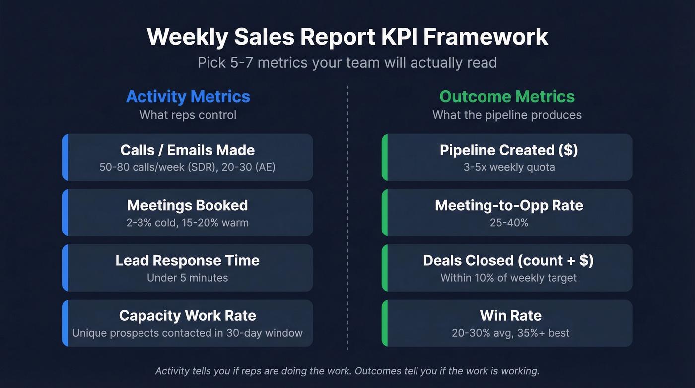
Split your metrics into two tiers: activity (what reps control) and outcomes (what the pipeline produces). Activity tells you if reps are doing the work. Outcomes tell you if the work is working.
| Metric | Type | Benchmark |
|---|---|---|
| Calls / emails made | Activity | 50-80 calls/week (SDR), 20-30 (AE) |
| Meetings booked | Activity | 2-3% cold, 15-20% warm |
| Lead response time | Activity | Under 5 minutes |
| Pipeline created ($) | Outcome | 3-5x weekly quota |
| Meeting-to-opp rate | Outcome | 25-40% |
| Deals closed (count + $) | Outcome | +/-10% of weekly target |
| Win rate | Outcome | 20-30% avg, 35%+ best |
These benchmarks draw from Claap's 2026 sales metrics guide and Zendesk's sales performance data. Your numbers will vary by industry and deal size. The point is measuring variance, not chasing a universal standard.
One advanced metric worth adding: capacity work rate - the number of unique potential clients a rep interacts with in a 30-day rolling window. It's a better signal of pipeline health than raw call volume because it filters out reps who hammer the same 20 accounts every week without expanding their reach.

Free Template Download
Here's what's inside:
- Activity columns: cold calls made, follow-up calls, emails sent, meetings arranged, visits completed
- Outcome columns: leads generated, deals closed, products sold, sales revenue
- Target and variance columns: set a weekly target per metric, and the template auto-calculates the gap
- Notes column: context matters - holidays, territory changes, product launches all affect numbers
- Sample data tab: pre-filled with realistic data so you can see how formulas and formatting work before entering your own
Available in both Excel (.xlsx) and Google Sheets formats, with variance tracking and conditional formatting built in. Whether you need a salesman weekly report or a team-wide dashboard, the same structure scales to both.
Download the Excel template (.xlsx) | Open in Google Sheets
How to Build It in Excel
If you'd rather build your own - or customize the template heavily - here's the full walkthrough. First time takes about 30 minutes. After that, weekly updates are a few minutes.
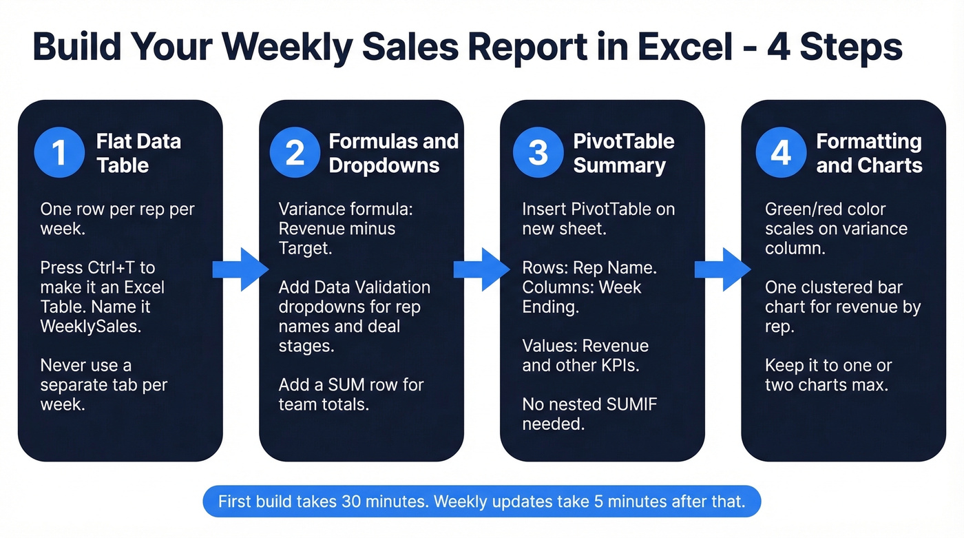
Set Up Your Data Table
Create one flat table with a single header row. Every row is one rep for one week. Columns include rep name, week ending date, and all your KPIs. Don't create a separate tab per week - it makes your workbook impossible to analyze over time.
Select your data range and press Ctrl+T to convert it to an Excel Table. This gives you auto-expanding ranges, structured references, and built-in filtering. Name the table something useful like WeeklySales. Once it's set up, you just append new rows each period - it doubles as a weekly sales tracker that grows with your team.
Add Formulas and Dropdowns
For the variance column, the formula is simple:
=[@Revenue]-[@Target]
Use Data Validation to create dropdown lists for rep names and deal stages. Go to Data, then Data Validation, then List, and point to a reference range. This eliminates typos and keeps your data consistent. Inconsistent entry is what kills reports over time - we've seen workbooks where "Closed Won," "closed-won," and "CW" all meant the same thing, and the PivotTable treated them as three separate categories.
Add a SUM row at the bottom for team totals:
=SUM([Revenue])
For a more advanced metric, add a sales velocity formula:
=(Opportunities x Avg_Deal_Size x Win_Rate) / Avg_Cycle_Days
This gives you a single number that captures pipeline momentum. If velocity drops week over week, something upstream is broken - even if individual metrics look fine.
Build a PivotTable Summary
Select your table, go to Insert, then PivotTable, and place it on a new worksheet. Drag Rep Name to Rows, Week Ending to Columns, and Revenue to Values. You've now got a cross-tab view of revenue by rep by week - no formulas required.
PivotTables also solve the performance problem. If your workbook is sluggish, the culprit is usually nested SUMIF and XLOOKUP formulas across dozens of sheets. PivotTables do the same work with a fraction of the file bloat. Drag additional metrics into Values to build a multi-KPI summary.
Conditional Formatting and Charts
Select your variance column, go to Home, then Conditional Formatting, then Color Scales. Set green for positive variance, red for negative. This gives your VP an instant visual read on who's hitting targets.
For charts, a clustered bar chart showing revenue by rep is the most useful weekly visual. Select your PivotTable summary, insert a bar chart, and it'll update automatically when you refresh the data. Keep it to one chart - two at most. The report should drive conversation, not replace it.
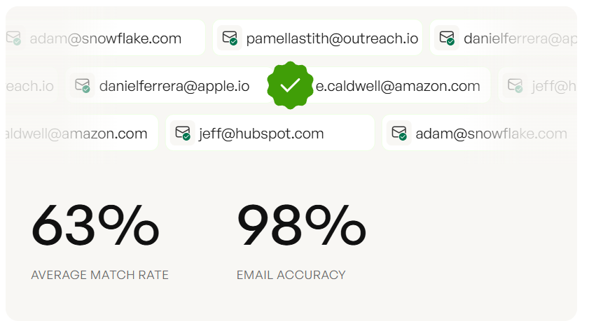
Tracking calls made and meetings booked is step one. But if your reps are dialing wrong numbers and emailing dead addresses, those activity metrics are lying to you. Prospeo gives your team 98% verified emails and 125M+ direct dials - so the outreach numbers in your weekly report actually convert.
Fix the data feeding your report, not just the spreadsheet formatting it.
Automate the Weekly Refresh
Up to 80% of reporting time goes to data prep, and 82% of organizations still rely on manual processes glued together with spreadsheets. Power Query changes this.
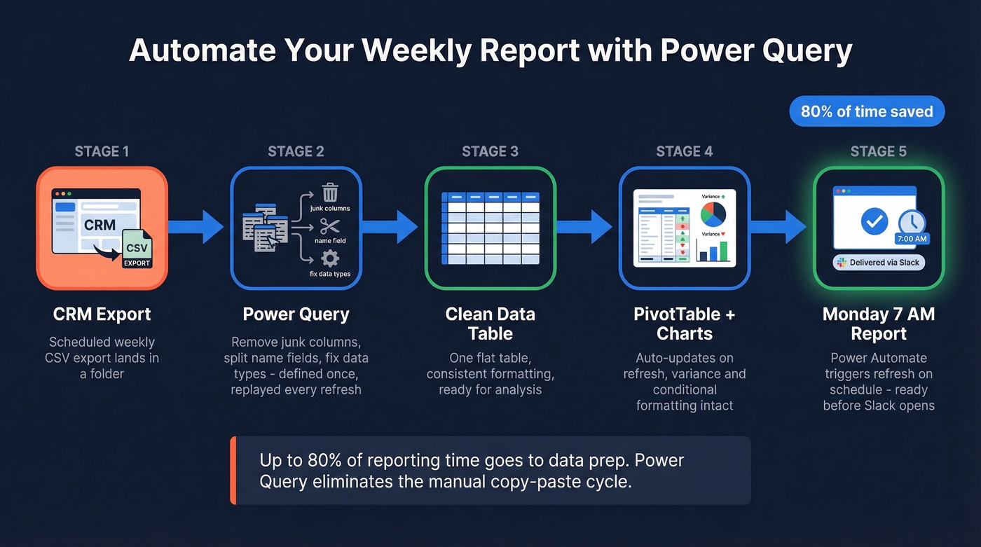
Go to Data, then Get Data, then From File, then From Folder. Point it at the folder where your CRM exports land - most CRMs can schedule a weekly CSV export. Power Query lets you define cleaning steps once (remove unnecessary columns, split name fields, change data types) and replay those steps every time you hit Refresh. If your corporate reports arrive as PDFs, Power Query can import and parse them directly. No more copy-paste cleanup.
For fully hands-off automation, Power Automate can trigger the refresh on a schedule. Set it for Monday at 7 AM and the report's ready before anyone opens Slack.
Power Query handles transformation. But garbage in, garbage out. If your CRM contact data is stale - bouncing emails, disconnected phone numbers - your weekly activity metrics will be inflated before anyone reads them. Prospeo refreshes contact data every 7 days (the industry average is 6 weeks), so the emails and phone numbers feeding your report are current before they ever hit the spreadsheet.
Five Mistakes That Ruin Reports
1. Metric overload. Tracking 20 KPIs means nobody reads any of them. Stick to 5-7 that directly connect to pipeline and revenue. Everything else is noise.
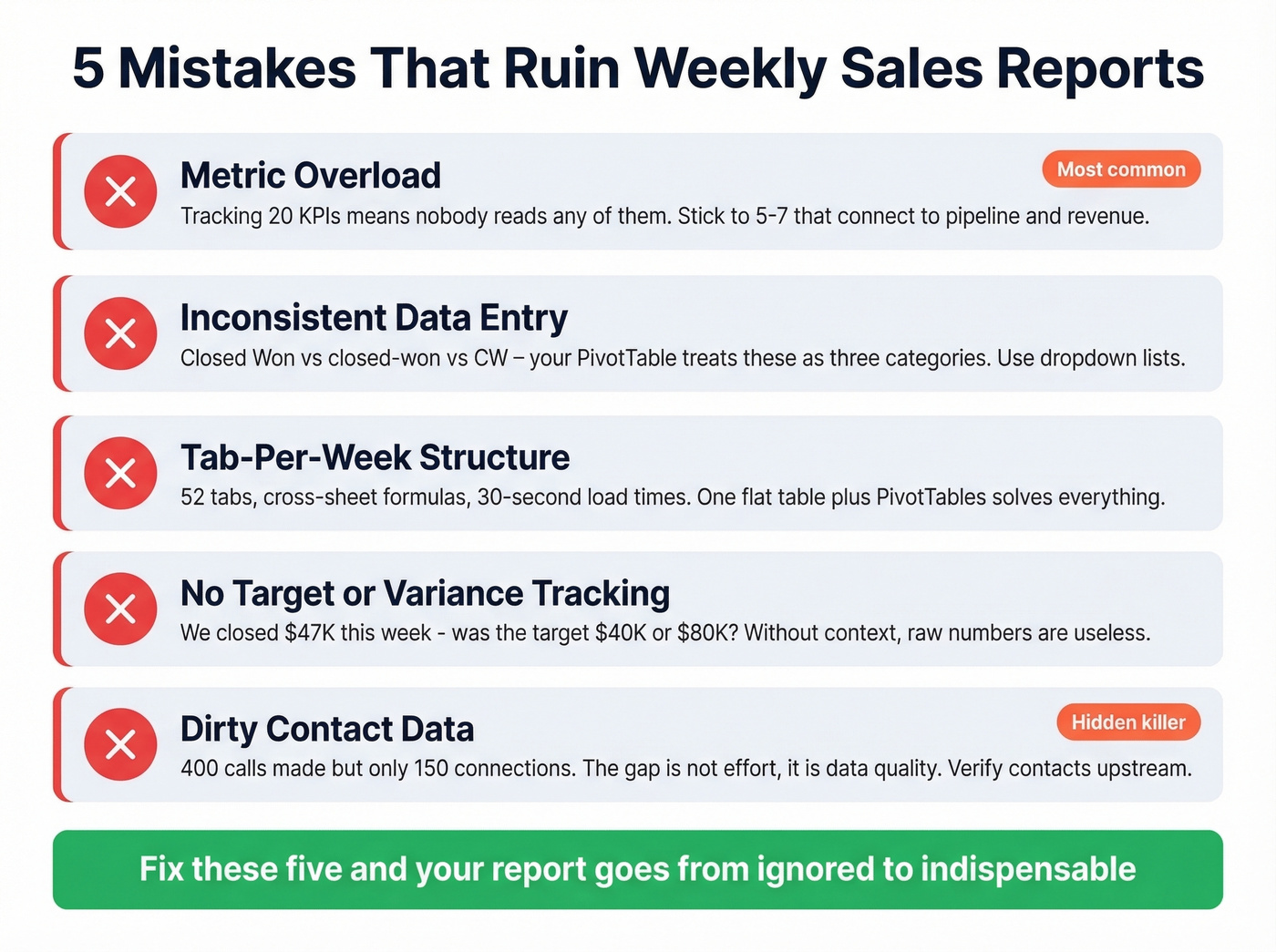
2. Inconsistent data entry. One rep types "Closed Won," another types "closed-won," a third types "CW." Use dropdown lists for every categorical field. Five minutes of setup saves hours of cleanup later.
3. Tab-per-week structure. You end up with 52 tabs, cross-sheet formulas, and a workbook that takes 30 seconds to open. One flat table plus PivotTables solves everything.
4. No target or variance tracking. Here's the thing: a report that says "we closed $47K this week" is useless without context. Was the target $40K or $80K? Variance columns turn raw numbers into actionable signals.
5. Dirty contact data inflating activity numbers. Your report says 400 calls made but only 150 connections. The gap isn't effort - it's data quality. Reps are dialing disconnected numbers and emailing addresses that bounce. In our experience, teams that verify contact data upstream see their reported-to-actual activity ratio tighten dramatically - and their weekly reports start telling the truth instead of a flattering fiction.
Your capacity work rate metric only matters if reps can actually reach new prospects each week. Prospeo's 300M+ profiles with 30+ filters - intent data, job changes, headcount growth - give reps a fresh pipeline to expand into, not the same 20 stale accounts recycled every Monday.
Stop reporting on the same dead pipeline. Start filling it with real buyers.
Run Your Weekly Meeting With This Report
The report exists to drive a meeting, not replace one. Here's a 30-minute structure we've seen work well across dozens of sales orgs:
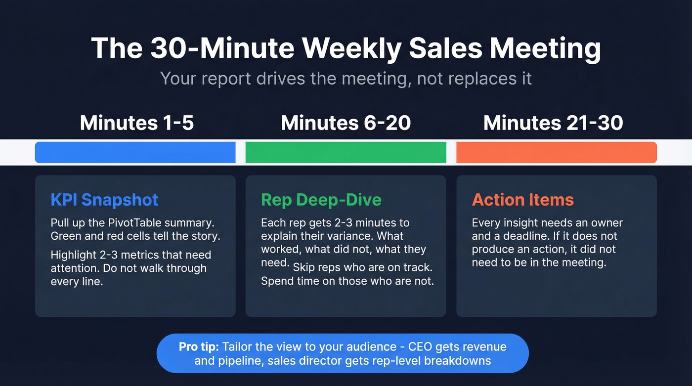
Minutes 1-5: KPI snapshot. Pull up the PivotTable summary. Green and red cells tell the story. Highlight the two or three metrics that need attention - don't walk through every line.
Minutes 6-20: Rep deep-dive. Each rep gets 2-3 minutes to explain their variance. What worked, what didn't, what they need. Skip reps who are on track and spend the time on those who aren't.
Minutes 21-30: Action items. Every insight needs an owner and a deadline. If it doesn't produce an action, it didn't need to be in the meeting.
Tailor the view to your audience. Your CEO gets one screen with revenue, pipeline, and win rate. Your sales director gets rep-level breakdowns with activity metrics. The reports that actually get read are the ones that fit on a single screen.
Let's be honest about something: if your average deal size is under $15K, you probably don't need a 20-metric dashboard. A five-row weekly report with calls, meetings, pipeline, deals closed, and win rate will tell you everything that matters. Complexity is where weekly reports go to die.
Format Tips
A strong weekly sales report follows a consistent format: a one-paragraph executive summary at the top, a KPI table with targets and variance in the middle, and two or three bullet-point action items at the bottom. Keep the layout identical week to week so stakeholders can scan for changes instead of relearning the structure every Monday.
If you want to go one step further, align your weekly view with your sales operations metrics so the report ladders up cleanly into monthly and quarterly reviews.
More Free Templates Worth Checking
Smartsheet offers industry-specific templates - retail, restaurant, hotel - each with pre-built formulas and sample data tabs. Close provides 11 free templates across Excel and Google Sheets with a focus on actionable metrics over data dumps. Microsoft's Office template gallery has basic weekly report layouts that work as starting points, though they're thinner on formulas and benchmarks. If none of those fit, the consensus on r/sales is that building your own from a flat table is almost always better than wrestling with someone else's over-engineered workbook.
FAQ
What should a weekly sales report include?
Track activity metrics (calls, emails, meetings) and outcome metrics (deals closed, revenue, pipeline created). Include target and variance columns for each KPI so you can spot gaps at a glance. Stick to 5-7 metrics - more than that and the report becomes a data dump nobody reads.
How do I automate a weekly sales report in Excel?
Use Power Query connected to a CSV or CRM export folder. Define your cleaning and transformation steps once, then hit Refresh every Monday to pull in the latest data automatically. For fully scheduled refreshes, Power Automate can trigger the process on a timer - no manual clicks needed.
How do I make sure my report data is accurate?
Start with data validation dropdowns to enforce consistent entry across reps. Then verify your contact data upstream - bad emails and disconnected numbers inflate activity metrics and hide real performance. Cleaning your CRM data on a regular cycle, whether manually or through a verification tool, is the single highest-ROI thing you can do for report accuracy.
What's the best report format for leadership?
Keep it to a single page or screen. Lead with a brief narrative summary, follow with a KPI table showing targets and variance, and close with action items. Leadership cares about trends and exceptions - not raw data - so highlight week-over-week changes and flag any metric more than 10% off target.