How to Build a Sales Performance Dashboard That Actually Gets Used
A RevOps lead we work with built a gorgeous Tableau dashboard last year. Twelve charts, custom color palette, real-time refresh. Nobody looked at it. Reps kept running their own spreadsheets, managers eyeballed Slack threads, and the VP of Sales asked for a "simpler view" two weeks later. The dashboard wasn't the problem - the data feeding it was fiction, and nobody trusted it.
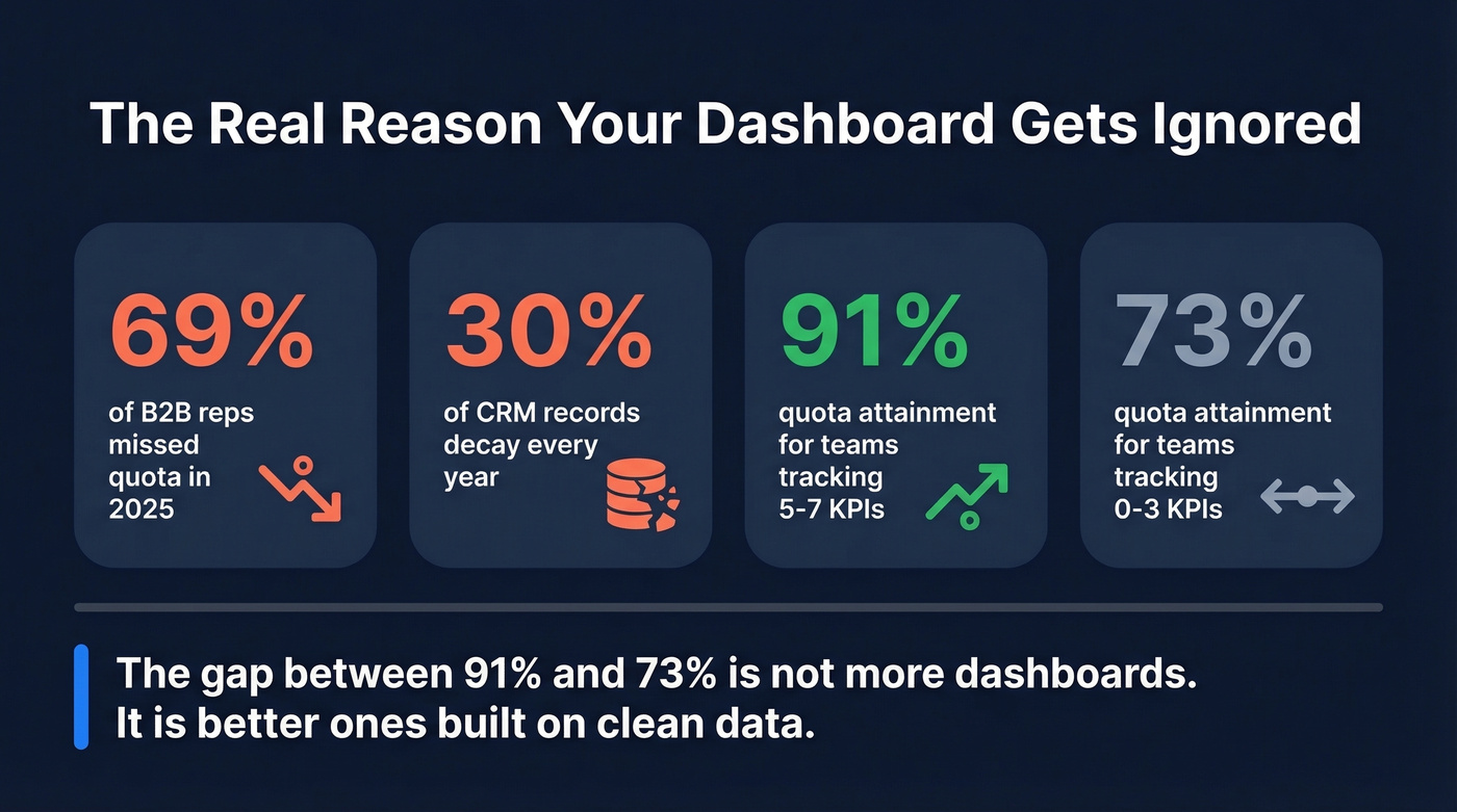
69% of B2B reps missed quota in 2025. That's not a tools problem or a talent problem - it's a visibility problem. Teams tracking 5-7 core KPIs hit 91% average quota attainment versus 73% for teams tracking 0-3 metrics. The difference isn't more dashboards. It's better ones.
The Quick Version
Track 5-7 KPIs max - we list the seven that matter with formulas and benchmarks below. Start with your CRM's native dashboards unless you've got 50+ reps or multi-source data needs. And fix your data before you build anything. A dashboard built on stale contacts is fiction dressed up in charts.
Why Most Sales Dashboards Fail
Sales reps spend 60% of their time on non-selling tasks. A metrics dashboard is supposed to cut through that noise and tell you what matters. Instead, most dashboards become digital wallpaper - built once, glanced at during QBRs, then ignored.
The root cause is always the same: bad data or too many metrics. Someone builds a dashboard with 15+ metrics because every stakeholder wants "their" number on the screen. The result is a spreadsheet with a coat of paint. Reps can't find their pipeline number without scrolling. Managers can't tell if the team is pacing to quota. Execs get a wall of charts that all look green until the quarter misses.
Here's the thing: the #1 reason dashboards fail isn't design. It's data. CRM records decay roughly 30% annually - people change jobs, companies get acquired, emails bounce. When your pipeline dashboard shows $2M in open opportunities but half those contacts have moved on, you're making decisions based on a mirage. We'll come back to this. It's the most fixable problem on the list.
What Is a Sales Performance Dashboard?
A sales performance dashboard is a visual layer that ties your team's activity and pipeline data to specific goals and targets. It's different from a generic sales dashboard the way a scoreboard is different from a stat sheet - performance dashboards measure progress against a number, not just activity in a vacuum.
The key difference: a performance dashboard triggers action. When pipeline coverage drops below 3x, someone should be doing something about it today, not discovering it at the QBR.
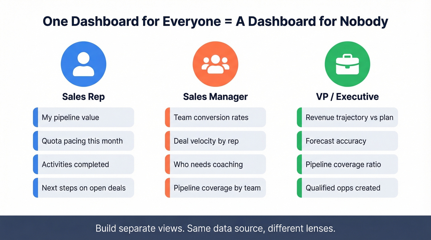
Three audiences need three different views. A rep needs their personal pipeline, activity metrics, and quota pacing. A manager needs team-level conversion rates, deal velocity, and coaching signals. An exec needs revenue trajectory, forecast accuracy, and pipeline coverage - nothing more. Building one dashboard for all three is the most common mistake we see.
7 KPIs That Drive Decisions
If your dashboard has more than seven metrics, it's a spreadsheet with a coat of paint. These are the seven that actually drive decisions, with formulas and benchmarks so you know what "good" looks like.
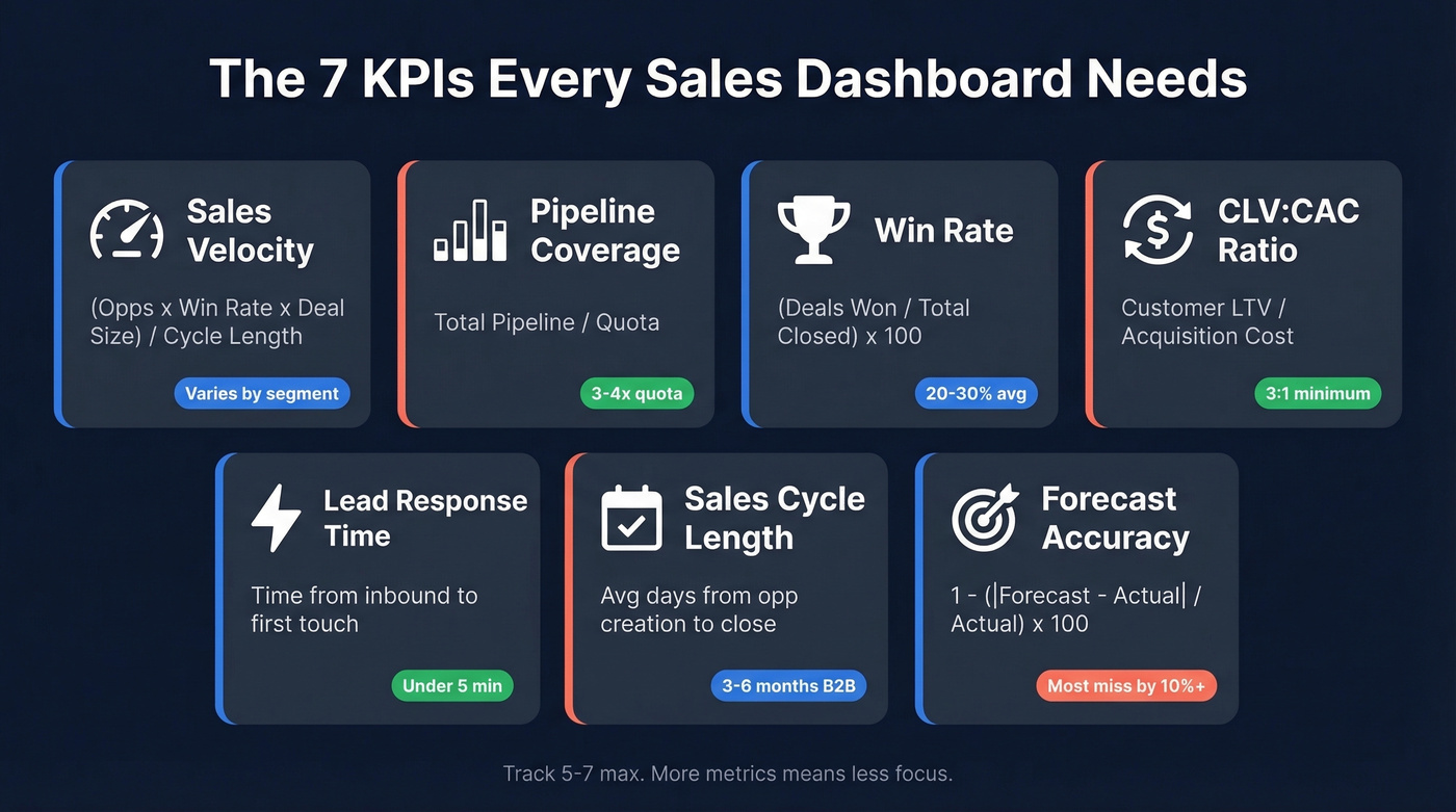
| KPI | Formula | Benchmark | Dashboard Type |
|---|---|---|---|
| Sales Velocity | (Opps x Win Rate x Deal Size) / Cycle Length | Varies by segment | Pipeline |
| Pipeline Coverage | Total Pipeline / Quota | 3-4x quota | Pipeline |
| Win Rate | (Deals Won / Total Closed) x 100 | 20-30% avg, 35-40% best | Pipeline |
| CLV:CAC Ratio | Customer LTV / Acquisition Cost | 3:1 min, 4:1 optimal | Revenue |
| Lead Response Time | Time from inbound to first touch | <5 min best-in-class | Activity |
| Sales Cycle Length | Avg days from opp creation to close | 3-6 months (B2B) | Forecast |
| Forecast Accuracy | 1 - (|Forecast - Actual| / Actual) x 100 | Most teams miss by 10%+ | Forecast |
Sales velocity is the single most important compound metric. It forces you to think about four levers simultaneously - you can't game it by stuffing the pipeline with garbage deals because win rate and cycle length will punish you. The formula: (Number of Opportunities x Win Rate x Average Deal Size) / Sales Cycle Length.
Pipeline coverage at 3-4x quota is the standard benchmark, but context matters. If your win rate sits below 20%, you need 5x coverage or you're going to miss. Teams with best-in-class win rates of 35-40% can operate comfortably at 3x.
Lead response time is the most underrated metric on this list. Responding in under five minutes drives 8-21x higher conversion rates, and 35-50% of deals go to the first responder. If you aren't tracking this, you're leaking pipeline.
Forecast accuracy is humbling. Only about 9% of teams produce accurate forecasts. AI tools are improving this, but no algorithm fixes sandbagged commits or reps who mark deals as "commit" because their manager asked them to.
CLV:CAC ratio belongs on executive dashboards, not rep scorecards. A 3:1 ratio is the minimum for sustainable unit economics; 4:1 is where you start feeling comfortable scaling spend.
Dashboard Examples by Use Case
Pipeline Dashboard
The single metric that matters most here is pipeline coverage - if it drops below 3x, you've got a problem that won't fix itself in the last two weeks of the quarter. Show open opportunities by stage, weighted pipeline value, and coverage ratio against quota. Teams that track pipeline velocity see 23% faster revenue growth compared to teams tracking only pipeline value.
Activity Dashboard
Tracks calls, emails, meetings booked, and demos completed. Anchor it to lead response time - that's the activity metric most correlated with revenue. Best for BDR/SDR managers who need to spot effort gaps before they become pipeline gaps.
Revenue Attainment
The exec view. Closed-won revenue, average deal size, and revenue by segment or product line. Three to four charts maximum. If leadership needs to squint, you've already lost them. A well-built revenue attainment view makes it immediately clear whether the team is tracking toward the quarterly number or falling behind.
Forecasting Dashboard
Skip this if your team is under 10 reps and you're still closing deals on handshakes. For everyone else, compare committed pipeline against quota with historical accuracy overlays. Layer in AI-assisted forecasting if your tool supports it - AI models improve accuracy by 10-20%, which is meaningful but won't fix garbage inputs.
Rep Scorecard
The best rep scorecards show pacing - not just "where am I" but "am I on track given the days left in the quarter." Quota pacing, activities completed, deals in pipeline, and next steps. When built as a visual goal tracker, the scorecard gives reps an at-a-glance view of how their daily effort maps to monthly targets. HubSpot and Salesforce both support this natively.
Manager + Enablement View
These two work best combined. Aggregate rep scorecards into a team view, highlight who's pacing and who's behind, and surface win rate by rep - the fastest signal for who needs coaching. On the same screen, track content usage, training completion, and ramp time for new hires. Pair ramp data with win rate and cycle length to measure whether enablement investments are actually moving numbers. Most teams skip the enablement layer. Don't.
Executive Summary
One page. Revenue trajectory, forecast vs. actual, pipeline coverage, and one leading indicator like qualified opportunities created. Execs don't want interactivity - they want a static one-pager they can scan in 30 seconds before the board meeting.
You read it above: CRM records decay 30% annually. That pipeline coverage metric on your dashboard? It's fiction if half your contacts have bounced. Prospeo's 7-day data refresh and 98% email accuracy mean your dashboard finally reflects reality - not last quarter's org chart.
Stop building dashboards on dead data. Fix the source.
How to Build One (Step by Step)
Six steps. Don't skip the first two - they're where most teams go wrong.
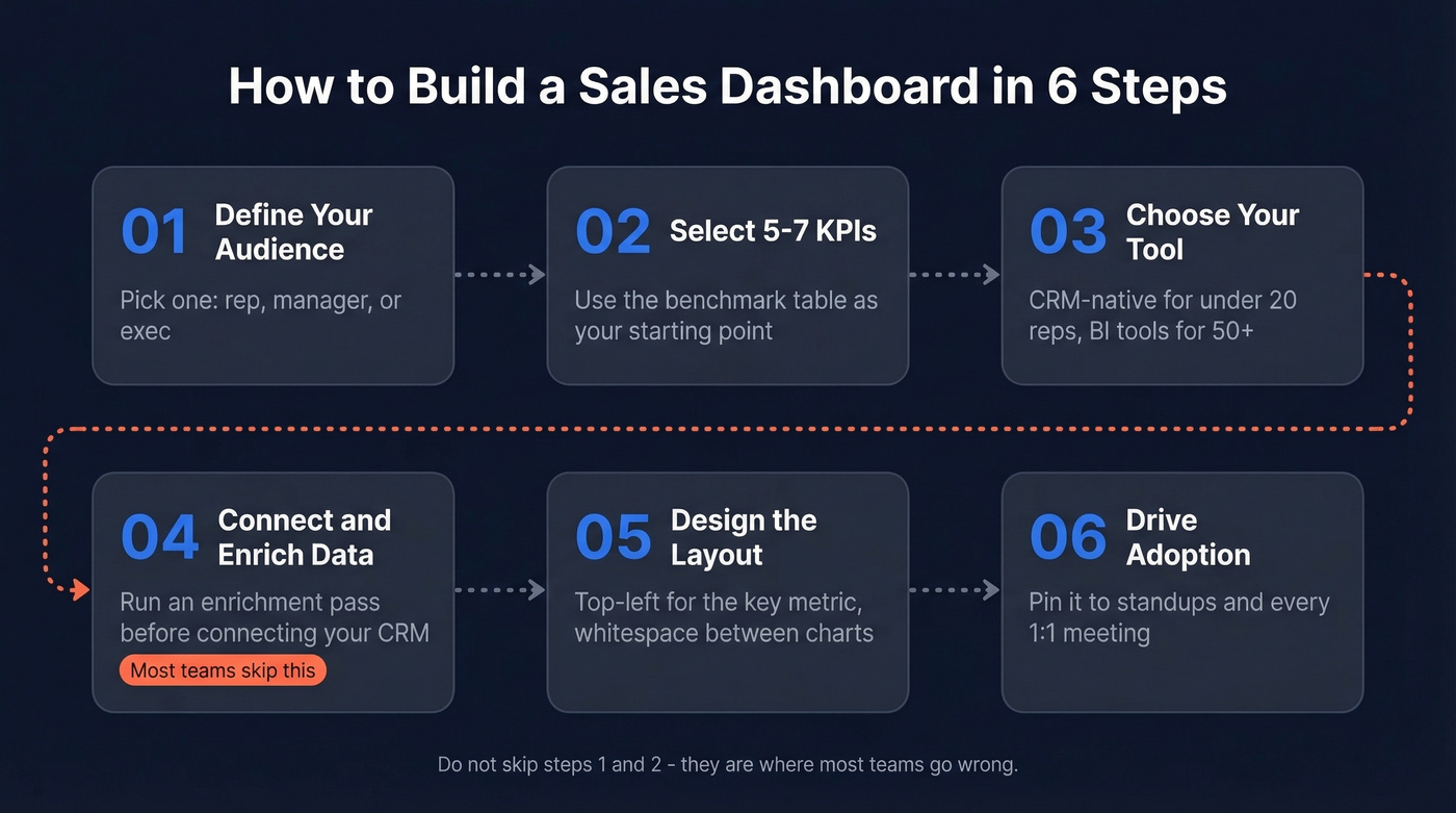
Define your audience. Pick one: rep, manager, or exec. Build separate dashboards for each. One dashboard for everyone is a dashboard for nobody.
Select 5-7 KPIs. Use the table above as your starting point. Resist the urge to add "just one more" metric. Every additional chart dilutes attention.
Choose your tool. For teams under 20 reps, your CRM's native dashboards are almost certainly good enough. HubSpot caps you at 30 reports per dashboard with no pacing alerts - that matters at scale. Salesforce is more flexible but requires someone who knows report types, folder permissions, and running user settings. For 50+ reps or blended CRM-plus-finance data, graduate to Tableau or Power BI.
Connect data sources. Before connecting your CRM, run an enrichment pass. Prospeo's CRM enrichment returns 50+ data points per contact with a 7-day refresh cycle, so your reports start clean rather than building on decayed records.
Design the layout. Follow the design rules in the next section. Top-left placement for your most important metric. Whitespace between charts. Filters in the upper left.
Drive adoption. Pin the dashboard to your team's daily standup. Review it in every 1:1. If nobody looks at it in the first two weeks, ask why - usually the answer is "I can't find my number fast enough."
Design Tips That Actually Matter
Good design isn't about making dashboards pretty. It's about making them scannable.
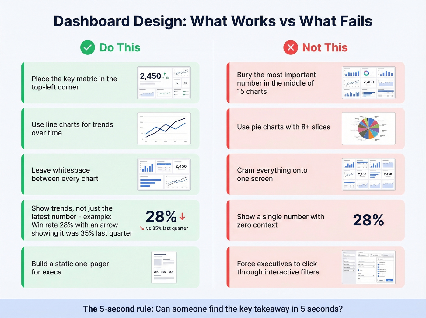
Start with the 5-second rule: can someone identify the key takeaway within five seconds of looking at the dashboard? Place your most important metric in the top-left corner - that's where eyes go first. Leave half an inch to a full inch of whitespace between charts, because cramped dashboards feel overwhelming and train people to stop looking. Use line graphs for trends over time and bar charts for comparisons. This isn't a style preference - it's how humans process visual data. And optimize for mobile if your reps are in the field.
Traps to avoid:
- Pie charts with more than four or five categories - they become unreadable fast.
- Cramming everything onto a single screen. Multiple focused dashboards beat one cluttered one every time.
- Showing only the latest data point without trend context. A win rate of 28% means nothing without knowing it was 35% last quarter.
- Overusing color. If everything is highlighted, nothing is.
- Building interactive dashboards for executives. Most execs want a static PDF they can scan before a meeting, not a tool they need to click through.
Treat dashboards as living documents. Review and iterate monthly.
Best Tools With Pricing (2026)
| Tool | Category | Starting Price | Best For |
|---|---|---|---|
| HubSpot Sales Hub | CRM-native | $9-$150/user/mo | Teams <20 reps in HubSpot ecosystem |
| Salesforce | CRM-native | $25/user/mo+ | 50+ rep orgs needing custom reports |
| Tableau | BI platform | ~$15/user/mo | Teams blending CRM + finance data |
| Power BI | BI platform | Free-$20/user/mo | Microsoft-stack companies |
| Geckoboard | TV dashboard | ~$49/mo | Sales floors with wall-mounted screens |
| Klipfolio | Dashboard tool | Free-$125/mo | Custom KPI dashboards, small teams |
| Zoho Analytics | BI platform | $24/mo | Zoho ecosystem teams |
| Pipedrive | CRM-native | $14/user/mo | Small sales teams <10 reps |
| Coefficient | Sheets add-on | Free-$49/mo | Spreadsheet-first teams, early stage |
| Google Sheets | Spreadsheet | Free | Bootstrapped startups, <5 reps |
HubSpot's native dashboards are good enough for 80% of teams - until they aren't. The ceiling hits at 30 reports per dashboard, no pacing alerts, and forecasting based only on deal stage probabilities. If you're a 15-person sales team on HubSpot Professional at $90/user/mo plus a $1,500 onboarding fee, the built-in dashboards will carry you. Enterprise at $150/user/mo adds some flexibility, but you'll still hit the same structural limits.
Salesforce is more powerful but demands more maintenance. G2 reviewers rate it 4.4/5 with 92% giving it four stars or higher, and that reputation is earned - but you need someone who'll own the report types, folder structure, and scheduled refreshes. Without that person, Salesforce dashboards rot within a quarter.
Let's be honest: if your average deal size is under $15k and you have fewer than 20 reps, you don't need a BI tool. Tableau and Power BI are overkill for a 10-person sales team. If you don't have a dedicated analyst who'll maintain the dashboards, nobody will. These tools shine when you're blending CRM data with marketing attribution, finance data, and product usage signals - typically at 50+ reps or when you've got a real RevOps function. Enterprise teams with dedicated BI staff might also evaluate Looker, Domo, or AWS QuickSight, though these are analytics platforms first and sales tools second.
Geckoboard is purpose-built for office TV displays - it loops through dashboards on a wall-mounted screen so the team sees metrics passively. If your sales floor has a big screen, it's worth the $49/mo.
For bootstrapped teams, Google Sheets plus the Coefficient add-on is a legitimate starting point. Coefficient connects directly to Salesforce or HubSpot and auto-populates a pre-built template. The limitation is real though - almost no automation, and you'll outgrow it past five reps.
One more thing on AI forecasting: sellers using AI sales tools are 3.7x more likely to meet quota. Impressive on paper. In practice, the 10-20% accuracy improvement is meaningful but won't fix sandbagged commits or pipeline stuffed with dead deals. AI needs clean data to work - which brings us to the most important section in this article.
Why Data Quality Makes or Breaks Everything
Harvard Business Review put it well: companies "fail to recognise the critical role that people play in the creation of good data." And Forrester's Ian Bruce warned that B2B companies failing to fix measurement "will continue to misallocate resources, misjudge performance, and miss out on growth opportunities."
Those aren't abstract warnings. They describe what happens when your pipeline dashboard shows $3M in open opportunities but a third of those contacts have changed jobs, bounced emails, or gone dark. CRM data decays roughly 30% per year. By Q4, nearly a third of the records you loaded in January are stale. Your dashboard doesn't know that - it just shows green.
We run Prospeo's data enrichment before building any dashboard. Each pass returns 50+ data points per contact - job title, direct dial, verified email, company size, tech stack - with a 98% email accuracy rate and a 7-day refresh cycle versus the 6-week industry average. Your pipeline metrics end up reflecting real, reachable people rather than ghosts.
Garbage in, garbage out applies to dashboards more than anywhere else. You can spend weeks perfecting chart layouts and filter logic, but if the underlying contact data is decayed, you're optimizing the presentation of lies. Fix the data first.
Lead response time under 5 minutes drives 8-21x higher conversions - but only if you're reaching the right person. Prospeo gives your reps 143M+ verified emails and 125M+ direct dials so that speed-to-lead metric actually converts into pipeline, not bounces.
Turn your activity dashboard green with contacts that actually connect.
Free Templates to Start
If you want something running today, Coefficient offers free Google Sheets templates for both Salesforce and HubSpot dashboards. Copy the template, install the add-on, connect your CRM, and data populates automatically with scheduled refreshes.
The templates cover the basics - pipeline by stage, win rates, activity metrics, revenue tracking. For an early-stage team with fewer than five reps, this is genuinely enough. But be honest about the ceiling: Google Sheets dashboards have almost no automation, the visualizations are basic, and collaboration features are limited. Plan to graduate to your CRM's native dashboards once you've got the team size to justify it.
FAQ
What's the difference between a sales dashboard and a performance dashboard?
A sales dashboard shows activity and pipeline data. A sales performance dashboard ties that data to specific targets, revealing whether the team is pacing to hit quota. Performance dashboards answer "are we on track?" not just "what happened?" - which is why they trigger action instead of passive observation.
How many KPIs should a dashboard track?
Five to seven. Teams tracking 5-7 core KPIs achieve 91% average quota attainment versus 73% for teams tracking 0-3. Beyond seven, each additional chart dilutes focus and reduces the likelihood anyone acts on what they see.
How often should dashboard data refresh?
Daily at minimum for activity and pipeline views; weekly for revenue and forecasting. The bigger issue is underlying contact data - CRM records decay ~30% annually. A 7-day enrichment refresh cycle keeps your metrics grounded in reality versus the 6-week industry average most providers offer.
What's the best free tool for building one?
Google Sheets with the Coefficient add-on connects directly to Salesforce or HubSpot, auto-populates a pre-built template, and costs nothing. It works for teams under five reps. Beyond that, HubSpot Starter at $9/user/mo or Power BI's free tier offer more structure and automation.
Every sales performance dashboard in this article is useless if the data underneath it is stale. Stop obsessing over chart layouts. Fix the data first. Then build the dashboard.