How User Experience Drives Lead Generation (With Real Numbers)
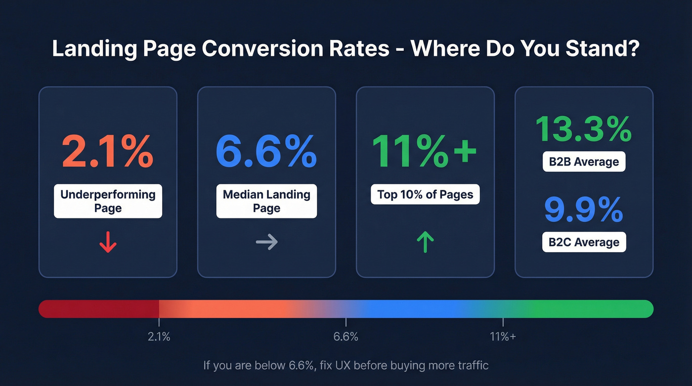
Say you had 5,000 visitors hit your landing page last month. Your conversion rate? 2.1%. That's 105 leads from a page you spent real money driving traffic to. The median landing page converts at 6.6%, which means that same 5,000-visitor month could've been 330 leads. That's 225 leads left on the table because your page didn't work hard enough.
First impressions form in about 0.05 seconds, and 94% of them are design-related. You don't have a traffic problem. You have a UX problem - and it's costing you pipeline every single day.
Three Things to Diagnose Right Now
If your landing page converts below 6.6%, fix UX before buying more traffic. The top 10% of pages hit 11%+. B2B averages 13.3%; B2C sits at 9.9%. There's room.
The three levers that actually move conversion are clarity of offer, message-to-intent match, and friction reduction. Everything else is noise.
And none of it matters if captured leads have bad data. Verify emails before they hit your CRM so your sales team isn't chasing ghosts.
Page Speed Is a Conversion Variable
Speed isn't a nice-to-have. Vodafone Italy improved LCP by 31% and saw 8% more sales. Redbus cut Time to Interactive from 8 seconds to 4 and watched mobile conversion jump 80-100%. These aren't marginal gains - they're pipeline-level shifts from infrastructure work that most marketing teams ignore because it "feels like engineering."
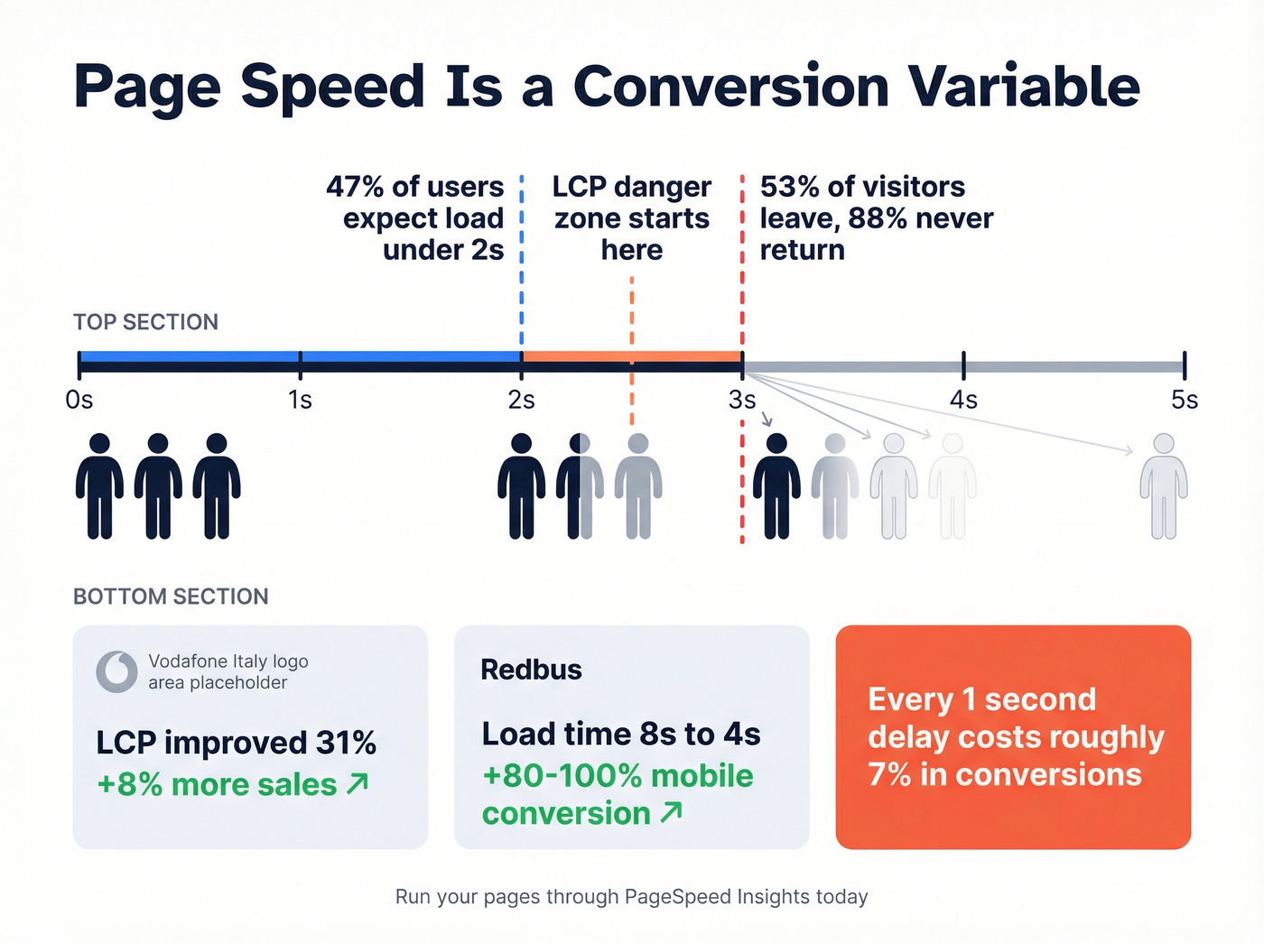
The expectations are brutal. 47% of users expect your page to load in under 2 seconds. A 1-second delay costs you roughly 7% in conversions. And 53% of visitors just leave if load time crosses 3 seconds; 88% of them won't come back.
Run your landing pages through PageSpeed Insights today. If your LCP is above 2.5 seconds, you're bleeding leads before anyone reads a word of your copy.
Form UX That Captures More Leads
Here's the thing: the "fewer fields = more conversions" rule is mostly right, but not universally true.
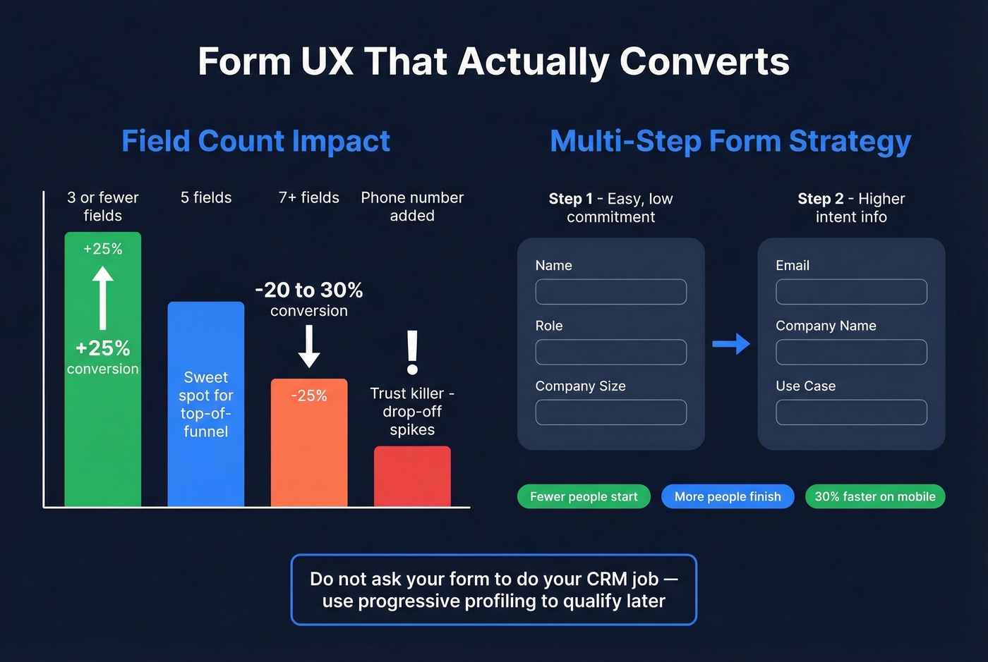
Forms with 3 or fewer fields see up to 25% higher conversion rates. Conversion rates drop 20-30% when you jump from 5 to 7+ fields. That's significant, and lengthy forms are especially punishing on mobile, where users abandon long forms 3x more often than desktop. Phone number requests are a common trust killer too - visitors don't understand why you need one, and drop-off spikes.
But blindly cutting fields can backfire. One A/B test showed that removing fields actually decreased conversions by 14%. The issue wasn't field count - it was removing fields users expected to see. When the team restored those fields with better labels and layout, conversions jumped 19%. Context matters more than raw count.
Multi-step forms add another layer of nuance. In practitioner tests, fewer people start a multi-step form, but more finish it. On mobile, completion time drops roughly 30% despite more screens. The trick is sequencing: easy, low-commitment questions first, then email and company info on step two. Moving company info later reduces early abandonment. Stick to 3-5 fields for top-of-funnel offers and use progressive profiling to qualify later. Don't ask your form to do your CRM's job.
Copy, CTAs, and Trust Signals
Your homepage should communicate a clear value proposition in the first 3 seconds. If a visitor can't articulate what you're offering in that window, they're gone - and average scroll depth sits at just 55% of a page, so front-load everything that matters.
Reading level matters more than most teams realize. Pages written at a 5th-7th grade level convert at roughly 11.1%. Professional-level copy? 5.3%. That's not dumbing things down. It's respecting your reader's attention.
Stick to a single primary CTA. Every additional option dilutes the one action you actually want. Place trust markers near your form - a privacy note, a client logo bar, a testimonial. And remember: 84% of users report difficulty completing transactions on mobile. If your form isn't mobile-optimized, you're losing the majority of your traffic before they even reach the submit button.
You just optimized your forms, speed, and CTAs to capture more leads. Now make sure those leads actually connect. Prospeo verifies emails through a 5-step process with 98% accuracy - so your sales team calls real buyers, not bounced addresses.
Stop losing pipeline to bad data after the submit button.
Stop Using Dark Patterns
A 2024 review by the FTC, ICPEN, and GPEN examined 642 subscription websites and apps. 76% used at least one dark pattern. 67% used multiple.
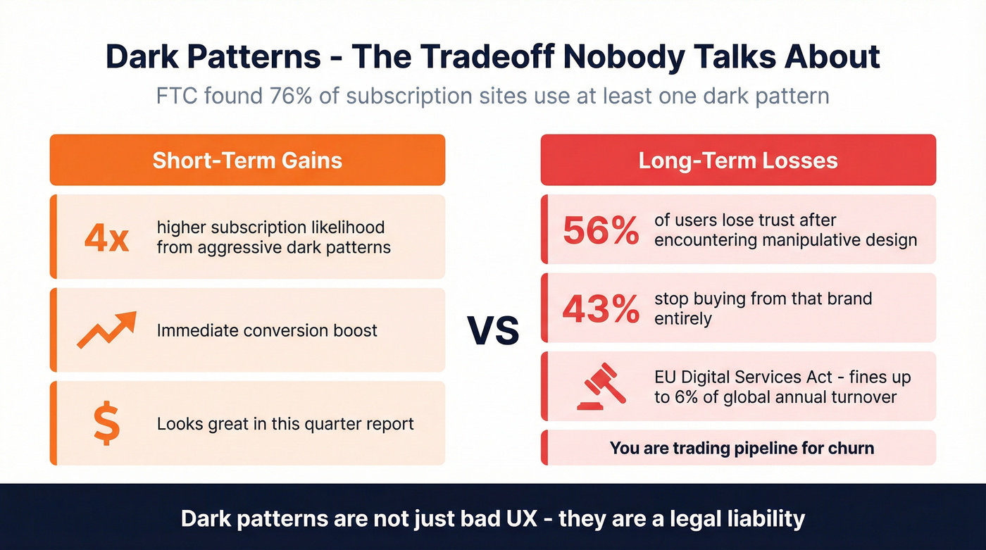
The short-term math looks attractive - aggressive dark patterns nearly quadruple subscription likelihood. But 56% of users lose trust after encountering manipulative design, and 43% stop buying from that brand entirely. You're trading pipeline for churn.
Let's be honest: the EU's Digital Services Act now prohibits deceptive interfaces with fines up to 6% of global annual turnover. Dark patterns aren't just bad UX. They're a legal liability.
Accessibility Is Untapped Revenue
1.3 billion people globally live with disabilities. Their combined disposable income, including friends and family who influence purchasing decisions, runs $13 trillion annually. And 97% of websites remain inaccessible to them.
Legal & General overhauled their site for accessibility and doubled online sales within 3 months. Tesco invested £35,000 in accessibility improvements and generated £13M in annual online sales. These aren't compliance stories - they're revenue stories, and Forrester estimates every $1 invested in accessibility yields up to $100 in benefits.
WCAG 2.2 gives you a practical starting point: 44x44px touch targets, accessible authentication flows, visible focus indicators, and keyboard-navigable forms. Every one of these improvements also helps your non-disabled users on mobile. Accessibility and conversion optimization aren't separate workstreams. They're the same workstream.
Measuring UX Impact on Lead Gen
You can't improve what you don't instrument. Here's a free measurement stack that covers the full lead lifecycle:
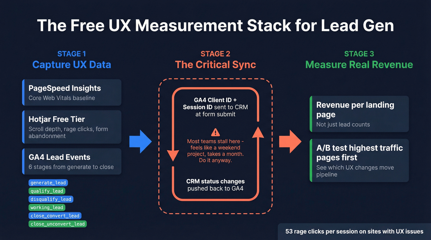
- PageSpeed Insights for Core Web Vitals baseline
- Hotjar (free tier) for scroll depth, rage clicks, and form abandonment heatmaps
- GA4 with a six-stage lead event model:
generate_lead,qualify_lead,disqualify_lead,working_lead,close_convert_lead,close_unconvert_lead
One benchmark worth knowing: on websites with UX issues, visitors can trigger 53 rage-clicks per session. You'll know fast where users are struggling.
The critical step most teams skip is sending your GA4 Client_ID and Session_ID into your CRM at form submission, then pushing CRM status changes back to GA4. This bidirectional sync lets you measure actual revenue per landing page, not just lead counts. In our experience, this is where most teams stall - the sync feels like a weekend project but turns into a month-long integration. Do it anyway. GA4's Lead Acquisition and Lead Disqualification reports make the payoff visible immediately, and A/B testing your highest-traffic pages first gives you a clear picture of which UX changes actually move pipeline.
The Data Quality Gap
Every section above optimizes for getting someone to fill out your form. But here's what happens next: your SDR spends hours calling leads, half the emails bounce, and the phone numbers go to voicemail or dead lines. The user experience was perfect. The data wasn't.
We've seen this pattern over and over - teams spend heavily on landing page redesigns, lift conversions by 30-40%, and still get crushed by email bounce rates and bad contact data that quietly erases the pipeline gains. If you want to capture more leads that actually convert, the answer isn't just better forms. It's ensuring every record that enters your pipeline is accurate and actionable. The consensus on r/b2bmarketing echoes this: clean data plus tighter ICP filtering beats volume every time.
Skip this section if your bounce rate is already under 3%. For everyone else, this is where Prospeo closes the loop - it verifies emails at 98% accuracy, enriches every lead with 50+ data points, and refreshes records every 7 days instead of the 6-week industry average. The free tier gives you 75 emails and 100 Chrome extension credits per month, so there's no reason your optimized leads should hit your CRM unverified.
If you're comparing options, start with email bounce rates and a shortlist of data enrichment services before you commit.
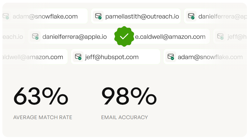
Your GA4 tracks lead events, but your CRM is full of gaps. Prospeo enriches every captured lead with 50+ data points at a 92% match rate - verified emails, direct dials, company intel - so the leads your UX worked hard to capture actually convert to revenue.
Enrich every form fill before it hits your pipeline.
FAQ
What's a good landing page conversion rate?
The median across industries is 6.6%. Top 10% of landing pages convert at 11%+. B2B averages 13.3%, B2C 9.9%. If you're below 4%, prioritize UX improvements over additional traffic spend.
How many form fields should a lead-gen form have?
Three to five for top-of-funnel offers. Forms with 3 or fewer fields see up to 25% higher conversion rates, and the tradeoff gets steep past 7 fields. Use progressive profiling to qualify later instead of front-loading every question.
Does publishing more landing pages generate more leads?
Yes. Companies that increase from 10 to 15 landing pages see a 55% lift in leads. Those with 40+ pages generate 500% more leads than those with 5 or fewer. Each page should target a single offer and audience segment.
How do I verify leads captured through optimized forms?
Run every new submission through an email verification tool before it reaches your CRM. Tools like Prospeo, Hunter, and NeverBounce offer free tiers so you can start without budget approval. Prospeo verifies at 98% accuracy and enriches contacts with 50+ data points automatically.