The 7 Best Sales Dashboards in Tableau - And How to Actually Build Them
It's Monday morning. Your VP pings Slack: "Pipeline number on the dashboard doesn't match Salesforce." You spend 45 minutes debugging. Turns out your incremental refresh only pulls changes from the previous 30 days, and nobody warned you. Sales reps already spend roughly [25% of their time actually selling](https://www.bain.com/insights/ai-transforming-productivity-sales-remains-new-frontier-technology-report-2025/), with [60% going to non-selling tasks](https://www.salesforce.com/sales/state-of-sales/). A broken Tableau sales dashboard doesn't just waste your time - it erodes trust in the one tool that's supposed to give leadership clarity.
With 11M+ vizzes on Tableau Public, there's no shortage of inspiration. But most of those aren't built for sales teams, and most "best sales dashboards" articles show pretty screenshots and stop there. That's a poster, not a guide. We've debugged more broken Salesforce extracts than we'd like to admit, so let's get into the calculated fields, connector gotchas, and design decisions that actually ship something useful.
What You Need (Quick Version)
- Start with the Pipeline Dashboard. It answers the one question every sales leader asks first.
- Limit each view to 5-7 KPIs. Use drill-downs for everything else. More than 7 and you've built a spreadsheet with better fonts.
- Connect via Salesforce extract, not live. Live connections aren't supported for Salesforce in Tableau Desktop.
- Fix your CRM data first. Stale contacts and wrong titles will poison every chart you build.
7 Tableau Sales Dashboard Archetypes
1. Pipeline Dashboard
This is your default starting point and the dashboard that gets the most exec attention. Key KPIs: stage distribution, average deal size by bucket, won vs. lost analysis, and pipeline velocity. Put the funnel visualization front and center - it's the single chart leadership will actually read.
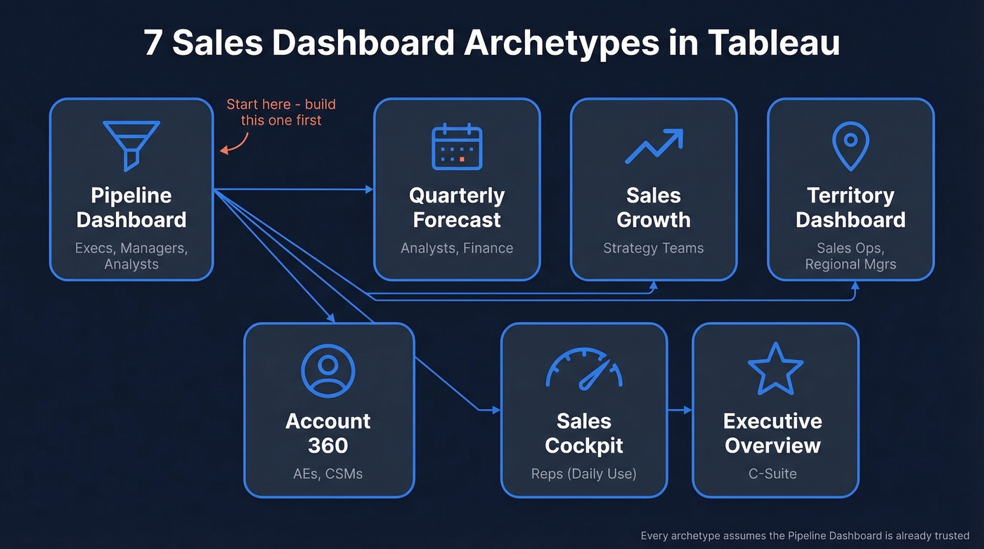
Build it for execs, managers, and analysts. If you only ship one dashboard this quarter, make it this one. Every other archetype on this list assumes the pipeline view already exists and is trusted.
2. Quarterly Forecast Dashboard
What happens when your commit number is off by 30% two quarters in a row? You lose credibility. Show commit, likely, and best-case columns side by side with an expected revenue timeline. Include a rolling accuracy metric so the team can see how well last quarter's forecast held up - that single addition changes the conversation from "is this number right?" to "how right has this number been historically?" Analysts and finance own this one. (If you’re evaluating tooling, compare sales forecasting solutions before you standardize.)
3. Sales Growth Dashboard
YoY and MoM comparisons with filters for region, segment, and rep. The value here is trend detection - are you growing because of one whale account, or is the base expanding? Strategy teams live in this view.
4. Territory Dashboard
Geographic performance maps, territory-level quota attainment, and optimization signals. Optimizing territory design can increase sales from 2% to 7% without changes in resources - Tableau's own research highlights this upside. Sales ops and regional managers are the primary users. If you’re building this out, sales mapping software can help validate territory logic.
5. Account 360 Dashboard
Think of this as the single-account deep dive for AEs and CSMs: account-level revenue, activity timeline, health score, and open opportunities. Embed it in Salesforce Lightning so reps don't have to context-switch.
6. Sales Cockpit
Here's the thing: if reps have to open a separate tab, they won't use it. Daily workflow metrics - calls made, emails sent, meetings booked, pipeline created today - embedded directly in the CRM via the Tableau View Lightning web component.
Performance is adoption. If your cockpit takes forever to load, reps will abandon it. Aim for sub-5-second loads by keeping extracts lean, using efficient calculations, and avoiding overbuilt layouts.
7. Executive Overview
High-level KPIs, trend arrows, and exception alerts. One screen. No scrolling. If an exec has to scroll, you've already lost them.
Skip this if your org doesn't have a C-suite that actually looks at dashboards. Some companies do fine with the pipeline and forecast views alone, and building an exec overview nobody opens is wasted effort.
KPIs That Actually Matter
The 5-7 KPI rule isn't arbitrary - it's the threshold where dashboards stay decision tools instead of becoming data dumps. If you want a tighter KPI framework, start with sales operations metrics.
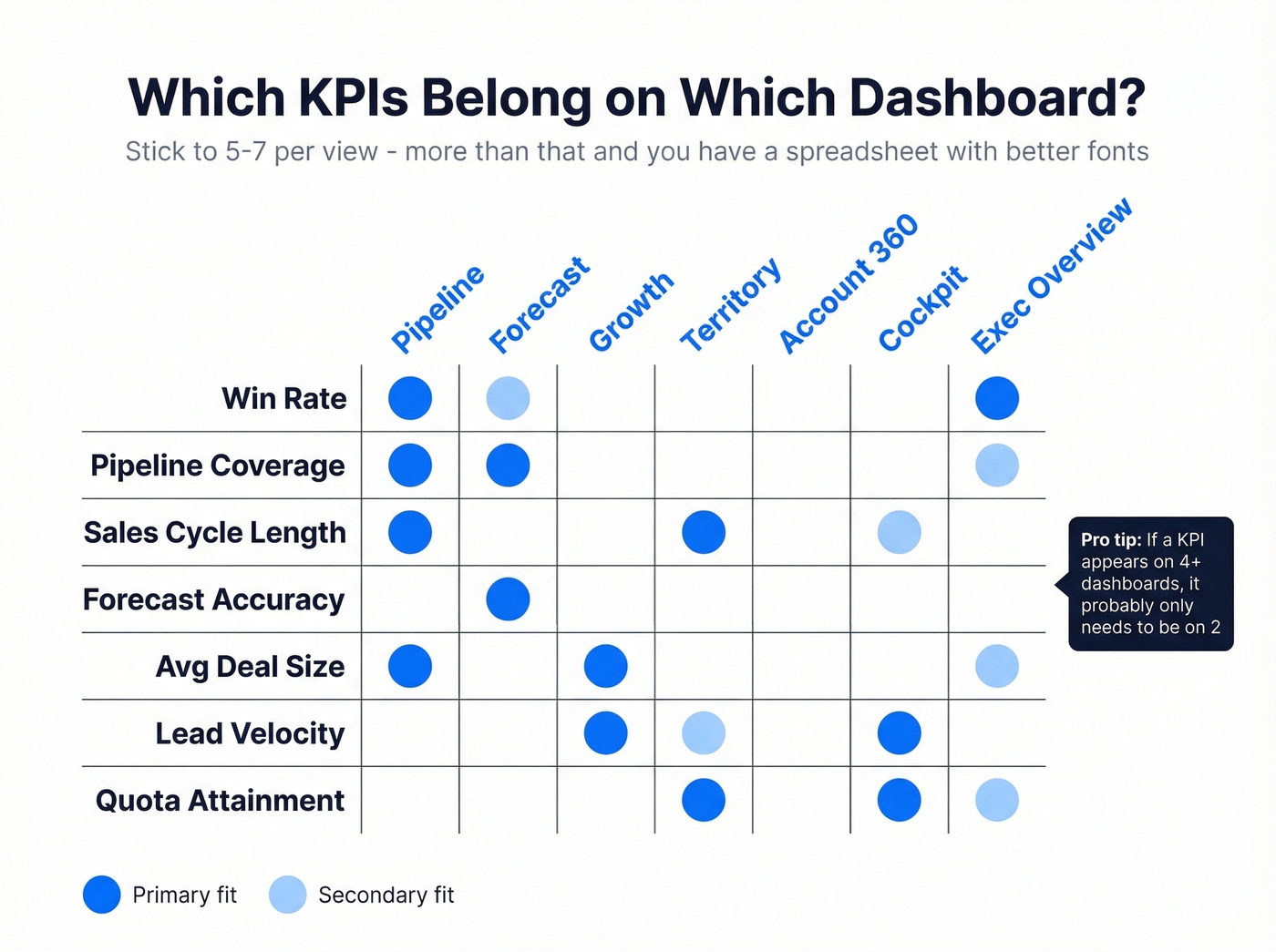
| KPI | Best Dashboard | Primary Audience |
|---|---|---|
| Win rate | Pipeline, Exec | Managers, C-suite |
| Pipeline coverage | Forecast, Pipeline | Analysts, VPs |
| Sales cycle length | Pipeline, Territory | Ops, managers |
| Forecast accuracy | Forecast | Finance, analysts |
| Avg deal size | Pipeline, Growth | Execs, AEs |
| Lead velocity | Growth, Cockpit | Ops, reps |
| Quota attainment | Territory, Cockpit | Managers, reps |
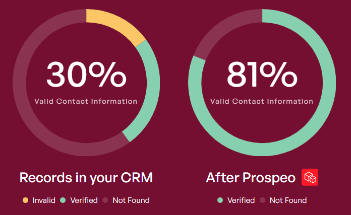
Every dashboard on this list breaks the moment your CRM data goes stale. Prospeo enriches your Salesforce contacts with 98% verified emails, direct dials, and 50+ data points - refreshed every 7 days, not every 6 weeks. Your pipeline chart finally matches reality.
Fix the data feeding your Tableau dashboards before you build another chart.
Calculated Fields You'll Need
Three patterns cover most sales dashboard requirements in Tableau.
Variance calculation (target vs. actual):
SUM([Sales]) - SUM([Sales Target])
KPI status indicator - this drives your green/red/neutral color coding:
IF SUM([Sales]) > SUM([Sales Target]) THEN "Above Target"
ELSEIF SUM([Sales]) < SUM([Sales Target]) THEN "Below Target"
ELSE "On Target"
END
FIXED LOD for per-rep revenue - computes at a level independent of your viz granularity, giving you a stable denominator:
{ FIXED [Sales Rep] : SUM([Revenue]) }
One gotcha worth flagging: FIXED LOD expressions ignore most filters except context filters, data source filters, and extract filters. If your per-rep calc isn't responding to a region filter, add the filter to context or switch to INCLUDE.
If you’re standardizing definitions across teams, document your sales forecast vs sales goal logic before you publish dashboards.
Salesforce Connector Gotchas
These will bite you if nobody warns you. Consider this your warning.
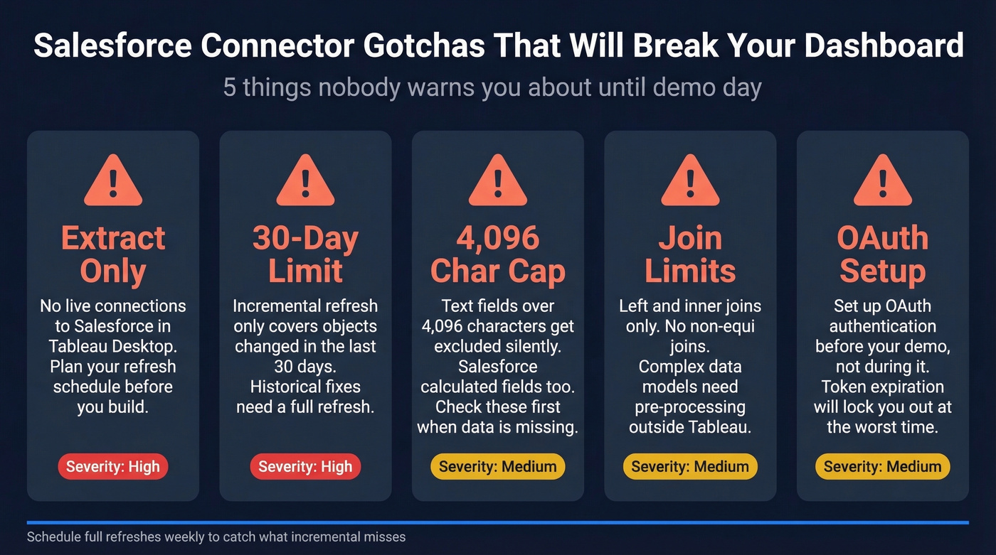
- Extract only. Tableau Desktop doesn't support live connections to Salesforce. Plan your refresh schedule accordingly.
- 30-day incremental refresh limit. Incremental refresh only includes objects added or changed in the previous 30 days. Historical corrections need a full refresh.
- Text fields over 4,096 characters get excluded. So do Salesforce calculated fields. Missing pipeline data? Check these first.
- Joins are limited. Left and inner only - no non-equi joins. Complex models need pre-processing.
- OAuth required. Set up OAuth before your demo day, not during it. We learned that one the hard way.
Design Mistakes That Kill Adoption
We've seen dashboards die within weeks of launch because of these anti-patterns, and Tableau's own best practices confirm them:
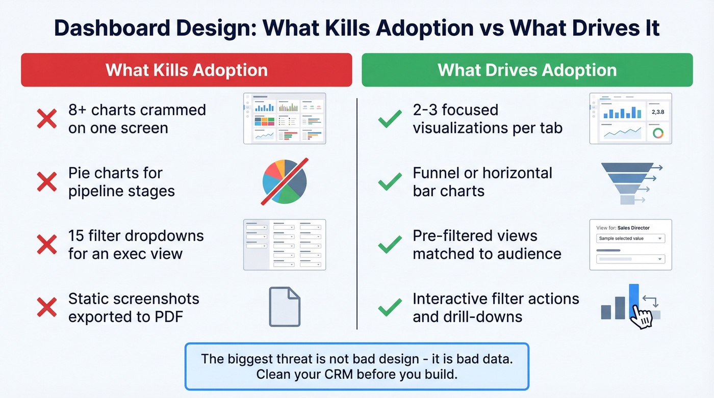
- Too many charts on one view. Stick to 2-3 visualizations per tab. If you need more, use tabs or drill-downs.
- Pie charts for pipeline stages. Use a funnel or horizontal bar. Pie charts can't show sequential progression.
- Ignoring your audience. An exec dashboard with 15 filters is a dashboard nobody uses.
- No interactivity. Static dashboards become stale PDFs within a month. Add filter actions, parameter controls, and drill-downs.
Let's be honest about the single biggest threat to your Tableau investment: it isn't bad design - it's bad data. The prettiest dashboard is useless when nearly a fifth of your company data can't even be accessed, and what is accessible is often stale. If your average deal value is above five figures, a broken pipeline chart costs you real money every week you ignore it. This is also why data-driven selling programs fail without clean inputs.
Fix Your CRM Data First
84% of analytics leaders say AI and analytics outputs are only as good as the data feeding them. Your pipeline dashboard lies when your CRM has bounced emails, wrong titles, and contacts who changed jobs six months ago. In our experience, teams that clean their CRM data before building dashboards ship something useful in half the time.
Prospeo's CRM enrichment returns 50+ data points per contact with an 83% match rate, refreshed on a 7-day cycle compared to the 6-week industry average. Connect it to Salesforce, clean your contact records, and your Tableau pipeline numbers actually reflect reality. If you’re comparing vendors, start with data enrichment services. With 98% email accuracy and native Salesforce integration, the data flowing into your dashboards stays current without manual scrubbing.
Quota attainment and lead velocity metrics tank when reps prospect with bad contact data. Prospeo gives your team 300M+ verified profiles at $0.01/email - so the numbers in your Sales Cockpit actually go up, not just look pretty.
Stop visualizing bad data. Start feeding Tableau contacts that convert.
FAQ
How many KPIs should a Tableau sales dashboard have?
Stick to 5-7 KPIs per view. Beyond that threshold, dashboards become data dumps where nobody knows where to look first. Use drill-downs and tab navigation for secondary metrics instead of cramming everything onto one screen.
Can Tableau connect to Salesforce in real time?
No. Tableau Desktop supports extract connections to Salesforce only. Incremental refresh covers the previous 30 days, so schedule full refreshes weekly or biweekly to catch historical corrections and backdated deal changes.
How do I keep my sales dashboard data accurate?
Run contacts through an enrichment tool before connecting to Tableau. Prospeo's 7-day refresh cycle and 98% email accuracy keep CRM records current, so your pipeline numbers reflect actual org charts rather than last quarter's.
What's the fastest way to build a sales dashboard in Tableau?
Start with the pipeline dashboard archetype and limit it to three visualizations: a stage funnel, a won/lost bar chart, and a KPI header row. Using Tableau's Salesforce connector with a pre-cleaned extract, most teams can ship a working v1 in under two hours.