Forecasting Metrics: A Practitioner's Guide for 2026
Your forecast accuracy dashboard says 97%. The CFO is thrilled. Then you drill into SKU-level performance and find half your line items are off by 40% or more. The total looks fine because overages and shortages cancel each other out - classic aggregation masking that hides real operational pain.
Choosing the right forecasting metrics is the only way to see through the illusion.
A 10% improvement in forecast accuracy translates to roughly a 1.5% improvement in stock availability. That's real money, but only if you're measuring accuracy with the right metric in the first place. Over-forecasting drives inventory and obsolescence costs; under-forecasting drives stockouts and lost sales. The metric you pick determines which direction you're blind to, and most teams don't realize they've been flying with one eye closed until the quarterly post-mortem.
MAPE is the most popular forecast error metric and the most misleading.
Which Metric, When
Every guide says "it depends on your context" and stops there. That's not guidance - it's a cop-out. Here's what we actually recommend:
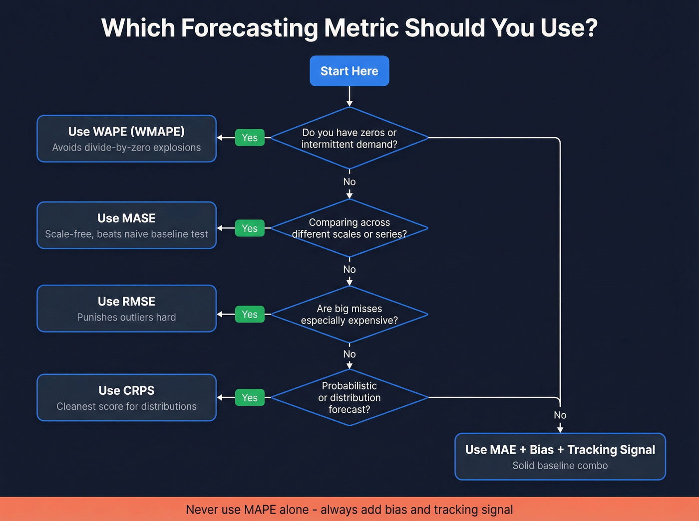
- Zeros or intermittent demand? Use WAPE (often called WMAPE in supply chain). MAPE will explode.
- Comparing across different series or scale? Use MASE. It's scale-free.
- Big misses are expensive? Use RMSE. It punishes outliers hard.
- Probabilistic forecasts? Use CRPS. Cleanest score for distributions.
- Only tracking MAPE? Stop. Add bias and tracking signal at minimum.
Here's the thing: if MAPE is your only KPI, you're not measuring forecast performance. You're measuring how good you are at hiding problems.
Core Forecast Error Metrics
| Metric | What It Measures | Best For | Watch Out For |
|---|---|---|---|
| MAE | Avg absolute error | Simple baseline | Scale-dependent |
| MAPE | % error vs actuals | Quick % headline | Breaks on zero/small actuals |
| WAPE | Total error / total actual | Intermittent demand | Can hide item-level pain |
| sMAPE | Symmetric % error | Bounded % score | Still distorts near zero |
| MASE | Error vs naive baseline | Cross-series comparison | Needs the right naive baseline |
| RMSE | Root of squared errors | Making big misses hurt | Outlier-sensitive |
MAE is the plain-English baseline: average the absolute errors. We like it for internal model iteration because it's stable and easy to reason about. It's also scale-dependent, so it's useless for comparing a $10M line to a $50K line.
MAPE divides each error by the actual value. That sounds fair until actual demand is tiny. Forecast 2 when actual is 1 and you've "missed by 100%" on a one-unit mistake. MAPE also penalizes over-forecasting more than under-forecasting - under-forecasts cap at 100% APE, while over-forecasts have no ceiling. This asymmetry quietly nudges teams toward sandbagging, which is exactly the wrong incentive for revenue orgs.
WAPE (often called WMAPE in supply chain) fixes the denominator problem by summing absolute errors and dividing by total actual demand. 52% of respondents in a supply-chain survey used WMAPE as their primary metric because it behaves in the real world: it weights errors by volume, so your top sellers matter most.
MASE compares your forecast error to a naive baseline (like "use last period"). Below 1.0 means you beat naive; above 1.0 means your fancy model lost to "just repeat last month." It's scale-free and doesn't blow up on zero actuals because the denominator is the naive model's error, not the actual value.
RMSE squares errors before averaging, then takes the square root. That squaring is the point: one ugly miss should hurt. In our experience, RMSE is the fastest way to surface "one SKU is quietly wrecking our plan" problems that MAE smooths over.
Worked Example - Same Data, Different Verdict
Let's break this down with a small dataset showing how one low-volume day can hijack a percentage metric:
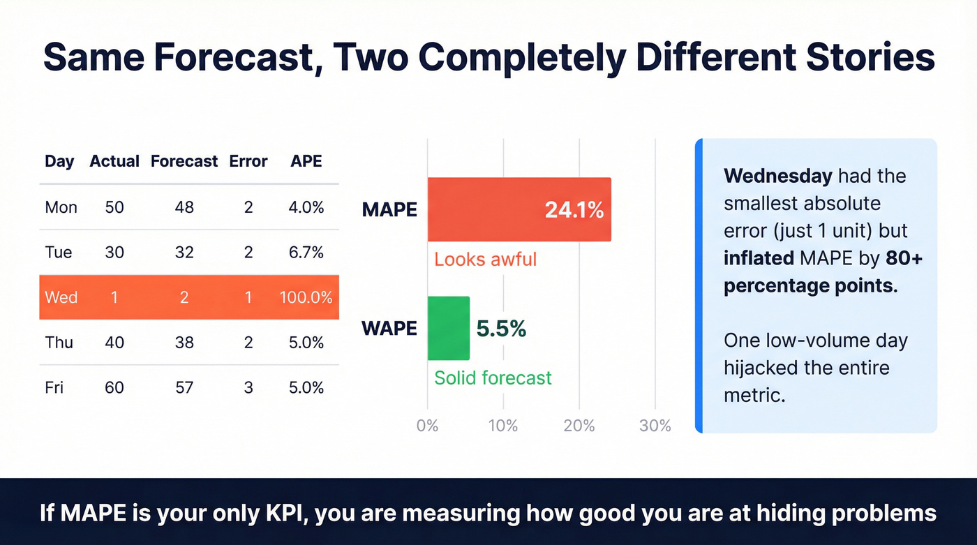
| Day | Actual | Forecast | Abs Error | APE |
|---|---|---|---|---|
| Mon | 50 | 48 | 2 | 4.0% |
| Tue | 30 | 32 | 2 | 6.7% |
| Wed | 1 | 2 | 1 | 100.0% |
| Thu | 40 | 38 | 2 | 5.0% |
| Fri | 60 | 57 | 3 | 5.0% |
MAPE = average APE = (4.0 + 6.7 + 100.0 + 5.0 + 5.0) / 5 = 24.1%. Looks awful.
WAPE = sum absolute errors / sum actuals = 10 / 181 = 5.5%. That's a solid forecast.
Same forecast. Two completely different stories. We've watched teams spend quarters "fixing" a MAPE spike that was nothing more than a handful of low-demand items going from 0 to 1. Wednesday's single-unit miss accounts for nearly all the MAPE inflation, yet it represents the smallest absolute error in the dataset.
Beyond Accuracy: Bias and Tracking Signal
Accuracy tells you how far off you are. Bias tells you which direction you're wrong - and that's what you can actually correct.
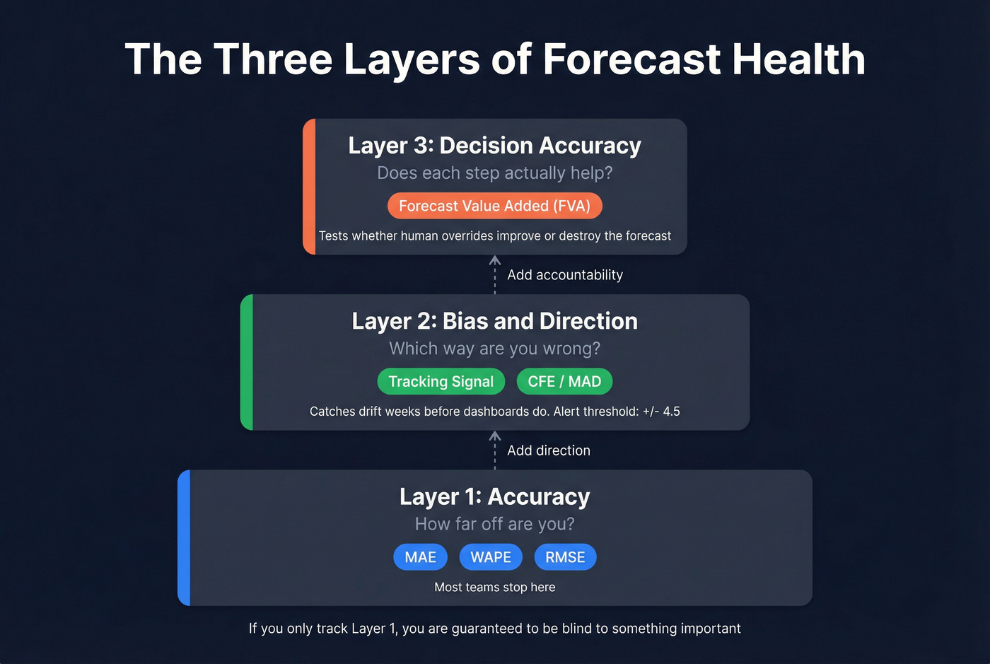
Track bias with tracking signal: cumulative forecast error (CFE) divided by mean absolute deviation (MAD). In practice, tracking signal catches drift weeks before anyone notices it in a dashboard. When it exceeds +/-4.5, your forecast is statistically out of control and needs intervention.
Humans inject bias constantly. Optimism inflates sales forecasts, sandbagging deflates them, and recency bias overweights the last data point. Anecdote bias is the killer - one loud customer story steamrolls the data. This is especially visible in bookings forecasts, where reps routinely inflate pipeline confidence to hit quarterly targets, then the number collapses in week 11 when deals slip.
Real talk: stop obsessing over forecast accuracy. Start measuring decision accuracy. Forecast Value Added (FVA) tells you whether each step - model output, planner override, management adjustment - improves the forecast versus a naive baseline. If overrides make it worse, you don't have a model problem. You have a process problem.
If you're building a revenue forecast, the same logic applies: you need clean inputs, a consistent model, and a way to audit what changed and why - especially in pipeline accuracy.
Bad data is the bias no forecasting metric can correct. When 35% of your emails bounce, pipeline inflates and forecasts collapse in week 11. Prospeo delivers 98% email accuracy on a 7-day refresh cycle - so the pipeline you forecast against is pipeline that's real.
Stop forecasting on phantom pipeline. Start with verified contacts.
Probabilistic Metrics: CRPS and Pinball Loss
Point forecasts are only half the game. If you're making inventory, staffing, or capacity decisions, you're already thinking in ranges - you should score forecasts in ranges too.
CRPS (Continuous Ranked Probability Score) generalizes MAE to probability distributions. It stays in the same units as your target variable, and if your distribution collapses to a single point, CRPS becomes MAE. Clean, consistent, hard to game.
Pinball loss (quantile loss) grades a specific quantile. If you set safety stock using the 95th percentile, pinball loss tells you whether your model is actually good at that tail - not just "pretty good on average." For revenue teams running scenario planning, this distinction matters more than any single-point accuracy number.
Industry Benchmarks for 2026
Industry averages are sobering. In one supply-chain survey, CPG companies averaged 39% forecast error and chemicals averaged 36%.
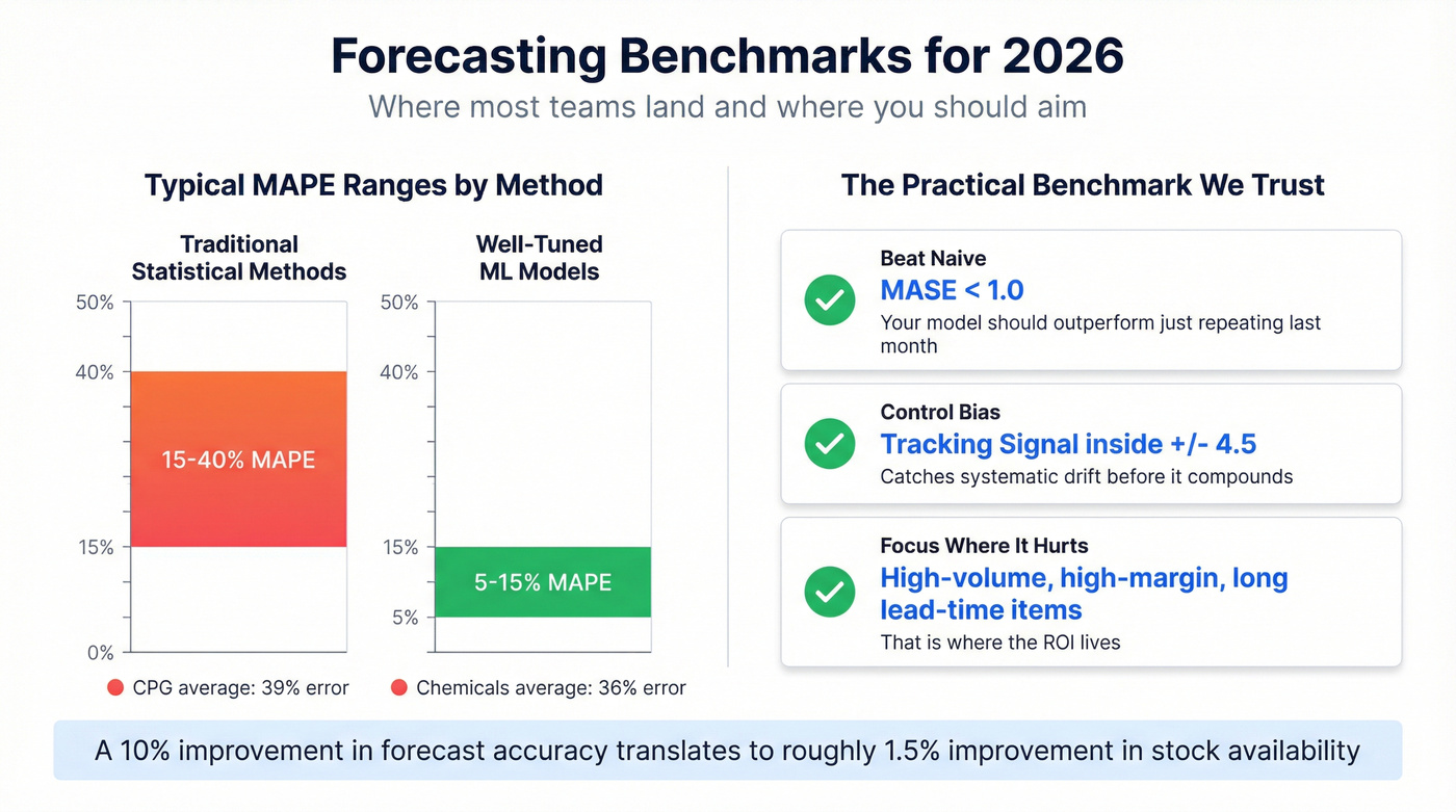
Traditional statistical methods typically land in the 15-40% MAPE range, while well-tuned ML approaches can reach 5-15% MAPE on structured, stable demand. But chasing a universal MAPE target is a trap. A 12% MAPE on a stable consumer staple isn't comparable to a 12% MAPE on a volatile industrial chemical with 18-month lead times.
The practical benchmark we trust is simpler: beat naive (MASE < 1), keep bias controlled (tracking signal inside +/-4.5), and focus improvements where misses are expensive - high-volume, high-margin, long lead-time items. That's where the ROI lives.
If you want the revenue-side equivalent, align your forecast targets to your revenue planning cadence and the levers you can actually pull.
Common Pitfalls
MAPE detonates on zeros. One unexpected transaction against a near-zero actual can wreck your month; r/learnmath has a real example of someone struggling with exactly this problem in a budgeting context.
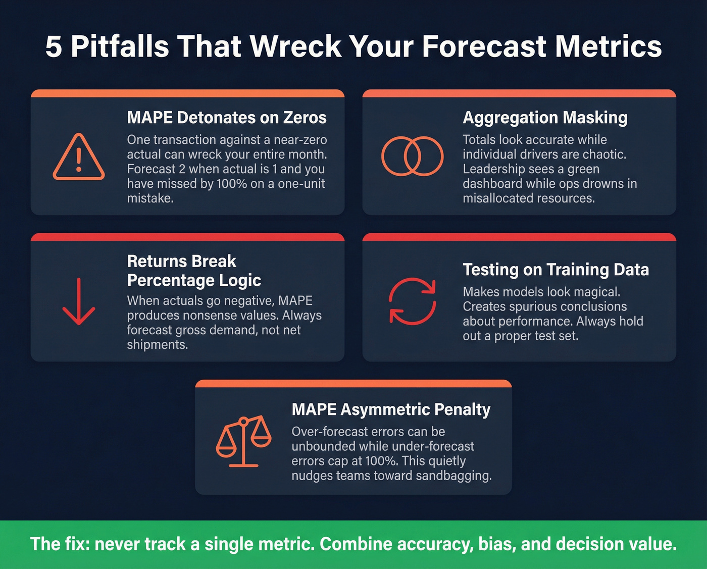
Aggregation masking. Totals look "accurate" while drivers are chaotic. The r/FPandA community complains about this constantly - leadership sees a green dashboard while the ops team drowns in misallocated resources.
Returns break percentage logic. When actuals go negative, MAPE can produce nonsense values. Forecast gross demand, not net shipments.
Testing on training data. It makes models look magical. A peer-reviewed review shows how often this creates spurious conclusions about model performance.
MAPE's asymmetric penalty. It quietly nudges teams toward under-forecasting because over-forecast errors can be unbounded while under-forecast errors cap at 100%.
Skip the "one metric to rule them all" mindset. If your team is only tracking a single number, you're guaranteed to be blind to something important.
Data Quality: The Upstream Killer
Every metric discussion assumes clean inputs. In practice, stale CRM data is the silent accuracy killer for revenue and pipeline forecasting - job changes, closed companies, and bounced emails quietly rot your forecast inputs while your dashboard stays green.
This is where tools like Prospeo make a difference. A 7-day data refresh cycle and 98% email accuracy mean your pipeline model isn't degrading between forecast cycles. When 83% of enriched leads come back with verified contact data, you're forecasting against a pipeline that actually exists - not one full of ghosts.
If you're trying to operationalize this, start by tightening your pipeline management workflow and running regular data cleansing on CRM fields that feed the model.
It also helps to standardize how you calculate and report forecasts across teams - especially if you're using a shared revenue forecasting process.
You just learned that decision accuracy beats forecast accuracy. Here's the upstream fix: Prospeo's 143M+ verified emails and 125M+ direct dials mean reps connect with real buyers, not dead leads. Teams using Prospeo book 26% more meetings - that's pipeline you can actually forecast.
Your forecast is only as good as the contacts feeding it.
FAQ
What's the best forecasting metric for intermittent demand?
WAPE (Weighted Absolute Percentage Error) is the best choice for intermittent or sparse demand because it divides total absolute error by total actual demand, avoiding the divide-by-zero explosions that make MAPE useless when actuals are near zero. Over 52% of supply-chain teams already use it as their primary accuracy measure.
How do I know if my forecast is biased?
Calculate tracking signal - cumulative forecast error divided by mean absolute deviation. If the result exceeds +/-4.5, your forecast has statistically significant directional bias. Check it monthly; it catches systematic drift weeks before aggregate accuracy dashboards flag a problem.
What MAPE range is considered good?
Well-tuned ML models on stable demand typically achieve 5-15% MAPE, while traditional statistical methods land between 15-40%. Rather than chasing a universal target, aim for MASE below 1.0 (beating naive) and tracking signal within +/-4.5. Those two checks are more actionable than any single MAPE threshold.
How does bad CRM data affect forecast accuracy?
Stale contacts, bounced emails, and outdated job titles silently corrupt pipeline forecasts by inflating deal counts that won't close. Keeping CRM inputs current with regular enrichment and verification prevents the "garbage in, garbage out" problem that no forecasting metric can fix after the fact.