How to Read a Sales Report Without Embarrassing Yourself
Your VP just asked why revenue is up 12% but the forecast says you'll miss Q3 by 20%. The numbers don't make sense because you're reading the report top to bottom, like a story.
Here's the thing: sales reports aren't narratives. They're dashboards with landmines, and the fastest way to lose credibility in a forecast review is to confidently explain a number you haven't defined.
Five-minute version: Skip the charts. Go straight to the variance column. Read pipeline coverage first (leading indicator), then conversion rate (efficiency), then revenue (lagging outcome). If numbers don't match across systems, check whether you're looking at bookings, billings, or recognized revenue - confusing them is the quickest way to get corrected in public.
Read a Sales Report in 3 Steps
Step 1: Identify the baseline
Before you interpret a single number, answer three questions: What time period is this? What metric is it actually measuring? And what's the comparison point - budget, prior period, or forecast?
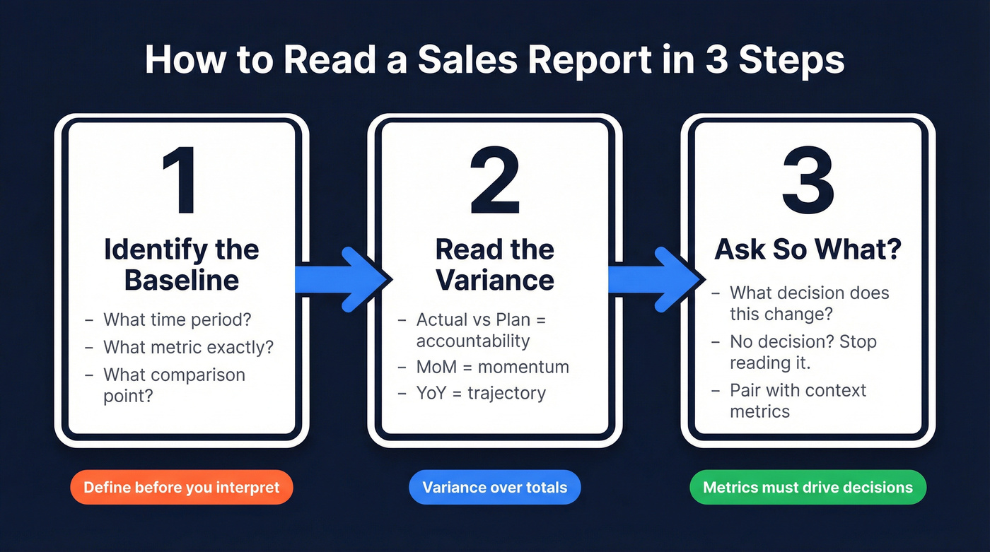
A report showing "Q2 revenue" might compare against the annual plan, last quarter, or the same quarter last year. Each tells a different story. If you don't know which baseline the report uses, "up 12%" can be good, bad, or basically noise.
Nail down the metric definition, too. In many CRMs, "revenue" is used to mean bookings (closed-won contract value). In finance reporting, revenue usually means recognized revenue under ASC 606. Same word, different number, different decision.
Step 2: Read the variance (not the total)
Variance is the gap between what happened and what was supposed to happen. Actual vs plan shows accountability. Month-over-month shows momentum. Year-over-year shows trajectory.
For operational adjustments like rep activity, meeting rates, and follow-up speed, monthly variance is your friend. For strategic calls like headcount, territory changes, or comp tweaks, quarterly variance smooths out the noise and reveals whether you're seeing a real trend or a weird month. Numeric has a solid walkthrough of variance analysis and why cadence matters: https://www.numeric.io/blog/variance-analysis-guide
Step 3: Ask "So what?"
Every number should answer one question: what decision does this inform? If a metric doesn't change a decision, stop reading it.
We've seen teams celebrate "$500K closed-won" while their conversion rate slid, their sales cycle stretched, and their acquisition costs spiked. That's not winning; it's borrowing from next quarter. Revenue without conversion rate and acquisition cost context is a vanity metric, and it leads to the wrong fixes. EOXS breaks down common sales-metrics mistakes that create exactly this kind of false confidence: https://eoxs.com/new_blog/common-sales-metrics-mistakes-and-how-to-avoid-them/
How to Interpret a Pipeline Report
Pipeline coverage is the most useful leading indicator in a sales report because it tells you whether future results are even possible. The basic math is simple: total pipeline value divided by quota. $400K in pipeline against a $100K target is 4x coverage.
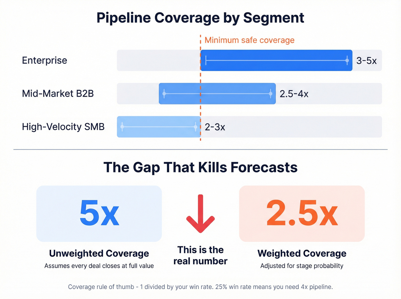
A practical rule that holds up in the real world: coverage is roughly 1 divided by win rate. If you win 25% of qualified opportunities, you need about 4x pipeline to hit the number.
| Segment | Coverage ratio | Notes |
|---|---|---|
| Enterprise | 3-5x | Longer cycles, fewer deals |
| Mid-market B2B | 2.5-4x | Balance of volume and deal size |
| High-velocity SMB | 2-3x | Higher volume, smaller deals |
Now the part people miss (and it's maddening): weighted vs unweighted coverage.
- Unweighted coverage assumes every deal closes at full value.
- Weighted coverage multiplies each deal by its stage probability.
A pipeline that looks like 5x unweighted can be 2.5x weighted once you account for stage mix. That's not a rounding error; it's the difference between "we're fine" and "we need pipeline now."
One more nuance: where you're losing matters as much as how much you're losing. DemandZEN's stage-by-stage benchmarks show a pattern we see constantly: teams lose most deals early by volume, but lose most revenue late. Late-stage losses killing your forecast usually means qualification and deal shaping upstream are weak, not that you need more discounting at the finish line. https://demandzen.com/sales-pipeline-conversion-rates-by-stage/
Trap #5 is the one that kills every other metric on your report. Bad CRM data means bad pipeline coverage, bad conversion rates, and bad forecasts. Prospeo's 5-step verification and 7-day data refresh cycle keep your CRM clean - 98% email accuracy, 92% enrichment match rate, 50+ data points per contact.
Stop reading reports built on dirty data. Start with contacts you can trust.
Bookings, Billings, or Revenue?
This is the most common reason your CRM and finance team show different numbers for the "same" quarter.
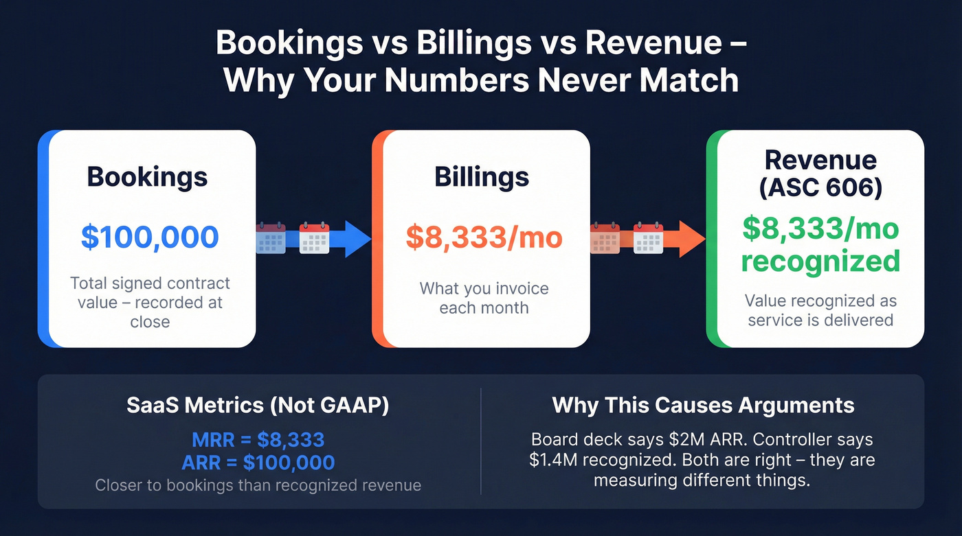
- Bookings = total value of signed contracts
- Billings = what you've invoiced
- Revenue = value recognized as service is delivered
Example: a $100K annual contract billed monthly is $100K in bookings, but about $8,333 in monthly billings. Turnstile's explainer is a clean reference if you need to align definitions across teams: https://turnstile.ai/blog/bookings-vs-billings-vs-revenue
MRR and ARR (what most SaaS teams live by) aren't GAAP metrics. They're closer to bookings than recognized revenue, which is why a board deck can say "$2M ARR" while the controller says "we recognized $1.4M" and both are right. Paddle has a good overview of how these SaaS finance metrics relate: https://www.paddle.com/resources/saas-finance-metrics
Let's be honest: if you export a sales report to CSV and can't define every column header, you shouldn't be drawing conclusions from it. Real talk, we've watched people argue for 20 minutes over "revenue" that turned out to be gross sales before fees and refunds.
5 Traps That Make Reports Misleading
Trap 1: Mixed date attribution
Different sections of the same report often use different date logic. One table shows leads that inquired during the period; another shows deals that closed during the period, including leads from months prior.
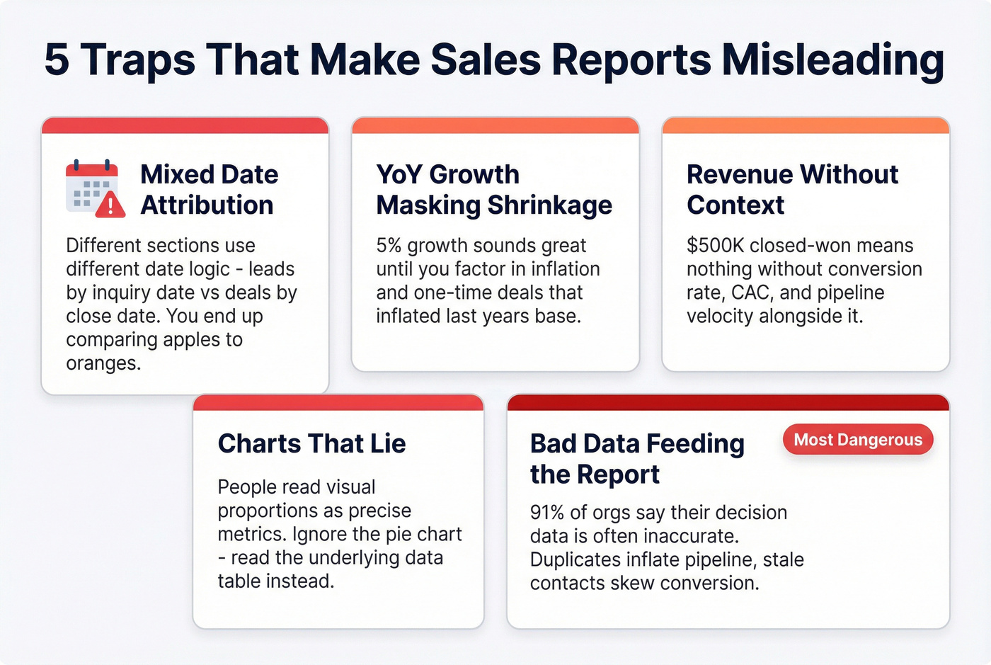
If you don't check attribution rules, you'll compare numbers that aren't comparable and then "fix" the wrong thing. This isn't just a SaaS problem; even vertical CRMs call it out in their own help docs. https://help.gymsales.net/article/339-how-to-read-the-sales-report
Trap 2: YoY growth masking real shrinkage
A 5% year-over-year increase sounds healthy until you remember inflation exists. One-time events distort the base, too: if last Q2 included a monster deal that won't repeat, this Q2's "growth" can look better or worse than reality depending on where that deal landed.
Farseer has a straightforward breakdown of YoY calculation pitfalls and weak comparison periods. https://www.farseer.com/blog/yoy-calculation/
Trap 3: Revenue without context
"$500K closed-won" is meaningless without knowing what it cost and what it did to the pipeline. Pair revenue with conversion rate, CAC, and pipeline velocity or you're reading a highlight reel, not a report.
Trap 4: Charts that lie (or get misread)
Pie charts are common offenders, but the bigger issue is human behavior: people read visual proportions as if they're precise metrics. We've watched leadership meetings derail because someone treated a chart slice as a conversion rate.
When in doubt, ignore the visual and read the underlying table. It's slower, but it stops bad decisions.
Trap 5: Bad data feeding the report
None of the analysis above matters if the data entering your CRM is wrong. Data Ladder reports that 91% of organizations say the data they use for key decisions is often or sometimes inaccurate. https://dataladder.com/how-inaccurate-data-impacts-your-bottom-line/
Duplicates inflate pipeline. Stale contacts skew conversion rates. Field definitions drift until "lead source" means three different things across three systems. Fixing it starts upstream: in our experience, the fastest wins come from tightening contact hygiene and enforcing deal-creation rules so garbage doesn't get in.
If you're cleaning contact data at scale, tools like Prospeo help by verifying emails and mobile numbers on a 7-day refresh cycle, so the records feeding your CRM reflect reality instead of last quarter's guesses. If you're evaluating vendors, start with a quick scan of data enrichment services.
Sales Report Benchmarks for 2026
One uncomfortable benchmark to keep in mind: 69% of B2B sales reps missed quota in the most recent benchmark study cited by Claap (drawing on Ebsta and Pavilion). Average performance is underperformance. https://www.claap.io/blog/sales-metrics
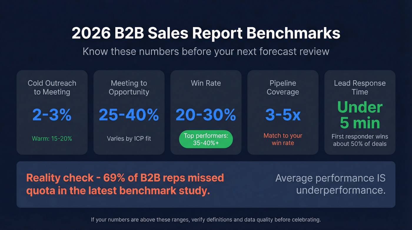
| Metric | Benchmark | Notes |
|---|---|---|
| Cold outreach -> meeting | 2-3% | Warm: 15-20% |
| Meeting -> opportunity | 25-40% | Varies by ICP and qualification bar |
| Win rate | 20-30% average; 35-40%+ top | Enterprise is typically lower |
| Pipeline coverage | 3x minimum; 4-5x if win rate is low | Coverage should match win rate |
| Lead response time | <5 minutes | Claap cites 8-21x higher conversion; first responder wins ~50% of deals |
If your numbers fall below these ranges, the report's telling you something. If they're above, verify the definitions and the data before you celebrate - inflated numbers usually mean a measurement problem, not a performance miracle.
One quick scenario we see a lot: a team reports a 45% win rate, but they only create opportunities after a verbal yes. That isn't a win rate; it's a paperwork completion rate. Useful internally, sure, but don't use it to size pipeline coverage. If you want a tighter view of what “good” looks like, compare against sales pipeline benchmarks and your own sales operations metrics.
Your pipeline coverage ratio is only meaningful when the contacts in it are real. Teams using Prospeo see bounce rates drop below 4% and pipeline grow up to 140% - because every record is verified, refreshed weekly, and enriched with 50+ data points. At $0.01 per email, accurate data costs less than one bad forecast.
Make every number in your sales report actually mean something.
FAQ
What's the first thing to look at in a sales report?
Pipeline coverage ratio. If coverage's below 3x your quota, you're likely to miss next quarter regardless of what current numbers show. After coverage, check weighted vs unweighted values - the gap between them is forecast risk.
Why don't my CRM and finance reports match?
One's usually showing bookings (signed contracts), the other's showing recognized revenue (delivered value). A $120K three-year deal is $120K in bookings and about $40K per year in recognized revenue if delivery's even. Confirm which metric each system reports before you compare anything.
How often should I review sales reports?
Activity metrics weekly. Pipeline and conversion monthly. Variance to forecast quarterly. Match cadence to the decision the metric informs, and make sure each review includes actual analysis, not just a glance at the top-line number.
How do I fix bad data before it reaches my reports?
Start with contact-level hygiene and clear definitions. Then add enforcement: dedupe rules, required fields on deal creation, and validation that stops reps from pushing junk through the pipeline just to hit activity targets.
If you're enriching or verifying contacts in bulk, Prospeo's real-time verification and 7-day refresh cycle help keep emails and mobile numbers current so your pipeline and conversion rates don't get distorted by dead records.