How to Build a Lead Generation Landing Page That Actually Converts
You spent $5,000 on ads last month. Your lead generation landing page captured 200 leads. Then 40% of the emails bounced, your sequences tanked, and your real cost per lead quietly doubled. The page wasn't the only problem - but it's where everything starts, and it's where most teams leave the most money on the table.
The Quick Version
Benchmark your current conversion rate against your industry median. If you're below it, fix the page before spending another dollar on traffic.
Strip your form to 3-5 fields and use exclusivity language. One company saw a 120% lift just by cutting fields from 11 to 4.
Verify captured emails before they hit your CRM. A high conversion rate means nothing if a third of your leads are fake or disposable addresses.
What a Lead Capture Page Actually Is
A lead generation landing page is a standalone page with one job: capture contact information in exchange for something valuable. No navigation bar, no footer links to your blog, no competing CTAs pulling attention in five directions.
Your homepage serves existing customers, job seekers, investors, and prospects simultaneously. A lead capture page serves one audience with one offer and one action. Every element on the page either moves someone toward the form or it's dead weight.
Conversion Benchmarks - What "Good" Looks Like
The median conversion rate across all industries is 6.6%, based on Unbounce's analysis of 41,000+ landing pages and 464 million unique visitors. That's a useful baseline, but it hides enormous variation.
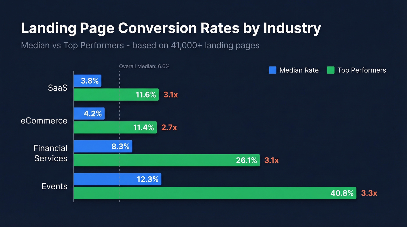
Top performers don't just beat the median. They crush it by 3x or more.
| Industry | Median Rate | Top Performers |
|---|---|---|
| SaaS | 3.8% | 11.6% |
| eCommerce | 4.2% | 11.4% |
| Financial Services | 8.3% | 26.1% |
| Events | 12.3% | 40.8% |
When you isolate SEO-only traffic, the picture shifts dramatically. First Page Sage's industry-specific data - drawn from 80+ clients over multi-year SEO campaigns - shows B2B SaaS landing pages converting at 1.1%, legal services at 3.4%, and financial services at 1.9%. The gap between an 8.3% financial-services median in broader benchmark tables and 1.9% in SEO-only benchmarks comes down largely to traffic mix and intent.
Unbounce's report also highlights a mobile paradox worth knowing: in some industries, pages receive up to 7x more mobile visitors than desktop visitors, yet mobile conversion rates are often lower. Before you panic about a 2% rate, check whether your industry benchmark is closer to 1.1% or 8.3% - and whether your traffic skews mobile. Context turns a "bad" number into a "we're actually outperforming" number.
Anatomy of a High-Converting Page
Every effective lead gen landing page shares the same structural DNA. Here are the seven elements that earn their place - plus real examples of companies getting them right.
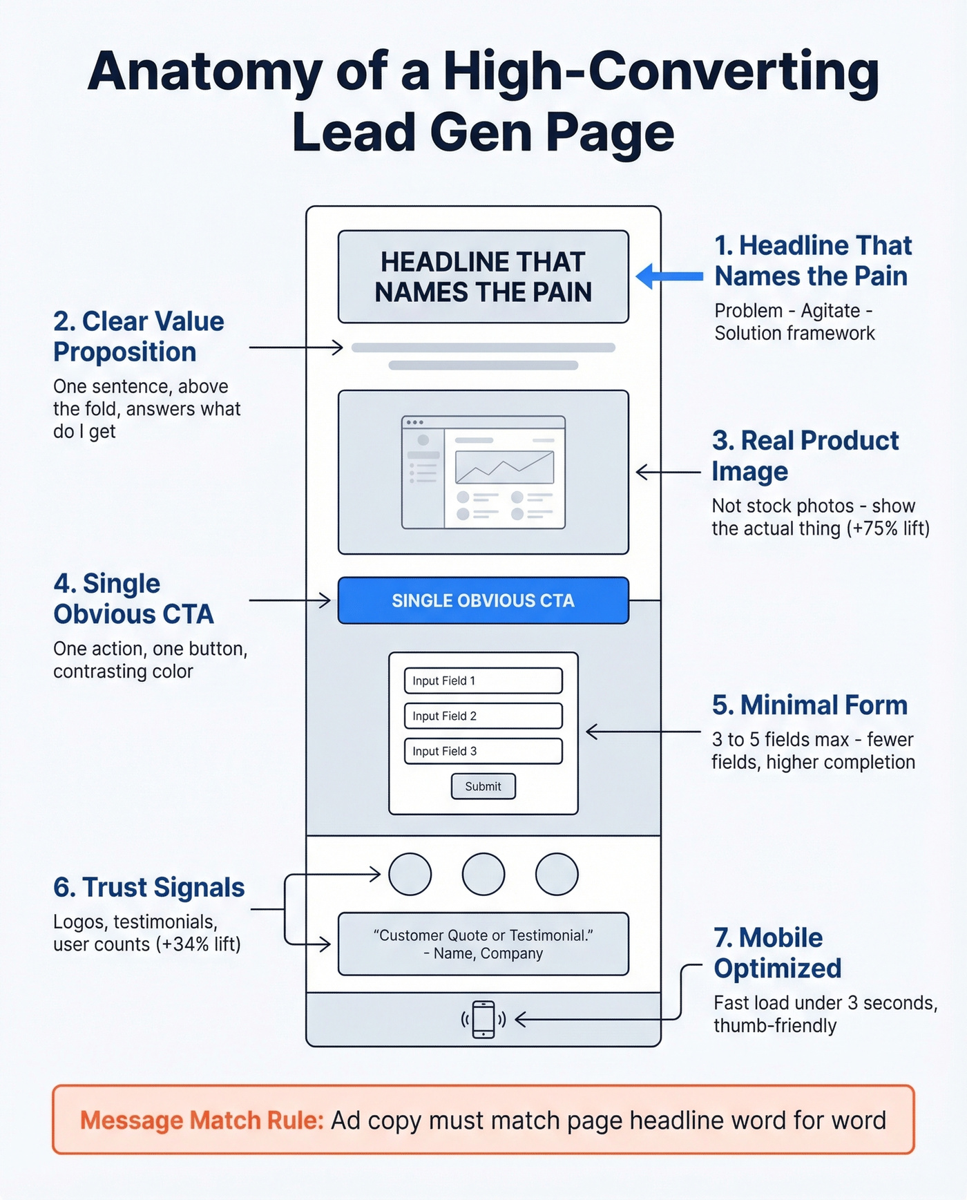
Headline That Names the Pain
Use a Problem-Agitate-Solution framework: identify the reader's problem, twist the knife slightly, then present your offer as the fix. Vague headlines like "Welcome to Our Platform" convert nobody. Shopify's free trial page nails this - the headline speaks directly to the desire ("Start selling today") rather than describing the product. The result is a page that converts cold traffic because it mirrors what the visitor already wants.
Clear Value Proposition
One sentence, above the fold, answering "what do I get and why should I care?" If a visitor can't answer that within five seconds of landing, you've lost them.
Hero Image That's Actually Yours
Linear Design shared an example where swapping a stock photo for a high-quality product image increased conversions by 75%. Show the thing you're offering - the ebook cover, the dashboard, the report. For a SaaS demo page, that means a screenshot of the actual interface, not a smiling person in a headset.
A Single, Obvious CTA Button
Not three buttons. Not a "learn more" link competing with a "sign up" button. One action, one button, one color that contrasts with the page. HubSpot's resource landing pages are a masterclass here - one form, one button, zero distractions.
The Form
We'll cover this in depth next, but the short version: fewer fields, higher completion. Every field you add is friction.
Trust Signals
Three lines of testimonials increased conversion rates by 34% in one cited example, and even small additions like client logos or "trusted by X companies" badges move the needle. Slack's landing pages stack three types of proof: customer logos, a specific user count, and a testimonial. That layering works better than any single trust element alone.
Mobile Optimization
Roughly 60% of web traffic is mobile, and pages that take longer than 3 seconds to load risk losing 50%+ of those visitors. If your page isn't fast and thumb-friendly, you're filtering out a huge chunk of your audience before they even see the form.
One more thing that's easy to overlook: message match. If your ad promises "Free 2026 Salary Benchmarks Report" and the landing page headline says "Welcome to Our Resource Center," you've broken the contract. The offer in the ad must match the offer on the page, word for word if possible.
Form Optimization With Data
Here's the thing: 81% of people have abandoned an online form after starting it. That stat should haunt every marketer who's ever added a "company size" dropdown "just in case." On the flip side, 30% of users will complete a form if they get something valuable in return - which means your lead magnet has to earn the data you're asking for.
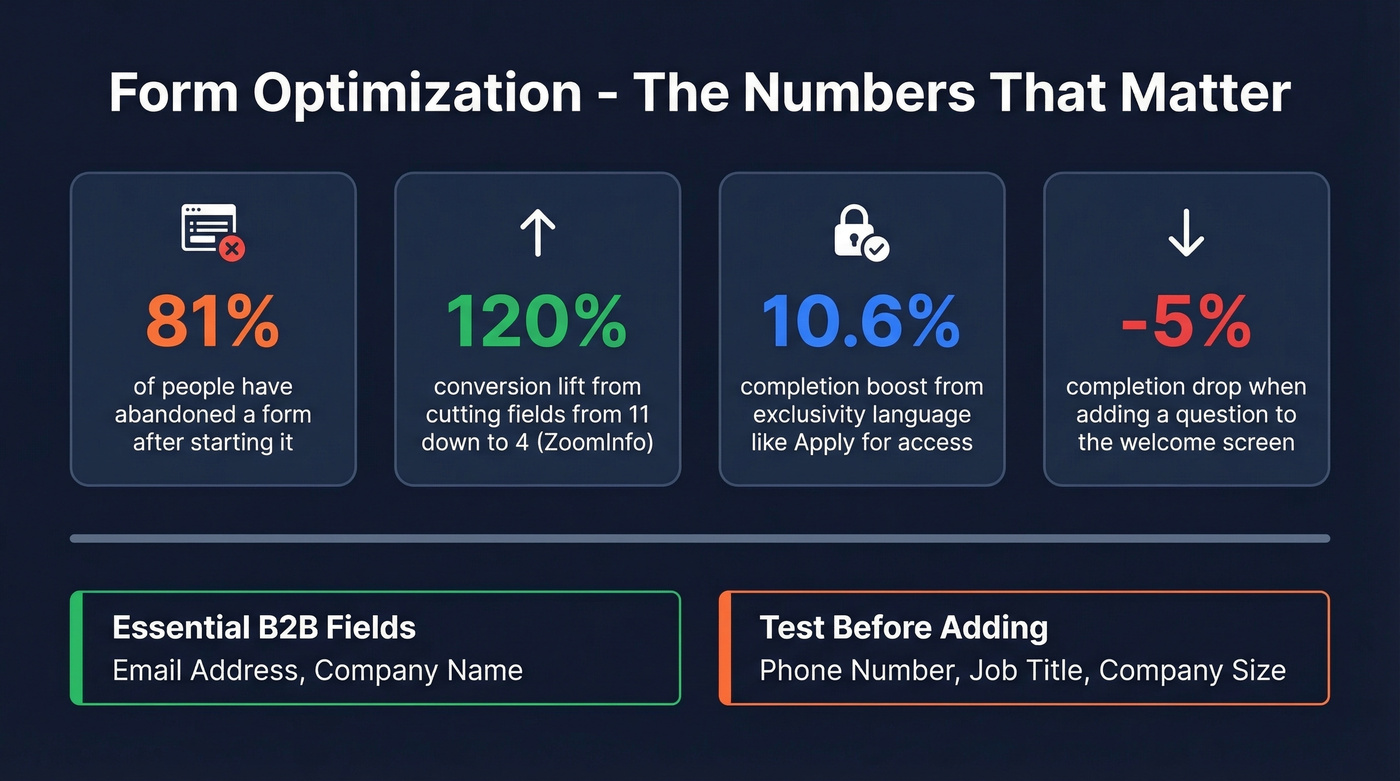
The most cited case study in form optimization comes from ZoomInfo: reducing form fields from 11 to 4 increased conversions by 120%. That's not a marginal improvement. It's a fundamentally different outcome from the same traffic.
Typeform's analysis of 10,000 forms adds nuance. Wording that implies exclusivity, like "Apply for access" instead of "Sign up," correlated with a 10.6% increase in completion rates. Forms using hidden fields to pre-populate known data saw a 4.8% lift. And adding a question to the welcome screen decreased completion by 5%.
For B2B, the essential field set is email address and company name. That's your minimum viable lead. Test adding phone number or job title if your sales process requires them, but add one at a time and measure the drop-off. Progressive profiling - collecting more data across multiple interactions rather than all at once - is the smarter long-term play.
Beyond the Static Form
Quiz funnels are gaining traction. A practitioner on r/DigitalMarketing with 13 years of experience building landing pages noted that static forms generated conversions, but "the drop-off after opt-in was brutal." Switching to guided quiz experiences produced higher opt-ins and more qualified leads almost immediately.
Conversational forms and chatbots are the other option. When you need more data upfront - say, qualifying budget or timeline - a chatbot-style form feels less invasive than a 10-field static form. The interaction mimics a conversation rather than an interrogation, and completion rates tend to hold up even as you collect more fields.
You just read that 40% of captured emails can bounce, quietly doubling your real cost per lead. Prospeo's 5-step email verification catches invalid, disposable, and catch-all addresses before they ever reach your CRM - delivering 98% accuracy at $0.01 per email.
Stop paying twice for leads that were never real.
The Step Most Guides Skip: Verifying Your Leads
Most landing page guides stop at "optimize your form." That's half the job.
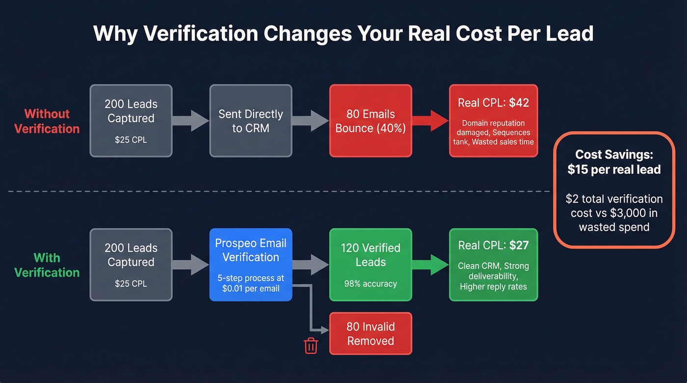
Your lead-to-opportunity rate matters more than your conversion rate. A page converting at 8% with 30% invalid emails is worse than a page converting at 5% with clean data. Verification is the missing workflow step between "lead captured" and "lead enters CRM clean." If you're mapping this end-to-end, use a simple lead generation workflow so verification isn't an afterthought.
Let's do the math on why this matters so much for smaller deal sizes. Say you're running 200 leads at $25 CPL with a 40% invalid rate. Your real CPL isn't $25 - it's $42. You've pushed 80 bad records into your CRM where they'll trigger bounces and damage your domain reputation. We've seen teams burn through sender domains in weeks because nobody caught the junk data at the front door. (If you're seeing this already, start with email bounce rate benchmarks and fixes.)
The ideal workflow: form submission, real-time email verification, then the thank you page. The thank you page itself is an underused asset - it's where you confirm the lead magnet delivery, set expectations for next steps, and offer a secondary conversion like booking a demo. But none of that matters if the email that triggered it is fake.
Prospeo's email verification runs every address through a 5-step process - syntax check, domain validation, mailbox ping, catch-all handling, and spam-trap removal - delivering 98% email accuracy. The free tier covers 75 verifications per month, and paid plans run roughly $0.01 per verified email. That's less than the cost of a single wasted sales email to a dead address. If you want to compare options, see Bouncer alternatives for other verification tools.
Your landing page form captures the lead. But if 35% bounce like the example above, your sequences tank and your domain reputation suffers. Prospeo enriches and verifies every contact with 50+ data points and a 92% match rate - turning raw form fills into qualified, reachable prospects.
Enrich every form submission before it hits your outbound workflow.
A/B Testing: What to Test First
If your conversion rate is below your industry median, don't add more traffic. Fix the page first. More budget into a broken page just means more wasted spend. Roughly 60% of high-growth companies run A/B tests on their landing pages - the other 40% are guessing. (If you're pressure-testing the rest of the funnel too, track funnel metrics alongside page conversion.)
The highest-leverage test is almost always the headline. Linear Design shared a case where a headline adjustment boosted conversions by 307%. That's not typical, but it shows why headline testing comes before everything else.
The Groove case study shows what happens when you stop guessing at copy entirely. They interviewed customers, captured the exact language those customers used to describe their problems, and rewrote their landing page to mirror it word for word. Conversion rate went from 2.3% to 4.3% - nearly doubling - without changing the product or the offer.
Priority Order
- Headline - the single biggest lever. Test pain-focused vs. benefit-focused vs. specific-number variants.
- CTA copy and button color - "Get the Report" vs. "Send Me the Report" vs. "Download Now" can swing results 20-30%.
- Hero image - stock photo vs. product screenshot vs. video thumbnail.
- Form length - 3 fields vs. 5 fields vs. multi-step.
- Page layout - long-form vs. short-form, testimonial placement, above-fold vs. below-fold form.
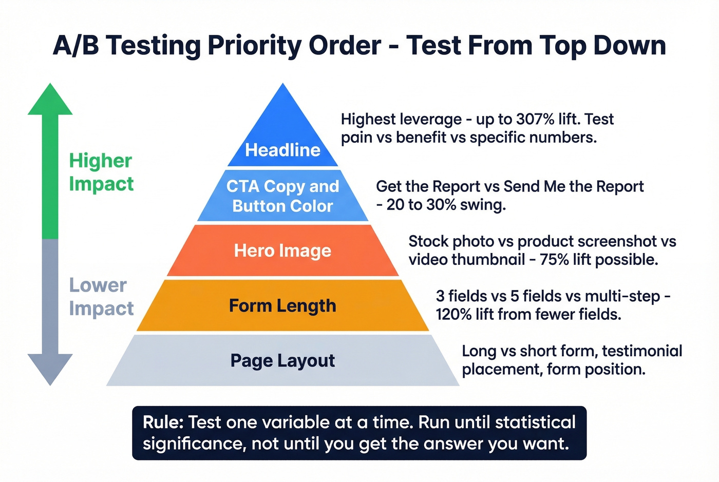
Test one variable at a time. Run each test until you hit statistical significance, not until you get the answer you want. Your first test this week: rewrite your headline using exact language from your last five customer calls. Run it for two weeks against your current version. That single change has the highest probability of moving your numbers.
Best Landing Page Builders in 2026
You don't need an enterprise-priced tool to build a lead capture page that converts. But you do need something that lets you test, iterate, and integrate with your marketing stack.
| Tool | Best For | Starting Price | A/B Testing | AI Features |
|---|---|---|---|---|
| Unbounce | Optimization | $99/mo | Yes | Smart Traffic AI |
| Leadpages | Budget teams | $49/mo | Yes | AI writing |
| Carrd | Simplicity | $9/yr | No | No |
| Instapage | Enterprise | $99/mo | Yes | Limited |
| Landingi | Small business | Free; $29/mo | Yes | AI assistant |
| Swipe Pages | Mobile-first | $39/mo | Yes | No |
| Webflow | Design control | $29/mo | Via 3rd-party | No |
Unbounce is the one we've seen recommended most often in our circles. Smart Traffic AI automatically routes visitors to the page variant most likely to convert for their profile - A/B testing on autopilot. The builder is mature, the template library is deep, and integrations cover every major CRM and email platform. At $99/mo it's not cheap for a solo marketer, but for teams running multiple campaigns, the time savings on manual testing pay for themselves.
Leadpages does the job without overthinking it. Skip this if you need AI-powered optimization or advanced personalization. Pick it if you want a solid drag-and-drop builder with A/B testing at $49/mo and enough templates to launch fast.
Carrd is essentially free at $9/year. Need a single page up in 30 minutes? This is it. Skip it if you need A/B testing, multi-step forms, or CRM integrations. Perfect for side projects, event signups, or MVPs.
Instapage is the enterprise pick - collaboration features and reusable page components make it work for large teams managing dozens of pages. Overkill for most SMBs.
Landingi hits a sweet spot with a free plan that actually works, plus paid tiers from $29/mo. Good for small businesses that need more than Carrd but can't justify Unbounce pricing.
Swipe Pages builds AMP pages that load fast on mobile. At $39/mo, worth testing if mobile traffic dominates your funnel.
Webflow gives you maximum design control with minimum hand-holding. A/B testing requires third-party tools. Best for teams with a designer who wants pixel-perfect control and doesn't mind the extra setup.
Eight Mistakes That Kill Conversions
These are the most common killers we see across page audits, roughly in order of how much damage they do.
Cluttered design tops the list. Remove everything that doesn't directly support the conversion action. If it doesn't help the visitor decide, it's noise.
Unclear value proposition. Put your one-sentence value prop above the fold in 24px+ font. If a stranger can't explain your offer after five seconds, rewrite it.
Missing or weak CTA. One button, contrasting color, action-oriented copy. "Get My Free Report" beats "Submit" every time.
Too many goals on one page. One page, one offer, one action. Period.
Complex forms. Start with 3-5 fields. Add more only when you have data showing the tradeoff is worth it.
No social proof. Even one testimonial moves the needle. Two or three client logos plus a specific number ("trusted by 4,200 companies") is better.
Ad-to-page mismatch. Mirror your ad headline on the landing page. Same language, same offer, same visual tone. Mismatches create instant distrust.
No immediate follow-up. A lead that waits 24 hours for a response is a lead that's already talking to your competitor. Trigger an automated email sequence the moment the form is submitted - and make sure that first email actually lands, which circles back to why email verification matters before anything fires. If you need copy you can deploy fast, keep sales follow-up templates on hand.
Smart Links for Dynamic Routing
One tactic gaining traction among growth teams is embedding smart links on landing pages to dynamically route visitors based on their attributes - geography, device, UTM parameters, or firmographic data. Instead of building separate pages for every audience segment, a single smart link directs each visitor to the most relevant version of your offer, improving both conversion rates and personalization without multiplying your page count.
This pairs especially well with ABM strategies where you're targeting specific accounts and need each visitor to see messaging tailored to their company or buying stage. Rather than maintaining dozens of static pages, smart links let you scale one-to-one personalization on a single URL. If you're building this out, align routing rules with your account-based selling best practices.
FAQ
What's a good conversion rate for a lead generation landing page?
The median is 6.6% across all industries, based on Unbounce's analysis of 41,000+ landing pages. B2B SaaS averages 1.1-3.8%, while financial services hits 8.3% at the median. Benchmark against your specific vertical and traffic source, not the overall number.
How many form fields should a lead gen page have?
Start with 3-5 fields for cold traffic. Email and company name are essential for B2B; test adding job title or phone number one at a time. Cutting fields from 11 to 4 produced a 120% conversion lift in one well-documented case.
Do I need a dedicated landing page builder?
For one or two campaigns, Carrd or a WordPress page works fine. Dedicated builders like Unbounce or Leadpages earn their cost when you're running multiple campaigns and need built-in A/B testing, dynamic text replacement, or AI-powered optimization.
How do I verify that captured leads have valid emails?
Run every captured email through a verification tool before it enters your CRM. Prospeo's 5-step process catches disposable addresses, typos, and spam traps - delivering 98% accuracy at roughly $0.01 per email. The free tier covers 75 verifications per month, enough to validate early campaigns.
What's the difference between a landing page and a squeeze page?
A squeeze page is stripped to the absolute minimum - headline, a sentence of copy, and an email field. A lead gen page can be longer, include trust signals, and collect additional fields. Squeeze pages optimize for volume; lead generation pages balance volume with lead quality.