The Practitioner's Guide to Sales Analysis: Benchmarks, Formulas & Templates
Your VP pings you on Tuesday: "Can you pull a sales performance review by Friday?" You open the CRM and immediately realize half the "pipeline" is vibes, not data.
That's normal. Over 70% of small businesses still track sales in spreadsheets or notebooks, so the moment someone asks for a real sales analysis, you're stitching together exports and hoping nothing breaks. Let's fix that - with an analysis that ends in decisions, not a dashboard nobody looks at.
What Is a Sales Analysis?
The definition is straightforward: it's the process of examining sales data to understand performance, find patterns, and decide what to change next. It's a task with an output - insights and actions.
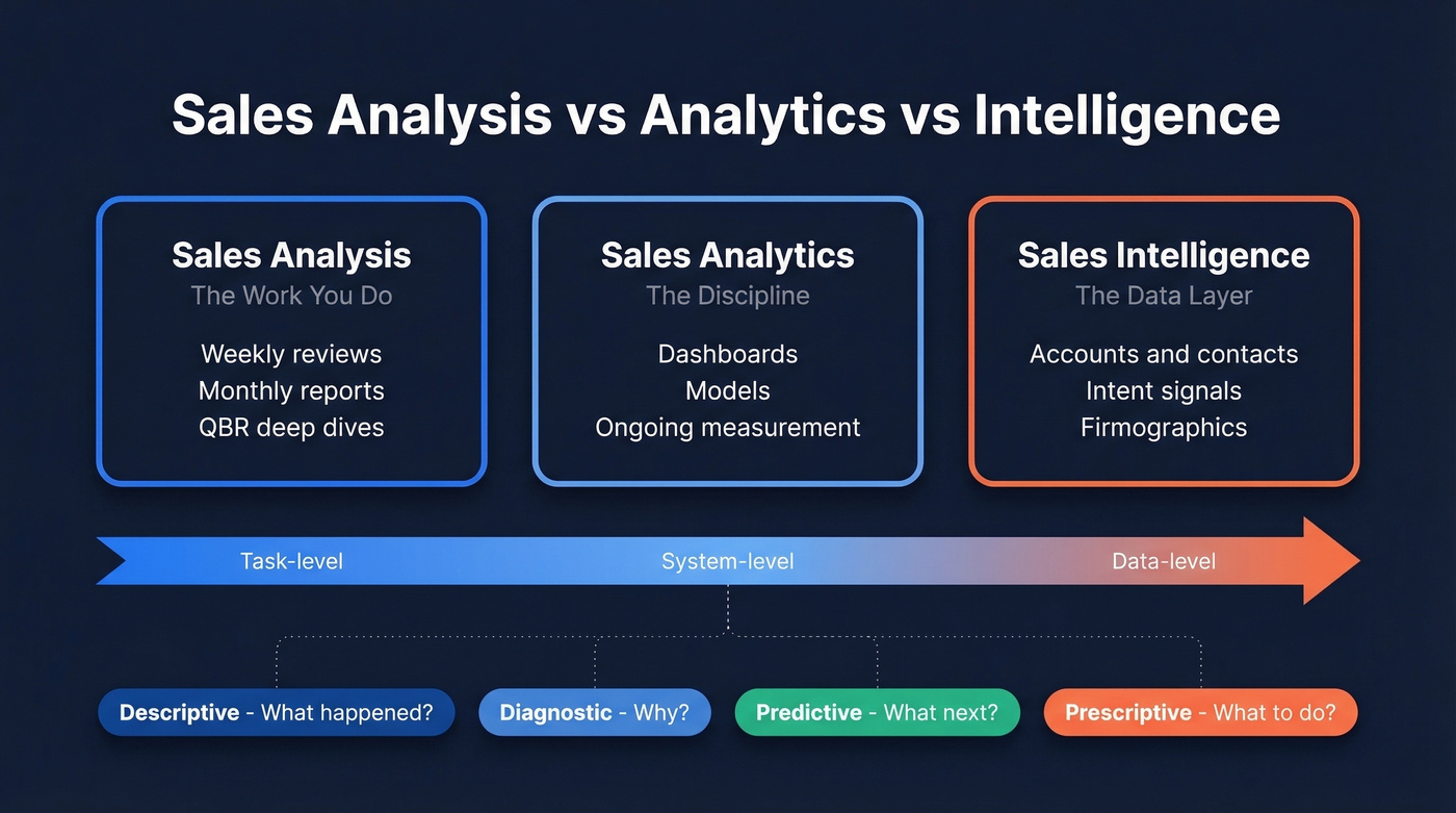
People mix up three terms:
- Sales analysis: the work you do - a weekly review, a monthly report, a QBR deep dive.
- Sales analytics: the broader discipline - dashboards, models, ongoing measurement.
- Sales intelligence: the data layer - accounts, contacts, intent, firmographics - that helps you decide who to sell to and how to reach them.
Here's the analytics taxonomy with real examples that map to sales work:
| Category | What it answers | Real-world example |
|---|---|---|
| Descriptive | What happened? | "Win rate dropped from 32% to 24%." |
| Diagnostic | Why did it happen? | "Win rate fell in EMEA because stage 2-to-3 conversion collapsed." |
| Predictive | What's likely next? | "At current velocity, we'll land at $820k vs $1M target." |
| Prescriptive | What should we do? | "Shift SDR capacity to Segment B and tighten discount guardrails." |
Why It Matters (With Numbers)
This isn't "reporting." It's how you stop arguing opinions and start arguing evidence.
McKinsey found companies using customer analytics are 1.5x more likely to achieve rapid sales growth. Deloitte's work on pricing analytics shows 200-350% ROI when teams get serious about discounting and price realization. And the average B2B purchase now involves 8.4 stakeholders per Gartner, which means your analysis needs to track multi-threaded deals, not just single-contact pipelines. Highspot cites research that 70% of reps say sales processes are more complex than last year.
Here's the thing: complexity punishes teams that wing it. Analyzing your sales data is how you simplify the chaos into a few levers you can actually pull.
What to Analyze First
The consensus on r/sales and r/salesops is refreshingly consistent: the best sales analytics projects aren't fancy. They're sequenced.
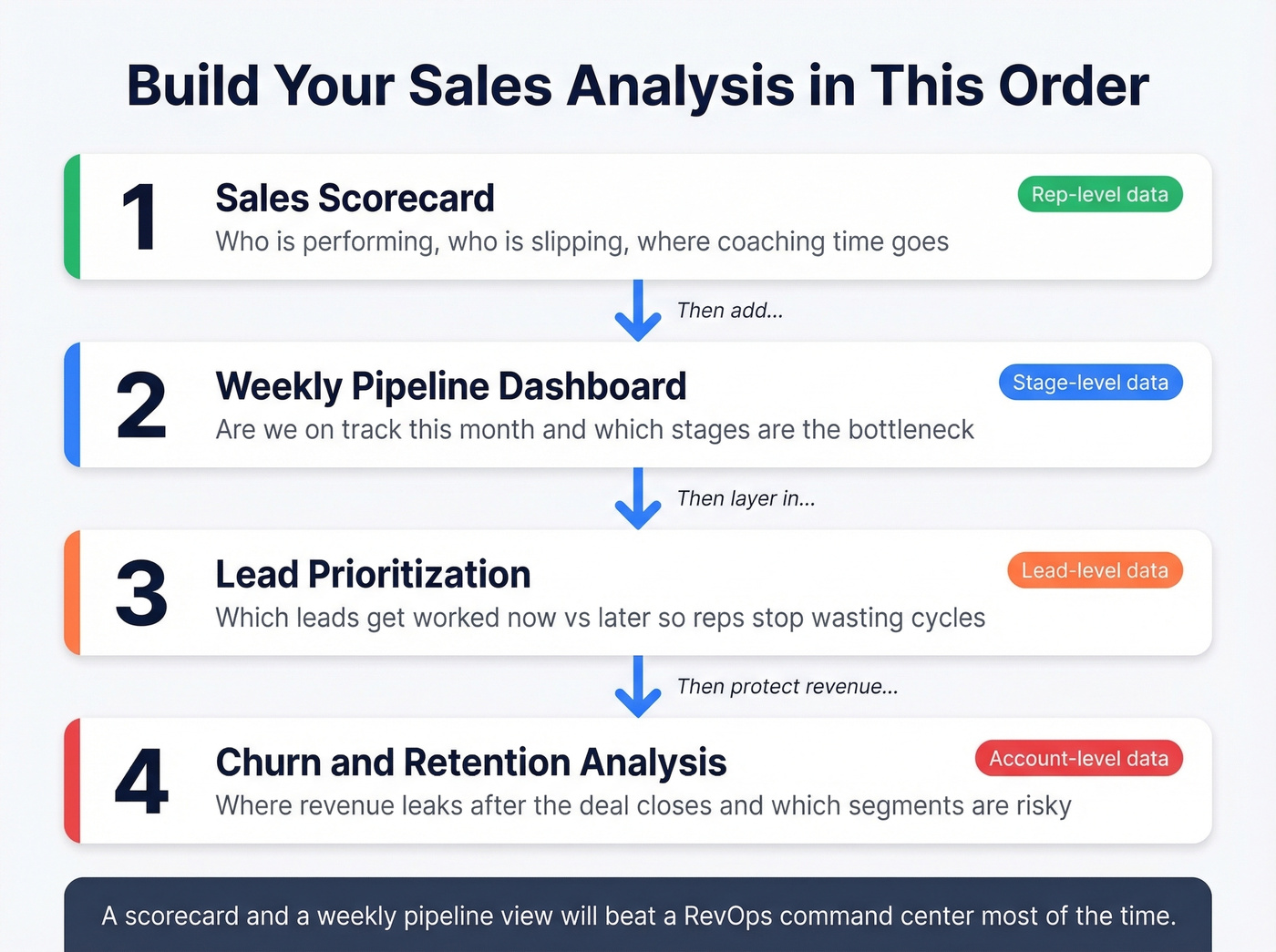
Build in this order:
Sales scorecard (first) - Who's performing, who's slipping, and where coaching time goes. You need rep-level data: quota, closed-won revenue, win rate, stage conversion, activity volume, lead response time.
Weekly pipeline dashboard (second) - Are we on track this month/quarter, and which stages are the bottleneck? Pull pipeline by stage, created date, expected close date, amount, stage age, and next step date.
Lead prioritization (third) - Which leads get worked now vs. later, so reps don't waste cycles. You need source, ICP fit fields like industry, size, and region, plus engagement signals, last touch, response time, and outcome.
Churn/retention analysis (fourth) - Where revenue leaks after the deal closes, and which segments are risky. Pull renewal dates, churn reason, product usage or support signals, expansion/contraction, and cohort start date.
Stop building dashboards nobody looks at. A scorecard and a weekly pipeline view will beat a "RevOps command center" most of the time.
Metrics That Actually Matter
Sales managers consistently ask the same question: which metrics actually identify gaps and improve close rates? The answer depends on who's reading the report - but if you're tracking more than about 7 core metrics in one report, you're usually tracking noise.
Metric summary table
| Metric | Formula | Audience |
|---|---|---|
| Revenue growth | (New-Old)/Old | Exec |
| Target attainment | Actual/Target | Exec/Rep |
| LTV | ARPA x Margin x Lifetime | Exec |
| Win rate | Won / (Won+Lost) | Manager |
| Pipeline velocity | (Opps x Win% x Deal)/Cycle | Manager |
| Conversion rate | Stage B / Stage A | Manager |
| Avg deal size | Revenue / # deals | Manager |
| Activity volume | Calls+emails+meetings | Rep |
| Quota attainment | Closed-won / quota | Rep |
| Lead response time | First touch lag | Rep |
Benchmarks vary by segment and motion. The point is consistency: pick a definition, document it, and don't change it mid-quarter.
Executive metrics
Revenue growth tells you if the machine's accelerating. Formula: (Current period revenue - Prior period revenue) / Prior period revenue. Worked example: $100,000 last quarter to $120,000 this quarter = (120,000 - 100,000) / 100,000 = 20% growth.
Target attainment keeps the conversation honest. Formula: Actual revenue / Target revenue. Worked example: $720,000 toward a $1,000,000 annual target = 72% attainment.
LTV is where exec teams fool themselves. If you don't have clean churn and gross margin, your LTV is a story, not a number. Simple formula: Average revenue per account per month x Gross margin % x Average customer lifetime in months. Example: $1,000/mo x 80% x 24 months = $19,200 LTV.
Manager metrics
Win rate is the blunt instrument and the fastest "are we getting better?" signal. Formula: Closed-won / (Closed-won + Closed-lost).
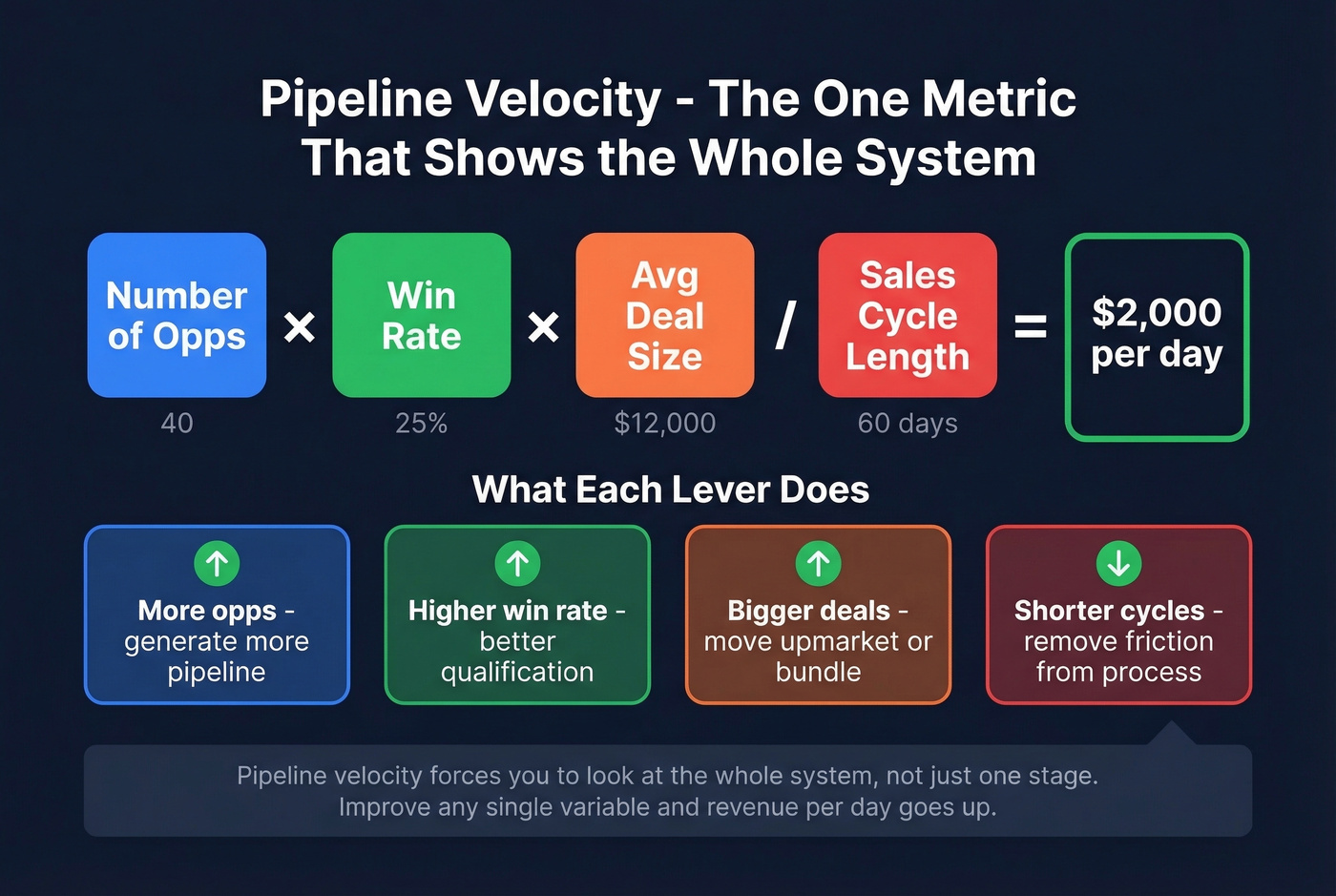
Pipeline velocity forces you to look at the whole system, not one stage. Formula: (Number of opportunities x Win rate x Average deal size) / Average sales cycle length. Example: 40 opps x 25% x $12,000 / 60 days = $2,000/day.
Conversion rate by stage is where bottlenecks hide. Example: 200 leads to 60 meetings booked = 30% lead-to-meeting conversion. Average deal size is only useful when segmented - company-wide averages are how you miss that SMB is thriving while enterprise is dying.
Rep metrics
Activity volume matters only when tied to outcomes. A rep doing 200 calls with zero meetings isn't hustling - they're mis-aimed.
Quota attainment is the scoreboard. Lead response time is the sneaky one: in our experience working with outbound teams, cutting response time is the fastest way to lift conversion without hiring anyone.
Benchmarks - What Good Looks Like
Benchmarks aren't there to shame your team. They're there to stop you from celebrating bad performance because "it's up from last month."
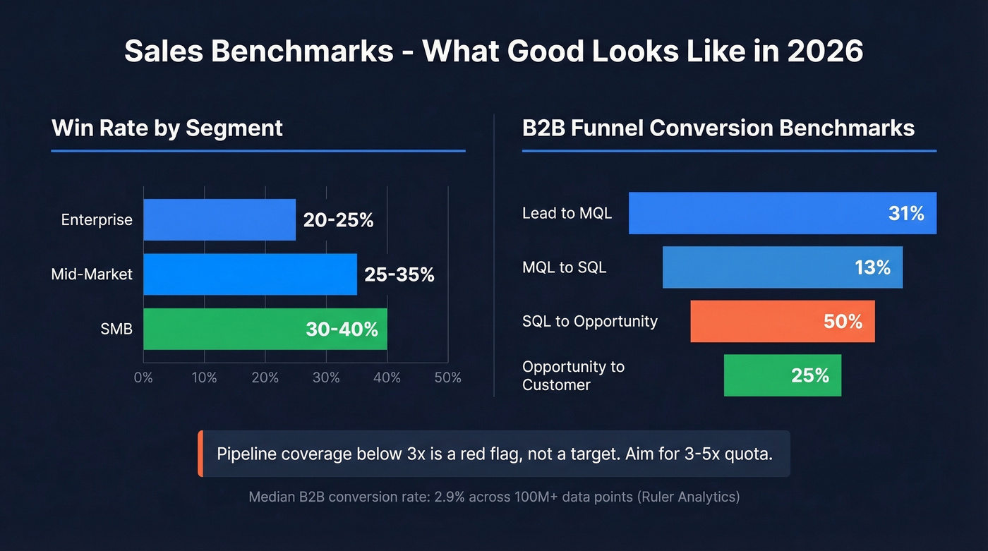
Core sales benchmarks
| Benchmark | "Good" range |
|---|---|
| Win rate (Enterprise) | 20-25% |
| Win rate (Mid-market) | 25-35% |
| Win rate (SMB) | 30-40% |
| Pipeline coverage | 3-5x quota |
| Quota attainment | 50-70% typical |
Pipeline coverage below 3x is a red flag, not a target. It usually means one of three things: not enough top-of-funnel, deals aren't progressing, or your close dates are fantasy.
Conversion benchmarks
A benchmark compilation anchored on Ruler Analytics' dataset pegs median B2B conversion at 2.9% across 100M+ data points. The spread by industry is the real lesson:
- Legal: 7.4%
- Manufacturing: 2.2%
- Financial services: 1.9%
- SaaS: 1.1%
Don't copy a "best practice" conversion target from a different category and call your team broken.
Funnel-stage benchmarks
These commonly cited B2B funnel benchmarks are a useful sanity check:
| Stage | Benchmark |
|---|---|
| Lead to MQL | 31% |
| MQL to SQL | 13% |
| SQL to Opportunity | 50% |
| Opportunity to Customer | 25% |
If your SQL-to-Opportunity is 20% while Opportunity-to-Customer is 35%, you don't have a closing problem. You have a qualification problem.
Lead prioritization only works when your contact data is real. Prospeo's 300M+ profiles with 98% email accuracy and 30+ filters - including buyer intent, technographics, and headcount growth - give your sales analysis actual signal, not noise.
Stop analyzing stale data. Start with contacts that connect.
How to Perform a Sales Analysis
This is the Friday-deadline workflow. It's not perfect - it's reliable.
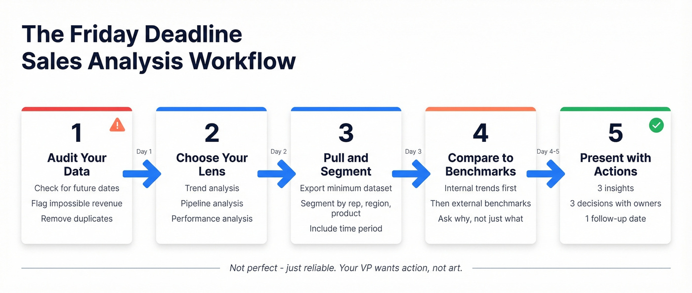
Audit your data
Before you calculate anything, run a basic QA pass. CaptivateIQ's data hygiene guidance is dead-on: look for red flags like dates in the future, impossibly high revenue, and unreasonably long or short sales cycles. Also check for stage names that changed mid-period, deals with no next step date, reps logging activity on accounts they don't own, and duplicate accounts splitting pipeline.
We've run bake-offs where the "best" analysis was wrong because one rep had $9,999,999 in ARR in a single deal field. That one cell wrecked every chart.
Choose your analysis type
Pick one primary lens, or you'll end up with a 40-slide deck that says nothing.
Common types: trend analysis for growth, seasonality, and MoM/QoQ movement; performance analysis for rep scorecards and territory comparisons; pipeline analysis for stage conversion, aging, slippage, and coverage; product analysis for product mix, attach rates, and discounting; and market analysis for segment performance, region, and channel effectiveness.
Pipeline analysis is the highest-ROI starting point because it ties directly to next week's actions. Analyzing by product can help you spot which SKUs drive margin versus which ones just drive volume - a distinction that changes how you compensate reps and allocate marketing spend.
Pull and segment
Export the minimum dataset that answers your question, then segment it by rep, region, product line, deal size band, source/channel, and time period. For teams running email sequences, segment by list source and sequence too - otherwise you'll miss that one list is poisoning deliverability.
A realistic example: one public walkthrough analyzed 8 months, 1,094 sales records, 6 countries, 22 products, and 25 salespeople. That's not "big data." That's normal sales ops work.
Compare against benchmarks
Internal trends are comforting. Benchmarks are clarifying.
If win rate went from 18% to 22%, that's improvement - but if your segment benchmark is 30-40%, you're still leaving money on the table. Use benchmarks to ask better questions: Are we underperforming the segment, or is the segment just hard? Is the bottleneck top-of-funnel, qualification, or late-stage execution? Are we discounting to "buy" win rate?
One analysis example found that deals involving multiple stakeholder demonstrations close 40% faster than single-contact approaches. That's the kind of insight benchmarking surfaces - you'd never see it staring at a company-wide win rate.
Present with recommendations
A report that doesn't end with "here's what we're changing next week" is a waste of time. Keep the output tight: 3 insights, 3 decisions, 3 owners, 1 follow-up date.
We've seen teams spend weeks polishing dashboards, then never change a single play. Your VP asked for Friday because they want action, not art.
Sales Analysis Report Template
You don't need a fancy template. You need consistent fields and a cadence.
Weekly activity report
Smartsheet's weekly activity template nails the basics: calls made, visits/meetings completed, leads generated, deals closed, revenue vs. target, and variance vs. target with daily and weekly totals. The key is pairing activity with outcome - calls without meetings is just noise.
Monthly dashboard
A solid monthly report covers top products by revenue and quantity, least-selling products, most valuable customers by total spend and frequency, time-based patterns like best days and weeks, and pricing/discount metrics including average discount and price realization. That structure forces tradeoffs: what to push, what to fix, what to stop discounting. To define sales volume clearly in your report, track units sold per product per period separately from revenue - it prevents you from confusing price increases with actual demand growth.
Keep metrics small
Close's reporting principle is the one most teams ignore: keep a small set of actionable metrics, tailored to who's reading. Execs get growth, attainment, forecast, and retention. Managers get pipeline health, conversion, and win/loss reasons. Reps get activity-to-meeting conversion, response time, and next steps.
Skip this if you're a solo founder with fewer than 50 deals a quarter - a spreadsheet with close date, amount, and win/loss reason will serve you better than any template.
Common Mistakes That Ruin Your Analysis
Most sales analysis fails before you even open a chart.
Bad CRM data is the root cause of everything. That 70%+ of small businesses running sales tracking in spreadsheets? That mess shows up as missing fields, inconsistent stages, and duplicate accounts. One frustrated RevOps manager on r/salesops put it perfectly: "I spent three days building the dashboard and two weeks cleaning the data to feed it."
Vanity metrics reward the wrong behavior. Activity volume without outcome ties is how you celebrate a rep doing 200 calls and booking zero meetings.
Single forecasting methods create blind spots. Forecasting works better as an ensemble: don't neglect historicals, don't ignore market trends, don't skip team input, and update regularly.
Ignoring external factors is another common trap. Seasonality, competitor pricing moves, macroeconomic shifts, and product changes all influence outcomes - and if your analysis doesn't account for them, you'll misattribute results to the wrong causes.
Stale contacts create fictional pipeline. If the champion left the company two months ago, that deal isn't "late stage" - it's dead. Run your contact list through a verification tool before analyzing. Prospeo checks emails at 98% accuracy and refreshes its 300M+ profile database every 7 days, compared to the 6-week industry average. If a third of your pipeline contacts have changed jobs, your forecast is fiction.
Not segmenting hides the truth. Company-wide averages let one region quietly collapse while another carries the number.
Tools for Sales Analysis
Excel is fine for your first analysis. Stop waiting for the perfect BI tool.
What you actually need to get started: a CRM you'll actually use, a weekly pipeline dashboard in Sheets, and clean contact data.
Pricing snapshot
| Category | Tool | Pricing | Best for |
|---|---|---|---|
| CRM | Salesforce | $25/user/mo | Enterprise CRM |
| CRM | HubSpot | Free; paid from ~$15/user/mo | SMB to mid-market |
| CRM | Pipedrive | $14/user/mo | Simple pipeline |
| Data quality | Prospeo | Free 75 emails/mo; ~$0.01/email | Verify + enrich |
| BI/Viz | Tableau | $15-$75/user/mo | Deep visualization |
| BI/Viz | Power BI | Free; paid from ~$10/user/mo | Microsoft stack |
| BI/Viz | Zoho Analytics | $24/mo | Budget BI |
| Spreadsheet | Sheets/Excel | Free | Fast start |
Salesforce reporting is powerful, but only as good as your field hygiene - great for mature teams, heavy for early-stage. Power BI is the default if your company lives in Microsoft and the fastest path to real dashboards without Tableau overhead. For data quality, we've found that verifying contacts before running any analysis saves you from building reports on phantom pipeline.
AI-powered forecasting is getting practical - tools like Salesforce Einstein and IBM Planning Analytics now offer AI-assisted forecasting and recommendations. But they're only as good as the data feeding them.
Pipeline velocity collapses when half your contacts bounce. Teams using Prospeo cut bounce rates from 35%+ to under 4% and book 26% more meetings. Data refreshed every 7 days means your analysis reflects reality, not last quarter's exports.
Clean data turns sales analysis into revenue decisions.
Advanced Techniques
Once the basics are stable, advanced analysis is mostly simple math used consistently.
Cohort analysis spots retention patterns: group customers by start month, then track churn and expansion over time. Time-series analysis with seasonality adjustments keeps you from punishing reps for December if your market always slows down. Bollinger Bands for declining accounts is a technique Reddit practitioners bring up because it works - it's just a moving average with standard deviation bands, and it flags accounts drifting below "normal" before anyone notices.
For win/loss, tie outcomes to a methodology so you can coach consistently. SPIN was built from 35,000+ sales calls studied across 20+ countries. Challenger came from 6,000 reps across 90 companies. MEDDIC originated at PTC in the 1990s as a qualification checklist. These aren't academic exercises - they give your analysis a framework for explaining why deals die, not just that they died.
Playbooks matter more than people admit: 42% of best-in-class companies use playbooks vs. 14% of laggards.
FAQ
What is a sales analysis?
It's the process of examining historical sales data to find patterns, measure performance against targets, and decide what to change. It can be as simple as a weekly pipeline review or as deep as a quarterly strategic teardown - what matters is that it ends with actions, not just charts.
What's the difference between sales analysis and sales analytics?
Sales analysis is the act of examining data to find patterns and decide what to change. Analytics is the broader discipline - tools, dashboards, predictive models, and ongoing measurement. Analysis is a task; analytics is a function.
How often should you run one?
Weekly for activity and pipeline health, monthly for performance trends and forecasting, quarterly for strategic reviews like territory design and product mix. The cadence matters less than acting on what you find.
What tools do you need to get started?
A CRM (even HubSpot's free tier works), a spreadsheet for your first pipeline dashboard, and a data quality tool to verify contacts before you analyze them. Most teams overcomplicate the stack - start with those three and add BI tooling once you outgrow Sheets.
The best sales analysis is the one that changes what your team does Monday morning. Start with the scorecard, fix the data, and let the numbers argue for you.