Sales Performance Reporting: The Practitioner's Guide for 2026
It's Thursday afternoon. You're staring at a pipeline dashboard that says $2.4M weighted, but your gut says it's closer to $1.6M - because three of those "commit" deals haven't had a meeting in two weeks, and one champion just changed jobs. Sales performance reporting should prevent that moment. Instead, 84% of reps missed quota last year, and the reports just documented the failure in colorful charts.
The problem isn't that teams lack data. It's that most sales performance reports are decorations - pretty enough for a Monday standup, useless by Wednesday.
What You Need (Quick Version)
If your reports look impressive but don't change Monday morning behavior, you've got a decoration problem, not a data problem.
Track 3-5 metrics per cadence, not 30. Match each metric to the decision it drives. Standardize your definitions before you build a single dashboard - if "qualified pipeline" means something different to marketing, sales, and finance, your numbers will never agree. Use the benchmarks in this guide to calibrate what "good" looks like. And start with data quality: if 20% of your CRM contacts are stale, every conversion rate and pipeline number downstream is wrong.
What Does Sales Performance Reporting Actually Mean?
Sales performance reporting isn't a dashboard. It's a system - data collection, analysis, visualization, and action - that turns raw CRM activity into decisions. The dashboard is just the visible layer. Underneath it, you need clean data, standardized definitions, the right cadence, and someone who actually acts on what the numbers say.
Here's a useful litmus test we call the 4-Question Insight Test. Can you answer Good or bad? How much? Why? What now? If your weekly pipeline review answers the first two but not the last two, you've got a scoreboard, not a management tool. Scoreboards are fine for leaderboards. They're terrible for coaching, forecasting, and capacity planning.
Most teams stop at "what happened" and never reach "what should we do differently." That gap is where quota attainment goes to die.
Why Reporting Matters Now
Data-driven sales organizations close 30% more deals than those relying on gut instinct. They're 23x more likely to acquire customers and 19x more likely to be profitable. monday.com reports that CRM dashboards can drive a ~29% increase in sales when used properly - and that mobile CRM users are 65% more likely to reach their targets.
The forecasting angle is even more compelling. 97% of companies implementing forecasting best practices hit their quotas, compared to 55% without structured forecasting. Meanwhile, 55%+ of sales leaders say inaccurate forecasting costs them revenue every quarter.
Here's the thing: reps spend 60% of their time on non-selling tasks. If your reports can't identify where that time goes and what to cut, you're leaving pipeline on the table. Buyers now use ~10 channels on average (up from 5 in 2016), and 80% of B2B sales interactions happen through digital channels. The data exhaust available for reporting has exploded. The question isn't whether you have enough data. It's whether you're using any of it well.
Core Metrics to Track
The biggest mistake in sales reporting is tracking everything your CRM can measure. You need 3-5 metrics per cadence, chosen because they drive a specific decision.
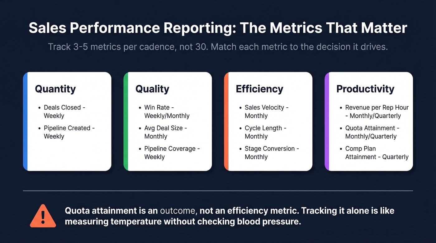
| Category | Metric | Formula | Cadence |
|---|---|---|---|
| Quantity | Deals closed | Count of won opps | Weekly |
| Quantity | Pipeline created | Sum of new opp value | Weekly |
| Quality | Win rate | Won / (Won + Lost) | Weekly/Monthly |
| Quality | Avg deal size | Total revenue / deals won | Monthly |
| Quality | Pipeline coverage | Pipeline / quota | Weekly |
| Efficiency | Sales velocity | (Opps x Win% x ACV) / Cycle | Monthly |
| Efficiency | Cycle length | Avg days create to close | Monthly |
| Efficiency | Stage conversion | % moving stage to stage | Monthly |
| Productivity | Revenue per rep hour | Revenue / selling hours | Monthly/Quarterly |
| Productivity | Quota attainment | Actual / target | Monthly/Quarterly |
| Productivity | Comp plan attainment | Actual commission / OTE | Quarterly |
That last row - comp plan attainment - is one most teams ignore. Connecting rep performance to commission data reveals whether your incentive structures are actually driving the right behaviors. If your top performers are maxing out accelerators on small deals while enterprise pipeline stagnates, the comp plan is the problem, not the reps.
We've seen teams build gorgeous dashboards that stop at reporting and never connect insights forward to capacity modeling, headcount planning, or quota setting. If your reports can't answer "do we need to hire two more AEs or fix stage-3 conversion?", they're incomplete.
Quota attainment is an outcome, not an efficiency metric. Tracking it alone is like measuring a patient's temperature without checking blood pressure. You know something's wrong, but you can't diagnose it.
If 20% of your CRM contacts are stale, every conversion rate, pipeline coverage ratio, and velocity metric in your reports is wrong. Prospeo refreshes 300M+ profiles every 7 days - not every 6 weeks - so your sales performance reports reflect reality, not last quarter's org chart.
Clean data in, accurate reports out. Start with 75 free verified emails.
Benchmarks - What Good Looks Like
Numbers without context are meaningless.
| Metric | Benchmark | Context |
|---|---|---|
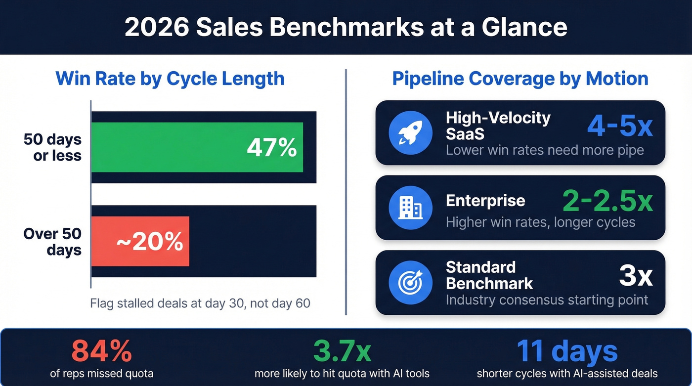
| Win rate (50-day cycle or less) | 47% | Outreach platform data |
| Win rate (over 50-day cycle) | ~20% | Drops sharply after 50 days |
| Most common win-rate bracket | 21-25% | Down from 31-40% prior year |
| Pipeline coverage (standard) | 3x | Industry consensus |
| Pipeline coverage (high-velocity SaaS) | 4-5x | Lower win rates need more pipe |
| Pipeline coverage (enterprise) | 2-2.5x | Higher win rates, longer cycles |
| Quota attainment (% of reps hitting) | ~16% | 84% missed quota |
| Sales cycle (most common) | 1-2 quarters | 34% of revenue teams |
The win-rate-by-cycle-time benchmark is the most actionable number on this list. If deals that close within 50 days win at 47% but deals dragging past that threshold drop to ~20%, your reporting should flag stalled deals at day 30 - not day 60 when it's already too late.
Pipeline coverage ratios need calibration by segment. A 3x ratio is the standard starting point, but high-velocity SaaS teams with 20% win rates need 4-5x to hit number. Enterprise teams can operate comfortably at 2-2.5x. If your report shows "3x coverage" without segmenting by motion, it's hiding problems.
Hot take: Most teams obsess over pipeline coverage when they should obsess over pipeline quality. A 5x ratio full of stalled, unqualified deals is worse than 2.5x of deals with engaged champions and clear next steps. Coverage is a safety blanket. Stage velocity is the real signal.
Sellers using AI tools are 3.7x more likely to meet quota. AI-assisted deals show roughly 11 days shaved off cycle times and up to +10 percentage points on win rates for deals over $50K. These aren't theoretical - they're showing up in platform data from Outreach and Gong.
How to Build a Report That Drives Decisions
The 4-Level Hierarchy
Not everyone needs the same view. The most effective reporting systems use four levels:
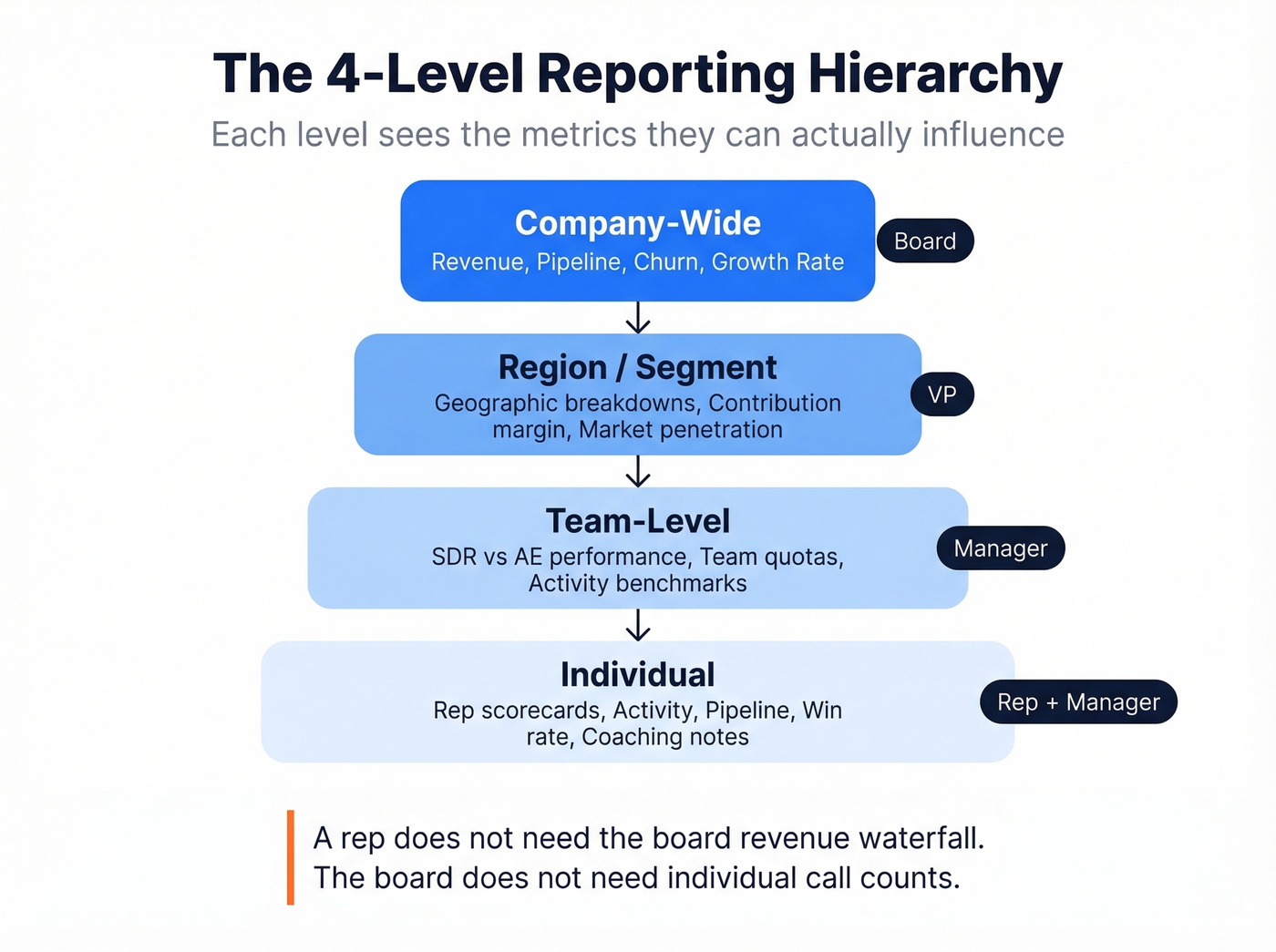
- Company-wide - overall revenue, pipeline, churn, growth rate. The board view.
- Team-level - SDR vs. AE performance, team quotas, activity benchmarks. Manager view.
- Region/segment - geographic or vertical breakdowns, contribution margin, market penetration. VP view.
- Individual - rep scorecards with activity, pipeline, win rate, and coaching notes. Rep + manager view.
Each level sees the metrics they can actually influence. A rep doesn't need the board's revenue waterfall. The board doesn't need individual call counts. Role-based design prevents information overload and keeps every stakeholder focused on their lever.
7-Step Build Process
Adapted from Qobra's framework:
- Define objectives - what decisions will this report drive?
- Identify your audience - which level of the hierarchy?
- Choose cadence - daily, weekly, monthly, quarterly?
- Select 3-5 KPIs per level - resist the urge to add more.
- Validate data sources - where does each number come from, and is it clean?
- Choose visualization types - match chart to metric (see below).
- Build a feedback loop - who reviews, when, and what changes?
Most teams skip step 5 and pay for it later. We've seen dashboards that pull "pipeline created" from one Salesforce report and "pipeline value" from another, using different date filters. The numbers disagree, trust evaporates, and within a month nobody looks at the dashboard anymore.
Choosing the Right Visualization
The wrong chart type hides the insight you're trying to surface. Based on CaptivateIQ's research:
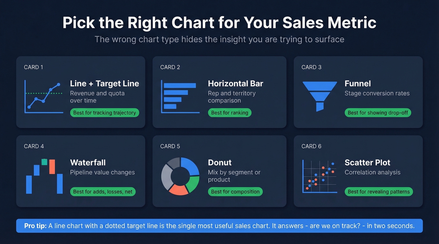
| Metric Type | Best Chart | Why |
|---|---|---|
| Revenue/quota over time | Line + target line | Shows trajectory |
| Rep/territory comparison | Horizontal bar | Easy ranking |
| Stage conversion | Funnel | Shows drop-off |
| Pipeline value changes | Waterfall | Shows adds/losses/net |
| Mix by segment/product | Donut | Shows composition |
| Correlation analysis | Scatter plot | Reveals patterns |
A line graph with a dotted target line is the single most useful sales chart. It answers "are we on track?" in two seconds. Pair it with a waterfall showing pipeline adds, closures, and losses for the full picture.
Data Governance - The Hidden Prerequisite
Let's be honest about something most reporting guides skip entirely: your dashboards are only as trustworthy as the definitions and data underneath them.
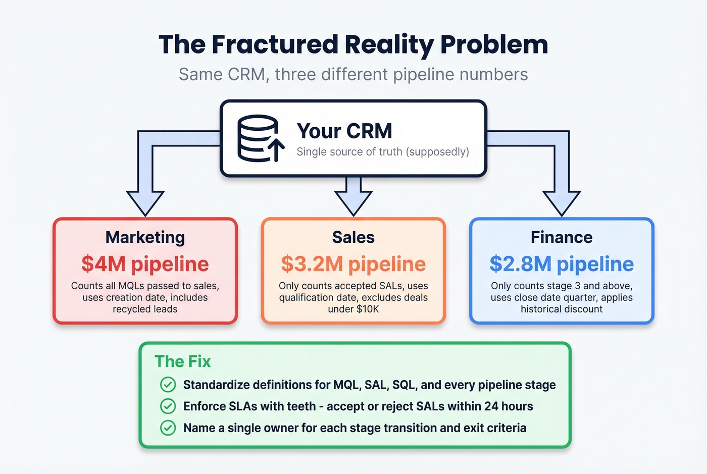
The "fractured reality" problem is real. Marketing says pipeline is $4M. Sales says $3.2M. Finance says $2.8M. They're all pulling from the same CRM but using different stage definitions, date ranges, and inclusion criteria. This isn't a technology problem. It's a governance problem. For teams running CPQ or billing systems alongside CRM, reporting accuracy requires data reconciliation across all three - not just CRM hygiene.
What actually fixes it:
- Standardize definitions for MQL, SAL, SQL, and every pipeline stage. Include explicit exit criteria and a named owner for each transition.
- Enforce SLAs with teeth. Sales must accept or reject a SAL within 24 hours and log the rejection reason in the CRM. No reason logged? It shows up in the weekly audit.
- Run monthly data audits. Check stage timestamps, campaign-member statuses, and SLA adherence. Flag records that haven't been updated in 14+ days.
- Assign metric owners. Every number on the dashboard should have one person responsible for its accuracy.
84% of data and analytics leaders say AI outputs are only as good as the data feeding them, and 74% of sales teams using AI are prioritizing data hygiene as a result.
One governance gap that quietly destroys reporting accuracy: CRM contact data decays 30%+ per year. People change jobs, get promoted, switch companies. If your enrichment tool refreshes every six weeks, your pipeline numbers reflect last quarter's org chart by the time they hit the dashboard. Tools like Prospeo address this with a 7-day refresh cycle, 98% email accuracy, and a 92% API match rate returning 50+ data points per contact - keeping the underlying records current so your conversion rates and pipeline values actually reflect reality. If you're comparing vendors, start with a shortlist of data enrichment services.
Reporting Audit Checklist
Use this before trusting any new dashboard:
- Every metric has a written definition agreed on by sales, marketing, and finance
- Each pipeline stage has explicit entry/exit criteria and a named owner
- Data sources are documented - you know exactly which Salesforce report feeds each number
- Contact records are enriched and refreshed on a schedule (weekly, not quarterly)
- SLAs exist for stage transitions, with logged rejection reasons
- Monthly data audits are scheduled and someone is accountable for running them
7 Reporting Mistakes That Kill Trust
1. Leading with vanity metrics. Dials made and emails sent look impressive on a slide. They tell you nothing about pipeline health. Lead with outcome KPIs - pipeline created, win rate, revenue per rep - and layer activity metrics underneath for diagnosis.
2. Overcomplicating dashboards. If your exec dashboard has 15 charts, nobody's reading it. Start with an executive summary and 3-5 KPIs. Layer detail into drill-down views for managers who need it.
3. Cherry-picking data. Showing wins without losses destroys credibility. Include both, with context. A 25% win rate isn't bad if your benchmark is 21-25%. A 40% win rate is suspicious if it's based on 10 deals.
4. Tracking dials instead of conversations. Research shows it takes at least 6 attempts to reach roughly 50% of leads, but the average rep makes 1.7-2.1 attempts before giving up. If your report tracks "dials" without tracking "conversations" and "call-to-conversation rate," you're measuring effort, not effectiveness. If you need a cleaner activity taxonomy, use these sales activities examples as a baseline.
5. Using reports as accountability weapons. The moment reps feel reports exist to punish them, they start gaming the data - staging deals optimistically, logging phantom activities. Reports should drive system improvement, not fear.
6. Ignoring assisted conversions. Last-click attribution in sales is just as misleading as it is in marketing. That "cold call closed" deal was probably warmed by three marketing touches and a webinar. Multi-touch views prevent you from cutting the wrong programs.
7. Dashboards that stop at reporting. This is the most common failure we see. The dashboard shows what happened but doesn't feed forward into capacity planning, headcount modeling, or quota setting. If your reports can't answer "do we need to hire?" they're incomplete.
Tools for Sales Reporting
Tools fall into five categories. You don't need one from each - you need the right combination for your stack.
| Category | Top Pick | Starting Price | Best For |
|---|---|---|---|
| CRM Analytics | Salesforce Sales Cloud | $25/user/mo | Deep customization |
| CRM Analytics | HubSpot Sales Hub | Free trial; paid from ~$20/user/mo | Teams under 100 reps |
| Revenue Intelligence | Gong | ~$100-150/user/mo | Conversation + deal intelligence |
| Revenue Intelligence | Clari | ~$50K-150K+/year | Enterprise forecasting |
| BI / Advanced | Tableau | $15-75/user/mo | Custom cross-system reporting |
| BI / Advanced | Zoho Analytics | $24/mo | Mid-market value |
| SPM / Gamification | Ambition | ~$30-50/user/mo | Coaching workflows |
| Data Enrichment | Prospeo | Free tier; ~$0.01/email | CRM data freshness + accuracy |
CRM-Native Analytics. Salesforce is the most powerful native reporting engine, but it requires real admin investment. HubSpot is the fastest path to value for teams under 100 reps - the built-in dashboards are surprisingly capable out of the box, and in our experience most mid-market teams underestimate them. Pipedrive (from $14/user/mo) is the budget pick with a clean UI that smaller teams love. If you're still evaluating platforms, see examples of a CRM.
Revenue Intelligence. Gong leads on conversation and deal intelligence - it turns call recordings into pipeline insights. Clari is the enterprise forecasting standard. Skip both if your average deal size is under $10K and your team is under 20 reps. HubSpot's built-in forecasting will get you 80% of the way there at a fraction of the cost. For a deeper stack comparison, use this list of sales forecasting tools.
BI / Advanced Analytics. Tableau remains the enterprise standard for custom reporting across multiple data sources, though the learning curve is steep and you'll need a dedicated analyst to get real value from it. Zoho Analytics is the mid-market value pick. Databox ($159/mo annual) works well for aggregating dashboards across multiple tools without SQL.
SPM / Gamification. Ambition is a tool practitioners on r/sales bring up when they want something beyond static dashboards - it connects coaching workflows to real-time performance data. SalesScreen (~$20-40/user/mo) focuses on leaderboards and activity gamification, which works well for high-volume SDR teams but less so for enterprise AEs. If you're building a broader system, align reporting with sales performance management.
A note on AI forecasting. Tools like Salesforce Einstein, Gong Forecast, Clari, and HubSpot AI are 20-50% more accurate than manual forecasting methods. Sellers using AI are 3.7x more likely to meet quota. But AI amplifies whatever data quality you feed it. If your CRM contacts are 20% outdated, your AI forecast is 20% wrong - with more confidence. Garbage in, garbage out. Fix the data first.
You just read that champions changing jobs can silently kill your pipeline. Prospeo tracks job changes across 300M+ profiles and returns 50+ data points per contact - so your reports catch deal risks before they show up as missed quota.
Stop documenting pipeline failures. Start preventing them at $0.01 per lead.
FAQ
What's the difference between a sales report and a dashboard?
A report is a point-in-time document with narrative context and analysis - the weekly email to leadership explaining what happened and what to do about it. A dashboard is a live, interactive view that updates in real time. You need both: reports provide the "why" and "what now," while dashboards handle daily monitoring and early warning signals.
How often should I refresh performance reports?
Activity metrics like calls and emails: daily or weekly. Pipeline and conversion metrics: weekly. Revenue, quota attainment, and forecasting: monthly and quarterly. Match cadence to the decision each metric drives - if nobody acts on a daily number, make it weekly.
What's a good pipeline coverage ratio?
3x is the standard benchmark. High-velocity SaaS teams often need 4-5x because lower win rates require more pipeline to hit number. Enterprise teams with longer cycles and higher win rates can operate at 2-2.5x. Always segment coverage by sales motion - a blended number hides problems.
How do I fix dashboards showing conflicting numbers?
Standardize metric definitions first - agree on what exactly counts as "qualified pipeline" across sales, marketing, and finance. Assign named owners to each stage transition, enforce SLAs with logged rejection reasons, and run monthly data audits on stage timestamps. The fix is governance, not technology.
How does stale CRM data affect reporting accuracy?
CRM contact data decays 30%+ per year, which means conversion rates, pipeline values, and activity metrics quietly drift from reality. A weekly enrichment cycle - rather than the industry-standard six weeks - keeps the numbers your reports depend on current and prevents your AI forecasting tools from compounding outdated inputs into confident-sounding wrong answers.