What Is a Lead Generation Website (And Why Yours Probably Isn't One)
You redesigned your website six months ago. It looks great. Your CEO loves it. But leads haven't changed - maybe they've even dropped. That's because a good-looking website and a lead generation website aren't the same thing, and most B2B companies are running the wrong one.
The Quick Version
Three things separate a lead generation website from a digital brochure:
- Conversion architecture. CTAs, forms, and lead magnets at every stage of the buyer journey - not just a "Contact Us" page buried in the footer.
- Benchmarks that matter. Visitor-to-lead conversion benchmarks typically sit in the 1-3% range, then you optimize through the funnel. Without numbers, you're guessing.
- A data quality layer. Captured leads are worthless if half the emails bounce. Verification before leads hit your CRM is non-negotiable.
If your site nails all three, you've got a lead gen site. If it doesn't, you've got an expensive brochure.
What Is a Lead Generation Website?
A lead generation website is built with one purpose: turning anonymous visitors into identifiable, contactable prospects. Every page, every element, every interaction is designed to move someone from "browsing" to "I'll give you my email in exchange for something useful."
This isn't a brochure site that lists your services and hopes someone calls. It's not a content hub that publishes blog posts without a conversion path. A site built for lead generation has intentional conversion paths - forms, lead magnets, progressive CTAs - woven into the architecture itself.
Here's the uncomfortable context: 92% of B2B buyers already have at least one vendor in mind when they start researching. Your website doesn't just need to capture leads. It needs to get you on the shortlist before the buyer even starts their formal evaluation.
Lead Gen vs. Brochure Website
Most B2B websites are brochure sites pretending to be lead generation machines. The difference isn't cosmetic - it's structural.
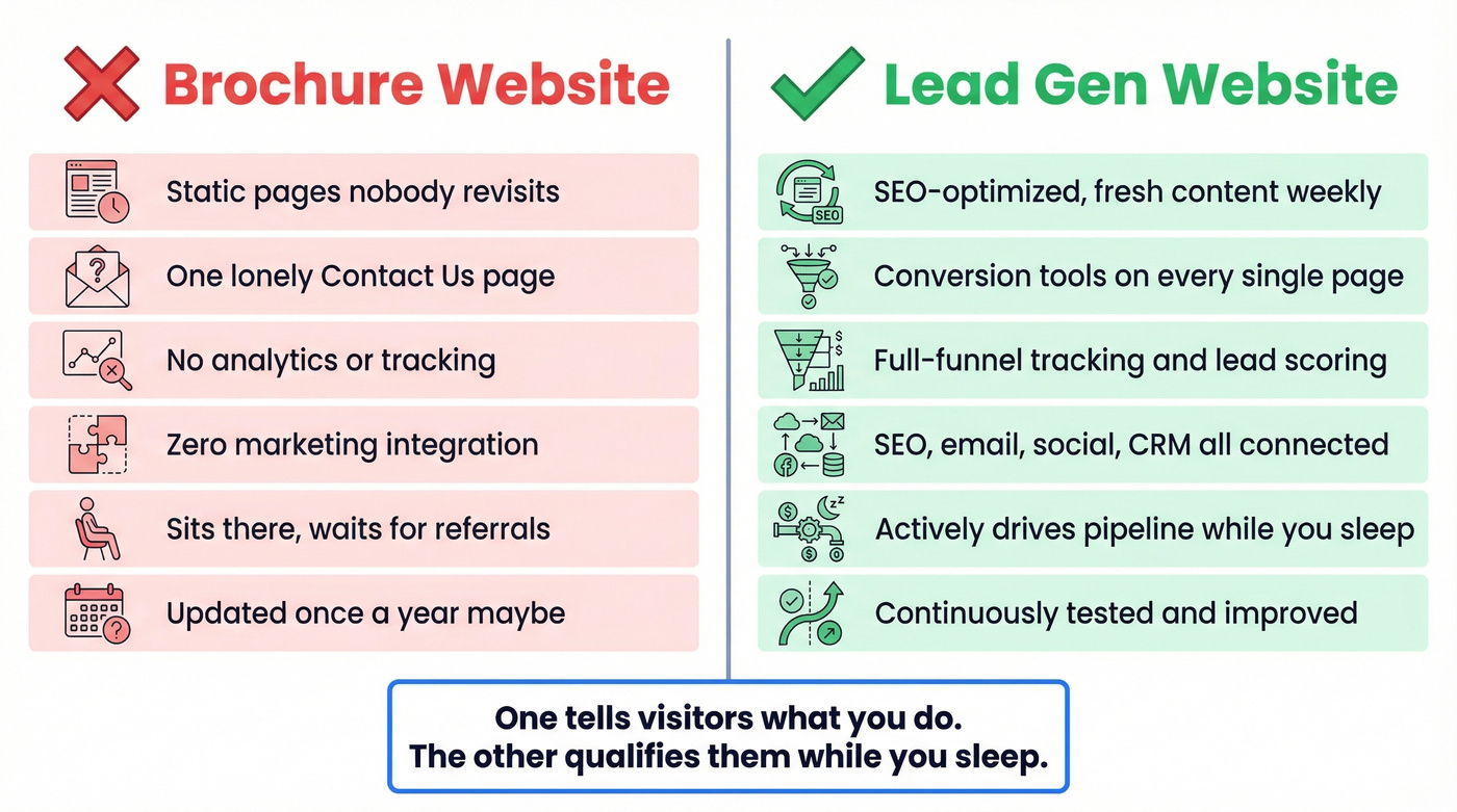
| Dimension | Brochure Site | Lead Gen Site |
|---|---|---|
| Search visibility | Limited, rarely updated | SEO-optimized, fresh content |
| Engagement | Low, static pages | Interactive forms, tools, CTAs |
| Lead capture | "Contact Us" page only | Conversion tools on every page |
| Data insights | Minimal analytics | Full-funnel tracking |
| Marketing integration | None | SEO, email, social, CRM tied in |
| Growth impact | Passive, referral-dependent | Active revenue driver |
The brochure site tells visitors what you do. A lead gen site helps visitors decide if you can solve their problem - and gives them a low-friction way to take the next step. One sits there. The other qualifies visitors while you sleep.
Why This Matters More in 2026
The B2B buying journey has shifted in ways that make your website more important than your sales team's first call. The winning vendor sits on the buyer's "Day One shortlist" 95% of the time. And 41% already have a preferred vendor before formal evaluation even begins. If you're not on that list, you're fighting for the remaining 5%.
The average B2B buying cycle runs 10.1 months. First contact with a vendor doesn't happen until 61% of the journey is already complete. Your website is doing the selling long before your reps get involved.
56% of buyers say there's too much content out there. They aren't looking for more whitepapers. They want clarity, relevance, and a reason to trust you enough to hand over their email. Your website needs to earn that trust in seconds, not paragraphs.
How a Lead Generation Website Works
Think of a lead gen site as a conversion machine with distinct stages, each one mapped to a specific type of visitor intent, each page type serving a different role in the funnel.
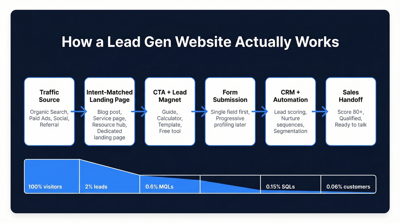
The flow works like this. A visitor arrives from a traffic source - organic search, paid ads, social, a referral. They land on a problem-focused page that matches their intent. That page offers a CTA tied to a lead magnet or form. The submission feeds into your CRM and marketing automation. Nurture sequences warm the lead. Sales picks up when the timing is right.
The key is matching page types to visitor intent. Navigational intent (people looking for your brand) gets pathway pages that route them efficiently. Informational intent gets blog content and resource hubs. Commercial intent - people comparing solutions - gets service pages with clear differentiation. Transactional intent gets dedicated landing pages with forms and minimal distractions. Every page is a potential landing page, because visitors enter from search results, social shares, and backlinks, not just your homepage.
Your homepage isn't where conversions happen. It's a billboard. It sets the tone, establishes credibility, and routes visitors to the right page for their intent. The actual conversion happens deeper in the site, on pages built specifically for that purpose.
You just read that captured leads are worthless if half the emails bounce. Prospeo's 5-step verification delivers 98% email accuracy - so every lead your website captures actually reaches a real inbox. At $0.01 per email, bad data stops being a cost of doing business.
Stop feeding your CRM dead emails. Verify every lead your site captures.
Essential Elements That Convert
A site designed for lead capture isn't a brochure with a form slapped on. These elements need to be baked into the architecture from day one.
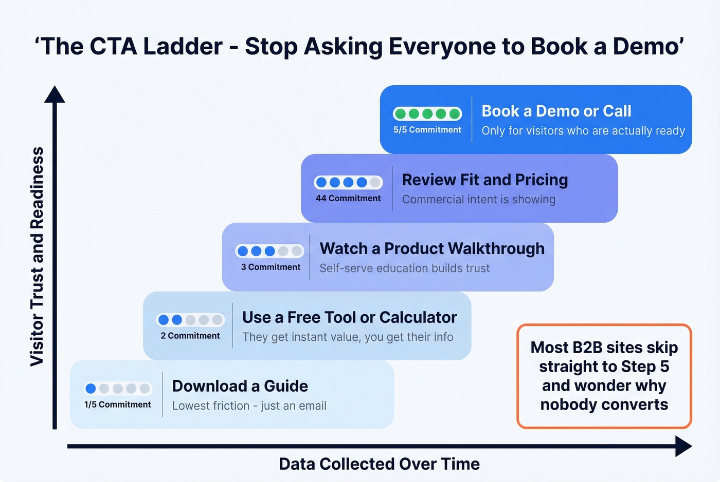
CTA ladder strategy. Don't force every visitor into "Book a Demo." Most aren't ready. Offer a progression: download a guide, review a framework, explore fit, schedule a conversation. Each step builds trust and moves the visitor closer to a sales conversation without triggering the "I'm being sold to" reflex.
Forms that respect attention spans. Shorter forms convert better. Always. Start with a single field - just an email - then use progressive profiling to collect more data over time. HubSpot and Calendly both use this pattern, and it works because it reduces the perceived commitment of that first interaction.
Lead magnets worth trading an email for. Templates, calculators, benchmark reports, free tools. The lead magnet needs to solve a real problem, not just exist as a PDF gate. If your "guide" is a thinly veiled sales deck, visitors will bounce and never come back.
Three more elements round out the conversion toolkit:
| Element | Why It Matters | Quick Win |
|---|---|---|
| Social proof above the fold | Buyers are skeptical by default - logos and G2 scores reduce friction before they reach the form | Add 3-5 customer logos within the first viewport |
| Mobile optimization | 60%+ of web traffic is mobile - clunky forms lose the majority of potential leads | Test every form on a phone before launching |
| Page speed | 50% of users expect load times under 3 seconds - every second beyond that costs conversions | Run key pages through PageSpeed Insights weekly |
Exit-intent popups catch visitors about to leave - offering a lead magnet at the moment of abandonment can recover 3-5% of abandoning visitors. Chatbots handle common questions around the clock and can qualify visitors before routing them to sales. And lead scoring assigns point values to actions (page visits, downloads, email opens) so your sales team focuses on the hottest prospects first, not whoever submitted a form most recently. A basic lead score threshold of 80+ is a common way to separate higher-intent leads from everyone else.
Conversion Benchmarks You Should Know
Benchmarks matter more than best practices. A "strong CTA" means nothing without context.
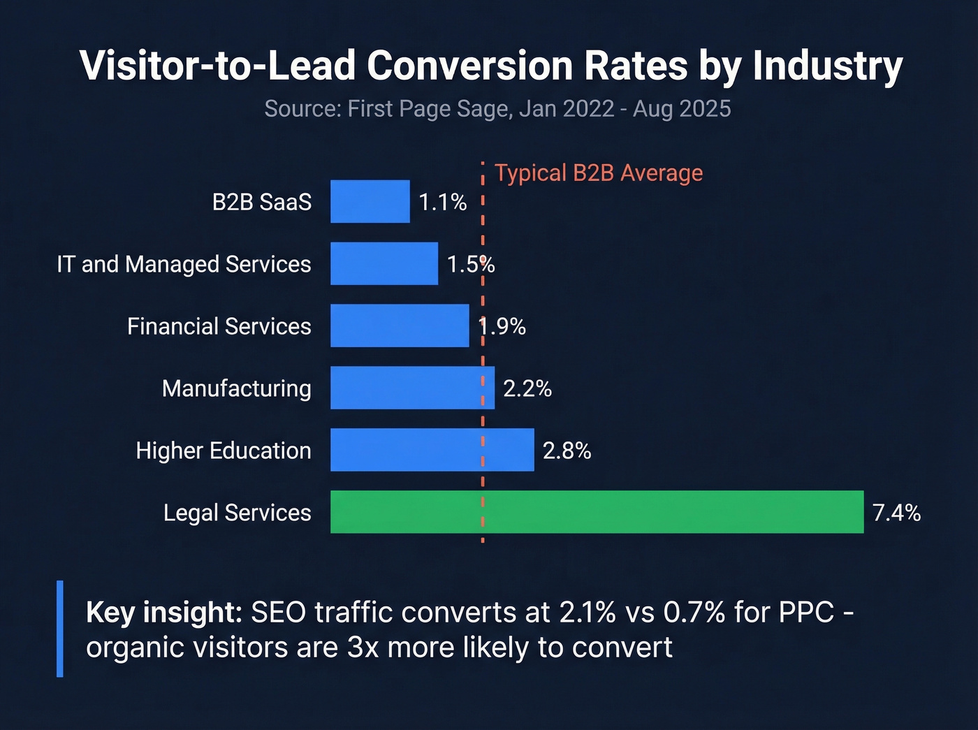
Visitor-to-lead conversion by industry:
| Industry | Avg. Conversion Rate |
|---|---|
| B2B SaaS | 1.1% |
| IT & Managed Services | 1.5% |
| Financial Services | 1.9% |
| Manufacturing | 2.2% |
| Higher Education | 2.8% |
| Legal Services | 7.4% |
Data from First Page Sage's benchmarks, drawn from client data collected January 2022 through August 2025. Even Salesforce converts less than 5% of its traffic into qualified leads. If you're above your industry average, you're doing something right. If you're below, start with your CTA architecture and form friction.
One insight we rarely see discussed elsewhere: SEO traffic converts at 2.1% visitor-to-lead vs. 0.7% for PPC. Organic visitors are 3x more likely to convert because they arrived with intent, not because an ad interrupted them. If you're pouring budget into paid without fixing your organic conversion paths, you're overpaying for every lead.
Full-funnel stage benchmarks:
| Funnel Stage | Benchmark Range |
|---|---|
| Visitor to Lead | 1-3% |
| Lead to MQL | ~31% |
| MQL to SQL | 15-35% |
| SQL to Opportunity | 30-55% |
| Opportunity to Close | 15-40% |
These ranges are aggregated from Ruler Analytics, First Page Sage, and RevenueHero data. The compounding math is what matters. Even small improvements at the top of the funnel multiply through every stage downstream. Moving visitor-to-lead from 1% to 2% doesn't just double your leads - it doubles everything downstream.
Let's make this concrete with a quick pipeline model: 10,000 monthly visitors x 2% conversion = 200 leads. At a 15% close rate and $25K ACV, that's $750K in annual pipeline from your website alone. Even a $50K website investment pays for itself in the first quarter. Run this math with your own numbers - if the ROI doesn't justify the investment, the problem isn't the model. It's your conversion rate.
Lead Generation Website Examples
Five sites that get this right - and what specifically makes them convert.
HubSpot
Minimal form fields, a prominent "No credit card needed" message, and a Google signup option that eliminates the password-creation barrier. The form sits above the fold. They get your email first and profile you later. It's the textbook example of reducing friction to near zero.
Calendly
Single-field email entry that expands into progressive steps. Real-time validation tells you immediately if something's wrong. Customer logos sit right next to the signup flow. We've tested dozens of signup patterns, and single-field entry consistently outperforms multi-field forms by 20-30%.
Shopify
One email field. "Start free trial." No credit card required. A progress bar shows remaining steps so the commitment feels manageable. The hardest conversion is the first click - everything after that is momentum.
Databox
G2 and Capterra scores sit above the fold - not buried in a testimonial carousel. The "no card required" CTA removes the last objection before someone clicks.
Lemonade
A quiz-style, conversational multi-step flow that feels nothing like a traditional form. A human face element adds warmth. This pattern works especially well for complex products where a single form would feel intimidating - something worth stealing if you sell anything that requires explanation.
Mistakes That Kill Your Leads
These aren't edge cases. We see them on the majority of B2B websites we audit.
Slow load times. Half your visitors expect the page in under three seconds. If your hero image is an uncompressed 4MB file, you're losing leads before they see your headline.
Broken mobile experience. More than 60% of traffic is mobile. If your form requires pinch-zooming or your CTA button is too small to tap, you're hemorrhaging conversions from your largest traffic segment.
Buried CTAs. If the only call-to-action is a "Contact Us" link in the navigation, you don't have a lead gen site. You have a brochure with a phone number.
No lead magnets. Asking for an email without offering something in return is a losing trade. Visitors need a reason to convert beyond "we'd like to add you to our newsletter."
Treating every form submission as a real lead. This is the one that burns teams the hardest. The consensus on r/sales and r/b2bmarketing is pretty clear: junk form submissions are the single biggest lead gen frustration for B2B marketers. Your marketing team celebrates 200 form submissions. Sales reports 60 bounced emails and 80 that never responded. The form captured data, but nobody verified it. Run captured emails through a verification tool - Prospeo's 5-step process catches spam traps, honeypots, and catch-all domains at 98% accuracy - before they enter your CRM and tank your sender reputation.
Tools You Actually Need
A lead generation website isn't one tool. It's a stack. Skip the ones that don't match your stage - a two-person startup doesn't need Salesforce, and an enterprise team shouldn't be running campaigns out of Mailchimp's free tier.
| Category | Tool | Price |
|---|---|---|
| Landing page builder | Leadpages | ~$40-$80/mo |
| Landing page builder | Unbounce | ~$100-$250/mo |
| CRM | HubSpot | Free tier available |
| CRM | Salesforce | From $25/user/mo |
| Marketing automation | ActiveCampaign | ~$29-$149/mo |
| Marketing automation | Mailchimp | Free-$350/mo |
| Analytics | GA4 | Free |
| Analytics | Hotjar | Free-$65/mo |
| Workflow automation | Zapier | $19.99+/mo |
| Data verification | Prospeo | Free tier; ~$0.01/email |
The website itself is the smaller investment. A solid lead gen site costs anywhere from $500 (DIY with Webflow and free tools) to $50K+ for a custom agency build. The ongoing stack - CRM, automation, verification, content production - is where the real budget goes. For context, B2B customer acquisition costs range from $1K-$4K for SMB deals up to $15K-$50K for enterprise, so calibrate your stack spend against what each closed deal is worth.
Here's our honest take: most B2B teams overspend on their website and underspend on what happens after the form submission. A $5K website with a $500/month verification-and-nurture stack will outperform a $50K website that dumps unverified leads into a CRM nobody checks. The website captures attention. The stack converts it into revenue.
If you're building outbound alongside inbound, start with sales prospecting techniques and a clean lead generation workflow so leads don't die after capture.
A lead gen site converts visitors into contacts. But what about the 97% who leave without filling out a form? Prospeo's 300M+ database with 30+ filters lets you find and reach decision-makers at companies already visiting your site - with verified emails and direct dials.
Turn anonymous website traffic into a pipeline your sales team can actually work.
Lead Generation Website FAQ
What is a lead generation website, and how does it differ from a regular site?
A lead generation website is engineered to convert visitors into contactable prospects through forms, lead magnets, and progressive CTAs at every stage of the buyer journey. A brochure site lists your services and waits for someone to call; a lead gen site actively captures and qualifies interest around the clock.
How much does it cost to build one?
A DIY build with Webflow or WordPress plus free tools can run as low as $500. A custom agency build with strategy, design, and development ranges from $10K to $50K+. The ongoing stack - CRM, automation, verification, and content - typically costs more per year than the initial build.
What's a good visitor-to-lead conversion rate?
B2B SaaS averages 1.1% visitor-to-lead, while legal services hit 7.4%. If you're above your industry average, keep optimizing. If you're below, fix your CTA architecture and form friction before touching anything else.