How to Build an Annual Sales Report That Gets Read (and Acted On)
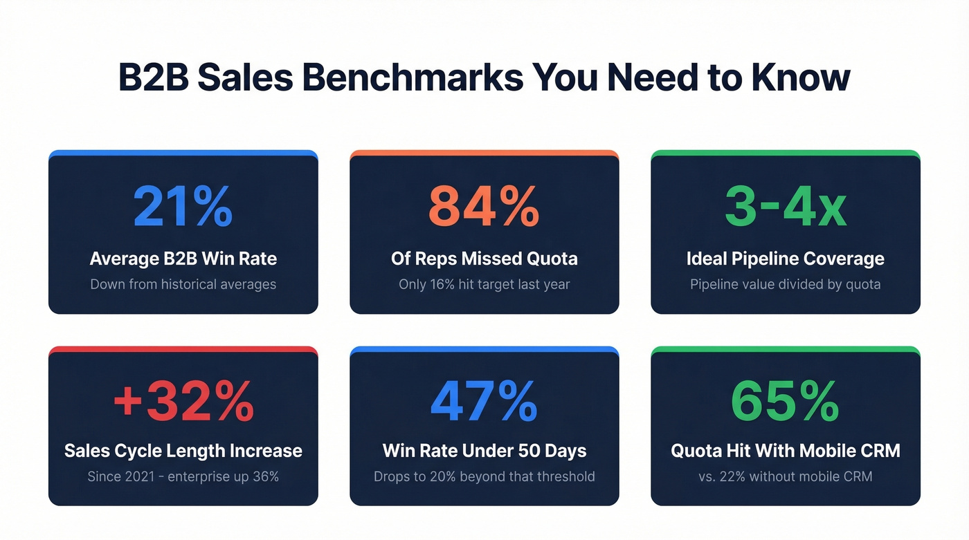
It's January 3rd. Your VP just pinged you: "Need the annual sales report by Friday." You've got a CRM full of data, a dozen half-finished dashboards from Q3, and no idea what the board actually wants to see. Meanwhile, 84% of reps missed quota last year, which means the numbers you're about to present aren't pretty - and how you frame them matters more than the numbers themselves.
Most yearly sales reports fail not because the data is bad, but because nobody reads past slide three. In our experience, the reports that actually get acted on answer "so what?" for every single number. Let's build one that does.
Quick version:
- Use the outline in Section 2 as your template - don't start from scratch
- Track 5-8 KPIs max, with formulas below
- Clean your CRM data before pulling a single number
- Match chart types to metrics using the mapping table in Section 5
- End with a "next year" plan - that's what separates reports from data dumps
What Is an Annual Sales Report?
An annual sales report is a structured review of your sales organization's performance over the past 12 months, built for a specific audience and designed to drive decisions about the next 12. It's not a dashboard screenshot. It's a narrative backed by data.
The annual cadence surfaces things weekly or monthly reports can't: year-over-year growth trends, customer lifetime value shifts, rep retention patterns, and total revenue trajectory. Your audience determines the depth. Reps need activity-level detail. Managers need pipeline and team performance. VPs need regional and product-line views. The board needs high-level YTD revenue and forward-looking forecasts - three to five key takeaways, not thirty slides.
The Outline Your Report Should Follow
Don't reinvent the structure. The best reports follow a "this year + next year" framework.
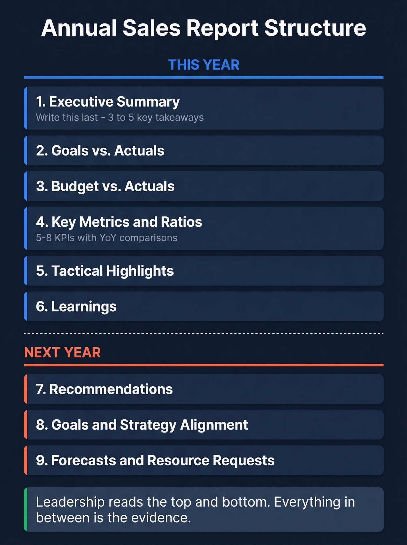
This Year:
- Executive summary - write this last, 3-5 key takeaways
- Goals vs. actuals
- Budget vs. actuals
- Key metrics and ratios - 5-8 KPIs with YoY comparisons
- Tactical highlights
- Learnings
Next Year:
- Recommendations
- Goals and strategy alignment
- Forecasts and resource requests
The executive summary and forecasts are what leadership actually reads. Everything in between is the evidence. If you're presenting to a board, the DFIN framework maps well here: executive summary, key metrics/ratios, budget vs. actuals, and projections. Same bones, different labels. You can find a working example of this structure in most public company investor decks - it translates directly to B2B sales orgs.
KPIs That Belong in Every Report
Before picking KPIs, understand the distinction: metrics are raw activity counts like calls made and emails sent. KPIs are measures tied to business objectives - demo-to-close rate, revenue per rep, pipeline coverage. Your yearly sales report should feature KPIs, not metrics. The principle from Close's framework is right: five to eight actionable KPIs is the sweet spot.
| KPI | Formula | B2B Benchmark | What It Tells You |
|---|---|---|---|
| Revenue Growth Rate | (Current - Prior) / Prior x 100 | 15-25% annually | Are we growing at a healthy pace? |
| Win Rate | Won / Total Closed x 100 | 20-30% (average B2B is ~21%) | How efficient is the team at converting? |
| Pipeline Coverage | Pipeline Value / Quota | 3-4x | Do we have enough fuel for next quarter? |
| Sales Velocity | (Opps x Win Rate x Avg Deal) / Cycle Length | Varies by segment | How fast does revenue move through the pipe? |
| Avg Deal Size | Total Revenue / Deals Closed | ~$4K median | Are we moving upmarket or down? |
| Sales Cycle Length | Avg days from opp creation to close | 3-6 months | Is friction increasing? |
| Customer Retention | Retained / Total Start x 100 | ~75% (55-84% range) | Are we keeping what we win? |
| Deal Slippage | Slipped Deals / Forecast x 100 | <20% | Can we trust our forecast? |
| Quota Attainment | Reps at/above quota / Total Reps | 16% hit quota last year | Is the target realistic? |
Sales cycles have lengthened 32% since 2021 - enterprise deals up 36%, startups up 24%. If your cycle length grew, you're not alone, but you need to explain why. There's also a sharp threshold on win rates: deals closed within 50 days carry a 47% win rate, while anything beyond that drops to 20% or lower. If your average cycle is stretching, your win rate is probably suffering too.
How to Build It Step by Step
Step 1: Define purpose and audience. Are you reporting to the board, the VP, or the full sales org? The answer changes everything. Exec audiences want the same core answers: three to five takeaways, YoY revenue, quota attainment, pipeline health, and a forward plan.
Step 2: Gather and clean your data. This is where most reports go wrong. Your CRM is the source of truth, but only if the truth is clean. Remove duplicates, standardize company names, and verify that contact data is current - not six months stale. Prospeo's CRM enrichment keeps records current, returning 50+ data points per contact on a 7-day refresh cycle. Plug it into Salesforce or HubSpot before you pull a single report.
Step 3: Define your "active" denominator. Here's a trap we've seen repeatedly: your conversion rate says 4%, but the denominator includes 2,000 leads from 2022 that'll never close. Define a 90-day active lead window for any time-based conversion metric. It's not perfect - some stale leads do convert - but it's far more honest than inflating your denominator with dead weight. Document your definition so next year's report uses the same baseline.
Step 4: Visualize. Match chart types to metrics using the table in the next section. Don't default to bar charts for everything. If you're building this as part of a recurring QBR rhythm, keep the chart set consistent quarter to quarter.
Step 5: Interpret and narrate. Numbers without "why" and "so what" are just a data dump. Every KPI needs a sentence explaining what drove the result and what you're doing about it.
Step 2 says clean your CRM before pulling a single number. Stale contacts inflate your denominator and distort every KPI in your annual sales report. Prospeo's CRM enrichment returns 50+ data points per contact with a 92% match rate - on a 7-day refresh cycle, not the 6-week industry average.
Fix your data before you report on it.
Chart-to-Metric Mapping
| Chart Type | Best For | Sales Example |
|---|---|---|
| Bar | Comparing reps or regions | Rep performance side-by-side |
| Line | Trends over time | Monthly revenue trajectory |
| Pie/Donut | Parts of whole (<6 categories) | Revenue by product line |
| Scatter | Correlation analysis | Deal size vs. cycle length |
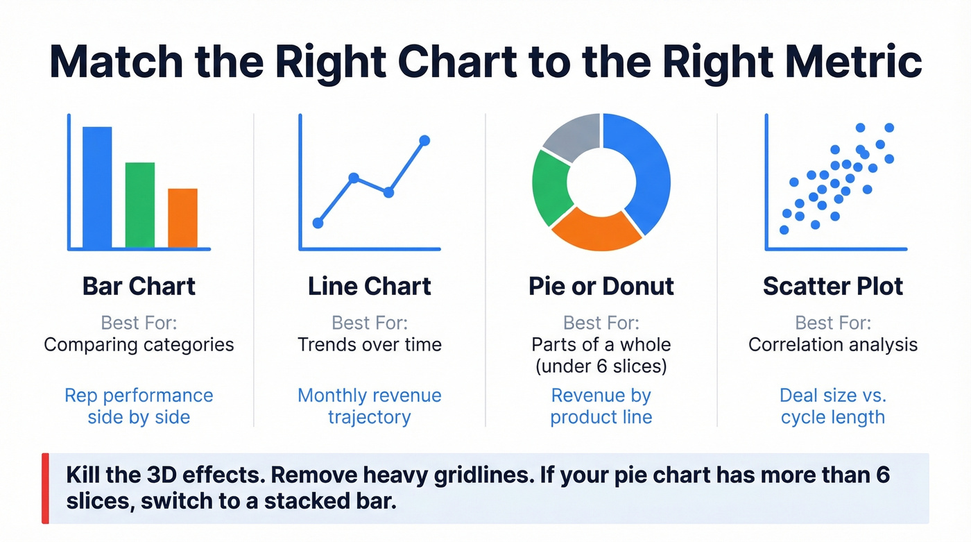
Use a muted base palette with one accent color for emphasis. Kill the 3D effects - they distort proportions. Remove heavy gridlines. And if you're tempted to use a pie chart with more than six slices, switch to a stacked bar instead.
Mistakes That Ruin the Report
| Don't Do This | Do This Instead |
|---|---|
| Include stale leads in your denominator | Define a 90-day active window (see Step 3) |
| Present 30 KPIs | Stick to 5-8; track the rest internally |
| Show numbers without context | Add "why" and "so what" to every metric |
| Recycle your November deck with a new cover | Build from scratch with annual-level insights |
| Trust shocking numbers at face value | Verify against a second source - tools like OpenRefine can standardize messy values |
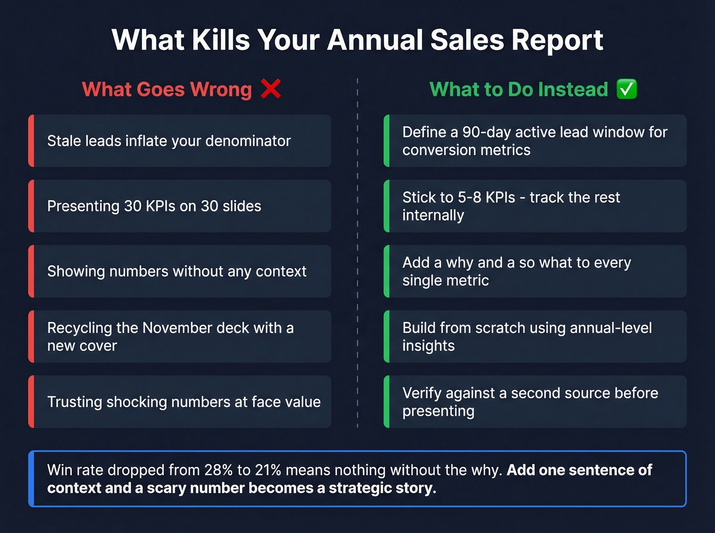
The narrative gap is the one I see kill the most reports. "Win rate dropped from 28% to 21%" means nothing without "because we expanded into enterprise where cycles are longer and close rates are lower - but average deal size tripled." That single sentence turns a scary number into a strategic story.
Presenting to Leadership
Here's the thing: if your average deal size is under $10k, your board probably doesn't need a 20-slide deck. A tight two-pager with the KPI table, a revenue waterfall chart, and a forward plan will get more engagement than any presentation.
For everyone else, the Kellblog framework for board presentations applies perfectly: build from scratch, cut to the chase, facilitate discussion, and ATFQ - answer the question directly when asked. Lead with three to five key takeaways, then support with data.
Stop building your report in December. The best ones are assembled from quarterly reviews throughout the year. If you're synthesizing Q1 through Q4 reviews, the annual report writes itself in a day. Starting from raw CRM data on January 2nd? You're already behind.
Tools for Year-End Sales Reporting
| Tool | Best For | Starting Price |
|---|---|---|
| Salesforce | Enterprise reporting | $25-$330/user/mo |
| HubSpot | Mid-market CRM + reports | Free; paid from ~$20/seat/mo |
| Prospeo | Data quality layer | Free tier; ~$0.01/email |
| Pipedrive | SMB pipeline tracking | ~$15-$100/user/mo |
| Close | Lean outbound teams | ~$30-$150/user/mo |
| monday CRM | Visual project-style CRM | Free-$19/seat/mo |
| Looker Studio | Free visualization layer | Free |
Excel and Google Sheets work as starting points, but they don't scale well once the team grows past a handful of reps. One Reddit user building invoice-by-SKU reports in Excel put it well: it "works day to day, but not for the long run." If you do build your year-end sales report in a spreadsheet, a few formatting tips save hours: use named ranges for KPI formulas, freeze the header row for easy scrolling, and apply conditional formatting to flag metrics that missed target. When 65% of companies using mobile CRM hit quota versus 22% without, the data flowing into that CRM determines whether it's an asset or a liability.
Skip the spreadsheet approach entirely if your team is above 15 reps or you're pulling data from more than two sources - the reconciliation headaches aren't worth it. At that point, it’s worth standardizing your sales operations metrics and adding a dedicated data enrichment layer.
Quota attainment, win rates, pipeline coverage - every KPI in your annual report depends on whether reps reached real buyers. Prospeo delivers 98% email accuracy and 125M+ verified mobile numbers so your team connects with decision-makers, not dead ends. That's how teams book 26% more meetings.
Next year's report starts with better data today.
FAQ
What should an annual sales report include?
An executive summary, three to five key takeaways, goals vs. actuals, five to eight KPIs with year-over-year comparisons, tactical highlights, learnings, and a next-year plan with recommendations and resource requests.
How many KPIs should I track?
Five to eight. Focus on revenue growth rate, win rate, pipeline coverage, sales velocity, and quota attainment. Track additional metrics internally, but keep the report tight enough that every number earns its place.
How do I make sure my report data is accurate?
Clean your CRM before pulling reports - remove duplicates, standardize company names, and define a 90-day "active lead" window so stale records don't inflate denominators. Enrichment tools that refresh records on a weekly cycle keep pipeline metrics grounded in reality, not last quarter's leftovers.
Can I build one in Excel?
Yes - Excel is a reasonable starting point for teams under ten reps. Set up a workbook with separate tabs for raw data, KPI calculations, and charts, then use pivot tables to slice revenue by rep, region, or product line. Once you need real-time pipeline data, migrating to a CRM with built-in reporting will save significant time.