Cold Email Analytics in 2026: The Practitioner's Guide to Metrics That Actually Matter
Your dashboard says 55% open rates. You feel great - until you realize a big chunk of those are Apple Mail Privacy Protection phantom opens, and your actual reply rate is 2.1%. The SDR team looks productive. The pipeline says otherwise.
Here's the uncomfortable trend: practitioners on Reddit report reply rates dropping from 15-25% in 2023 to 8-10% in 2026. Agency owners keep asking the same question in every community thread: "What metrics are you even reporting back to clients now that click rates and open rates aren't much of a thing?" The answer isn't to find a new vanity metric. It's to rebuild your cold email analytics around the numbers that predict revenue.
Open rates are inflated by machine reads. Click tracking hurts deliverability. And the metrics that actually predict revenue - positive reply rate, meetings booked, cost per acquisition - are buried three clicks deep or not tracked at all. Meanwhile, 61% of B2B decision-makers still prefer email over LinkedIn (29%) or phone (10%). The channel works. The measurement is broken.
What follows is the framework I wish someone had handed me three years ago.
What You Need (Quick Version)
- Stop tracking open rates as a primary metric. Apple MPP makes them unreliable for ~50% of email recipients. Track positive reply rate instead.
- Your benchmarks depend on volume. Campaigns under 50 recipients average 5.8% reply rate; 1,000+ recipients average just 2.1%. Smaller, targeted lists win by 3x.
The Metric Hierarchy - What to Track (In Order of Importance)
Most cold email tools put open rate front and center on their dashboard. That's like judging a restaurant by how many people walk past the window.

Here's the framework that actually maps to business outcomes, organized in three tiers:
Tier 1: Revenue Metrics (Your North Star)
These are the numbers your CEO cares about. They're also the hardest to track - which is why most teams default to vanity metrics instead.
- Positive reply rate: Not total replies. Positive replies - the ones where someone says "yes, let's talk" or "tell me more." OOO responses and "not interested" inflate raw reply numbers. Separate them.
- Meetings booked rate: The metric that bridges marketing activity and pipeline. If your reply rate is healthy but meetings lag, you've got a scheduling or qualification problem.
- Revenue per email sent: Total revenue attributed to cold email divided by total emails sent. Average reply rates land around 3.4-4.1% and median CTR at 2.05% - but neither matters if you can't trace them to dollars.
Tier 2: Health Metrics (Your Diagnostic Dashboard)
These don't generate revenue directly, but they tell you whether your infrastructure is healthy enough for Tier 1 metrics to mean anything.
- Bounce rate: Under 2% is a strong target. Above 5%, every other metric is corrupted.
- Inbox placement rate: 14-17% of legitimate emails never reach the inbox. If you're not measuring this, you're optimizing blind.
- Unsubscribe rate: A trailing indicator of targeting quality. Spikes here mean your list or messaging is off.
Tier 3: Directional Only (Use With Caution)
- Open rate: Directional at best. Apple MPP, corporate security tools, and Gmail proxying make this unreliable for ~50% of recipients.
- Click-through rate: Better than opens for automation triggers, but tracking pixels themselves hurt deliverability. Use sparingly.
| Tier | Metric | Why It Matters | Target |
|---|---|---|---|
| 1 | Positive reply rate | Measures real interest | 5.5%+ (top 25%) |
| 1 | Meetings booked | Pipeline creation | 1-3% |
| 1 | Revenue per email | ROI attribution | Varies by ACV |
| 2 | Bounce rate | Data quality signal | Under 2% |
| 2 | Inbox placement | Infrastructure health | 85%+ |
| 3 | Open rate | Directional only | Ignore as KPI |
After analyzing 11 million emails, Hunter.io's takeaway is blunt: forget open rates - focus on replies. Most tools invert this hierarchy because open rates look impressive in demos. Don't fall for it.
Why Open Rates Are Unreliable in 2026
I've seen teams spend weeks optimizing subject lines based on open rate data packed with phantom reads. This isn't a minor accuracy issue - it's a structural problem that makes open-rate-based decisions actively harmful.
Apple Mail Privacy Protection - The Scale of the Problem
MPP pre-loads tracking pixels for every email, regardless of whether the recipient actually opens it. The result is a flood of fake "opens" that inflate your numbers and destroy any signal. 77% of marketers wrongly believe MPP is automatic - it's technically opt-in, but adoption is near-universal among Apple Mail users.
The scale is massive. iOS Mail alone covers ~40% of the email client market. Add macOS Mail and roughly 50% of all email recipients generate phantom opens. Within one week of MPP's launch, unique open counts jumped 6.5% across the industry.
It gets worse. MPP-generated opens peak between 6pm and 11pm PST - while real human opens peak 6am to 1pm PST. If you're using open data for send-time optimization, you're literally optimizing for when Apple's servers are most active, not when your prospects are reading email. iOS 18 added another layer: AI-generated previews, inbox categories, and link tracking protection that strips UTM parameters. Your attribution data is getting distorted before the email even loads.
The Bombshell - Open Tracking Hurts Deliverability
This is the stat that should change how you think about open tracking entirely.
An analysis of 44 million emails found that turning off open tracking more than doubled reply rates - from 1.08% to 2.36%.
Read that again. Removing the tracking pixel didn't just fail to hurt performance. It doubled the metric that actually matters. The mechanism is straightforward: tracking pixels are a deliverability signal. Email providers see them and factor them into spam scoring. You're paying a deliverability tax for data that's packed with phantom reads anyway. Terrible trade.
Google Postmaster Tools v2 - The False Confidence Trap
Google retired the IP Reputation and Domain Reputation dashboards in October 2025. What's left? Two dashboards: Compliance Status (pass/fail on SPF, DKIM, DMARC, PTR, TLS) and Spam Rate.
The Spam Rate dashboard only tracks manual spam reports - emails where a human clicks "Report Spam." It doesn't show automatic spam filtering. You can have a 0.1% spam rate in Postmaster Tools while the majority of your emails land in spam folders automatically.
This creates a dangerous false confidence loop. Teams check Postmaster Tools, see a low spam rate, and assume deliverability is fine. Meanwhile, Gmail's AI is quietly routing their emails to spam based on engagement signals that Postmaster Tools doesn't surface. The enforcement phase is now live: a "Fail" on Compliance Status can result in 5xx rejection - your emails don't just go to spam, they bounce entirely.
What to Use Instead
- Clicks for automation triggers (when you must track engagement)
- Replies for campaign performance measurement
- Meetings booked for pipeline forecasting
That's the hierarchy. Everything else is noise.
2026 Cold Email Benchmarks (With Context)
Benchmarks without context are useless. A 3% reply rate is terrible for a 50-person targeted campaign and excellent for a 5,000-person blast. Here's the data, with the context you need to interpret it.
Master Benchmark Table
| Metric | Average | Good (Top 25%) | Elite (Top 10%) |
|---|---|---|---|
| Reply rate | 3.4-4.1% | 5.5%+ | 10.7%+ |
| Positive reply | ~2% | 3-5% | 8%+ |
| Bounce rate | ~7.5% | Under 2% | Under 1% |
| Meetings booked | ~1% | 2-3% | 5%+ |
| Open rate (directional only) | 27-42% | 45%+ | 55%+ |
Why the range on reply rate? Methodology differences. Instantly's 2026 benchmark report (billions of emails) puts the average at 3.43%. An 11-million-email study from Hunter.io lands at 4.1%. The Belkin report via Snov.io says 5.1%. Instantly's sample skews toward high-volume senders; the Hunter.io dataset includes more targeted campaigns. Both are valid - your benchmark depends on which profile matches your operation.
Instantly's recommended targets for healthy campaigns: 5-8% reply rate, under 1% bounce rate. If you're hitting those, you're in the top quartile.
Benchmarks by Industry
| Industry | Open Rate (Directional) | Reply Rate |
|---|---|---|
| SaaS | 38% | 3% |
| Finance | 43% | 4% |
| Healthcare | 45% | 3% |
| Software | 47.1% | 3-4% |
These come from LevelUp Leads' analysis of Smartlead's 14.3 billion cold email sends (Jan 2021-Apr 2025). The open rates are directional at best, but the reply rate differences by industry are real and useful for setting expectations.
One thing that jumps out: finance outperforms SaaS on reply rate despite lower perceived "tech-savviness." Finance professionals are more accustomed to cold outreach and more responsive to well-targeted pitches.
The Volume Effect - Why Your Benchmarks Depend on List Size
This is the single most important benchmark insight, and most teams miss it entirely.
The data is unambiguous: campaigns with fewer than 50 recipients average a 5.8% reply rate. Campaigns with 1,000+ recipients average 2.1%. That's a 3x difference. Team size data tells the same story from a different angle - small teams sending under 10,000 emails per month see 5-10% reply rates, while large teams blasting 100,000+ see 1-3%.
The case study that makes this concrete: a SaaS startup sent 400 highly targeted emails over 8 weeks and booked 61 demos - a 15% conversion rate. That's not a typo.
Here's the thing: if your deal sizes are under $10k, you probably don't need 5,000 emails a week. You need 500 emails to the right 500 people. The teams I've seen build the most efficient pipelines aren't the ones with the biggest sending infrastructure - they're the ones with the best targeting.
You just read that bounce rates above 5% corrupt every other metric. That's a data quality problem, not a copywriting problem. Prospeo's 5-step email verification delivers 98% accuracy - teams using it consistently report bounce rates under 4%.
Stop optimizing campaigns built on bad data. Fix the foundation first.
Cold Email Tracking Mistakes Killing Your Campaigns
A Reddit practitioner nailed it: "90% of the time the real problem happened way earlier - list quality, sending volume, warmup duration." Most teams are optimizing the wrong layer. Here are the seven mistakes I see repeatedly.
1. Treating open rates as truth. It's 2026 and most cold email tools still put open rate front and center. Apple MPP has been live since 2021. Five years. That's inexcusable.
2. Ignoring bounce rate as a data quality signal. A bounce rate above 5% doesn't mean your campaign is bad - it means your data is bad. Every metric downstream of a 15% bounce rate is corrupted. You're not measuring campaign performance; you're measuring list rot.
3. Over-following-up based on false engagement signals. Someone "opened" your email three times? That's Apple's servers, not a hot lead. Teams that trigger aggressive follow-up sequences based on open signals are annoying prospects who never saw the original email.
4. Not separating positive replies from total replies. Your reply rate is 8%? Great - until you realize 60% are OOO auto-replies and "please remove me from your list." Track positive reply rate separately. It's the only reply metric that correlates with pipeline.
5. Skipping deliverability monitoring. 14-17% of legitimate emails never reach the inbox. If you're not running inbox placement tests, you're optimizing copy that nobody's reading. GlockApps isn't optional - it's table stakes.
6. Collecting data without acting on it. I've watched teams run the same subject line for six months while sitting on A/B test data that clearly showed a winner. Analytics without action is just expensive record-keeping.
7. Not connecting metrics to CRM for closed-loop attribution. Only about 35-40% of cold email teams have CRM integration for closed-loop attribution. The rest are flying blind on the metric that matters most: did this campaign generate revenue?
Follow-Up Sequence Analytics and A/B Testing
Where Replies Actually Come From
There's a seemingly contradictory data point floating around: Instantly says 58% of replies come from Step 1, while separate research shows campaigns with follow-ups generate 66% more total replies than campaigns without them (4.9% vs 3.0% reply rate).
The reconciliation is simple. Your first email does the heavy lifting, but follow-ups capture a meaningful chunk of people who needed a second or third nudge. Both data points agree on one thing: diminishing returns hit hard after 4-7 touchpoints.
The qualitative insight matters as much as the numbers. The best Step 2 emails "feel like replies, not reminders" - and they outperform formal follow-ups by about 30%. Referral requests ("Is there someone else on your team I should reach out to?") are the top-performing follow-up type.
Sequence Drop-Off Analysis
Here's the diagnostic framework I use when a sequence underperforms:
- Step 1 reply rate is low - Subject line or targeting problem. Your email isn't getting read, or it's reaching the wrong people.
- Step 1 is fine but Step 2-3 drops off - Follow-up copy or timing issue. You hooked them but lost them.
- Replies are healthy but meetings lag - Scheduling friction or weak CTA. Make it easier to book.
- Meetings are fine but SQLs are low - You're booking meetings with the wrong people. Tighten targeting.
Day-of-week patterns matter too. Wednesday is peak engagement day. Monday is the best day to launch a new sequence (gives the full week to build momentum). Friday? Auto-reply minefield.
A/B Testing - A Practical Framework
Most teams overcomplicate A/B testing. Here's what actually works:
One variable at a time. Testing a new subject line AND a new CTA simultaneously tells you nothing. Isolate the variable.
Minimum 100-200 prospects per variant. Anything less and you're reading tea leaves. A 50-person test that shows a "winner" is just noise.
Priority order for testing:
- Subject lines (biggest impact - personalized subject lines boost open rates by 22-26%)
- CTAs (the ask matters more than the pitch)
- Body length (more on this below)
- Sender name (first name vs. full name vs. title)
- Send time (least impactful, despite what tools want you to believe)
Subject line specifics worth knowing: lines with numbers generate 45% higher open rates. Lines framed as questions see a 10% lift. Lines of 3, 7, or 8 words show the highest engagement rates.
The Email Length Debate
Instantly's data says elite performers keep emails under 80 words. Gong's analysis of millions of cold emails says longer cold emails (30-150 words) are significantly more effective at booking meetings than shorter ones (30 or fewer words).
Both are right for different contexts. Under 80 words works for high-volume, lightly personalized campaigns. Longer emails (120-180 words) outperform when you're targeting senior decision-makers with a complex value proposition. Test this for your audience rather than following a universal rule.
For teams running at scale, Saleshandy's A-Z testing lets you run up to 26 variations simultaneously. That's overkill for most, but powerful for agencies managing multiple client campaigns. Segmented campaigns see 14.32% higher CTR than non-segmented ones - so segment first, then test within segments.
AI-Powered Cold Email Analytics in 2026
This is the new frontier, and it's moving fast.
Predictive reply scoring. Instantly and Smartlead now use AI to predict which leads are most likely to reply based on engagement patterns, firmographic data, and sequence behavior. B2B teams using AI-driven email strategies see 57% higher open rates and 82% more replies.
AI reply categorization. Smartlead's Master Inbox automatically classifies replies as Interested, Meeting Booked, Not Interested, or OOO. This solves the positive-reply-rate tracking problem at scale - no more manually tagging 200 replies per week.
The AI writing paradox. 67% of B2B decision-makers say they don't mind receiving AI-written emails. The takeaway isn't that AI writing is safe - it's that bad, generic writing is the risk, regardless of whether a human or AI produced it.
Data Quality - The Analytics Input Nobody Talks About
You're reviewing last quarter's outbound. Reply rate: 2.1%. Meetings: 12. The CEO asks what's wrong. You check bounce rate: 28%.
Nearly a third of your emails never reached a human. You weren't running a bad campaign - you were running a campaign on bad data.
I've watched this play out dozens of times. Teams spend weeks optimizing subject lines and follow-up sequences while sitting on a contact list that's 20-30% invalid. Every metric downstream of bad data is meaningless.
Infrastructure Prerequisites
Before you touch analytics, get your infrastructure right:
Separate domains for cold email. Never send from your main domain. Five domains at $10-15/year each, 200 emails per week per domain, gives you 1,000 emails per week safely distributed.
DNS authentication is non-negotiable. SPF, DKIM, DMARC - all three, configured correctly. Start DMARC with p=none for monitoring before moving to enforcement.
Warmup takes longer than it used to. Domains that were ready in 3 weeks now need 6-8 weeks. Budget 30 emails per inbox per day max.
Safe sending math: 4 domains x 3 inboxes x 25 emails = 300 emails per day. Scale by adding domains, not volume per inbox.
Why Verification Is the First Analytics Investment
Here's the contrarian take: you don't need more analytics. You need better data.
Prospeo's 5-step verification process delivers 98% email accuracy - catch-all handling, spam-trap removal, honeypot filtering included. The 7-day data refresh cycle keeps records current while the industry average sits at 6 weeks. Real results: Snyk went from 35-40% bounce rates to under 5% after switching. Meritt dropped from 35% to under 4%.

When your bounce rate drops from 28% to 3%, your analytics transform overnight. Reply rates that looked mediocre at 2.1% recalculate to 2.9% on delivered emails. Deliverability scores climb because ISPs stop flagging you for high bounce rates. Every downstream metric gets more accurate and more actionable.
Connecting Cold Email Analytics to Revenue
This is where most analytics setups fall apart. Teams track opens, replies, even meetings - but can't answer the question leadership actually asks: "What's the ROI of cold email?"
CPL and CPA - The Formulas That Matter
Cost Per Lead = Total campaign costs / Leads generated Cost Per Acquisition = Total campaign costs / Customers acquired
The "total campaign costs" part is where teams consistently undercount. Here's what actually goes into it:
- Domains: $10-15/year each x 5 = $50-75/year
- Sending tool (Instantly, Smartlead, etc.): ~$37-59/month
- Warmup tools: $15/inbox/month x 12-15 inboxes = $180-225/month
- Data/verification: $39-99/month
- Copywriting time: 5-10 hours/month at your team's loaded cost
- List building and research: 3-8 hours/month
A realistic all-in monthly cost for a mid-volume operation runs $500-1,200/month. At a 2% meeting rate and 25% close rate on 3,000 emails/month, that's roughly 60 meetings and 15 customers. CPL lands around $15-50 depending on your tooling and volume.
Stage Drop-Off Analysis
Map your funnel stages and diagnose where the leak is:
Emails sent to Delivered: If delivery rate is under 90%, it's an infrastructure or data quality problem. Fix domains, authentication, or your contact list.
Delivered to Replies: Under 3%? Subject line, targeting, or relevance issue. Your email is reaching inboxes but not compelling action.
Replies to Positive replies: If less than 50% of replies are positive, your messaging is attracting the wrong attention or your targeting is too broad.
Positive replies to Meetings: Low conversion here means scheduling friction. Add a Calendly link. Reduce the steps between "yes" and "booked."
Meetings to SQLs to Closed deals: If meetings are high but SQLs are low, you're targeting the wrong people. If SQLs close at a significantly lower rate than other channels, tighten your qualification criteria.
The Metric Leadership Actually Cares About
Revenue per email sent. That's it.
Everything else is a leading indicator.
ROI formula: (Revenue from campaign - Total campaign costs) / Total campaign costs x 100
The diagnostic that tells you whether your system is improving: steady CPL plus declining CPA. That ratio proves your qualification steps work - you're generating leads at the same cost but converting them more efficiently.
About 35-40% of cold email teams have CRM integration for closed-loop attribution. The rest are reporting on reply rates and hoping leadership doesn't ask about revenue. If you're in that 60%, connecting your sending tool to Salesforce or HubSpot is the single highest-ROI analytics project you can do this quarter.
Best Tools for Cold Email Analytics in 2026
All-in-One Cold Email Platforms
| Tool | Analytics Highlights | Starting Price | Best For |
|---|---|---|---|
| Instantly | Campaign Pulse, A/B testing | ~$37/mo | Analytics-focused teams |
| Smartlead | Master Inbox, lead sorting | ~$39/mo | Agencies |
| Saleshandy | A-Z testing (26 variants) | $25/mo (annual) | A/B testing at scale |
| Apollo | Custom reports, CRM sync | Free / $59/mo | Teams on a budget |
| Lemlist | Multichannel, lemwarm | ~$59/mo | Multichannel analytics |
| GMass | Gmail-native, Spam Solver | $25/mo | Solo senders |
The analytics leader: Instantly. Campaign Pulse gives you real-time performance across 20+ sender accounts in a single view, with blocklist monitoring baked in. Their 2026 benchmark report is the most comprehensive dataset available - which tells you they take analytics seriously as a product differentiator. From ~$37/month, it's the obvious starting point for teams that care about data. One G2 reviewer put it simply: "The analytics dashboard alone justified the switch from our previous tool."
Skip Smartlead if you're a solo sender. It's built for agencies. The Master Inbox automatically categorizes leads as Interested, Meeting Booked, or OOO, then fires webhooks to your CRM. The white-label client portal means you can give clients a dashboard without exposing your infrastructure. From ~$39/month with unlimited email accounts, the unit economics are hard to beat for multi-client operations.
Instantly vs. Smartlead - the real difference: Instantly wins on analytics depth and benchmark data. Smartlead wins on agency workflows and lead categorization. Managing your own pipeline? Pick Instantly. Managing client pipelines? Pick Smartlead.
Apollo deserves mention for budget-conscious teams. The free tier (100 credits/month) includes prospecting, and paid plans offer custom reports plus Salesforce/HubSpot integration. The analytics aren't as deep as Instantly's, but for a team that needs prospecting AND sending in one tool, it's a solid starting point at $59/month per user.
The sleeper pick for founders: GMass at $25/month lives inside Gmail and includes Spam Solver - a deliverability diagnostic tool that most $50+/month platforms don't match. Skip it if you need team features.
Deliverability Monitoring Tools
| Tool | Key Feature | Price |
|---|---|---|
| GlockApps | Inbox placement by ISP | Free (2/mo) / $59/mo |
| Google Postmaster | Compliance + spam rate | Free |
| MxToolbox | DNS + blacklist checks | Free / $129/mo |
| ZeroBounce | Validation + deliverability | $18/mo (2K credits) |
| Warmup Inbox | 30K+ real email network | $15/inbox/mo |
| EmailWarmup.com | Warmup + monitoring | Free forever / $19/mailbox |
| Folderly | Enterprise deliverability | ~$120/mailbox/mo |
GlockApps is the go-to. Inbox placement testing across ISPs, 50+ blacklist checks, and the free tier gives you 2 tests per month to get started. The $59/month Essential plan is worth it for any team sending more than 1,000 emails per week.
Google Postmaster Tools is free and essential - but remember its limitations. It only shows manual spam reports, not automatic filtering. Pair it with GlockApps for the full picture.
EmailWarmup.com is worth knowing about for the free forever plan - useful for teams warming up new domains without adding another line item to the budget.
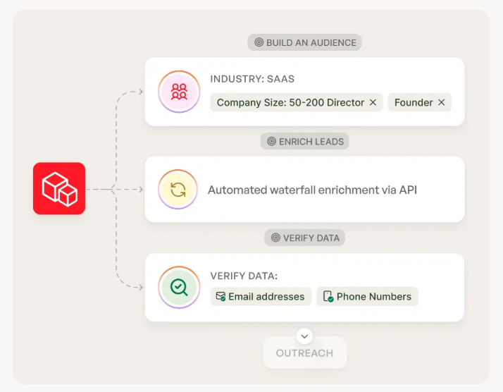
Smaller, targeted lists get 3x the reply rate of mass blasts. Prospeo's 30+ filters - buyer intent, technographics, job changes, headcount growth - let you build those lists in minutes, not hours. At $0.01 per email, the math on revenue per email sent changes fast.
Build the list that moves your Tier 1 metrics. 100 free credits, no card required.
FAQ
What are the most important cold email metrics to track in 2026?
Positive reply rate, meetings booked, and revenue per email sent are the three Tier 1 metrics that correlate directly with pipeline. Bounce rate (target under 2%) and inbox placement (target 85%+) are essential health diagnostics. Open rates are directional only - Apple MPP inflates them for roughly half of all recipients.
What is a good cold email reply rate in 2026?
Average reply rate sits between 3.4-4.1% across major benchmark studies. Top-25% senders hit 5.5%+, and elite performers reach 10.7%+. Your benchmark depends on list size - campaigns under 50 recipients average 5.8%, while 1,000+ recipients average 2.1%. Always compare against your volume tier.
Should I still track open rates for cold email?
Only as a directional signal, never as a primary KPI. Apple Mail Privacy Protection covers roughly half the email recipient market and generates fake opens. A 44-million-email study found that disabling open tracking doubled reply rates (1.08% to 2.36%). Use positive reply rate and meetings booked instead.
How do I reduce my cold email bounce rate?
Start with verified contact data - aim for 98% accuracy with a 7-day refresh cycle. Prospeo's 5-step verification process routinely drops bounce rates from 35-40% to under 5%, as documented at companies like Snyk and Meritt. Keep bounce rates under 2%; above 5%, your deliverability and every downstream metric are compromised.
How many follow-up emails should I send in a cold sequence?
Send 4-7 follow-ups with the expectation of diminishing returns after each step. 58% of replies come from the first email, but campaigns with follow-ups generate 66% more total replies than single-touch sends (4.9% vs 3.0% reply rate). Follow-ups that read like natural replies outperform formal templates by about 30%.