Data Aggregation Techniques That Actually Matter in 2026
Your VP sees revenue up 15% on the quarterly dashboard. Every regional manager says their number is flat. Someone's wrong - or more likely, the aggregation is hiding the real story.
Most guides on data aggregation techniques stop at SUM and AVG. This one covers the decisions that actually trip teams up: which technique fits your latency requirements, where the math quietly lies to you, and the statistical pitfalls nobody warns you about.
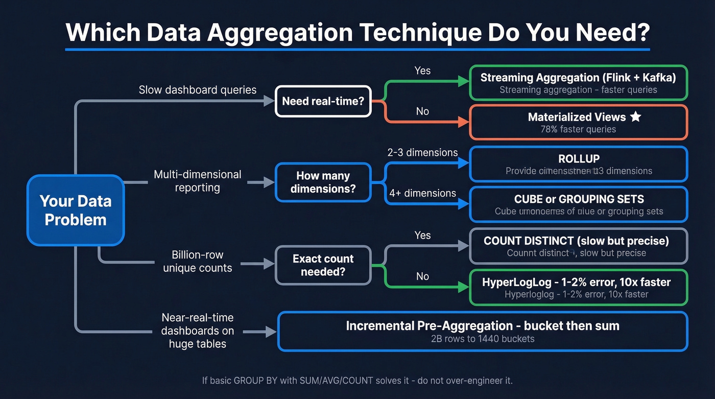
What You Need (Quick Version)
| Your Problem | Technique | Start Here |
|---|---|---|
| Slow dashboard queries | Materialized views | Snowflake/BigQuery MVs |
| Multi-dimensional reporting | CUBE / ROLLUP | SQL GROUP BY extensions |
| Billion-row real-time counts | Streaming aggregation | Flink + Kafka |
| Approximate uniques at scale | HyperLogLog | BigQuery APPROX_COUNT_DISTINCT |
Core Techniques for Aggregating Data
You don't need ten techniques. You need three or four that match your latency and dimensionality requirements.
Foundational SQL
Quick reference - you know these, but they're the building blocks:
SELECT region, SUM(revenue), AVG(deal_size), COUNT(*)
FROM pipeline GROUP BY region;
MIN, MAX, and COUNT(DISTINCT account_id) round out the basics. If these solve your problem, don't over-engineer it.
ROLLUP, CUBE, and GROUPING SETS
When you need subtotals and grand totals without running multiple queries:
SELECT region, product, SUM(revenue)
FROM sales
GROUP BY ROLLUP(region, product);
ROLLUP gives hierarchical subtotals: region, then product, then grand total. CUBE gives every combination - useful for multi-dimensional reporting but produces more rows. GROUPING SETS lets you pick exactly which groupings you want, and GROUPING_ID(region, product) helps you distinguish subtotal rows from detail rows in the output.
These work across SQL Server, PostgreSQL, and most modern warehouses including BigQuery and Snowflake, with minor syntax differences.
Window Functions
If you learn one advanced SQL feature first, make it window functions. They aggregate without collapsing rows - you keep the detail while computing the summary right alongside it.
SELECT order_date, daily_revenue,
  SUM(daily_revenue) OVER (
    ORDER BY order_date
    ROWS BETWEEN 6 PRECEDING AND CURRENT ROW
  ) AS rolling_7d
FROM daily_sales;
That's a fundamentally different capability than GROUP BY. In our experience, it's the one teams underuse the most.
Pre-Aggregation
A common question on r/dataengineering about pre-aggregation: "How many summary tables do I need?" Five filterable columns with 10 values each means 100,000 possible groupings. That's the dimensionality explosion problem.
Three focused pre-agg tables beat one massive one every time. Store only additive measures like sums and counts, compute ratios at query time, and use dbt to automate the refresh. This sounds obvious but gets skipped under deadline pressure.
If you’re doing this for revenue reporting, it also helps to standardize your RevOps Tech Stack so the same definitions flow from source to dashboard.
Materialized Views
Here's the thing: this is the highest-ROI optimization most teams aren't using. A community benchmark showed a single Snowflake materialized view delivered a 78.4% performance improvement for the 12 out of 17 queries that used it, with costs dropping from $0.504 to $0.396 per run. Another test on a 500M-row orders table cut a monthly summary query from 45 seconds to 0.3 seconds.
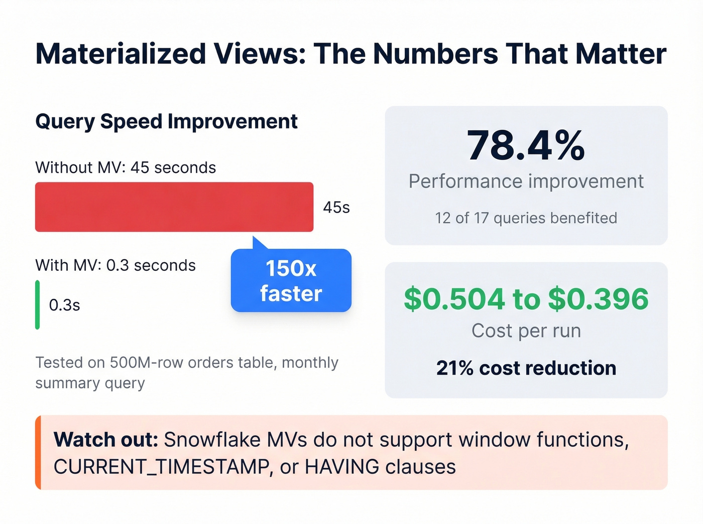
The catch? Snowflake MVs don't support window functions, CURRENT_TIMESTAMP, or HAVING clauses in their definitions. So you'll need to plan around those constraints, which usually means pre-filtering data into a staging table before the MV picks it up.
Approximate Aggregation
When you've got billions of rows and exact counts don't matter, HyperLogLog gives you unique counts with roughly 1-2% relative error at a fraction of the compute cost. In BigQuery:
SELECT APPROX_COUNT_DISTINCT(user_id)
FROM events
WHERE event_date = '2026-01-15';
"Approximately 4.2 million unique visitors" is just as useful as the exact number for most dashboards - and returns in seconds instead of minutes. For latency-sensitive monitoring, percentile aggregations like P95/P99 follow the same philosophy: trade precision for speed where the use case allows it.
Streaming Aggregation
Kafka and Flink aren't interchangeable. Kafka is the broker - it ingests and durably buffers events. Flink is the processing framework - it runs the actual aggregation logic with stateful computations, checkpointing, and watermarks for late-arriving data.
Let's be honest: streaming isn't "better" than batch. If hourly refreshes are fine, a materialized view is simpler and cheaper. Skip streaming unless your use case genuinely demands sub-second or sub-minute freshness. Streaming solves a latency problem, not a data problem.
Incremental Aggregation
A practitioner on r/dataengineering described this scenario: a MySQL table with roughly 2 billion rows, the biggest tenant generating about 5 million jobs per day. The solution was elegant - pre-aggregate into 1-minute buckets, then answer "last 24 hours" by summing 1,440 buckets instead of scanning millions of raw rows. Simple, effective, and dramatically cheaper than real-time streaming for near-real-time dashboards.
This is also where clean pipeline definitions matter; otherwise you’re incrementally rolling up the wrong thing (see B2B Sales Pipeline Management).
You just read why aggregation breaks when source data is stale or duplicated. Prospeo's 7-day refresh cycle and automatic deduplication mean your CRM counts, pipeline rollups, and outreach metrics reflect reality - not phantom records from 6-week-old data.
Stop aggregating garbage. Start with 98% accurate data.
When Aggregation Lies
Remember that VP who saw revenue up 15%? Here's why the regional managers can all be right too.
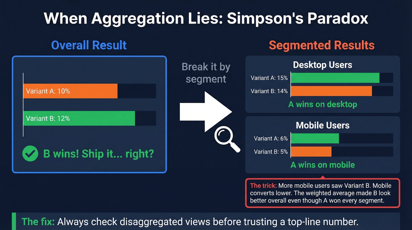
Simpson's paradox. You run an A/B test. Overall: Variant A converts at 10%, Variant B at 12%. B wins, right? Break it by device - Desktop: A 15% vs B 14%. Mobile: A 6% vs B 5%. A wins every segment. The overall number is a weighted average distorted by uneven traffic distribution. More mobile users saw Variant B, dragging its blended rate up despite losing in both segments. We've seen this exact scenario tank a product launch decision at a SaaS company that trusted the top-line number without segmenting.
This is the same failure mode you see in sloppy sales performance analysis: the rollup looks “up and to the right,” but the segments that matter are deteriorating.
Ecological fallacy. Relationships in aggregated data don't necessarily hold at the individual level. Counties with higher average income correlate with higher education spending - that doesn't mean the wealthy individuals are the ones spending more on education.
The Modifiable Areal Unit Problem (MAUP). Change your geographic boundaries, change your results. Aggregate sales by zip code, county, or state and you'll get three different stories from the same underlying data.
The fix for all three: always check disaggregated views before trusting a top-line number.
Aggregation Is Only as Good as Your Source Data
Before you optimize your GROUP BY, check what you're grouping. We've seen CSV ingestion where line breaks mid-row created phantom records that inflated counts by double digits.
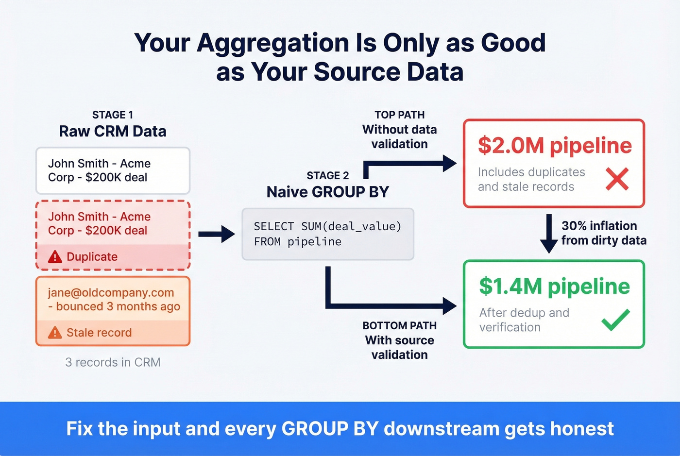
Data quality issues aren't limited to ingestion bugs - they compound in B2B reporting specifically. Stale emails inflate outreach volume counts. Duplicate CRM records double-count pipeline value. Your aggregated dashboard says $2M in pipeline; the real number is $1.4M after deduplication. Among all the data aggregation techniques you can master, source-record validation is the one most teams deprioritize - and it's the one that causes the most damage downstream. Tools like Prospeo address this with a 7-day data refresh cycle and 98% email accuracy across 300M+ professional profiles, so when you roll up outreach metrics or pipeline value, the underlying records actually reflect reality.
If you’re evaluating providers, start with accuracy-first comparisons like Best Verified Contact Databases or the broader 10 Best B2B Databases in 2026. And if you need to enrich missing firmographics before you aggregate, use a shortlist of data enrichment tools.
Stale emails inflate outreach counts. Duplicate records double your pipeline numbers. Prospeo's 5-step verification, catch-all handling, and 92% enrichment match rate give your aggregation layer what it actually needs: clean, deduplicated source data at $0.01 per email.
Fix the input and every GROUP BY downstream gets honest.
FAQ
What's the difference between aggregation and summarization?
Aggregation applies a specific function - SUM, AVG, COUNT - to grouped rows and returns a numeric result. Summarization is broader: it includes aggregation but also narrative interpretation and trend identification. Think of aggregation as one tool within the summarization toolkit.
When should I use streaming instead of batch aggregation?
Use streaming when your use case demands sub-second or sub-minute freshness: fraud detection, live inventory alerts, real-time bidding. If hourly refreshes work, batch processing or materialized views are simpler and cheaper - often 5-10x less infrastructure overhead.
How do I prevent aggregated B2B data from silently inflating metrics?
Verify and deduplicate source records before aggregating. Stale contacts and duplicate CRM entries can inflate pipeline numbers by 30% or more. A 7-day refresh cycle on your contact data - rather than the 6-week industry average - catches decay before it compounds into your rollups.