Email Analytics Dashboard: What to Track in 2026
Your VP asks "how are our emails doing?" and you pull up your email analytics dashboard - except it's actually six different tools showing six different numbers. Mailchimp says opens are up. EmailAnalytics says response times are slipping. HubSpot looks impressive but nobody configured it. The recurring frustration on r/SalesOperations is always the same: teams want simple reporting without spinning up a CRM project. They want to know who's responding, how fast, and whether campaigns actually convert.
Two paths, depending on what you're tracking:
- Team inbox productivity (response times, volume, follow-ups)? EmailAnalytics or Email Meter. Dashboard in minutes.
- Campaign performance (clicks, conversions, revenue)? Your ESP's built-in dashboard - Mailchimp, Brevo, Klaviyo - or Looker Studio to blend data across platforms.
Either way, stop trusting open rates. Apple Mail Privacy Protection has made them unreliable since 2021. Track clicks and replies instead.
Two Types of Email Dashboards
There's a clean split most teams miss. The broadcaster's view is campaign analytics - what happened after you hit send. Opens, clicks, conversions, unsubscribes, revenue per email. That's your Mailchimp or Klaviyo dashboard.
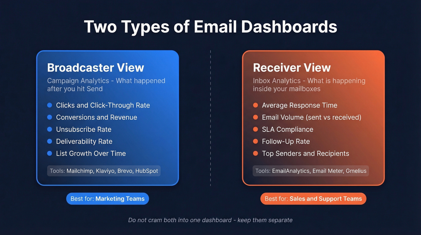
The receiver's view is inbox analytics - what's happening inside your team's mailboxes. Volume, average response time, SLA compliance, follow-up rates. That's where EmailAnalytics and Email Meter live.
Sales and support teams need the receiver's view. Marketing teams need the broadcaster's view. If you're running both outbound sequences and marketing campaigns, you need both - but don't cram them into one dashboard. Mixing the two creates a Frankenstein report that confuses everyone and answers nobody's actual question.
Metrics That Actually Matter
A MailerLite study covering 3.6M campaigns across 181,000 accounts gives us the best available median benchmarks:
| Metric | All Industries | E-commerce | Software | Non-profits |
|---|---|---|---|---|
| Open rate | 43.46% | 32.67% | 39.31% | 52.38% |
| Click rate | 2.09% | 1.07% | 1.15% | 2.90% |
| CTOR | 6.81% | - | - | - |
| Unsub rate | 0.22% | - | - | - |
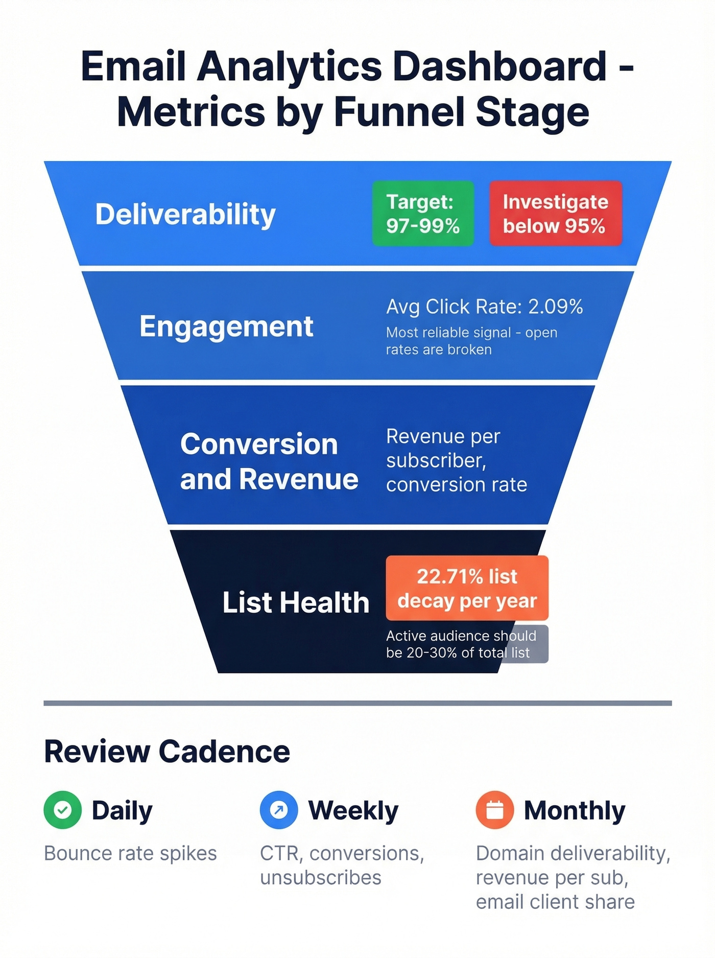
Structure your dashboard by funnel stage. Deliverability first - target 97-99% and investigate anything below 95%. Then engagement: click-through rate is the single most reliable signal now that open rates are compromised. Then conversion and revenue metrics. Finally, list health.
Here's a number that should bother you: email lists degrade at roughly 22.71% per year. That's nearly a quarter of your contacts going stale. Your active audience should represent 20-30% of your total subscriber base, and if it doesn't, you've got a list problem, not a content problem.
For outbound teams, reply rate is the metric that actually predicts pipeline. We've seen teams obsess over open rates while ignoring reply rates - they're optimizing for vanity. If you want a tighter KPI set, borrow from proven sales engagement analytics frameworks.
Review cadence matters too. Check bounce rates daily; a sudden spike means something broke. Review CTR, conversions, and unsubscribes weekly. Monthly, audit email client share, domain-level deliverability, and revenue per subscriber. Most teams default to monthly reviews and catch problems three weeks too late.
Open Rates Are Lying
Apple Mail Privacy Protection preloads tracking pixels via proxy servers, firing the pixel even when the subscriber never reads your email. It also obscures IP addresses, geolocation, and device data. Anyone using the Apple Mail app - even with a Gmail account - triggers phantom opens.
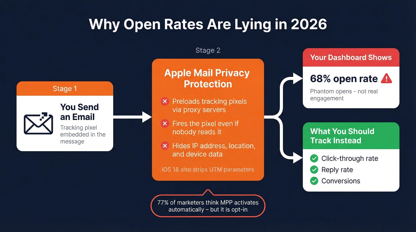
iOS 18 makes things worse. AI-generated previews and branded sender icons reshape the inbox experience, and Apple's Link Tracking Protection can strip tracking parameters like UTMs. Your attribution data gets noisier every year. If you need the technical breakdown, see our guide to email open tracking.
Here's the kicker: 77% of marketers believe MPP activates automatically, but it's opt-in. Most teams haven't adjusted their dashboards to account for it. Replace open-rate triggers with clicks, replies, and conversions - metrics that require intentional human action and can't be faked by a proxy server.
Your email analytics dashboard is only as good as the data feeding it. When 22% of your list decays every year, bounce rates spike and every metric downstream suffers. Prospeo refreshes all 300M+ profiles every 7 days - not every 6 weeks - so your outbound data stays clean and your dashboards reflect reality.
Stop diagnosing dashboard problems caused by stale contact data.
Best Tools by Type
Inbox Analytics
EmailAnalytics is the go-to for team inbox monitoring. $19/inbox/month with a 14-day free trial, supporting Gmail and Outlook. It tracks response times, top senders/recipients, and internal vs. external splits, syncing up to 2 years of history. We've tested both EmailAnalytics and Email Meter, and EmailAnalytics edges ahead on response-time granularity - you can drill into individual rep performance in ways Email Meter doesn't support.
Email Meter offers a free tier for basic stats and a Plus plan at $15/user/month (annual) or $19 month-to-month. It carries a 4.8/5 on SoftwareAdvice, and reviewers praise how readable the reports are. Better value if you just need clean weekly reports without deep drill-downs. Skip it if you need real-time alerts or per-rep SLA tracking.
Gmelius and Front also include inbox analytics, though they're shared-inbox collaboration tools with reporting bolted on. If you're trying to standardize follow-ups across reps, pair inbox reporting with a dedicated sales follow-up software stack.

Campaign Analytics
Your ESP already has a decent dashboard. Mailchimp (free up to 500 contacts, ~$13/mo+ paid), Brevo (300 emails/day free, ~$25/mo+ paid), and Klaviyo (~$20/mo) all provide clicks, conversions, and revenue attribution without extra setup.
HubSpot's Marketing Hub Starter runs around ~$20/month, but as PCMag's editors note, the tier structure gets confusing fast. Let's be honest: HubSpot is overkill if all you need is email reporting. You're paying for a full marketing automation platform to get a dashboard you could build in Looker Studio for free. If you do want email inside a CRM, start with an email CRM comparison before committing.
| Tool | Type | Price | Best For |
|---|---|---|---|
| EmailAnalytics | Inbox | $19/inbox/mo | Sales team response tracking |
| Email Meter | Inbox | $15/user/mo | Budget inbox analytics |
| Gmelius | Inbox | Shared inbox pricing | Shared inbox teams |
| Mailchimp | Campaign | ~$13/mo+ | Small list campaigns |
| Brevo | Campaign | ~$25/mo+ | Transactional + marketing |
| Klaviyo | Campaign | ~$20/mo | E-commerce revenue attribution |
| HubSpot | Campaign | ~$20/mo (Starter) | Full-stack marketing |
| Looker Studio | DIY | Free | Multi-source blending |
Build Your Own Dashboard (Free)
Looker Studio is free, powerful, and underused. If you're blending data from multiple ESPs or want a single cross-channel view, here's the build:
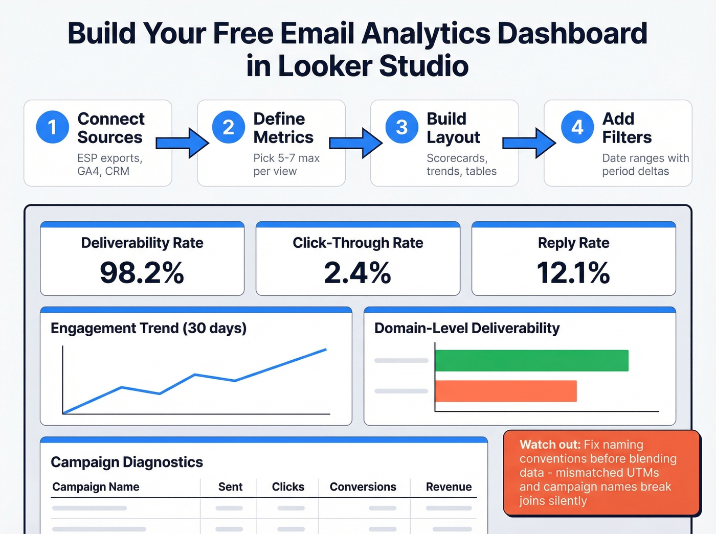
- Connect data sources - ESP exports, GA4, CRM
- Define key metrics - pick 5-7 max per view
- Layout - KPI scorecards top, trend charts middle, diagnostic tables bottom; add domain-level deliverability breakdowns to catch ISP-specific issues
- Add date-range filters - previous-period deltas are automatic
The biggest pitfall we see is data blending. If you're joining Mailchimp data with GA4 data, fix naming conventions before you blend. Campaign names, UTM parameters, date formats - if they don't match, your join breaks silently and you get garbage numbers. I've debugged dashboards where a team spent two weeks making decisions off a broken join they never noticed. A good test from Metabase's dashboard design guide: if someone had only 30 seconds with your dashboard, would any single chart be worth their time? If not, cut it. For more KPI layout ideas, see these sales dashboard examples.
Your Dashboard Needs Clean Data
Every metric on your email analytics dashboard is downstream of list quality. When nearly a quarter of your contacts go stale every year, invalid addresses inflate bounce rates, suppress engagement metrics, and tank sender reputation - which then corrupts deliverability numbers across the board. You end up making decisions based on data that's been poisoned at the source. If you’re seeing persistent deliverability issues, start with email bounce rate diagnostics.
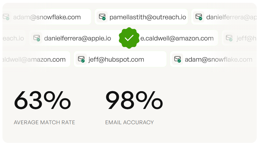
Prospeo's 5-step verification process handles catch-all domains, spam-trap removal, and honeypot filtering, delivering 98% email accuracy. Before you trust any dashboard number, verify the list feeding it - especially if you’re doing email appending or importing third-party contacts. Teams like Stack Optimize maintain 94%+ deliverability and sub-3% bounce rates across all client campaigns by verifying every contact before it enters a sequence.
You're tracking reply rates because open rates are broken. Smart move. But replies start with reaching real inboxes. Prospeo's 5-step verification delivers 98% email accuracy - teams using it see bounce rates drop from 35% to under 4% and reply rates triple.
Fix the input data and every metric on your dashboard improves.
FAQ
What's the difference between email marketing analytics and inbox analytics?
Marketing analytics tracks campaign performance after you send - clicks, conversions, revenue. Inbox analytics tracks team productivity: response times, email volume, follow-up rates. Sales and support teams lean inbox; marketing teams lean campaign. Most mid-market orgs need both views but should keep them in separate dashboards.
Are email open rates still accurate in 2026?
No. Apple Mail Privacy Protection preloads tracking pixels, inflating open rates for roughly 50%+ of subscribers on Apple devices. iOS 18's Link Tracking Protection also strips UTMs, degrading attribution. Track click-through rate, reply rate, and conversions instead - these require intentional action and can't be faked by a proxy server.
How often should I review my dashboard?
Daily: check bounce rates for sudden spikes. Weekly: review CTR, conversions, and unsubscribes. Monthly: audit email client share, domain-level deliverability, active audience percentage, and revenue per subscriber. Most teams default to monthly reviews and catch problems three weeks too late.
What free tools can I use to verify emails before tracking?
Prospeo offers 75 free email verifications per month with 98% accuracy and a 5-step verification process including spam-trap removal. Hunter provides 25 free searches monthly but caps enrichment. For teams running real outbound campaigns, Prospeo's free tier covers more ground without feature restrictions.