10 Sales Dashboard Examples (With the Benchmarks Nobody Else Shares)
It's Monday morning. Your VP pulls up the pipeline dashboard in the all-hands and asks why forecast accuracy is off - again. You stare at the numbers and realize you don't trust a single one.
Most sales dashboard examples you'll find look great in screenshots and fall apart the moment real data hits them. Only 7% of sales organizations achieve forecast accuracy of 90% or higher. The dashboard isn't the problem. The problem is what's behind it - the data, the KPIs, and the design decisions nobody talks about.
What You Need (Quick Version)
- Best free tool: Looker Studio (60+ templates)
- Best paid tool: Power BI ($10/user/mo, downloadable templates)
- Already in HubSpot? Use the built-in dashboards - don't add another tool
- Jump to: 10 dashboard examples · 2026 KPI benchmarks · Mistakes that kill adoption
How to Build a Dashboard People Actually Use
Most dashboards get ignored because they try to show everything to everyone. Here's how to avoid that.
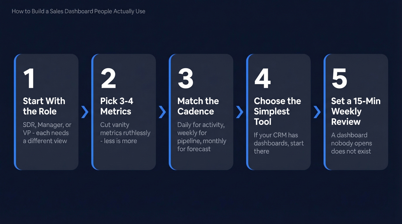
1. Start with the role, not the data. An SDR needs activity metrics. A manager needs pipeline coverage. A VP needs forecast accuracy and revenue vs. target. One dashboard can't serve all three - and forcing it to try is how you end up with a cluttered mess nobody opens.
2. Pick 3-4 metrics per goal. Salesforce's guidance nails this: stick to three or four metrics per goal to keep dashboards interpretable. Ruthlessly cut vanity metrics.
3. Match the review cadence. Activity dashboards get checked daily. Pipeline dashboards weekly. Forecasting dashboards monthly or at quarter-end. Build the refresh frequency around the meeting rhythm.
4. Choose the simplest tool that works. If your CRM already has dashboards, start there. Don't buy Tableau for a five-person team. If you're still evaluating examples of a CRM, pick one with reporting you’ll actually use.
5. Set a 15-minute weekly review. A dashboard nobody opens is a dashboard that doesn't exist. Block the time, assign an owner, review as a team.
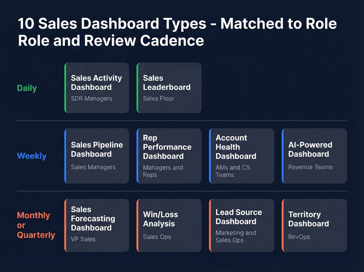
10 Sales Dashboard Examples
1. Sales Pipeline Dashboard
Who it's for: Sales managers tracking deal flow from lead to close.
Key KPIs: deals by stage, pipeline value, average deal size, stage-to-stage conversion rate. A commonly used B2B pipeline standard is 3:1 coverage against quota - $3M in pipeline for every $1M target. If your conversion-to-opportunity rate sits below the 20% benchmark, you've got a top-of-funnel problem, not a closing problem.
Review this one weekly. The pipeline view is the single most common dashboard type you'll encounter, and for good reason - it directly ties daily activity to revenue outcomes. We've found it's also the best starting point for teams building their first dashboard, because the KPIs are intuitive and the data usually already lives in your CRM. If you want deeper ranges, use these sales pipeline benchmarks to sanity-check coverage and stage conversion.
2. Sales Forecasting Dashboard
Think of this as your weather radar - it tells you what's coming, not what already happened. More than 55% of sales leaders say inaccurate forecasting costs them revenue targets every quarter.
The fix: layer in AI-weighted probability scores if your CRM supports them. Manual "gut feel" forecasts are consistently 20-50% less accurate than model-driven ones. Key KPIs: weighted pipeline, forecast vs. actual, deal velocity, commit vs. best-case. Review monthly and at quarter-end. If you’re shopping, compare sales forecasting tools before you rebuild your stack.
3. Rep Performance Dashboard
The average B2B win rate hovers around 21%. If a rep consistently beats that, study their process. If they're below, this dashboard tells you where deals die.
Key KPIs: quota attainment, win rate, average deal cycle, activities per opportunity. We run this during weekly 1:1s - it turns coaching conversations from opinion-based to evidence-based, which reps actually appreciate once they see the data working in their favor. If you need a cleaner definition of what to track, start with sales performance management.
4. Sales Activity Dashboard
Who it's for: SDR managers tracking outbound volume and quality.
Key KPIs: calls made, emails sent, connect rate, meetings booked, time-to-first-touch. Reps spend just 28% of their time actually selling - the rest is admin, data entry, and chasing bad contact info. If connect rates are declining, the issue is often stale phone data, not rep effort. Review daily. For a tighter activity taxonomy, use these sales activities examples.
5. Win/Loss Analysis Dashboard
Here's a mistake we see constantly: teams track wins obsessively and ignore losses entirely. The real intelligence lives in the losses.
Key KPIs: win rate by competitor, loss reasons, deal size won vs. lost, sales cycle length for wins vs. losses. In B2B tech, quote win rates typically land between 35-55%. Track loss reasons categorically - "lost to competitor," "no decision," "budget" - and you'll spot patterns within a quarter. Review monthly.
6. Sales Leaderboard Dashboard
Skip this if your team has fewer than five reps. It just creates awkwardness.
For larger teams, keep it dead simple and public: revenue closed (ranked), deals won, biggest deal. The best leaderboards show one or two metrics and update in real time. Overcomplicating it with weighted scores kills the motivational effect.
7. Lead Source Dashboard
Who it's for: Marketing and sales ops aligning on pipeline contribution.
Key KPIs: leads by source, conversion rate by channel, cost per lead, pipeline generated by source. Email campaigns benchmark around 15.4% open rate and 7.4% CTR. Here's the insight most teams miss: if your outbound channel underperforms inbound on conversion but costs less per opportunity, that's a scaling signal, not a failure. And 55% of companies can't even tell you their customer acquisition cost - their dashboards reflect that blind spot. Review monthly. If you want to standardize definitions, map this to your lead generation metrics.
8. Account Health Dashboard
Who it's for: Account managers and CS teams managing renewals.
Key KPIs: NPS or health score, product usage, open support tickets, expansion revenue, days since last contact. This dashboard prevents churn surprises. Flag any account with declining usage and no executive contact in 30+ days. Review weekly. If you’re building retention reporting, pair it with a simple churn analysis view.
9. Territory Dashboard
Territory imbalances are one of the most common - and most fixable - reasons teams miss number. If one region is at 140% capacity while another sits at 60%, you don't need more reps. You need a rebalance.
Key KPIs: pipeline by territory, quota attainment by region, rep capacity, whitespace accounts. Review quarterly. If you need a system for this, start with sales mapping software.
10. AI-Powered Dashboard
Who it's for: Revenue teams betting on conversational BI.
Key KPIs: AI-generated deal risk scores, next-best-action recommendations, anomaly alerts, natural-language query results. Tools like Power BI and Tableau now support natural-language Q&A so reps can ask "Which deals are most likely to slip this quarter?" and get chart-level answers. The point isn't the novelty - it's cutting the manual reporting work so reps spend more time selling and less time building spreadsheets.
Reps spend 72% of their time on admin and chasing bad contact info. That's what tanks your activity dashboard metrics. Prospeo's 98% email accuracy and 125M+ verified mobiles mean your connect rates actually reflect rep effort - not data rot.
Clean data in, clean dashboards out. Start free with 75 verified emails.
2026 Sales KPI Benchmarks
Most dashboard articles skip the actual numbers. Pin this table next to your dashboard and use it during planning.
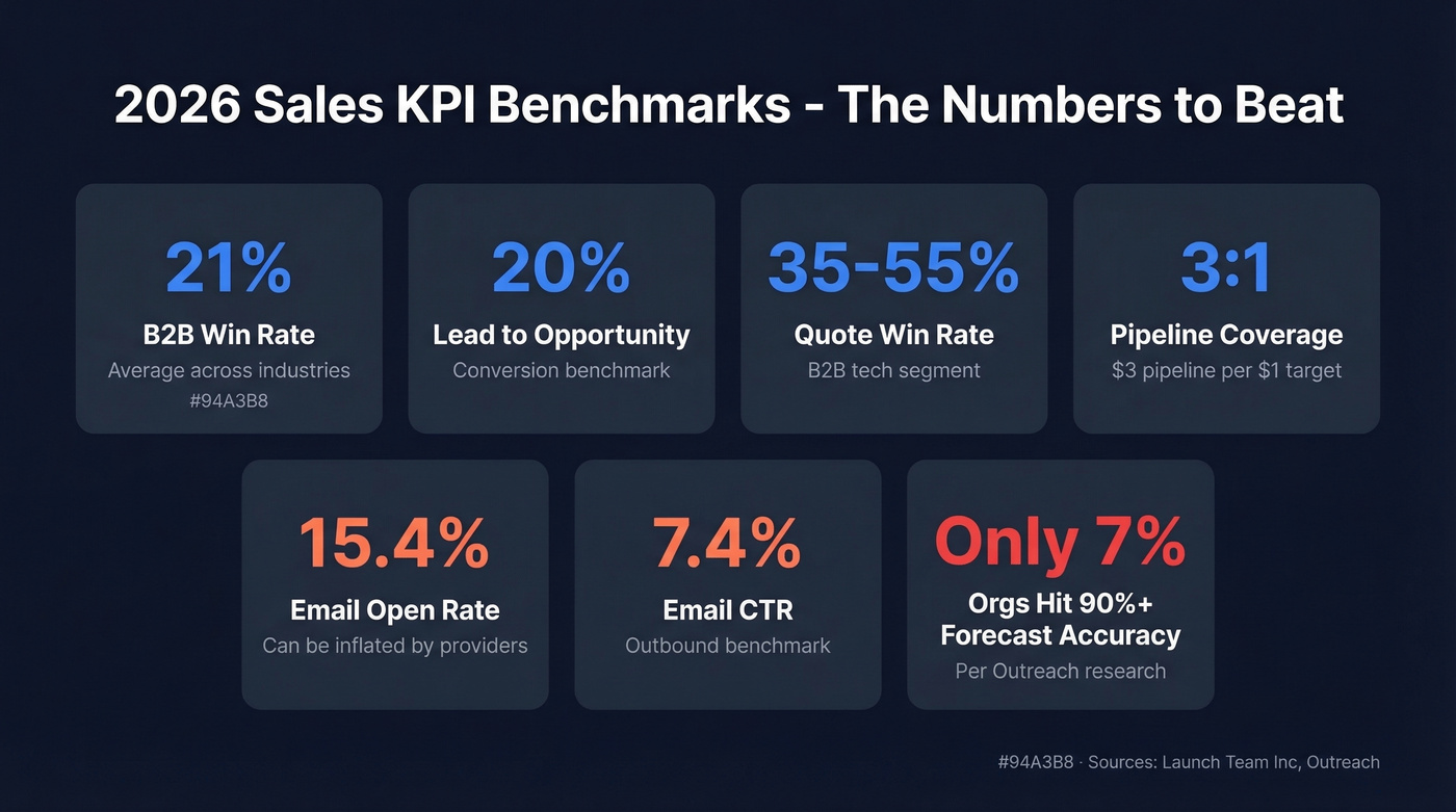
| KPI | Benchmark | Notes |
|---|---|---|
| Win rate | ~21% | B2B average |
| Conversion to opp | 20% | Lead to opportunity |
| Quote win rate | 35-55% | B2B tech; varies by segment |
| Pipeline coverage | 3:1 | $3 pipeline per $1 target |
| Email open rate | 15.4% | Can be inflated by providers |
| Email CTR | 7.4% | Outbound benchmark |
| Forecast accuracy 90%+ | 7% of orgs | Per Outreach research |
These come from Launch Team Inc's planning benchmarks and Outreach's dashboard research. Your industry and average contract value will shift the ranges, but these are the baselines to beat.
5 Mistakes That Kill Dashboard Adoption
75% of business leaders say analytics-based decisions improve performance. So why do most dashboards get abandoned? These five design mistakes, drawn from Yellowfin's research and echoed constantly in RevOps communities on Reddit, are the usual culprits.
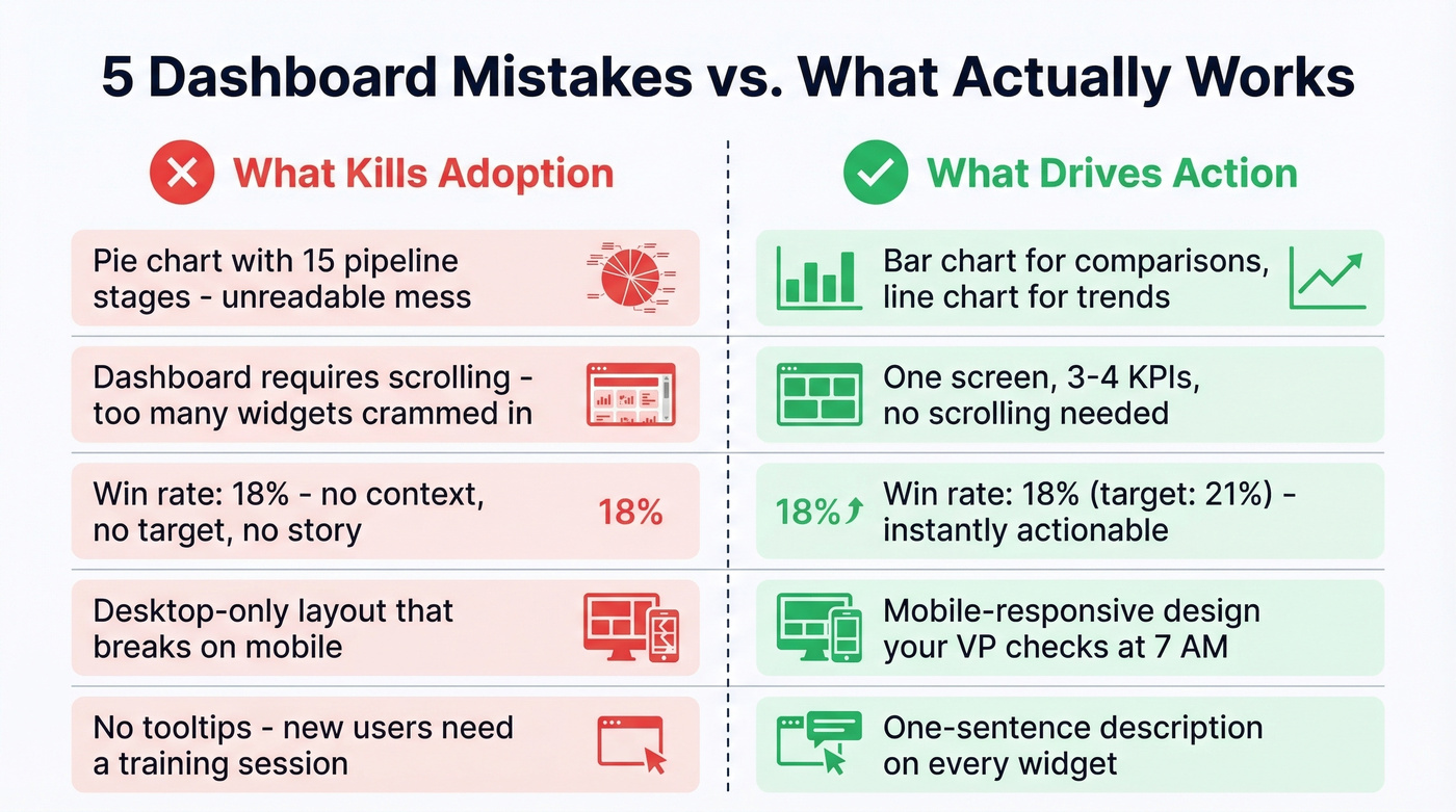
1. Wrong visualization type. A pie chart for 15 pipeline stages is unreadable. Use bar charts for comparisons, line charts for trends, and tables for exact numbers.
2. Too many elements. If your dashboard requires scrolling, it's too long. One screen, 3-4 KPIs, no exceptions.
3. No labels or context. A number without a benchmark is meaningless. "Win rate: 18%" tells you nothing. "Win rate: 18% (target: 21%)" tells a story. Add targets and period-over-period comparisons to every metric.
4. Missing mobile usability. Your VP checks the dashboard on their phone at 7 AM. If it doesn't render on mobile, it doesn't get checked.
5. No summary or tooltips. New users shouldn't need a training session to read your dashboard. Add a one-sentence description to every widget explaining what it measures and why.
Best Sales Dashboard Tools
| Tool | Starting Price | Free Tier? | Best For |
|---|---|---|---|
| Power BI | $10/user/mo | Yes (Desktop) | Best paid for most teams |
| Looker Studio | Free | Yes | Best free option |
| HubSpot Sales Hub | $20/user/mo | Limited | CRM-native dashboards |
| Databox | Starts at $59/mo | Yes | Multi-source rollups |
| Tableau | $15/user/mo | 14-day trial | Enterprise visualization |
| Google Sheets | Free | Yes | Pre-revenue startups |
| Qlik Sense | ~$200/mo | Trial only | Heavy-duty analytics |
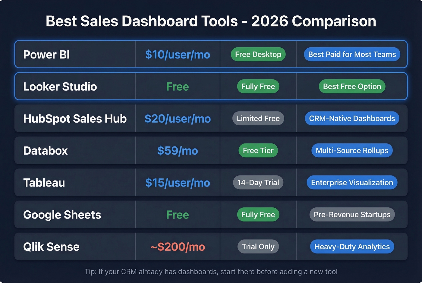
Power BI is the default recommendation for most sales teams. At $10/user/month, it's absurdly cheap for what you get - and there's a huge ecosystem of templates. Zebra BI publishes downloadable PBIX templates that can speed up your first build. The free Desktop version handles solo analysis; you only pay when you need cloud sharing.
Looker Studio is the best free option, full stop. Coupler.io maintains 60+ templates including CRM-specific dashboards for HubSpot, Salesforce, and Pipedrive. For startups with no BI budget, start here.
HubSpot's built-in dashboards are good enough for teams already on Sales Hub. Don't add a separate BI tool just to recreate what HubSpot already shows you. Starter covers basic reporting; advanced custom dashboards require Professional or higher.
Databox shines when you need metrics from multiple sources - CRM, ad platforms, email tools - in one view.
Tableau is still one of the most powerful options for complex, enterprise-grade visualization, but it takes time to learn. Skip it unless you have a dedicated analyst.
Google Sheets works for pre-revenue startups tracking a handful of deals manually. No automation, but free and universal. Qlik Sense is overkill for most sales teams - consider it only for advanced associative analytics across massive datasets.
Fix Your Data Before You Build
Let's be honest: the best dashboard investment most teams can make isn't a dashboard tool - it's a data quality tool.
None of these reporting views matter if the underlying data is wrong. CRM data decays fast as people change jobs, get promoted, and switch companies. That pipeline number your VP stares at on Monday morning? It's built on contacts who may no longer be at the company, phone numbers that ring dead, and email addresses that bounce. If you’re evaluating options, start with these data enrichment services.
Here's a scenario we've watched play out dozens of times: an SDR team's connect rate drops from 8% to 3% over six months, and leadership blames the reps. The real problem is stale phone data. Prospeo fixes this at the source - 98% email accuracy, 125M+ verified mobiles, and a 7-day data refresh cycle keep the contact records feeding your dashboards current. The Salesforce and HubSpot integrations run enrichment automatically, so your dashboard reflects reality because the data behind it is verified and fresh.
If your pipeline dashboard shows healthy coverage but deals keep stalling, stale contact data is the silent killer. Prospeo refreshes every 7 days - not the 6-week industry average - so your pipeline KPIs reflect reality, not ghosts.
Stop forecasting on data that expired three weeks ago.
FAQ
What KPIs belong on a sales dashboard?
It depends on who's looking at it. SDRs need activities and connect rate. Managers need pipeline coverage and quota attainment. VPs need forecast accuracy and revenue vs. target. Stick to 3-4 metrics per view - anything more turns the dashboard into noise.
How often should I update my sales dashboard?
Real-time sync is ideal, but at minimum: daily for activity dashboards, weekly for pipeline, monthly for forecasting. Set a 15-minute weekly review cadence with your team so the dashboard drives decisions, not decoration.
Which dashboard type should I build first?
Start with the pipeline dashboard. It covers the metrics every sales org needs from day one and connects directly to revenue outcomes. Once pipeline reporting is solid, layer in rep performance and forecasting views.
Why does my dashboard show inaccurate pipeline numbers?
Stale CRM data is the most common cause. Contact records decay as people change roles, and outdated emails and phone numbers inflate pipeline counts. A data enrichment tool with a 7-day refresh cycle keeps job titles, emails, and mobiles current so your numbers reflect reality.