How to Build a Real-Time Sales Dashboard That Doesn't Collect Dust
It's Monday morning. Your VP of Sales pulls up the real-time sales dashboard your team spent three weeks building. Glances at it for four seconds. Opens a spreadsheet instead.
70% of B2B reps missed quota in 2024, and the dashboards meant to fix that are collecting dust - wrong metrics, stale data, or designed for a board meeting nobody attends. Meanwhile, reps spend 60% of their time on non-selling tasks, partly because the tools meant to focus them do the opposite. Here's our hot take: most sales teams don't need a better dashboard. They need a simpler one built on clean data. Everything below serves that idea.
What "Real-Time" Actually Means
A real-time sales dashboard is a live, interactive view of your pipeline and rep activity that refreshes automatically - no manual exports, no stale CSVs. The features that matter: live updates, customizable layouts, drill-through filters, and intelligent alerts that flag anomalies before your manager does.
A practical target is 1-5 minute refresh intervals on operational dashboards and 10-15 minutes for executive rollups. You don't need sub-second streaming unless you're processing 10M+ events per hour.
5 KPIs Every Sales Dashboard Needs
Teams that track the right KPIs see 28% higher quota attainment. Start with five. Most teams that start with fifteen end up using zero.
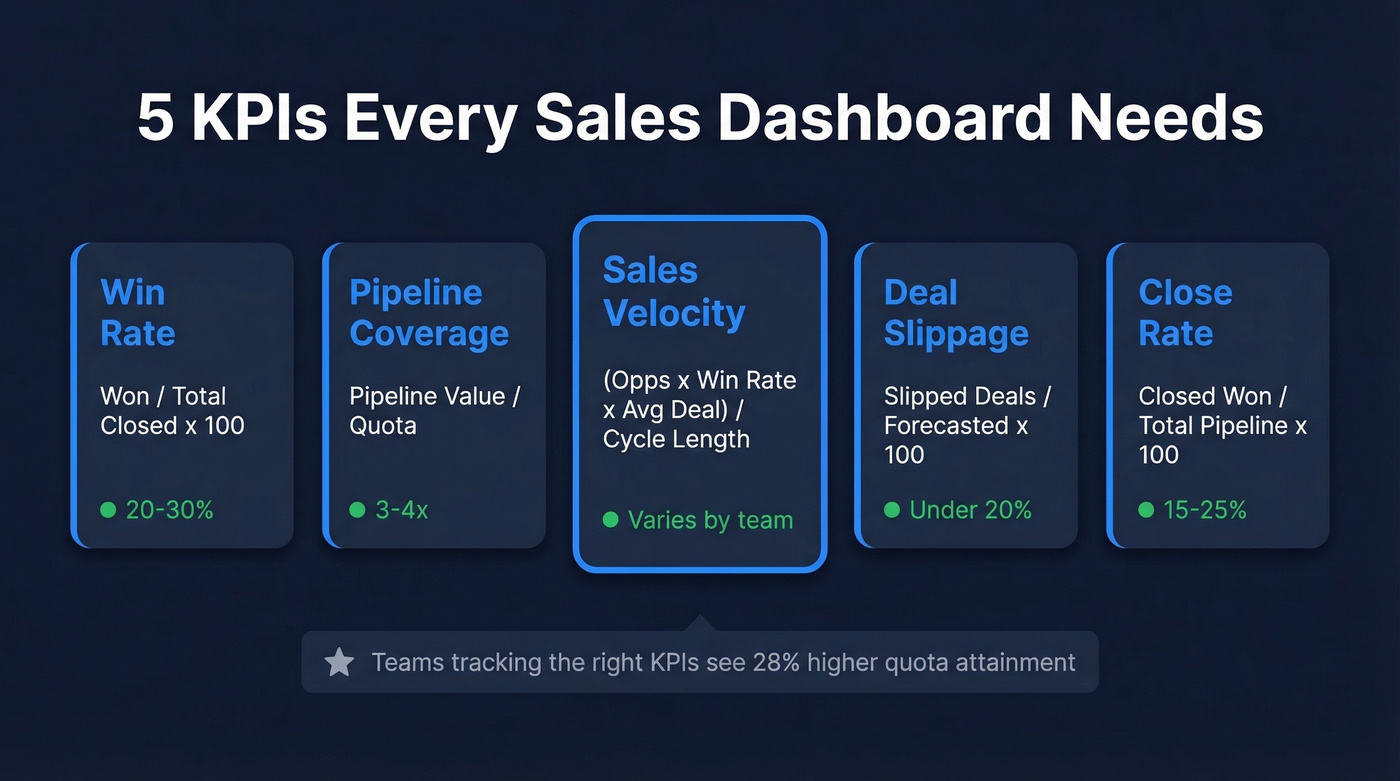
| KPI | Formula | Benchmark |
|---|---|---|
| Win Rate | Won / Total Closed x 100 | 20-30% |
| Pipeline Coverage | Pipeline Value / Quota | 3-4x |
| Sales Velocity | (Opps x Win Rate x Avg Deal) / Cycle Length | Varies |
| Deal Slippage | Slipped Deals / Forecasted x 100 | < 20% |
| Close Rate | Closed Won / Total Pipeline x 100 | 15-25% |
Win rate tells you whether qualification is working or reps are chasing bad deals. Pipeline coverage at 3-4x gives you a buffer for deals that stall - anything below 2x and you're flying blind into quarter-end.
Sales velocity is the single best compound metric because it captures volume, quality, deal size, and speed in one number. Deal slippage above 20% means your forecast is fiction. Close rate connects top-of-funnel activity to actual revenue. Teams that focus on pipeline velocity see 23% faster revenue growth compared to those only tracking pipeline value, yet most teams don't track velocity at all.
Your sales velocity metric is fiction if a third of your emails bounce. Prospeo enriches your CRM with 98% email accuracy on a 7-day refresh cycle - so every KPI on your dashboard reflects reality, not stale data.
Fix the data underneath before you build the dashboard on top.
Dashboard Tools Compared
| Tool | Category | Starting Price | Best For |
|---|---|---|---|
| HubSpot | CRM-native | $9/seat/mo (Starter); Pro $90/user/mo | HubSpot shops |
| Salesforce | CRM-native | ~$25/user/mo | Enterprise CRM |
| Geckoboard | Dedicated | $44/mo | TV dashboards |
| Databox | Dedicated | $159/mo | Multi-source rollups |
| Plecto | Dedicated | ~$25/user/mo | Rep gamification |
| Tableau | Full BI | ~$15/user/mo | Complex analysis |
| Power BI | Full BI | ~$10/user/mo | Microsoft shops |
| Zoho Analytics | Full BI | ~$24/mo | Zoho ecosystem |
| Pipedrive | CRM-native | ~$14/user/mo | SMB pipelines |
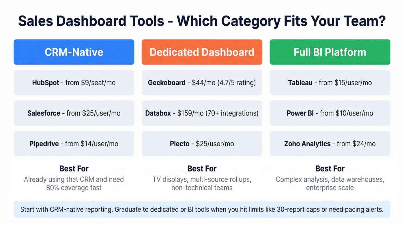
If your team isn't technical, Geckoboard (4.7/5 on Capterra) or Databox (4.6/5, 70+ native integrations) will get you live dashboards without writing a single query. For HubSpot or Salesforce shops, start with native reporting - it's already included in your CRM and covers 80% of use cases.
In our experience, teams outgrow CRM-native dashboards once they hit limits like HubSpot's 30-reports-per-dashboard cap, or when they need pacing alerts and trend views that native tools can't render. Enterprise teams with a data warehouse should go straight to Tableau, Looker, or Power BI.
Skip Plecto unless gamification is a real priority for your team. It's fun, but it's a nice-to-have, not a foundation.
Fix Your Data Before You Build
Here's the part most dashboard guides skip entirely: 84% of data and analytics leaders agree that AI and analytics outputs are only as good as the data feeding them. Yet teams spend weeks picking the perfect BI tool and zero hours auditing the CRM data underneath.
A quick CRM data audit usually reveals the same culprits: duplicates, missing fields, and outdated contacts.
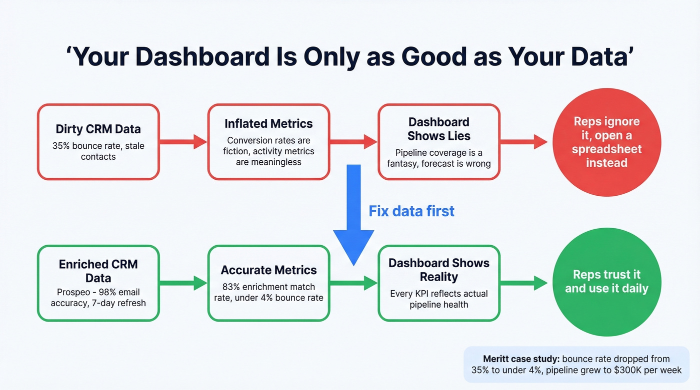
If a third of your contact emails bounce, your conversion rates are inflated, your activity metrics are meaningless, and your pipeline coverage ratio is a fantasy. We've seen this pattern repeatedly - a team builds a gorgeous dashboard, then realizes the numbers don't match because the underlying contact data is stale. The dashboard isn't broken. The data is.
Prospeo fixes this upstream by verifying CRM contacts in bulk with 98% email accuracy on a 7-day refresh cycle and an 83% enrichment match rate. One customer, Meritt, dropped their bounce rate from 35% to under 4% after running their database through Prospeo's enrichment - the difference between a dashboard that reflects reality and one that tells comfortable lies. If you're evaluating vendors, start with a shortlist of data enrichment services and compare match rates and refresh cycles.
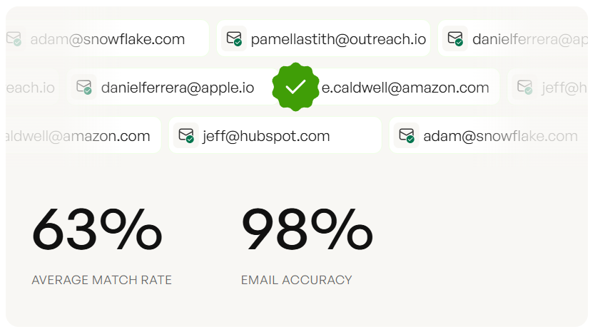
Meritt dropped their bounce rate from 35% to under 4% and tripled pipeline to $300K/week. The dashboard didn't change - the data feeding it did. Prospeo's 83% enrichment match rate turns your CRM into a source of truth.
Stop building dashboards on dirty data. Start with 75 free verified emails.
Mistakes That Kill Adoption
Too many charts. If your dashboard has 15+ widgets, nobody reads any of them. Stick to 5-7 KPIs and add a second dashboard for deep dives. If you need a deeper framework, map KPIs to your funnel metrics so each widget has a job.
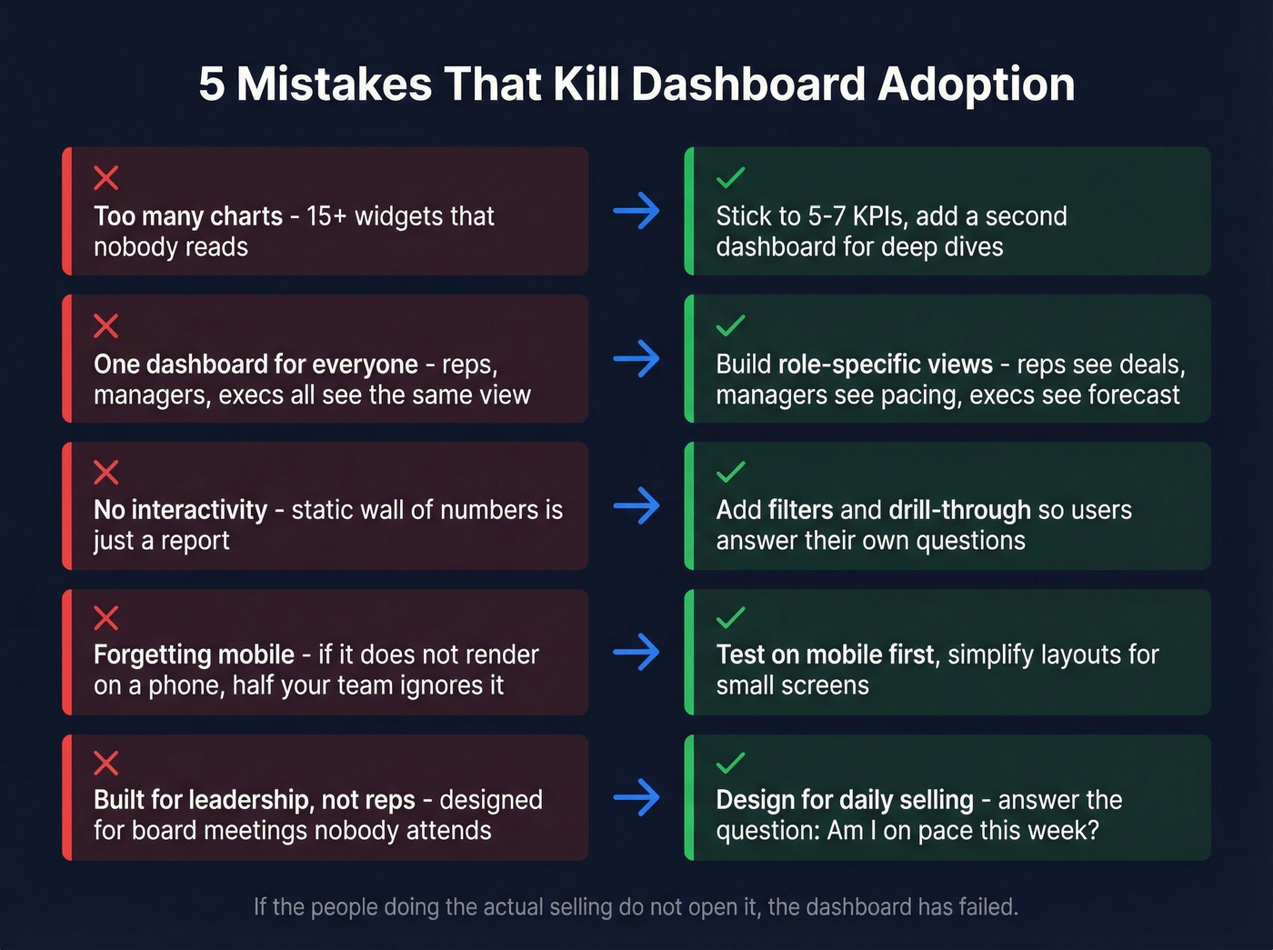
Ignoring your audience. Reps need deal-level next actions. Managers need team pacing. Execs need forecast confidence. Tableau's own guidance is blunt: don't combine all sales metrics into one dashboard.
No interactivity. A static wall of numbers is a report, not a dashboard. Add filters and drill-through so users can answer their own follow-up questions without pinging RevOps.
Forgetting mobile. If the dashboard doesn't render on a phone, it doesn't exist for half your team.
Building for leadership, not reps. The top complaint on r/BusinessIntelligence is that dashboards "collect dust" because they're designed for board meetings, not daily selling. Let's be honest - if the people doing the actual selling don't open it, the dashboard has failed no matter how pretty it looks.
The flip side works too. One RevOps team replaced 12 manual reports with a single Power BI dashboard pulling from SQL every morning - Power Query, DAX, and a bit of Python for automation. Their reps actually opened it because it answered the one question that mattered: "Am I on pace this week?" That kind of adoption usually comes from aligning dashboards to sales activities, not vanity metrics.
FAQ
What does "real-time" mean for a sales dashboard?
For most B2B teams, 1-5 minute refresh intervals on operational dashboards and 10-15 minutes for executive rollups. True sub-second streaming (Kafka + Flink) is overkill unless you're processing 10M+ events per hour - stick with scheduled refreshes and save the engineering budget.
Can I build a live dashboard inside HubSpot?
Yes. Navigate to Reporting, then Dashboards, then Create dashboard. HubSpot connects with 1,500+ apps and offers templates to start fast. But native reporting caps you at 30 reports per dashboard with no pacing alerts or trend views. Professional ($90/user/mo + $1,500 onboarding) unlocks more, though most teams eventually graduate to a dedicated BI tool.
How do I keep dashboard data accurate?
Verify contact emails and phone numbers before they enter your CRM - stale data corrupts every metric downstream. Bulk enrichment that returns 50+ data points per contact on a weekly refresh cycle is the standard we'd aim for. Clean data in, trustworthy dashboard out.
Which KPI matters most on a sales dashboard?
Sales velocity. It's the only compound metric that captures pipeline volume, win rate, average deal size, and cycle length in a single number. If you could only track one thing, velocity tells you whether revenue is accelerating or stalling - and exactly which lever to pull.