Revenue Dashboards in 2026: Metrics, Examples, and How to Build One You Can Trust
Most revenue dashboards I see are just sales dashboards with nicer colors.
They're heavy on totals and light on the tie-outs and leading indicators that prevent surprises. If you want a dashboard you can defend in a board meeting, you need crisp definitions, clean roll-forwards, and zero tolerance for vanity widgets.
I've watched teams burn two quarters arguing about "revenue" because nobody agreed on whether they meant bookings, billings, recognized revenue, or cash. The dashboard wasn't the problem. The definitions were.
Revenue dashboards: what you need (quick version)
Use this as your checklist:

- Build 3 dashboards, not 1. One view can't serve finance truth, GTM execution, and board narrative without becoming untrustworthy.
- Dashboard #1: CFO cash + AR (weekly).
- Cash balance, runway, burn
- AR aging + repeat late payers
- Deferred revenue movement
- Dashboard #2: SaaS retention (weekly/monthly).
- GRR/NRR, churn + contraction, expansion
- Cohorts + trailing averages
- CAC payback, gross margin
- Dashboard #3: Pipeline coverage + velocity (daily/weekly).
- Coverage ratio (target 3x-4x)
- Pipeline velocity + stage conversion
- Sales cycle drift + win rate drift
If you try to "simplify" by merging these, you'll get a dashboard nobody trusts. Finance will argue about recognition, Sales will argue about stages, and RevOps will spend their life explaining why numbers don't match.
What a revenue dashboard is (and what it isn't)
A revenue dashboard is a decision system: it tells you what happened, what's happening, and what's likely to happen using definitions that reconcile to finance. In mature orgs, it becomes a lightweight revenue command center: one place to see finance truth, GTM drivers, and forecast risk without debating basic terms.
A sales dashboard is different. It's rep activity + pipeline + attainment. Useful, but it's not "revenue" unless it's anchored to recognized revenue, billings, cash, and retention.
Use a revenue dashboard when you need answers like:
- "Are we actually earning revenue, or just signing contracts?"
- "Will cash get tight before revenue catches up?"
- "Is expansion masking churn?"
- "Is pipeline coverage strong enough to hit next quarter?"
Don't call it a revenue dashboard if it's only:
- Calls/emails/meetings
- Open pipeline totals with no quota context
- "Influenced revenue" without strict guardrails
Cadence matters.
- Daily: GTM leading indicators (coverage, velocity, stage flow).
- Weekly: CFO view (cash, AR, forecast risk) + retention risk.
- Monthly: close-aligned views (recognized revenue, margin, cohorts). For subscription businesses, this is where a monthly recurring revenue dashboard (MRR movements + retention bridges) earns its keep.
Roles matter too.
- CFO: cash, AR, deferred revenue, margin, forecast confidence.
- RevOps: metric definitions, tie-outs, pipeline mechanics, governance.
- Sales leader: coverage, velocity, win rate, cycle length, rep mix.
Define revenue first: the 4 numbers you must separate
If you don't separate these four numbers, your dashboard will lie:
- Bookings (commercial commitment)
- Billings (invoices issued)
- Recognized revenue (earned under GAAP/IFRS)
- Cash collected (money in the bank)
Under GAAP/IFRS, revenue is recorded when it's earned (goods/services delivered), not when payment is received. That one rule explains most "why doesn't this match finance?" fights.
Here's the quick contrast table teams should pin to the top of their metric dictionary:
| Number | What it answers | Where it "lives" | Who uses it most |
|---|---|---|---|
| Bookings | "Are we selling?" | Sales/CRM + contracts | Sales leadership, RevOps |
| Billings | "Are we invoicing?" | AR subledger / invoicing system | Finance, RevOps |
| Recognized revenue | "What did we earn?" | P&L (close output) | CFO, board |
| Cash collected | "What can we spend?" | Cash/bank + cash flow | CFO, founders |
For most companies building CFO-grade dashboards, recognition logic follows ASC 606 / IFRS 15:
- Identify the contract
- Identify performance obligations
- Determine the transaction price
- Allocate the price to obligations
- Recognize revenue when/as obligations are satisfied
Bookings vs billings vs recognized revenue vs cash collected
Bookings (when it moves): at signature / order acceptance.
- Think: "sales momentum."
- Often tracked as ARR, TCV, or contracted MRR.
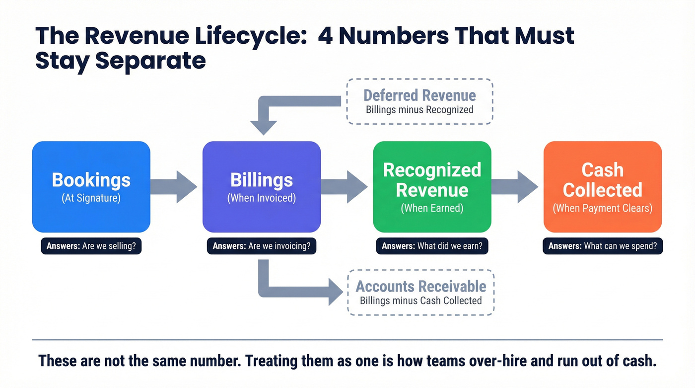
Billings (when it moves): when you invoice.
- Think: "cash timing signal."
- Hits AR (if unpaid) or cash (if paid immediately).
Recognized revenue (when it moves): when you deliver the service or product.
- Think: "P&L truth."
- For subscriptions, usually ratable over time. For projects, milestone- or effort-based.
Cash collected (when it moves): when payment clears.
- Think: "runway."
- This is what your bank account cares about.
A clean dashboard makes it obvious which number you're looking at, because they answer different questions.
Worked example #1: same deal, four different numbers
Deal: $100,000 annual contract, billed monthly, service delivered evenly over 12 months.
- Bookings: $100,000 (at signature)
- Billings: $8,333 per month (each invoice)
- Recognized revenue: $8,333 per month (earned ratably)
- Cash collected: depends on payment behavior (net-30, late payers, etc.)
This is where phantom runway happens. If your dashboard celebrates $100k bookings like it's $100k cash, you'll over-hire, over-spend, then act surprised when the bank balance doesn't cooperate.
Worked example #2: upfront billing + deferred revenue roll-forward (with numbers)
Same deal: $100,000 annual contract, billed upfront on day 1, delivered evenly over 12 months.

Month 1:
- Billings: +$100,000
- Recognized revenue: +$8,333
- Deferred revenue ending: $100,000 - $8,333 = $91,667
Month 2:
- Recognized revenue: +$8,333
- Deferred revenue ending: $91,667 - $8,333 = $83,334
By Month 12:
- Total recognized revenue: $100,000
- Deferred revenue ending: $0
Your cash can look fantastic in Month 1 while your P&L moves normally. That's not a bug. It's accrual accounting. Your revenue dashboards should show that unwind explicitly, or leadership will misread "cash up" as "revenue up."
Deferred revenue & AR tie-outs
Two balance-sheet tie-outs keep CFOs sane:
- Deferred revenue = billings - recognized revenue (for prepaid/annual invoicing)
- Accounts receivable (AR) = billings - cash collected
Your dashboard should show movements, not just ending balances:
- Deferred revenue beginning -> additions (billings) -> recognized -> ending
- AR beginning -> invoices -> collections -> write-offs/credits -> ending
In the US, some smaller businesses can qualify for cash accounting if they have $31M or less in average annual gross receipts over the past three years (limit in effect in 2026). If you want dashboards that scale, assume accrual definitions and build the tie-outs now.
What to include in revenue dashboards: CFO-grade modules
If your CFO view doesn't have these modules, it's not CFO-grade. It's a reporting collage. The goal's simple: every number needs a definition, a grain, a source of truth, and a tie-out.

Below is the module checklist, plus a minimum viable widget spec for each.
1) Revenue & gross margin module
What it's for: "Are we earning revenue profitably?" Minimum viable widget spec
- Definition: recognized revenue (close output) + gross margin % and $
- Grain: month (finance), with drill to invoice line / product line
- Source of truth: ERP/accounting close tables
- Tie-out: recognized revenue by month matches GL
- Refresh: monthly close (optional mid-month estimate clearly labeled)
Widgets
- KPI tiles: Recognized revenue (MTD/QTD/YTD), gross margin %, gross profit $
- Trend: 12-18 months line (seasonality shows up fast)
- Breakdown: product/service line, region, segment
2) Bookings vs billings vs recognized module (recurring businesses)
What it's for: "Are we selling, invoicing, and earning in sync, or drifting?" Minimum viable widget spec
- Definition: bookings (contracted), billings (invoices), recognized (earned)
- Grain: month; drill to customer and contract
- Source of truth: CRM + invoicing + close output
- Tie-out: billings tie to invoice totals; recognized ties to GL
- Refresh: weekly for bookings/billings; monthly for recognized
Widgets
- 3-line chart: bookings vs billings vs recognized revenue
- Mix shift: annual upfront vs monthly billing %
- "Gap callout": billings minus recognized (deferred movement) and billings minus cash (AR movement)
3) Cash flow module
What it's for: "How long can we operate if growth slows?" Minimum viable widget spec
- Definition: cash balance + burn (trailing average) + runway
- Grain: daily cash, monthly burn
- Source of truth: bank feed + GL cash accounts
- Tie-out: cash balance matches bank/GL reconciliation
- Refresh: daily (cash), weekly (runway/burn)
Widgets
- Cash balance + runway (months)
- Burn rate (3-month trailing average)
- Optional: cash conversion cycle (if you're inventory-heavy)
Hot take: if your deal sizes are small and you're not profitable yet, cash is the only KPI that gets a veto vote. ARR doesn't pay payroll.
4) Pipeline for forecast module
What it's for: "What's the forward bridge to next quarter's revenue?" Minimum viable widget spec
- Definition: pipeline coverage + weighted pipeline + slippage
- Grain: opportunity (one row per opp)
- Source of truth: CRM opportunities
- Tie-out: stage definitions and close dates are enforced (RevOps governance)
- Refresh: daily
Widgets
- Coverage ratio (pipeline ÷ quota)
- Weighted pipeline (stage probability)
- Slippage: pushed deals count and value
- Win rate and cycle length drift (trailing 4-8 weeks)
5) AR aging + collections risk module
What it's for: "Is revenue turning into cash, or into excuses?" Minimum viable widget spec
- Definition: AR aging + DSO + repeat late payers
- Grain: invoice (one row per invoice, not per customer summary)
- Source of truth: AR subledger
- Tie-out: aging totals match AR control account
- Refresh: weekly (daily if you're tight on cash)

Widgets
- AR aging buckets (0-30, 31-60, 61-90, 90+)
- Top overdue customers + repeat late payers
- Credits/write-offs trend (so "collections" isn't blamed for billing errors)
What operators actually ask for (because it ends arguments):
- "Show me the repeat late payers list."
- "Show me invoices over 60 days with owner and last touch."
- "Show me credits and rebills. That's where mystery AR comes from."
- "Show me DSO trend next to cash balance."
- "Show me top 10 customers as % of revenue so we can talk concentration risk."
What to exclude (on purpose)
These don't belong in CFO-grade views:
- Influenced revenue (keep it separate; it's not finance truth)
- Rep activity metrics (calls/emails/meetings) unless you're diagnosing pipeline creation
- Unreconciled ARR (if it doesn't tie to billing/close logic, it's a separate ops estimate, not revenue)
A revenue dashboard with 3-4x coverage ratios starts with pipeline you can trust. Prospeo gives your team 300M+ profiles with 98% email accuracy and 125M+ verified mobiles - so the pipeline numbers on your dashboard actually convert to recognized revenue.
Stop dashboarding bad data. Start with contacts that connect.
Revenue dashboards examples (layouts you can copy)
These are wireframes you can lift and implement. Each layout includes the question it answers, because dashboards without a question turn into a museum.
CFO revenue + cash + AR layout
What question this answers: "Are we earning revenue profitably, and will cash stay healthy over the next 90 days?"
Top row (tiles):
- Cash balance
- Runway (months)
- Recognized revenue (MTD/QTD)
- Gross margin %
Row 2 (time series):
- Recognized revenue (18 months)
- Cash balance (18 months) with burn overlay
Row 3 (tables):
- AR aging summary (bucket bar)
- Top 15 overdue invoices (table)
- Repeat late payers (table: customer, avg days late, last 6 invoices)
Row 4 (bridge charts):
- Deferred revenue bridge: begin + billings - recognized = end
- Bookings vs billings vs recognized (3-line)
Mini-spec tip: make every tile clickable into a detail page (AR detail, deferred rev detail, margin by product).
SaaS retention layout
What question this answers: "Is growth coming from new business, or are we leaking it through churn and contraction?"
Top row (tiles):
- GRR (last month, trailing 3-month avg)
- NRR (last month, trailing 3-month avg)
- Net MRR change (new + expansion - churn - contraction)
- CAC payback (months)
Row 2 (cohorts):
- Logo retention cohort heatmap (by start month)
- Revenue retention cohort heatmap (by start month)
Row 3 (waterfalls):
- MRR bridge: Start MRR -> +New -> +Expansion -> -Contraction -> -Churn -> End MRR
- Customer count bridge: Start customers -> +New -> -Churn -> End
Row 4 (risk list):
- Renewals next 90 days with health score
- Accounts with usage drop / support escalation (if you have signals)
Retention pitfall guardrail: compute retention per customer first, then sum. This per-customer-first rule is the #1 reason GRR/NRR dashboards lie when they're built off aggregated tables.
Ecommerce revenue layout
What question this answers: "Are we growing profitably, and which channels are actually driving net revenue?"
Top row (tiles):
- Gross revenue (orders)
- Net revenue (after refunds/returns)
- Contribution margin (or gross margin)
- AOV (average order value)
Row 2 (channel mix):
- Net revenue by channel (stacked area)
- CAC / ROAS by channel (table)
Row 3 (refunds/returns):
- Refund rate % trend
- Return reasons (bar)
- Time-to-refund (median days)
Best-practice rules that save fights later:
- Define gross vs net explicitly (refunds, credits, chargebacks).
- Pick one FX conversion rule (order date vs settlement date) and stick to it.
- Normalize discounts (coupon vs manual adjustment vs credit note) into one field.
Services/projects layout
What question this answers: "Are we earning revenue as we deliver work, and are we about to miss utilization or milestone targets?"
Services dashboards break when you treat invoicing as revenue. Recognition is driven by delivery.
Top row (tiles):
- Recognized services revenue (MTD)
- Billings (MTD)
- Utilization % (billable hours ÷ capacity)
- Gross margin % (or delivery margin)
Row 2 (progress driver widget):
- "Progress to recognize" gauge using one method:
- Output method: milestones/deliverables completed
- Input method: hours worked / costs incurred
- Example trigger: recognize revenue every 300 billable hours delivered (if that's your documented method)
Row 3 (project table):
- Project: budget, billed, recognized, remaining, margin, delivery risk flag
Recognition cue: obligations can be satisfied at a point in time (deliverable accepted) or over time (hours/costs/milestones). Your dashboard should show which method each project uses, or you'll get nonsense comparisons.
Revenue dashboards KPI library + formulas (with "good" threshold bands)
Use these bands as defaults; adjust only if your motion or segment is materially different. Think of this section as the backbone of a revenue KPI dashboard: the handful of KPIs that explain performance, plus the thresholds that trigger action.
| KPI | Formula (short) | Good band |
|---|---|---|
| Pipeline coverage | Pipeline ÷ quota | 3x-4x |
| Win rate | Closed-won ÷ opps | 20-30% |
| Sales cycle length | Avg days to close | ~84 days (typical B2B SaaS) |
| Pipeline velocity | (#Opps × Win% × Avg deal) ÷ cycle days | Up and to the right |
| Lead->customer | Customers ÷ leads | 2-5% |
| GRR | 1 - rev churn | 85-95% |
| NRR | (Start-loss+exp)÷Start | 110-130%+ (enterprise) |
| Logo churn | Logos churned ÷ starting logos | <2% monthly |
| CAC payback | CAC ÷ gross profit/mo | <12 SMB; <18-24 enterprise |
| DSO | AR ÷ (revenue/period days) | Down over time |
| Revenue concentration | Top 10 customers ÷ total revenue | Lower is safer |
| Gross margin | (Revenue - COGS) ÷ revenue | Improve with scale |
| Net revenue retention (cohort) | Cohort end rev ÷ cohort start rev | Stable or rising |
Retention formulas (NRR/GRR) + pitfalls
GRR (Gross Revenue Retention)
- Revenue churn = (MRR lost to churn + downgrades) ÷ starting MRR
- GRR = 1 - revenue churn
- Pitfall rule: cap each customer's period-2 revenue at period-1 revenue. GRR excludes expansion by definition.
NRR (Net Revenue Retention)
- NRR = (Starting MRR - churn - downgrades + expansion) ÷ Starting MRR
Two practices that keep retention widgets honest:
- Compute retention per customer first, then sum across customers.
- Track "same month last year," then smooth with 3/6/12-month trailing averages. Annual rollups hide collapses.
Pipeline velocity formula (and why it belongs on revenue dashboards)
Pipeline velocity is the cleanest forward indicator that isn't hand-waving.
[ \text{Velocity}=\frac{#\text{Opps \times Win rate \times Avg deal size}}{\text{Sales cycle length (days)}} ]
If velocity drops, revenue misses later, even if pipeline total looks fine.
A worked threshold example (so bands feel real)
Say you've got:
- 40 opps
- 25% win rate
- $30,000 avg deal
- 90-day cycle
Velocity = (40 × 0.25 × 30,000) ÷ 90 = $3,333/day.
Now imagine cycle length drifts to 120 days with everything else flat. Velocity drops to $2,500/day. That's a 25% hit to revenue pace without a single "pipeline total" number changing.
Leading indicators that make revenue predictable (pipeline + retention risk)
Vanity metrics are comforting. Forward indicators are useful.
Use this if you want fewer end-of-quarter surprises. Skip this if nobody's going to act on the inputs.
Pipeline coverage ratio (the simplest forecast sanity check)
Pipeline coverage ratio = total pipeline value ÷ sales quota.
Benchmark: 3x-4x coverage is healthy. If quota is $500k, you want $1.5M-$2M in pipeline.
Scenario: you're at 1.6x coverage two weeks before a board meeting. That's not a motivation problem. It's math:
- Create pipeline fast (top-of-funnel + outbound), or
- Reset expectations now and protect credibility
Pipeline velocity (the driver behind "we had pipeline but still missed")
Velocity bakes in what pipeline totals ignore:
- win rate drift
- cycle length drift
- deal size compression
If your dashboard shows pipeline up but velocity down, you're watching a slow-motion miss.
Retention risk leading indicators (before churn shows up)
Lagging retention metrics (GRR/NRR) tell you what already happened. Leading indicators tell you what's about to happen:
- Renewal volume next 90 days + health score
- Usage drop cohorts
- Support escalation cohorts
- Contraction requests / seat reductions
Most dashboards omit this, then leadership acts shocked when churn spikes.
Here's the thing: coverage isn't just a metric. It's a list.
In our experience, the fastest way to move coverage is to stop arguing about "more outbound" and fix the inputs: clean ICP filters, fresh contacts, and verified deliverability. Tools like Prospeo (the B2B data platform built for accuracy) help RevOps turn dashboard targets into an actual account list by using 30+ filters plus real-time email and mobile verification, so reps aren't burning cycles on stale records.
Trust layer: data model + governance that prevents double counting
Most dashboard failures aren't visualization problems. They're modeling problems.
The non-negotiables
Define the grain for each fact table.
- Invoice fact grain: invoice line
- Subscription fact grain: subscription-month (or subscription-day if you need proration)
- Opportunity fact grain: opportunity
- If you mix grains, you'll multiply revenue when you join tables.
Use star schema principles (facts vs dimensions).
- Facts: numeric measures (amount, quantity, hours)
- Dimensions: who/what/where (customer, product, region, rep)
- One-to-many relationships from dimension -> fact keep filters sane.
Pick one system of record per metric.
- Recognized revenue: accounting/ERP close output
- Pipeline: CRM opportunities
- Retention: subscription system (or warehouse model that reconciles to billing)
Add a metric layer so definitions live outside BI.
- A dbt Semantic Layer pattern is the cleanest approach: define metrics once, reuse everywhere, and let the layer handle joins.
- dbt Semantic Layer metrics require a dbt Starter or Enterprise-tier account.
Set refresh SLAs by decision cadence.
- Daily: pipeline + activity drivers
- Weekly: cash/AR + retention risk
- Monthly: close-aligned recognized revenue + margin
Tie-out rules (the trust contract).
- Recognized revenue ties to GL by month
- Deferred revenue roll-forward ties to balance sheet
- AR ties to subledger aging totals
Common dashboard lies (and how to stop them)
These show up in almost every rebuild:
- "Revenue" is actually bookings. Fix: label tiles explicitly and separate the four numbers.
- Pipeline is inflated by duplicates or reopened opps. Fix: enforce unique opp IDs and closed-lost hygiene.
- Retention looks great because expansion hides churn. Fix: compute per-customer first; show logo churn next to NRR.
- AR looks fine because credits/write-offs are hidden. Fix: include credits, write-offs, and rebills as first-class movements.
- Gross margin is blended across products with different COGS rules. Fix: margin by product line with documented COGS mapping.
Attribution revenue vs finance revenue (guardrails)
Attribution is useful, but it's not finance revenue. Treat it as a separate lens with explicit guardrails, or you'll inflate numbers until nobody believes any of it.
A clean comparison:
- Finance revenue: recognized revenue under ASC 606 / IFRS 15 (P&L truth)
- Attribution revenue: credit assignment for marketing/sales touches (optimization lens)
Adoption reality: 41% of marketers still rely on last-touch, while 75% use multi-touch models. That mismatch explains why attribution dashboards turn into political fights.
If you're on Salesforce, the common models look like this:
- Lead Source: manual, error-prone, channel-level at best
- Primary Campaign Source (PCS): basically last-touch for the opportunity
- Customizable Campaign Influence: multi-touch with rule-based association and revenue share
Guardrails checklist (minimum viable trust):
- One authoritative touch object (don't count the same touch twice across tools)
- A standardized UTM + channel schema (so "Other/Unknown" doesn't become #1)
- Touch eligibility rules (what counts, what doesn't)
- Lookback windows + decay rules (so ancient touches don't steal credit)
- Contact <-> opportunity role mapping (the bridge from touches to revenue)
If you can't meet these requirements, keep attribution out of the CFO dashboard. Put it in a marketing ops dashboard where it belongs.
If you're building this for ABM, treat attribution as its own system: see ABM attribution and touchpoint data.
Tooling paths + pricing ranges (Sheets -> BI -> warehouse)
Tooling should follow maturity. Jump to an enterprise stack too early and you'll pay for complexity you can't govern. Stay in spreadsheets too long and you'll drown in manual tie-outs.
Quick pricing table (keep it simple)
| Tool | Best for | Typical pricing | Cost driver |
|---|---|---|---|
| Looker Studio | Lightweight dashboards | $0-$50/mo | connectors |
| Power BI | Finance + ops BI | $10-$30/user/mo | seats, capacity |
| Tableau | Enterprise viz | $70-$150/user/mo | seats, server |
| Qlik | Governed analytics | $50-$150/user/mo | users, embed |
| Databox | Exec KPI boards | $50-$400/mo | sources, seats |
| Coupler.io | Scheduled sheet pipelines | $25-$200/mo | refresh, rows |
| Klipfolio | TV dashboards + KPIs | $60-$300/mo | dashboards, users |
| Geckoboard | Wallboards | $50-$300/mo | seats, dashboards |
| GoodData | Embedded analytics | $1,500-$10,000+/mo | compute, embed |
| Bold BI | Budget BI + embed | $30-$300/mo | users, hosting |
| Improvado | Marketing data pipelines | $1,500-$6,000+/mo | sources, volume |
| Gong | Revenue intelligence | $1,200-$1,600/user/yr | seats, recordings |
| Prospeo | B2B data for pipeline inputs | Free; $39-$500/mo | credits, volume |
Automation order of operations (what to automate first)
If you automate in the wrong order, you'll build beautiful charts on top of broken inputs. Do it like this:
- Billing: invoices, credit notes, refunds/chargebacks
- Cash: bank balance + collections feed
- CRM: opp stages, amounts, close dates, slippage reasons
- Subscription: MRR movements (new/expansion/contraction/churn)
Only then: build visuals and alerts.
Tier 1 mini-reviews (the tools most teams actually pick)
Power BI (Tier 1)
Best for: finance + RevOps teams that want one place to model metrics properly and still deliver polished exec views. Power BI's the practical workhorse for revenue dashboards because you can build a real semantic model, enforce row-level security, and drill from a tile into invoice-level detail.
Not for: teams that refuse to do data modeling. If nobody owns the model, you'll end up with a spaghetti DAX file and a dashboard everyone fears touching.
Data model reality: star schema wins. Keep invoice lines, subscription-months, and opportunities in separate fact tables and relate them through shared dimensions.
Typical gotcha: measures get duplicated across reports. Fix it by centralizing measures and being strict about naming (for example, Recognized Revenue (GL) vs Billings (Invoices)).
Do this today: download Microsoft's Power BI Revenue Opportunities sample PBIX, then inspect the model and measures to see how drill interactions and KPI cards are wired.
Pricing signal: typically $10-$30/user/month, with extra cost if you need capacity for large models or broad distribution.
Tableau (Tier 1)
Best for: organizations that care deeply about visualization quality and executive adoption. Tableau still wins when you need flexible, polished dashboards that leaders actually use, especially when you already have a warehouse and modeled tables.
Not for: "we'll figure out definitions later." Tableau won't save you from metric chaos; it'll just make metric chaos look expensive.
Data model reality: Tableau performs best when the warehouse is doing the heavy lifting (clean fact tables, conformed dimensions, precomputed rollups where needed). Treat Tableau as the presentation layer, not the transformation layer.
Typical gotcha: multiple extracts and multiple versions of revenue. Fix it by enforcing a single curated dataset for recognized revenue and a separate curated dataset for pipeline/attribution.
Pricing signal: typically $70-$150/user/month depending on role and deployment, plus server/cloud costs at scale.
Looker Studio (Tier 1, lighter-weight)
Best for: scrappy teams that need dashboards fast and can live with "good enough" modeling. If your dashboards are mostly KPI tiles and trend lines across a few sources, Looker Studio ships quickly.
Not for: CFO-grade tie-outs across many tables. Complex joins and metric governance get painful fast.
Data model reality: connectors often push you toward blended data. That's fine for marketing dashboards; it's risky for finance metrics unless you stage data first (even in Sheets).
Typical gotcha: "Revenue" becomes whatever the connector calls revenue. Fix it by defining your four numbers (bookings/billings/recognized/cash) and naming every chart accordingly.
Pricing signal: the product's free; teams usually pay $10-$50/month for connectors and scheduled refresh.
Prospeo (Tier 1, pipeline inputs)
Best for: making pipeline widgets actionable, especially when coverage is low and you need clean, fresh contact data now. Prospeo has 300M+ professional profiles, 143M+ verified emails, and 125M+ verified mobile numbers, with 98% verified email accuracy and a 7-day data refresh cycle (industry average: 6 weeks). It's self-serve, no contracts, and works well as an enrichment and list-building layer feeding your CRM and warehouse.
Not for: BI visualization. It's not a dashboard tool; it's the input layer that helps your pipeline dashboard move.
Data model reality: treat it like a governed enrichment source: enrich into your CRM or warehouse, then report from there.
Typical gotcha: teams buy data but don't operationalize it. Fix that by tying list pulls to a coverage target and tracking meeting rate by segment.
Pricing signal: free tier includes 75 emails + 100 Chrome extension credits/month. Paid plans typically run $39-$500/month (credit-based, about $0.01/email, 10 credits per mobile).
Tier 3 tools (useful, but only in the right lane)
- Klipfolio: Great for KPI dashboards on TVs and lightweight exec reporting. Skip it if you need heavy modeling or finance tie-outs. $60-$300/month depending on users and dashboards.
- Geckoboard: Purpose-built wallboards for teams that want "today's numbers" visible. Skip it for deep drill-down analysis. $50-$300/month based on seats and dashboards.
- GoodData: Strong for embedded analytics when you're shipping dashboards inside a product. Skip it if you don't have engineering support. ~$1,500-$10,000+/month depending on embed scale and compute.
- Bold BI: A budget-friendly BI option, especially for embedding. Skip it if you need a massive connector ecosystem out of the box. ~$30-$300/month depending on users/hosting.
- Improvado: A serious marketing data pipeline when you're wrangling many ad platforms and want clean spend-to-revenue reporting. Skip it if you only have 2-3 sources. ~$1,500-$6,000/month based on sources and volume.
- Gong: Not a dashboard builder, but it's a goldmine for standardizing pipeline stage definitions, deal reasons, and coaching signals that feed forecast hygiene. Skip it if you won't enforce process changes. ~$1,200-$1,600/user/year depending on package.
External links worth bookmarking:
- Microsoft's Power BI Revenue Opportunities sample (downloadable PBIX)
- Microsoft's star schema guidance for Power BI
- dbt's Semantic Layer docs
- Smartsheet's free Excel dashboard templates
Revenue dashboard templates (copy/paste pack)
If you want templates that actually help, start with two artifacts: a Sheets tab schema (so exports land consistently) and a metric dictionary (so definitions stop drifting).
Option A: Google Sheets / Excel tab schema (fastest to implement)
Create a workbook with these tabs (each tab is one export table). Keep columns consistent and avoid merged cells.
- Bookings
Columns: booking_id, customer_id, opp_id, booking_date, arr, tcv, term_months, product, segment, region, owner
- Billings (Invoice Lines)
Columns: invoice_id, invoice_line_id, customer_id, invoice_date, due_date, amount, currency, product, tax, discount, status
- Cash (Collections)
Columns: payment_id, customer_id, invoice_id, payment_date, amount, method, status
- Recognized Revenue (Close Output)
Columns: rev_id, customer_id, period_month, recognized_amount, product, segment, region, rev_rec_method
- Deferred Revenue Roll-forward
Columns: period_month, begin_deferred, billings_additions, recognized_reductions, end_deferred
- AR Aging Snapshot
Columns: snapshot_date, invoice_id, customer_id, amount_open, days_past_due, aging_bucket
- Pipeline (Opportunities)
Columns: opp_id, account_id, created_date, close_date, amount, stage, probability, owner, forecast_category, last_stage_change_date
- Retention (Customer-Month)
Columns: customer_id, period_month, start_mrr, expansion_mrr, contraction_mrr, churn_mrr, end_mrr, logo_churn_flag
This structure makes automation straightforward: each connector or export has a landing zone, and your BI model can treat each tab as a staging table.
Option B: Metric dictionary template (the trust document)
| Field | Example |
|---|---|
| Metric name | Recognized Revenue (GL) |
| Business definition | Revenue earned in the period under ASC 606 / IFRS 15 |
| Formula | Sum(recognized_amount) |
| Grain | Customer-month |
| Source system | ERP close output |
| Owner | Finance |
| Refresh SLA | Monthly (post-close) |
| Tie-out rule | Matches GL revenue accounts by month |
| Notes | Excludes bookings; excludes billings; FX rule = close rate |
If you only adopt one template, adopt this one.
Dashboards fail when definitions live in someone's head.
Implementation checklist (build it in a week)
Do these steps in order and you'll ship something trustworthy fast:
- Define revenue labels: bookings vs billings vs recognized vs cash
- Choose grains for facts (invoice line / subscription-month / opportunity)
- Build metric definitions (one doc + one metric layer if possible)
- Tie-out to GL (recognized revenue by month matches)
- Add benchmark bands (coverage 3x-4x, win rate 20-30%, etc.)
- Set refresh SLAs (daily pipeline, weekly cash/AR, monthly close)
- Add alerts:
- AR aging spikes (especially 60+ and repeat late payers)
- Pipeline coverage dips below target
- Sales cycle length drift
- GRR/NRR trailing average drops
If you only do one governance thing: implement tie-outs. A dashboard that doesn't reconcile is just a prettier argument.
Pipeline velocity and win rates tank when reps chase dead contacts. Prospeo's 7-day data refresh means your coverage ratios reflect real opportunities - not stale leads inflating your forecast.
Fix the input and your revenue dashboard fixes itself.
FAQ
What's the difference between bookings, billings, and recognized revenue on a dashboard?
Bookings are the contract value committed at signing. Billings are invoices issued (what creates AR). Recognized revenue is what you've earned as you deliver under GAAP/IFRS (ASC 606 / IFRS 15) and is the number that belongs on the P&L. They move at different times, so mixing them creates phantom growth and bad cash decisions.
What KPIs should a CFO see on revenue dashboards every week?
A weekly CFO view should show cash balance and runway, burn (trailing average), AR aging with repeat late payers, recognized revenue and gross margin, deferred revenue movement, and a pipeline coverage/forecast module. That set explains performance and near-term cash risk without dragging in activity metrics that don't tie to finance.
How do I stop my revenue dashboards from double counting revenue?
Start by defining fact-table grain (invoice line, subscription-month, opportunity) and modeling with a star schema so joins don't multiply amounts. Centralize metric definitions in a metric layer or shared measures. Then enforce tie-outs: recognized revenue matches the GL by month, deferred revenue rolls forward, and AR aging totals match the subledger.
How do I improve pipeline coverage if my dashboard shows I'm under 3x?
Treat it like a math problem: tighten ICP, increase outreach volume, and remove friction that prevents meetings (bad emails, stale contacts, missing mobiles). Then track coverage by segment and stage so you know where the gap is. If you can't name the exact accounts you're targeting this week, coverage's just a number on a slide.
Summary: the point of revenue dashboards is trust, not decoration
The best revenue dashboards don't "report." They reconcile. Separate bookings, billings, recognized revenue, and cash; build the CFO modules (cash/AR/deferred tie-outs); and pair them with leading indicators like coverage, velocity, and retention risk. Do that, and you'll have a system you can defend internally, with investors, and in every close.