Sales Activity Reporting: The Practitioner's Guide to Reports That Actually Change Behavior
Your VP asks why pipeline is down 18% this quarter. Your SDR manager pulls up the activity dashboard and points to call quotas - every rep hit their number. Fifty dials a day, five days a week, for twelve weeks straight. And yet pipeline shrank.
That's the gap between tracking activity and understanding it. Volume metrics feel safe, but they measure motion, not progress. Effective sales activity reporting bridges that gap by connecting what reps do daily to what closes quarterly.
What You Need (Quick Version)
Stop tracking 15 metrics. Use the AIR framework - Activities, Indicators, Results - and start with 3-5 metrics that connect daily actions to quarterly outcomes. Verify your contact data before trusting any activity numbers, because if 15%+ of your phone numbers are disconnected, your dials-per-day metric is fiction. The rest of this guide shows you exactly how to build reports that drive coaching, not just accountability.
What Is Sales Activity Reporting?
Sales activity reporting tracks the performance of sales activities over a defined timeframe - daily, weekly, monthly, or quarterly. Databox frames it as measuring the performance of sales activities to surface what's working and what isn't. That's the right lens: structured analysis of what reps actually do (calls made, emails sent, meetings booked, proposals delivered) measured against what those actions produce.
It's not a dashboard, though dashboards can display it. Dashboards are real-time visual snapshots. Reports are periodic documents designed to surface patterns, diagnose problems, and drive decisions. And it's not sales analytics in the broader sense - analytics encompasses forecasting, attribution modeling, and revenue intelligence. Activity reporting is narrower and more operational. It answers one question: are the right activities happening at the right volume and quality to produce results?
Why Activity Reports Matter
70% of B2B executives receive reports that don't match their strategic needs. That Forrester finding explains why so many leadership teams feel data-rich but insight-poor.
The stakes are concrete. Outreach benchmark data shows that opportunities closed within 50 days carry a 47% win rate - but after that threshold, win rates drop to 20% or lower. If your report doesn't flag stalled deals early enough to intervene, you're watching revenue evaporate in slow motion. Aberdeen research shows teams tracking five or more report types see a 12% year-over-year revenue lift compared to those flying blind.
Activity reporting isn't about surveillance. It's about seeing problems early enough to fix them.
Here's the thing: most teams don't have a reporting problem - they have a "reporting the wrong things" problem. If your weekly report can't explain why two reps with identical dial counts have a 3x difference in pipeline, the report is broken. Fix what you measure before you fix how you display it.
The AIR Framework
The cleanest way to structure your reports comes from a taxonomy ThoughtSpot calls AIR: Activities, Indicators, Results. Think of it as three layers, each with a different time horizon and a different owner.
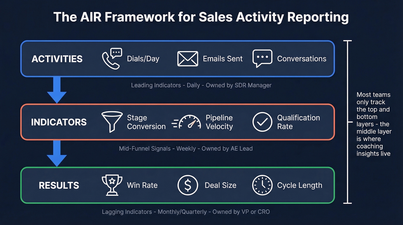
Pipeliner distinguishes leading indicators (inputs you can change now) from lagging indicators (outcomes you can only explain after the fact). That distinction is the backbone of AIR: Activities are pure leading indicators, Results are pure lagging indicators, and Indicators sit in between - the early-warning system most teams skip entirely.
| Layer | What It Tracks | Example Metrics | Cadence | Owner |
|---|---|---|---|---|
| Activities | Daily rep actions | Dials, emails, meetings | Daily | SDR Manager |
| Indicators | Mid-funnel signals | Stage conversion, pipeline velocity, qualification rate, qualification rate | Weekly | AE Lead |
| Results | Closed outcomes | Win rate, deal size, cycle length | Monthly/Qtr | VP/CRO |
Activities are leading indicators - the inputs reps control directly. Dials per day, emails sent, conversations held. These are the levers. If you need a clean taxonomy for what counts as an activity, start with these sales activities examples.
Indicators sit in the middle. They tell you whether activities are translating into pipeline momentum. Stage conversion rates, qualification rates, and proposal engagement all live here. DocBeacon's data makes the case vividly:
| Proposal Behavior | Win Rate |
|---|---|
| Opened within 24 hours, 8+ min read time | 67% |
| Opened in 2-4 days, 3-7 min read time | 38% |
| Opened after 5+ days, under 2 min read time | 9% |
| Never opened | 2% |
That's an Indicator metric that predicts Results far better than raw call volume ever could.
Results are lagging indicators - revenue, win rate, average deal size, sales cycle length. By the time these move, it's too late to change them for the current quarter. Remember the 50-day cliff from Outreach's data: deals that cross 50 days see win rates plummet from 47% to 20% or lower. If your Results reporting only surfaces this at quarter-end, you've already lost those deals. The whole point of tracking Activities and Indicators is to steer Results before they're locked in.
If you don't track Indicators, your activity reporting is broken. Most teams only report on Activities and Results, skipping the Indicator layer entirely. That's like checking your speedometer and your destination arrival time but never looking at the fuel gauge.
Rep A vs. Rep B: Why Indicators Matter
Consider two SDRs on the same team. Rep A logs 60 dials and 40 emails per day - above quota. Rep B logs 35 dials and 25 emails - below quota. At the end of the month, Rep B has generated 40% more qualified pipeline.
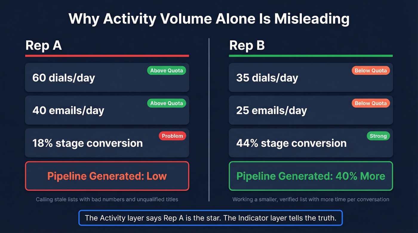
How? Rep B's stage conversion rate is 44% from first meeting to qualified opportunity. Rep A's is 18%. Rep A is calling into a stale list with bad numbers and unqualified titles. Rep B is working a smaller, verified list and spending more time per conversation.
The Activity layer says Rep A is the star. The Indicator layer tells the truth.
Without Indicators, your coaching conversation with Rep B is "make more calls." With Indicators, your coaching conversation with Rep A is "let's fix your targeting." We've seen this exact pattern play out across dozens of teams, and the fix is almost always upstream data quality, not downstream effort.
Rep A's problem isn't effort - it's stale data. If 15%+ of your phone numbers are disconnected, every activity metric downstream is fiction. Prospeo refreshes all 300M+ profiles every 7 days and delivers 98% email accuracy with a 30% mobile pickup rate. Your Indicator layer finally tells the truth.
Stop coaching reps on activity volume built on bad numbers.
Key Metrics With Benchmarks
Treat these as directional benchmarks - your own baseline matters more than internet averages.
| Metric | What It Measures | SMB/SDR Range | Enterprise/AE Range |
|---|---|---|---|
| Dials/day | Outbound call volume | 50-80 | 20-40 |
| Emails/day | Outbound email volume | 40-75 | 15-30 |
| Conversations/day | Live connects | 8-15 | 3-8 |
| Call duration flag | Engagement quality | <2 min = coaching needed | Same |
| Contact attempts/lead | Persistence | 6+ needed; avg rep does 1.7-2.1 | Same |
| Connect rate | Dials to conversations | 5-12% | 8-15% |
| Reply rate | Emails to responses | 2-5% | 4-8% |
| Meetings set/week | Booked discovery calls | 4-8 | 2-4 |
| Qualification rate | Meetings to qualified opps | Team baseline first | Team baseline first |
| Stage conversion | Opps advancing per stage | 30-50% per stage | 25-40% per stage |
| Pipeline velocity | $ moving through pipeline/week | Team baseline first | Team baseline first |
| Win rate | Opps to closed-won | 20-30% | 15-25% |
| Sales cycle length | Time to close | 30-60 days | 34% of teams run 1-2 full quarters |
The call duration flag comes from Revenue.io benchmarks: reps who can't keep prospects past two minutes need coaching on conversation skills, not more dials. And XANT research shows at least six attempts are needed to contact 50% of leads.
The persistence gap is the most underappreciated number on this list. If your activity report tracks dials but doesn't track attempts-per-lead, you're missing the metric that actually predicts contact rates. A rep making 60 dials spread across 60 leads (one attempt each) will underperform a rep making 40 dials across 7 leads (six attempts each). Your report should make this visible.
Optional metrics worth adding when you have clean CRM data: voicemail return rate, calls by time of day, and email open-to-reply ratio. If you're tightening email performance, it also helps to standardize email subject lines so reply-rate changes are attributable to targeting, not randomness.
How to Build Your First Report
Start with three metrics, not fifteen. Pick one from each AIR layer - say, dials per day, stage conversion rate, and win rate. You can always add more when one of those three reveals a problem you can't diagnose.
A solid weekly activity report template - adapted from the Smartsheet sales report templates - includes these fields for each rep, each day:
- Calls made
- Visits completed
- Leads generated
- Deals closed
- Daily revenue goal
- Actual revenue collected
- Variance (goal minus actual)
If you have clean CRM logging, add meetings booked, deals advanced (stage changes), and proposals sent.
Roll daily numbers into weekly totals, then weekly into monthly. The Smartsheet templates calculate variance automatically and include charts for lead-to-opportunity and opportunity-to-win ratios. Reviewing month-to-date activities in these rollups helps managers spot trends before they become quarter-end surprises.
The key design principle: every number on the report should connect to a decision someone can make. If a metric doesn't trigger a coaching conversation or a process change, it doesn't belong on the report.
Implementation in 30 Minutes
If your CRM logging is inconsistent, build the report in a spreadsheet first - then automate. Trying to build automated reports on top of messy CRM data just produces automated garbage faster.
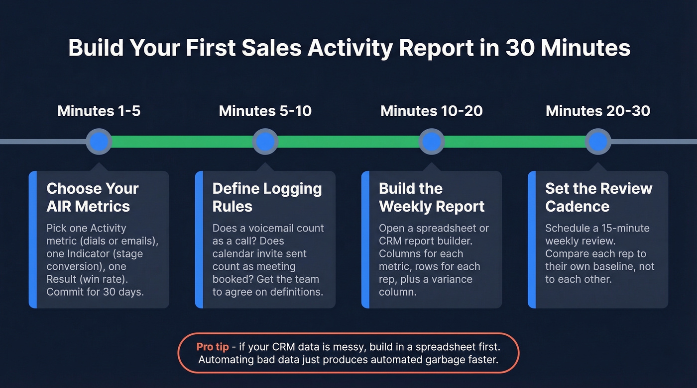
Minutes 1-5: Choose your AIR metrics. Pick one Activity metric (dials/day or emails/day), one Indicator (stage conversion or qualification rate), and one Result (win rate or revenue). Write them down. You're done choosing for the next 30 days.
Minutes 5-10: Define logging rules. What counts as a "call"? Does a voicemail count? Does an auto-dialer attempt count? What counts as a "meeting booked" - calendar invite sent, or calendar invite accepted? Get your team to agree on definitions before you track anything. Write these in a shared doc.
Minutes 10-20: Build the weekly report. Open a Smartsheet template, a Google Sheet, or your CRM's native report builder. Create columns for each metric, rows for each rep, and a variance column. For teams in HubSpot (Sales Hub Professional/Enterprise) or Salesforce, use the built-in activity report and add your three metrics as columns. If CRM reporting feels unreliable - and Reddit threads confirm it often is - start in a spreadsheet.
Minutes 20-25: Schedule the send and coaching ritual. Set the report to auto-send every Monday morning. Block 30 minutes on Tuesday for a team review where you walk through one Indicator metric and one coaching decision it enables. No report survives without a recurring meeting attached to it.
Minutes 25-30: Audit your data quality. Pull a random sample of 50 contacts your reps called last week. How many numbers are disconnected? How many emails bounced? If more than 15% are bad, your activity metrics are measuring data rot, not rep performance. Fix the upstream data before trusting the downstream numbers. If you need a repeatable process, use a dedicated data enrichment service to keep records current.
Five Mistakes That Ruin Reports
1. Tracking Volume Instead of Effectiveness
The #1 complaint on r/sales about activity metrics: managers obsessing over volume quotas like "50 calls/day" when what actually matters is reply rates, connect rates, and meetings set per 100 touches. A rep making 30 highly targeted calls who books four meetings is outperforming the rep making 80 spray-and-pray dials who books two. Shift your reports from "did they hit the number?" to "did the activity produce the outcome?" This is also where better sales prospecting techniques show up clearly in the Indicator layer.
2. Measuring Too Many KPIs
InsightSquared's recommendation for closers is blunt: track five KPIs. Open opportunities, closed opportunities, deal size, win rate, and sales cycle. That's it. Every time a new problem surfaces, the instinct is to create a new KPI. Resist it. "Flavor of the week" metrics destroy focus and make reports unreadable. Add a metric only when your existing five can't diagnose a specific problem.
3. Comparing Unlike Reps
A rep selling a $200K enterprise product into financial services and a rep selling a $15K mid-market product into tech aren't comparable on the same activity report. Different products, segments, and experience levels produce different activity profiles. Teams routinely demoralize strong performers by benchmarking them against reps in completely different selling motions. Segment your reports by role and ACV band.
4. Using Reports as Punishment
When reps see activity reports as surveillance tools, they game the numbers. They log phantom calls, send low-effort emails to hit quotas, and mark tasks complete without doing the work. The goal is to match a rep's activity level to their final outcome, then diagnose the gap. If activity is high but results are low, that's a coaching conversation about quality. If both are low, that's a different conversation about effort. Reports should enable diagnosis, not punishment.
5. Ignoring Upstream Data Quality
This is the mistake that makes every other metric unreliable.
Picture a rep who makes 200 dials in a day, but 60 of those numbers are disconnected. Your report says they hit quota. Reality says they wasted a third of their time. Salesforce activity counting is already painful enough - Reddit threads are full of teams struggling with EAC vs. non-EAC email counting and activity rollups that require specialized configuration. Layering bad contact data on top of messy CRM logging creates reports nobody should trust. If you're seeing systemic issues, it's usually a sign your contact management software and enrichment workflow aren't aligned.
Getting Your Team to Actually Use Reports
The HubSpot subreddit captures a universal problem: teams that have never used reports "don't see the need or value." Prettier dashboards won't fix this.
Start by showing decisions, not data. In your next team meeting, pull up one report and walk through one decision it enables: "This stage conversion chart shows deals stalling at proposal. Let's look at the three deals stuck there and figure out why." That single moment is more powerful than any dashboard tour.
Tie reports to weekly coaching conversations, not quarterly reviews. When reps see their manager use the data to help them close a specific deal, the reporting habit stops feeling like oversight and starts feeling like support. Adoption follows naturally. In our experience, most reporting rollouts fail because they launch with 20 widgets and zero context for why any of them matter. Start with three metrics. Add only when one reveals a problem you can't diagnose.
Tools for Activity Reporting
You don't need a dedicated reporting platform. Most teams already have the pieces - the trick is stacking them correctly.
Start with your CRM's native reporting. HubSpot Sales Hub (entry tiers typically start around $20/user/month) and Salesforce (Starter Suite typically starts around $25/user/month) both include activity dashboards, pipeline reports, and rep scorecards out of the box. If you're already paying for a CRM, build your first report there before buying anything else. If you're still evaluating options, it helps to review a few examples of a CRM to see what “native reporting” really includes.
When your activity data lives across CRM, email, and calling tools, a BI aggregation layer like Databox (14-day trial available, paid plans from around ~$47/month) pulls everything into unified dashboards. Databox is particularly useful because it refreshes data automatically rather than waiting for manual exports. For teams under 10 reps, skip the BI tool entirely - Google Sheets or Excel give you full control over layout and calculations, and the Smartsheet templates mentioned earlier are solid starting points.
The layer most teams skip is upstream data verification. If your reps are working bad numbers, no reporting tool will save you. Run a weekly audit: pull 50 random contacts, check how many are reachable, and track that percentage over time. Prospeo's enrichment API can automate this, feeding verified contact data directly into your CRM so the activity numbers your reports display reflect reality.
A practical stack: CRM (logging + basic reports) -> BI dashboard (cross-tool visibility) -> spreadsheet export (custom analysis) -> data verification (trust layer). Most teams can get this running in a day.
Connect rate is the metric that separates real pipeline from busywork. Teams using Prospeo's verified mobiles see a 30% pickup rate - nearly 3x the industry average. When your dials actually reach decision-makers, you need fewer of them to hit quota. That's a reporting story your VP will love.
Book 26% more meetings with data that actually connects.
FAQ
What's the difference between a sales activity report and a dashboard?
A report is a structured document analyzing activity data over a specific period - weekly, monthly, quarterly. A dashboard is a real-time visual display of current metrics. Reports drive periodic coaching conversations and behavioral change; dashboards enable in-the-moment monitoring. Most teams need both, but reports are where decisions actually get made.
How many metrics should I track?
Start with 3-5 using the AIR framework: one Activity metric, one Indicator, and one Result. For closers specifically, InsightSquared recommends five: open opportunities, closed opportunities, deal size, win rate, and sales cycle length. Add metrics only when existing ones can't diagnose a specific problem.
How do individual and team-level reports differ?
Individual seller reports focus on personal dials, connect rates, and stage conversions - they fuel 1:1 coaching. Team-level reports aggregate those numbers to reveal systemic patterns, like an entire pod struggling at a specific pipeline stage. Use individual views for coaching and team views for process decisions.
How do I make sure my activity data is accurate?
Standardize CRM logging definitions (what counts as a call, email, or meeting) and audit weekly. Then verify upstream contact data - a weekly sample of 50 contacts will reveal whether quality is trending up or down. If bounce rates or disconnected numbers are above 15%, fix the data before trusting the reports built on top of it.
What's the best review cadence?
Daily for reps self-monitoring. Weekly for manager-led coaching - this is the cadence where behavior actually changes. Monthly for leadership reviewing Indicator and Result trends. Quarterly for strategic adjustments to targets and territory assignments.