How to Build a Sales Pipeline Dashboard That Doesn't Collect Dust
It's Thursday at 3pm. The VP of Sales pings the team Slack: "Need pipeline numbers for the board deck by EOD." Three reps scramble to update stages. RevOps exports a CSV that doesn't match the CRM. The sales pipeline dashboard everyone built last quarter? Nobody's opened it since week two. 84% of reps missed quota last year, and the tools meant to fix that are gathering dust.
The problem isn't the dashboard. It's how it was built, what it tracks, and whether anyone owns it after launch.
The Short Version
- Track 5-7 metrics max. More than that and reps stop looking. Fewer and leadership can't make decisions.
- Pipeline coverage is your alarm bell. Below 3x? Five-alarm fire. Everything else is secondary until coverage is healthy.
- Pick a tool that matches your team size. Google Sheets for under 10 reps. Native CRM dashboards for mid-market. BI tools when you've outgrown both.
- Automate the data feed. Manual updates kill dashboards faster than bad design.
- Assign an owner or it dies. One person - usually RevOps - needs to be accountable.
What Is a Sales Pipeline Dashboard?
A sales pipeline dashboard is a real-time view of every deal your team is working, organized by stage, value, and velocity. It answers three questions: how much pipeline do we have, how fast is it moving, and where are deals getting stuck.
Don't confuse it with a sales funnel dashboard. The pipeline tracks sales actions and stages from the rep's perspective - discovery calls, proposals sent, negotiations in progress. The funnel tracks the buyer's journey with volume attrition at each step. Most teams need both views, but they serve different audiences.
Reps check their pipeline view daily to prioritize their day. Managers use it weekly for coaching and forecasting. RevOps owns the data model behind it. Leadership glances at it monthly for board-level numbers. The cadence matters - if it's only useful once a quarter, it's a report, not a dashboard.
Four Reports Every Dashboard Needs
Not every dashboard needs twenty charts. But it does need four core report types, each driving a specific decision.
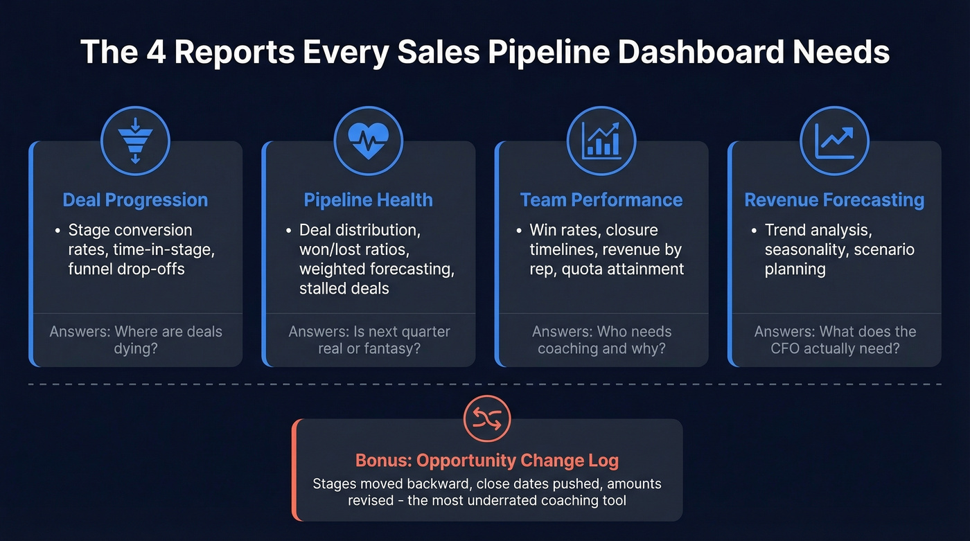
Deal Progression shows stage conversion rates, time-in-stage, and funnel drop-offs. Use this when you need to answer "where are deals dying?" If your MQL-to-SQL conversion is below the 15-21% benchmark range, this report makes it impossible to ignore. A well-built deal performance dashboard turns vague hunches about stuck deals into specific, coachable moments - the kind of granularity that separates pipeline reviews from pipeline theater.
Pipeline Health surfaces deal distribution, won/lost ratios, probability-weighted forecasting, and stalled deals. This is the report that tells you whether next quarter's number is real or fantasy. It's the single view that separates confident forecasts from wishful thinking. Skip this if you enjoy explaining forecast misses to your VP. (If you want a deeper KPI list, start with pipeline health.)
Team Performance breaks down win rates, closure timelines, revenue by rep, and quota attainment. It's the coaching report. Use it when you need to figure out why one rep closes in 30 days and another takes 90.
Revenue Forecasting layers trend analysis, seasonality, and scenario planning on top of your pipeline data. This is what the CFO actually wants. It turns "we feel good about Q3" into "here's the weighted probability by segment." (If you're evaluating tooling, compare sales forecasting solutions.)
The most underrated report type? The opportunity change log - a running record of what changed on deals this week. Stages moved backward, close dates pushed, amounts revised. We've seen this single view surface more coaching moments than any other dashboard component.
Pipeline KPIs - Formulas and Benchmarks
Most dashboard guides list 20+ KPIs and leave you to figure out which ones matter. You need seven.
| KPI | Formula | 2026 Benchmark | What It Tells You |
|---|---|---|---|
| Pipeline Coverage | Pipeline Value / Quota | 3-4x typical; 3-5x "safe" | Can you hit your number? |
| Pipeline Velocity | (Opps x Deal Size x Win Rate) / Cycle Length | Varies | Revenue per day |
| Win Rate | Deals Won / Total Deals | 20-30% | Qualification quality |
| Stage Conversion | Deals Exiting Stage / Entering | See benchmarks below | Where deals stall |
| Avg Sales Cycle | Sum Days to Close / Deals Closed | Median 84 days; optimal 46-75 | Forecasting accuracy |
| Avg Deal Size | Total Revenue / Deals Closed | Industry-specific | Revenue mix health |
| Stalled Deal % | No activity >14 days / Active Deals | Target <15% | Pipeline rot |
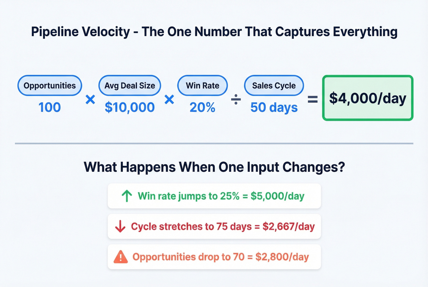
Let's walk through pipeline velocity with real numbers. Say you've got 100 opportunities, $10K average deal size, 20% win rate, and a 50-day average cycle. That's (100 x $10,000 x 0.20) / 50 = $4,000/day in pipeline velocity. Now you've got a single number that captures the health of your entire engine. If it drops, you know something broke - you just need to figure out which input changed.
Pipeline coverage deserves its own callout. If your quarterly quota is $500K, you want $1.5M-$2M in pipeline at 3-4x coverage. Run a 5x safety rule and that's $2.5M. Below 3x and you're relying on heroics. Above 5x and you're stuffing the pipe with unqualified deals that distort every other metric on the board.
For activity metrics feeding the top of your dashboard: cold email open rates run 20-30%, B2B email response rates sit at 8-10%, and calls-to-meeting ratios land between 1:8 and 1:15. If your numbers are below these ranges, the problem isn't your dashboard - it's your outbound motion (see sales activities).
Your dashboard says cold email response rates should hit 8-10%. But if 20% of your emails bounce, those pipeline metrics are fiction. Prospeo delivers 98% email accuracy with a 7-day refresh cycle - so every contact in your pipeline is real, reachable, and current.
Stop feeding your pipeline dashboard dead data. Start with verified contacts.
2026 Pipeline Benchmarks by Segment
Benchmarks are useless without context. A 39% opportunity-to-close rate is excellent for SMB and mediocre for a transactional SaaS product.
Stage-by-Stage Conversion: SMB vs. Enterprise
| Stage | SMB / Mid-Market | Enterprise |
|---|---|---|
| Visitor to Lead | 1.4% | 0.7% |
| MQL to SQL | 15-21% | 15-21% |
| Opp to Close | 39% | 31% |
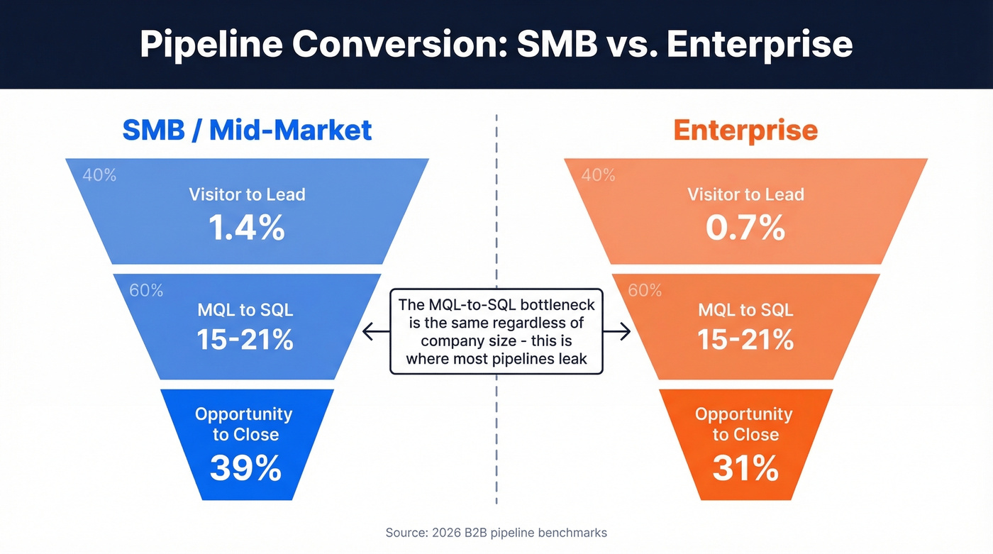
The MQL-to-SQL bottleneck is consistent across segments - 15-21% regardless of company size. That's where most pipelines leak.
Industry Win Rates
| Industry | Opp to Won Range |
|---|---|
| B2B SaaS | 20-35% |
| Professional Services | 25-40% |
| Manufacturing | 25-45% |
| Financial / Insurance | 20-30% |
Channel matters too. SEO-sourced leads convert at roughly 2.1% visitor-to-lead with a 51% MQL-to-SQL rate. PPC leads? 0.7% visitor-to-lead and 26% MQL-to-SQL. If your dashboard doesn't segment by source, you're averaging away the signal. (For more context, see average B2B lead conversion rate.)
How to Build Your Dashboard
Every BI vendor shows you a beautiful demo. None of them mention you'll spend 80% of the project arguing about what "Stage 3" means.
Step 1: Pick Your Tool
The decision framework is simpler than vendors want you to believe.
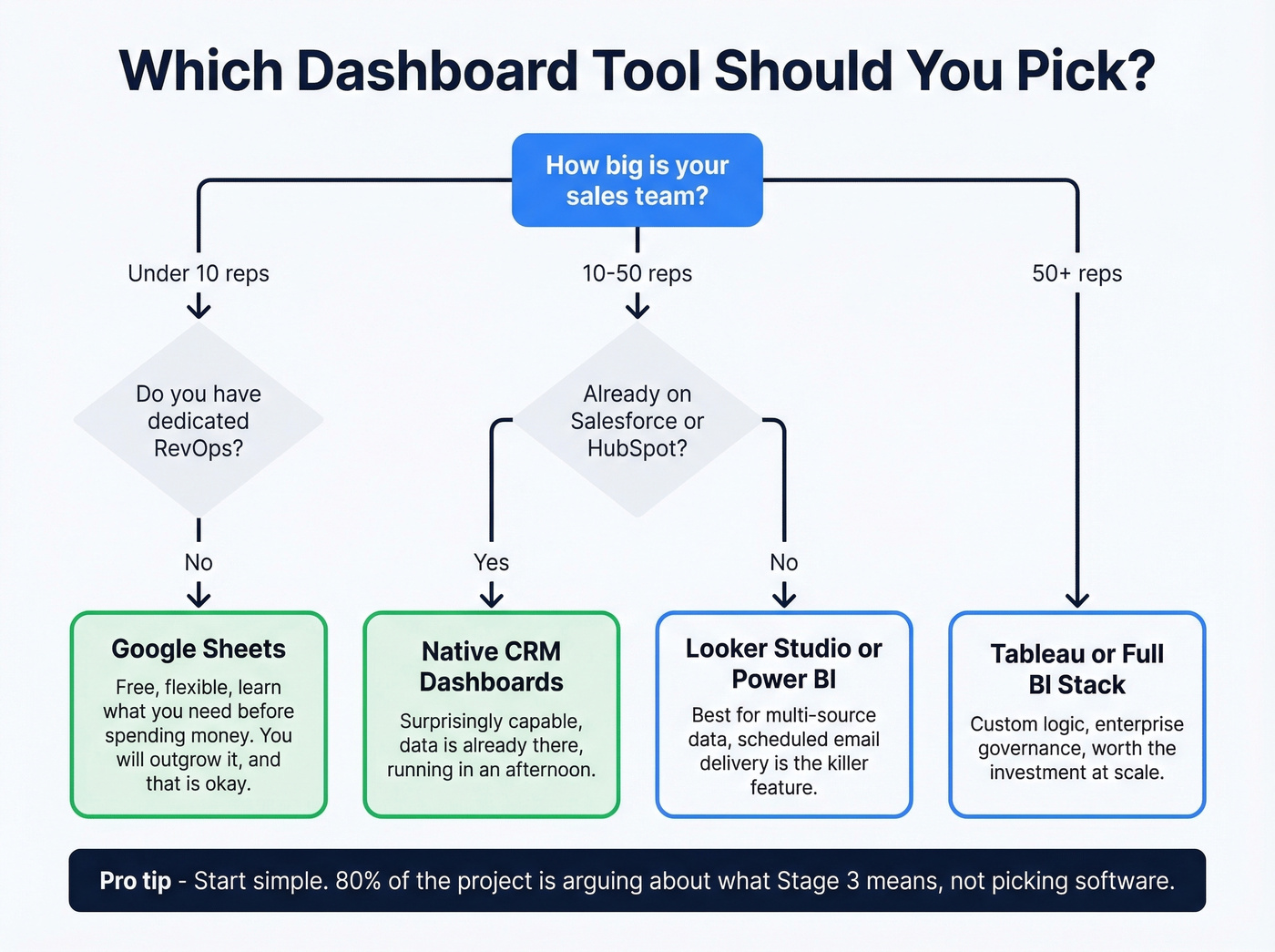
Under 10 reps with no dedicated RevOps? Start with Google Sheets. You'll outgrow it, but you'll learn what you actually need before spending money. Already on Salesforce or HubSpot? Use the native dashboards first - they're surprisingly capable and the data's already there. Multi-source data, 20+ reps, or a RevOps team that wants custom logic? That's when Looker Studio, Power BI, or Tableau earn their keep.
Step 2: Connect Your Data
Google Sheets path: Connect Salesforce via a sync tool like Coefficient or Supermetrics. Import Opportunity fields - deal stage, expected close date, deal size, owner, win probability, and weighted forecast value. Pivot by Forecast Category in rows and Close Date grouped by month in columns. Build a combo chart with area for pipeline categories and a line for target.
Looker Studio path: Create a new report, add your CRM as a data source, set up date range controls and stage filters, then style it. The killer feature is scheduled email delivery - PDFs land in inboxes every Monday morning without anyone logging in.
Native CRM path: Both Salesforce and HubSpot ship pipeline dashboards out of the box. Customize the default views to match your stage definitions, add the seven KPIs from the table above, and you're running in an afternoon. (If you're still evaluating platforms, start with examples of a CRM.)
Step 3: Design for Adoption
Three rules that separate dashboards people use from dashboards that collect dust.
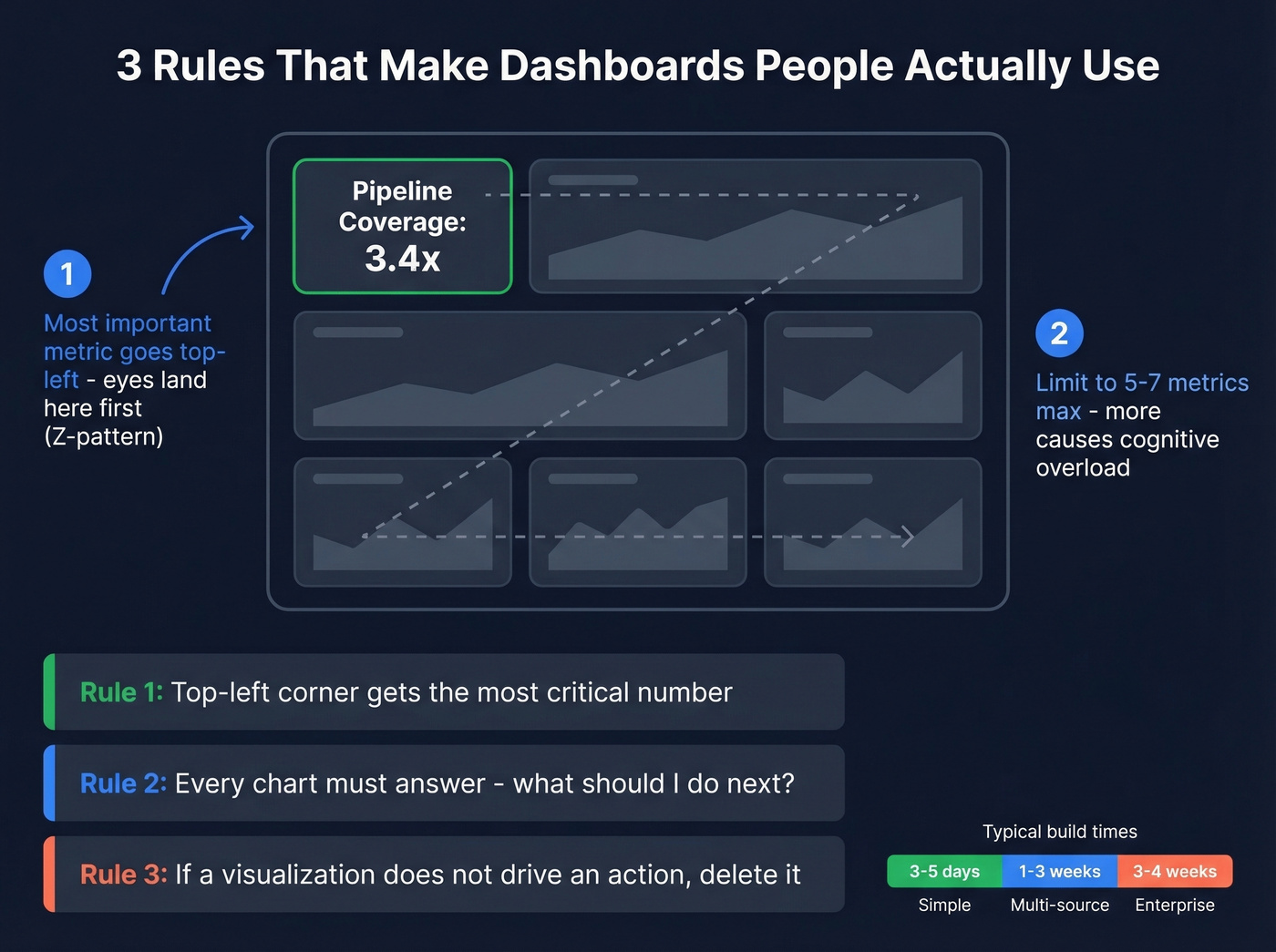
First, put the most important metric in the top-left corner - viewers scan in a Z-pattern, and that's where their eyes land first. Second, limit each view to 5-7 metrics. More than that and cognitive overload kicks in. Third, every chart needs to answer "what should I do next?" If a visualization doesn't drive an action, delete it.
Time estimates: a simple dashboard takes 3-5 business days. A typical multi-source build runs 1-3 weeks. Complex enterprise implementations can stretch to 3-4 weeks.
Getting Your Data Right
Here's where most dashboard projects actually fail - not in the design phase, but in the data modeling decisions nobody talks about.
Salesforce doesn't ship a perfect pipeline view because the "right" logic depends on your process. Should an opportunity exist in all stages it's passed through, or only its current stage? When a rep moves a deal backward from Stage 4 to Stage 2, do you track current stage or furthest stage achieved? What about skipped stages - if a deal jumps from Stage 1 to Stage 3, do you pad the missing data with synthetic timestamps? These aren't academic questions. They break dashboards in production.
79% of marketing leads never convert into sales, and roughly 24% of forecasted deals go dark. If your underlying data is stale or inconsistent, your dashboard is just a prettier way to be wrong. (This is one of the most common sales pipeline challenges.)
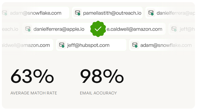
Data quality is step zero. Garbage contacts in your CRM mean garbage metrics on your dashboard - inflated pipeline counts, phantom coverage ratios, forecasts built on contacts who left the company six months ago. Prospeo keeps CRM data trustworthy with 98% email accuracy and a 7-day refresh cycle, compared to the roughly 6-week industry average. It integrates natively with Salesforce and HubSpot, so enrichment runs automatically rather than as a quarterly cleanup project. When your contact data is verified and current, your pipeline numbers actually mean something. (If you're comparing vendors, see data enrichment services.)
Pipeline velocity drops when reps waste hours hunting for contact data instead of selling. Prospeo's 300M+ verified profiles with 30+ filters - including buyer intent, job changes, and headcount growth - fill your pipeline with qualified leads automatically. At $0.01 per email, scaling coverage from 3x to 5x doesn't break the budget.
Build pipeline coverage that hits 5x without burning your outbound budget.
Why Dashboards Fail (and How to Fix It)
68% of companies don't even attempt to measure their sales funnel. The ones that do often build dashboards nobody opens after the first month. Here's our hot take: most dashboards fail not because they're poorly designed, but because they track outcomes nobody can act on.
No owner. The dashboard launches to applause, then nobody maintains it. Stages change, reps get added, data sources drift. Within 60 days it's showing stale numbers and trust evaporates. Assign one person who reviews the dashboard weekly and owns data quality.
No actionable next steps. 80% of sales require five follow-up calls, but 44% of reps give up after one. A chart showing pipeline by stage is informative. A chart showing pipeline by stage with stalled deals highlighted in red and a "days since last activity" column is actionable. If your dashboard doesn't tell a rep what to do next, it's a screensaver. (If follow-up is the issue, use these sales follow-up templates.)
Invisible "no decision" losses. 40-60% of deals are lost to no decision at all - the prospect simply goes dark. Your dashboard should flag these before they become invisible losses. Add a filter for deals with no stage change in 14+ days and no scheduled next step. That single view will surface more revenue risk than your entire forecast model.
Wrong audience, wrong metrics. Reps need deal-level detail. Managers need team rollups. The CEO needs a single coverage number and a forecast. Building one dashboard for all three audiences guarantees none of them use it. Build role-specific views instead.
Let's be honest: stop adding metrics to your dashboard. Remove them. The best dashboards we've seen track five things well, not fifteen things poorly.
Best Tools for Pipeline Dashboards
| Tool | Best For | Starting Price |
|---|---|---|
| Prospeo | CRM data enrichment + verification | Free tier; ~$0.01/email |
| Google Sheets | Teams <10 reps, zero budget | Free |
| Looker Studio | Mid-market, multi-source | Free |
| Power BI | Microsoft-stack orgs | ~$10/user/mo |
| Tableau | Enterprise custom viz | From ~$15/user/mo |
| Salesforce (native) | Teams already on SFDC | From ~$25/user/mo |
| HubSpot (native) | SMB/mid-market, easy setup | Free CRM; Starter $9/seat/mo |
| Databox | Template-first, low-code | Free tier; paid ~$47/mo |
| Geckoboard | TV dashboards, real-time | From ~$44/mo |
Most teams don't need a dedicated BI tool to start. Native CRM dashboards handle most use cases. Add a BI layer when you're pulling from multiple data sources or need custom calculations your CRM can't handle. For teams running shorter deal cycles with lower contract values, a native CRM dashboard plus clean data will outperform an expensive Tableau deployment built on garbage contacts every single time.
FAQ
What's the difference between a pipeline dashboard and a funnel dashboard?
A pipeline dashboard tracks rep-side sales stages - deals in discovery, proposal sent, negotiation, closed-won. A funnel dashboard tracks buyer-side volume attrition - visitors, leads, MQLs, SQLs, customers. Most mature revenue teams run both views because they answer fundamentally different questions for different stakeholders.
How often should I update my pipeline dashboard?
Daily auto-refresh is the minimum viable cadence. Connect your CRM directly via native integration or a sync tool like Coefficient so the dashboard stays current without manual intervention. If reps have to update a spreadsheet to make it work, adoption drops to near zero within 30 days.
What's the most important KPI on a pipeline dashboard?
Pipeline coverage ratio - pipeline value divided by quota target. Below 3x coverage, you're relying on heroics to hit your number. Above 5x, you're likely padding with unqualified deals. Aim for 3-4x as a healthy baseline and treat everything below 3x as a fire drill.
How do I fix bad data on my dashboard?
Start with contact-level accuracy. Stale emails, departed contacts, and duplicate records inflate pipeline counts and distort forecasts. A 7-day data refresh cycle and verified emails keep CRM records current automatically - compared to the 6-week industry average - so your dashboard reflects reality rather than six-month-old snapshots.