Email Call to Action Best Practices That Actually Move Click Rates
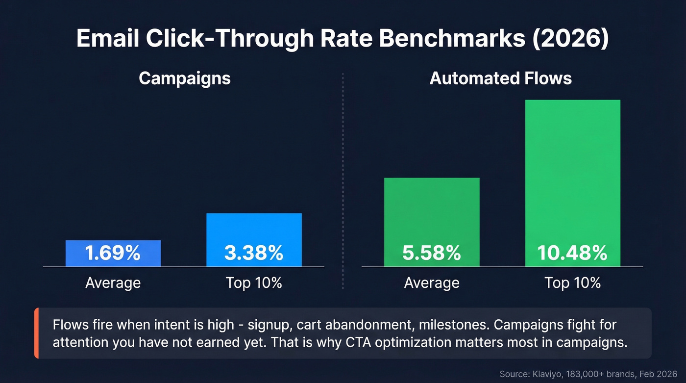
You redesigned the template. You A/B tested the subject line. You swapped the button from blue to orange. Click-through rate moved 0.1%. Meanwhile, your welcome flow - same brand, same audience - is pulling a 5.58% click rate against your campaign's 1.69%. The button wasn't the problem. What you're asking people to do is.
Most email call to action best practices guides obsess over color and copy. They miss the three variables that actually move the needle: ask size, dark mode rendering, and list quality. Let's break those down.
What "Good" Actually Looks Like
Before optimizing, know what you're optimizing against.
| Email Type | Average CTR | Top 10% CTR |
|---|---|---|
| Campaigns | 1.69% | 3.38% |
| Automated Flows | 5.58% | 10.48% |
Klaviyo, 183,000+ brands, Feb 2026
Industry context from Mailchimp benchmarks tells a different story by vertical:
| Industry | Average CTR |
|---|---|
| Nonprofits | 3.27% |
| Education | 3.02% |
| Business & Finance | 2.78% |
| All Users | 2.62% |
| Ecommerce | 1.74% |
The takeaway isn't that flows are "better." Flows work because they fire when intent is high - the subscriber just signed up, just abandoned a cart, just hit a milestone. Campaigns hit inboxes on your schedule, not the reader's. That's why CTA optimization matters most in campaigns: you're fighting for attention you haven't earned yet.
CTA Copy That Drives Action
Stop obsessing over the verb. Start obsessing over what you're asking people to do.
Across 500K+ cold emails analyzed on r/coldemail, soft-ask CTAs - offering a resource, case study, or value asset - drove roughly 3x the positive reply rate compared to meeting requests. The biggest variable isn't "Download" vs. "Get" vs. "Claim." It's the size of the commitment you're requesting.
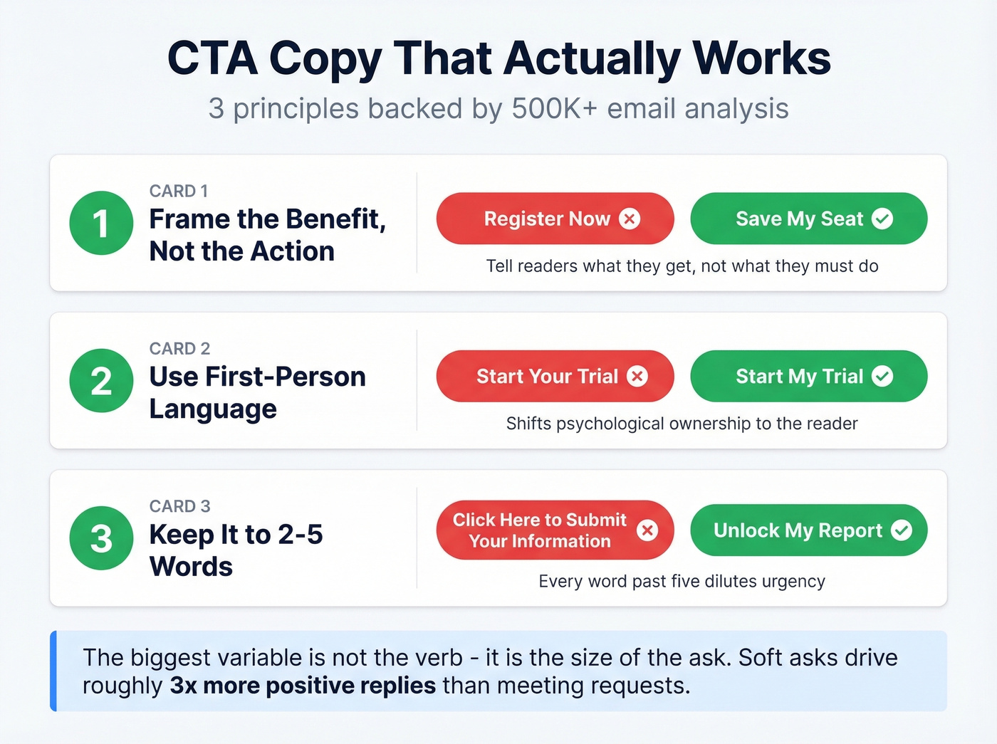
Three copy principles hold up once you've right-sized the ask:
Frame the benefit, not the action. "Save My Seat" beats "Register Now" because it tells the reader what they get. This call-to-benefit approach reframes the CTA around value instead of obligation.
Use first-person language. "Start My Trial" outperforms "Start Your Trial" because it shifts psychological ownership to the reader. Small change, measurable lift.
Keep it to 2-5 words. Every word past five dilutes urgency. Choose verbs that imply immediate value - "Unlock," "Reserve," "Claim" - rather than passive labels like "Submit" or "Continue." (If you want more frameworks, see email copywriting and email copywriting best practices.)
Here's the thing: if you're agonizing over "Get" vs. "Grab" vs. "Claim," you're optimizing the wrong variable. Match the ask to the reader's stage first. Then wordsmith.
CTA Design and Placement
Campaign Monitor testing found a button-based CTA increased click-through rate by 28% compared to a link-based CTA. Visual weight creates a clear focal point that a plain text link can't match.
Place your primary CTA above the fold. Most readers won't scroll past the first screen on mobile, and if your CTA lives below three paragraphs of preamble, it's invisible. One primary CTA per campaign email. A secondary CTA is fine in newsletters, but it should be visually subordinate - smaller, lighter, text-link style. The moment you give readers two equal choices, you've given them a reason to choose neither.
Use contrasting color with whitespace. The specific color doesn't matter nearly as much as whether the button pops against the background. Surround it with breathing room. A cramped CTA looks like an afterthought. (For deeper button patterns, see email CTA buttons.)
Skip this section entirely if you're designing a transactional flow email with a single obvious action like "Track My Order." Those need clarity, not design optimization.
Personalized CTAs convert 202% better - but only if they reach the inbox. Prospeo's 98% email accuracy and under-4% bounce rates mean your carefully optimized CTAs land in front of real buyers, not spam folders.
Stop perfecting buttons nobody sees. Fix the data first.
Dark Mode: The CTA Killer Nobody Talks About
Look - not a single top-ranking guide for email CTA design mentions dark mode. It's 2026. Around 40% of your audience is reading in dark mode, and most marketers are designing like it doesn't exist.
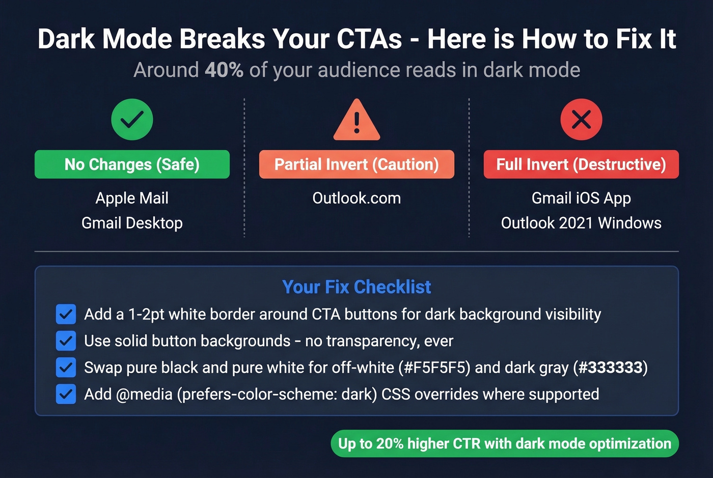
Your designer sends you a screenshot. The CTA looks perfect - bold red on white. Then you open it in dark mode. The button is gone.
Litmus tracked ~35% of opens in dark mode back in 2022. With continued adoption across iOS, Android, and desktop clients, that number sits comfortably around 40% now. Over 80% of users enable dark mode on at least one app or device.
Not all email clients handle dark mode the same way. Litmus breaks them into three tiers: clients that don't change your email at all (Apple Mail, Gmail desktop), clients that partially invert light areas (Outlook.com), and clients that fully invert everything - including your carefully designed buttons. Gmail's iOS app and Outlook 2021 on Windows fall into that last, most destructive category.
Your fix checklist:
- Add a 1-2pt white border around CTA buttons so they stay visible on dark backgrounds
- Use solid button backgrounds - no transparency, ever
- Swap pure black (#000000) and pure white (#FFFFFF) for off-white (#F5F5F5) and dark gray (#333333) to reduce harsh inversions
- Add
@media (prefers-color-scheme: dark)CSS overrides where supported
We've seen dark-mode-optimized emails produce up to 20% higher CTR in our own sends. That's a bigger gain than most copy tests will ever produce.
Accessible CTAs
Accessibility directly affects deliverability and conversions. WCAG 2.2 AA, which aligns with the EU's EN 301 549 standard, is the baseline most teams target.
Contrast ratios need to hit 4.5:1 for normal text and 3:1 for large text. Tap targets should be at minimum 44x44px per Apple HIG or 48x48px per Google Material Design - anything smaller and mobile users will miss the button entirely. Use descriptive copy: "Get the Report" tells a screen reader what happens, while "Click Here" tells it nothing. And always use real <a> tags with styled backgrounds. Image-only CTAs break for screen readers and when images are blocked, which is more common than you'd think.
Testing and Personalized CTAs
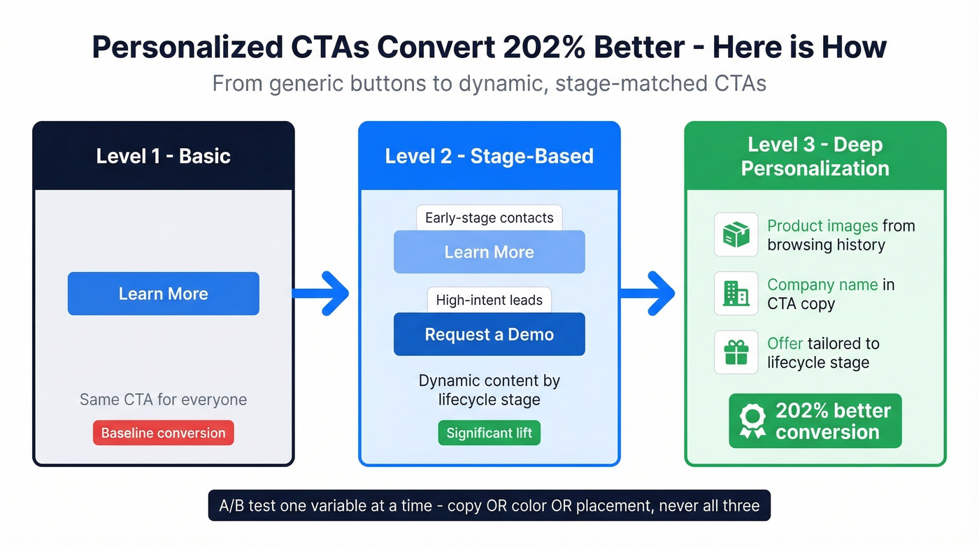
A/B test one variable at a time. Copy OR color OR placement - not all three. Otherwise you'll get a result you can't explain or replicate. (If you need a system for measurement, use email marketing measurement.)
If you're on HubSpot, heads up: you can't A/B test CTAs inside marketing emails. You have to test the full email variant. Plan around it.
Personalized CTAs convert 202% better than generic ones. The simplest version: use dynamic content to serve "Learn More" to early-stage contacts and "Request a Demo" to high-intent leads from the same template. Most modern ESPs support basic conditional content blocks - you don't need a Pardot certification to pull this off. For teams that want to go deeper, swap product images based on browsing history, reference the recipient's company name in the CTA copy, or tailor the offer itself to their lifecycle stage. Each of these turns a generic button into something that feels relevant rather than templated, and the 202% lift proves readers can tell the difference.
Your CTA Can't Work If Your Email Bounces
None of this matters if your email never arrives.
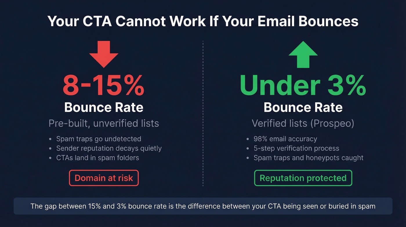
Pre-built lists routinely produce 8-15% bounce rates. Verified lists stay under 3%. That gap is the difference between a healthy sender reputation and one that's quietly decaying - and once your domain reputation tanks, even your best-performing CTA copy won't save you because the email lands in spam before anyone sees it. (If you're buying data, start with a vetted B2B email list provider and understand contact data decay.)
We use Prospeo for list verification - 98% email accuracy with a 5-step process that catches spam traps and honeypots before they torch your domain. Fewer bounces mean better sender reputation, which means your CTA actually gets seen. The free tier covers 75 emails a month, enough to clean a list segment and see the difference in your next send. (More options: bulk email verification service and free email verification tools.)
You just learned that soft-ask CTAs drive 3x more replies. Now imagine pairing that with verified contact data refreshed every 7 days - not the 6-week-old lists that tank your sender reputation and bury your CTAs.
Great CTA copy deserves an audience that actually exists.
FAQ
How many CTAs should an email have?
One primary CTA per campaign email. Adding a second button splits attention and typically lowers overall click-through rate. A secondary link is fine in newsletters, but keep it visually subordinate - text-link style, not a competing button.
What's the best CTA button color?
No universal best color exists. What matters is contrast against your email background - aim for at least a 3:1 WCAG ratio. The 28% CTR lift came from button format, not color. Pick something that pops and move on.
Do first-person CTAs perform better?
Yes. "Start My Free Trial" outperforms "Start Your Free Trial" because it shifts ownership to the reader. But the bigger variable is what you're asking - a soft ask beats a hard ask regardless of pronoun. Fix the ask size first.
How do I make sure my CTA actually reaches the inbox?
Verify every address before sending. Unverified lists produce 8-15% bounce rates, which destroy sender reputation and push future emails to spam. Prospeo's 5-step verification catches spam traps and invalid addresses at 98% accuracy - the free tier at 75 credits per month is enough to test the impact on a single campaign segment.