Email CTA Buttons: The Practitioner's Guide to Design, Code, and Performance
A 500-email A/B test on r/Emailmarketing showed buttons pulling 7.8% CTR versus 3.2% for text links - a 2.4x difference from a single design change. Email CTA buttons are the highest-leverage element in any campaign, and most teams still get the implementation wrong.
The Short Version
Buttons beat text links ~2.4x. Build them in HTML/CSS, never as images. Code for Outlook first using VML. Test in dark mode. Hit 44px+ tap targets on mobile. Stick to one primary CTA per email. If your campaign CTR exceeds 2%, you're above median.
Why Buttons Beat Text Links
Buttons stand out when people scan. Text links vanish into paragraphs. That Reddit test isn't a massive dataset, but the 2.4x multiplier lines up with what we've seen across dozens of campaigns - and increasing button size alone can [lift CTR by roughly 90%](https://marketingexperiments.com/email-marketing/email-optimization-a-single-word-change-results-in-a-90-lift-in-sign-ups).
If you're still relying on hyperlinked text as your primary call-to-action, you're leaving clicks on the table.
CTA Button Design That Clicks
Good button design isn't subjective. There's a checklist that works:
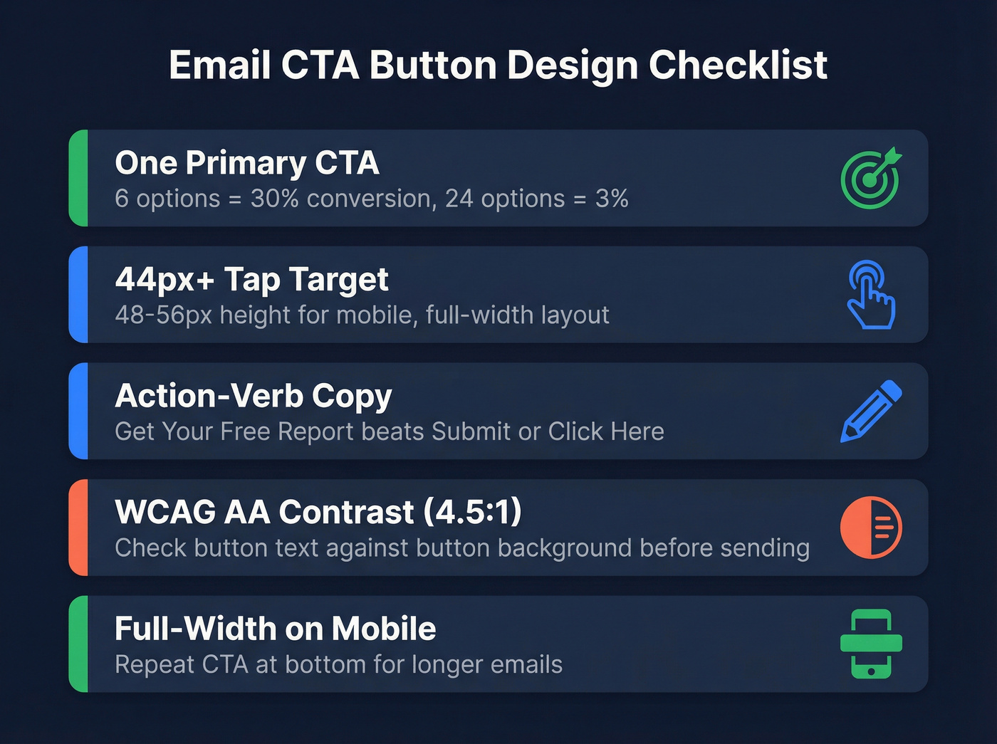
- One primary CTA per email. The classic jam study found 6 options converted at 30% versus 3% for 24 options. Decision fatigue kills clicks. Pick one action and make it unmissable.
- 44x44px minimum tap target. That's Apple's Human Interface Guideline baseline. For mobile-heavy audiences, go 48-56px height with full-width layout. Generous padding around the button matters too - cramped tap targets cause rage taps on phones.
- Action-verb copy. "Get Your Free Report" beats "Submit." "Start My Trial" beats "Click Here." Screen readers often list links out of context, so descriptive text is an accessibility requirement, not a nice-to-have.
- WCAG AA contrast (4.5:1 minimum). If your button text doesn't pass a contrast checker against the button background, fix it before you send.
- Full-width on mobile, above the fold. A 200px button centered on a 375px screen is a small target - let it stretch. For longer emails, repeat the CTA at the bottom.
A/B test one variable at a time: color, copy, or size. Most ESPs support this natively. If you're also testing subject lines, keep the variables separate - use a dedicated A/B testing plan so you can attribute lifts correctly.
You just spent hours perfecting button design, VML code, and dark mode fixes. None of it matters if 12% of your list is bouncing. Prospeo's 5-step verification catches invalid addresses, spam traps, and honeypots - delivering 98% email accuracy so your bulletproof CTA actually reaches an inbox.
Fix your list before you fix your button color.
Bulletproof HTML Buttons for Outlook
Here's the thing about Outlook for Windows: it uses the Word rendering engine. It ignores border-radius, box-shadow, and most modern CSS. You can build a beautiful button that works in Gmail and Apple Mail, and Outlook users see a broken rectangle - or worse, nothing clickable at all.
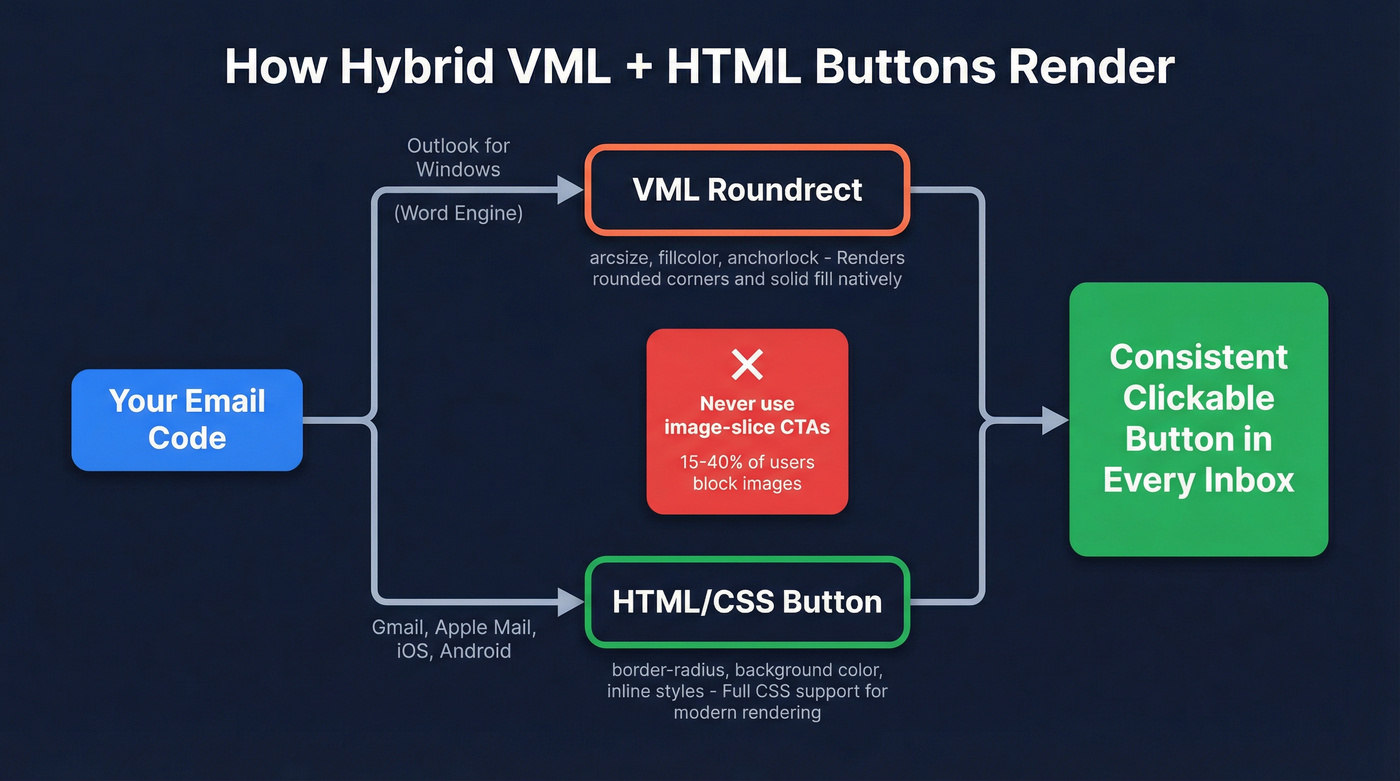
The fix is a hybrid approach: VML for Outlook, HTML/CSS for everything else. Litmus documents five bulletproof coding methods, but the VML hybrid below covers the widest client range:
<!--[if mso]>
<v:roundrect xmlns:v="urn:schemas-microsoft-com:vml"
  href="https://example.com"
  style="height:48px;width:220px;v-text-anchor:middle;"
  arcsize="10%" fillcolor="#1a73e8">
  <w:anchorlock/>
  <!-- unknown MDX component: center -->
</v:roundrect>
<![endif]-->
<!--[if !mso]><!-->
[
  Get Started Free
](https://example.com)
<!--<![endif]-->
The <w:anchorlock/> prevents Outlook from breaking the button on line wrap. The role="button" on the fallback <a> tag helps screen readers. And -webkit-text-size-adjust:none stops mobile WebKit from shrinking your font.
Never use image-slice CTAs. With roughly 15-40% of recipients blocking images depending on client and settings, your button can literally disappear - no accessibility, no fallback. This is a recurring debate on r/Klaviyo: native buttons vs "baked into an image" CTAs. Code-based buttons win every time. Need rounded corners and shadows in Outlook? That requires stacking multiple VML shapes - a technique worth exploring once you've nailed the basics.
If you're sending cold outreach, pair bulletproof buttons with a deliverability-first stack (warmup, throttling, and authentication). See our email deliverability guide for the full checklist.
Dark Mode and Your Buttons
Around 30-50% of email opens happen in dark mode. The problem is that email clients handle it in three completely different ways:
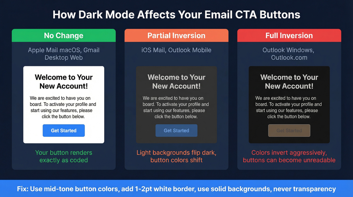
No change - Apple Mail macOS and Gmail desktop web render your button exactly as coded. Partial inversion - iOS Mail and Outlook mobile flip light backgrounds dark and dark text light, shifting your carefully chosen button color. Full inversion - Outlook Windows desktop and Outlook.com invert many colors outright, turning a bright orange button on white into a muddy mess on near-black.
Use mid-tone button colors that survive inversion. A saturated blue or green holds up better than a pale pastel. Add a 1-2pt white border around your button to preserve its shape when backgrounds flip. Use solid backgrounds, never transparency. You can add @media (prefers-color-scheme: dark) overrides, but client support is inconsistent - treat it as progressive enhancement, not a reliable fix.
If you're tracking performance, make sure you're using the right metric definitions (CTR vs CTOR, unique vs total). Our click rate formula breakdown helps you benchmark correctly.
What's a Good Click Rate?
Let's be honest: most teams obsess over button color when their real problem is list quality. A perfect CTA in an email that bounces has a 0% click rate.
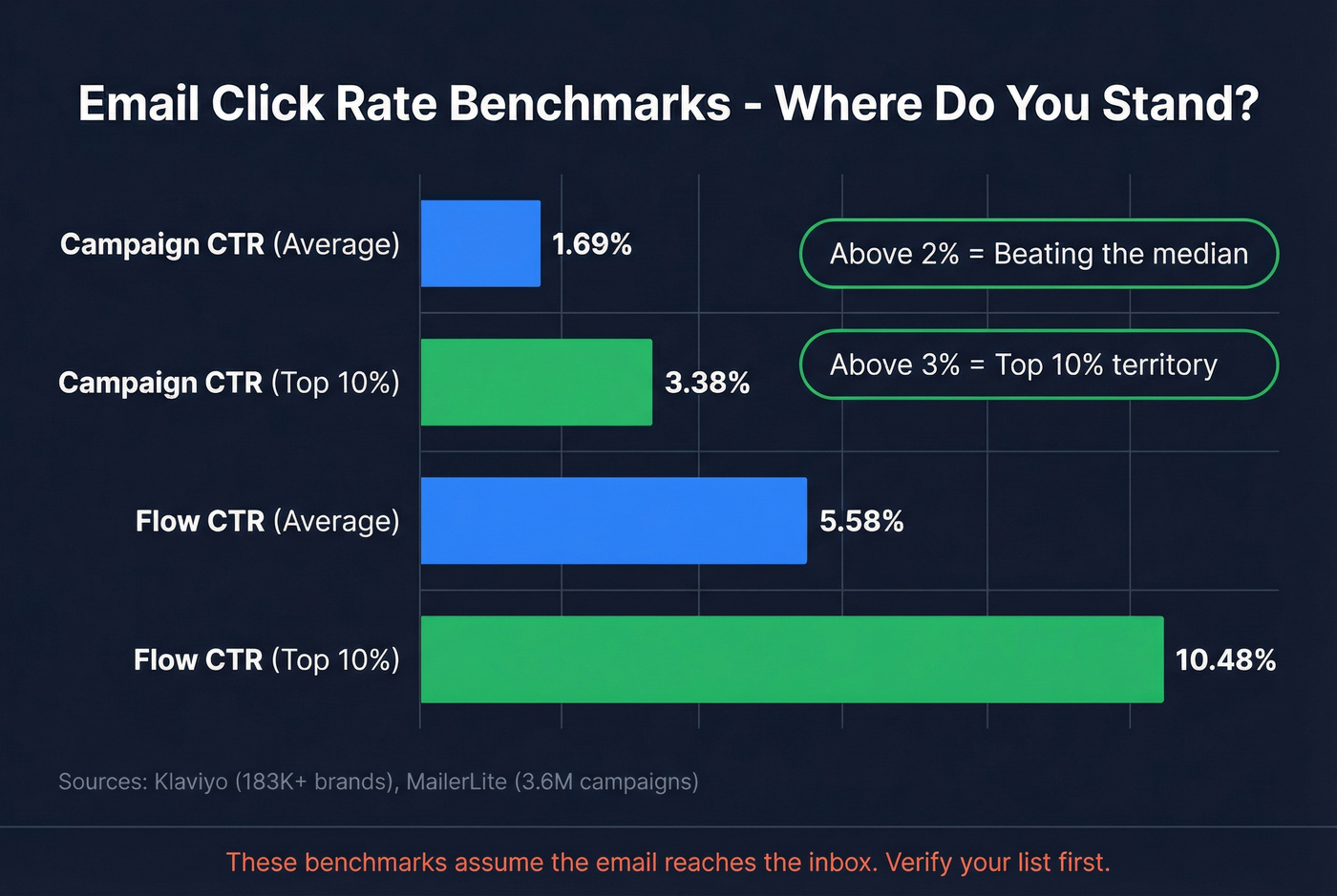
That said, here are the numbers worth knowing:
| Metric | Average | Top 10% | Source |
|---|---|---|---|
| Campaign CTR | 1.69% | 3.38% | Klaviyo (183K+ brands) |
| Flow CTR | 5.58% | 10.48% | Klaviyo |
| Median click rate | 2.09% | - | MailerLite (3.6M campaigns) |
| Median CTOR | 6.81% | - | MailerLite |
If your campaign CTR is above 2%, you're beating the median. Above 3% puts you in the top decile. Automated flows naturally run higher because they're triggered by behavior - comparing flow CTR to campaign CTR is apples to oranges.
All of these benchmarks assume the email reaches the inbox in the first place. We've watched teams redesign buttons three times before realizing 12% of their list was bouncing. Prospeo's real-time verification catches invalid addresses, spam traps, and honeypots at 98% accuracy - so your carefully designed CTA actually lands where it's supposed to.
If bounces are creeping up, start with the basics: monitor your email bounce rate and run a cleanup before your next big send.
Common Mistakes to Avoid
Image-slice CTAs. They disappear when images are blocked, they're invisible to screen readers, and they complicate click tracking in many ESPs. Code-based buttons only.
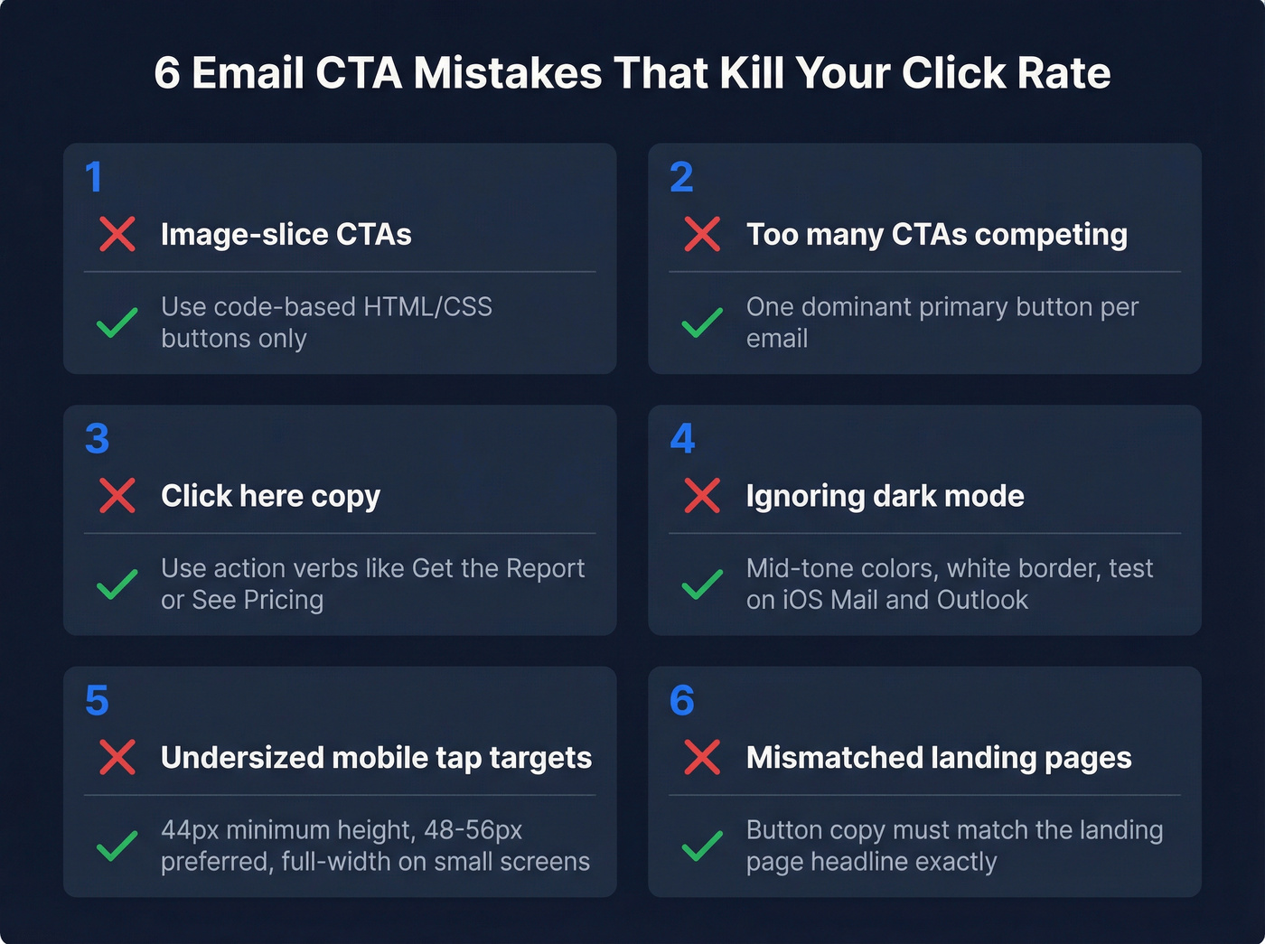
Too many CTAs. Three buttons competing for attention means none of them win. The jam study showed 6 options at 30% conversion vs. 24 at 3%. One dominant CTA applies the same principle.
"Click here" copy. It's meaningless out of context and wastes the chance to reinforce your value prop. "Download the Report" tells the reader what they get. "See Pricing" tells them where they're going. For more examples, borrow from these emails that get responses patterns.
Ignoring dark mode. If you haven't tested your button in dark mode on at least iOS Mail and Outlook, you're guessing. Add the border, pick mid-tone colors, test before you send.
Undersized mobile tap targets. A 30px-tall button on a phone screen is a missed-tap machine. 44px minimum, 48-56px preferred, full-width on small screens.
Mismatched landing pages. If your button says "Get the Report" but the page says "Contact Sales," trust evaporates instantly. Match your button copy to the landing page headline - always.
If you're building outbound sequences, align CTA buttons with your cold email sequence structure so each step has one clear action.
Great CTA buttons drive clicks. But clicks require deliverability, and deliverability requires clean data. Prospeo refreshes 300M+ profiles every 7 days - not the 6-week industry average - so the contacts behind your campaigns are current, verified, and reachable at $0.01 per email.
Stop redesigning buttons for emails that never arrive.
FAQ
How many CTA buttons should I put in one email?
One primary CTA. The jam study showed 6 options converted at 30% versus 3% for 24 - decision fatigue kills clicks. If you need a secondary action, make it a text link with less visual weight so the main button dominates.
What size should an email CTA button be?
Minimum 44x44px per Apple's Human Interface Guidelines. For mobile-heavy audiences, 48-56px height with full-width layout is the strongest default. Anything under 44px causes missed taps and frustrates recipients on phones.
How do I make sure my CTA emails actually get delivered?
Start with verified contact data - your button design doesn't matter if the email bounces. Beyond list quality, authenticate your domain with SPF, DKIM, and DMARC, and monitor bounce rates every send.
Do email CTA buttons work in all email clients?
Not by default. Outlook for Windows ignores standard CSS, so you need VML fallback code for bulletproof rendering. Use the hybrid VML + HTML/CSS approach above, and always test across Gmail, Apple Mail, Outlook, and at least one mobile client before sending.