Lead Capture Pages: What They Are, What Works, and What Everyone Gets Wrong
Only 27% of leads that hit your CRM are actually qualified. The other 73% clog your pipeline, waste your sales team's hours, and wreck deliverability when bad addresses slip into outbound sequences. The gap between "we captured a lead" and "we closed a deal" starts right here - on the lead capture page itself, and what happens in the five minutes after someone fills out your form.
The Short Version
A lead capture page has one job: collect contact info in exchange for something valuable. No navigation menus, no competing CTAs, no "learn more about our company" sidebar. One form, one offer, one outcome.
- Median conversion rate: 6.6%. Squeeze pages often hit 20-30%+. If you're below 5%, your page has a structural problem.
- Three form fields is the sweet spot for volume. Adding a fourth can drop completion by around 10%.
- Interactive lead magnets - quizzes, calculators, assessments - beat static PDFs on opt-in rate and downstream lead quality because they deliver personalized value and qualify intent simultaneously.
- The real failure point is after the form. 79% of marketing leads never convert without proper follow-up, and follow-up fails fast when the data is bad.
- Verify and enrich leads before they hit your CRM. A captured email is worthless if it bounces.
What Is a Lead Capture Page?
People use "landing page," "lead capture page," and "squeeze page" interchangeably. They're not the same thing.
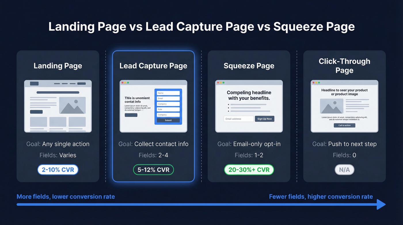
A landing page is any standalone page built around a single goal - a purchase, a demo booking, a signup. A lead capture page is a specific type whose only goal is collecting contact information through a form, usually in exchange for a lead magnet. A squeeze page is the most stripped-down version: email-only, minimal copy, maximum pressure to opt in. The distinction matters because conversion expectations vary wildly by type.
| Page Type | Purpose | Typical Fields | Expected CVR |
|---|---|---|---|
| Landing page | Any single goal | Varies | ~2-10% |
| Lead capture page | Collect contact info | 2-4 | 5-12% |
| Squeeze page | Email-only opt-in | 1-2 | 20-30%+ |
| Click-through page | Push to next step | 0 | N/A |
One case study from Involve.me illustrates the stakes: removing navigation links from a capture page doubled conversions from 3% to 6%. That's twice the leads from the same traffic, just by eliminating exit paths. The same research found that scaling from 5 landing pages to 40 segment-specific pages can yield 12x more leads - a stat that should make every team running a single generic page uncomfortable.
Lead Capture Page vs Home Page
One of the most common mistakes we see is teams sending paid traffic to their home page instead of a dedicated capture page. Your home page serves multiple audiences, features site-wide navigation, and offers dozens of competing links. A dedicated capture page strips all of that away - one visitor segment, one offer, one action. That's why dedicated pages routinely convert 2-5x higher than home pages receiving the same traffic. Fewer choices mean more completions.
Conversion Benchmarks
Let's talk numbers, because "good" is meaningless without context.
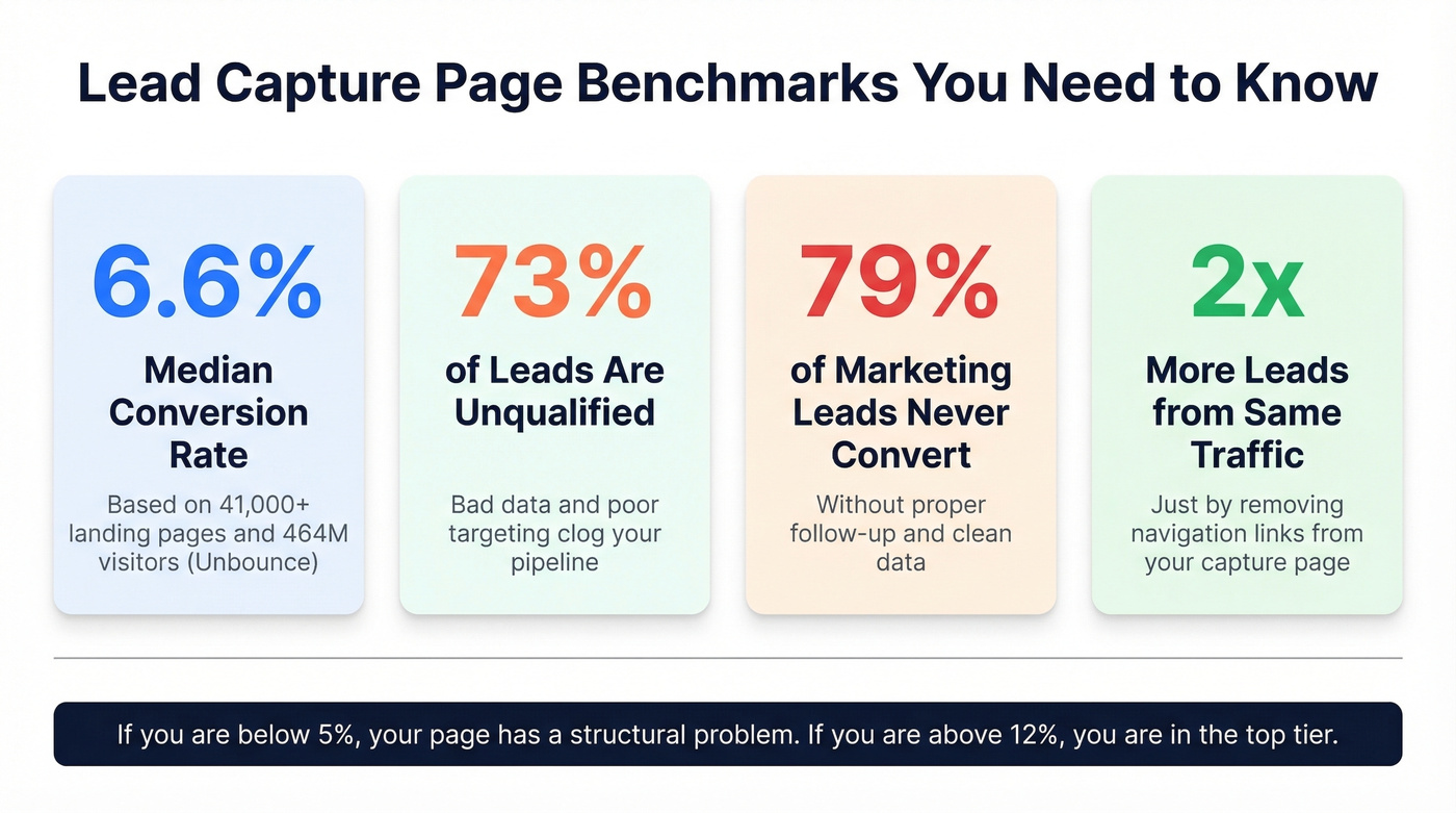
Unbounce analyzed 41,000+ landing pages with 464 million unique visitors and 57 million conversions and found a median conversion rate of 6.6% across all industries. Industry-specific medians range from 3.8% to 12.3%. B2B pages specifically average around 3.6% sitewide, though dedicated capture pages should outperform those numbers significantly.
For context, WordStream's analysis of 16,000+ Google Ads campaigns found an average CTR of 6.66% - meaning your ad gets the click, but your page determines whether that click becomes a lead. Most teams obsess over ad performance while ignoring the page that actually captures the conversion.
Here's the math that should keep you up at night. Say you're driving 10,000 visitors per month. At the 6.6% median, that's 660 leads. Drop to 3% - where poorly optimized pages land - and you're at 300. That's 360 leads lost every month, not because your traffic is bad, but because your page is.
For lead magnets specifically, the benchmark target is a 5-15% conversion rate. If your gated content converts below 5%, the offer itself is the problem - not the page design.
Anatomy of a High-Converting Page
Headline and Message Match
Your headline has one job: confirm that the visitor landed in the right place. If your ad says "Download the 2026 B2B Outbound Playbook," your headline better say exactly that - not "Welcome to Our Resource Center." Message match between traffic source and headline is the single easiest conversion lever you have. Most teams get it wrong by trying to be clever instead of clear.
The Form - How Many Fields?
This is where the volume-versus-quality tradeoff lives.
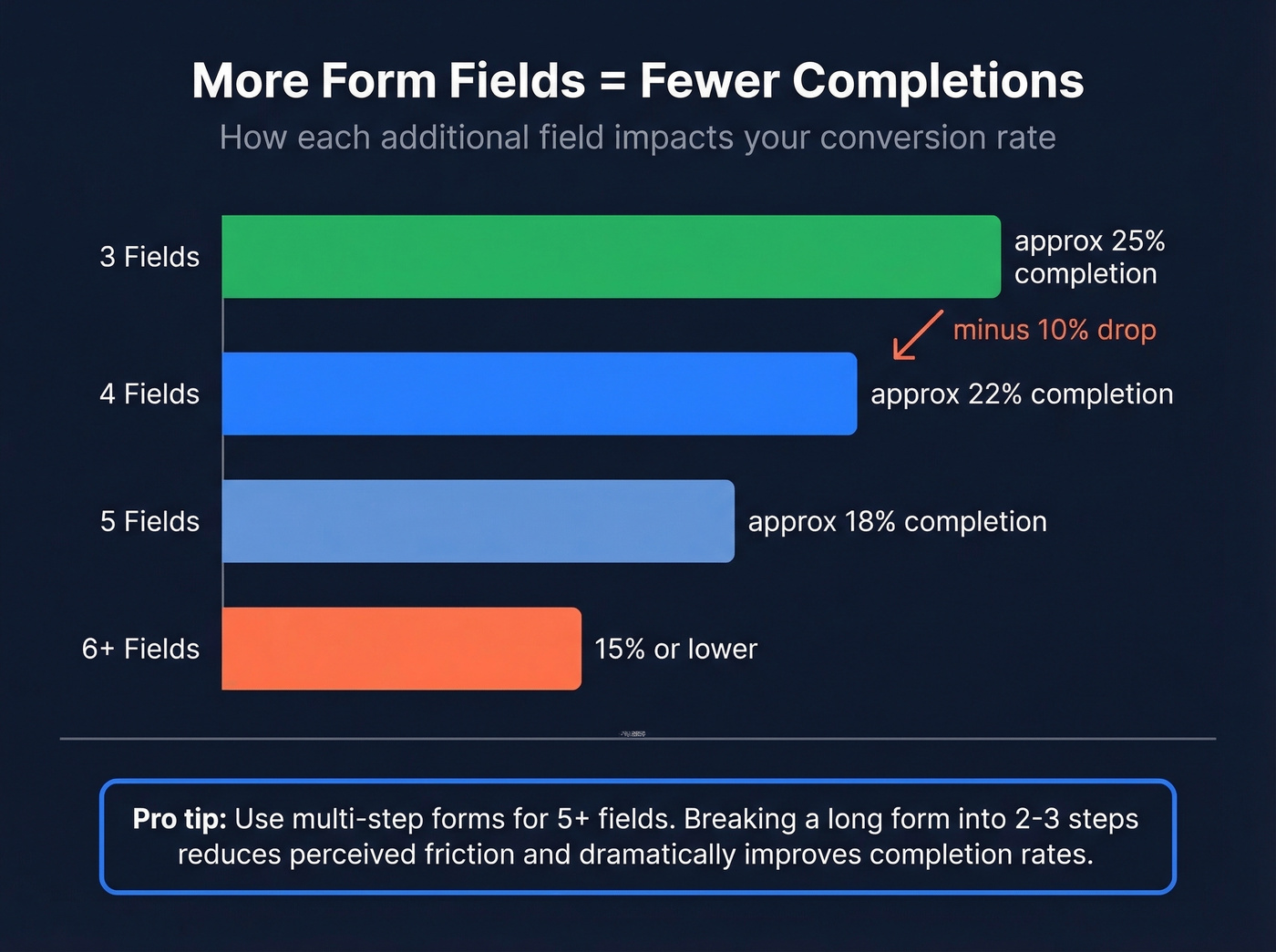
Three-field forms convert at roughly 25%. Adding a fourth field drops completion by about 10%. Push past six fields and you're looking at 15% or lower. But fewer fields isn't always better - it depends on your goal. Three fields maximizing name, email, and company works for top-of-funnel offers. Four to five fields that add job title and phone give sales something to qualify against (and a cleaner lead scoring model). Six or more fields only make sense for high-ticket pre-qualification, and if you go that route, use a multi-step breadcrumb technique that breaks a long form into two or three steps to reduce perceived friction dramatically.
We've tested multi-step forms against single-page forms, and the completion rates aren't even close. People who finish step one feel committed to finishing.
Copy That Converts
Visitors decide whether to stay or bounce in about half a second, so your copy needs to earn attention instantly. Lead with the outcome the visitor gets - not features, not your company story. Every line above the fold should answer "what's in it for me?" and nothing else.
Skip generic CTA labels entirely. "Get the Report" outperforms "Submit." "Start My Free Audit" outperforms "Download." The CTA should describe what the visitor gets, not what they're doing. Pair it with testimonials, client logos, or a simple "Join 10,000+ marketers" counter near the form. Security badges matter too, especially when you're asking for phone numbers or company details.
Form Placement
Keep your primary form above the fold. For longer pages, HubSpot recommends embedding the form in at least three positions - roughly every 350 words. Embedded forms on the page itself outperform forms that require clicking through to a separate page. Fewer clicks between "I want this" and "I submitted my info" always wins.
You just read that 79% of marketing leads never convert - and bad data is the top reason follow-up fails. Prospeo's 5-step email verification catches invalid addresses, spam traps, and catch-all domains before they ever reach your CRM. At 98% accuracy and $0.01 per email, cleaning your captured leads costs less than one wasted sales call.
Stop feeding bad form data into your pipeline. Verify every lead in real time.
Lead Magnets That Work in 2026
The static PDF playbook is dying. Whitepapers and ebooks still convert, but the trend is unmistakable: interactive content that delivers personalized value beats generic downloads on both opt-in rate and post-conversion engagement.
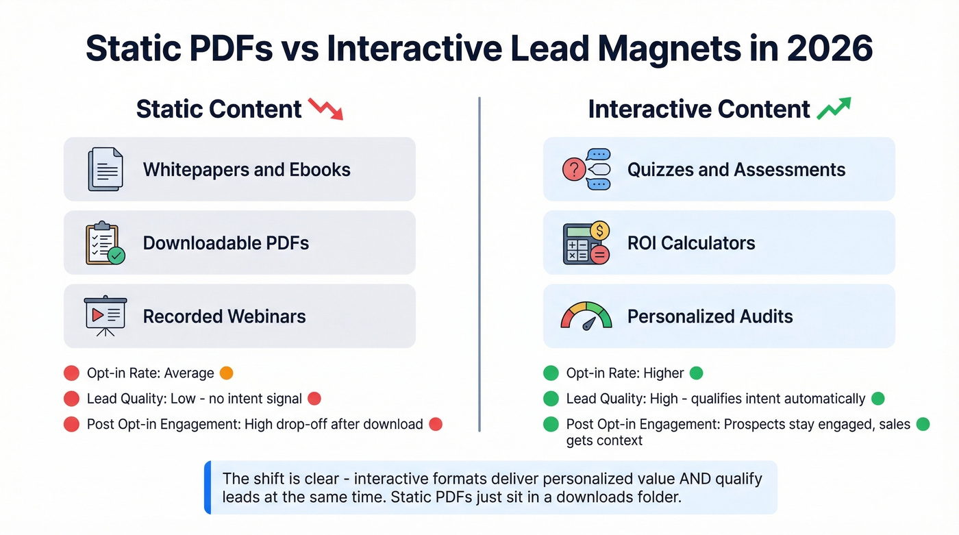
Quizzes, ROI calculators, and self-assessments are the formats gaining the most ground. A practitioner on r/DigitalMarketing with 13 years of experience put it bluntly: "Conversions were fine but the drop-off after opt-in was brutal" with static forms and freebies. Quiz funnels produced higher opt-ins, more qualified leads, and clearer insights into what prospects actually needed.
If your average deal size is under $10K, you don't need a 20-page gated ebook. A two-minute assessment that segments visitors by pain point will outperform it every time - and give your sales team something useful to reference on the first call.
The gating strategy should match the asset's value. Light interactive content like a quick assessment or one-page checklist warrants email-only. Premium reports, detailed benchmarks, or personalized audits justify asking for title, company, and phone. The key is proportionality - don't ask for six fields to download a two-page PDF.
How to Build a Lead Capture Page
1. Define one goal and one audience segment
Are you targeting cold leads, warm prospects, or existing customers? Each group needs a different offer and different form depth. A capture page built for prospects who already know your brand can ask for more information than one targeting first-time visitors. For high-ticket offers above $3K, practitioners report strong results with application forms that feed into calendar embeds - filtering for sales-ready calls rather than maximizing raw lead volume.
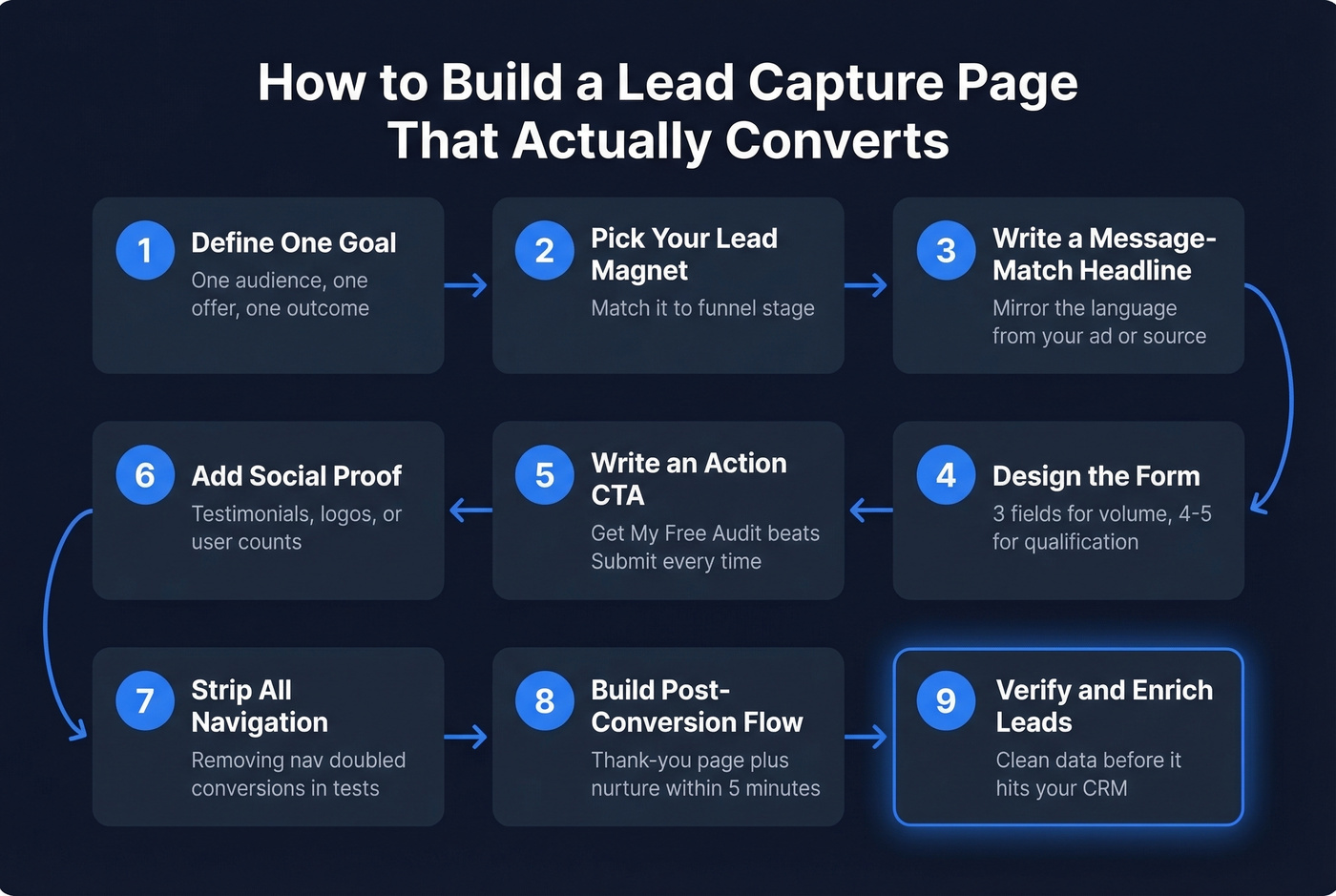
2. Choose your lead magnet and match it to funnel stage
Top-of-funnel: checklists, templates, quizzes. Mid-funnel: case studies, benchmarks, ROI calculators. Bottom-of-funnel: free trials, audits, consultations.
3-5. Design the page: headline, form, and CTA
These three elements work as a unit. Write a message-match headline that mirrors the language from whatever drove the click. Design the form with three fields for volume, four to five for qualification, and multi-step layouts for anything beyond five. Then write an action-oriented CTA - "Get My Free Audit" beats "Submit" every single time.
6. Add social proof and strip navigation
Testimonials, client logos, user counts - pick at least one. Then remove your main nav, footer links, and anything else that gives visitors an exit path. Removing navigation doubled conversions in documented tests. This is the single cheapest conversion win available to you.
7. Build the post-conversion experience
Your thank-you page and automated follow-up email are where leads get lost. Deliver the asset immediately, set expectations for next steps, and trigger your nurture sequence within minutes. In our experience, the biggest conversion killer isn't the page design - it's what happens in the five minutes after someone hits submit. If you need a starting point, use proven sales follow-up templates to standardize speed and messaging.
8. A/B test with discipline
Test one variable at a time. Run tests until you hit statistical significance - not just until one variant looks better after 48 hours. Headline, CTA text, and form length are the highest-impact elements to test first.
9. Verify and enrich captured data before CRM import
This is the step most teams skip, and it's the one that costs them the most. Raw form submissions contain typos, disposable emails, and outdated addresses. Run captured emails through a verification tool before they hit your CRM. If you're comparing options, see our breakdown of data enrichment services. Prospeo verifies emails with 98% accuracy and appends 50+ data points per contact - job title, company size, direct dial - turning a raw form submission into a sales-ready record.
Best Practices for Higher Conversions
Beyond the structural elements covered above, these practices separate pages that hit 10%+ conversion rates from those stuck at 3%.
Match form depth to funnel stage. Top-of-funnel offers get two to three fields. Bottom-of-funnel offers can justify five or more - but use multi-step forms to reduce friction.
Load the page in under two seconds. Every additional second of load time drops conversions by roughly 7%. Compress images, defer scripts, and skip the hero video.
Use directional cues. Arrows, eye-gaze in hero images, and contrasting CTA button colors guide attention toward the form. These are small details that compound.
Retarget non-converters. Most visitors won't convert on the first visit. A tracking pixel on your capture page lets you build retargeting audiences from the traffic that bounced - so you can serve them a follow-up ad with a different angle or offer. If you haven't set this up yet, do it before scaling paid traffic. (If you're implementing this end-to-end, it helps to map it into a full lead generation workflow.)
Personalize by traffic source. Visitors from LinkedIn ads respond to different messaging than those from Google search. Dynamic text replacement lets you tailor headlines without building separate pages for each channel.
Five Mistakes That Kill Conversions
1. Too many form fields for a low-commitment offer. Asking for phone number, company size, and annual revenue to download a checklist is a conversion killer. Match form depth to offer value.
2. Weak or generic CTA. "Submit" tells the visitor nothing. "Get the Report," "Start My Free Trial," "See My Results" - these describe what they're getting, not what they're giving up.
3. Navigation links competing with the form. Every link that isn't your CTA is an exit path. Your main nav, footer links, "About Us" - all of it should be gone. One page, one goal, one action.
4. No mobile optimization. More than half your traffic is on mobile. If your form fields are tiny, your CTA button is below three scrolls of text, or your page takes four seconds to load, you're losing leads before they even see the offer.
5. Sending unverified leads straight to sales. Here's the thing: high bounce rates damage your sender reputation. Every invalid email that makes it into your outbound sequences chips away at deliverability for your entire domain. Verify before import - always. (If this is a recurring issue, fix it at the source with an email deliverability guide and a process to improve sender reputation.)
A lead capture page gives you a name and email. Prospeo turns that into 50+ data points - job title, company size, tech stack, funding stage, and buyer intent signals. With a 92% API match rate, you can enrich and qualify form submissions automatically before a rep ever touches them.
Enrich every captured lead with the data your sales team actually needs to close.
GDPR and CCPA Compliance
If you're capturing leads from EU residents, GDPR applies - and the penalties are severe. Fines reach up to EUR 20 million or 4% of global annual revenue, whichever is higher. CCPA covers businesses with $25 million+ in annual revenue or those collecting data from 50,000+ consumers annually, with penalties up to $7,500 per violation.
Your compliance checklist for every lead capture form:
- No pre-checked consent boxes. Consent must be active and explicit.
- Implement double opt-in. Especially for email marketing lists - it's not legally required everywhere, but it's the safest approach and it improves list quality.
- Link your privacy policy on every form. Not buried in the footer. Right next to the submit button.
- Define data retention policies. How long do you keep lead data? When do you delete it? Document this.
- Use a consent management platform. Tools like Cookiebot or OneTrust handle multi-jurisdiction complexity so you don't have to build it yourself.
- Honor deletion requests promptly. Both GDPR and CCPA give individuals the right to request data deletion. Your workflow needs to support this without manual scrambling.
Real talk: most B2B teams treat compliance as an afterthought until they get their first data subject access request. Build it into your lead capture workflow from day one.
Lead Capture Page Tools
You don't need to spend weeks picking a page builder. Pick one, launch a page, and spend your optimization energy on the form, the offer, and the post-capture workflow. That's what actually moves the needle.
| Tool Type | Typical Cost | Best For |
|---|---|---|
| SMB landing page builders | ~$30-$200/mo | Most teams shipping pages fast |
| Experimentation platforms | ~$100-$500+/mo | A/B testing, routing, personalization |
| Enterprise platforms | $1,000+/mo | Large teams, governance, scale |
For most teams just getting started, a mainstream SMB builder gets you live fast. If you're running serious A/B testing, Unbounce is the standard - their Smart Traffic feature automatically routes visitors to the highest-converting variant. Skip this if you're only running one or two pages; the ROI won't justify the cost until you're testing at scale. Once you’re scaling, it’s also worth tracking the right lead generation metrics so you optimize beyond just CVR.
FAQ
What is a lead capture page?
A lead capture page is a standalone web page designed to collect visitor contact information through a form, usually in exchange for a lead magnet like a checklist, report, or free tool. Unlike general landing pages that drive purchases or demo bookings, it focuses exclusively on turning anonymous visitors into known contacts for sales and marketing follow-up.
How many form fields should I use?
Three fields - name, email, company - hit roughly 25% completion rates and maximize volume. Four to five fields adding job title or phone number give sales qualification data but reduce completions by about 10%. Beyond five fields, use multi-step forms to reduce perceived friction.
What's a good conversion rate?
The median across all industries is 6.6% based on Unbounce's analysis of 41,000+ pages. Squeeze pages often hit 20-30%+. If you're consistently below 5%, your page likely has too many fields, a weak offer, or competing exit paths.
Do I need GDPR consent on my form?
Yes, if you collect data from EU residents. GDPR requires explicit consent with no pre-checked boxes, accessible privacy policies, and documented data retention practices. Penalties reach EUR 20 million or 4% of global annual revenue.
How do I improve lead quality from my capture page?
Use qualifying form fields, interactive lead magnets like quizzes and assessments, and verify captured emails before they enter your CRM. Running submissions through a verification and enrichment step turns raw form data into complete, sales-ready records - and keeps bad addresses from damaging your sender reputation.