Sales Enablement Analytics: What to Measure in 2026
Your VP of Sales just pinged you. The $80K enablement budget is up for renewal, and the CFO wants proof it's working. You pull up the dashboard - completion rates, content downloads, session attendance - and immediately realize none of it answers the question. Your sales enablement analytics feel like theater. Over on r/ProductMarketing, practitioners openly admit that revenue attribution from enablement tools feels unrealistic when deals take six months and involve ten stakeholders.
Here's how to measure what actually matters.
The Short Version
- Stop reporting training completion rates in isolation. Every metric must connect to a revenue outcome - quota attainment, win rate, ramp time, pipeline velocity.
- Audit your measurement maturity. Most teams are stuck at "descriptive" when they need "prescriptive." The four-level model below shows you where you really are.
- Fix your data inputs first. If 20-30% of your outbound emails bounce, your pipeline metrics measure data decay, not enablement effectiveness. (If you need benchmarks and fixes, start with bounce rate.)
Why Measurement Matters Now
67% of B2B buyers now prefer a rep-free experience, per a Gartner survey of 646 buyers. And 45% of those buyers used AI during a recent purchase. Reps aren't competing with other vendors - they're competing with self-serve research and AI copilots.
Meanwhile, 76% of organizations now have a dedicated enablement function, up from 32% five years ago. The scope is expanding too: what used to be "sales enablement" increasingly looks like revenue enablement, spanning onboarding, content, coaching, and buyer engagement analytics across the full customer lifecycle. But measurement hasn't kept pace. Enablement reports into RevOps (39.4%), Sales (25.4%), and the C-Suite (16.6%). Every one of those stakeholders speaks in revenue terms. Completion certificates don't cut it.
Four Levels of Enablement Analytics
Most teams think they're running sophisticated analytics. They're not.
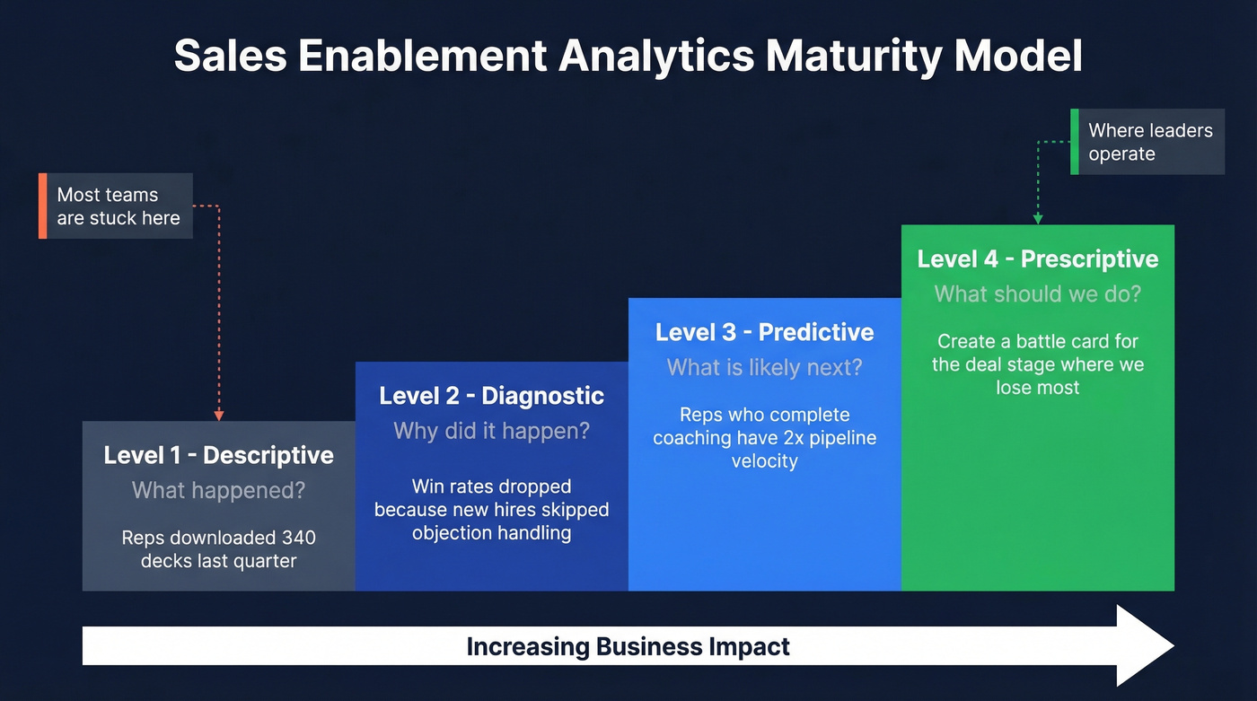
| Level | Question It Answers | Example |
|---|---|---|
| Descriptive | What happened? | "Reps downloaded 340 decks last quarter" |
| Diagnostic | Why did it happen? | "Win rates dropped because new hires skipped objection-handling modules" |
| Predictive | What's likely next? | "Reps who complete coaching have 2x pipeline velocity - flag those who haven't" |
| Prescriptive | What should we do? | "Create a competitive battle card for the deal stage where we lose most often" |
Most enablement teams are stuck at descriptive. They can tell you what content was downloaded. They can't tell you which content actually influenced a closed deal, or which coaching intervention would move the needle on next quarter's win rate. I've watched teams present beautiful dashboards that answer zero questions the CFO actually asked. The gap between "we have data" and "we have answers" is where most programs stall out, and it's exactly the gap that separates enablement leaders from enablement administrators.
Moving from descriptive to prescriptive doesn't require a $150K+ platform. It requires intentional metric design.
Moving from descriptive to prescriptive analytics starts with clean data inputs. If 20-30% of your outbound emails bounce, every pipeline metric downstream is corrupted. Prospeo's 98% email accuracy and 7-day data refresh cycle give your enablement dashboards numbers that reflect rep performance - not data decay.
Stop measuring data rot. Start measuring enablement impact.
Metrics That Actually Matter
Content adoption leads at 50% of what enablement teams measure, followed by quota attainment (43.1%) and win rate (42.2%). Content adoption alone is a vanity metric. It only matters when tied to deal outcomes.
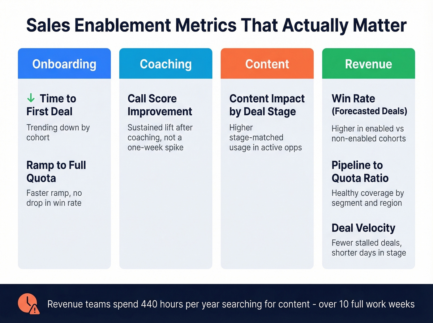
Here's a more useful framework, organized by category:
| Category | Metric | What "Good" Looks Like |
|---|---|---|
| Onboarding | Time to first deal | Trending down by cohort |
| Onboarding | Ramp to full quota | Faster ramp with no drop in win rate or deal quality |
| Coaching | Call score improvement | Sustained lift after structured coaching, not a one-week spike |
| Content | Content impact by deal stage | Higher stage-matched usage in active opportunities |
| Revenue | Win rate (forecasted deals) | Higher win rate in enabled cohorts vs. non-enabled cohorts |
| Revenue | Pipeline-to-quota ratio | Healthy coverage maintained by segment and region |
| Revenue | Deal velocity | Fewer stalled deals; shorter days-in-stage where enablement intervenes |
Revenue teams spend 440 hours a year searching for or creating content - over 10 full work weeks. If your enablement program doesn't measurably reduce that number, it's not working, regardless of what the adoption dashboard says.
Let's be honest: most teams would get more ROI from cutting content search time in half than from any conversation intelligence tool. Fix the basics before buying the shiny thing.
How to Prove ROI to Your CFO
Leadership cares about three things: revenue, efficiency, and growth.
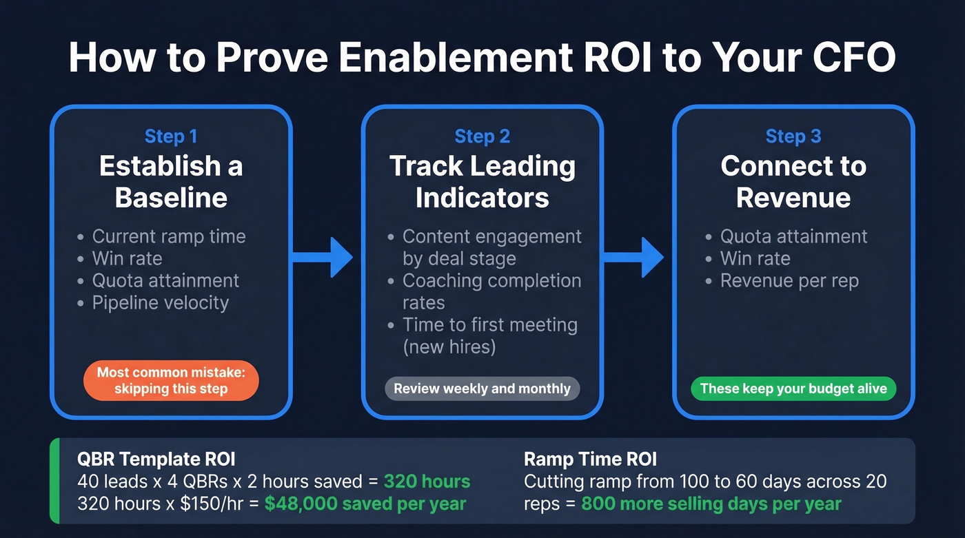
Step 1: Establish a baseline. Before any program launches, document current ramp time, win rate, quota attainment, and pipeline velocity. We've seen teams skip this step and spend the next two quarters unable to prove anything changed. It's the single most common mistake in enablement measurement, and it's entirely preventable.
Step 2: Track leading indicators. Sales content engagement tracking by deal stage, coaching completion, and time-to-first-meeting for new hires all serve as early signals that programs are gaining traction.
Step 3: Connect to lagging indicators. Quota attainment, win rate, revenue per rep. These are the numbers that keep your budget alive.
Real math: you build a QBR template adopted by 90% of reps. Prep time drops from 3 hours to 1 hour - 2 hours saved per QBR. With 40 leads running 4 QBRs per year, that's 320 hours saved. At $150/hour fully loaded, that's $48,000 in annual productivity value from a single template. Or take ramp time: cutting new-hire ramp from 100 days to 60 days across a 20-person team means 800 more selling days per year. (If you want to standardize ramp faster, use a 30-60-90 day plan.)
Enterprise enablement platforms run $20K-$150K+ per year. ROI proof isn't optional - it's a survival skill.
Why Your Analytics Are Lying
Here's the thing: 43% of enablement stacks are underutilized, with adoption under 50%. If half your reps aren't using the platform, your analytics measure the behavior of your most compliant reps, not your team. That's selection bias baked into every chart.
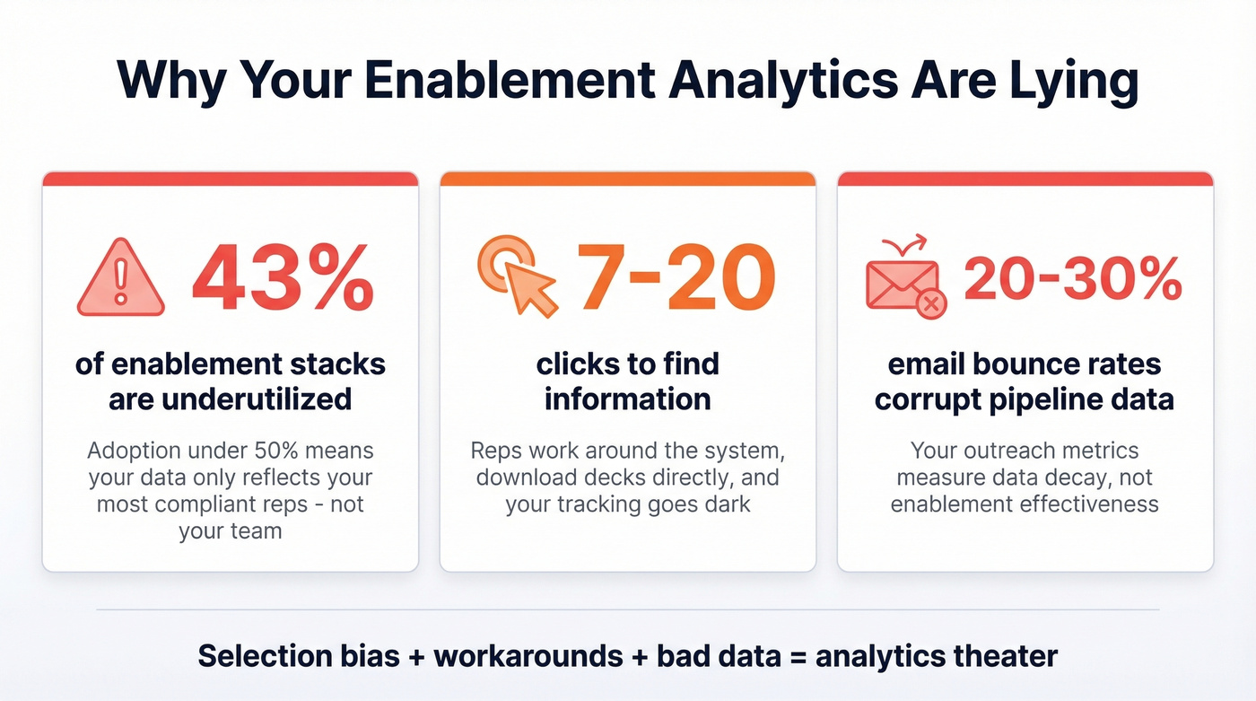
It gets worse. When it takes 7-20 clicks to find information, reps work around the system. They download decks, attach them to emails directly, and your ability to track sales documents goes dark. There's also a disconnect between what vendors emphasize - content management, training, analytics - and what practitioners actually need: organized content and better follow-up workflows (for example, sales follow-up templates that reps actually use).
Then there's data quality, which is the silent killer of enablement analytics. Your outreach metrics are only as reliable as your contact data. If reps' emails bounce at 20-30%, pipeline metrics reflect data decay, not enablement effectiveness. We've found that teams using Prospeo's 98% email accuracy and 7-day data refresh cycle get outbound metrics that actually measure whether enablement programs are working - not whether the contact database has rotted. Snyk, for example, cut bounce rates from 35-40% to under 5% after switching, which meant their pipeline attribution data finally told the truth.
Build Your Enablement Dashboard
Four sections, each answering a different question.
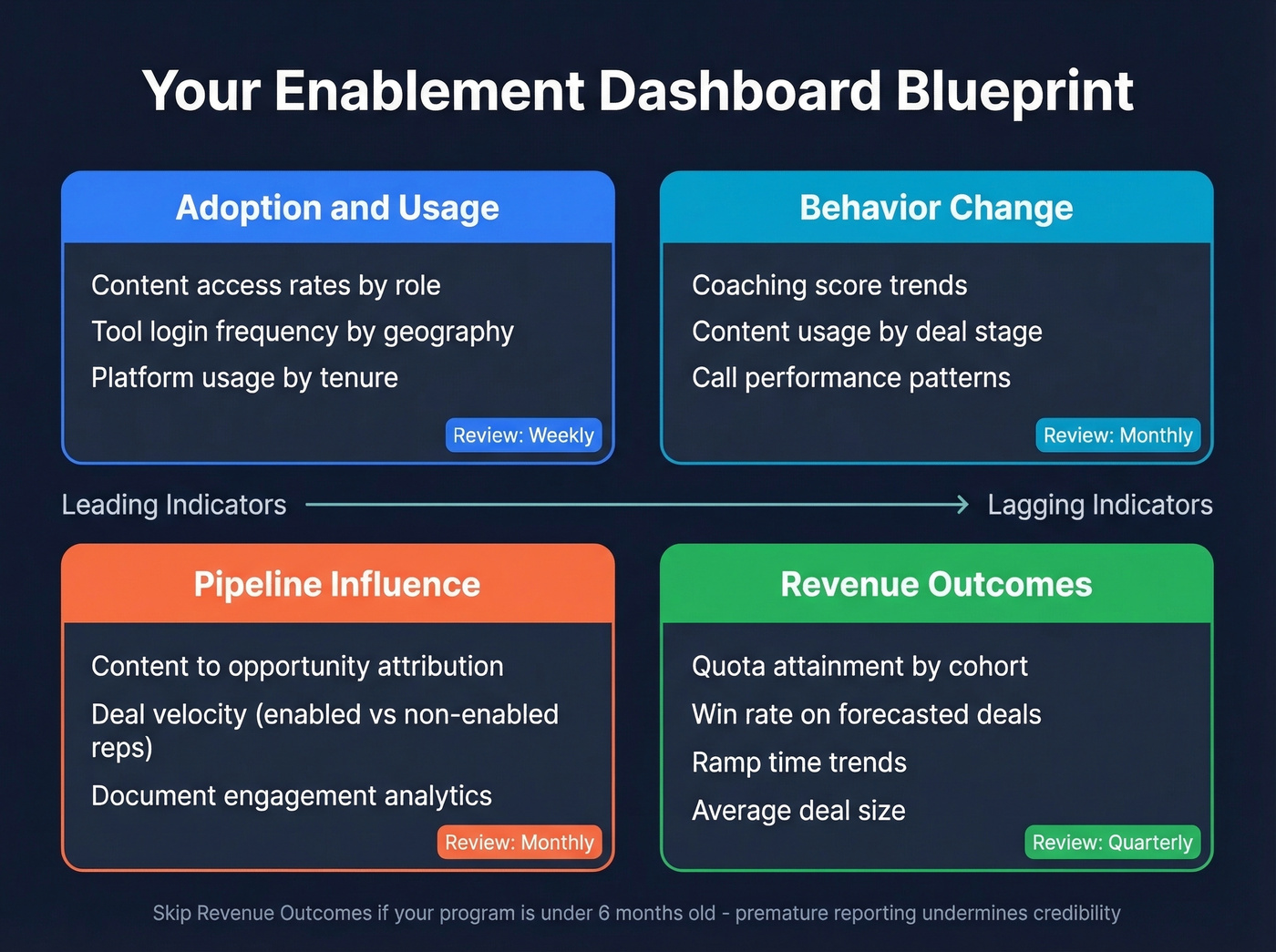
Adoption & Usage - Are reps using the content and tools? Review weekly. Segment by role, geography, and tenure. Reps should access content where they already work - CRM, email, Slack - or adoption will crater and your analytics will reflect a ghost town.
Behavior Change - Are reps doing things differently? Track coaching scores, content usage by deal stage, and call performance trends. Review monthly. This is where diagnostic analytics live: you're looking for patterns that explain why numbers are moving, not just that they moved.
Pipeline Influence & Document Analytics - Track content-to-opportunity attribution and deal velocity for enabled vs. non-enabled reps monthly. Understanding which assets move deals forward is the core of sales document analytics - it tells you not just what was sent, but what actually influenced a buyer's decision. (If you need a broader KPI set, borrow from sales operations metrics.)
Revenue Outcomes - Review quota attainment, win rate, ramp time, and deal size quarterly. The monthly metrics tell you what's changing; the quarterly metrics tell you whether it mattered.
Skip the revenue outcomes section if your enablement program is under six months old. You won't have enough data to draw meaningful conclusions, and premature reporting will undermine credibility with leadership.
You just calculated $48K in productivity savings from a single QBR template. Now imagine what happens when reps stop wasting hours on bounced emails and wrong numbers. Prospeo delivers 143M+ verified emails at $0.01 each and 125M+ verified mobiles with a 30% pickup rate - so your ramp time, win rate, and pipeline velocity metrics actually mean something.
Give your reps data that connects. Your analytics will finally prove ROI.
FAQ
What's the difference between enablement analytics and sales analytics?
Sales analytics measures deal outcomes - win rate, revenue, cycle length. Sales enablement analytics measures whether your programs are driving those outcomes. One tells you the score; the other tells you which plays are working. Think of it as leading vs. lagging indicators for your revenue engine.
Which enablement metrics should I report to leadership?
Quota attainment, win rate on forecasted deals, ramp time, and pipeline velocity. These four speak the CFO's language directly. Skip completion rates unless you can tie them to a measurable lift in one of those revenue metrics.
How do I make sure my enablement data is accurate?
Start with CRM hygiene and verified contact data. If reps' emails bounce at 20%+, every outreach metric downstream is meaningless. Audit CRM fields quarterly and treat clean inputs as non-negotiable. On the data side, a 5-step verification process with catch-all handling and spam-trap removal - the kind Prospeo runs on its 143M+ verified emails - is what separates usable analytics from noise.
What tools help measure enablement ROI?
Platforms like Highspot, Seismic, and Allego handle content tracking and coaching analytics. For the data quality layer underneath - verified emails, direct dials, CRM enrichment - you need a separate solution that keeps contact records fresh. Layer both to get analytics you can actually trust.