Sales Pipeline Visualization: How to See What Your Pipeline Is Really Telling You
Your VP just pulled up the pipeline report. $4.2 million in active opportunities - looks healthy against a $1.5M quarterly target. Except half that number is sitting in "Discovery" with no second meeting scheduled, and three deals worth $600K have been in "Negotiation" since last summer. That $4.2M pipeline is really $2.4M, maybe less. The dashboard didn't lie, exactly. It just showed you what you wanted to see instead of what you needed to know.
Sales pipeline visualization isn't about making pretty charts. It's about building views that surface the truth - stalled deals, inflated stages, conversion bottlenecks - before they wreck your forecast. Teams using purpose-built pipeline views improve forecast accuracy by up to 25%. Here's how to build the ones that actually deliver that.
The Cheat Sheet
Before we go deep:
- Start with one metric: weighted pipeline coverage ratio. Formula: (Total pipeline value x stage probability) / revenue target. If you can't calculate this from your dashboard in under 10 seconds, your dashboard is broken.
- Match the view to the viewer: reps need Kanban deal boards for daily tracking. Managers need funnel charts and heatmaps to spot drop-off and aging. Execs need coverage ratio trends and velocity lines - nothing else.
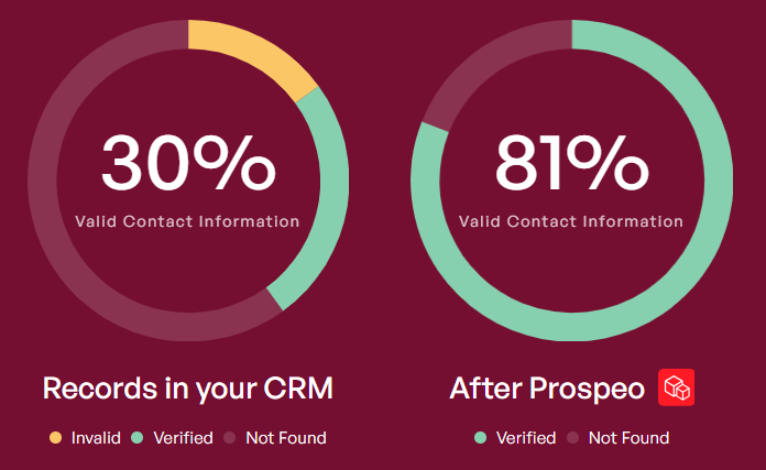
- Fix the data first: every visualization is only as honest as the contacts underneath it. If 15-30% of your CRM emails are stale, your pipeline is inflated before anyone opens a chart.
What Pipeline Visualization Actually Means
Sales pipeline visualization turns your deal data into visual formats that reveal patterns, bottlenecks, and risks you'd miss in a spreadsheet. But most teams confuse seeing their pipeline with understanding it.
A Kanban board - deals as cards moving left to right across stages - is table stakes. Most CRMs ship one. It tells you where deals sit right now. That's deal tracking, not pipeline intelligence.
Analytical visualization goes further: it shows you conversion rates between stages, how long deals linger, where money leaks out, and whether your coverage ratio is real or imaginary. The views that change outcomes answer "why" - why deals stall in stage three, why Q2 pipeline always looks fat in March and thin by May, why your top rep's win rate dropped 12 points last quarter. A common frustration on RevOps forums captures it well: CRM dashboards show what happened, not why. That's exactly the gap analytical visualization fills.
Seven Chart Types That Matter
Kanban Deal Boards
The default. Deals as cards, stages as columns, drag to advance. Kanban works for individual reps managing their day - it's a task view, not an analytical tool. It can't show you conversion rates, aging patterns, or pipeline trends over time. Use it for deal management, not pipeline health assessment.
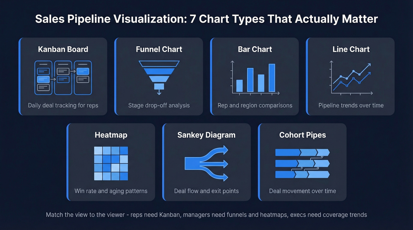
Funnel Charts
The go-to for visualizing stage drop-off. How many leads enter the top, how many survive to close. One critical design note: avoid triangular funnels. They exaggerate early-stage losses visually. Use bar-style funnels with center-aligned bars instead - they're more accurate and easier to compare across periods.
Bar Charts
Best for comparing performance across reps, regions, or time periods. Pipeline value by rep, win rate by territory, deals closed by quarter. One rule: always start the y-axis at zero. Truncated axes make a 5% difference look like a 50% gap, and that misleads everyone in the room.
Line Charts
Pipeline value or deal volume over time. Great for spotting trends - is your pipeline growing, shrinking, or flat? Keep it to four lines maximum. Track total pipeline, weighted pipeline, new pipeline added, and pipeline lost. More than that is noise.
Heatmaps
Underrated and underused. Heatmaps show win rates by stage and time, or deal aging patterns across your team. They make it obvious when deals cluster in a particular stage for too long, or when a specific rep's conversion drops in a specific phase. Color does the analytical work your brain would otherwise have to do manually.
Sankey Diagrams
Sankey diagrams show the volume and direction of flows through your pipeline - link width is proportional to deal volume. The advantage over a standard funnel: a Sankey stops the flow when a lead dies. You can see exactly where deals exit, not just that they disappeared somewhere between "Demo" and "Proposal." Tableau has a plug-and-play template that makes these accessible even for non-technical teams.
Cohort-Style "Pipes"
This is the visualization most teams haven't seen but should be using. Instead of a snapshot, cohort-style pipes show how deals move through stages over time. Take January's $1.6M in "Prospect" stage: 47% ($750K) stayed in Prospect, 31% ($500K) advanced, and 22% ($350K) was lost or purged. When the "stayed" percentage rises month over month, you're looking at a lengthening sales cycle and poor pipeline hygiene - problems that won't show up in a standard funnel until it's too late.
When to Use What
| Chart Type | Best Use Case | Stakeholder | Avoid When |
|---|---|---|---|
| Kanban | Daily deal tracking | Reps | Analyzing trends |
| Funnel | Stage drop-off | Managers | Comparing periods |
| Bar | Rep/region comparison | Managers, execs | Showing flow |
| Line | Pipeline trends | Execs | Too many variables |
| Heatmap | Win rate + aging | Managers | Small data sets |
| Sankey | Deal flow paths | Analysts | Simple pipelines |
| Cohort pipes | Movement over time | RevOps, execs | Real-time views |
Metrics Worth Visualizing
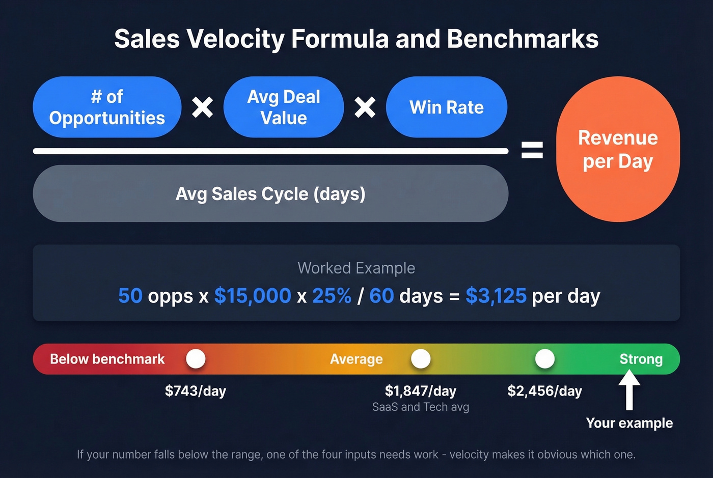
Sales Velocity
Sales velocity tells you how fast your pipeline generates revenue. The formula: (number of opportunities x average deal value x win rate) / average sales cycle length. A worked example: 50 opportunities x $15,000 average deal x 25% win rate / 60-day cycle = $3,125/day. B2B SaaS benchmarks commonly land around $743-$2,456/day depending on segment and deal size. If your number falls below that range, one of the four inputs needs work - velocity makes it obvious which one.
Pipeline Coverage Ratio
Coverage ratio = total pipeline value / revenue target. A $250K pipeline against a $100K target gives you 2.5x coverage. But that's unweighted - it treats every deal as equally likely to close.
Segment benchmarks from Outreach's coverage analysis: Enterprise needs 3-5x, mid-market B2B needs 2.5-4x, and high-velocity SMB can operate at 2-3x. Most teams default to a generic "3x" target. That's fine as a starting point, but it hides the real question: 3x of what quality?
Weighted vs. Unweighted Pipeline
Unweighted pipeline is a vanity metric. It treats a Discovery-stage deal the same as a Verbal Commit. Weighted pipeline multiplies each deal's value by its stage probability, giving you expected revenue instead of fantasy revenue.
| Stage | Probability Range |
|---|---|
| Discovery | 10-15% |
| Demo/Presentation | ~30% |
| Proposal/Quote | ~50% |
| Negotiation | Up to 80% |
| Verbal Commit | 90-95% |
A $100K deal in Discovery is worth $10-15K in weighted terms. That reframes your entire coverage picture. We've seen teams go from "comfortable 4x coverage" to "barely 2x" once they apply real stage probabilities. That's the moment your pipeline dashboard starts telling the truth.
Stage Conversion Benchmarks
Conversion rates vary dramatically by segment:
| Stage | SMB/Mid-Market | Enterprise |
|---|---|---|
| Visitor to Lead | 1.4% | 0.7% |
| Lead to MQL | 41% | 39% |
| MQL to SQL | 39% | 31% |
| SQL to Opportunity | 42% | 36% |
| Opportunity to Close | 39% | 31% |
If your numbers are significantly below these ranges at any stage, that's where your dashboard should be screaming at you. The MQL-to-SQL handoff is the biggest bottleneck in this data - the exact point where marketing and sales coordination either works or doesn't, and where finger-pointing replaces pipeline movement.
You just read it: if 15-30% of your CRM emails are stale, your pipeline is inflated before anyone opens a chart. Prospeo refreshes every record on a 7-day cycle and delivers 98% email accuracy - so your weighted pipeline actually reflects reality, not fantasy revenue.
Clean data in, honest pipeline out. Start free with 75 verified emails.
Benchmarks: What Good Looks Like
Benchmarks give your visualizations context. Without them, a 25% win rate is just a number. With them, you know it's within the 20-30% B2B average.
- Pipeline velocity: $743-$2,456/day (SaaS & Tech averages ~$1,847/day)
- Median B2B SaaS sales cycle: 84 days (optimal range: 46-75 days)
- Lead-to-customer conversion: 2-5%
- Win rate: 20-30% from initial opportunity to close
Channel performance varies wildly, and your dashboard should reflect that:
| Channel | Visitor to Lead | MQL to SQL | Opp to Close |
|---|---|---|---|
| SEO | 2.1% | 51% | 38% |
| PPC | 0.7% | 26% | 35% |
| Events | 1.0% | 24% | 40% |
SEO leads convert to SQLs at nearly double the rate of PPC leads. If your dashboard doesn't segment by source, you're averaging away the signal. Events have the highest close rate but the lowest top-of-funnel volume - that tradeoff should be visible in your pipeline views.
Five Problems Your Dashboard Should Catch
Traditional pipeline reports create an illusion of control - they show totals without explaining why deals stall. Let's walk through the problems worth building detection for.
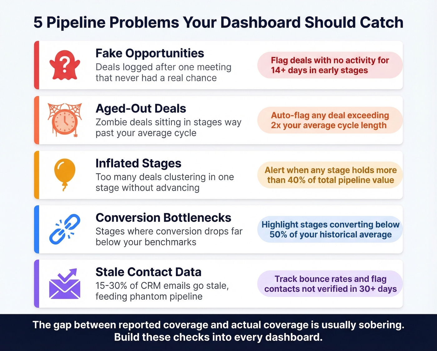
Fake Opportunities
Deals logged after a single meeting that never had a real chance. If there's no second meeting within two weeks, it's not an opportunity - it's wishful thinking. Your dashboard should flag deals in early stages with no activity for 14+ days and let you calculate "actual coverage" after removing them. The gap between reported coverage and actual coverage is usually sobering.
Aged-Out Deals
We've all seen it: a deal sitting in "Proposal" for 18 months when the average cycle is 90 days. The worst example I've encountered was a five-year-old opportunity that a rep refused to close-lost because "the contact said they'd revisit next quarter." Your dashboard needs an aging threshold - any deal exceeding 2x your average cycle length should be flagged automatically. Without this visibility, zombie opportunities quietly erode forecast accuracy.
Here's the thing: 15-30% of emails in a typical CRM go stale over time. Those stale contacts feed phantom pipeline - deals attached to people who've changed jobs, companies that've been acquired, or emails that bounce. Prospeo's 7-day data refresh cycle and 83% enrichment match rate catch this decay before it inflates your numbers. One customer, Meritt, saw their bounce rate drop from 35% to under 4% after switching - that's the kind of data hygiene that makes pipeline numbers trustworthy. (If you want to go deeper on bounce mechanics, see our email bounce rate benchmarks and fixes.)
Poor-Fit Deals
Not every opportunity deserves to be in your pipeline. Deals outside your ICP inflate coverage ratios and waste rep time. Your dashboard should let you filter by deal quality signals - company size, industry, use case fit - so you can see your qualified pipeline separately from the total.
Stalled Deal Clusters
Don't manage by averages - manage by exception. If your overall stage conversion looks fine but three reps have zero movement from Demo to Proposal this month, that's a coaching problem hiding behind aggregate data. Build views that flag anomalies, not just averages. Heatmaps are perfect for this.
Unweighted Forecasts
Default CRM stage probabilities are fiction. They're generic percentages someone set during implementation and never updated. If your forecast is built on these defaults instead of your team's actual historical conversion rates, you're guessing with extra steps. Recalibrate quarterly using real data, and visualize the gap between default-weighted and actual-weighted pipeline. The difference is usually 20-40%.
Building Your Dashboard: Four Reports
Deal Progression
Stage conversion rates, average time in stage, and funnel visuals. This is your operational view - where deals are moving and where they're stuck. Reps and frontline managers live here.
Pipeline Health
Deal distribution by stage, won/lost ratio, stalled deal count, and weighted revenue. This is the manager's view - it answers "do we have enough real pipeline to hit target?" If the answer requires more than 10 seconds of mental math, redesign the report. Customer success teams can also benefit from a separate board tracking expansion and renewal opportunities alongside net-new pipeline. (More on what to track in our pipeline health guide.)
Team Performance
Win rates, time-to-close, and revenue by rep and territory. This is where coaching opportunities surface. The goal isn't a leaderboard - it's identifying which reps need help at which stages. If you need a tighter definition of what “good” looks like, use these sales operations metrics as your baseline.
Revenue Forecasting
Historical trends, scenario planning, and attribution. This is the exec view. It should show best-case, expected, and worst-case scenarios based on weighted pipeline and historical velocity. Teams with mobile CRM access hit targets 65% of the time vs. 22% without - so make sure these reports render on a phone. If you’re evaluating platforms, compare sales forecasting solutions by data inputs and workflow fit, not just UI.
Four design principles make these reports useful: real-time data sync so stale dashboards don't get ignored, mobile accessibility, role-based views so each stakeholder sees what matters to them, and customizable KPIs that match your specific sales motion.
How to Choose the Right Tools
Stop obsessing over your visualization tool and start obsessing over your pipeline data. That said, you need something to build dashboards in. The options fall into three categories, and the right choice depends on your team size, budget, and technical depth.
CRM-native analytics are where most teams start. Salesforce runs about $25-$330/user/mo depending on edition, with solid built-in reporting that improves as you move up. HubSpot has a free CRM, with paid Sales Hub plans ranging from about $20 to $150+/seat/mo - its visual pipeline view is one of the cleanest out of the box. Pipedrive runs $15-$100/seat/mo and works well for smaller teams who want visual pipeline management without a steep learning curve. Monday CRM starts at $9-$19/seat/mo billed annually and handles basic pipeline views cleanly. (If you’re still comparing options, here are more examples of a CRM with real pricing.)
BI tools add flexibility when CRM reporting hits its limits. Tableau runs about $15-$75/user/mo depending on role - complex but capable, with Sankey templates built in. Power BI ranges from free to about $10-$20/user/mo and integrates natively with Microsoft shops. Looker Studio is free and surprisingly capable for teams already in the Google ecosystem.
Revenue intelligence platforms like Clari (~$30K-$100K+/year) and Gong (~$100-$200/user/mo) layer AI-driven forecasting and conversation analytics on top of your pipeline data. They're expensive but powerful for mid-market and enterprise teams where the average B2B purchase involves 8.4 stakeholders. Skip these if you're under 20 reps - the ROI math doesn't work at smaller scale.
| Tool | Category | Starting Price | Best For |
|---|---|---|---|
| Salesforce | CRM-native | $25/user/mo | Enterprise reporting |
| HubSpot | CRM-native | Free | SMB to mid-market |
| Pipedrive | CRM-native | $15/user/mo | Small sales teams |
| monday CRM | CRM-native | $9/seat/mo | Basic pipeline views |
| Tableau | BI | $15/user/mo | Complex analysis |
| Power BI | BI | Free | Microsoft shops |
| Looker Studio | BI | Free | Google ecosystem |
| Clari | Revenue intel | ~$30K/yr | Forecast accuracy |
| Gong | Revenue intel | ~$100/user/mo | Conversation insights |
The Data Quality Layer
None of these tools matter if the data feeding them is wrong. A beautiful dashboard built on bad contact data is just a beautiful lie.
Prospeo integrates with your CRM and enrichment workflows as the data quality foundation - 98% email accuracy, 50+ data points returned per enrichment, and a 7-day refresh cycle that keeps contacts current while most providers update every six weeks. At roughly $0.01 per email, it's a fraction of what enterprise data platforms charge. The visualization tool you pick is a preference. The data underneath it is a requirement. (If you’re comparing vendors, start with these data enrichment services.)
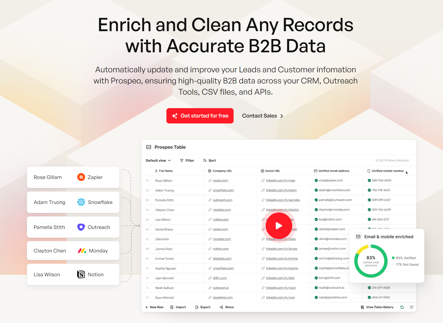
Every visualization in this guide - velocity, coverage ratio, weighted pipeline - breaks down when contact data decays. Prospeo enriches your CRM with 50+ data points per contact at a 92% match rate, so your funnel charts and heatmaps show real deals, not ghost opportunities.
Stop visualizing stale data. Enrich your CRM for $0.01 per email.
Getting Started Without a CRM
You don't need Salesforce to visualize your pipeline. A Google Sheets template works fine for small teams - the key is including the right fields: deal stages, win probability percentage, expected close date, rep owner, deal size, and next steps. Those six columns give you everything you need to calculate coverage, velocity, and conversion rates manually.
Tools like Coefficient or Coupler.io can connect your spreadsheet to data sources and automate some of the refresh work. The Indzara template is worth a look - it includes a dashboard showing pipeline value, average conversion rate, average time to close, and which stage loses the most deals.
Here's our hot take: if your average deal is under $10K and you have fewer than 50 active opportunities, a well-maintained spreadsheet will outperform a $300/user/mo CRM that nobody bothers to update. The best visualization tool is the one your team actually uses. Above 50 deals or 3+ reps, graduate to a CRM - the manual upkeep becomes a full-time job and errors compound fast.
FAQ
What's the best chart type for pipeline visualization?
Kanban boards for daily deal tracking, funnel charts for stage drop-off analysis, and heatmaps for aging patterns and win-rate anomalies. No single chart covers everything - match the visualization to the stakeholder using the decision framework table above.
What's a good pipeline coverage ratio?
Enterprise teams need 3-5x weighted coverage, mid-market B2B needs 2.5-4x, and high-velocity SMB can operate at 2-3x. Always use weighted coverage adjusted by stage probability - unweighted ratios hide risk behind inflated totals.
How do I calculate sales velocity?
Use the formula: (number of opportunities x average deal value x win rate) / average sales cycle length. B2B SaaS benchmarks land around $743-$2,456/day. Track monthly to identify which of the four inputs is dragging performance down.
Can I build a pipeline dashboard without a CRM?
Yes. A Google Sheets template with deal stages, win probability, expected close date, and deal size works for teams with fewer than 50 active deals. Tools like Coefficient automate data refresh. Graduate to a CRM when manual upkeep costs more time than it saves.
How do I keep pipeline data accurate over time?
Purge aged-out deals quarterly, verify contact emails with a tool like Prospeo's enrichment API (98% accuracy, 7-day refresh cycle), and require second-meeting validation before logging opportunities. Bad data in means misleading dashboards out.