How to Build an ABM Dashboard That Actually Tracks Pipeline
You've got 14 widgets, three color-coded charts, and a weekly email digest nobody opens. Your CMO calls it "the ABM dashboard." Your sales team calls it wallpaper.
That gap is where most ABM programs quietly die - 42% of organizations still can't measure ABM effectiveness at all. With 29% of marketing budgets flowing into ABM and the market projected to hit $3.81B by 2030, that's a staggering amount of money running on vibes. Teams burn 10-20 hours per week on manual reporting that nobody acts on, and without proper dashboards, ABM degrades into LinkedIn ads and generic nurture sequences - expensive busywork disguised as strategy.
What You Need (Quick Version)
Two dashboards - one for marketing pipeline, one for sales activity. Not ten. Add an ABM Tier field on your Account object so every dashboard can filter by account priority. Track five core metrics with real benchmarks (covered below). And before any of this matters, make sure the contact data feeding your dashboards is actually current. If 20% of your emails bounce, your engagement scores are fiction.
You can build the basics in HubSpot or Salesforce in a day. If your data's stale, fix that first.
What an ABM Dashboard Is (And Isn't)
An account-based marketing dashboard isn't a demand gen report with an account filter slapped on top. The core distinction is aggregation level: a standard marketing dashboard tracks leads - MQLs, form fills, campaign clicks. An ABM dashboard aggregates everything at the account level, connecting multiple contacts within a buying group to a single account's progression through your pipeline.
A dashboard is real-time monitoring. A report is historical analysis. Your dashboard should tell you right now which target accounts are heating up, which are stalled, and where your buying committee coverage has gaps. If it only tells you what happened last quarter, that's a report - and it's too late to act on.
One challenge most teams discover too late: enterprise accounts with multiple domains, subsidiaries, and office locations break engagement tracking entirely. If Acme Corp has three divisions using different email domains, your CRM treats them as three separate accounts. Map parent-child account hierarchies before you build dashboards, or your engagement data will be fragmented from day one.
Essential Metrics & Benchmarks
Most ABM reporting dashboards track too many things and benchmark none of them. Here's what actually matters.
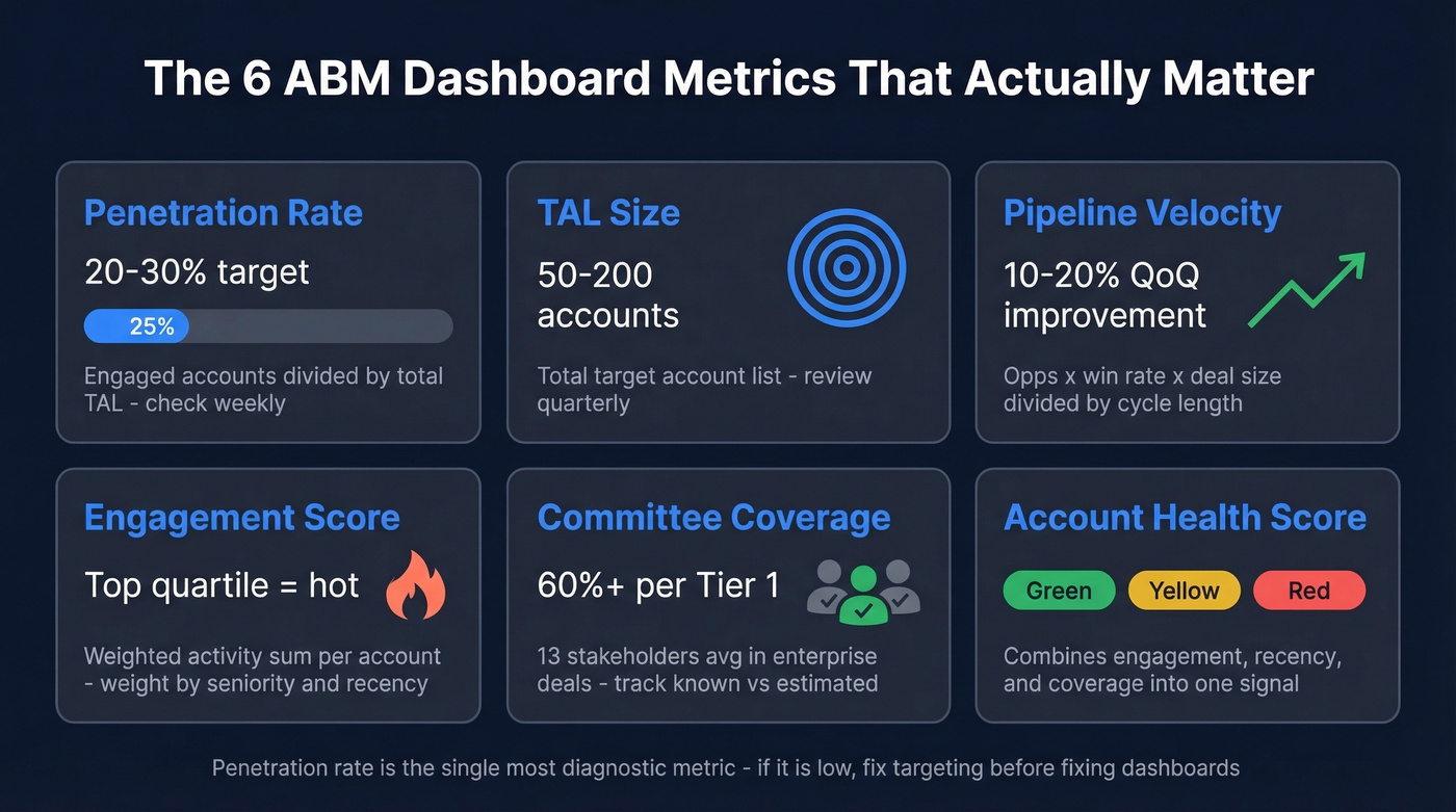
| Metric | How to Calculate | Cadence | Target |
|---|---|---|---|
| Penetration Rate | Engaged accounts / TAL | Weekly | 20-30% |
| TAL Size | Total target accounts | Quarterly | 50-200 |
| Pipeline Velocity | Opps x win% x deal size / cycle | Monthly | 10-20% QoQ improvement |
| Engagement Score | Weighted activity sum per account | Weekly | Top quartile = "hot" |
| Committee Coverage | Known contacts / est. committee | Weekly | 60%+ per Tier 1 |
| Account Health Score | Engagement + recency + coverage | Weekly | Green / yellow / red |
Penetration rate is the single most diagnostic metric in ABM. If you're running a 150-account TAL and only 25 show any engagement, you've got a targeting or messaging problem - not a dashboard problem. (If you're still defining your TAL, start with an Ideal customer profile and scoring rubric.)
Buying committee coverage is where most teams fall short. The average enterprise purchase involves 13 internal stakeholders plus 9 external advisors. If your dashboard shows one contact per account, you're single-threaded, and that's a pipeline risk, not a win. We've seen teams celebrate "engaging" 80 accounts when they'd actually reached one person at each - that's outbound with a fancy label.
Engagement scoring needs to be weighted, not just additive. A webinar attendance from the VP of Engineering is worth more than a blog visit from an intern. Build your scoring model around title seniority, content depth, and recency, then review the weights quarterly. (If you need a framework, use a lead scoring model as your starting point and adapt it to accounts.)
Two Dashboards, Not Ten
One vendor guide recommends building 10 separate dashboards. That's aspirational to the point of being counterproductive. Start with two.
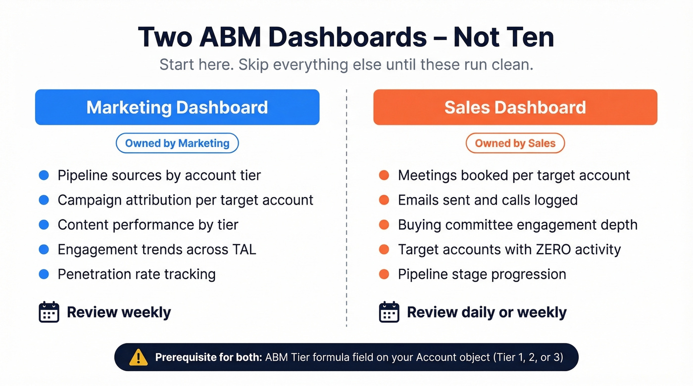
Marketing Dashboard: Track pipeline sources, campaign attribution, content performance by account tier, and engagement trends across your TAL. Marketing owns this. Review it weekly.
Sales Dashboard: Track activities within target accounts - meetings booked, emails sent, calls logged, buying committee engagement, and target accounts with zero activity. That last one matters most. Sales owns this. Review it daily or weekly. (If you want a clean taxonomy, standardize your sales activities first.)
Skip everything else until these two are running clean and reviewed on a cadence.
The prerequisite for both: an ABM Tier formula field on your Account object. This field evaluates firmographic and engagement criteria to assign each account a tier (1, 2, or 3) and becomes the primary filter on every dashboard. Without it, you're treating a Fortune 500 strategic account the same as a mid-market exploratory target. That kills prioritization.
Your ABM dashboard tracks buying committee coverage - but if 20% of your contact data is stale, your engagement scores are fiction. Prospeo's 300M+ profiles refresh every 7 days, not every 6 weeks. Fill coverage gaps across all 13+ stakeholders with 98% verified emails at $0.01 each.
Stop building dashboards on dead data. Fix the foundation first.
How to Build Your ABM Dashboard
In HubSpot
HubSpot's ABM features are available with Marketing Hub Professional/Enterprise and Sales Hub Professional/Enterprise. Start by enabling ABM properties - these add fields like Target account, Ideal customer profile tier, and Buying role to your contact and company records.
Here's the thing most teams miss, and it's the #1 source of confusion on r/hubspot: you can run an ABM engagement funnel alongside your existing lifecycle stages. They aren't mutually exclusive. Your ABM funnel tracks account-level engagement progression from aware through engaged to opportunity. Lifecycle stages track individual contact status from subscriber through MQL to SQL. Build separate dashboards for each, and use the ABM engagement funnel to trigger lifecycle stage changes via workflows.
HubSpot ships native ABM dashboard templates - start there and customize. Don't build from scratch on day one.
In Salesforce
Salesforce's ABM dashboard workflows are often built in B2B Marketing Analytics (B2BMA). Create a blank dashboard rather than using a template - you'll learn the component model faster. Drag chart widgets, select your dataset, build lenses with filters and groupings, and pick your visualization. Add your ABM Tier formula field as a global filter so every chart respects account priority. If you're on Einstein, enable Einstein Key Account Identification to surface accounts that match your best-customer profile automatically.
DIY with BI Tools
When your CRM's native dashboards feel limiting, Looker, Tableau, or Power BI give you maximum flexibility. Export CRM data via API or scheduled sync, model your account-level metrics in the BI layer, and build custom views that combine marketing, sales, and product usage data. Smartsheet offers free ABM reporting templates with built-in funnel progression and TAL pipeline views if you want a lightweight starting point before committing to a full BI build.
The tradeoff is setup cost - expect 2-4 weeks of data engineering versus a day in HubSpot. But for teams that need custom attribution models or cross-platform data blending, a BI tool is the right call.
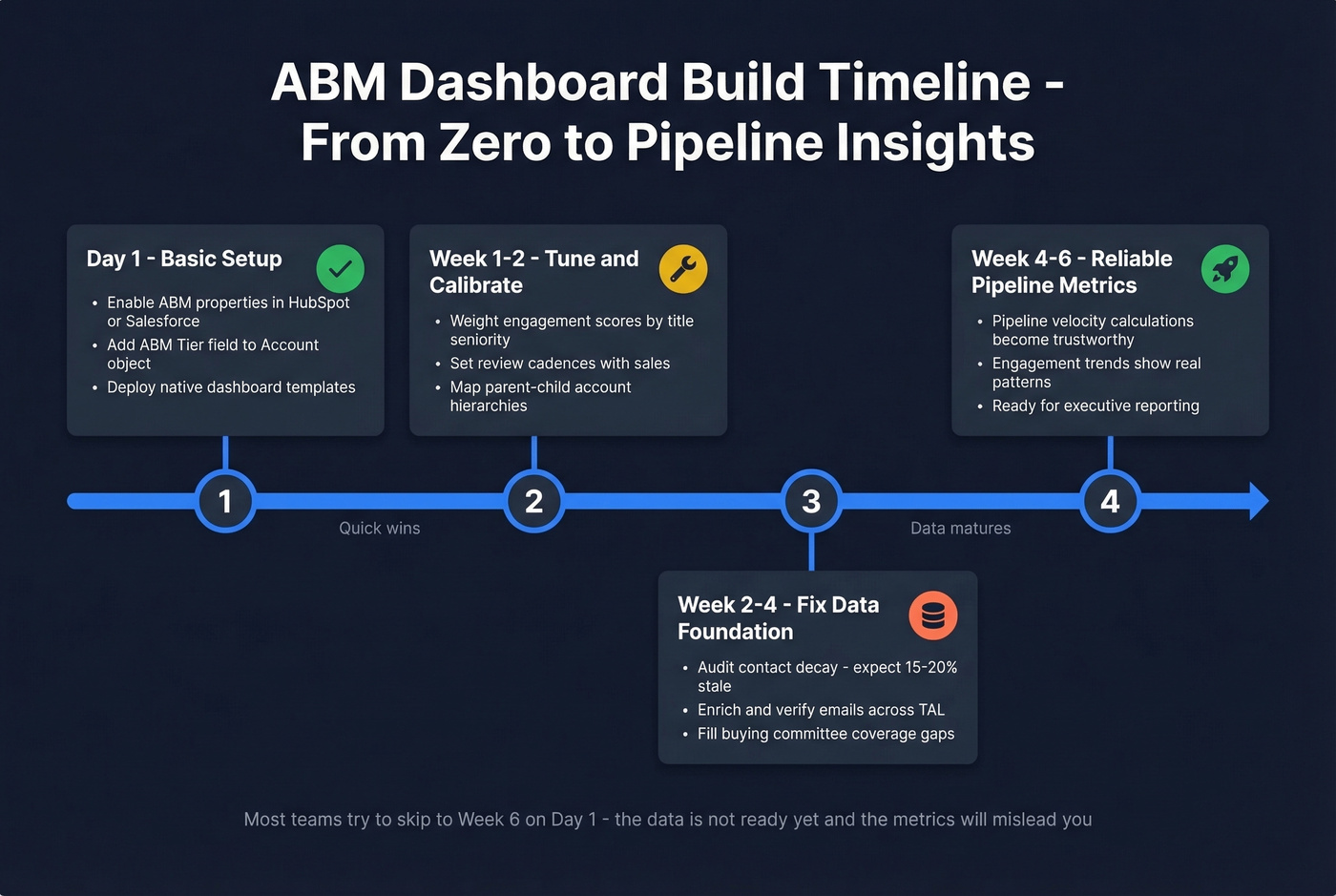
Timeline reality check: 1 day for basic HubSpot or Salesforce setup. 1-2 weeks to tune scoring weights and review cadences. 4-6 weeks before your data is mature enough for reliable pipeline velocity calculations. (If you want to pressure-test your pipeline math, compare against sales pipeline benchmarks and a pipeline health checklist.)
Fix Your Data Before You Build
Look, most ABM programs don't have a dashboard problem. They have a data problem. No amount of chart customization fixes rotten inputs.
B2B contact data decays at 15-20% annually. People change jobs, get promoted, switch emails. If you built your TAL six months ago and haven't refreshed it, a fifth of your contacts are ghosts. Your dashboard shows 47 "engaged" accounts - sales calls into them and finds disconnected numbers and bounced emails. That's not an ABM failure. That's a data hygiene failure wearing an ABM costume.
Engagement scores built on bounced emails are fiction. Pipeline velocity calculated from stale contacts is misleading. Every metric downstream of bad data is wrong. (If you're seeing bounces, start with email bounce rate benchmarks and fixes, then work backward into your data sources.)
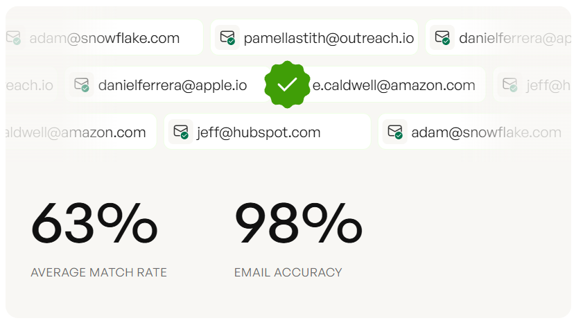
This is where data quality becomes the actual prerequisite. Prospeo's CRM and CSV enrichment returns 50+ data points per contact with an 83% match rate, running on a 7-day refresh cycle compared to the industry average of six weeks. With 98% verified email accuracy across 300M+ professional profiles, the contacts feeding your ABM dashboard are current and reachable - and at roughly $0.01 per email, it's the cheapest insurance policy your ABM program can buy. (If you're evaluating vendors, see our roundup of data enrichment services.)
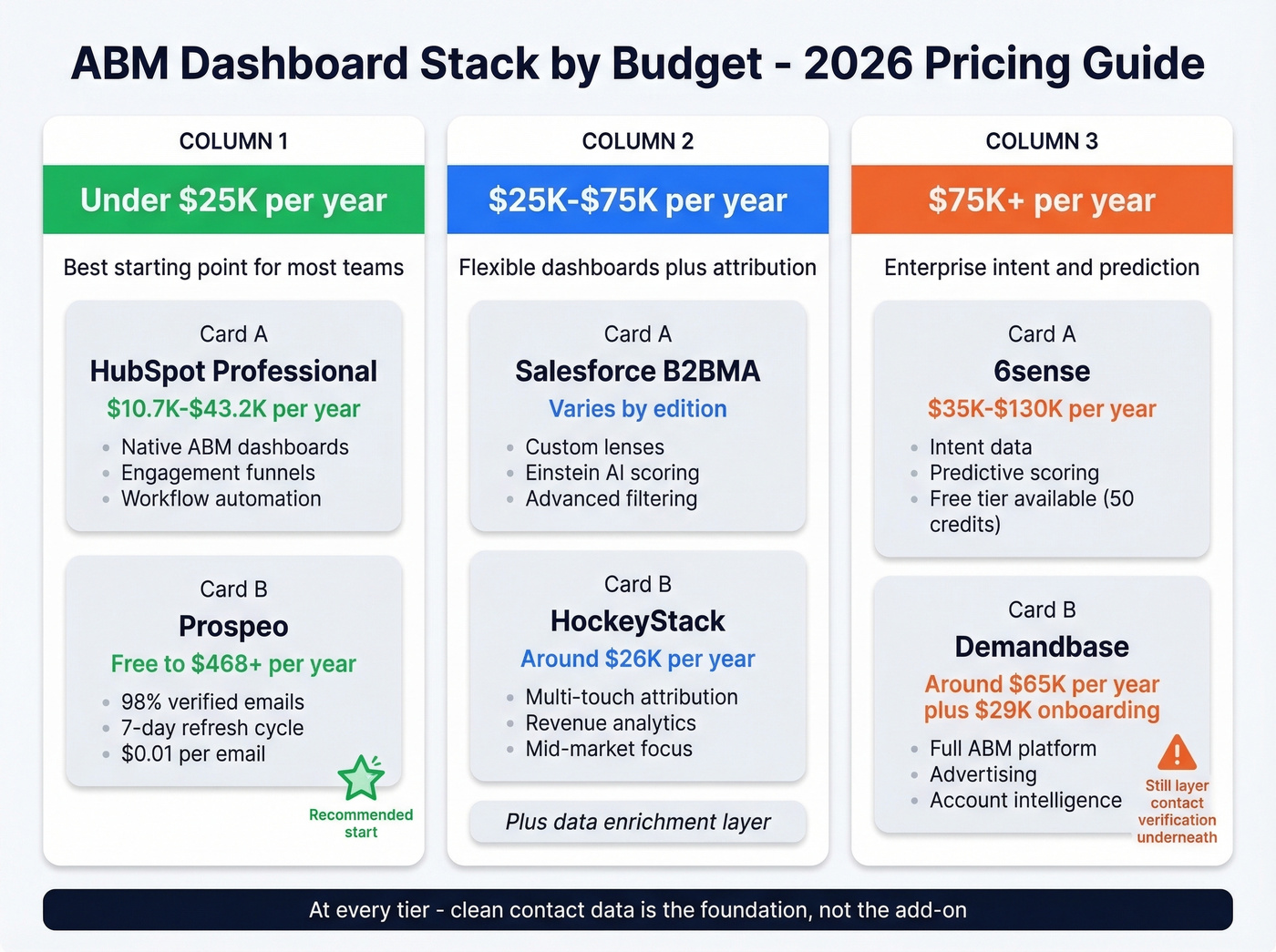
Tools & Pricing for 2026
The tool you need depends on your budget and existing stack. Here's the realistic pricing landscape.
| Tool | Cost | What You Get | Best For |
|---|---|---|---|
| HubSpot Marketing Hub | $10.7K-$43.2K/yr | Native ABM, dashboards | SMB / mid-market |
| Salesforce B2BMA | Varies by edition | Lenses, Einstein AI | Salesforce shops |
| Prospeo | Free-$468+/yr | Data quality, enrichment | Contact accuracy layer |
| 6sense | ~$55K median/yr | Intent, predictive, ads | Enterprise ABM |
| Demandbase | ~$65K median/yr | ABM platform, ads, data | Enterprise ABM |
| HockeyStack | ~$26K/yr | Attribution, analytics | Mid-market analytics |
6sense offers a free tier with 50 credits/month, but real deployments run $35K-$130K/year depending on modules. Demandbase is similar - expect a ~$29K onboarding fee on top of the platform cost. Both are enterprise commitments.
Under $25K/year: HubSpot Professional paired with Prospeo for data quality. You get native ABM dashboards and verified contacts without six-figure platform fees. In our experience, this is the best starting point for most teams.
$25K-$75K/year: Salesforce plus HockeyStack for attribution, with a data enrichment layer underneath. This gives you flexible dashboards, multi-touch attribution, and clean data feeding both. (If forecasting is a priority, add sales forecasting solutions to your evaluation list.)
$75K+/year: 6sense or Demandbase for intent and predictive scoring, paired with a BI tool for custom reporting. Even at this tier, layer contact verification underneath - enterprise platforms still ship stale emails.
Five Mistakes That Kill Pipeline
1. Tracking vanity metrics. If your dashboard shows impressions, clicks, and form fills but not pipeline created, you've built a busy marketing dashboard, not a pipeline dashboard. Make pipeline and revenue the top-level metrics. Everything else is a supporting indicator. (If you're unsure what to keep, use a funnel metrics list as a sanity check.)
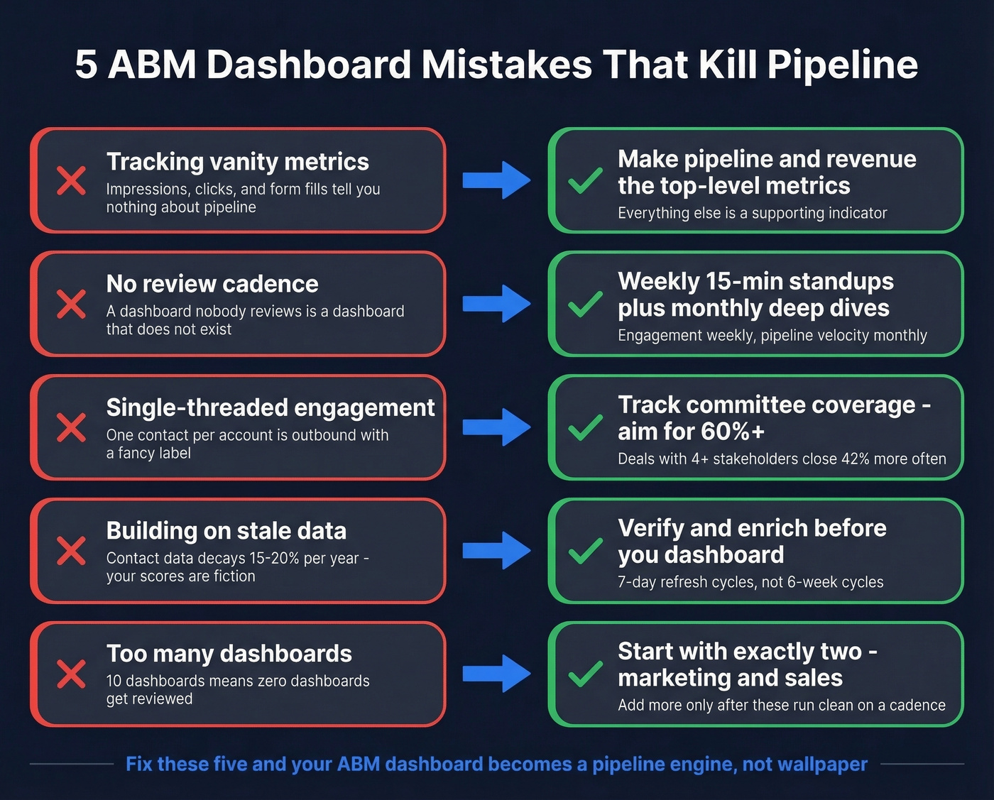
2. No review cadence. A dashboard nobody reviews is a dashboard that doesn't exist. Weekly 15-minute standups for engagement dashboards, monthly deep dives for pipeline velocity.
3. Single-threaded engagement. Deals with 4+ engaged stakeholders close at 42% higher rates. Track buying committee coverage per account and flag single-threaded accounts immediately - this is the metric that separates real ABM from expensive email blasts.
4. Dirty data. We've watched teams spend weeks perfecting dashboard layouts while 20% of their contact records were outdated. Every downstream metric was wrong, and they didn't realize it until sales started complaining about bounced emails and dead phone numbers. Fix the inputs before you polish the outputs.
5. No tiering. If you treat all 200 accounts equally, your best opportunities get the same attention as long shots. Implement ABM Tier scoring, filter every dashboard by tier, and allocate resources accordingly.
These last two go hand in hand - they're foundation failures that compound each other.
Let's be honest: 50% of ABM programs fail on their first attempt. But 75% succeed after regrouping, per Salesforce Trailhead citing BCG research. Your ABM dashboard is the diagnostic tool that tells you what to fix. Build it right, review it consistently, and iterate.
You just built ABM Tier fields and engagement scoring - now you need contacts to score. Prospeo's 30+ search filters match your ICP criteria exactly: technographics, headcount growth, funding, buyer intent across 15,000 topics. Enrich your CRM with 50+ data points per contact at a 92% match rate.
Multi-thread every Tier 1 account before your next dashboard review.
FAQ
What's the difference between an ABM dashboard and a marketing dashboard?
An ABM dashboard aggregates data at the account level - engagement scores, buying committee coverage, pipeline progression - across multiple contacts within each target account. A standard marketing dashboard tracks lead-level metrics like MQLs, form fills, and campaign clicks without connecting them to specific accounts or buying groups.
How often should I review my ABM dashboard?
Weekly for engagement and activity dashboards - that's where you catch stalled accounts before deals die. Monthly for pipeline velocity and campaign ROI. Quarterly for strategic reviews: TAL adjustments, tier reassignment, and budget reallocation based on penetration rates and revenue impact.
What's the minimum tech stack needed?
A CRM like HubSpot or Salesforce, a verified contact database for data quality, and a shared ABM Tier field on your Account object. You don't need 6sense or Demandbase to start - those add intent data and predictive scoring once your foundation is solid.