Good Email Signatures: Design, Deliverability, and Dark Mode in 2026
A sysadmin posted on r/sysadmin that Microsoft support flagged their entire org's outbound email. The culprit wasn't malware or a compromised account - it was the company email signature. Eight images, a broken link, and a pile of formatting junk that made every message look like spam to Microsoft 365's filters. Legitimate business emails stopped reaching clients because someone in marketing thought the signature needed a banner, a headshot, three social icons, a logo, an animated GIF, and a legal disclaimer the size of a paragraph.
That story isn't unusual. It's the logical outcome of treating your email signature like a billboard instead of a business card. With 61.9% of emails now read on mobile, a cluttered signature doesn't just look bad - it breaks. Collapsed layouts, unreadable text, images that refuse to load. Good email signatures in 2026 are boring on purpose. Here's how to build one that works everywhere without tanking your deliverability.
The Quick Version
Five essential fields, every signature:
- Full name
- Job title
- Company name
- Phone number
- Website URL
If your signature has more than three images, simplify it. Keep each image under 50KB, total links under five.
For most individuals, HubSpot's Email Signature Generator is a great free option. Teams should look at WiseStamp.
The contrarian thesis: The best email signatures are boring. No animated GIFs, no inspirational quotes, no rainbow gradients. Clean, scannable, and invisible enough that the recipient focuses on your actual message.
What to Include (And What to Leave Out)
The temptation is to cram everything into your signature - every social profile, every certification, every award. Resist it. Every element you add increases rendering risk, file size, and visual noise.
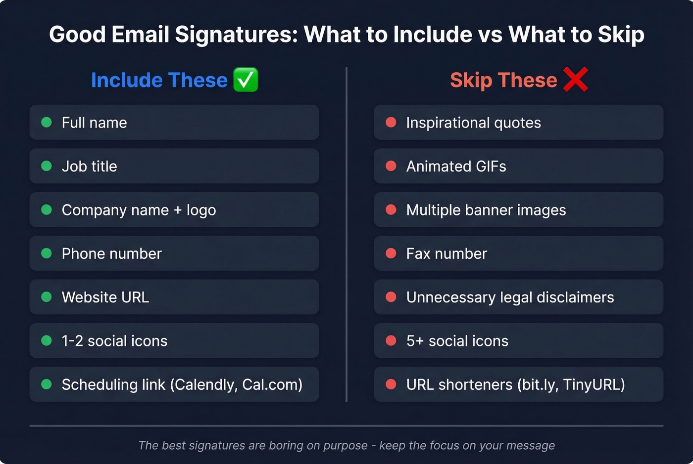
| Include | Skip |
|---|---|
| Full name | Inspirational quotes |
| Job title | Animated GIFs |
| Company name + logo | Multiple banner images |
| Phone number | Fax number (it's 2026) |
| Website URL | Legal disclaimers you don't need |
| 1-2 social icons | 5+ social icons |
Beyond the essentials, a few optional fields earn their spot. Pronouns take up almost no space and signal inclusivity. A scheduling link through Calendly or Cal.com saves the back-and-forth on meeting times - genuinely useful for anyone in a client-facing role. One or two social icons are fine if they point somewhere active; a dormant profile from 2019 adds nothing.
What to actively remove: quotes - nobody reads them, and they add visual clutter. Animated GIFs, because Outlook still renders them as a static first frame. Legal disclaimers you're including "just in case." We'll cover the legal angle properly later. Spoiler: GDPR doesn't require a disclaimer.
Hierarchy matters as much as content. Name and title first, because that's what people scan for. Contact details next. Social icons and any optional elements last. This isn't a design preference - it's how people actually read signatures, top to bottom, left to right, stopping as soon as they've found what they need.
Design Rules for 2026
Keep It Minimal
The dominant design trend in 2026 is minimalism with clear hierarchy. Name and title get the most visual weight. Contact details sit below in a smaller size. Icons and banners - if you use them at all - anchor the bottom.
Stick to 2-3 colors maximum. Your brand's primary color, black or dark gray for text, and maybe one accent. Web-safe fonts are non-negotiable: Arial, Helvetica, Verdana, and Georgia render consistently across every email client. That custom brand font your designer loves? It won't render for most recipients. They'll see a fallback, and it won't be the one you'd choose.
Build your signature with HTML tables, not divs. Email clients aren't browsers, and div-based layouts break unpredictably across Outlook, Gmail, and Apple Mail. Skip bullet points in your signature HTML too - they render differently in Outlook versus Gmail, and the inconsistency looks sloppy.
Size It Right
| Spec | Recommended | Safe Maximum |
|---|---|---|
| Width | 450px | 600px |
| Image size | Under 30KB | 50KB absolute max |
| Font size | 12-14px body | 10px minimum |
| Colors | 2-3 | 4 max |
| Total links | 3-4 | 5 |
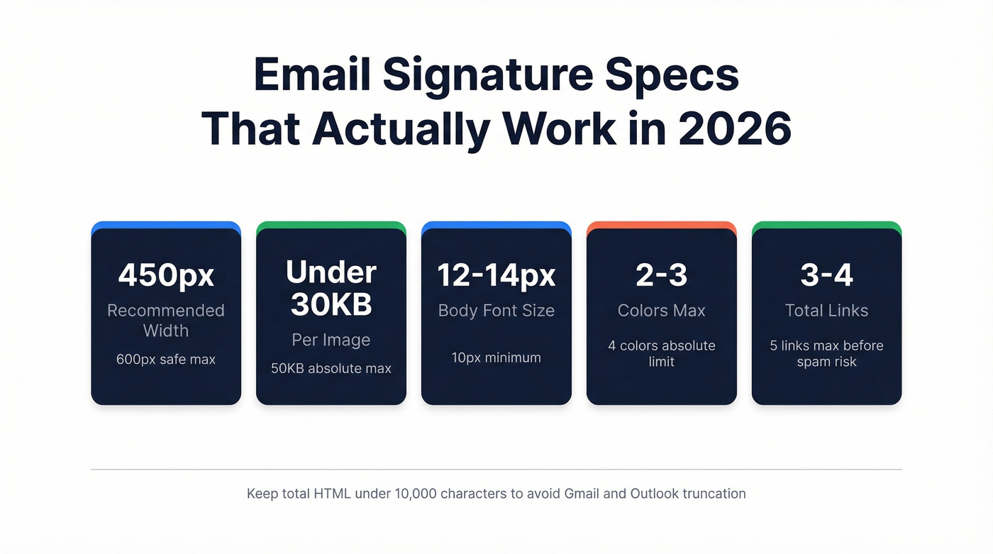
The industry standard width is around 650px, but 600px is the safer recommendation - and 450px gives you cross-client safety. Some email clients render wider signatures fine; others clip or wrap them unpredictably.
Use transparent PNGs for logos so they don't show up as ugly white boxes in dark mode. Resize your images before uploading - even if you set a small display size in HTML, some clients load the original dimensions and blow out your layout.
Mobile-First, Always
The mobile majority means your signature will be viewed on a phone more often than a desktop. Single-column layouts are the only safe choice. Multi-column designs that look great in Gmail on a 27-inch monitor collapse into unreadable stacks on an iPhone.
Tap targets matter too. If your phone number and email are crammed together with no spacing, mobile users will tap the wrong one. Give interactive elements breathing room - at least 44px of tap target height, per Apple's own guidelines.
Dark Mode Survival Guide
How Each Client Handles It
Around 35% of email opens happen in dark mode, and the real number in 2026 is almost certainly higher. The problem is that every email client handles dark mode differently, and your signature gets caught in the crossfire.
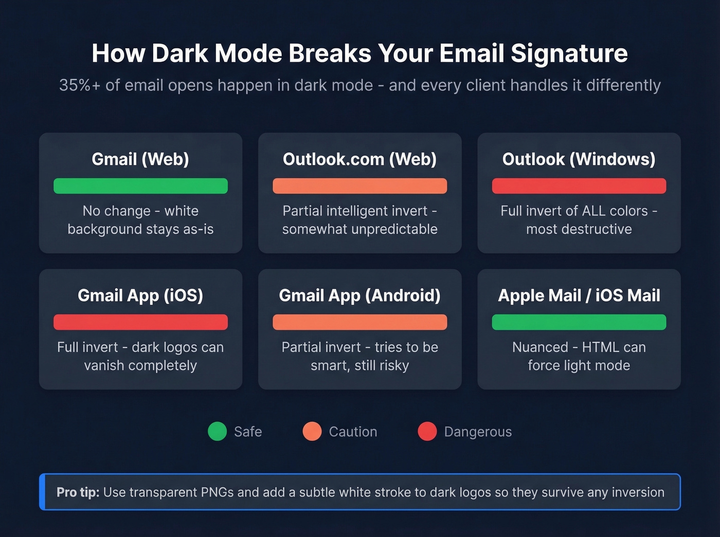
| Email Client | Dark Mode Behavior |
|---|---|
| Gmail (web) | No change - white background stays |
| Outlook.com (web) | Partial intelligent invert |
| Outlook (Windows) | Full invert of all colors |
| Gmail app (iOS) | Full invert |
| Gmail app (Android) | Partial invert |
| Apple Mail / iOS Mail | Nuanced - HTML can force light |
Full invert is the most destructive. It flips all your colors, which means a dark logo on a transparent background can vanish entirely against a now-dark background. Partial invert is smarter - it tries to adjust only what needs adjusting - but it's still unpredictable.
How to Protect Your Signature
Start with transparent PNGs for every image. A logo saved with a white background will show up as a white box floating in a dark email - it looks broken, not professional. If your logo uses dark colors, add a subtle white stroke or outer glow so it stays visible when the background goes dark.
Avoid relying on background colors in your signature HTML. Clients handle them inconsistently, and what looks like a clean colored bar on Gmail desktop becomes an awkward floating rectangle on Outlook Windows. Test your signature across clients using tools like Litmus or Email on Acid - a single multi-client screenshot test catches problems you'd never spot otherwise.
Here's the thing most people miss: CSS <style> tags that target dark mode with @media (prefers-color-scheme: dark) usually get stripped when you copy-paste a signature into your email client's settings. So the dark-mode-specific CSS your generator adds probably doesn't survive installation. Design defensively instead - transparent backgrounds, high-contrast text, and logos that work on both light and dark surfaces.
How Signatures Kill Deliverability
The Thresholds That Matter
Your email signature is part of your email's HTML. Spam filters don't evaluate it separately - they see one message, and if the signature pushes it over certain thresholds, the whole thing gets flagged.
If you're troubleshooting inbox placement issues beyond signatures, it helps to understand the bigger picture of email deliverability and how sender reputation gets built (or damaged).
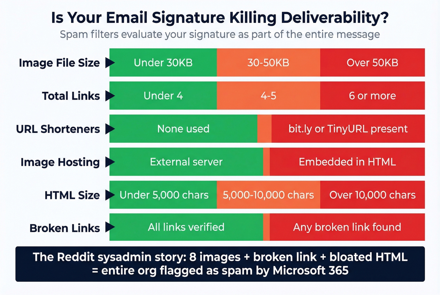
Keep images under 50KB each, ideally under 30KB. Emails with six or more links are significantly more likely to trigger spam filters, so count every link in your signature - website, social icons, scheduling link, banner - and stay under five total. Never use URL shorteners like bit.ly or TinyURL. Spam filters associate shortened URLs with phishing, and a bit.ly link in your signature is an easy way to land in junk.
Host your images externally on a reliable server rather than embedding them in the HTML. Embedded images increase message size and can appear as attachments in some clients, which looks suspicious to both spam filters and recipients.
Watch your total HTML size too. Many generators aim to keep signatures under ~10,000 characters to avoid truncation in Gmail and Outlook. Bloated generator output can exceed this silently, and the client just truncates whatever doesn't fit.
The Sysadmin Story, Expanded
That Reddit sysadmin's org had eight images, a broken link, and enough HTML junk to trigger Microsoft's spam detection across their entire tenant. The consequence wasn't just annoying - legitimate business emails stopped reaching clients. Microsoft support explicitly pointed to the signature as the cause.
The fix was simple: strip the signature down to text, a small logo, and two links. A proper email signature isn't decoration - it's code that gets evaluated by every spam filter between you and your recipient.
You're optimizing your signature so emails look professional. But 35% bounce rates destroy your sender reputation faster than any cluttered signature ever could. Prospeo's 5-step email verification delivers 98% accuracy - so your polished signature actually reaches the inbox.
Fix what matters most: make sure your emails actually arrive.
Eight Mistakes That Hurt Credibility
1. Creating your signature in Microsoft Word. Word injects hidden formatting - proprietary styles, invisible line breaks - that breaks rendering in email clients. Your signature looks perfect in Word and completely mangled in Gmail.
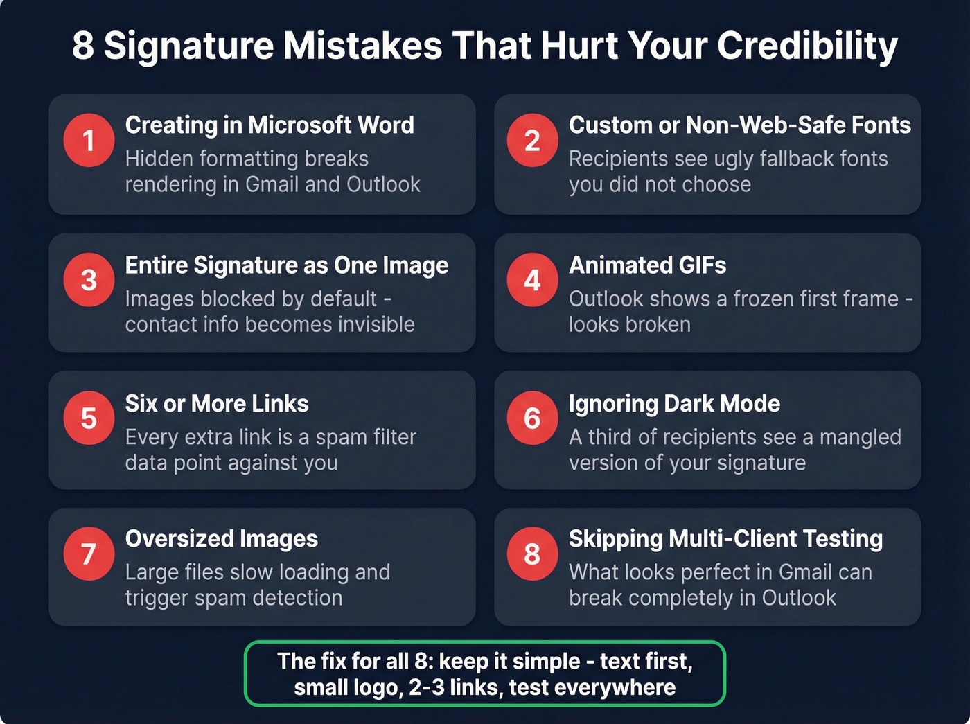
2. Using custom or non-web-safe fonts. Your recipient's email client doesn't have your brand font installed. It'll substitute whatever it wants, and the result is never what you intended. Stick to Arial, Helvetica, Verdana, or Georgia.
3. Making the entire signature an image. It seems easier - just export a designed graphic, right? But images don't auto-download in many clients, contact info can't be copied, screen readers can't parse it, and linking is limited. It's an accessibility and usability disaster.
4. Using animated GIFs. Outlook still doesn't support animated GIFs reliably. It renders the first frame as a static image. Your clever animation becomes a frozen, often confusing snapshot for a huge chunk of business email users.
5. Stuffing in six or more links. Every link is a spam-filter data point. Social icons, website, scheduling link, banner link, email link, phone link - they add up fast. Audit your link count and cut ruthlessly. If you're doing outbound, pair this with a basic email spam checker workflow.
6. Ignoring dark mode. A third of your recipients are reading in dark mode. If you haven't tested your signature against a dark background, there's a real chance your logo is invisible or your text is unreadable for those people.
7. Skipping mobile testing. Most emails are read on phones. Send yourself a test email and open it on your phone before deploying. If anything wraps, overlaps, or requires pinch-zooming, fix it.
8. Using one signature for everything. Your first email to someone needs the full treatment - logo, contact details, a banner. Your fifth reply in the same thread does not. Use two signatures.
The Two-Signature Strategy
Most email clients let you create multiple signatures and assign them to new messages vs. replies. Use this. In our experience, the two-signature strategy is the single highest-impact change most teams can make for thread readability and deliverability.
First email signature: Full name, title, company, phone, website, logo, and optionally a CTA banner. This is your introduction - make it complete and professional. Research from Stanford found that mobile-style signatures ("Sent from my iPhone") actually increase forgiveness for typos and brevity, so your compact reply signature gets a psychological pass that your full signature doesn't.
Reply signature: Name, title, phone. That's it. No logo, no banner, no social icons. Reply threads stack signatures on top of each other, and by the fourth exchange, your recipient is scrolling past a wall of repeated logos and banners to find the actual message. It looks cluttered, increases message size, and degrades deliverability on long threads.
The rationale is practical, not aesthetic. Every image in a reply thread gets loaded or blocked again. Every link gets counted again. A 10-reply thread with a full signature on each message can easily push past spam-filter thresholds that a single email never would.
Legal and Compliance
EU Business Email Requirements
If you're operating a business in the EU, your email signature often needs to include specific company information. This aligns with eCommerce Directive-style requirements that many member states enforce:
- Full legal entity name
- Company registration number
- Registered business address
- VAT ID (if applicable)
- Sender name and job title
- Direct contact information
- Link to privacy policy
The UK has similar company-identification rules for business emails.
The GDPR Disclaimer Myth
Let's be honest: GDPR doesn't require email disclaimers. This is one of the most persistent myths in business email. LegalVision's analysis is clear - not including a disclaimer isn't a GDPR violation. Those long "this email is confidential and intended only for the recipient" blocks are legally toothless in most cases and take up valuable signature real estate.
Disclaimers can support your data protection practices, but they aren't mandated. If your legal team insists, keep it to one line.
One distinction worth knowing: informational banners in your signature - promoting a blog post, an upcoming event, a webinar - are generally fine. Direct marketing banners with "buy now" messaging, discount codes, or product promotions are a different story. Under ePrivacy rules, those require prior consent from the recipient. If your signature banner looks like an ad, treat it like one.
Industry-Specific Needs
Healthcare organizations dealing with patient information need HIPAA-related notices. Financial services firms often include regulatory disclosures. Law firms typically add confidentiality notices that carry legal weight in their jurisdiction. These are legitimate use cases - but they're industry-specific, not universal. Don't add a confidentiality notice just because you saw one on a lawyer's email.
Signatures by Role
Sales and Business Development
Sales signatures need to drive action. A direct dial number, a scheduling link, and a clean CTA banner promoting your latest case study or webinar. Keep social icons to one - your professional profile.
Hot take: If your average deal size is under $15K, your email signature matters more than your website. Prospects in that range rarely visit your site before replying. Your signature is the brand impression.
But here's what most sales teams miss: your signature only matters if the email actually lands in someone's inbox. We've seen teams obsess over banner design and scheduling link placement while sending to unverified lists that bounce 20-30%. One team we worked with cut bounce rates from 35% to under 4% after running their prospect list through Prospeo's email verification before any outbound campaign. The free tier gives you 75 verified emails per month - enough to test before committing. If you're building a repeatable outbound motion, it also helps to standardize your B2B cold email sequence and keep a few proven cold email follow-up templates on hand.
Great signatures build trust on first impression. Bad data burns it. Teams using Prospeo cut bounce rates from 35%+ to under 4% - meaning every carefully designed signature you send gets seen by real people, not returned by mail servers.
Your signature deserves an audience. Verified emails guarantee one.
Marketing and Creative
Marketing signatures are your brand's last touchpoint in every email. Consistency matters more than creativity here - use the same colors, fonts, and logo treatment as your other brand assets. A portfolio link or recent campaign link earns its spot. Awards and certifications can work as small visual elements, but don't overload.
Legal and Finance
Minimal design, maximum compliance. Include required company registration details, any industry-mandated confidentiality notices, and direct contact information. Skip the banners and social icons - they add risk without adding value in these contexts.
Freelancers and Consultants
Your signature is your brand. A professional headshot can increase trust - keep it under 50KB, hosted externally. A booking link is essential since you don't have an assistant scheduling meetings for you. If you have recognizable client logos or a strong testimonial snippet, a small "trusted by" line can work. Just don't turn your signature into a portfolio page.
Best Free Signature Generators
The email signature software market hit $1B in 2022 and is growing at nearly 12% annually - which means more tools, more templates, and more bloated HTML to watch out for. We've tested every generator on this list. Here's what actually works.
| Tool | Best For | Free Tier | Key Limitation |
|---|---|---|---|
| HubSpot Generator | Quick individual setup | Fully free | Limited templates |
| WiseStamp | Team management | Free basic | Advanced features paid |
| Canva | Design-first users | Free templates | Image-heavy output |
| Newoldstamp | Team branding | Free basic | Analytics require paid |
| htmlsig | Custom HTML control | Free basic | No visual editor |
| mail-signatures.com | Template variety | 100+ free templates | Limited customization |
One critical warning about generators: some produce bloated HTML that gets truncated in clients like Gmail and Outlook. Always check your output's character count before deploying. If it's over 8,000 characters, simplify. Also, if your generator changes its image hosting infrastructure, your signature images can break overnight. Regenerate and re-paste your signature at least once a year.
If you're sending signatures as part of outbound campaigns, keep an eye on email bounce rate and your email velocity so you don't compound deliverability issues.
HubSpot Email Signature Generator
The best free option for most people. No account required - you fill in your details, pick a template, and get clean HTML you can paste directly into your email client. The template selection is limited compared to paid tools, but the output is remarkably clean and renders reliably across clients. That reliability matters more than having 50 template options.
WiseStamp
The go-to for teams that need centralized signature management. The free tier works for individuals, but the real value is in paid plans that let you deploy consistent signatures across an entire organization. For teams managing 20+ people who all need to stay on-brand, WiseStamp is where to start. Paid plans run around $2-5/user/month depending on team size and features.
Canva
Beautiful templates, but proceed with caution. Canva's strength is design, and their signature templates look great - in Canva. The exported output tends to be image-heavy, which hurts deliverability and dark mode compatibility. Use Canva for design inspiration, then rebuild the layout in a code-based generator like HubSpot or htmlsig. If you're already paying for Canva Pro at around $13/month, you get access to more templates, but the core rendering problem remains.
Skip Canva if deliverability is your top concern.
Other Generators
Newoldstamp offers solid team branding features but gates analytics behind paid plans at around $6-8/user/month. htmlsig is good if you're comfortable editing HTML directly - no visual editor, but full control over the output. mail-signatures.com has 100+ free templates for quick setup. MySigMail is another lightweight option worth a look.
How to Add Your Signature
Gmail: Settings > See all settings > General > scroll to Signature > click "Create new" > paste your HTML > Save Changes. Gmail's editor can strip some formatting on paste, so preview by sending yourself a test email.
Outlook (Desktop): File > Options > Mail > Signatures > New > name it > paste your HTML > set as default for new messages and/or replies > OK. Outlook's editor is finicky with pasted formatting - if it breaks, try pasting without formatting first, then re-add links and images manually.
Apple Mail: Mail > Settings > Signatures > select your account > click "+" > paste your signature. Uncheck "Always match my default message font" or Apple Mail will override your formatting.
FAQ
How long should a signature be?
Three to four lines of text plus one image maximum. Keep total HTML under ~10,000 characters to avoid truncation in Gmail and Outlook. Use a full signature for first emails and a compact two-line version for replies.
Should I include my photo?
A small, professional headshot can increase trust, particularly in sales and consulting. Keep the image under 50KB, use a hosted URL rather than embedding, and test it against a dark background before deploying.
Do I need a legal disclaimer?
GDPR doesn't require email disclaimers. EU businesses often need registered company details per eCommerce Directive-style requirements, but the boilerplate confidentiality paragraph is legally toothless. Check industry-specific rules for healthcare, finance, and legal.
What makes a professional email signature?
A professional signature includes your full name, job title, company name, phone number, and website URL - nothing more unless a specific element earns its place. It uses a single-column HTML table layout, web-safe fonts, and no more than two small images. If it renders cleanly across Gmail, Outlook, and Apple Mail in both light and dark mode, you've nailed it.
Why does my signature look broken in Outlook?
Outlook uses Word's rendering engine instead of a browser engine, so it ignores many CSS properties, animated GIFs, and div-based layouts. Build with HTML tables, web-safe fonts, and inline styles - then test in Outlook specifically before deploying to your team.