The Only Sales Activity Report Template You Need in 2026
It's Friday at 4:47 PM. Your VP pings you: "Can I get a sales activity report by Monday?" You dig through old files, ask around Slack, and every template you find tracks revenue instead of activity. None of them have benchmarks. None of them scale past three reps.
Here's what you actually need - one template, the right metrics, and a filled-in example you can customize in 10 minutes.
Quick version:
- Track 5-7 metrics max - calls with outcomes, emails plus bounce rate, meetings booked, pipeline generated, and goal attainment %.
- Use a flat-log layout with one row per activity so it scales and supports pivot tables.
- Grab the template structure below, fill in the example data, and customize for your team.
What a Sales Activity Report Actually Is
A sales activity report tracks the process inputs your reps control - calls made, emails sent, meetings booked, follow-ups completed - within a specific time frame. It's a visibility tool, not a revenue scorecard.
The distinction matters. Activity reports measure what reps do. Performance reports measure what happens - revenue, win rate, deal size. Many templates floating around online are actually revenue reports mislabeled as "activity reports." They track sales dollars and costs, not the daily behaviors that drive pipeline. If your template has a "Revenue" column but no "Conversations" column, you've got the wrong report.
The 5-7 Metrics That Matter
We've watched teams track 15+ metrics and learn nothing useful from any of them. The sweet spot is five to seven, organized into categories that tell a story from effort to outcome.
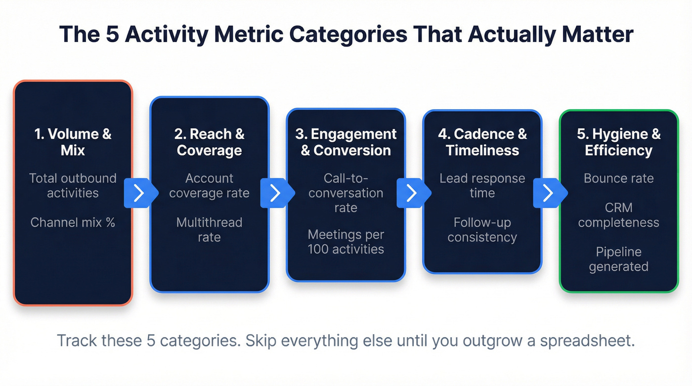
1. Volume & Mix - Total outbound activities across calls, emails, and social touches, plus channel mix percentage. If a rep logs 320 activities and 56% are calls, you know where their time goes. Formula: channel activities / total activities x 100.
2. Reach & Coverage - Target-account coverage (touched accounts / total target accounts) and multithread rate. A rep hitting 76% account coverage with a ~52% multithread rate - meaning accounts with 2+ stakeholders engaged - is working smart. Some teams also track capacity work rate, the number of unique prospects touched in a rolling 30-day window, which is a cleaner signal than raw activity volume.
3. Engagement & Conversion - Call-to-conversation rate and meetings booked per 100 activities. This is where activity becomes pipeline. (If you need more ideas for what to log, see sales activities.)
4. Cadence & Timeliness - Lead response time and follow-up consistency. Deals closed within 50 days carry a 47% win rate; after that, it drops to roughly 20%. Speed matters more than almost any other variable. If your team needs a repeatable system, use sales follow-up templates.
5. Hygiene & Efficiency - Email bounce rate, CRM data completeness, and duplicate contact rate. This category gets ignored the most and costs teams the most. An 8% bounce rate means nearly 1 in 10 emails never reach a human, which poisons every conversion metric downstream. Pipeline generated - weekly pipeline dollars created and goal attainment percentage - also belongs here, bridging activity to outcomes and giving leadership the number they actually care about. For deeper benchmarks and fixes, see email bounce rate.
Track these five categories. Skip everything else until your team outgrows a spreadsheet.
Activity Benchmarks Worth Knowing
Numbers without context are noise. Here are the benchmarks that give your daily sales activity report meaning.
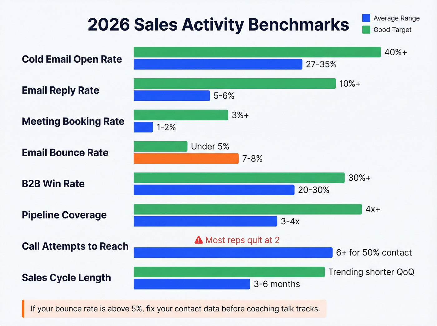
| Metric | Benchmark Range | "Good" Looks Like |
|---|---|---|
| Cold email open rate | 27-35% | 40%+ on targeted lists |
| Email reply rate | 5-6% | 10%+ |
| Meeting booking rate | 1-2% of total sent | 3%+ |
| Email bounce rate | 7-8% average | Under 5% |
| B2B win rate | 20-30% | 30%+ |
| Pipeline coverage | 3-4x quota | 4x+ |
| Call attempts to reach | 6+ for 50% contact | Most reps quit at 2 |
| Deal slippage | Under 20% | Under 20% |
| Sales cycle length | 3-6 months (mid-market) | Trending shorter QoQ |
Those cold email benchmarks come from aggregated data across multiple studies, and the B2B outcome benchmarks represent typical ranges for mid-market teams. The 6+ call attempts figure has been a consistent rule of thumb in sales research for years - it's one of the most durable findings in sales ops.
Here's the thing: if your bounce rate is above 5%, stop coaching reps on talk tracks and fix your contact data first. In our experience, bad data is the single most common reason activity reports look worse than they should. Prospeo verifies emails at 98% accuracy with a 7-day refresh cycle, so your activity numbers reflect real outreach instead of emails vanishing into the void. (If you're evaluating vendors, start with data enrichment services.)
Your activity report tracks calls, emails, and meetings - but if 8% of your emails bounce, every conversion metric downstream is a lie. Prospeo delivers 98% email accuracy with a 7-day refresh cycle, so your reps' numbers reflect actual outreach, not messages lost to bad data.
Stop coaching reps on talk tracks when the real problem is contact data.
Free Template Structure
The layout decision matters more than most people realize. A flat-log structure beats a matrix layout every time. One row per activity, with these columns:
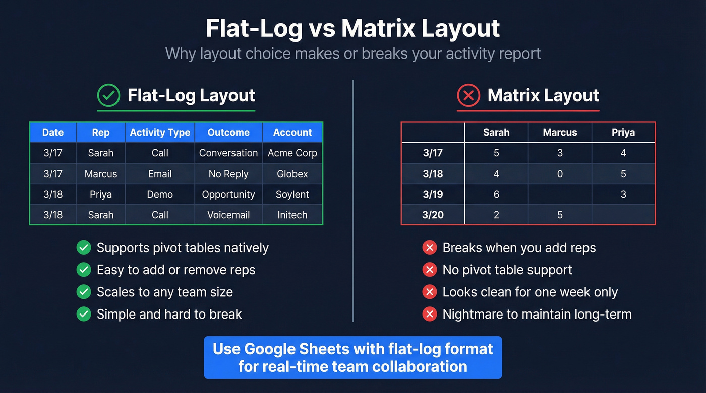
| Date | Rep | Activity Type | Outcome | Account |
|---|
Add Contact and Notes columns if your CRM doesn't capture them already. Keep the core to five columns so it stays readable on any screen. Whether you build this as an Excel file or a Google Sheet, the flat-log format works the same way.
Flat-log wins because it supports pivot tables natively. You can slice by rep, by activity type, by date range, by account - without rebuilding anything. A matrix layout with reps across the top and dates down the side looks clean for a week but becomes a nightmare when you add or remove reps. As one r/excel user put it, the tracker needs to be "simple and hard to break" for less tech-savvy reps. Flat-log delivers that.
Use Google Sheets over Excel for team reports. Real-time collaboration eliminates version conflicts, and the sharing permissions are simpler.
Key formulas for a summary tab:
- Activity count by rep:
=COUNTIFS(B:B,"Sarah",C:C,"Call") - Goal attainment:
=COUNTIFS(B:B,"Sarah")/200*100where 200 is the weekly target - Conditional formatting: green for >=100% of target, yellow for 80-99%, red for below 80%
Keep the raw data tab untouched. Build a summary tab with pivot tables and charts that pull from it. Reps enter data in one place; managers get their dashboard without touching the log. (If you want a broader KPI framework, use sales operations metrics.)
Filled-In Example: Weekly Summary
Here's what a realistic week looks like for a 4-rep SDR team doing B2B outbound. This is the summary view - the raw data lives in the flat-log tab.
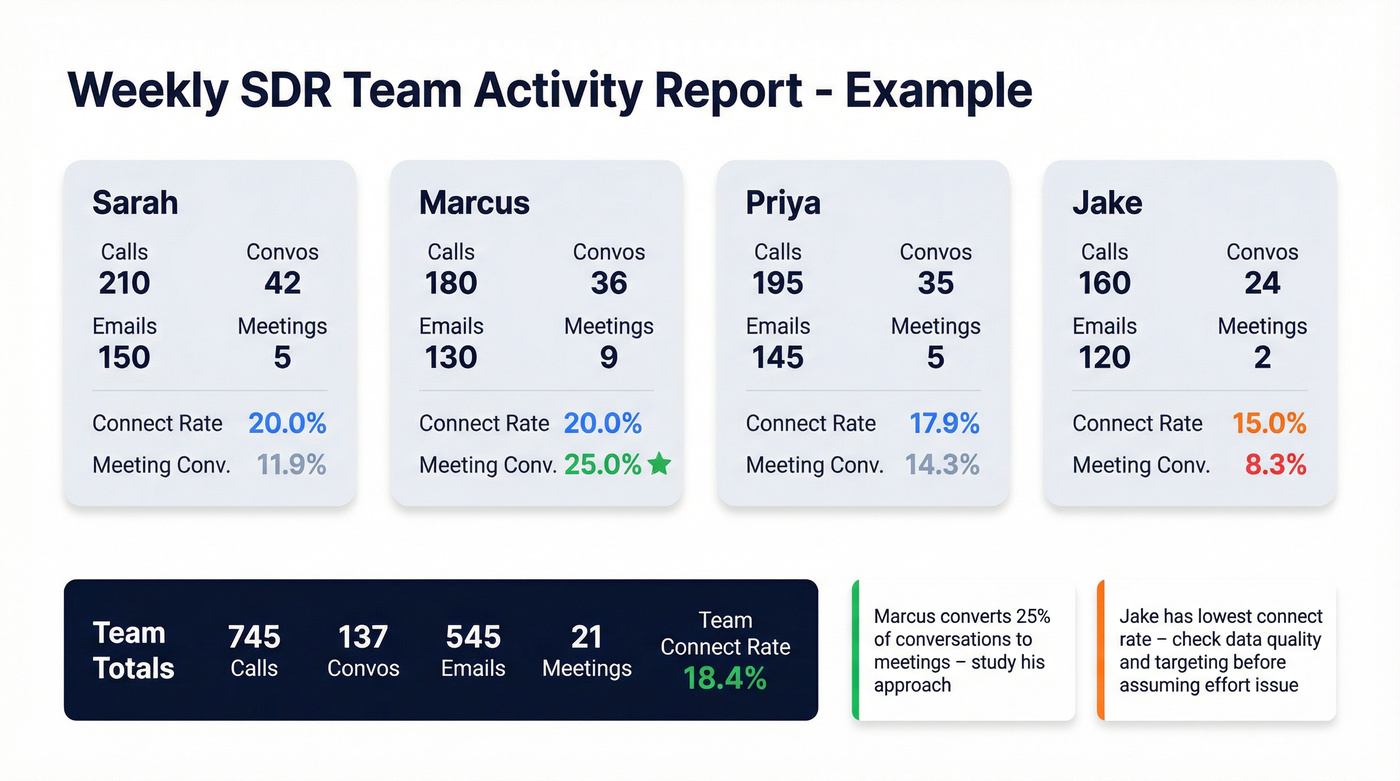
| Rep | Calls | Convos | Emails | Meetings |
|---|---|---|---|---|
| Sarah | 210 | 42 | 150 | 5 |
| Marcus | 180 | 36 | 130 | 9 |
| Priya | 195 | 35 | 145 | 5 |
| Jake | 160 | 24 | 120 | 2 |
| Team | 745 | 137 | 545 | 21 |
And the derived metrics that make this report actually useful:
- Sarah: 20.0% connect rate, 11.9% meeting conversion (meetings / conversations)
- Marcus: 20.0% connect rate, 25.0% meeting conversion
- Priya: 17.9% connect rate, 14.3% meeting conversion
- Jake: 15.0% connect rate, 8.3% meeting conversion
Notice Jake's low meeting output. That's not automatically an effort problem - it could be a data problem, a targeting problem, or a messaging problem. This report makes it visible where the drop-off happens. Without a conversations line, you'd just see "Jake books fewer meetings" and assume he's slacking. (To tighten targeting, start with an ideal customer profile.)
Now look at Marcus. Same 180 calls and 36 conversations as a hypothetical average rep, but 9 meetings booked - a 25% meeting conversion from conversations. That's elite. The activity report surfaces this so you can figure out what Marcus does differently in those conversations and coach the rest of the team on it.
The team's 18.4% connect rate is solid against the benchmarks above. That's the power of pairing activity data with conversion ratios - each rep's daily activity report feeds into this team-level view, so individual coaching conversations are backed by real numbers instead of gut feelings. (If you want to map this to a full funnel, use a B2B sales funnel template.)
Mistakes That Kill Activity Reports
Tracking dials instead of conversations. Reps game dial counts. The average rep makes about 2 call attempts before giving up, while research shows you need 6+ to reach half your leads. Track conversations and connect rate - those can't be faked. If you need a repeatable calling motion, build a cold calling system.
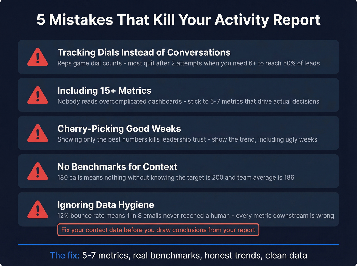
Including 15+ metrics. We've watched teams spend weeks building elaborate dashboards that nobody opens. Stick to 5-7. Overcomplicating reports with too many metrics means nobody reads them. Lead with the KPIs that drive decisions, layer detail underneath.
Cherry-picking good weeks. If the report only shows the best numbers, leadership loses trust and makes bad decisions. Show the trend, including the ugly weeks. Consistency builds credibility.
No benchmarks for context. "Marcus made 180 calls" means nothing without knowing the target is 200 and the team average is 186. Every metric needs a comparison point. And if your "activity report" template has Revenue and Cost columns but no Conversations column, you downloaded a revenue report by mistake - go back to the template structure above.
Ignoring data hygiene. Look, a 12% bounce rate means 1 in 8 emails never reached a human. Every conversion metric downstream is artificially deflated. Check your data before you draw conclusions from it. (For deliverability fundamentals, see the email deliverability guide.)
A clean activity report starts with clean contacts. Prospeo's 300M+ verified profiles and 30+ search filters let you build targeted lists at $0.01/email - so when your reps log 545 emails in a week, those emails actually reach real buyers.
Fill your flat-log with activities that count, not bounces.
When to Ditch the Spreadsheet
Spreadsheets work until they don't. The breaking point usually hits around 20-40 active deals or when multiple reps are editing the same file simultaneously. Version conflicts, buried deals, and zero pipeline visibility are the classic failure modes.
When you hit that wall, CRMs like HubSpot and Salesforce can auto-log activities and generate reports without manual pivots. Match your reporting frequency to the audience: reps benefit from a daily snapshot their manager can review each morning, managers want weekly rollups, and leadership cares about monthly and quarterly trends. The closer someone is to the actual work, the more frequently they need the data. If you're comparing options, start with examples of a CRM.
Skip the spreadsheet entirely if you're already running 5+ reps on a CRM - just build the same five-category framework as a saved report or dashboard inside your existing tool.
FAQ
How often should I update a sales activity report?
Weekly works for most teams - long enough to spot trends, short enough to course-correct. High-volume SDR teams benefit from daily snapshots, while leadership summaries work best monthly or quarterly. Adjust the cadence to match your sales cycle length; a 90-day cycle needs weekly reviews, not daily ones.
What's the difference between an activity report and a performance report?
Activity reports track process inputs - calls, emails, meetings booked. Performance reports track outcomes - revenue, win rate, deal size. The best activity reports bridge both with conversion ratios like meetings-per-100-calls, which is why the template above includes derived metrics alongside raw counts.
What tools help automate sales activity reporting?
CRMs like HubSpot and Salesforce auto-log activities and generate reports natively. For the data quality foundation that makes those reports trustworthy, email verification tools ensure your activity numbers reflect real outreach - not bounced messages inflating volume.
Can I use this template in Google Sheets?
Yes - Google Sheets is actually the better choice for team reports. The flat-log structure described above works identically in Sheets and Excel, but Sheets adds real-time collaboration and simpler sharing permissions. Use the same five-column layout (Date, Rep, Activity Type, Outcome, Account) and build a separate summary tab with pivot tables.