12 Sales Dashboard Templates That Actually Get Used (2026)
It's Monday morning. Your VP pulls up the pipeline dashboard and sees $4.2M in open opportunities. Looks great - until someone checks the CRM and discovers 40% of those contacts have bounced emails, dead phone numbers, or job titles from two roles ago. The dashboard isn't lying, exactly. It's just built on rotten data.
Most teams hunting for sales dashboard templates skip the hardest part: making sure the underlying data is worth visualizing. The ones who get it right see an average 29% increase in sales. The ones who don't build a pretty chart once, ignore it by week three, and go back to spreadsheets.
What You Need (Quick Version)
Tight budget / early stage: Copy Coupler's free Google Sheets template and start tracking pipeline today.
Scaling team: Power BI Pro at $10/user/month with Zebra BI's free .PBIX template gives you enterprise-grade visuals without enterprise pricing.
Before anything: Clean your CRM data first. A dashboard built on stale contacts is a beautiful lie - run your records through an enrichment tool so your numbers actually reflect reality.
What Is a Sales Dashboard?
A sales dashboard is a real-time visual layer on top of your CRM and revenue data. It's not a report. Reports are snapshots - someone pulls them on Friday, emails a PDF, and nobody reads it until Tuesday. Dashboards are live displays that update as deals move, reps log calls, and leads convert.
The real-time piece matters more than most teams realize. Organizations using mobile CRM dashboards hit their sales targets 65% of the time versus 22% for teams without mobile access. That gap isn't about the dashboard itself - it's about whether reps can act on data in the moment, between meetings, on the road, before a call.
12 Templates Organized by Role
A rep needs activity metrics. A VP needs revenue forecasts. Building one mega-dashboard for everyone is how you end up with a 22-widget monster nobody trusts. Here are twelve templates organized by who actually uses them.
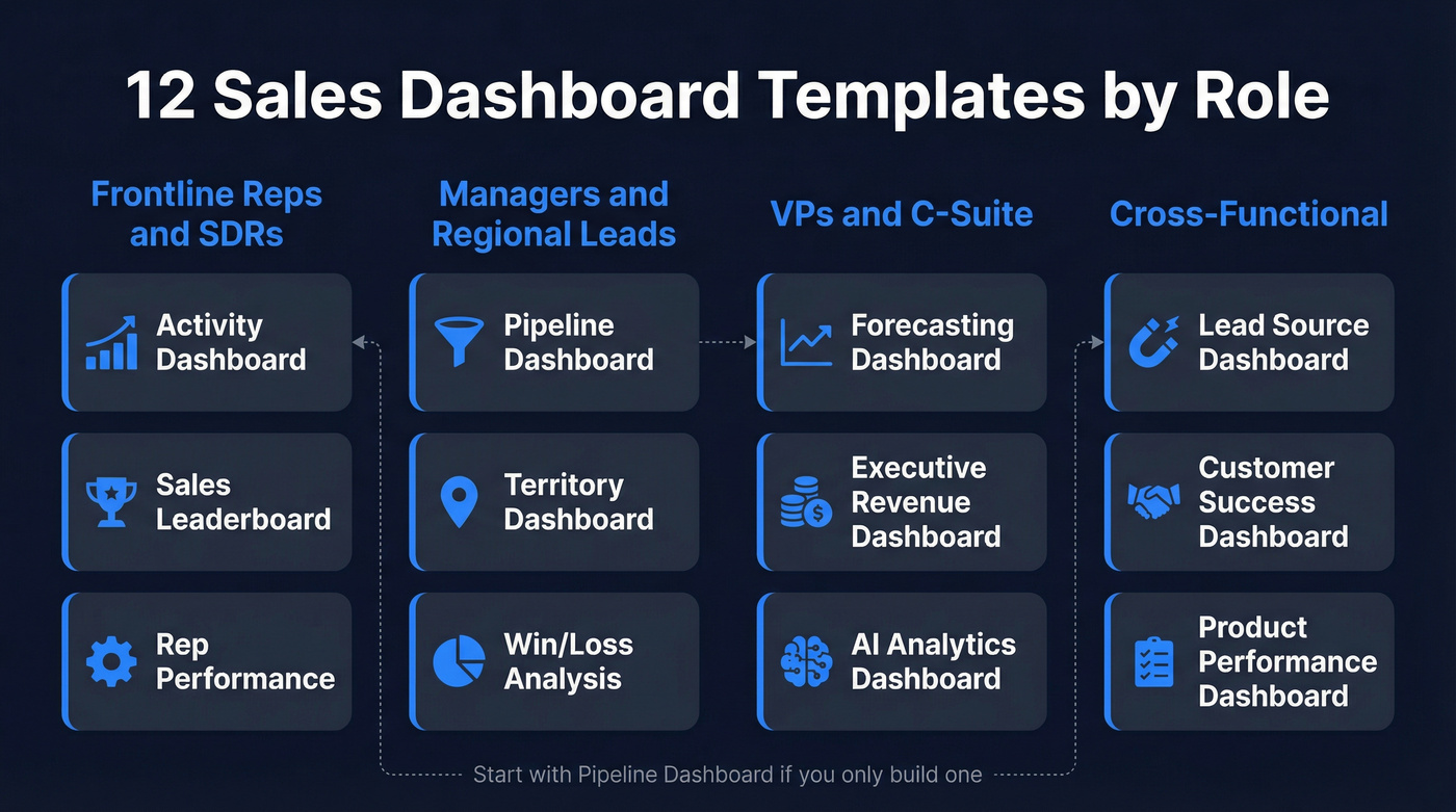
Pipeline Dashboard (Manager)
Track open deals by stage, total pipeline value, average deal size, and stage-to-stage conversion rates. This is the dashboard your sales manager lives in. If you build only one template, build this one.
Forecasting Dashboard (VP/Finance)
Weighted pipeline by close date, commit vs. best-case vs. upside, and historical forecast accuracy. Finance wants a number they can plan around - this dashboard makes the uncertainty visible instead of hiding it in a spreadsheet. If you want to tighten this up, start with forecast accuracy and a consistent sales forecast method.
Rep Performance Dashboard (Manager)
Quota attainment, win rate, average deal cycle, and activity-to-close ratios per rep. The goal isn't a leaderboard. It's identifying who needs coaching and on what specific stage of the funnel.
Sales Leaderboard (Team-Wide)
Revenue closed, deals won, and activity volume ranked across the team. Keep it to three metrics max. Leaderboards work when they're simple and visible. They backfire when they track fifteen things and embarrass bottom performers.
Activity Dashboard (Rep/SDR Manager)
Calls made, emails sent, meetings booked, and response rates. This is the SDR manager's cockpit. Pair it with conversion metrics so you're measuring output quality, not just volume. If your team is still defining what “good” looks like, use SDR conversion rate benchmarks as your baseline.
Executive Revenue Dashboard (C-Suite)
ARR, MRR growth, net revenue retention, and pipeline coverage ratio. Executives don't need granularity - they need three to five numbers that tell them whether the business is healthy. One screen, no scrolling.
Win/Loss Analysis Dashboard (Ops)
Win rate by segment, loss reasons categorized, competitive win rate, and average sales cycle by outcome. If you're losing 60% of deals to "no decision," that's a qualification problem, not a closing problem. To make this actionable, align it to your account qualification criteria.
Lead Source Dashboard (Marketing/Sales)
Leads by channel, cost per lead, source-to-opportunity conversion, and revenue attribution. This is where marketing and sales alignment either happens or falls apart. Both teams need to see the same numbers. If your CRM is messy here, fix your lead source tracking first.
Territory Dashboard (Regional Manager)
Revenue and pipeline by geography, rep coverage per territory, and whitespace analysis. Regional managers need to see which territories are over-served and which are starving.
Customer Success Dashboard (CS/AM)
Net retention, expansion revenue, churn risk scores, and NPS by segment. If your CS team doesn't have a dashboard, they're flying blind on renewals.
Product Performance Dashboard (Product/Sales)
Revenue by product line, attach rates, cross-sell conversion, and product-specific win rates. Essential when you sell multiple products and need to know which ones are carrying the number.
AI Analytics Dashboard (RevOps)
AI-generated deal risk scores, next-best-action recommendations, anomaly detection, and narrative insights that auto-generate written summaries of pipeline changes. This is one of the fastest-growing dashboard categories - 89% of revenue orgs have adopted AI in their sales stack, up from 34% in 2023. Tools like Power BI Copilot and Tableau Pulse are making these accessible without a data science team. If you're building this category, borrow patterns from AI sales analytics.
KPI Benchmarks for Every Dashboard
A dashboard without benchmarks is just a number on a screen. You need context. Is 18% good or terrible?
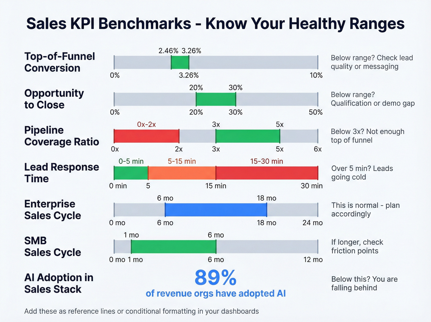
| Metric | Healthy Range | Below Range Means |
|---|---|---|
| Top-of-funnel conversion | 2.46-3.26% | Lead quality or messaging issue |
| Opportunity-to-close | 20-30% (B2B SaaS) | Qualification or demo gap |
| Pipeline coverage | 3:1 minimum | Not enough top-of-funnel |
| Lead response time | Under 5 minutes | Leads going cold |
| Enterprise sales cycle | 6-18 months | Normal - plan accordingly |
| SME sales cycle | 1-6 months | If longer, check friction |
| AI adoption in sales stack | 89% of revenue orgs | You're falling behind |
Bake these ranges into your dashboard as reference lines or conditional formatting. A pipeline number without a coverage ratio next to it is just a vanity metric.
You read it above: 40% of pipeline data is built on bounced emails, dead numbers, and outdated job titles. Prospeo enriches your CRM records with 50+ data points at 98% email accuracy - refreshed every 7 days, not 6 weeks. Your dashboards finally reflect reality.
Stop visualizing stale data. Fix the source for $0.01 per email.
Free Templates to Download
You don't need to build from scratch. These are the best free starting points we've found, organized by platform.
| Platform | Source | Price | Best For | Key Features |
|---|---|---|---|---|
| Google Sheets | Coupler.io | Free | Early-stage teams | Geo chart, deals, win ratio |
| Google Sheets | HubSpot | Free | HubSpot users | 6 templates: pipeline, activity, forecasting |
| Power BI | Zebra BI | Free (.PBIX) | Scaling teams | Pre-built calculations, waterfall, Top N |
| Notion | NotionApps | $0-$30 | Lightweight CRM | 49 templates, pipeline stages |
| Figma | Community kits | Free | Design mockups | UI kits for prototyping |
The Zebra BI template ships with pre-built calculations for variances and growth rates, waterfall charts, and Top N rankings - for a free download, it's remarkably complete. Coupler's Sheets template is the fastest path if you just need something working by end of day.
Dashboard Tools Compared
Here's the thing: the tool matters less than the data feeding it. But since everyone asks, here's how the major options stack up.
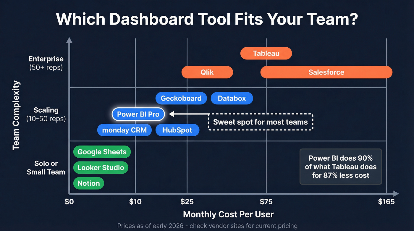
| Tool | Starting Price | Best For | AI Features | Free Tier? |
|---|---|---|---|---|
| Google Sheets | Free | Sub-10 rep teams | Limited | Yes |
| Excel | $0-$12.50/user/month | Desktop power users | Copilot (M365) | Partial |
| Power BI Pro | $10/user/month | Scaling teams | Copilot | No |
| Tableau Creator | $75/user/month | Enterprise data teams | Pulse AI | No |
| Looker Studio | Free | Google stack | Gemini | Yes |
| HubSpot | Free; paid from ~$20/seat/month | HubSpot CRM users | AI assistant | Yes |
| Salesforce | $25-$165/user/month | Salesforce orgs | Einstein | Partial |
| monday CRM | From $12/seat/month | SMB teams | AI blocks | Yes |
| Notion | $0-$10/user/month | Lightweight ops | AI add-on | Yes |
| Databox | Free-$47/month | Multi-source | Benchmarks | Yes |
| Geckoboard | From $39/month | TV dashboards | No | No |
| Qlik | ~$30/user/month | Governed analytics | AI assistant | No |
Tableau at $75/user/month is for enterprise data teams with dedicated analysts, not a five-person sales org. Power BI Pro at $10/user/month does 90% of what Tableau does for 87% less. That's not a controversial opinion - it's math. The consensus in sales ops communities like r/salesoperations is that Power BI is the sweet spot for teams graduating from spreadsheets, and we've seen the same thing with our own clients. For teams under 20 reps, start with Sheets or Looker Studio and graduate to Power BI when you need real-time refresh and row-level security.
5 Layout Mistakes That Kill Adoption
Edward Tufte said it best: "Graphical excellence gives viewers the greatest number of ideas in the shortest time with the least ink in the smallest space." Most dashboards violate every word of that sentence.
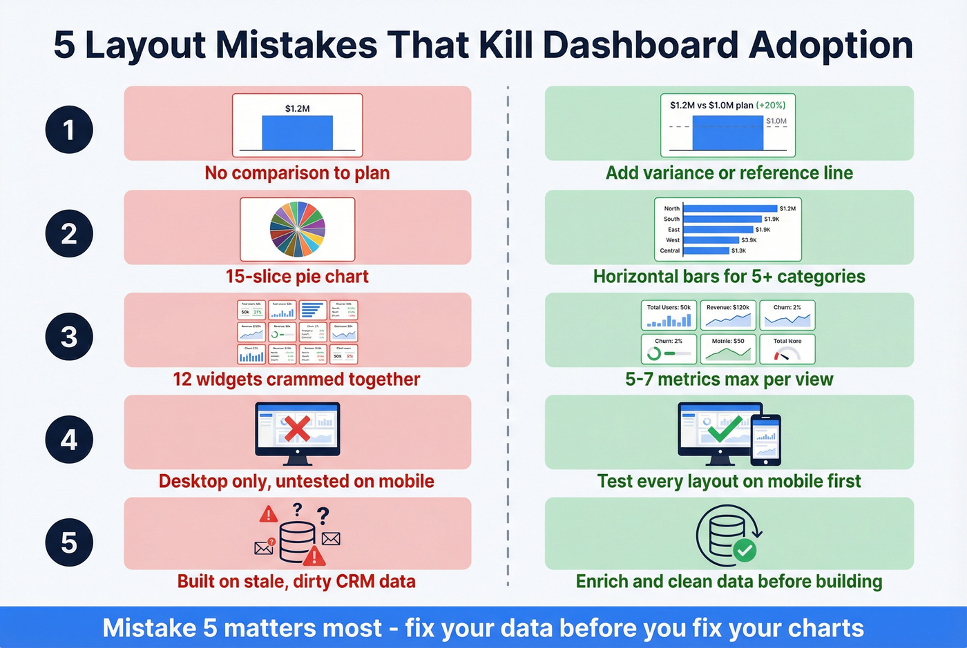
Mistake 1: No comparisons to plan or previous period. A bar showing $1.2M in revenue means nothing without context. Add a variance column or reference line to every primary metric.
Mistake 2: Wrong chart types. Line charts are for trends over time. Bar charts compare categories. Pie charts work for three to five slices - never fifteen. If your pie chart needs a legend, switch to a horizontal bar.
Mistake 3: Too many widgets. Cap it at five to seven metrics per dashboard. Need more? Create role-specific views.
Mistake 4: Not mobile-friendly. Your reps aren't at their desks when they need pipeline data. We've seen teams build gorgeous desktop dashboards that are completely unusable on a phone - test every layout on mobile before shipping it.
Mistake 5: Ignoring data quality. This is the one that actually matters most. The most common complaint in RevOps communities isn't about dashboards - it's about the data feeding them. If you want a system for this, start with CRM hygiene.
Fix Your Data Before You Build
CRM data decays fast - often around 30% per year. People change jobs, emails bounce, titles go stale. If you build a gorgeous dashboard on top of dirty data, you're just visualizing garbage with better fonts. (If you want the benchmarks and why it happens, see B2B contact data decay.)
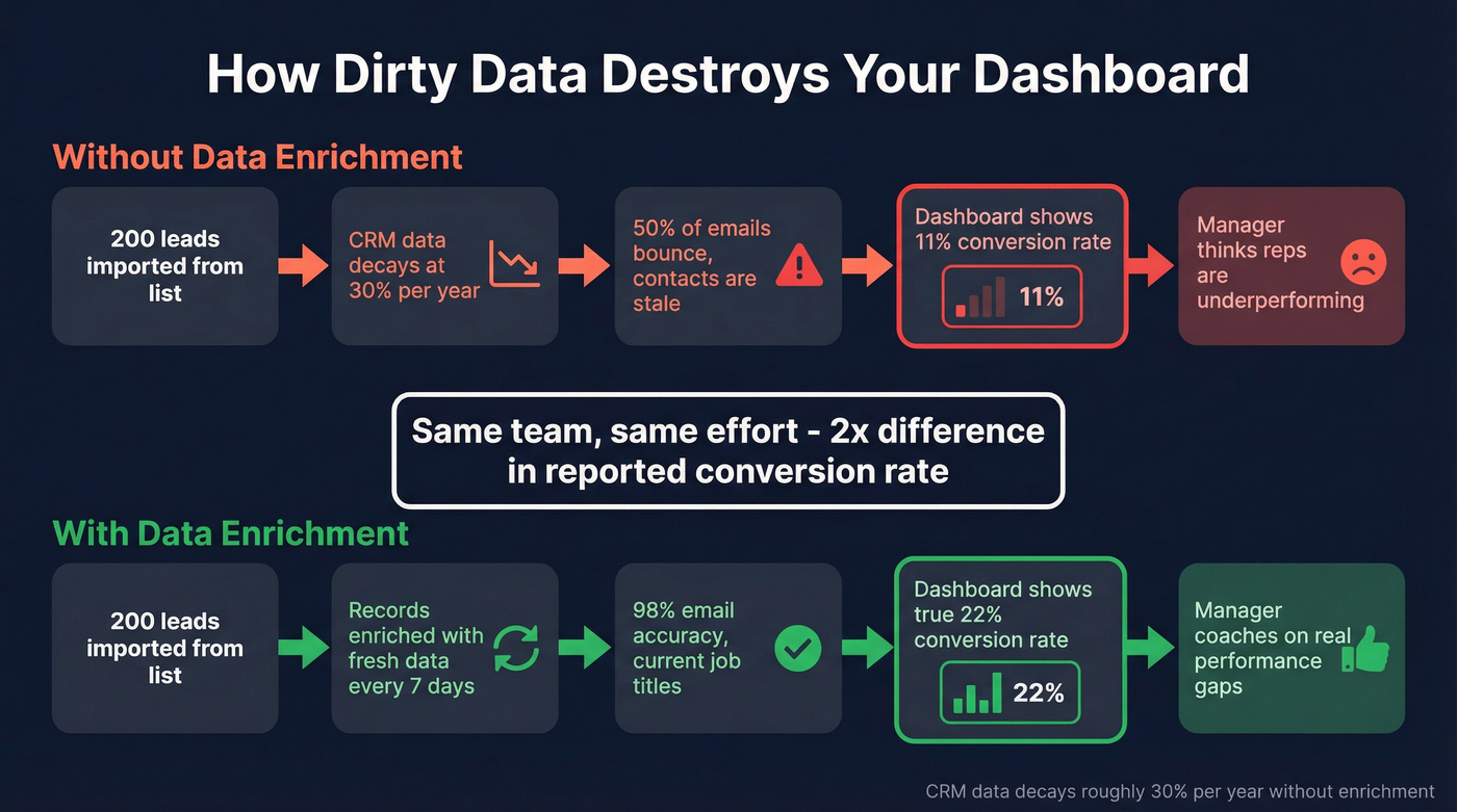
Let's be honest about what denominator pollution looks like in practice: you import 200 leads from a purchased list, half the emails bounce, and your conversion rate drops from 22% to 11%. The dashboard says your team is underperforming. They're not - your data is just dirty, and now your manager is scheduling "performance improvement" meetings based on fiction.
The fix is straightforward. Export your CRM contacts, run them through Prospeo to verify emails and fill missing fields, clean out bounced records, and reconnect to your dashboard. With a 92% API match rate and 50+ data points returned per contact, your pipeline numbers, conversion rates, and territory maps will finally reflect reality instead of last year's data wearing a fresh coat of paint. If you need a step-by-step, follow a CRM verify workflow.
Skip this step if your CRM is under 500 contacts and you manually entered every one. Everyone else - clean first, build second.
Every dashboard template on this page measures pipeline, conversion rates, and rep performance. None of those metrics mean anything when 35% of your contacts bounce. Prospeo's 5-step verification and 92% enrichment match rate turn your CRM from a liability into a single source of truth.
Clean data in, accurate dashboards out. It starts with your contact records.
FAQ
How long does it take to set up a sales dashboard template?
With a free template like Coupler's Google Sheets version or Zebra BI's Power BI file, expect 30-60 minutes including data connection. CRM-native dashboards in HubSpot or Salesforce take about 15 minutes since your data's already there.
What's the best free dashboard tool for small sales teams?
Google Sheets with Coupler's template for teams under 10 reps. Once you outgrow it - usually around 15-20 reps - move to Power BI Pro at $10/user/month for real-time refresh and row-level security.
How do I make sure my dashboard numbers are accurate?
Clean your CRM data first. Run contacts through an enrichment tool to verify emails, fill missing fields, and remove stale records. Bad data in means bad charts out - no amount of dashboard design fixes that.
What's the difference between a dashboard and a report?
A dashboard is real-time and visual - it updates as data changes. A report is a point-in-time document built for deeper analysis. Dashboards show what's happening now; reports explain why it happened.