The Sales Management Dashboard Guide: KPIs, Tools, Templates, and Mistakes to Avoid
It's Monday morning. Your VP asks for the forecast. You open Salesforce, pull a report, realize half the pipeline hasn't been updated since last Tuesday, and spend 45 minutes reconciling numbers in a spreadsheet before the standup. Sound familiar? That's not a dashboard problem - it's a data and process problem disguised as one.
What You Need (Quick Version)
A sales management dashboard needs three to four views max: a manager overview, a pipeline health view, a forecast tracker, and a rep activity board. It needs a CRM with clean data feeding it and a review cadence your team actually commits to. If you only build one dashboard, make it the pipeline health view - it catches problems earliest.
What Is a Sales Management Dashboard?
This type of dashboard pulls live data from your CRM, sales tools, and activity logs into a single visual interface - the control panel for your revenue engine.
Here's the distinction that matters: a sales dashboard tracks individual rep metrics. A management-level dashboard rolls everything up to the team level. Quota attainment across reps. Pipeline coverage ratios. Forecast accuracy. Coaching signals like stage-to-stage conversion rates that tell you which reps need help and where deals are dying.
Whether you're a frontline manager or VP of Sales, this is where you spend your analytical time. It answers "are we going to hit the number?" before the quarter ends - not after.
Why Dashboards Matter in 2026
Only 7% of sales organizations achieve forecast accuracy of 90% or higher. That means 93% of sales teams are, functionally, guessing.
They're guessing in an environment where the average B2B deal involves 8.4 stakeholders, reps spend just 28% of their time actually selling, and pipeline complexity keeps climbing. On the flip side, 75% of business leaders report measurable performance improvements from analytics-based decision-making.
The dashboard isn't magic. It's visibility. When a manager sees Stage 2 conversion drop 15% this month, they can coach before the quarter is lost. When a VP sees pipeline coverage dipping below 3:1, they can trigger prospecting before it's a crisis. Most teams don't lack dashboards - they lack dashboards they trust. And trust starts with the data underneath.
Essential KPIs and How to Calculate Them
Every sales management dashboard should track these eight metrics. The formulas are straightforward; the hard part is keeping the underlying data clean enough to make them accurate.
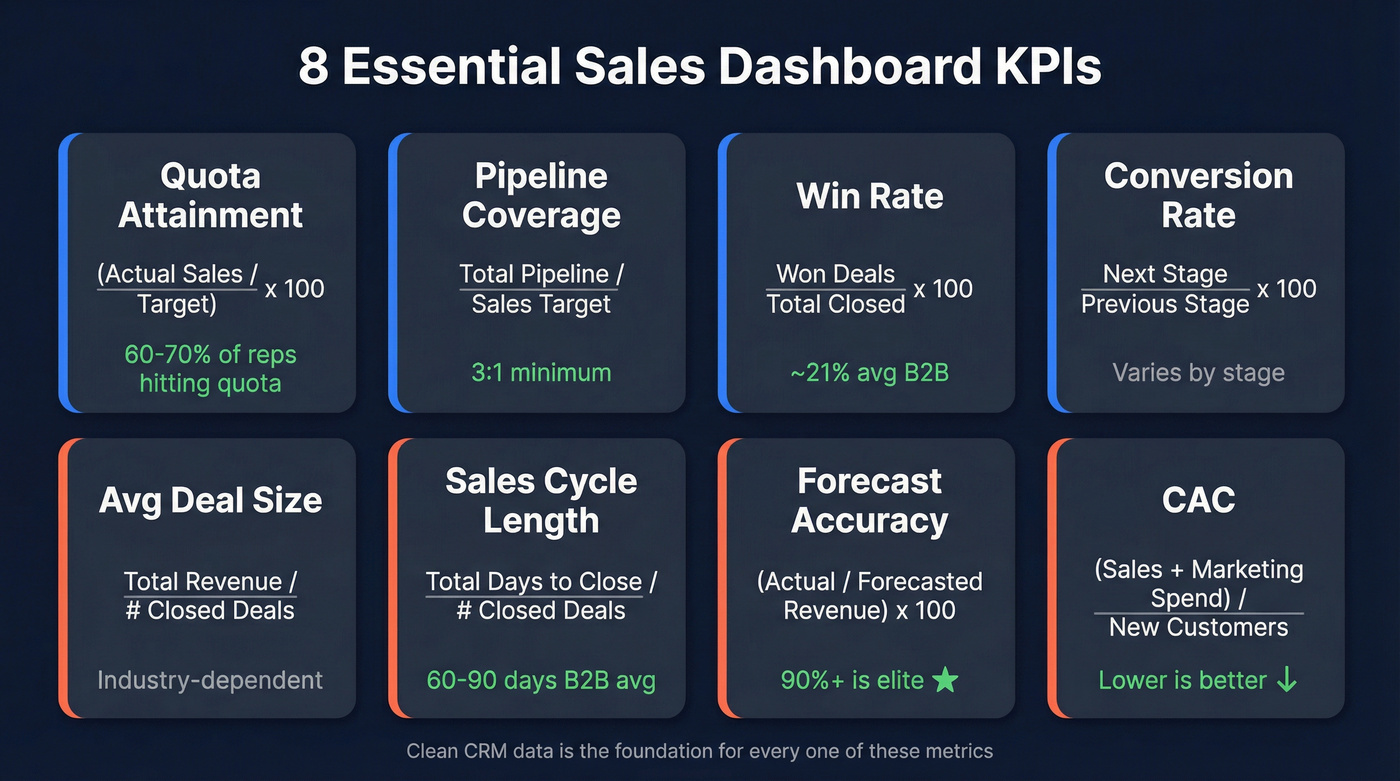
| KPI | Formula | Benchmark |
|---|---|---|
| Quota Attainment | (Actual Sales / Target) x 100 | 60-70% of reps hitting quota is healthy |
| Pipeline Coverage | Total Pipeline / Sales Target | 3:1 minimum |
| Win Rate | Won Deals / Total Closed Deals x 100 | ~21% average B2B |
| Conversion Rate | Next Stage Opps / Previous Stage Opps x 100 | Varies by stage |
| Avg Deal Size | Total Revenue / # Closed Deals | Industry-dependent |
| Sales Cycle Length | Total Days to Close / # Closed Deals | 60-90 days B2B avg |
| Forecast Accuracy | (Actual Revenue / Forecasted Revenue) x 100 | 90%+ is elite |
| CAC | (Sales + Marketing Spend) / # New Customers | Lower is better |
Let's work through the most important one. If your quarterly target is $500K, the 3:1 pipeline coverage rule means you need $1.5M in qualified pipeline at the start of the quarter. Below 2.5:1, you're in trouble - start prospecting aggressively. Above 4:1, you probably have a qualification problem with too much junk in the pipe.
Win rate deserves attention too. The average B2B win rate hovers around 21%, meaning roughly four out of five opportunities don't close. If your team's rate is significantly below that, the problem is usually qualification - reps are advancing deals that shouldn't be in the pipeline. Significantly above? You're not creating enough at-bats.
One angle nobody covers: if your team uses CPQ software, connect it to your dashboard. Automated quote tracking and pricing intelligence improve forecast accuracy at the line-item level, which is where most forecasts actually break down.
Dashboard Types Worth Building
You don't need ten dashboards. You need three to four, and you need your team to actually look at them.
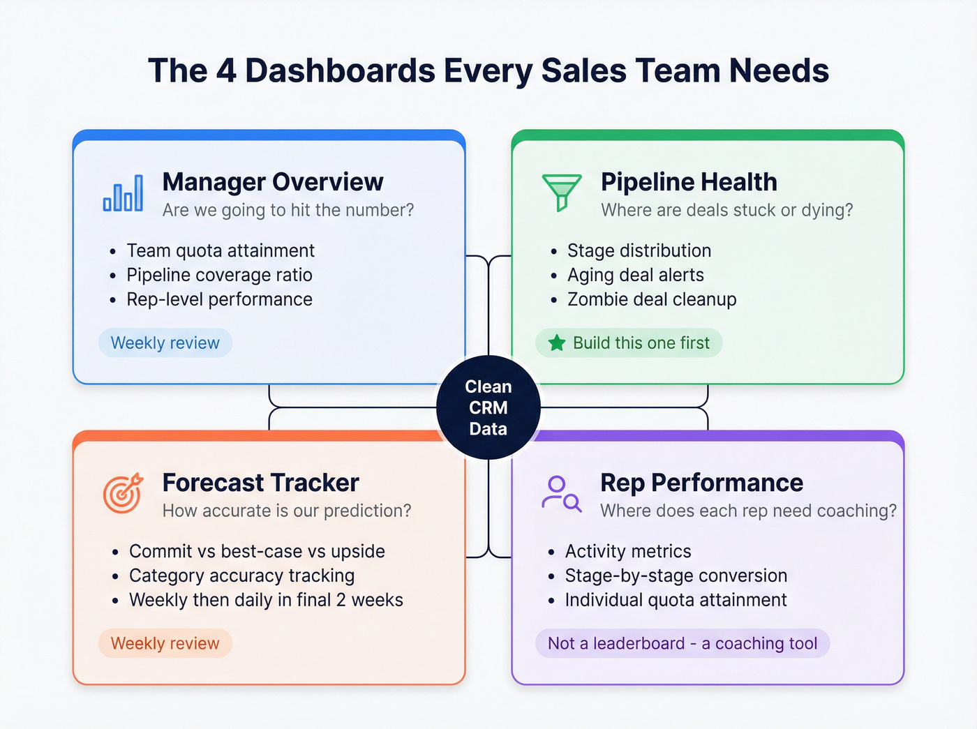
Manager Overview
KPIs: Team quota attainment, pipeline coverage, rep-level performance summary.
Audience: Frontline managers, VP of Sales.
Cadence: Weekly review, daily glances during end-of-quarter push.
This is your "are we going to hit the number?" view. It should fit on one screen and answer that question in under 10 seconds.
Pipeline Health
This is the most underrated dashboard, and the one we'd build first if we could only pick one. Stage distribution tells you if deals are bunching up at a bottleneck. Aging deals - flag anything sitting longer than twice your average cycle length - tell you what's dead but nobody's marked it lost yet. We've seen teams inflate pipeline value by 30-40% with zombie deals sitting in Stage 3 that everyone knows aren't going anywhere but nobody wants to kill.
The fix is simple: add an "aging deals" widget that auto-highlights anything past your threshold. Review it weekly. Be ruthless.
Forecast Tracker
Separate your pipeline into commit (90%+ confidence), best-case (50-89%), and upside (below 50%). Track how accurate each category was last quarter. Most teams discover their "commit" category closes well below 90%, which means the forecast is structurally optimistic. Review weekly during the quarter, daily in the final two weeks.
Rep Performance
Track activity metrics, conversion rates by stage, and individual quota attainment. The key signal: a rep with great Stage 1 to Stage 2 conversion but terrible Stage 3 to Closed needs help on negotiation, not prospecting. Review weekly.
Don't use this as a leaderboard. Use it to spot where specific reps are losing deals.
Win/Loss Analysis
The strategic dashboard, reviewed monthly or quarterly. It answers "why are we losing?" and "who are we losing to?" If a large share of losses cite a specific competitor, product marketing needs to know. If deals consistently die at the pricing stage, your packaging is the problem - not your reps.
Sales Prioritization View
One view that often gets overlooked: a prioritization dashboard that ranks open deals by a weighted score combining deal size, stage velocity, and days since last activity. This helps managers direct rep attention toward the deals most likely to close this quarter rather than letting reps default to whichever account pinged them last.
Zombie deals and inflated pipelines start with bad contact data. If 30-40% of your pipeline is stale, the problem isn't your dashboard - it's the data underneath. Prospeo's 7-day refresh cycle and 98% email accuracy mean the contacts in your CRM are current, verified, and reachable.
Clean data in, accurate forecasts out. Start for free.
Tools and Pricing Compared
The right tool depends on team size, not feature lists.
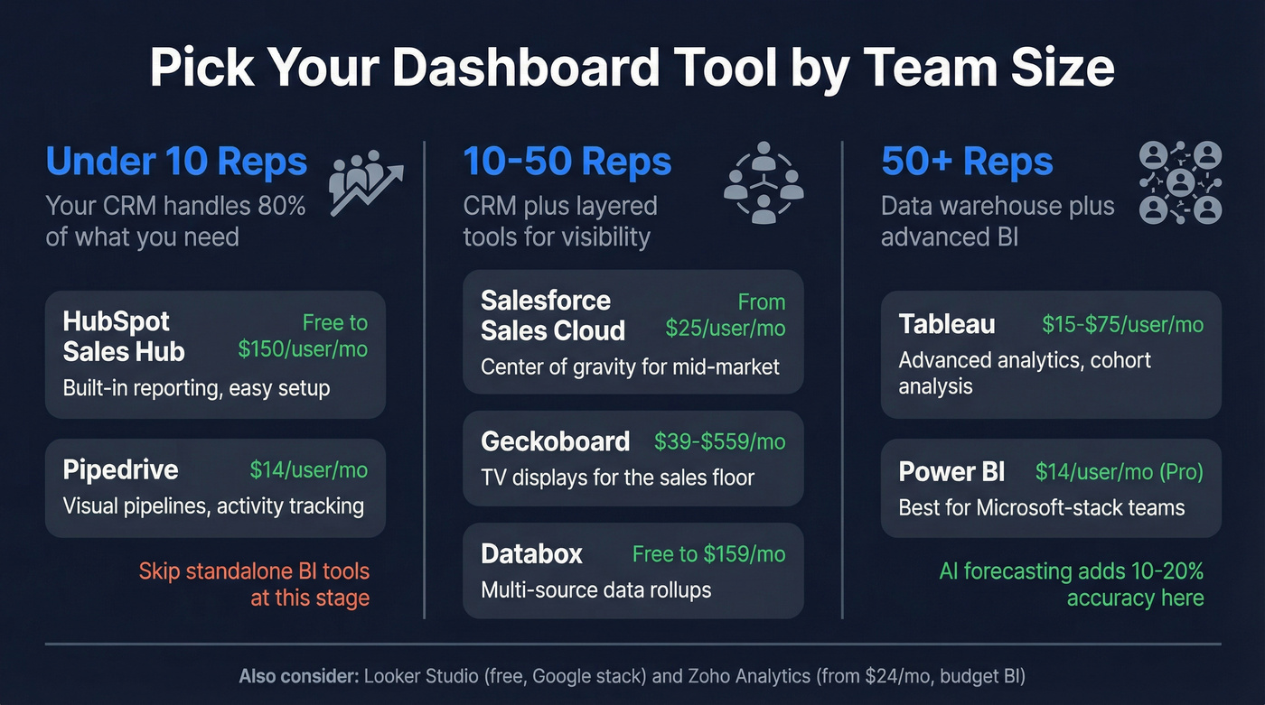
| Tool | Starting Price | Category | Best For |
|---|---|---|---|
| HubSpot Sales Hub | Free; paid ~$20-$150/user/mo | CRM-native | Teams under 10 reps |
| Pipedrive | $14/user/mo | CRM-native | SMBs wanting simplicity |
| Salesforce Sales Cloud | From $25/user/mo (tiered) | CRM-native | Mid-market to enterprise |
| Geckoboard | $39-$559/mo | TV display | Office TV dashboards |
| Databox | Free; paid from $47-$159/mo | BI | Multi-source rollups |
| Power BI | $14/user/mo (Pro) | BI | Microsoft-stack teams |
| Tableau | $15-$75/user/mo | BI | Advanced analytics at scale |
| Zoho Analytics | From $24/mo | BI | Budget BI |
| Looker Studio | Free | BI | Google-stack teams |
Under 10 reps: Your CRM's built-in dashboards handle 80% of what you need. HubSpot's free tier includes basic reporting. Pipedrive at $14/user/mo gives you visual pipelines and activity tracking without a BI tool.
10-50 reps: Salesforce becomes the center of gravity. Layer Geckoboard on top for TV displays in the sales pit. Databox works well for pulling from multiple sources. At this stage, a dedicated sales operations dashboard that tracks process metrics - CRM hygiene scores, data completeness, lead routing accuracy - helps ops teams keep the engine running alongside the revenue-facing views.
50+ reps: Tableau or Power BI earn their keep here, connecting to a data warehouse, building custom models, running cohort analysis. AI models in these tools can improve forecasting accuracy by 10-20%, but only if the data going in is clean.
Here's the thing: Tableau and Power BI are overkill for most sales teams under 50 reps. We've watched teams spend three months building a Tableau instance that does less than what Salesforce reports could've done out of the box. If your team is small and your deal sizes are modest, skip the standalone BI tool. You almost certainly don't need it.
Mistakes That Kill Adoption
Most dashboards fail because of design, not tooling. These seven anti-patterns come up constantly.
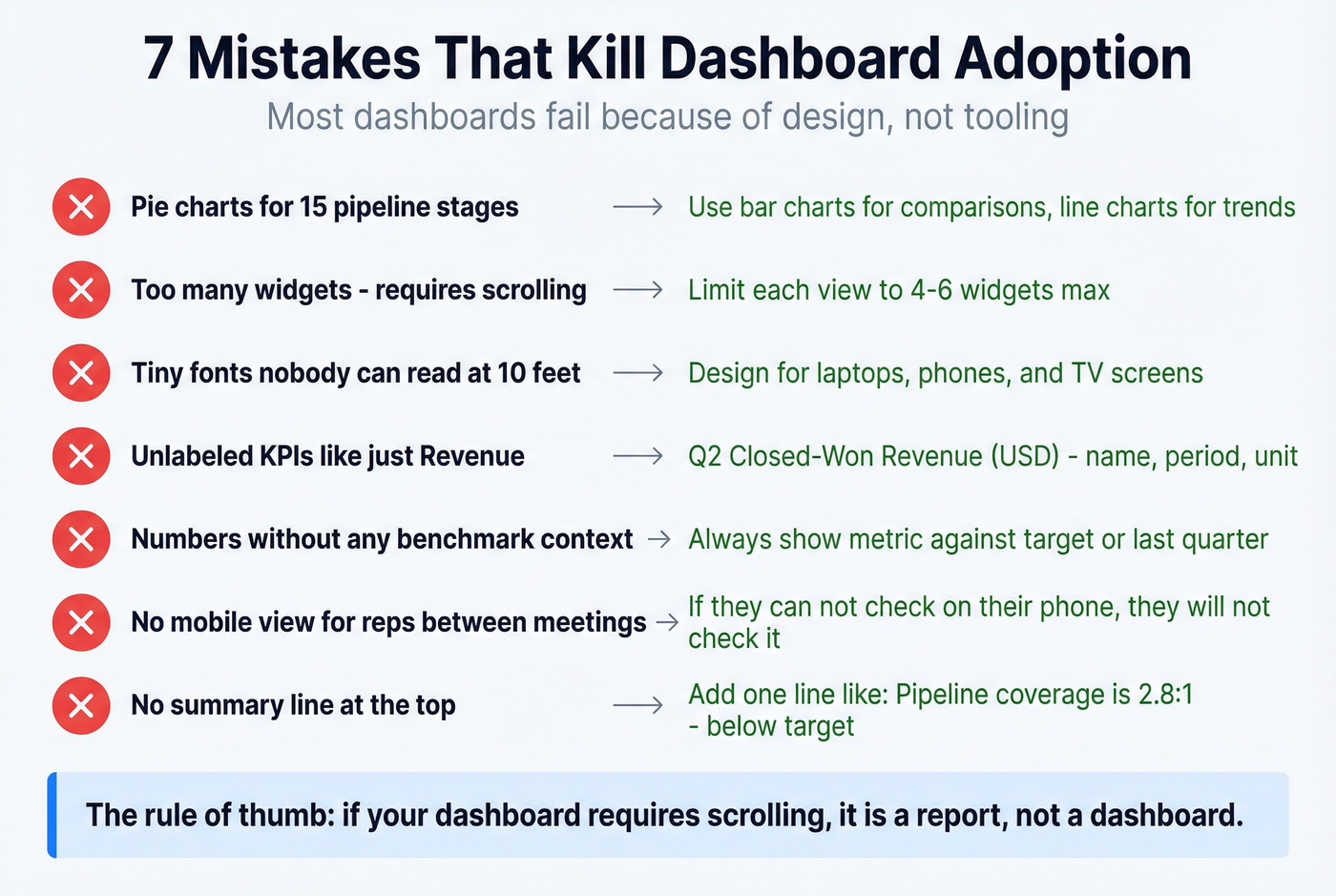
Wrong visualization choice. A pie chart for 15 pipeline stages is unreadable. Use bar charts for comparisons, line charts for trends, and tables for exact numbers. That covers most sales dashboards.
Too many elements on one screen. If a dashboard requires scrolling, it's a report, not a dashboard. Limit each view to four to six widgets max.
Illegible fonts and graphics. Your dashboard will be viewed on laptops, phones, and conference room TVs. If the numbers aren't readable at 10 feet, redesign.
Unlabeled KPIs. Every metric needs a name, a time period, and a unit. "Revenue" means nothing. "Q2 Closed-Won Revenue (USD)" means everything.
No data context. A number without a benchmark is noise. Show quota attainment against target. Show pipeline coverage against the 3:1 threshold. Show win rate against last quarter.
Poor navigation and no mobile view. If your reps can't check the dashboard from their phone between meetings, they won't check it. Full stop.
No summary line. Add a one-line summary at the top of each dashboard: "Pipeline coverage is 2.8:1 - below target. 12 deals aging past 90 days." That's what people actually read first.
AI-Powered Dashboards in 2026
The AI dashboard hype is real, but the practical value is narrower than vendors suggest.
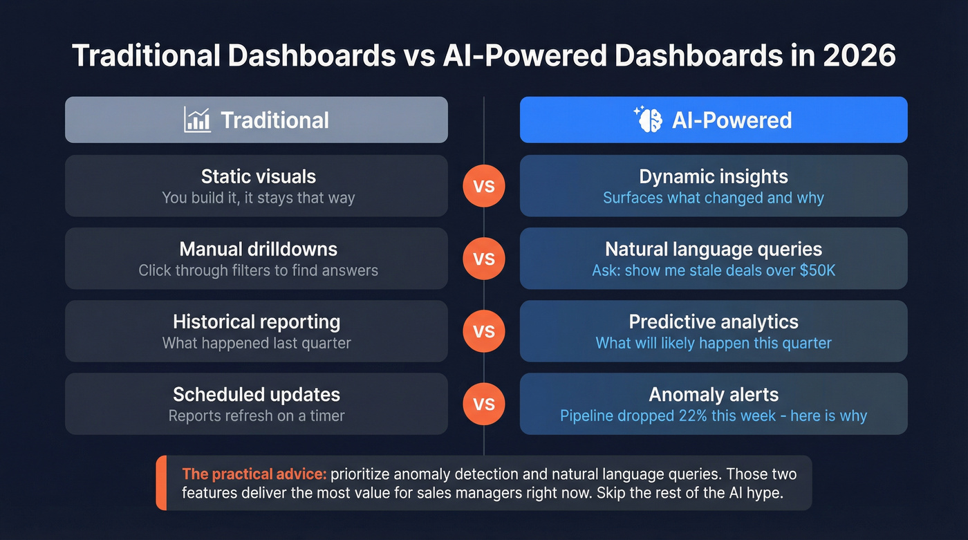
| Traditional Dashboard | AI-Powered Dashboard |
|---|---|
| Static visuals | Dynamic insights |
| Manual drilldowns | Natural language queries |
| Historical reporting | Predictive analytics |
| Scheduled updates | Anomaly alerts |
The most useful AI features for sales managers right now are anomaly detection - "pipeline dropped 22% this week, here's why" - and natural language queries like "show me deals over $50K that haven't had activity in 14 days." When evaluating AI dashboard tools, prioritize those two capabilities. Conversational analytics and governed AI reasoning are nice-to-haves that most teams won't touch in the first six months.
That 10-20% forecasting improvement from AI only materializes when the underlying data is accurate. An AI model trained on a CRM full of stale contacts and outdated deal stages will produce confidently wrong predictions. Garbage in, garbage out - just faster. (If you want the practical stack view, start with AI sales analytics.)
Data Quality: The Prerequisite Everyone Skips
Your best AE just left. You pull up their account list and half the contacts have bounced emails and disconnected phone numbers. The new rep inherits a territory of ghosts. Every dashboard metric built on that data - pipeline value, activity rates, forecast - is wrong.
This isn't hypothetical. Poor data quality costs businesses an average of $12.9M per year. Only 14% of companies have a 360-degree view of their customers. The prettiest Tableau instance in the world is useless if a big chunk of your contact records are stale.
This is where tools like Prospeo fit into the dashboard conversation. It's not a dashboard tool - it's the data layer that makes dashboards trustworthy. CRM enrichment pushes 50+ data points per contact back into Salesforce or HubSpot, with a 92% API match rate and 98% email accuracy. The 7-day data refresh cycle means your contact records don't decay between quarterly cleanups - they stay current automatically.
Want to audit how bad your CRM data actually is? Pull a sample of your pipeline contacts through a verification tool and see how many bounce. The number will be uncomfortable, but it'll tell you exactly how much your dashboard is lying to you.
Free Templates That Actually Exist
Most "free template" articles link to gated PDFs. These three are genuinely downloadable.
Smartsheet Excel Sales Management Dashboard Template - A proper Excel template with stacked bar charts, rep rankings, and performance breakdowns by region, product, and outlet. Best free option for teams that live in spreadsheets.
Oboard Google Sheets KPI Dashboard - Free, works in Google Sheets and Excel. Solid for getting started, but it breaks at scale with manual data entry and formulas that crack when you add rows. Use it as a prototype, not a production tool.
ZoomCharts Power BI Examples Gallery - Over 2,550 Power BI report examples including CRM dashboards, pipeline analyses, and sales conversion reports. Not templates you download - more like a lookbook for layout inspiration before you build your own.
Pipeline coverage below 3:1? Your reps need more qualified opportunities, fast. Prospeo gives your team 300M+ profiles with 30+ filters - buyer intent, technographics, headcount growth - so they fill the pipeline with real buyers, not noise. At $0.01 per email, scaling outreach won't break the budget.
Stop guessing. Build pipeline your dashboard can trust.
FAQ
What's the difference between a sales dashboard and a sales management dashboard?
A sales dashboard tracks individual rep metrics like calls and personal pipeline. A sales management dashboard rolls up team-level data: quota attainment across all reps, pipeline coverage ratios, forecast accuracy, and stage-to-stage conversion rates. Managers need the rollup; reps need the individual view.
How often should I review my dashboards?
Daily for activity views, weekly for pipeline health, monthly for performance trends, and quarterly for win/loss analysis. Set a cadence and stick to it - a dashboard nobody checks is just a decoration.
What's a good pipeline coverage ratio?
3:1 is the standard benchmark - $1.5M in qualified pipeline for a $500K target. Below 2.5:1, prospecting should become urgent. Above 4:1, you likely have a qualification problem with too many unqualified deals inflating the number.
Which free tool is best for building a sales dashboard?
Looker Studio is the strongest free option - it connects to Google Sheets, BigQuery, and dozens of other sources. HubSpot's free CRM includes basic reporting for small teams. For spreadsheet-based approaches, the Smartsheet Excel template is a solid starting point.
How do I keep dashboard data accurate without manual cleanup?
Use automated CRM enrichment that refreshes contact records on a recurring cycle. Prospeo, for example, pushes 50+ data points per contact into Salesforce or HubSpot with a 92% match rate and 7-day refresh cycle - eliminating the quarterly data-scrub scramble that most teams dread.