How to Build a Sales Reporting Dashboard That Doesn't Lie to You
It's Monday morning. Your VP opens the pipeline dashboard and sees 85% of quarterly target covered. By Friday, three "committed" deals slip. The real number is 62%.
The dashboard didn't lie - it reported what was in the CRM, which was wrong.
Here's the scale of the problem: 70% of B2B sales reps missed quota last year, and reps spend only 28% of their time actually selling. A bad sales reporting dashboard contributes to both numbers - not because the charts are ugly, but because the data underneath them is rotten. Your dashboard needs three things: clean data, 5-7 role-specific KPIs with benchmark targets, and a review cadence that forces action. Most dashboards fail at step one.
What Is a Sales Reporting Dashboard?
A sales reporting dashboard is a visual layer on top of your CRM and revenue data that tracks performance across daily, weekly, and monthly timeframes. It's not a generic analytics view. It's segmented by region, product line, or rep, and it answers a specific question for a specific audience. Your VP of Sales needs pipeline coverage ratios. Your frontline manager needs activity-to-outcome metrics. Your reps need to know where they stand against quota.
The distinction from a general "sales dashboard" matters. A sales dashboard can be anything - a leaderboard, a forecast view, a compensation tracker. A reporting-focused dashboard is the recurring heartbeat: what happened, how it compares to target, and what's trending. Think of it as the weekly physical for your pipeline.
Why Most Sales Dashboards Fail
Here's the uncomfortable truth that every "dashboard examples" article skips: most sales dashboards fail because of bad data, not bad design.
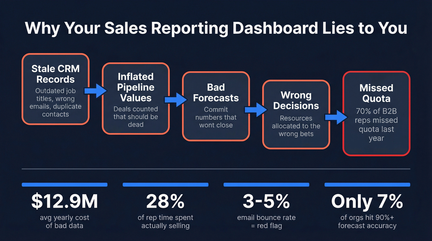
You can build the most elegant Tableau visualization in the world, and it'll still mislead you if your CRM is full of stale job titles, duplicate records, and bounced emails. Gartner estimated poor data quality costs organizations an average of $12.9 million per year. That's not a typo. And it's not just about duplicate records - it's about the cascade effect. Stale contacts mean inaccurate pipeline values, which mean bad forecasts, which mean your Monday morning dashboard is fiction.
The pattern is painfully predictable: leadership demands a dashboard, but nobody enforces CRM hygiene first. Forrester analyst Ian Bruce puts it bluntly - failing to fix measurement leads to misallocation and missed growth. HBR contributors Redman and Burbank reinforce the point: good data is essential, but the critical role people play in maintaining it gets ignored.
Before you build a single chart, audit your CRM:
- ☐ Contact freshness: when were records last updated?
- ☐ Email bounce rate: anything above 3-5% is a red flag
- ☐ Field completeness: are deal amounts, stages, and close dates filled in?
- ☐ Duplicate records: merge before you measure
Garbage in, garbage out. And most CRMs are full of garbage.
10 Dashboard Types by Role
Not every dashboard serves every audience. Here's what to build, who it's for, and the benchmarks that matter.
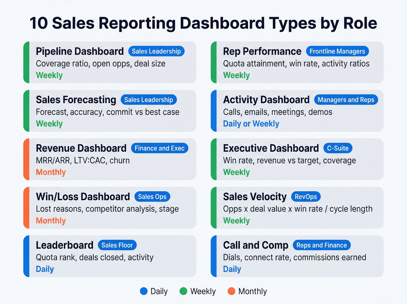
Pipeline Dashboard
The foundation. Track pipeline value, open opportunities, average deal size, and pipeline coverage ratio. Your pipeline should be 3-5x your revenue target. Targeting $500K this quarter? You need $1.5-2.5M in qualified pipeline. If coverage drops below 3x, next quarter is already in trouble. Review weekly.
Rep Performance Dashboard
For frontline managers. Track quota attainment, win rate, average deal size, and activity-to-outcome ratios per rep. When one rep converts demos at 40% and another at 15%, the dashboard surfaces the coaching conversation. Layer in buyer engagement signals - positive and negative reply rates are a leading indicator most teams ignore. Review weekly in 1:1s.
Sales Forecasting Dashboard
The most politically charged dashboard in any org. Track forecast accuracy, commit vs. best-case vs. pipeline, and stage-to-stage conversion rates. The sobering benchmark: only 7% of sales organizations achieve 90%+ forecast accuracy. AI tools often promise 10-50% improvements, but the real gains depend on your data quality and process discipline. Review weekly during forecast calls.
Activity Dashboard
Tracks calls, emails sent, meetings booked, and demos completed. The average seller juggles eight tools to close deals - an activity dashboard helps you diagnose where time actually goes versus where it should go. Review daily or weekly depending on team maturity.
Revenue Dashboard
For finance-adjacent leaders. Track MRR/ARR, LTV:CAC ratio, expansion revenue, and churn. LTV should be 3-5x CAC. Early-stage SaaS should target 15-25% month-over-month MRR growth; mature SMBs, 5-10%. Review monthly.
Executive Dashboard
The 30,000-foot view. Win rate, revenue vs. target, pipeline coverage, and forecast accuracy on a single screen. The average B2B win rate sits around 21% - if yours is significantly below that, the exec dashboard should make it impossible to ignore. Review weekly or biweekly.
Win/Loss Dashboard
Tracks closed-won and closed-lost deals by reason, competitor, segment, and stage. This is the dashboard that actually improves your sales process over time. If you're losing 40% of deals at the proposal stage to the same competitor, that's a product or positioning problem, not a sales problem. Review monthly.
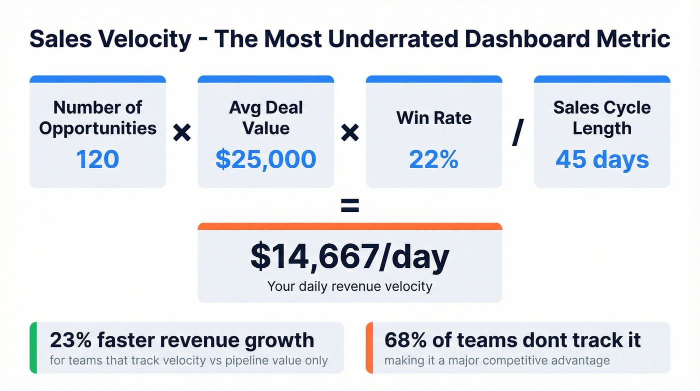
Sales Velocity Dashboard
The underrated one. Sales velocity = (number of opportunities x average deal value x win rate) / sales cycle length. Teams that track velocity saw 23% faster revenue growth compared to those tracking only pipeline value - yet 68% of teams don't track it. If you only add one new metric this quarter, make it velocity.
Leaderboard Dashboard
Controversial but effective. Ranks reps by quota attainment, deals closed, or activity volume. Works well in competitive cultures, backfires in collaborative ones. Keep it to 2-3 metrics max, display on a TV in the office or a Slack channel, and update daily.
Call Reporting & Compensation Dashboards
For phone-heavy teams, track dials, connect rates, talk time, and outcomes per call. Pair with a conversation intelligence tool like Gong to surface coaching moments. If your connect rate drops below 5%, the problem is likely data quality - wrong numbers - not rep effort.
Compensation dashboards serve reps and finance. Track commission earned, accelerators hit, and payout timelines. If your reps can't see how much they're making in real time, they're guessing at which deals to prioritize.
Dashboard Design Rules
Good design isn't about making things pretty. It's about making data scannable and actionable.
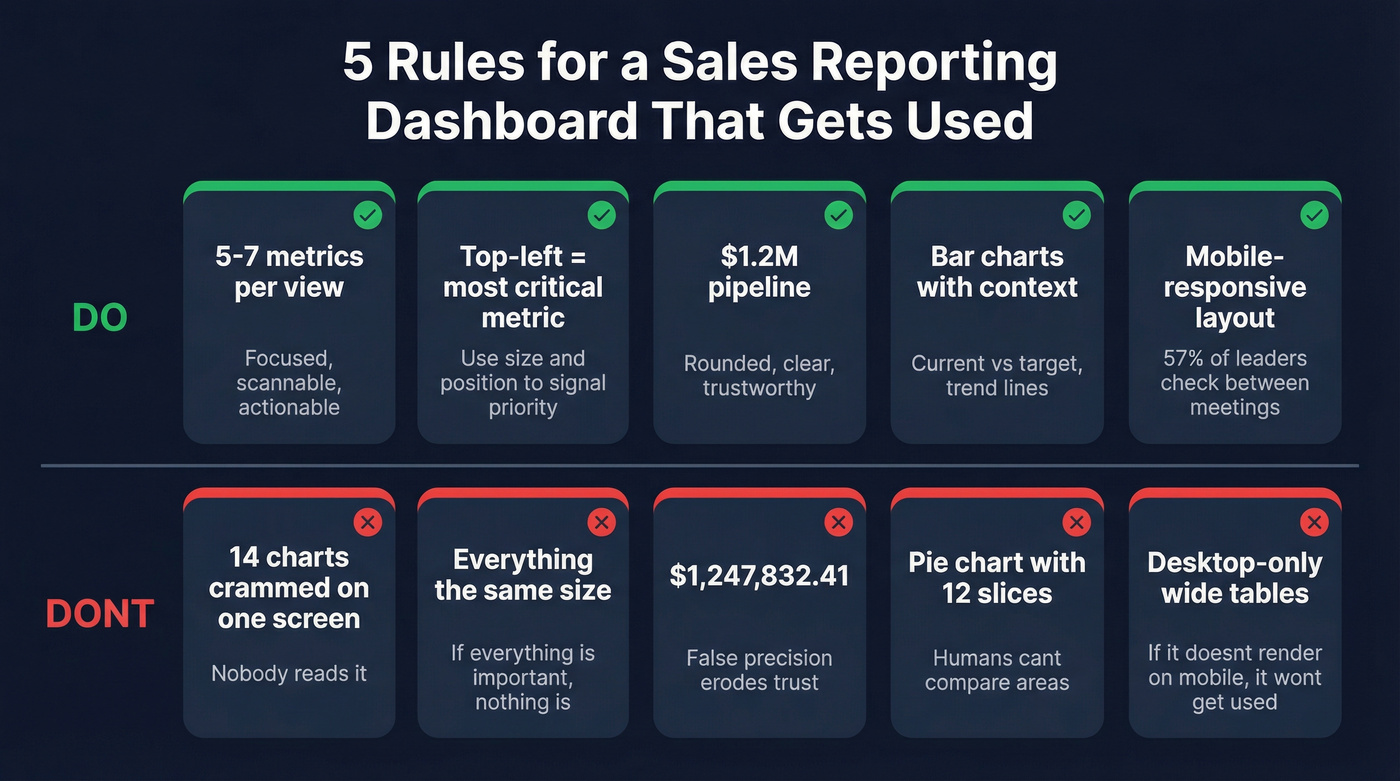
Limit to 5-7 metrics per view. More than that and you've built a report, not a dashboard. If everything is important, nothing is. Maximize your data-ink ratio by removing gridlines, borders, and decorative elements that don't convey information.
Use hierarchy. Top-left is prime real estate - put your most critical metric there. Size and position signal importance. Always provide context: a number without a target, trend, or comparison is meaningless. Show current vs. target, this period vs. last, and threshold indicators.
Round your numbers. $1.2M is more useful than $1,247,832.41. False precision erodes trust because it implies accuracy you don't have. Skip pie charts - humans are terrible at comparing areas, and bar charts are boring but effective.
Design for mobile. 57% of sales leaders say cycles are getting longer, which means reps check dashboards between meetings on their phones. If it doesn't render on mobile, it won't get used.
You just read it: most dashboards fail because of bad CRM data, not bad design. Prospeo refreshes 300M+ profiles every 7 days, delivers 98% email accuracy, and enriches records with 50+ data points - so your pipeline numbers actually reflect reality.
Stop building dashboards on top of garbage data.
How to Present Sales Data Effectively
Building a great dashboard is only half the battle. You also need to present sales data so stakeholders actually act on it.
Lead with the insight, not the chart. Open with "Pipeline coverage dropped below 3x this week" rather than "Here's our pipeline chart." The chart supports the story; it isn't the story. Tailor depth to the audience - executives want three numbers and a recommendation, managers want trends and exceptions, reps want their personal stats and next steps.
End every slide or screen with a decision. If a dashboard view doesn't prompt a clear action - reallocate resources, coach a rep, adjust forecast - it's noise. The best dashboards are designed with presentation in mind from the start. When the weekly review meeting can run off the live dashboard instead of a separate slide deck, you've eliminated the gap between data and decision.
Mistakes That Kill Adoption
Your RevOps lead spent two days building a 14-chart Tableau dashboard. Two weeks later, the only person who looks at it is the RevOps lead.
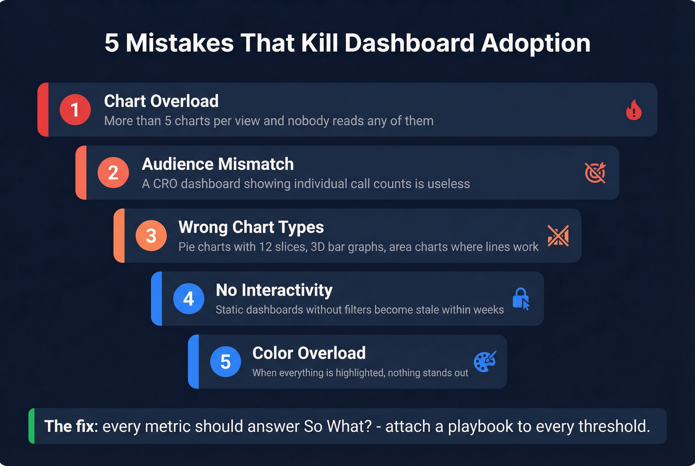
We've seen this pattern play out dozens of times. The root causes are always the same. Chart overload is the first killer - three to five visualizations per view is the ceiling. The second is wrong chart types: pie charts with 12 slices, 3D bar graphs, area charts where a simple line would do.
Audience mismatch is the third. A dashboard built for the CRO shouldn't show individual call counts. When the audience doesn't recognize their own questions in the data, they stop looking. Color overload compounds this - if everything is highlighted, nothing is. Use color to signal exceptions, not to decorate.
Let's be honest about the part most teams miss: static dashboards without filters or interactivity become stale fast. Let users drill into regions, time periods, and segments. And when pipeline numbers don't match what reps know to be true, we've watched teams abandon the tool entirely within a month. Every metric should answer "so what?" If pipeline coverage drops below 3x and there's no playbook attached, it's decoration.
Best Tools for Sales Dashboards
The tool matters less than the data and design, but you still need to pick one. Here's how the options break down:
| Tool | Category | Starting Price | Best For |
|---|---|---|---|
| Salesforce | CRM-native | $25/user/mo | Mid-market and enterprise |
| HubSpot Sales Hub | CRM-native | Free; $20/user/mo | SMBs and scaling teams |
| Pipedrive | CRM-native | $14/user/mo | Pipeline-focused teams |
| Tableau | BI platform | $15/user/mo | Advanced visualization |
| Power BI | BI platform | Free; Pro ~$10/user/mo | Microsoft ecosystem |
| Zoho Analytics | BI platform | $24/mo | Budget-friendly BI |
| Geckoboard | Live TV dashboard | $49/mo | Real-time office displays |
| Gong | Revenue intel | ~$100-150/user/mo | Conversation-driven teams |
| Clari | Revenue intel | ~$30-100K+/year | Forecast-obsessed orgs |
CRM-native dashboards are the path of least resistance. Your data is already there. Salesforce's reporting is powerful but requires admin expertise. HubSpot is more intuitive out of the box. Pipedrive is lean and pipeline-obsessed.
BI platforms make sense when you need to blend data from multiple sources or build highly custom visualizations. Power BI is essentially free if you're already in the Microsoft ecosystem. Tableau is the gold standard for complex visual analytics but has a steeper learning curve. Geckoboard is worth a look for live TV dashboards in the office - it's designed for at-a-glance monitoring, not deep analysis.
Revenue intelligence tools add AI-driven forecasting and conversation analytics on top of your CRM data. If you're paying $30K+/year for revenue intelligence and your reps still don't fill CRM fields, you've bought a Ferrari with no gas.
Look - most teams under 20 reps don't need a BI platform or revenue intelligence tool. HubSpot's free CRM reporting plus a disciplined weekly review will outperform a $50K Clari deployment where nobody trusts the data. Spend your budget on data quality first, dashboards second. The consensus on r/sales backs this up: fancy tooling doesn't fix broken process.
How to Build One in 7 Steps
- Define the audience and the decision it drives. A rep dashboard drives daily prioritization. A VP dashboard drives quarterly resource allocation. Don't build one dashboard for both.
- Choose 5-7 KPIs with benchmark targets. Pipeline coverage at 3x, win rate vs. 21% average, forecast accuracy vs. last quarter. Every metric needs a "good" number.
- Select your tool. CRM-native for simplicity, BI platform for flexibility, revenue intelligence for AI-driven forecasting.
- Connect data sources. CRM + email + calendar at minimum. The best dashboards also pull in conversation intelligence and marketing attribution.
- Design the layout. Top-left = most important metric. Provide context for every number. Test on mobile.
- Set a review cadence and stick to it. A dashboard nobody reviews is a dashboard that doesn't exist. Weekly pipeline reviews, monthly win/loss analysis, daily activity checks.
If you want a deeper system for the weekly review itself, run it like an Internal QBR with owners and follow-ups.
If your connect rate drops below 5%, the problem is data quality. Prospeo gives you 125M+ verified mobile numbers with a 30% pickup rate and emails at $0.01 each - so your activity and call reporting dashboards measure rep performance, not bad contact info.
Make every metric on your dashboard trustworthy.
Free Dashboard Templates
Spreadsheet dashboards are fine for startups. Stop apologizing for Google Sheets.
Rows.com offers 15 free Google Sheets templates, including a CRM report dashboard and a monthly sales dashboard with target tracking and opportunity forecasting. They're view-only - make a copy to customize. The limitations are real (no real-time sync, limited integrations), but for a 5-person sales team, they work.
For Excel users, Smartsheet's sales management dashboard template lets you rank reps, visualize performance by region and product, and track trends with stacked bar charts. They also have a data quality dashboard template - worth grabbing if you're doing a CRM audit.
The honest tradeoff: spreadsheet dashboards break at about 15-20 reps. Beyond that, you need a real BI tool or CRM-native reporting. But in our experience, a well-maintained Google Sheet beats an abandoned Tableau instance every single time.
FAQ
What KPIs should a sales reporting dashboard include?
Start with 5-7 core metrics: pipeline coverage ratio (3-5x), win rate, average deal size, sales cycle length, quota attainment, and forecast accuracy. Add activity metrics like calls, emails, and meetings for rep-level views. More than seven and you're building a report, not a dashboard.
How often should you review your dashboard?
Pipeline and activity dashboards: weekly minimum. Forecasting dashboards: weekly during forecast calls. Revenue and executive dashboards: monthly. Leaderboards and compensation: daily or on-demand. Match the cadence to the decision cycle the dashboard supports.
What's the best free tool for sales dashboards?
HubSpot's free CRM includes basic reporting dashboards suitable for teams under 10 reps. Power BI's desktop version is free. Google Sheets works for early-stage teams. For most SMBs, HubSpot's free tier is the fastest path to a functional sales data dashboard without spending anything.
How do I keep dashboard data accurate?
Enrich and verify CRM contacts on a regular refresh cycle - weekly is ideal, and tools like Prospeo handle this automatically with 98% email accuracy across 50+ data points per record. Beyond tooling, automate field validation rules, enforce required fields at deal stage gates, and run quarterly audits.
How many dashboards does a sales team need?
Most teams need three to five: a pipeline dashboard for managers, an activity dashboard for reps, a forecasting dashboard for leadership, and optionally a win/loss and compensation view. Resist the urge to build ten. Each should serve a specific audience and drive a specific action.