Sales Trends Analysis: Formulas, Benchmarks, and Methods That Actually Work
It's week 8 of the quarter. Your VP asks about pipeline coverage, and you pull up the Salesforce dashboard - only to realize half the stage names don't match, close dates are from 2024, and the "analysis" you're staring at is really just noise from one whale deal that closed in March. One analyst on r/sales was applying Bollinger Bands - a stock-trading technique - to revenue data because there's no standard playbook for this stuff. Meanwhile, 69% of B2B reps missed quota last year, and it now takes an average of 266 touchpoints to close a B2B opportunity. The teams that hit number aren't working harder. They're reading their data better.
You don't need more data. You need cleaner data and fewer metrics. This is that playbook - with formulas you can copy, benchmarks you can steal, and a process that starts with the spreadsheet you already have open.
What Is Sales Trends Analysis?
Sales trends analysis examines historical sales data over time to identify patterns - upward, downward, seasonal, or horizontal - then uses those patterns to make better decisions about pipeline, forecasting, and resource allocation. It's not market trend analysis, which looks at industry-level shifts. It's not general trend analysis, which could apply to stock prices or weather. This discipline is specifically about your revenue data, your pipeline, your conversion rates.
The four core trend types map directly to sales scenarios. An upward trend might be quarter-over-quarter growth in new logo revenue. A downward trend could be declining win rates in a specific segment. Seasonal trends show up as predictable Q4 spikes or summer slowdowns. Horizontal trends - flat lines - are often the scariest, because they mean you're not growing while costs keep rising.
One distinction most guides skip: everything here covers pipeline-based trend analysis, meaning deals, conversion rates, and revenue patterns. If you're in retail or manufacturing doing demand-driven forecasting on product/SKU volume, the methods overlap but the data inputs differ.
What You Need Before Starting
Three things:
- 12-18 months of CRM data. Two years is ideal if you want seasonal decomposition.
- 3-5 metrics tied to your biggest business problem. Not 15. Not 25. Three to five. We'll cover which ones below.
- A method for separating signal from noise. Moving averages, decomposition, or even a well-built PivotTable.
Start with a spreadsheet you already have. You don't need Clari-priced forecasting software at $100-120/user/month to find that your Q1 pipeline creation dropped 30%. If you're rebuilding your stack, start with sales forecasting solutions that match your team size.
The Metrics That Matter
7 Core Metrics for Trend Tracking
| Metric | Formula / Calculation | Why It Matters |
|---|---|---|
| pipeline coverage | Open pipeline / quota | Tells you if you have enough at-bats |
| Win rate | Closed-won / total opps | The single best health indicator |
| Sales velocity | (Opps x deal size x win rate) / cycle days | Revenue speed in one number |
| Cycle length | Avg days from opp creation to close | Lengthening cycles signal friction |
| Stage conversion | % moving from stage N to N+1 | Pinpoints where deals die |
| Deal aging | Avg days an opp sits in current stage | Flags stalled pipeline |
| Pipeline creation rate | New pipeline $ created per period | Leading indicator of future revenue |
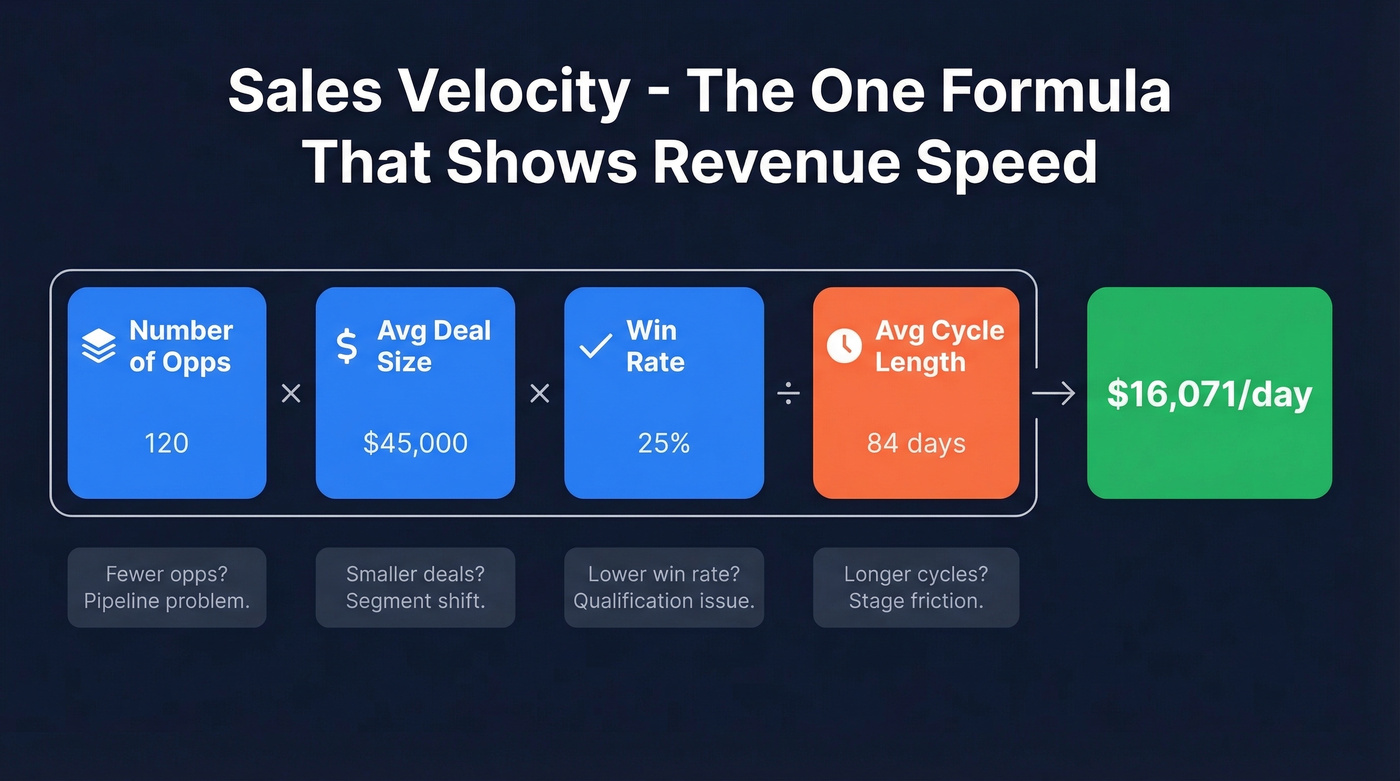
Sales velocity - (number of opportunities x average deal size x win rate) / average sales cycle length - compresses four variables into a single dollar-per-day figure. When velocity drops, you can immediately see which lever moved: fewer opps, smaller deals, lower win rates, or longer cycles.
If you want a deeper set of leading indicators, use this pipeline health framework to pressure-test what your dashboard is really telling you.
Why 3-5 Metrics Is Enough
Here's the thing: most guides hand you a dashboard with 20+ metrics. We've watched RevOps teams build beautiful Looker dashboards that nobody opens because they tracked 25 metrics instead of 5. Pick the 3-5 that connect directly to whatever's keeping your VP up at night. If pipeline is the problem, focus on coverage, creation rate, and stage conversion. If forecasting accuracy is the issue, zero in on win rate, deal aging, and cycle length.
You can always add metrics later. You can't un-waste the two weeks you spent building a dashboard nobody uses. If you're unsure what to prioritize, start with these sales operations metrics.
2026 Benchmarks
Before you analyze trends, you need baselines. Here's where B2B SaaS benchmarks sit based on the most recent full-year data:
| Metric | Benchmark Range | Notes |
|---|---|---|
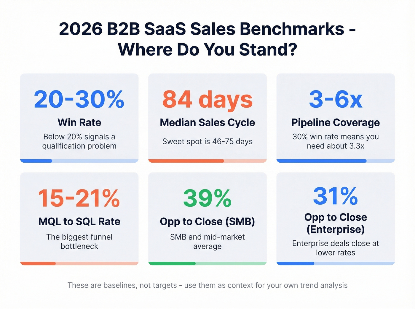
| Lead-to-customer | 2-5% | Varies heavily by channel |
| MQL to SQL | 15-21% | The biggest funnel bottleneck |
| Median sales cycle | 84 days | Optimal range: 46-75 days |
| Win rate | 20-30% | Below 20% = qualification issue |
| Opp to Close (SMB) | 39% | SMB/mid-market |
| Opp to Close (Enterprise) | 31% | Enterprise complexity |
| Pipeline coverage | 3-6x quota | 30% win rate = need ~3.3x |
These aren't targets - they're context. If your win rate is 18% and the benchmark is 20-30%, that's a signal worth investigating. If your cycle length is 120 days against an 84-day median, you've found a trend worth decomposing. For more context on funnel ratios, compare against broader funnel metrics.
Step-by-Step Process
Pull 12-18 Months of CRM Data
Export everything: opportunities, stages, close dates, amounts, owner, source. Twelve months is the minimum for spotting seasonal patterns. Eighteen months gives you overlap to validate whether last Q4's spike was a real trend or a one-time event.
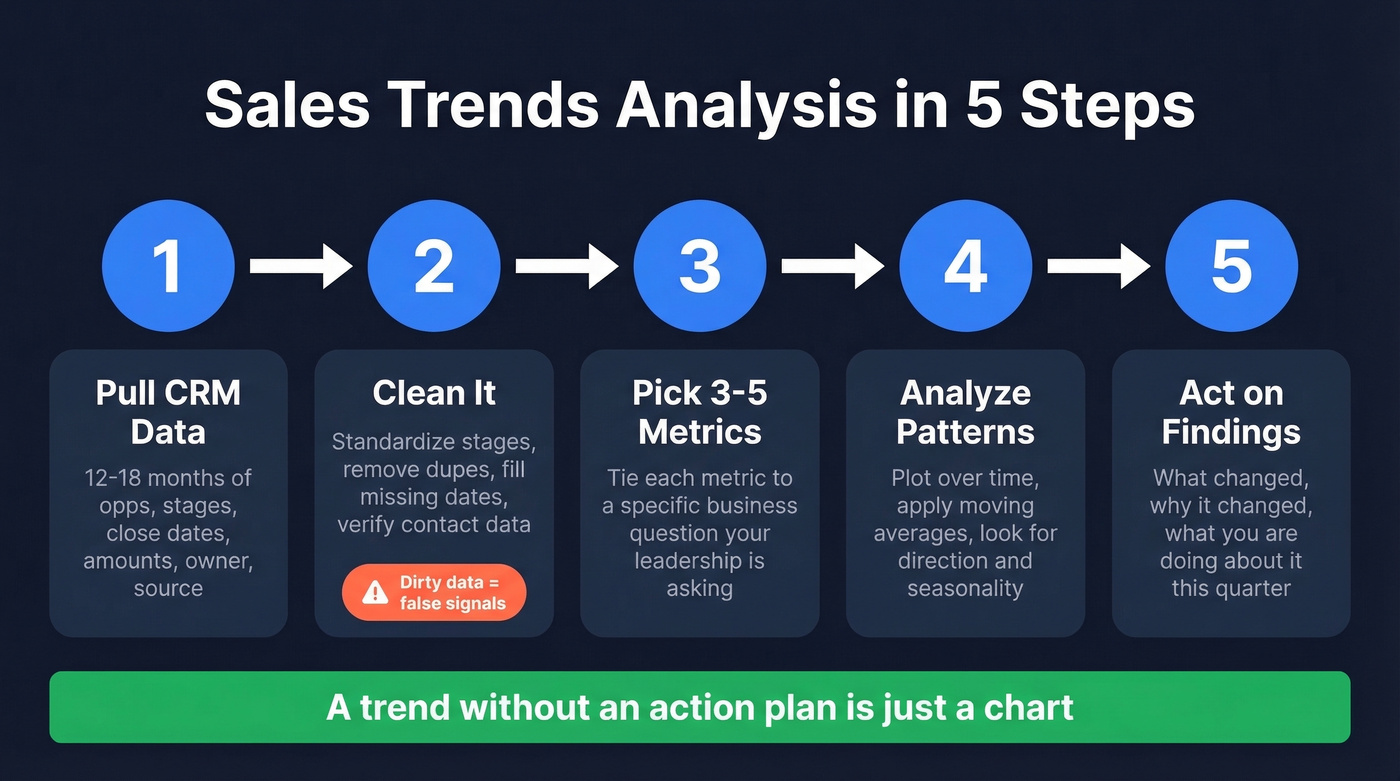
Clean It
Dirty data is the silent killer of every trend analysis. It's common to find duplicate records in a CRM that's been running for two or more years, with three different spellings of "Negotiation" as a stage name. The Outreach step-by-step guide nails the checklist: standardize stage names, remove duplicates, fill missing close dates, and flag suspicious values.
But there's an upstream problem most guides ignore: the contact data feeding your CRM is often wrong before it even arrives. Bounced emails, outdated titles, wrong companies - all of it corrupts the records your trend analysis depends on. Tools like Prospeo address this at the source with 98% email accuracy and a 7-day data refresh cycle, compared to the 6-week industry average. Trend analysis built on stale CRM records is just noise with a chart on top. If you're evaluating vendors, start with these data enrichment services.
Pick 3-5 Metrics
Tie each metric to a specific business question. "Why did we miss forecast last quarter?" points you toward win rate and deal aging. "Why is pipeline thin going into Q2?" leads to pipeline creation rate and stage conversion. If you're working from invoice-level data rather than CRM opportunities - common in teams that haven't fully adopted a CRM - the same logic applies: group by customer, product, or region and pick the 3-5 cuts that answer your leadership's actual question.
Don't pick metrics because a blog told you to. Pick them because they answer what the business is asking. If you need a practical way to operationalize this, borrow a data-driven selling approach.
Analyze Patterns
Start simple: plot your chosen metrics over time in a line chart. Look for direction (up, down, flat), inflection points, and seasonality. Then apply a moving average to smooth out week-to-week noise and reveal the underlying trend.
Act on Findings
A trend without an action plan is just a chart. If win rates are declining, dig into which segments, reps, or deal sizes are driving the drop. If cycle length is increasing, check whether it's happening at a specific stage. The best analyses end with three things: what changed, why it changed, and what you're doing about it this quarter.
If the “why” keeps coming back to process friction, use a sales process optimization checklist to turn insights into fixes.
Every trend line in your analysis is built on CRM data - and dirty data produces false signals. Prospeo enriches your pipeline with 98% verified emails, 50+ data points per contact, and a 7-day refresh cycle so the patterns you spot are real, not artifacts of stale records.
Stop analyzing noise. Start with data that's accurate this week.
Formulas You Can Copy Today
Moving Average
A 7-day moving average strips out daily volatility and shows you the real direction. In Google Sheets or Excel:
=AVERAGE(OFFSET(C2,0,0,-7))
This averages the current cell and the six cells above it. Drag it down your column and chart both the raw data and the moving average. The gap between them tells you how noisy your data is.
TREND Function
To project a metric forward based on historical patterns:
=TREND(C2:C90, A2:A90, A91)
Column C holds your metric values, column A holds dates. A91 is the future date you're projecting to. This fits a linear regression and extrapolates - useful for quick "where are we headed?" estimates. Fair warning: it assumes linearity, and revenue growth isn't a straight line. Always plot the data first and eyeball the shape before trusting the output.
Excel Forecast Sheet
Excel's built-in Forecast Sheet is criminally underrated. Go to Data > Forecast Sheet, select your date and value columns, and Excel generates a time series forecast with confidence intervals. It handles seasonality detection automatically. For teams under 20 reps who don't need Python or a BI tool, this is the fastest path to a defensible forecast. Period.
Seasonal Decomposition
This is the method that separates competent analysis from guesswork. Seasonal decomposition breaks your time series into three components: trend (Tt), seasonal pattern (St), and residual noise (Rt).
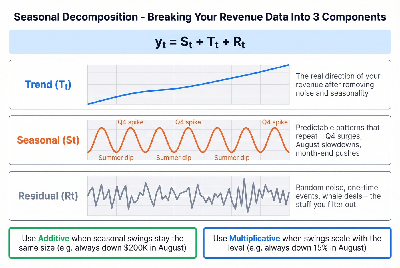
The additive model: yt = St + Tt + Rt
Use additive decomposition when your seasonal swings stay roughly the same size regardless of the overall level - for example, pipeline creation dips by $200K every August whether your baseline is $1M or $2M. Use multiplicative when the variation scales with the level, like a consistent 15% dip in August regardless of baseline.
For monthly data, the classical approach estimates the trend using a 2x12 moving average to center the values, then computes seasonal indices by averaging the detrended values for each month. In Python, it's five lines:
from statsmodels.tsa.seasonal import seasonal_decompose
result = seasonal_decompose(df['revenue'], model='additive', period=12)
result.plot()
If your seasonal patterns evolve over time, look into STL decomposition - it's more flexible and handles outliers better. For most B2B sales teams, classical decomposition on 18-24 months of monthly data is more than enough to separate real trends from "it's just Q4."
Common Pitfalls
Pipeline inflation. Salesforce pipeline is routinely inflated. One FP&A team on Reddit described their pipeline as "highly aggravated" and compensated by manually selecting the top 20-30 opportunities and adjusting based on sales conversations. If your analysis is built on inflated pipeline, your trends are fiction.
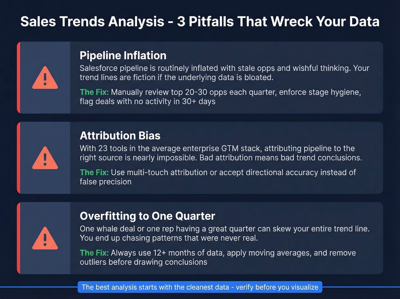
Attribution bias. With 23 tools in the average enterprise GTM stack, every platform claims credit for the same deal. When you're analyzing which channels drive pipeline, platform self-attribution will make every channel look like the winner. Cross-reference everything.
Assuming linearity. The TREND function fits a straight line. Revenue growth isn't one. If you're projecting forward with linear regression and your actual growth is exponential or decelerating, your forecast will be wrong. Plot first, model second.
Sentiment-behavior mismatch. Reps report confidence in deals while activity metrics show declining engagement. In our experience, the teams that catch this early - by comparing self-reported pipeline health against actual email/call activity - avoid the worst forecast misses.
Confirmation bias. You already believe pipeline is healthy because the VP said so in the all-hands. Now you're looking at the data to confirm that belief instead of testing it. Before you analyze, write down what you expect to find. If the data matches perfectly, be suspicious.
Ignoring external factors. NetSuite's trend analysis framework explicitly warns that past trends won't predict the future when unforeseen variables enter the picture. A new competitor, a pricing change, a macroeconomic shift - none of these show up in your historical data, but they'll break your projections. If you want a structured way to sanity-check assumptions, use a competitive intelligence strategy process alongside your trend work.
Tools by Team Size
Under 20 Reps
Excel or Google Sheets plus your CRM's built-in dashboards. Cost: $0. This handles moving averages, TREND functions, Forecast Sheets, and PivotTable analysis. Don't overcomplicate it.
Let's be honest: if your average deal size is under $15K and you have fewer than 20 reps, you almost certainly don't need a dedicated forecasting tool. A well-maintained spreadsheet with clean CRM data will outperform a $50K/year AI platform running on dirty data every single time.
20-100 Reps
Add Power BI at ~$10/user/month or Tableau at $15-75/user/month for automated dashboards and more sophisticated visualizations. HubSpot ($45-150/user/mo) and Zoho ($14-40/user/mo) both include decent forecasting in their CRM tiers. Forecastio ($49-99/user/mo) and Oliv (from $19/user/mo) are newer entrants worth evaluating if you want AI-assisted forecasting without enterprise pricing. Budget $500-2K/month for the analytics layer.
If you're building an outbound motion in parallel, pair reporting with a solid SDR tool so activity data is consistent.
100+ Reps
This is where Clari ($100-120/user/mo), Gong Forecast ($250/user/mo), Salesforce Einstein ($50-220/user/mo), or Anaplan ($30K-100K+/year) start making sense. AI-native platforms often claim 90-98% forecast accuracy, but those numbers assume clean, complete data and 2+ years of history. Without that foundation, you're paying enterprise prices for mediocre predictions.
Skip the BI tool if...
Your team is under 10 reps and your CRM has fewer than 500 opportunities. You'll spend more time configuring the tool than analyzing data. A PivotTable and a line chart will get you 80% of the insight at 0% of the cost.
Data Quality Layer
None of these tools matter if the underlying data is wrong. Prospeo verifies and enriches contact records before they enter your CRM - 300M+ profiles, 98% email accuracy, 7-day refresh cycle. At ~$0.01/email, it's the cheapest insurance policy against garbage-in-garbage-out. If you're troubleshooting bounce issues, start with email bounce rate benchmarks and fixes.
| Team Size | Tools | Cost |
|---|---|---|
| Under 20 reps | Excel/Sheets + CRM | $0 |
| 20-100 reps | Power BI or Tableau + CRM | $500-2K/mo |
| 100+ reps | Clari, Gong, or Anaplan | $800-4K+/mo |
| Data quality (all sizes) | Prospeo | Free-$39+/mo |
Declining win rates and lengthening sales cycles often trace back to one root cause: you're reaching the wrong people with wrong contact data. Prospeo's 300M+ verified profiles and 92% enrichment match rate fix the upstream problem before it corrupts your trend analysis.
Fix the data feeding your pipeline - trends will follow.
Practice With Real Data
Don't just read about trend analysis - do it. ExcelX offers free synthetic sales datasets (CC0 licensed) that are perfect for building muscle memory:
- Product Sales by Region - 1,500 rows with regional breakdowns, discounts, and salesperson data
- Online Store Orders - 1,200 records with order status and referral channels
Download one, build a PivotTable grouping revenue by month, calculate a week-over-week comparison, then overlay a 4-week moving average chart. You'll internalize the process faster than reading another guide - and you'll immediately see which methods click for your analysis style.
FAQ
How much data do I need for reliable trend analysis?
Twelve to eighteen months is the minimum for identifying meaningful patterns. Two or more years is ideal for seasonal decomposition, since you need at least two full cycles to separate seasonal effects from one-time events. Anything under six months is too noisy - you'll mistake random variation for real trends.
What's the difference between trend analysis and sales forecasting?
Trend analysis identifies patterns in historical data - what happened and why. Forecasting uses those patterns, plus current pipeline data and rep input, to predict future revenue. Trend analysis feeds forecasting, but they're distinct disciplines. You can analyze trends without forecasting; you shouldn't forecast without analyzing trends first.
Can I do this in a spreadsheet instead of buying software?
Yes, and for most teams it's the right starting point. Excel and Google Sheets handle moving averages, TREND functions, and built-in Forecast Sheets. You don't need a dedicated AI platform unless you have 50+ reps and 2+ years of clean data to feed it. Pair your spreadsheet with a data quality tool to keep the underlying contact data accurate, and you've got a complete stack at near-zero cost.