Email Deliverability Score: What It Really Means and How to Improve Yours
Your open rates just dropped 40% overnight. Nothing changed - same list, same copy, same sending schedule. But something shifted on the ISP side, and now a chunk of your emails are landing in spam. Roughly one in six emails never reaches the inbox, and 70% of emails show at least one spam-related issue. The gap between "sent" and "seen" is where your email deliverability score lives, and understanding yours is the first step to fixing it.
The Quick Version
A deliverability score above 80 on a 0-100 scale means you're in good shape. Below 70, something's broken and needs immediate attention.
The most authoritative signals come from the mailbox providers themselves - Google Postmaster Tools for Gmail and Microsoft SNDS for Outlook/Hotmail. Third-party scores are directional at best. And the fastest way to destroy your score? Sending to bad data. Fix your contact quality first, authentication second, content third.
What Does a Deliverability Score Actually Measure?
An email deliverability score predicts the likelihood that your messages land in the inbox rather than the spam folder or vanish entirely. Scores typically range from 0 to 100, where 80+ indicates good deliverability and anything below 70 signals significant problems.
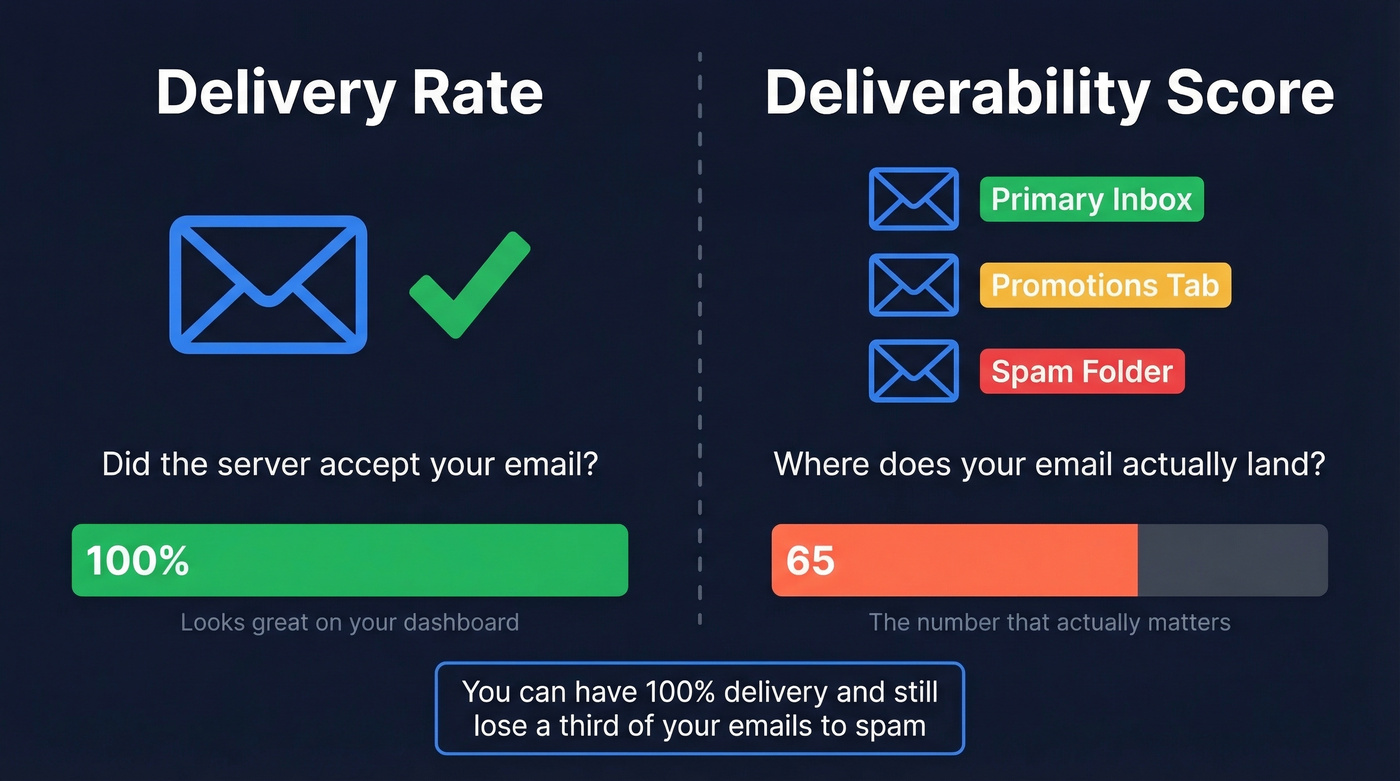
Here's the distinction most people miss: delivery rate and deliverability aren't the same thing. Delivery rate measures whether the receiving mail server accepted your message - it didn't hard bounce. Deliverability measures where that accepted message actually ends up: primary inbox, promotions tab, spam folder, or some black hole in between.
You can have a 100% delivery rate and a 65 deliverability score. Every email gets accepted, but a third of them route straight to spam. That's the scenario that kills campaigns silently - your ESP dashboard shows green, but your reply rates tell a different story. Once bounce rates cross 5%, ISPs start compounding the damage to your sender reputation fast (and it’s why tracking your email bounce rate matters).
How Scores Are Calculated
Every deliverability score draws on the same five core inputs, weighted differently depending on who's doing the math:
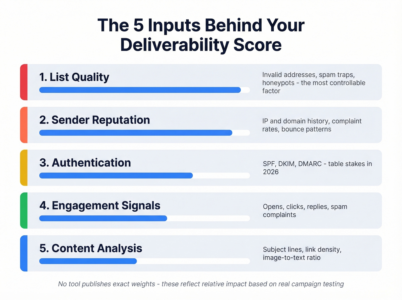
Sender reputation - your IP and domain history. ISPs track complaint rates, bounce rates, and sending patterns over time. A clean history earns trust; a dirty one takes months to rebuild (more on how to improve sender reputation).
Authentication status - whether you've properly configured SPF, DKIM, and DMARC. These protocols prove you're who you say you are. Missing any of them is like showing up to a meeting without ID.
Content analysis - spam filters scan subject lines, body text, link density, image-to-text ratio, and attachment size. Image-heavy emails and link shorteners still trigger filters in 2026 (use a proper email spam checker when in doubt).
Engagement signals - opens, clicks, replies, and spam complaints. Gmail in particular uses engagement as a major routing signal. MailerLite's benchmarks from December 2024 through November 2025, based on 3.6M campaigns from 181,000 accounts, show an average 43.46% open rate. If your numbers are significantly below that, engagement signals are dragging your score down (compare against a standard email open rate).
List quality - invalid addresses, spam traps, honeypots, and inactive contacts. This is the most controllable input and the one most teams neglect (see spam trap removal).
No tool publishes exact weights for these inputs. ISPs guard their algorithms the way Google guards search ranking factors. But in our experience testing across dozens of client campaigns, list quality and sender reputation drive the biggest swings - authentication is table stakes, and content issues are usually the easiest to fix.
Types of Deliverability Scores
Not all scores measure the same thing. Understanding the differences explains why your results seem contradictory across tools.
Sender Score (Validity)
Sender Score rates your sending IP on a 0-100 scale based on complaint rates, unknown user rates, spam trap hits, and sending patterns observed across Validity's partner network. It's the most widely cited reputation metric in the industry.
The limitation: Sender Score reflects Validity's dataset, not what Gmail or Microsoft actually see. A high Sender Score doesn't guarantee inbox placement. Think of it as an early warning system - a declining score means something's wrong, but a perfect score doesn't mean everything's right.
Google Postmaster Tools
Google Postmaster Tools underwent a major overhaul in October 2025. The V2 interface removed the familiar IP Reputation and Domain Reputation dashboards entirely. What replaced them is simpler but arguably more useful: a Compliance Status dashboard with pass/fail on SPF, DKIM, DMARC alignment, PTR records, TLS, and one-click unsubscribe, plus a Spam Rate dashboard.
The spam rate formula is straightforward: emails users report as spam divided by emails delivered to inbox, times 100. Keep this below 0.3%.
Here's what most guides skip: the spam rate in Postmaster Tools only reflects manual user reports - someone clicking "Report spam." It doesn't capture automatic filtering to Spam or Promotions. You can have a 0.1% spam rate in Postmaster while Gmail silently routes 30% of your mail to Promotions. We've seen this firsthand with clients who thought everything was fine until they actually asked recipients to check their folders.
Third-Party Tool Scores
Tools like GlockApps, Mail-Tester, and others generate proprietary scores by combining authentication checks, blacklist lookups, content heuristics, and seed inbox placement tests. None of them use the same methodology, which is exactly why they disagree. These scores are useful for catching specific problems - a blacklisting, a broken DKIM record, a spammy subject line - but treating any single tool's number as your "real" score is a mistake.
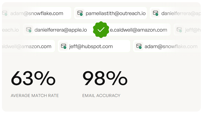
List quality drives the biggest swings in your deliverability score - you just read why. Prospeo's 5-step verification with catch-all handling, spam-trap removal, and honeypot filtering delivers 98% email accuracy. Clients like Snyk dropped bounce rates from 35% to under 5%.
Stop sending to bad data. Start with emails that actually land.
2026 Benchmarks by Provider
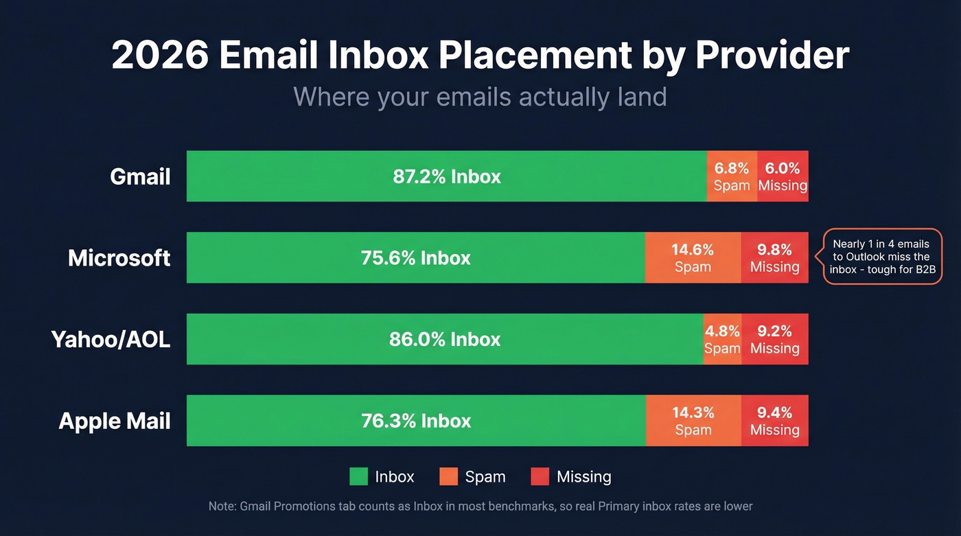
Here's where emails actually land across the major mailbox providers:
| Provider | Inbox | Spam | Missing |
|---|---|---|---|
| Gmail | 87.2% | 6.8% | 6.0% |
| Microsoft | 75.6% | 14.6% | 9.8% |
| Yahoo/AOL | 86.0% | 4.8% | 9.2% |
| Apple Mail | 76.3% | 14.3% | 9.4% |
Most benchmarks count Gmail's Promotions tab as "inbox," so real Primary inbox rates are lower than that 87.2% figure suggests.
That Microsoft number should concern anyone doing B2B outreach. Nearly one in four emails to Outlook and Hotmail addresses miss the inbox entirely. The consensus on r/coldemail consistently flags Microsoft as the toughest provider to crack, and the data backs it up.
Your ESP matters too. EmailTooltester's tests showed wild variance across platforms:
| ESP | Inbox Rate |
|---|---|
| ActiveCampaign | 94.2% |
| Mailchimp | 89.5% |
| HubSpot | 77.7% |
| Benchmark | 47.1% |
If you're on a platform scoring below 80%, switching ESPs might do more for your deliverability than any amount of list cleaning. That's a hot take, but the data is hard to argue with.
For grading your own performance, EmailTooltester's benchmarks offer a clean rubric: above 89% inbox placement is excellent, 83-88% is acceptable, and below 83% is poor. The average across the 15 ESPs they tested sits at 83.1%, meaning the typical sender is barely scraping "acceptable." Litmus's own internal benchmark is even stricter - if inbox placement drops below 90%, they investigate immediately.
Let's be honest: a fifth of the market is flying blind. 22% of email practitioners don't measure deliverability at all, or aren't sure if they do.
Why Tools Give Different Results
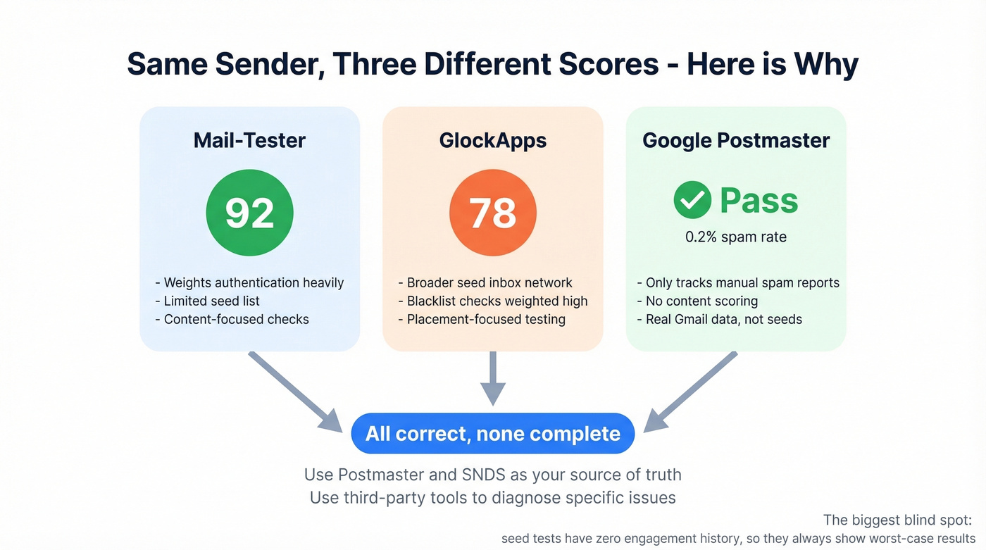
You ran three deliverability tests and got three different answers. A 92 on Mail-Tester, a 78 on GlockApps, and Postmaster shows a "Pass" with a 0.2% spam rate. Which one's right?
All of them, and none of them.
Different seed lists. Each tool sends test emails to its own set of seed mailboxes. The composition of those seed lists directly affects results.
Different scoring weights. One tool weights authentication at 40% and content at 20%. Another flips those numbers. There's no industry standard.
Zero engagement history. This is the one most people miss. Seed-list tests are essentially cold emails with no prior engagement. Your real emails, sent to people who've opened and clicked before, will almost always perform better than a seed test suggests. The tools are testing a worst-case scenario.
Use Google Postmaster Tools and Microsoft SNDS as your source of truth. Use third-party tools to diagnose specific issues. Don't obsess over the number itself.
What's Killing Your Score
Fix these from the top down - ordered by impact.
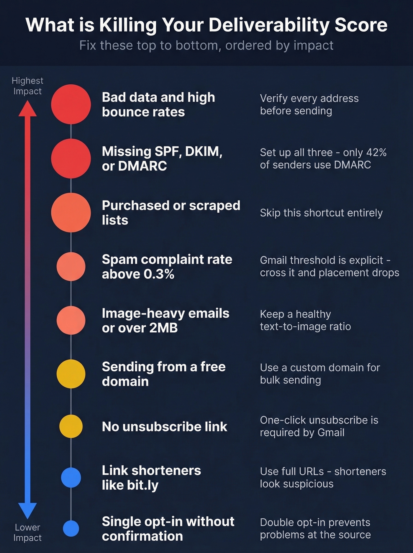
Bad data and high bounce rates. This is the number-one controllable factor. Bounce rates above 5% trigger ISP warnings, and once your reputation takes a hit, every subsequent send performs worse. Verify every address before you send. Prospeo's 5-step verification catches invalid emails, spam traps, and honeypots before they become bounces - 98% email accuracy across 143M+ verified addresses.
Missing authentication. The adoption numbers are still surprisingly low: only 55.4% of senders use SPF, 58.5% use DKIM, and just 42.5% use DMARC. If you're in the missing percentage, you're handing ISPs a reason to distrust you (start with a clean SPF record example).
Purchased or scraped lists. These are loaded with spam traps and inactive addresses. One spam trap hit can blacklist your IP. Skip this shortcut entirely (and if you’re unsure on the rules, read Is It Illegal to Buy Email Lists?).
Spam complaint rate above 0.3%. Gmail's threshold is explicit. Cross it and your inbox placement drops immediately.
Image-heavy emails or messages over 2MB. Modern spam filters penalize high image-to-text ratios. The old "entire email as one image" trick hasn't worked in years.
Sending from a free domain. Gmail, Yahoo, and Outlook all penalize emails sent from @gmail.com or @yahoo.com addresses in bulk. Use a custom domain.
No unsubscribe link. Gmail's bulk-sender compliance requirements include one-click unsubscribe. Skipping it is a compliance failure that Postmaster Tools will flag.
Link shorteners like bit.ly. Spammers use these to mask malicious URLs. Filters treat them with suspicion.
Single opt-in without confirmation. Double opt-in reduces list quality issues at the source. It's a small friction that prevents big problems.
How to Check Your Score
Google Postmaster Tools
Free, direct from Gmail, and the single most important deliverability monitoring tool available. The V2 interface gives you Compliance Status and Spam Rate tracking. If your compliance status shows a fail, you can face 5xx-level rejections - not just spam placement, but outright blocking.
The limitation is scope: it only covers Gmail. You get no visibility into Outlook, Yahoo, or Apple Mail behavior. And it won't tell you if your emails are landing in Promotions versus Primary.
GlockApps
The most thorough seed-list testing tool on the market. GlockApps sends test emails across 50+ ISPs and shows you exactly where they land - including the Gmail Primary vs. Promotions split, which most tools ignore. It checks 50+ blacklists and generates detailed authentication reports.
The free plan includes 2 spam tests per month. The Essential plan runs $59/mo for 360 test credits. Our standard caveat: seed-list tests use around 100 mailboxes, so don't overgeneralize from a single test. Run multiple tests over time to spot trends.
Other Tools Worth Knowing
| Tool | Type | Free Tier | Paid From | Best For |
|---|---|---|---|---|
| Mail-Tester | Quick check | Yes | Free | Fast spam score |
| Microsoft SNDS | Monitoring | Yes | Free | Outlook IP rep |
| MxToolbox | Testing | Yes (basic) | $129+ | Blacklist + auth |
| Sender Score | Reputation | Yes | Free | IP trend tracking |
| Warmy | Warmup | Free trial | - | Domain warmup |
| ZeroBounce | Verification | - | from $49 | List cleaning |
Microsoft SNDS deserves a special callout for B2B teams. It's free, it shows your IP reputation, spam complaints, and spam trap hits for Outlook/Hotmail recipients. Pair it with JMRP (Junk Mail Reporting Program) to get feedback-loop data on spam complaints. It doesn't cover Office 365/Microsoft 365 enterprise accounts, and you'll need to send at least 100 messages per day to see meaningful data.
The 30-Day Improvement Playbook
Week 1: Authentication. Set up SPF, DKIM, and DMARC if you haven't already. Add BIMI for verified logo display once DMARC is enforcing. This is the foundation - skip it and nothing else matters. Most DNS providers make this a 30-minute job per protocol (if you want to validate setup, see how to verify DKIM is working).
Week 2: List hygiene. Run your existing list through a verification tool before your next send. Stack Optimize used Prospeo's verification to maintain 94%+ deliverability with bounce rates under 3% and zero domain flags across all clients. Remove anyone who hasn't engaged in 90+ days. I can't stress this enough - we've seen teams recover 15+ points on their deliverability score from list cleaning alone.
Week 3: Warmup and engagement. For new domains or reputation recovery, ramp sending volume gradually - start at 20-50 emails per day and increase by 20% weekly. Prioritize sending to your most engaged contacts first. Their opens and replies signal to ISPs that your mail is wanted (keep an eye on safe email velocity as you ramp).
Week 4: Monitoring setup. Connect Google Postmaster Tools and Microsoft SNDS. Set a weekly calendar reminder to check both dashboards. Configure your ESP's bounce and complaint alerts to notify you when rates spike above 2% for bounces or 0.2% for complaints. This isn't a one-time fix - it's an ongoing practice. Checking your email deliverability score on a regular cadence is what separates teams that maintain inbox placement from those who only react after campaigns tank.
Every invalid email you send compounds the damage to your sender reputation. Prospeo refreshes all 300M+ profiles every 7 days - not every 6 weeks like competitors. That means the contacts you pulled last Monday are still accurate this Monday.
Fix your deliverability score at the source: your contact data.
FAQ
What is a good email deliverability score?
A score of 80+ on a 0-100 scale indicates good deliverability. For inbox placement specifically, above 89% is excellent, 83-88% is acceptable, and below 83% signals problems. The global average across major ESPs sits around 83.1%, so most senders are barely clearing the bar.
Why do different tools give different scores?
Each tool uses different seed lists, scoring weights, and methodologies. Seed-list tests send cold emails with no engagement history, which skews results lower than real-world performance. Use Google Postmaster Tools and Microsoft SNDS as your source of truth, and third-party tools to diagnose specific issues like blacklistings or broken DKIM.
How often should I check my deliverability?
Monitor Google Postmaster Tools and your ESP's bounce/complaint dashboards weekly. Run seed-list tests monthly, or before any major campaign change like a new domain or significant volume increase. Teams that check weekly catch reputation dips before they compound.
Can email warmup fix a bad score?
Warmup helps rebuild reputation for new or damaged domains, but it won't fix root causes like bad data, missing authentication, or high complaint rates. Fix structural issues first, then use warmup to gradually re-establish ISP trust. Expect 4-6 weeks to see meaningful improvement.
What's the best free way to verify emails before sending?
Prospeo offers 75 free email credits per month with full 5-step verification, including catch-all handling, spam-trap removal, and honeypot filtering. ZeroBounce and NeverBounce also offer limited free tiers, but Prospeo's free plan includes the deepest verification pipeline at no cost - a solid option for small teams protecting sender reputation.