How to Build a Lead Generation Dashboard That Actually Tells You Something
Your marketing team presents 1,200 leads at the monthly review. The VP of Sales asks one question: "How many turned into pipeline?" Silence. That's not a reporting problem - it's a dashboard problem.
In a Databox survey, 67% of respondents called lead gen dashboards "very important," yet 36.1% don't even have a defined strategy behind theirs. Most dashboards are decoration. Let's build one that isn't.
What a Good Dashboard Does
Every lead gen dashboard worth opening does three things:
- Tracks KPIs by funnel stage, not in a flat list. TOFU, MOFU, and BOFU metrics need separate views because they measure different things on different timelines. (If you need a clean framework, start with funnel metrics.)
- Attributes leads to specific channels and campaigns. If you can't answer "which campaign generated pipeline?" you're guessing with budget.
- Runs on clean data. If 30% of your emails bounce, your CPL and conversion rates are fiction. (Use email bounce rate benchmarks to sanity-check your list health.)
What Is a Lead Generation Dashboard?
A lead generation dashboard is a real-time reporting layer that visualizes how prospects enter your funnel, how they progress through qualification stages, and what they cost. Simple concept. Harder to execute than it sounds.
The average B2B buying cycle runs 10.1 months. First contact happens at 61% of the buyer's journey, the winning vendor is on the Day One shortlist 95% of the time, and Forrester data shows 92% of buyers start with at least one vendor already in mind. If your dashboard only shows the last seven days, you're staring at noise. You need a view that spans months - one that tracks how today's website visitor becomes next quarter's closed deal.
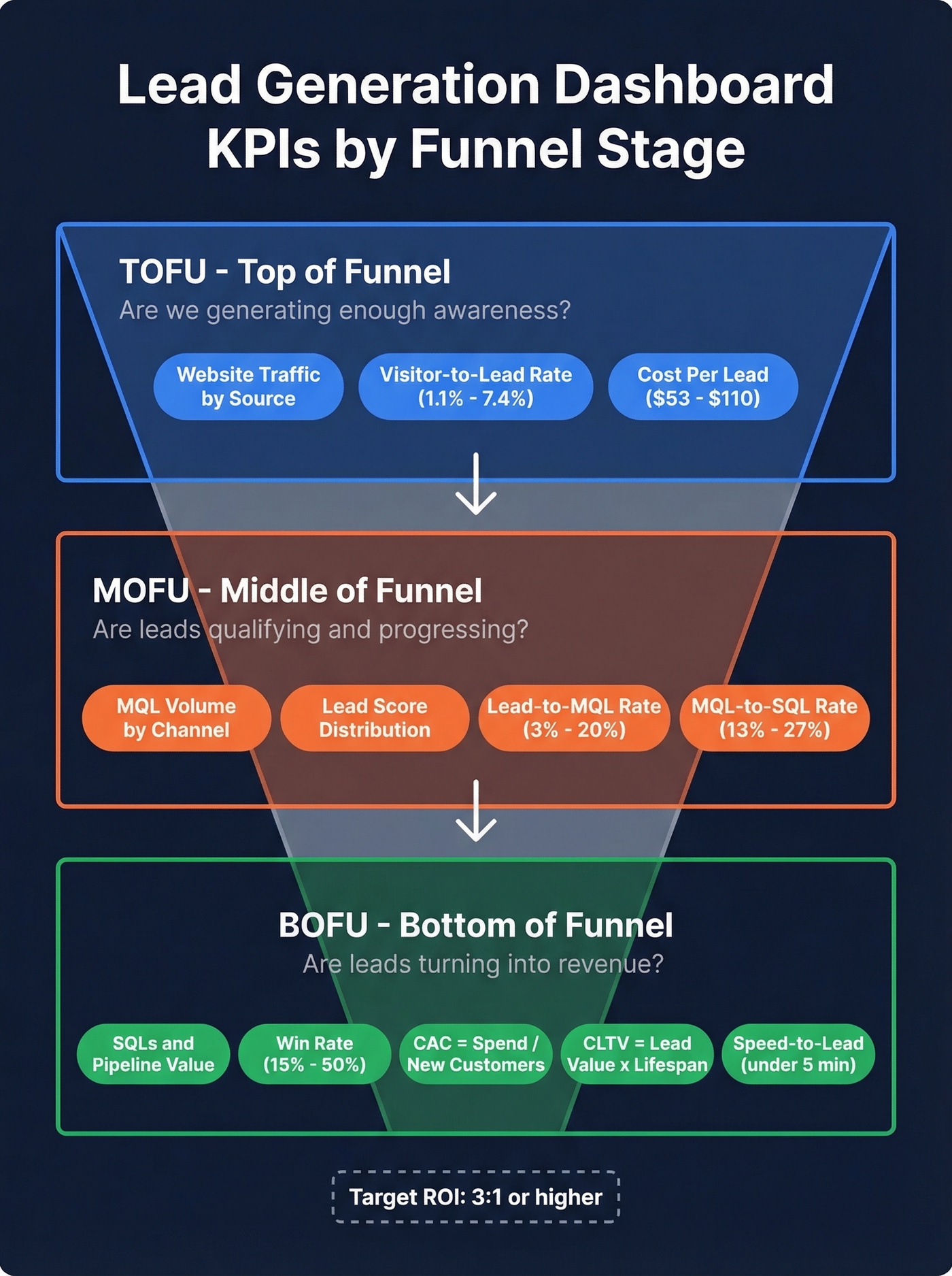
KPIs by Funnel Stage
Top of Funnel
TOFU metrics answer one question: are we generating enough awareness to fill the pipe? Track website traffic by source, visitor-to-lead conversion rate, and cost per lead. (For deeper benchmarks, compare against the average B2B lead conversion rate.)
Conversion benchmarks vary wildly by industry. FirstPageSage's 2026 report shows these visitor-to-lead rates:
| Industry | Conversion Rate |
|---|---|
| B2B SaaS | 1.1% |
| IT & Managed Services | 1.5% |
| Manufacturing | 2.2% |
| Legal Services | 7.4% |
If you're a SaaS company celebrating a 1% conversion rate, you're right on benchmark. A legal firm at 1%? Something's broken. Your dashboard needs industry-specific targets, not generic ones.
For CPL, channel averages range from $53 to $110, with email marketing at the low end and paid channels pushing toward $110 depending on audience and platform.
Middle of Funnel
MOFU is where most dashboards fall apart. You need MQL volume, lead score distribution, email engagement metrics, and - critically - lead-to-MQL conversion rates broken out by channel. The aggregate number hides everything useful.
| Channel | Lead-to-MQL Rate | Time to Convert |
|---|---|---|
| Organic Search | 12-15% | 14-21 days |
| Paid Advertising | 8-10% | 7-14 days |
| Email Campaigns | 5-8% | 21-30 days |
| Social Media | 3-6% | 30-45 days |
| Referrals | 15-20% | 7-14 days |
Referrals convert fastest and at the highest rate. Social converts slowest. Seeing this on your dashboard changes how you allocate budget - we've watched teams shift 30% of their social spend to referral programs after one quarter of tracking this breakdown. The MQL-to-SQL benchmark sits at 13-27%. Below 13%, your lead scoring model needs recalibration, not more leads.
Bottom of Funnel
BOFU metrics tie everything to revenue. Track SQLs, pipeline velocity, win rate (15-50% depending on industry), and two formulas every dashboard should calculate automatically:
- CAC = total marketing spend / new customers acquired (If you want the full breakdown, see cost to acquire customer.)
- CLTV = average lead value x average customer lifespan
Your ROI target should be 3:1 or higher. Anything below that and you're spending more to acquire customers than they're worth over time.
One metric that belongs on every BOFU view: speed-to-lead. Leads contacted within 5 minutes are 21x more likely to qualify than those contacted after 30 minutes. Cognism targets under 3 minutes for inbound response with a 70% outcome target - that's the bar. If your dashboard tracks time-to-first-response, you'll know whether your team is hitting it.
Attribution Models That Matter
Look, a lead fills out your form. The dashboard says "direct traffic." You have no idea which of your three active campaigns actually worked. This scenario plays out constantly on r/DigitalMarketing - it's a single-touch attribution failure, and it's the default in many setups.
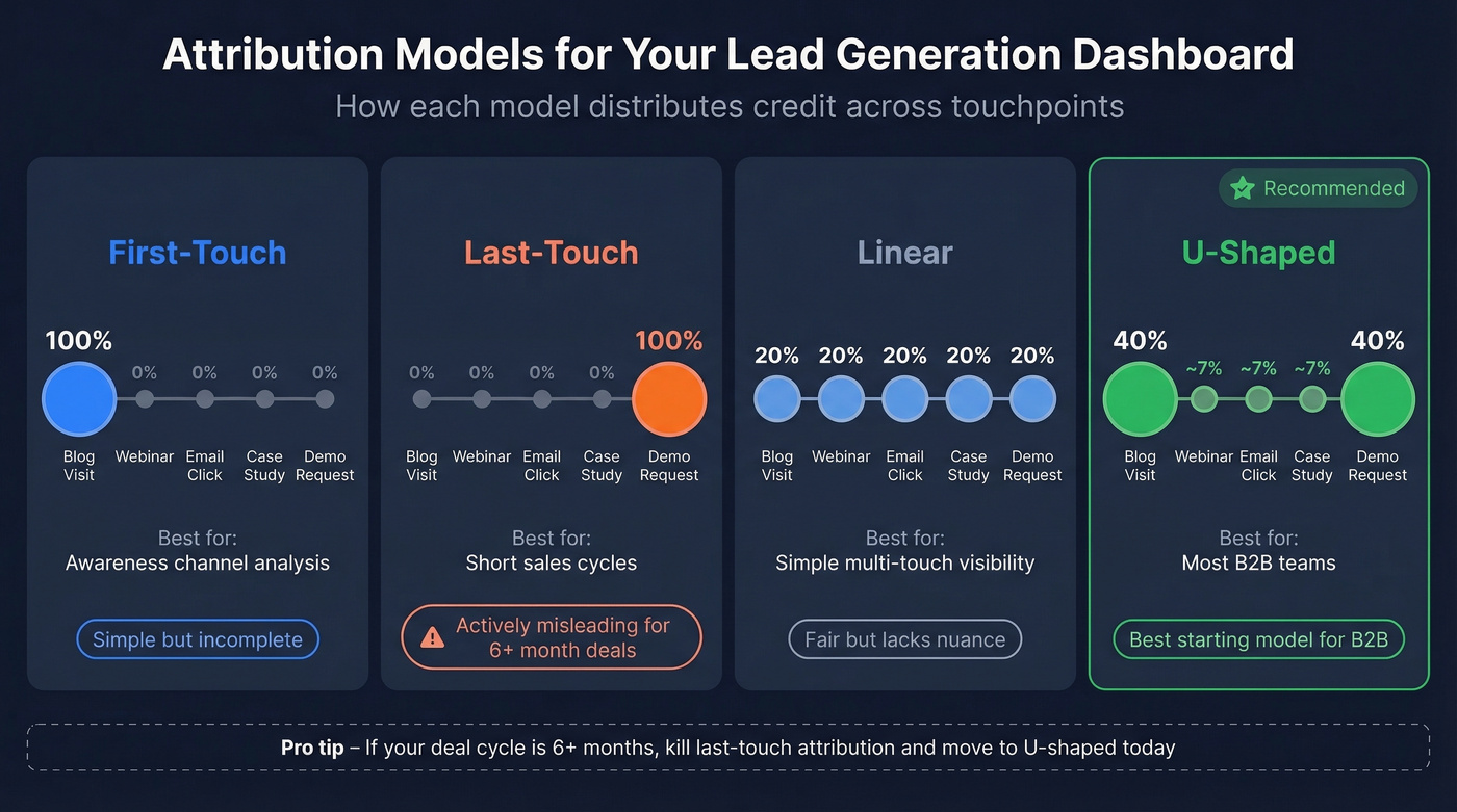
Four models worth considering:
| Model | Credit Distribution | Best For |
|---|---|---|
| First-Touch | 100% to first interaction | Awareness channel analysis |
| Last-Touch | 100% to final interaction | Short sales cycles |
| Linear | Equal split across all touches | Simple multi-touch visibility |
| U-Shaped | 40% first / 40% last / 20% middle | Most B2B teams |
U-shaped is the best starting model for most B2B teams. It gives proper credit to the channel that created awareness and the one that closed the deal, while acknowledging the nurture touches in between.
Here's our strong opinion on this: if your average deal takes 6+ months to close, last-touch attribution is actively lying to you. It gives 100% credit to whatever the buyer happened to click right before converting and ignores the blog post, webinar, and three emails that actually built the relationship. Kill last-touch. Move to U-shaped today.
Getting multi-touch attribution right requires UTM discipline. A practical structure: utm_source=linkedin&utm_medium=paid_social&utm_campaign=q1-ebook-launch&utm_content=cta-variant-a. Tag every link, every campaign, every ad variant. Then map those UTM values to your CRM's lead source fields so GA4 and your pipeline data speak the same language. There's no shortcut - but the payoff is knowing which campaigns generate pipeline, not just clicks. (If you're tightening your process end-to-end, use a lead generation workflow to standardize handoffs.)
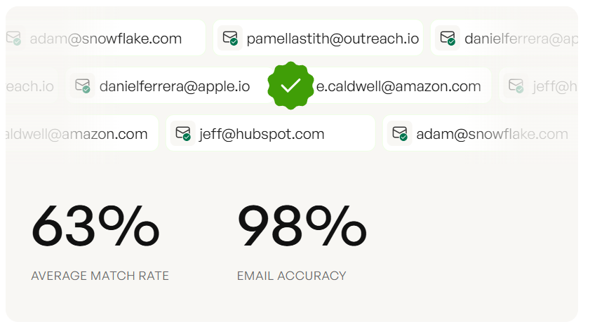
Your dashboard says you generated 1,200 leads. But if 30% of those emails bounce, your CPL, conversion rates, and attribution are all built on fiction. Prospeo's 98% email accuracy and 7-day data refresh mean every lead on your dashboard is a real person you can actually reach.
Fix your data first. Your dashboard will finally tell the truth.
Dashboard Modules to Include
Think of your dashboard as four pages:
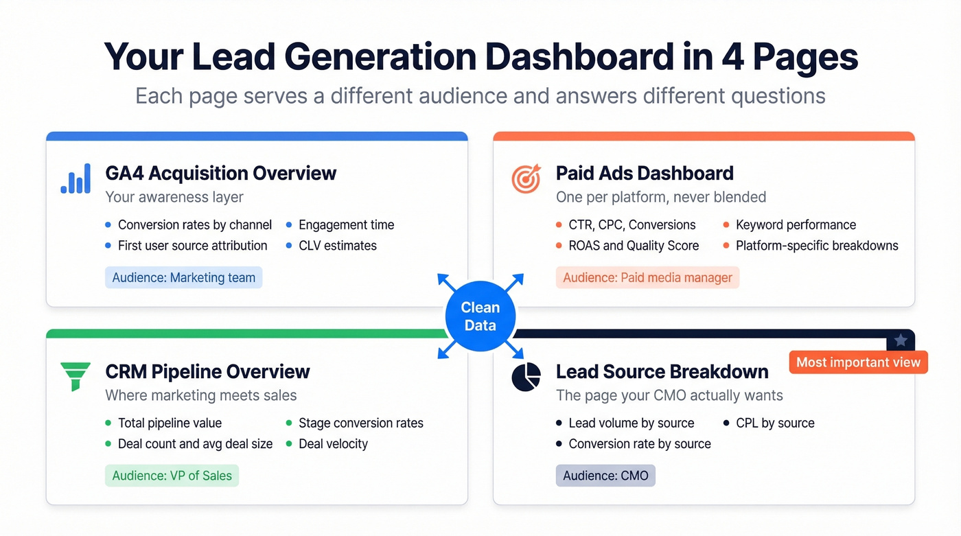
GA4 acquisition overview covers conversion rates by channel, first user source attribution, engagement time, and CLV estimates. This is your awareness layer.
Paid ads dashboard tracks CTR, CPC, conversions, ROAS, quality score, and keyword performance. Build one per platform if you're running multiple paid channels simultaneously - blending Facebook and Google Ads data into a single view creates more confusion than clarity.
CRM pipeline overview is where marketing and sales data merge: total pipeline value, deal count, average deal size, stage conversion rates, and deal velocity. (To pressure-test what “healthy” looks like, track pipeline health alongside velocity.)
Lead source breakdown is the single view showing lead volume, conversion rate, and CPL by source. This is the page your CMO actually wants to see. Klipfolio's module catalog has solid templates for visual inspiration before building your own.
Build a Free Dashboard in Looker Studio
Looker Studio is the best free option for most teams. Here's a walkthrough that goes deeper than the surface-level "connect your data" advice.
1. Create a report and add data sources. Looker Studio natively connects to Google Analytics, Google Ads, Google Sheets, and BigQuery. For HubSpot, Facebook Ads, or CRM data, you'll need partner connectors like Coupler.io or Supermetrics - budget ~$50-$300/month for those.
2. Set a date range control. The default "last 28 days" is useless for B2B. Change it to "this month / last month" and add a custom range selector for quarterly views. Remember: 10.1-month buying cycles need long lookback windows.
3. Build pages by funnel stage. One page for TOFU (traffic, conversion rate, CPL), one for MOFU (MQLs, lead scores, channel performance), one for BOFU (SQLs, pipeline, win rate, CAC). Don't cram everything onto a single view. On your TOFU page, create a calculated field for CPL using Cost / Conversions - this auto-updates as your ad spend changes. For MOFU, add a scorecard chart showing MQL count with a comparison period set to "previous period" so you instantly see whether volume is trending up or down. Use bar charts for channel breakdowns and scorecards for single KPIs. Mixing chart types keeps each page scannable.
4. Set permissions carefully. Assign owner, editor, and viewer roles. Disable download and copy for viewers - you don't want last quarter's pipeline numbers floating around in random spreadsheets.
5. Schedule email deliveries. Weekly summaries every Monday morning. Use personal report links for filtered views - your VP of Sales sees pipeline metrics, your CMO sees channel ROI, and nobody has to ask "where's the dashboard?" again.
Mistakes That Kill Your Reporting
Vanity metrics without pipeline context. Tracking impressions and clicks is fine. Tracking them without tying to downstream conversion is pointless. Every metric on your dashboard should connect to pipeline within two steps.
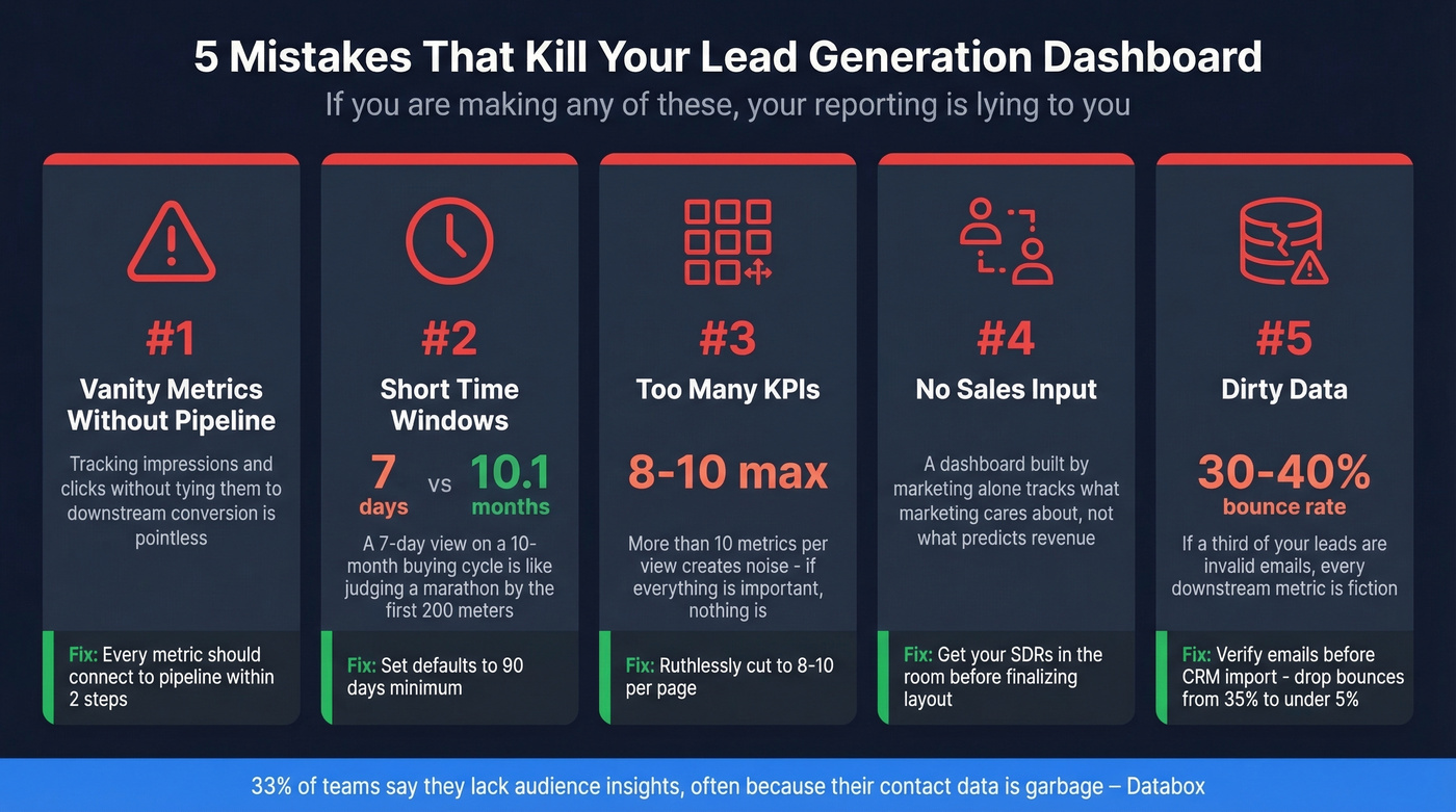
Short time windows. A 7-day default view on a 10.1-month buying cycle is like judging a marathon by the first 200 meters. Set your defaults to 90 days minimum.
Too many KPIs. More than 8-10 metrics per view creates noise. If everything's important, nothing is.
No sales input. We've seen this mistake more than any other. A dashboard built by marketing without SDR feedback will track what marketing cares about, not what actually predicts revenue. Get your sales team in the room before you finalize the layout. (If you’re building the SDR stack too, start with SDR tools.)
Dirty data. This is the silent killer. If 30-40% of your email list bounces, your CPL calculations are inflated, your conversion rates are wrong, and your attribution is broken. 33.3% of teams say they lack audience insights - often because their contact data is garbage. Run your lead list through a verification tool before importing to your CRM. One cleanup pass can drop your bounce rate from 35% to under 5%, and suddenly every downstream metric becomes trustworthy. (For the full deliverability chain, see our email deliverability guide.)
Clean Data Feeds Accurate Dashboards
Your dashboard is only as accurate as the data feeding your CRM. Every metric - CPL, conversion rate, ROI - sits downstream of contact data quality. If a third of your "leads" are invalid emails, you're making budget decisions on fiction. (This is also where data enrichment services can help fill missing fields before reporting.)
Real talk: we've seen teams spend weeks perfecting their Looker Studio layouts while ignoring the fact that their CRM is full of dead addresses. Snyk's 50-person sales team saw bounce rates drop from 35-40% to under 5% after running Prospeo's verification, which didn't just improve deliverability - it made their entire reporting stack trustworthy and drove AE-sourced pipeline up 180%.
Tracking lead-to-MQL conversion by channel only works when your contact data connects you to real buyers. Prospeo delivers 300M+ verified profiles at ~$0.01 per email - so your pipeline metrics reflect actual pipeline, not dead addresses inflating your funnel.
Stop dashboarding phantom leads. Start with data that converts.
Tools for Building Lead Gen Dashboards
Free Tier
Looker Studio is the clear winner for teams that want a free, customizable dashboard. Native Google ecosystem connectors handle Analytics, Ads, and Sheets out of the box. Partner connectors extend it to HubSpot, Facebook Ads, and most CRMs. The main tradeoff: no built-in alerting. You'll need Zapier or a similar workflow for Slack notifications when CPL spikes.
Plug-and-Play Platforms
Skip Looker Studio if you're already deep in the HubSpot ecosystem. HubSpot's free CRM tier includes basic reporting; paid plans start at $15/month/user for Starter, with Professional at ~$90/month/user and Enterprise at ~$150/month/user. Built-in lead scoring and attribution are genuinely good. The tradeoff is the walled garden - pulling in non-HubSpot data is clunky.
Databox is the better pick for mixed stacks. It connects to 130+ sources, offers a free trial, and paid plans typically land around $50-$300/month depending on features. Where HubSpot locks you into its ecosystem, Databox lets you blend HubSpot, GA4, and Stripe data into one view without custom connectors. Goals and benchmarks are locked behind higher tiers, which is frustrating but expected.
Niche Options
Klipfolio (~$50-$300/month) leans enterprise and packs serious power, but if Looker Studio plus a connector tool gets you there, save the budget. Geckoboard (~$50-$300/month) builds TV-friendly wallboard dashboards for real-time lead volume displays - great for office energy, not for deep analysis. Skip it if you need anything beyond surface-level metrics. Coupler.io (free tier; paid ~$50-$300/month) is plumbing, not a dashboard - it feeds Looker Studio or Sheets with automated data pulls.
| Tool | Price | Best For | Limitation |
|---|---|---|---|
| Looker Studio | Free | Custom dashboards | No built-in alerts |
| HubSpot | Free-$150/mo/user | HubSpot-native teams | Walled garden |
| Databox | Free-$300/mo | Mixed-stack teams | Features gated by tier |
| Geckoboard | ~$50-$300/mo | Office wallboards | Shallow analysis |
| Coupler.io | Free-$300/mo | Data pipelines | Not standalone |
| Klipfolio | ~$50-$300/mo | Enterprise reporting | Overkill for SMBs |
FAQ
What's the difference between a lead gen dashboard and a sales dashboard?
A lead generation dashboard tracks how leads enter and move through the top and middle of the funnel - traffic, conversion rates, MQLs, CPL, and attribution. A sales dashboard picks up from SQLs onward: pipeline value, deal velocity, win rates, and revenue. Separating them ensures each audience sees the metrics they can actually act on.
How often should I review my dashboard?
Check speed-to-lead and inbound volume daily. Review channel performance, lead-to-MQL rates, and CPL trends weekly. Monthly, audit attribution accuracy and benchmark against industry conversion rates. Set Looker Studio to email weekly summaries automatically so stakeholders don't have to remember to log in.
How do I make sure my dashboard data is accurate?
Verify contact data before it enters your CRM - invalid emails inflate lead counts and produce misleading conversion rates. Then audit your UTM tagging, GA4 event setup, and CRM field mapping quarterly. In our experience, most "dashboard problems" are actually data hygiene problems in disguise.
What KPIs should a lead generation dashboard always include?
At minimum: visitor-to-lead conversion rate, CPL by channel, MQL volume, lead-to-MQL rate, SQLs, pipeline value, CAC, and speed-to-lead. That's eight metrics across three funnel stages - enough to drive decisions without creating noise. Add win rate and CLTV if your sales cycle data supports it.