The Lead Generation Process Flow Chart With Actual Numbers
Your CEO asks where leads are getting stuck. You pull up the flowchart someone made two years ago - six boxes, some arrows, zero numbers. It tells you nothing.
That's the problem with most lead generation process flow charts: they're decorative, not diagnostic. Let's build one that actually works.
What You Need (Quick Version)
You need two flowcharts, not one. Inbound and outbound follow different paths, different timelines, and different failure modes. Cramming both into a single diagram creates a mess nobody uses.
Annotate every stage with conversion benchmarks or the chart is just wall art. Here are the B2B SaaS baselines for SMB/mid-market:
- Visitor to Lead: 1.4%
- Lead to MQL: 41%
- MQL to SQL: 39%
- SQL to Opportunity: 42%
- Opportunity to Close: 39%
Build it in Miro (free for 3 boards) or diagrams.net (free, no limits). Don't overthink the tool - overthink the numbers you put inside it.
Why Most Lead Gen Flowcharts Fail
The typical flowchart you'll find on a marketing blog has five or six boxes connected by arrows. Visitor. Lead. Qualified Lead. Customer. Maybe a "nurture" box floating off to the side. It looks clean. It communicates nothing.
Here's what's actually missing: decision logic, conversion rates, and the distinction between inbound and outbound. Without those, you can't diagnose where your funnel is leaking. You can't tell whether the problem is top-of-funnel volume, a broken MQL definition, or a sales team that takes three days to follow up on demo requests.
96% of visitors aren't ready to buy on their first visit. That single stat reshapes every stage after "Attract." If your flowchart doesn't account for nurture paths, re-engagement loops, and scoring thresholds, it's not a diagnostic tool - it's a PowerPoint slide.
Most teams don't need a prettier flowchart. They need an uglier one with real numbers scribbled in every box. A hand-drawn diagram on a whiteboard with actual conversion rates beats a polished Lucidchart masterpiece with no data every single time.
Every Stage of the Lead Gen Funnel
Before drawing anything, define what each stage actually means. We've watched teams argue about MQL definitions for months while leads pile up unworked. Getting alignment here saves you from building a lead generation process flow chart that marketing and sales interpret differently.
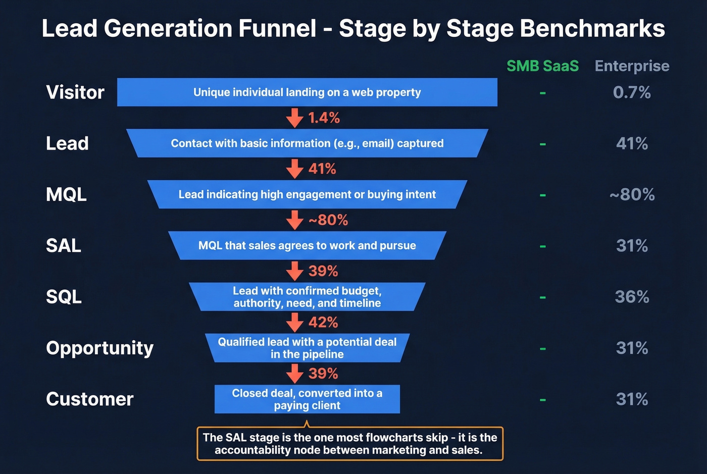
| Stage | Definition | SaaS Benchmark (SMB) | Enterprise Benchmark |
|---|---|---|---|
| Visitor | Hits your site/content | - | - |
| Lead | Gives contact info | 1.4% from visitor | 0.7% from visitor |
| MQL | Meets scoring threshold | 41% from lead | 41% from lead |
| SAL | Sales accepts the lead | ~80% from MQL | ~80% from MQL |
| SQL | Sales qualifies via convo | 39% from MQL | 31% from MQL |
| Opportunity | Active deal in pipeline | 42% from SQL | 36% from SQL |
| Customer | Closed-won | 39% from opp | 31% from opp |
The SAL stage is the one most flowcharts skip. It's the checkpoint where sales explicitly accepts an MQL and commits to follow up within a defined timeframe. Without it, leads disappear into a black hole between marketing and sales - and nobody knows whose fault it is. Include SAL. It's the accountability node that makes the whole chart functional.
Inbound Lead Generation Flowchart
Inbound is the "pull" side - content, SEO, paid ads, webinars. The flowchart follows a five-stage path: Attract, Capture, Nurture, Qualify, Close.
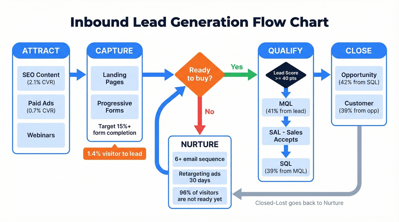
Each box represents a stage; each diamond represents a decision point:
Attract: Content, SEO, Ads
Everything starts with traffic, but not all traffic converts equally. SEO visitors convert to leads at 2.1%, while PPC visitors convert at just 0.7%. That's a 3x difference at the very top of the funnel, and it compounds at every stage below.
Your inbound cadence targets for a mid-stage SaaS company: 2-4 blog posts per month, 1 gated asset per quarter, and 10+ meaningful first-page rankings within 6 months. Work backward from your revenue target - if you need 50 customers and your overall funnel converts at roughly 2.7%, you need about 1,850 leads, which means you need around 132,000 visitors. That math should dictate your content investment, not gut feeling about "how much content is enough."
Capture: Landing Pages and Forms
This is where visitors become leads. The average visitor-to-lead conversion rate sits at 1.4% for B2B SaaS. If you're below 1%, your landing pages need work before you worry about anything downstream.
Use progressive forms - don't ask for company size, budget, and phone number on the first touch. Collect email and name initially, then layer in firmographic questions on subsequent interactions. Target 15%+ form completion rates on gated content.
Nurture: Sequences and Retargeting
96% of visitors aren't ready to buy. Your flowchart needs a nurture branch that catches every lead who isn't immediately sales-ready and feeds them content until they are.
Plan for at least six follow-up emails in your nurture sequence. Most teams send two or three and wonder why MQL volume is low. Combine email nurture with retargeting ads - the lead who downloaded your whitepaper should see case studies in their feed for the next 30 days, not disappear into silence. If your leads go quiet after the initial download, that's not a lead quality problem. It's a nurture problem.
Qualify: Scoring to MQL to SAL to SQL
This is where the flowchart gets its decision diamonds. A lead hits your scoring threshold and becomes an MQL. Sales reviews and accepts it as an SAL. Then a conversation confirms budget, authority, need, and timeline - and it becomes an SQL.
The MQL-to-SQL conversion rate is the single most diagnostic number in your funnel. B2B SaaS averages 39%. The broader B2B range runs 13-26%. If you're below 15%, either your scoring model is too loose or your sales-marketing handoff is broken.
Speed matters enormously here. For inbound demo requests, aim for less than 5 minutes to first touch. Treat speed-to-lead as a revenue KPI, not an operational nice-to-have.
Close and Retain
The opportunity-to-close rate for B2B SaaS averages 39%. Your flowchart should include a feedback loop here - closed-lost deals get tagged with a reason and recycled into nurture. Closed-won customers enter an onboarding flow and eventually a referral loop.
The best flowcharts aren't linear. They're circular. Every "no" at the bottom feeds back into a "not yet" at the top.
Your outbound flowchart breaks at the 'Build List' stage if your data is bad. Prospeo's 300M+ profiles with 98% email accuracy and 7-day refresh cycle mean every lead entering your funnel is real, verified, and current - not a bounce waiting to tank your domain reputation.
Fix the data stage of your flowchart before optimizing anything else.
Outbound Lead Generation Flowchart
Outbound is the "push" side - cold email, cold calls, social outreach. The stages look different: Define ICP, Build List, Verify, Sequence, Handle Replies, Qualify, Close.
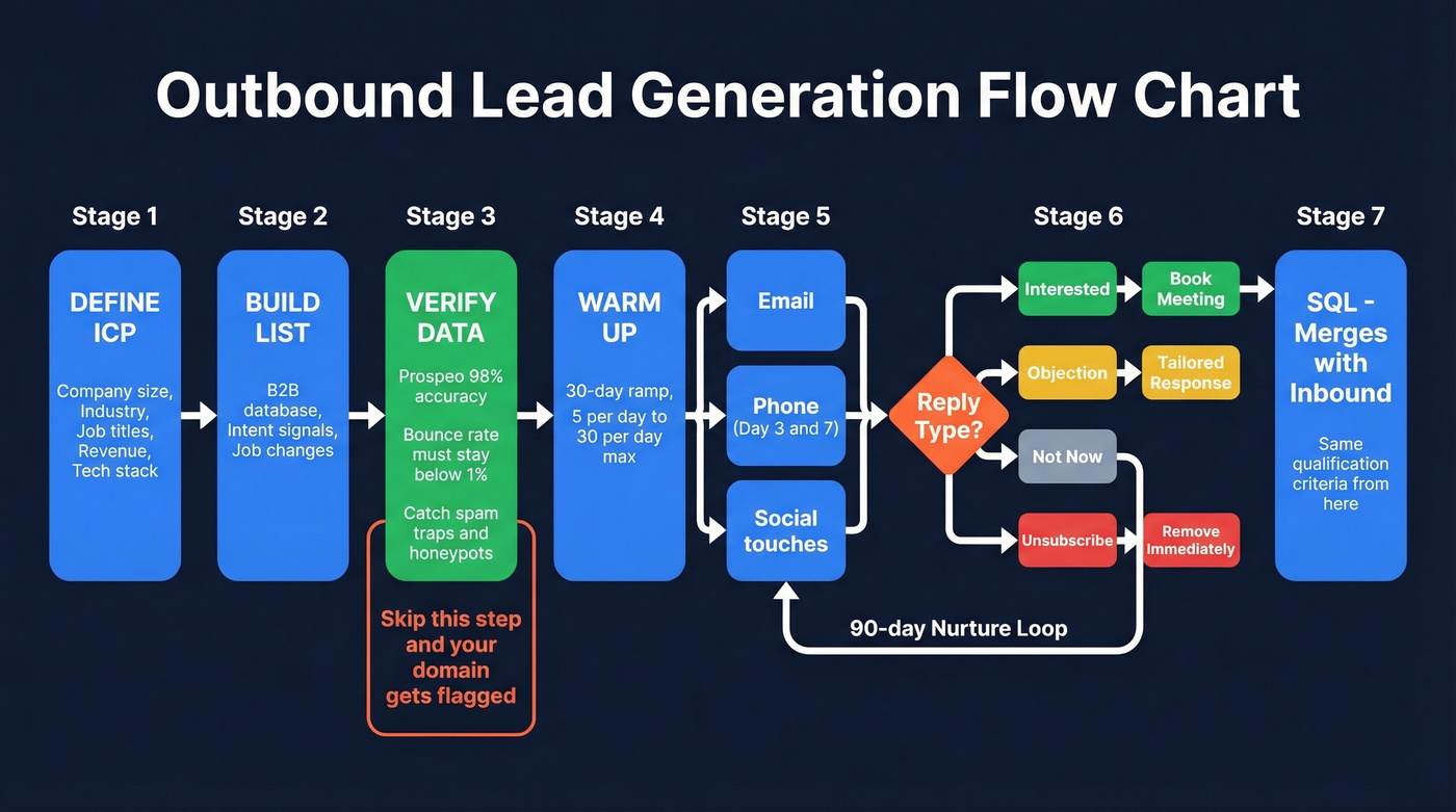
Define ICP and Build Your List
Start with your ideal customer profile: company size, industry, job titles, revenue range, tech stack. This isn't optional brainstorming - it's the filter that determines whether your outbound produces pipeline or spam complaints.
Build your list as a distinct step before any outreach. Pull contacts matching your ICP from a B2B database, filter by intent signals or job changes if available, and export to a clean CSV. The list is the raw material. Everything downstream depends on its quality.
Verify Contact Data
Here's the thing: this is where most outbound flowcharts have a gap, and where most outbound campaigns die. We've seen teams skip verification, launch a 5,000-contact sequence, hit a 15% bounce rate, and get their domain flagged within a week. That's not a hypothetical. It happens constantly.
Your bounce rate must stay below 1%. Not 5%. Not 3%. One percent.
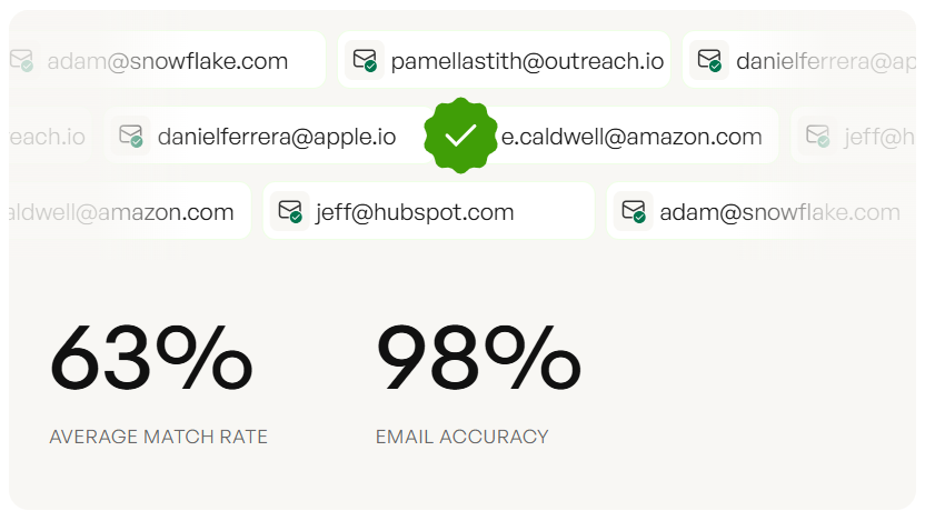
Prospeo's 5-step verification catches invalid addresses, spam traps, honeypots, and catch-all domains before they ever hit your sequence. At 98% email accuracy and roughly $0.01 per email verified, it's the cheapest insurance policy in your outbound stack. The free tier gives you 75 emails per month to test - enough to validate the workflow before committing. (If you want to go deeper on bounce prevention, see email bounce rate and email deliverability.)
Warm Up and Launch Sequences
New email accounts need a 30-day warmup before you send cold outreach at scale. Ramp sends gradually: 5 per day in week one, 15 in week two, 30 by week four. Never exceed 30 sends per inbox per day - that's the ceiling, not the target. (More on safe sending limits in email velocity.)
Build multi-touch, multi-channel sequences. Email alone isn't enough. Layer in phone calls on day 3 and day 7, and social touches between emails. The flowchart should show parallel channels converging on the same prospect, not a single linear email chain.
Handle Replies and Book Meetings
Every reply gets categorized: interested, objection, not now, or unsubscribe. Your flowchart needs a branch for each.
"Interested" goes straight to a meeting booking step. "Objection" gets a tailored response. "Not now" enters a 90-day nurture loop. "Unsubscribe" gets removed immediately - no exceptions, no "are you sure?" follow-ups. The meeting-booked moment is your handoff to the SQL stage, and from here outbound merges with inbound: the same qualification criteria and close benchmarks apply regardless of how the lead entered your funnel.
Lead Scoring Decision Logic
Your flowchart's decision diamonds need actual logic behind them. "Is this lead qualified?" isn't a decision - it's a vibe check. You need a scoring model with numbers.
Basic Scoring Model
Combine fit signals with behavior signals. Fit tells you who they are. Behavior tells you what they've done.
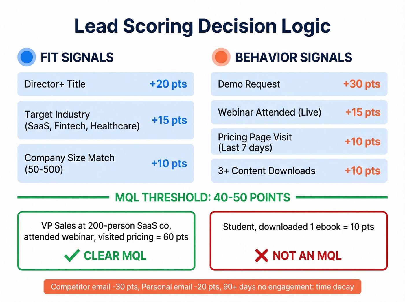
| Signal Type | Signal | Points | Example |
|---|---|---|---|
| Fit | Director+ title | +20 | VP Sales at 200-person co |
| Fit | Target industry | +15 | SaaS, fintech, healthcare |
| Fit | Company size match | +10 | 50-500 employees |
| Behavior | Webinar attended | +15 | Live attendance, not replay |
| Behavior | Pricing page visit | +10 | Within last 7 days |
| Behavior | 3+ content downloads | +10 | Gated assets only |
| Behavior | Demo request | +30 | Immediate SAL trigger |
Set your MQL threshold at 40-50 points. A director at a target company who attended a webinar and visited pricing scores 60 - clearly an MQL. A student who downloaded one ebook scores 10 - clearly not. The model should make this obvious without any human judgment calls.
Negative and Predictive Scoring
Positive scoring alone isn't enough. Subtract points for poor-fit signals: competitor email domains get -30, student or personal email addresses get -20, and leads with no engagement for 90+ days should have time-decay scoring that gradually reduces their total.
Unbounce reduced sales time spent on unqualified leads by 40% using negative scoring rules that flagged generic email domains and out-of-target geographies. That's the kind of efficiency gain that makes the scoring model worth building.
For teams with enough data, predictive scoring takes this further - you'll need roughly 1,000 historical leads with known outcomes to train a model. The investment is real, but companies that have made it report 30-50% jumps in MQL volume and conversion rates.
Benchmarks by Channel
Not all channels are created equal, and your flowchart should reflect that. The difference between your best and worst channel isn't 10% - it's often 2-3x across the entire funnel.
| Channel | Visitor to Lead | MQL to SQL | Opp to Close |
|---|---|---|---|
| SEO | 2.1% | 51% | 38% |
| PPC | 0.7% | 26% | 35% |
| Webinars | 2.2% | 30% | 33% |
| 1.8% | 42% | 37% | |
| Referrals | 3.5% | 55% | 45% |
SEO leads convert MQL-to-SQL at 51%. PPC at 26%. That's not a rounding error.
If your average deal size sits below $10k, you probably can't afford to run PPC profitably at a 0.7% visitor-to-lead rate. Double down on SEO and referrals instead. Let the channel benchmarks drive your budget allocation, not the other way around. The consensus on r/sales tends to agree - outbound teams that track channel-level conversion rates consistently outperform those that lump everything into one "leads generated" number.
Five Ways Your Flowchart Breaks
A flowchart is only useful if it reflects reality. These are the five failure modes we see most often, and in our experience, most teams are dealing with at least two of them right now.
Misaligned handoffs. Marketing says a lead is qualified. Sales disagrees. There's no shared MQL definition, no SLA on follow-up time, and no feedback loop. Fix this before you draw a single box. (If you need a concrete handoff system, start with lead status.)
Low-quality sources inflating volume. A channel that generates 500 leads per month looks great until you realize only 3 become opportunities. Volume isn't pipeline. Your flowchart should track conversion rates per source, not just total volume. (For what to track, see lead generation metrics.)
Bad contact data. Your outbound flowchart is only as good as the data feeding it. Unverified emails mean bounces, and bounces mean your outbound motion stops working. Verify every email before it enters a sequence - this is the step that separates functional outbound from domain-burning outbound.
Slow lead activation. If a prospect requests a demo and doesn't hear back for two hours, a competitor has already booked the meeting. Under 5 minutes for demo requests. Under 1 hour for everything else. (If your reps need a system, use these sales follow-up templates.)
No real nurture after capture. Most teams send two emails and give up. The lead isn't dead - they're just not ready. Build a genuine nurture branch with at least six touches over 30-60 days. The 96% who aren't ready today will be ready in 90 days if you stay in front of them.
Tools to Build Your Flowchart
Don't spend three weeks evaluating diagramming software. The tool matters far less than what you put in the boxes.
| Tool | Best For | Free Tier | Paid From |
|---|---|---|---|
| Miro | Collaboration | 3 boards | $8/user/mo |
| diagrams.net | No limits, free | Unlimited | Free forever |
| Lucidchart | Advanced features | 3 docs | $9/mo |
| Whimsical | All-in-one workspace | 3 boards | $10/user/mo |
| SmartDraw | Speed | None | $9.95/user/mo |
| yEd | Completely free | Unlimited | Free forever |
For most teams, Miro or diagrams.net is the right answer. Miro wins if you need real-time collaboration with remote teammates. diagrams.net wins if you want zero cost and no document limits.
Skip Lucidchart unless you need advanced conditional formatting or Visio import - for a lead gen flowchart, it's overkill. And honestly, a flowchart in Google Slides with real conversion data beats a beautiful diagram with no numbers. Pick a tool in 10 minutes, then spend your time on the benchmarks.
That MQL-to-SQL conversion rate you're tracking? It craters when reps waste calls on bad numbers. Prospeo delivers 125M+ verified mobiles with a 30% pickup rate - 3x the industry average - so your flowchart's 'Qualify' stage actually produces pipeline.
Stop losing deals to wrong numbers and dead emails.
FAQ
What is a lead generation process flow chart?
It's a visual diagram mapping every stage from first visitor touch to closed deal, including decision points like scoring thresholds and qualification checks, annotated with stage-to-stage conversion benchmarks. It serves as both a diagnostic tool and an alignment document between marketing and sales.
How many stages should a lead gen flowchart have?
Seven for inbound: Attract, Capture, Nurture, MQL, SAL, SQL, Close. Six for outbound: ICP, Build List, Verify, Sequence, Meeting, Close. Most guides skip SAL - include it. It's the accountability checkpoint that prevents leads from vanishing between marketing and sales.
What's a good MQL-to-SQL conversion rate?
B2B SaaS averages 39% for SMB/mid-market and 31% for enterprise. Below 15% usually signals misaligned scoring or a broken handoff. Channel matters too - SEO leads convert MQL-to-SQL at 51%, while PPC sits at 26%.
How do I keep outbound data clean in my flow?
Verify every email before it enters a sequence - bounce rates must stay below 1%. Tools like Prospeo catch invalid addresses, spam traps, and catch-all domains at roughly $0.01 per email. The free tier (75 emails/month) lets you validate the workflow before scaling.
How often should I update my lead generation flowchart?
Quarterly at minimum. Review conversion benchmarks at each stage, compare them to the baselines in this guide, and adjust scoring thresholds or handoff SLAs based on what the data shows. A flowchart that hasn't been updated in 6 months is already lying to you.