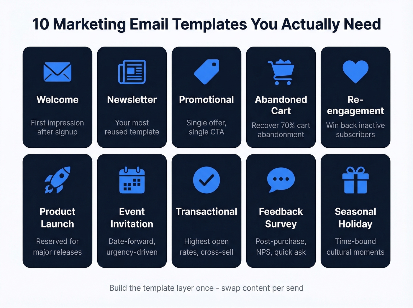
10 Marketing Email Templates You Actually Need in 2026
376.5 billion emails hit inboxes every day. Email still delivers roughly 36:1 ROI, which is why every marketing team on the planet keeps pouring money into it. The problem isn't whether email works - it's that most teams drown in template galleries when they need a tight set of marketing email templates that cover the campaign types they actually run.
Template galleries are a trap. You need a small, reusable set built once and customized per send. That's what we're building here: 10 templates with real copy examples, specific design rules backed by numbers, benchmarks to measure against, and a comparison of free builders so you don't waste a week evaluating tools.
How Email Templates Work
Think of every marketing email as two distinct layers. The template layer controls layout, spacing, column structure, responsive breakpoints, and brand consistency. It's the skeleton - the thing that makes your email look right on a phone, a desktop, and in dark mode.
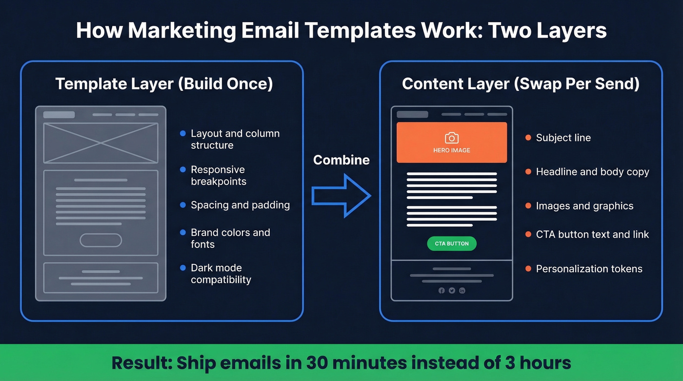
The content layer drives action: subject line, headline, body copy, images, and CTA buttons. This is the framework LinkMobility uses, and it's the right mental model. Most teams rebuild both layers from scratch every campaign. That's a massive waste of time. Build the template layer once per email type, lock it down, and only swap the content layer each send.
What You Need (Quick Version)
- 10 core templates: Welcome, Newsletter, Promotional, Abandoned Cart, Re-engagement, Product Launch, Event Invitation, Transactional, Feedback/Survey, Seasonal/Holiday
- One good builder: Stripo's free tier handles most teams. Upgrade when you hit the 4-export/month wall.
- Measure CTOR, not opens: Apple Mail inflates open rates for nearly half of all email clients. Click-to-open rate actually tells you if your template is working.
Now let's build each one.
The 10 Templates Every Team Needs
Welcome Email
When to use it: Immediately after signup, purchase, or subscription. This is your first impression - it sets the tone for the entire relationship.
Layout: One-column, inverted pyramid. Start wide with a warm headline, narrow to a single CTA.
Copy example:
Subject: You're in. Here's what happens next.
Hey [First Name],
Welcome to [Brand]. You just joined 12,000+ marketers who get our best insights every Tuesday. Your first issue drops next week - but here's something to get started right now.
[CTA: Read Our Most Popular Guide →]
One CTA. Don't dump your entire product catalog into the welcome email. Single-CTA welcome emails usually win on clicks because there's no decision fatigue.
Newsletter
This is the template you'll reuse most, so invest the most design time here. Use a two-column or zig-zag layout - alternating image-left/text-right blocks keeps scanning easy and creates natural visual breaks between stories.
Copy example:
Subject: 3 things that worked this week (and 1 that didn't)
[Article 1 headline + 2-sentence summary + Read More link]
[Article 2 headline + 2-sentence summary + Read More link]
[Article 3 headline + 2-sentence summary + Read More link]
Keep subject lines under 50 characters - most mobile clients truncate beyond that. Each content block should be self-contained because readers scan; they don't read top to bottom.
If you want a swipe file for subject lines, use these subject lines as a starting point.
Promotional / Sale
The highest-converting promotional emails we've seen share one trait: ruthless focus. Single product, single offer, single CTA. No sidebar. No secondary links. Nothing to distract from the action you want.
Layout: Inverted pyramid. Hero image → headline → one paragraph → button.
Copy example:
Subject: 40% off ends at midnight
This is the only time this year we're running this deal. Every plan, every feature, 40% off - but only until 11:59 PM tonight.
[CTA: Claim Your 40% Off →]
Personalized emails pull a 44.3% open rate versus 39.13% for non-personalized. Use the recipient's name and reference their plan or past behavior whenever possible. (If you're building this for outbound, targeted email campaigns are where personalization pays off fastest.)
Abandoned Cart
Roughly 70% of online shopping carts are abandoned - and 43% of those abandoners say they were just browsing. A well-timed sequence converts a meaningful chunk of that group.
Subject: You left something behind
Hey [First Name], your [Product Name] is still in your cart. We're holding it for you - but stock is limited.
[Product image + name + price + size/color]
[CTA: Complete Your Order →]
The product image block is non-negotiable. Show exactly what they left behind - don't make them remember.
Re-engagement / Win-back
When to use it: When a subscriber hasn't opened or clicked in 60-90 days.
Layout: One-column, minimal design. Strip away everything except the message and one CTA.
Copy example:
Subject: We miss you (and here's 20% off to prove it)
It's been a while, [First Name]. We get it - inboxes are noisy. But we've been working on some things we think you'll love. Come back and take 20% off your next order.
[CTA: See What's New →]
Research shows 50% of consumers give a brand a second chance after a negative experience when offered compensation like a refund, discount, or replacement. The incentive isn't optional - it's the mechanism that makes win-back emails work.
Product Launch
Skip this template if your update is minor. Product launch emails should be reserved for genuine releases - overuse trains subscribers to ignore them. When you do send one, lead with a single hero image and 2-3 feature bullets. Long-form announcements underperform.
Subject: It's here: [Product Name]
We've been building this for 6 months. [Product Name] does [one-sentence value prop]. Here's what's new:
- [Feature 1] - [one-line benefit]
- [Feature 2] - [one-line benefit]
[CTA: Try It Free →]
Event Invitation
Layout: One-column with a prominent date/time block. The date needs to be impossible to miss - include it in the subject line because it's a major driver of event email opens.
Subject: Join us June 12: [Event Name]
June 12, 2026 | 1:00 PM ET | Virtual
[Speaker Name] is breaking down [topic] - the same framework that helped [Company] grow pipeline 3x in Q1. Seats are limited.
[CTA: Save Your Spot →]
Transactional / Order Confirmation
Transactional emails typically have the highest open rates of any email type, which makes them prime real estate for a subtle cross-sell. Don't waste it on a plain receipt.
Subject: Order confirmed: #[Order Number]
Thanks, [First Name]. Here's your receipt:
[Order details: item, qty, price, shipping estimate]
While you wait, customers who bought [Product] also loved [Related Product].
[CTA: Shop Related Items →]
Use a text-heavy, one-column layout. Order details first, cross-sell block below. Never let the cross-sell overshadow the confirmation - the subscriber opened this for their receipt. (If you want to systematize this, build a modular design system across lifecycle emails.)
Feedback / Survey Request
When to use it: Post-purchase, post-onboarding, quarterly NPS.
Layout: One-column, deliberately short. The entire email should be scannable in 3 seconds.
Subject: Quick question (takes 60 seconds)
Hey [First Name], how was your experience with [Product/Service]? We read every response - and we actually change things based on what you tell us.
[CTA: Share Your Feedback →]
"Takes 60 seconds" outperforms "Complete our survey" every time. Low-commitment CTAs reduce friction.
Seasonal / Holiday
When to use it: Black Friday, end-of-year, Valentine's Day, back-to-school - any time-bound cultural moment.
Layout: Zig-zag or dynamic product feed. Show multiple products with a time-limited framing.
Subject: Our biggest sale of the year starts now
[First Name], we're going all out for [Holiday]. Every product below is [X]% off through [Date]. No codes, no hoops.
[Product grid: 3-4 items with images, prices, and individual CTAs]
[CTA: Shop the Sale →]
Email Design Rules That Actually Matter
These aren't vague guidelines. They're specific numbers you can hand to a designer or check against your current templates.
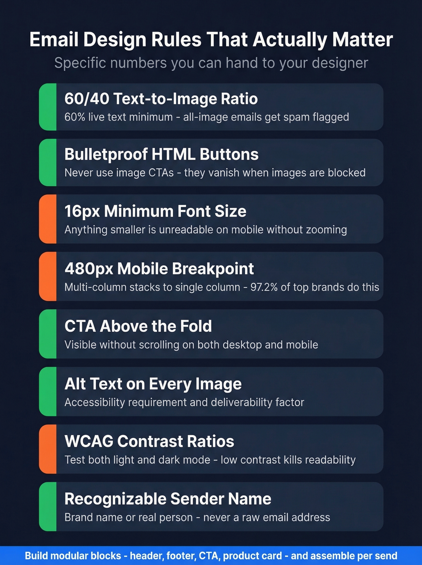
Text-to-image ratio: 60/40. At least 60% live text, 40% or less images. All-image emails get flagged by spam filters, break when images are blocked, and AI inbox summaries can't parse them. Put important information in text, not baked into graphics.
Bulletproof buttons, always. Your CTA must be an HTML/CSS button, not an image. Image-based CTAs disappear when images are blocked - and plenty of corporate email clients block images by default. If you're auditing CTAs across templates, use these email call to action rules and examples.
Font size: 16px minimum. Anything smaller is unreadable on mobile without zooming. Headers should create clear visual separation between sections.
Mobile breakpoint: 480px. At this width, multi-column layouts should stack to a single column. 97.2% of emails from top ecommerce brands are responsive - if yours aren't, you're in the bottom 3%.
CTA above the fold. The primary call-to-action needs to be visible without scrolling on both desktop and mobile. Secondary CTAs can live lower, but the main one goes up top.
Alt text on every image. This isn't optional - it's an accessibility requirement and a deliverability factor. As Chad S. White of Litmus puts it, "Accessibility is an investment in your ability to retain future subscribers at a higher rate." Screen readers depend on alt text, and so do subscribers with images disabled.
WCAG contrast ratios. Check your text-to-background contrast against WCAG AA standards. Low-contrast text looks elegant in Figma and is invisible in an inbox. Dark mode makes this worse - test both.
Sender name matters. Use a recognizable sender name - your brand or a real person - not a raw email address. It's the first thing recipients scan, and it directly affects whether your email gets opened or trashed.
Modular design system. Build reusable blocks - header, footer, CTA module, product card, testimonial block - and assemble templates from them. Litmus calls this a modular design system, and it's the difference between a team that ships emails in 30 minutes and one that takes 3 hours. If you're also trying to protect inbox placement, pair this with an email deliverability guide so design and deliverability don’t fight each other.
Beautiful templates mean nothing if they bounce. Prospeo delivers 98% email accuracy across 143M+ verified addresses - so every template you build actually reaches a real inbox. At $0.01 per email, bad data stops killing your campaign ROI.
Stop perfecting templates that land in the void.
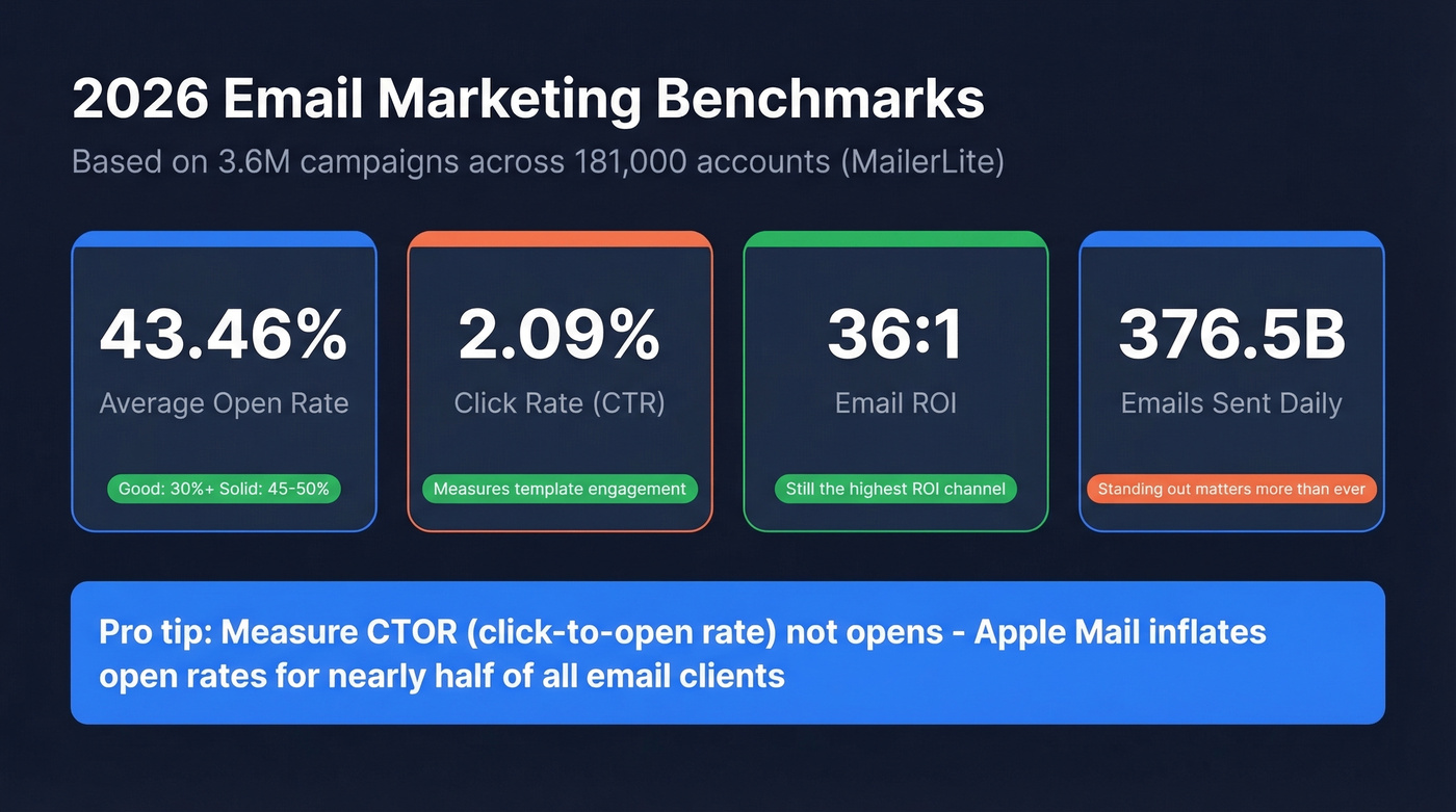
2026 Email Benchmarks
Here's where your templates should be performing, based on MailerLite's analysis of 3.6M campaigns across 181,000 accounts:
| Metric | 2026 Benchmark | What "Good" Looks Like |
|---|---|---|
| Open rate | 43.46% | 30%+ solid; 45-50% strong |
| Click rate (CTR) | 2.09% | 2.5%+ is solid |
| Click-to-open (CTOR) | 6.81% | 7%+ means your content works |
| Unsubscribe rate | 0.22% | Under 0.3% is healthy |
HubSpot's cross-reference puts the average open rate at 42.35% and CTOR at 5.3% - close enough to confirm the range. Industry open rates span from 30.10% (travel) to 55.71% (religion), so context matters.
Here's the thing: open rates are increasingly unreliable. Apple Mail represents roughly 46% of email clients, and Apple Mail Privacy Protection pre-loads tracking pixels - inflating opens whether the subscriber actually read your email or not. We've seen teams obsess over open rates that are 90% noise from Apple MPP. CTOR and CTR are the metrics that tell you if your template design and copy are actually working. (If you want to calculate and track it cleanly, use this click rate formula.)
If your average deal size is under $5k, you probably don't need to obsess over open rates at all. Focus on reply rate and conversion rate instead. The teams getting the best ROI from email in 2026 are the ones who stopped chasing vanity metrics two years ago.
7 Mistakes That Kill Engagement
1. Non-responsive design. If your email doesn't stack to single-column at 480px with 16px+ fonts and fluid percentage widths, it's broken on mobile. Mobile is the majority of opens. This is table stakes.
2. All-image emails with no alt text. They look great in preview. They look like a blank white box when images are blocked. They're invisible to screen readers. Spam filters treat them with suspicion.
3. Image-based CTAs. Your "Shop Now" button is a PNG? It vanishes when images are blocked. Build bulletproof HTML/CSS buttons that render regardless of image settings.
4. Too many CTAs competing for attention. Every additional CTA dilutes the one you actually want clicked. Promotional emails should have one primary CTA. Newsletters can have multiple, but each should be visually distinct and tied to a specific content block.
5. Ignoring dark mode. Your beautiful white-background email turns into a mess of inverted colors and invisible text in dark mode. Test every template in both modes. Use transparent PNGs with care - add padding or background colors that work in both contexts.
6. Never A/B testing templates. Layout changes, CTA placement, button color, copy length - small tests often move CTR by 5-20%. Bot clicks can muddy the data. Test anyway. Directional data beats no data.
7. Sending to unverified lists. Look, the best template in the world is useless if it bounces. Every bounce damages your sender reputation, which means your next campaign - the one with the perfect subject line and the bulletproof button - lands in spam. In our experience, sending to an unverified list is the single fastest way to tank deliverability. One of our agency customers, Stack Optimize, cut bounce rates to under 3% and maintained 94%+ deliverability across all their clients by verifying every address before sending. That's the difference between campaigns that land and campaigns that get blacklisted. (If you’re troubleshooting this, start with email bounce rate benchmarks and fixes, then work on how to improve sender reputation.)
Best Free Email Template Builders
Most free tiers are designed to frustrate you into upgrading. We tested all six of these builders, and a few are genuinely useful if you know the limits.
| Tool | Free Tier Limits | Paid From | Best For | Caveat |
|---|---|---|---|---|
| Stripo | 4 exports/mo, 2 projects | ~$20/mo | Most teams | Export cap is tight |
| Beefree | Branding on exports | ~$30/mo | Collaboration | Free tier feels limited |
| Unlayer | Core editor only | ~$20/mo | Developers | No saved blocks free |
| MJML | Fully free, open-source | Free | Dev teams with ESP | Requires coding |
| Campaign Monitor | Builder free, sending paid | ~$10-$20/mo | Simple campaigns | Need paid to send |
| Benchmark Email | 143 templates | ~$10-$20/mo | Beginners | Basic customization |
Stripo is the starting point for most teams and the one we keep coming back to. Over 1,600 templates, exports to 90+ ESPs, reusable content blocks on the free tier, and a drag-and-drop editor that doesn't fight you. The 4-export/month limit is the main constraint - if you send more than weekly, the Basic plan at ~$20/mo is worth it. We've used Stripo for internal campaigns and it handles everything from simple announcements to complex zig-zag newsletters without breaking.
Beefree brings real-time co-editing and a dedicated Mobile Design Mode that lets you hide elements on mobile or adjust text sizes per device. The free tier slaps Beefree branding on your exports, which is a dealbreaker for client-facing work. For internal teams who don't care about the watermark, it's a solid collaborative option.
MJML is a free open-source framework that compiles to responsive HTML and pairs well with any ESP. If you have a developer on the team who wants code-level control without a GUI, this is the move. No drag-and-drop - just clean markup that outputs bulletproof responsive email.
Canva is fine for social graphics. For email, skip it. Canva's HTML export isn't optimized for email clients, so designs render inconsistently across major inboxes, especially Outlook. Use a dedicated email builder.
2026 Email Template Trends
AI-assisted creation and personalization is moving from novelty to default. Template builders are integrating AI for copy suggestions, subject line generation, and dynamic content blocks that adapt per recipient. This doesn't replace good template design - it accelerates the content layer. If you're applying this to outbound sequences, AI cold email outreach is a useful playbook.
Interactive elements like accordions, carousels, live polls, and embedded forms are shifting from experimental to expected. They don't work in every email client yet, but progressive enhancement means you can build them with graceful fallbacks for clients that don't support them.
Dark mode optimization is no longer optional. Every template should be tested in both light and dark rendering before it goes out. Period.
Privacy-forward design is the big structural shift. Visible unsubscribe links, preference centers, heavier footer disclaimers, and BIMI for visual brand verification in inboxes. With an estimated 3.4 billion phishing emails sent daily, trust signals in email design are becoming a competitive advantage. Google and Yahoo's authentication rule changes are accelerating this - and the consensus on r/emailmarketing is that teams who dragged their feet on DMARC enforcement are paying for it now with deliverability drops. (If you’re implementing this, start with DMARC alignment.)
Zero-party data collection via preference centers and in-email polls is how smart teams are replacing the signals they lost to Apple MPP. Ask subscribers what they want instead of inferring it from pixel tracking.
Personalized emails pull 44.3% open rates - but personalization requires real data. Prospeo enriches every contact with 50+ data points including name, role, company size, and tech stack, refreshed every 7 days. Feed your templates with data that converts.
Enrich your lists before you hit send.
FAQ
What's the best free email template builder?
Stripo is the best free option for most teams - over 1,600 templates, exports to 90+ ESPs, and reusable content blocks on the free tier. The 4-export/month cap is the main limit; upgrade to Basic at ~$20/mo if you send weekly.
How many email templates does a business need?
Ten core templates cover every campaign type most teams run: welcome, newsletter, promotional, abandoned cart, re-engagement, product launch, event invitation, transactional, feedback, and seasonal. Build the layout once, swap content per send.
What's a good click-through rate in 2026?
The current benchmark is 2.09% CTR and 6.81% CTOR across industries. Aim for 2.5%+ CTR and 7%+ CTOR. Focus on CTOR over open rate - Apple Mail Privacy Protection inflates opens for nearly 46% of email clients.
How do I stop my campaigns from bouncing?
Verify your list before every major send. Each bounce damages sender reputation and pushes future emails to spam. Real-time verification catches invalid addresses, spam traps, and honeypots before they do damage - tools like Prospeo offer a free tier to get started.
Do these templates work for B2B campaigns?
Yes. The same 10 structures apply whether you sell to consumers or businesses. B2B teams lean heavier on welcome, newsletter, product launch, and event invitation formats, with longer copy and CTAs like "Book a Demo" instead of "Shop Now." A modular design system helps sales and marketing customize per persona without rebuilding from scratch.